HTML & CSS for Designers: Essential Coding Skills for Web & UI/UX Professionals
Why Designers Must Learn HTML & CSS: The Bridge Between Vision & Reality
The role of a designer has evolved beyond creating static mockups. Today’s digital products are fluid, interactive, and responsive, demanding a deeper understanding of how designs translate into functional code. For UI/UX designers, knowing HTML CSS for designers is the key to unlocking a new level of control, precision, and collaboration.
Enhanced Communication and Collaboration: One of the most significant benefits is the ability to speak the same language as developers. When you understand the capabilities and limitations of HTML structure and CSS styling, you can design with implementation in mind. This means fewer “that’s not possible” moments, more realistic prototypes, and clearer handoffs. Instead of simply dictating aesthetics, you can articulate technical solutions, discuss component architectures, and understand development timelines with greater accuracy. This mutual understanding drastically reduces misinterpretations, leading to faster development cycles and products that more faithfully reflect your original design intent.
Greater Control Over Design Implementation: Ever felt frustrated when a developer’s interpretation of your design didn’t quite hit the mark? Learning HTML and CSS grants you agency over the final output. You can troubleshoot minor styling issues yourself, suggest precise CSS properties for complex animations, or even build small components to demonstrate exact functionality. This hands-on capability ensures that the nuances of your typography, spacing, and responsive behaviors are preserved from concept to production, maintaining the integrity of your UI/UX vision.
Realistic Prototyping and Testing: While design tools offer excellent prototyping features, nothing beats the realism of an actual coded prototype. With HTML and CSS, you can build low-fidelity to high-fidelity prototypes that behave exactly like a live website, complete with real browser rendering, responsive adjustments, and interactive states. This allows for more accurate user testing, revealing genuine usability issues that might be missed in a tool-based prototype. For instance, testing a truly responsive layout with actual media queries provides invaluable feedback on how content reflows and elements adapt across different screen sizes, an insight static mocks cannot fully convey.
Understanding Web Constraints and Opportunities: The web operates within certain constraints – browser compatibility, performance, accessibility standards, and search engine optimization. A designer with coding knowledge inherently understands these factors. You’ll design more accessible interfaces because you know how to structure semantic HTML and apply ARIA attributes. You’ll consider performance implications of complex CSS animations. This knowledge elevates your design decisions, transforming you into a more strategic and impactful contributor to the product development process.
Practical Tip: Start Small, Iterate Often
Don’t feel overwhelmed. Begin by dissecting simple web pages. Use your browser’s developer tools (right-click -> Inspect Element) to peek behind the curtain. Identify HTML tags, CSS properties, and observe how they interact. Then, try to replicate a simple component you designed, like a button or a navigation bar, purely with HTML and CSS in a local file. The immediate visual feedback will reinforce your learning and build confidence.
Understanding HTML: The Foundation of Web Structure
HTML (HyperText Markup Language) is the backbone of every web page. It defines the structure and content, much like the skeleton of a body. Without HTML, your beautiful designs would be formless. For designers, understanding HTML isn’t about memorizing every tag, but grasping the principles of semantic structure and how different elements contribute to a page’s layout and accessibility.
Semantic HTML: Building with Meaning:
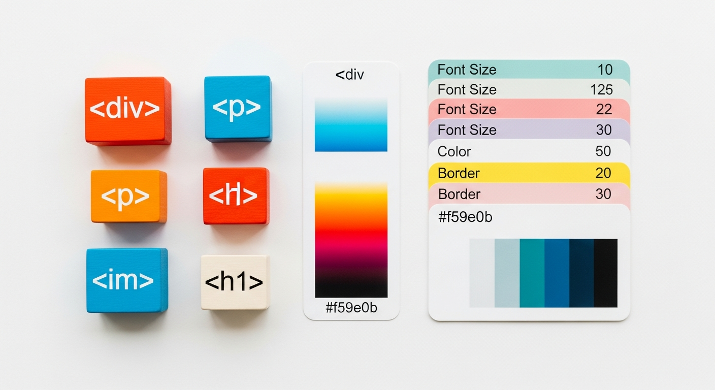
At its core, good HTML is semantic HTML. This means using tags that convey the meaning or purpose of the content they enclose, rather than just how they should look. For example, instead of using a generic <div> tag for everything, you’d use:
<header>for introductory content or navigation links.<nav>for navigation links.<main>for the dominant content of the<body>.<article>for independent, self-contained content.<section>for thematic grouping of content.<aside>for content indirectly related to the main content (e.g., sidebars).<footer>for boilerplate content like copyright or contact information.
Why does this matter for designers? Semantic HTML improves accessibility for screen readers, aids SEO by providing context to search engines, and makes your code more readable and maintainable for developers. When you design, think about the structural hierarchy of your content – is this a heading? A paragraph? A list of items? – and visualize the appropriate HTML tags.
Key HTML Elements Every Designer Should Know:
- Headings (
<h1>to<h6>): Define hierarchy and importance of text. Remember: typically one<h1>per page for the main title. - Paragraphs (
<p>): For blocks of text. - Links (
<a>): Create hyperlinks. Thehrefattribute is crucial (e.g.,<a href="https://layoutscene.com">Layout Scene</a>). - Images (
<img>): Embed images. Thesrcattribute points to the image file, and crucially, thealtattribute provides alternative text for accessibility (e.g.,<img src="logo.png" alt="Layout Scene Logo">). - Lists (
<ul>for unordered,<ol>for ordered, with<li>for list items): Essential for navigation, feature lists, or any enumerated content. - Divisions (
<div>) and Spans (<span>): Generic containers for structuring content when no other semantic tag is appropriate.<div>is block-level,<span>is inline. - Input Elements (
<input>,<textarea>,<select>): Form controls. Understanding their types (text, email, password, checkbox, radio) and attributes (placeholder, required) is vital for UI designers. - Buttons (
<button>): Interactive elements for user actions.
Accessibility through HTML:
As designers, we advocate for inclusive experiences. HTML is the first step towards accessibility. Using semantic tags correctly helps assistive technologies interpret page content. Providing descriptive alt text for images, clear <label> elements for form inputs, and ensuring logical heading structures are fundamental practices that stem directly from HTML knowledge. For more detailed information, refer to the W3C Web Accessibility Initiative.
Practical Tip: Sketch HTML Structure First
Before jumping into visual design, try a quick wireframe on paper or in a basic tool, and label the sections with their semantic HTML tags. Think: “This will be my <header>, this section will contain an <article> with an <h2> and several <p> tags, and this is my <footer>.” This structural thinking will make your designs more robust and easier to implement.
Mastering CSS: Bringing Designs to Life with Style
If HTML provides the structure, CSS (Cascading Style Sheets) provides the aesthetics. It’s the language that defines colors, fonts, spacing, layout, animations, and all the visual flourishes that transform a bare-bones page into a captivating user interface. For designers, mastering CSS is akin to knowing how to mix paints and control brushstrokes – it’s where your visual vision truly comes alive on the web.
Understanding CSS Selectors and Properties:
CSS works by selecting HTML elements and applying specific properties to them.
- Element Selectors: Target all instances of an HTML tag (e.g.,
p { color: black; }). - Class Selectors: Target elements with a specific class attribute (e.g.,
.button-primary { background-color: blue; }). Classes are reusable and incredibly powerful for component-based design. - ID Selectors: Target a unique element with a specific ID attribute (e.g.,
#main-hero { padding: 100px; }). IDs should only be used once per page. - Descendant Selectors: Target an element inside another (e.g.,
nav a { text-decoration: none; }targets all links within a<nav>). - Pseudo-classes: Style elements based on their state (e.g.,
:hoverfor mouseover,:focusfor keyboard navigation,:activefor click states). These are crucial for creating interactive UI elements.
CSS properties are what define the actual styles. Designers should become intimately familiar with properties related to:
- Typography:
font-family,font-size,font-weight,line-height,letter-spacing,text-align,color. - Colors and Backgrounds:
color,background-color,background-image,gradient. - Box Model:
width,height,padding,border,margin. Understanding how these properties affect an element’s size and spacing is fundamental. - Layout:
display(block, inline, inline-block, flex, grid),position(static, relative, absolute, fixed, sticky),float,clear. - Visual Effects:
box-shadow,text-shadow,border-radius,opacity,transform,transition.
The CSS Box Model: Your Layout’s Foundation:
Every HTML element is essentially a box. The CSS Box Model describes how these boxes are rendered and how their dimensions are calculated. It consists of four parts, from innermost to outermost:
- Content: The actual content of the element (text, images, etc.).
- Padding: Space between the content and the border.
- Border: A line that goes around the padding and content.
- Margin: Space outside the border, separating the element from other elements.
As a designer, mastering the Box Model is crucial for precise spacing and layout. For instance, if you design a button with 16px of padding, 1px border, and 20px of margin on all sides, you know exactly how much space it will occupy and how much distance it will maintain from adjacent elements. Understanding box-sizing: border-box; (which includes padding and border within the specified width/height) versus the default content-box is also a critical detail for consistent layout control. For more details, consult the MDN Web Docs on the CSS Box Model.
Cascading and Specificity:
CSS stands for “Cascading” Style Sheets for a reason. Styles cascade down, and rules determine which styles apply when multiple rules target the same element. Specificity is the algorithm browsers use to decide which CSS property value is most relevant to an element. Understanding that inline styles > IDs > Classes > Element selectors, and that !important overrides everything, is vital for debugging and ensuring your intended styles are applied.
Practical Tip: Master Your Browser’s Developer Tools
The “Elements” and “Styles” tabs in Chrome, Firefox, or Edge developer tools are your best friends. Select any element on a web page, and you can see all the HTML and applied CSS. Even better, you can modify CSS properties live in the browser to experiment with values, colors, or layouts. This immediate feedback loop is invaluable for learning and debugging.
Responsive Design Principles with HTML & CSS: A Mobile-First World
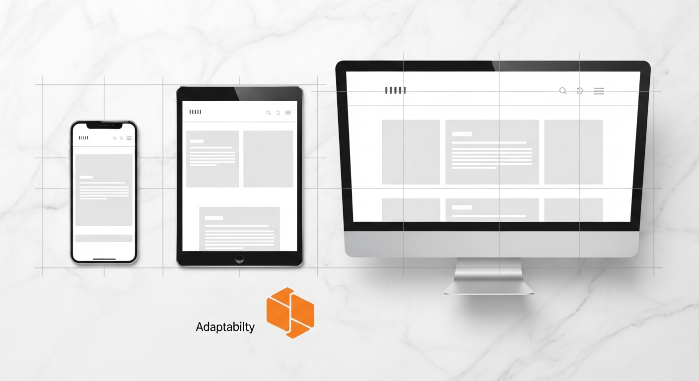
In an era where users access the web from an astounding array of devices – from smartwatches to ultra-wide monitors – responsive design is no longer a luxury but a fundamental requirement. For UI/UX designers, building interfaces that adapt seamlessly across screen sizes is central to user experience. HTML and CSS are the foundational tools for achieving true responsiveness.
The Viewport Meta Tag: Your First Responsive Step:
Every responsive web page must begin with the viewport meta tag in the HTML <head>:
<meta name="viewport" content="width=device-width, initial-scale=1.0">This tag tells the browser to set the width of the viewport to the device’s width and to set the initial zoom level to 1.0. Without it, mobile browsers might render your page at a desktop width and then scale it down, making text unreadable and elements tiny. For designers, ensuring this tag is present is crucial for any responsive project.
Media Queries: The Heart of Responsiveness:
Media queries in CSS allow you to apply different styles based on device characteristics, most commonly screen width. This is how you implement breakpoints in your design.
/ Base styles for all devices (mobile-first approach) /
body {
    font-size: 16px;
}

/ Styles for screens wider than 768px (e.g., tablets and desktops) /
@media (min-width: 768px) {
    body {
        font-size: 18px;
    }
    .container {
        width: 750px;
        margin: 0 auto;
    }
}

/ Styles for screens wider than 1200px (e.g., large desktops) /
@media (min-width: 1200px) {
    body {
        font-size: 20px;
    }
    .container {
        width: 1140px;
    }
}
As a designer, you need to understand how to define these breakpoints based on your content, not just generic device sizes. Think about where your layout naturally breaks or becomes unreadable, and apply media queries there. Common breakpoints often cluster around mobile (320-480px), tablet (768-1024px), and desktop (1024px+).
Fluid Layouts: Percentages, Ems, Rems, and Viewport Units:
Instead of fixed pixel widths, responsive designs utilize fluid units for dimensions and spacing:
- Percentages (
%): Define widths relative to their parent container. E.g.,width: 50%;means half the width of its parent. emandrem: Relative font sizes.emis relative to the parent element’s font size, whilerem(root em) is relative to the root HTML element’s font size. Using these ensures scalable typography that respects user preferences.- Viewport Units (
vw,vh,vmin,vmax): Define sizes relative to the viewport’s width (vw) or height (vh). E.g.,font-size: 3vw;means the text size will be 3% of the viewport width. Useful for elements that should scale proportionally with the browser window.
Flexbox and CSS Grid: The Modern Layout Powerhouses:
These two CSS layout modules have revolutionized responsive design, making complex layouts manageable and intuitive.
- Flexbox (Flexible Box Layout): Ideal for one-dimensional layouts (either rows or columns). It’s perfect for aligning items within a container, distributing space among them, and ordering them. Think navigation bars, form elements, and card layouts. For a comprehensive guide to CSS Flexbox, check out our dedicated article.
.container { display: flex; justify-content: space-between; / Distribute items with space between / align-items: center; / Vertically align items / } - CSS Grid Layout: Designed for two-dimensional layouts (rows AND columns simultaneously). It’s the go-to for entire page layouts, complex dashboards, and galleries where precise control over both dimensions is needed. Explore our deep dive into CSS Grid for advanced techniques.
.grid-container {
    display: grid;
    grid-template-columns: 1fr 2fr 1fr; / Three columns, middle one twice as wide /
    gap: 20px; / Space between grid items /
}
Designers should familiarize themselves with the core concepts of Flexbox and Grid, as they directly impact how your designs can be efficiently translated into responsive code. Understanding them allows you to design layouts that are inherently adaptable and maintainable.
Practical Tip: Embrace Mobile-First Design
When designing, start with the smallest screen size first (mobile). Design your layout, content, and interactions for this constrained environment. Once that’s solid, progressively enhance the design for larger screens. This forces you to prioritize content and simplifies the responsive implementation, often leading to cleaner, more efficient designs.
Practical Workflow: From Design Tool to Code (Bridging the Gap)
The journey from a pixel-perfect design in Figma or Sketch to a fully functional, responsive web page involves a critical translation step. For designers, understanding this workflow and knowing how your visual decisions map directly to HTML and CSS is paramount. It’s about bridging the perceived gap between “design” and “development” and making your creations truly buildable.
Translating Design Components to Code:
Consider how you build components in your design tool: buttons, navigation items, cards, input fields. Each of these has direct analogues in HTML and CSS.
- Buttons: In your design tool, a button has a background color, text color, padding, border-radius, font style, and hover/active states. In CSS, this translates directly to properties like
background-color,color,padding,border-radius,font-family,font-size, and pseudo-classes like:hoverand:active. - Navigation Bars: Often composed of an unordered list (
<ul>) of list items (<li>), each containing a link (<a>). CSS Flexbox is perfect for arranging these horizontally, while properties manage spacing, typography, and interactive states. - Cards: Typically a
<div>with a specific class, containing an image (<img>), a heading (<h3>), a paragraph (<p>), and perhaps a button (<button>). CSS Grid or Flexbox can then arrange multiple cards efficiently.
By thinking about your designs in terms of these fundamental building blocks and their corresponding HTML elements and CSS properties, you’ll inherently create more structured and code-friendly designs.
Leveraging Design Tokens:
Modern design systems often utilize “design tokens” – abstract values (like colors, fonts, spacing units) that represent your design decisions. These tokens can be exported and consumed directly by developers, ensuring consistency. While not strictly HTML/CSS, understanding their role helps you appreciate how your design system translates into concrete values that CSS can use (e.g., CSS Custom Properties/Variables).
CSS Frameworks and Libraries (Know Their Role):
Frameworks like Bootstrap, Tailwind CSS, or Bulma provide pre-written CSS and sometimes JavaScript components, accelerating development.
- Bootstrap: A comprehensive framework offering a grid system, pre-styled components (buttons, navbars, cards, modals), and utilities. Designers should understand its component structure and how its classes (e.g.,
.btn .btn-primary,.container,.row .col-md-6) map to visual elements. - Tailwind CSS: A “utility-first” framework. Instead of semantic component classes, it provides low-level utility classes (e.g.,
flex,pt-4,text-center,bg-blue-500) that you compose directly in your HTML. This gives designers immense control over styling without writing custom CSS, provided they understand the utility class names.
While you might not need to write framework-specific code, knowing how developers use these frameworks allows you to design components that are easier to implement with them, or to specify if a custom component requires a bespoke CSS solution.
Preprocessors (Sass/Less) and Post-processors (PostCSS):
These tools enhance CSS by adding features like variables, mixins, nested rules, and functions (preprocessors), or by transforming CSS after it’s written (post-processors, often for vendor prefixes or minification). For designers, knowing that variables exist (e.g., $primary-color: #007bff; in Sass) can reinforce the idea of a consistent design system and simplify updates across a project.
Version Control Basics (Git):
While typically a developer’s domain, a basic understanding of Git (a version control system) can benefit designers, especially those contributing directly to codebases. Knowing how to commit changes, pull the latest updates, and resolve simple conflicts helps in collaborating on shared projects and understanding the developer workflow.
Practical Tip: Replicate Your Own Designs
Pick a simple screen from one of your past UI/UX projects. Try to build it using only HTML and CSS. Don’t aim for perfection initially, but focus on getting the structure, basic styling, and responsiveness right. This hands-on exercise will rapidly accelerate your understanding of how your visual designs map to code, exposing common challenges and effective solutions. Consider following a tutorial on Figma-to-code workflow to streamline this process.
Advanced CSS Techniques for UI/UX Excellence: Beyond the Basics
Once you’ve grasped the fundamentals of HTML and CSS, the door opens to a world of advanced techniques that can significantly elevate the user experience and visual polish of your designs. These techniques allow for richer interactions, greater consistency, and improved maintainability.
CSS Transitions and Animations: Adding Polish and Feedback:
Subtle animations and transitions can dramatically improve the perceived quality and usability of a UI.
- Transitions: Provide smooth changes between states. For example, a button changing color on hover shouldn’t snap; it should smoothly transition.
.button {
    background-color: blue;
    transition: background-color 0.3s ease-in-out; / Smooth transition over 0.3 seconds /
}
.button:hover {
    background-color: darkblue;
}
Designers can specify durations, easing functions (e.g.,
ease-in,linear), and properties to animate. - Keyframe Animations: For more complex, multi-step animations. These allow you to define a sequence of styles at different points in time, creating dynamic effects like loading spinners, parallax scrolls, or elaborate entrance effects. Understanding how keyframes work empowers you to design animations that are performant and precisely controlled by code.
Always consider the user experience with animations: are they enhancing clarity, providing feedback, or merely decorative? Overuse can be detrimental, but judicious application can make an interface feel alive and intuitive.
CSS Custom Properties (Variables): Consistency and Themability:
CSS Custom Properties, often called CSS Variables, allow you to define reusable values directly in CSS. This is incredibly powerful for maintaining design consistency and implementing theme switching.
:root { / Define global variables /
    --primary-color: #007bff;
    --secondary-color: #6c757d;
    --spacing-unit: 16px;
    --font-stack: "Inter", sans-serif;
}

button {
    background-color: var(--primary-color);
    padding: var(--spacing-unit) calc(var(--spacing-unit) * 1.5);
    font-family: var(--font-stack);
}
For designers, CSS variables mean that if you decide to change your primary brand color, you only need to update it in one place in the CSS, and it will propagate across the entire site. This directly mirrors the concept of variables in design tools and strengthens the connection between design system principles and code implementation.
Accessibility Features (Focus States, prefers-reduced-motion):
A truly excellent UI/UX design is accessible to everyone. CSS plays a crucial role here:
- Focus States (
:focus): Ensure interactive elements (links, buttons, form inputs) have clear visual indicators when they are keyboard-focused. This is critical for users who navigate with keyboards or assistive technologies. Designers should explicitly design these focus states. prefers-reduced-motionMedia Query: Respecting user preferences for reduced motion is a key accessibility feature. This media query allows you to provide a simpler, static experience for users who prefer to avoid animations, preventing potential discomfort or motion sickness. For more information, refer to the WCAG guidelines on animations.@media (prefers-reduced-motion: reduce) { .element-with-animation { animation: none !important; transition: none !important; } }
CSS Methodologies for Maintainable Code (BEM, SMACSS, OOCSS):
As projects grow, managing CSS can become complex. Methodologies like BEM (Block, Element, Modifier), SMACSS (Scalable and Modular Architecture for CSS), and OOCSS (Object-Oriented CSS) provide structured ways to name classes and organize stylesheets. For designers, understanding these approaches means:
- Your designs will translate into more predictable and modular components.
- You’ll understand why developers name classes in a particular way (e.g.,
.card__title--largein BEM). - You can contribute to maintaining a clean and scalable codebase.
Practical Tip: Explore Real-World Codebases
Examine the source code of popular websites or open-source UI libraries. How do they use Flexbox and Grid? What kind of transitions do they implement? How are their CSS variables structured? This exposure to professional code will reveal best practices and inspire new approaches to your designs and their implementation.
Future-Proofing Your Skills: Staying Current with HTML & CSS
The web is an ever-evolving landscape. New HTML elements are introduced, CSS properties gain wider browser support, and best practices shift. For designers who embrace coding, staying current isn’t just about learning new tricks; it’s about maintaining relevance, adaptability, and an edge in a competitive industry.
Embrace Continuous Learning:
HTML and CSS specifications are regularly updated by the W3C (World Wide Web Consortium) and browser vendors. Features like CSS Container Queries, Cascade Layers, and new pseudo-classes are continuously emerging, offering more powerful ways to build adaptive and sophisticated interfaces.
- Follow Reputable Sources: Keep an eye on authoritative blogs and news sites (like Layout Scene, CSS-Tricks, Smashing Magazine, A List Apart, MDN Web Docs).
- Experiment with New Features: Don’t wait for full browser support to experiment with exciting new CSS properties or HTML elements. Use feature flags in browsers or tools like CodePen to play around.
- Join Communities: Engage with designer-developer communities online (e.g., Reddit’s r/web_design, Discord channels, local meetups). Discussions often highlight emerging trends and challenges.
The Convergence of Design and Code Tools:
The tools we use are also evolving to blur the lines between design and code.
- Design-to-Code Plugins: Tools in Figma, Sketch, and Adobe XD are improving their ability to export code snippets or integrate with development environments, though still requiring human refinement.
- Browser-Based Design Tools: Platforms like Webflow and Framer are giving designers more direct control over coded output, allowing for visual design with direct manipulation of HTML and CSS properties. Even if you don’t use these exclusively, understanding their approach reinforces the direct relationship between design and code.
- Component Libraries: Design systems often translate directly into component libraries (e.g., React components, Vue components) built with HTML and CSS. Designers who understand the underlying code can contribute more effectively to these libraries and ensure their visual designs align with reusable code components.
Accessibility and Performance as Core Competencies:
As digital experiences become more central to daily life, accessibility (A11y) and web performance are no longer optional extras; they are fundamental aspects of good design and development.
- Accessibility: Deepen your understanding of WCAG (Web Content Accessibility Guidelines) and how HTML attributes (ARIA roles, states, properties) and CSS (contrast ratios, focus states, responsive typography) contribute to an inclusive experience.
- Performance: Learn how CSS animations can be optimized, how images can be lazily loaded in HTML, and how minimizing CSS file sizes and complex selectors can impact page load times. A design that looks great but performs poorly is a failed design.
For a designer, embracing HTML CSS for designers is not just about adding another skill; it’s about transforming your approach to design. It fosters empathy for the development process, empowers you with greater control, and positions you as a more versatile and invaluable asset in any product team. The investment in these foundational coding skills will undoubtedly pay dividends in your career growth and the quality of the digital experiences you create.
Practical Tip: Build a Personal Project End-to-End
The best way to solidify your skills and stay current is to continuously build. Start a small personal project – a portfolio site, a landing page for a fictional product, or a recreated UI challenge. Take it from design concept to a fully functional, responsive HTML/CSS page. This hands-on experience will force you to apply everything you’ve learned and discover new areas for growth.
Conclusion
The journey to becoming a truly impactful web and UI/UX professional transcends the confines of purely visual design. As we’ve explored, mastering HTML & CSS for designers is not merely an optional add-on but an an essential core competency that empowers you to communicate effectively, build precisely, and innovate responsibly. These foundational coding languages provide the lexicon to articulate your design vision to developers, the tools to ensure its accurate implementation, and the understanding to create truly accessible, performant, and responsive user experiences.
By investing in these skills, you elevate your role from a creator of aesthetics to a holistic architect of digital products. You gain the ability to anticipate technical challenges, design with practical implementation in mind, and ultimately, craft digital experiences that are not only beautiful but also robust, user-centric, and future-proof. The web continues to evolve, and with a solid grasp of HTML and CSS, you equip yourself with the adaptability and insight required to navigate its complexities and shape its future.
Ready to transform your design practice?
Start today by dedicating time to practical coding exercises. Pick a component from your current design project and challenge yourself to build it in HTML and CSS. Explore online tutorials, experiment with browser developer tools, and join communities where you can learn and grow. The digital landscape awaits your coded creations. Embrace the code, and unlock your full potential as a web and UI/UX professional.
Frequently Asked Questions