In the dynamic realm of digital experiences, where user attention spans are fleeting and competition is fierce, the strategic integration of design principles with technical considerations to create fast, efficient, and user-friendly web experiences has become paramount. This discipline, known as website performance optimization design, is no longer an afterthought but a foundational element that dictates a website’s success. For digital design professionals, understanding and actively shaping performance through design choices is critical for user satisfaction, conversion rates, and robust search engine optimization.
This comprehensive guide delves into how every design decision, from visual asset selection to interactive elements and layout architecture, directly influences a site’s speed and responsiveness. We aim to equip you with the knowledge and actionable strategies to build web experiences that are not only aesthetically pleasing but also blazing fast, setting new benchmarks for efficiency and engagement.
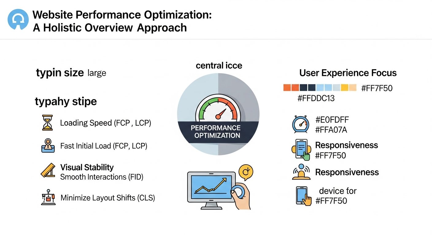
The Foundational Role of Design in Website Performance
The perception that website performance is solely a developer’s concern is outdated. In reality, designers hold significant influence over a website’s speed and responsiveness from the earliest stages of conception. Every element placed on a page, every visual style applied, and every interactive component envisioned carries a performance footprint. A designer’s choice of high-resolution images, complex custom fonts, intricate animations, or even an inefficient layout structure can contribute significantly to larger file sizes, increased rendering times, and higher CPU usage on the user’s device.
Conversely, a performance-driven web design approach ensures that aesthetic goals are balanced with technical efficiency. This involves making informed decisions about asset optimization, prioritizing critical content, streamlining user flows, and creating interfaces that feel instantaneous. By understanding the direct relationship between design choices and performance metrics like Largest Contentful Paint (LCP) and Cumulative Layout Shift (CLS), designers can proactively bake speed into the core of their projects, rather than attempting to bolt it on later as an expensive fix.
What success looks like: A design brief that includes performance targets from the outset, leading to a lean design system where every component is evaluated for its speed impact, resulting in an effortless user experience that loads almost instantly, irrespective of device or network speed.
See our detailed guide on The Interplay of Design and Performance.
| Design Element | Impact on Performance | Key Optimization Strategy | Designer’s Role |
|---|---|---|---|
| Images | Largest contributor to page weight, slow LCP. | Modern formats (WebP/AVIF), compression, lazy loading, responsive images. | Selecting appropriate formats, specifying resolutions, ensuring responsive implementation. |
| Web Fonts | Render-blocking, layout shifts (FOIT/FOUT), increased download size. | Font subsetting, variable fonts, `font-display` property, local hosting. | Choosing efficient font families, defining loading strategies, minimizing weights. |
| CSS | Render-blocking, larger stylesheets increase parse time. | Minification, critical CSS extraction, concatenation, efficient selectors. | Structuring stylesheets, defining visual hierarchy for critical CSS. |
| JavaScript | Main thread blocking, increased TBT/FID, high CPU usage for animations. | Minification, defer/async, tree shaking, code splitting, efficient animation libraries. | Minimizing complex interactions, choosing performant animation methods, simplifying logic. |
| Layout/Structure | DOM complexity increases render tree building, reflows/repaints. | Semantic HTML, flattened DOM, efficient responsive design patterns. | Creating lean, maintainable layouts, prioritizing content flow. |
| Animations | Can cause jank if not optimized, increased CPU/GPU load. | Hardware-accelerated CSS animations, limiting JS animations, `will-change` property. | Selecting performant animation types, minimizing resource-intensive effects. |
| Responsive Design | Inefficient asset delivery on smaller screens, layout shifts. | Mobile-first approach, `srcset`/`sizes`, media queries for targeted styles. | Designing for various viewports, prioritizing mobile user experience. |
Optimizing Visual Assets: Images, Icons, and Fonts for Speed
Visual assets are the heaviest elements on most webpages, making their optimization a cornerstone of effective performance-driven web design. A beautiful design can quickly become a frustrating experience if it’s burdened by unoptimized media. Strategically handling images, icons, and fonts significantly reduces page load times and improves perceived performance.
Choosing the Right Image Formats
The format chosen for an image has a profound impact on its file size and quality. Traditional formats like JPEG are excellent for photographs due to their lossy compression, while PNG is better for graphics requiring transparency and lossless quality. However, modern formats offer superior efficiency.
- WebP: Developed by Google, WebP offers both lossy and lossless compression for photographic and graphic images, typically resulting in 25-35% smaller file sizes than JPEG or PNG at comparable quality. It supports transparency and animation.
- AVIF: An even newer format, AVIF, based on the AV1 video codec, often delivers significantly smaller file sizes (up to 50% less than JPEG) while maintaining high quality. It supports transparency and HDR.
Leveraging these formats with `
| Format | Best Use Case | Compression Type | Transparency Support | Browser Support (General) |
|---|---|---|---|---|
| JPEG | Photographs, complex images with gradients. | Lossy | No | Excellent |
| PNG | Graphics, logos, images with transparency, sharp edges. | Lossless | Yes | Excellent |
| WebP | Photographs, graphics, animated images; balances quality and small size. | Lossy & Lossless | Yes | Very Good |
| AVIF | Next-gen image format for high-quality images at ultra-low file sizes. | Lossy | Yes | Good (Growing) |
Implementing Responsive Image Techniques
Serving images tailored to the user’s device and viewport is crucial. The `srcset` and `sizes` attributes within the `` tag allow browsers to choose the most appropriate image resolution from a set of options, preventing larger-than-necessary images from being downloaded on smaller screens. Additionally, lazy loading (using the `loading=”lazy”` attribute) defers the loading of off-screen images until they are needed, dramatically improving initial page load times.
What failure looks like: A mobile user accessing a website, downloading a 4000px wide hero image on their small screen, resulting in wasted bandwidth, slow rendering, and a high data cost, ultimately leading to frustration and abandonment.
How do font loading strategies impact perceived speed?
Custom web fonts enhance branding but can significantly delay text rendering, leading to issues like Flash of Unstyled Text (FOUT) or Flash of Invisible Text (FOIT). The `font-display` CSS property is essential for managing this:
- `swap`: Text is rendered immediately using a fallback font, then swapped with the custom font once loaded.
- `optional`: Similar to `swap` but gives the browser discretion to use the fallback permanently if the custom font takes too long.
- `block`: Blocks rendering until the font is loaded, potentially causing FOIT.
Further optimization includes font subsetting (only including the characters needed) and using variable fonts to reduce the number of font files required. By optimizing font delivery, designers directly contribute to visual stability and perceived speed.
[INLINE IMAGE 1: diagram illustrating the impact of image compression on file size and load time, comparing an unoptimized high-resolution JPEG to a WebP optimized image at similar visual quality, showing significant file size reduction]
See our detailed guide on Visual Asset Optimization for Performance.
Structural and Layout Design for Enhanced Performance
Beyond individual assets, the overall structure and layout of a webpage significantly influence rendering speed and visual stability. A well-constructed layout minimizes browser reflows and repaints, ensures content is quickly visible, and maintains a stable user experience.
Mobile-First Design for Optimal Performance
Adopting a mobile-first design philosophy inherently promotes lean and efficient layouts. By starting with the smallest screen, designers are forced to prioritize content and functionalities, eliminating unnecessary elements that can bloat pages. This approach ensures that mobile users receive only what’s essential, leading to faster load times and a better experience on limited bandwidth. Media queries then progressively enhance the design for larger viewports, adding complexity only where appropriate.
Managing DOM Complexity
The Document Object Model (DOM) is the browser’s representation of your HTML structure. An excessively complex DOM with deeply nested elements can slow down rendering, as the browser has more work to do when calculating styles and layout. Designers can contribute by advocating for simpler, flatter HTML structures and avoiding unnecessary wrapper `div`s. This directly impacts metrics like Layout Shift and Long Tasks.
Critical CSS and Render-Blocking Resources
CSS stylesheets are render-blocking resources; the browser must download and parse them before it can render any content. Critical CSS refers to the minimum CSS required to render the content above the fold (the initial viewable area) as quickly as possible. Designers can help identify and define the essential styles that must be inlined in the HTML to ensure a fast First Contentful Paint (FCP) and LCP, with the rest of the CSS loaded asynchronously.
See our detailed guide on Efficient Layout and Structure for Web Speed.
Interactive Design and JavaScript Performance Considerations
Interactivity is a hallmark of modern web experiences, but it comes at a cost. JavaScript, while powerful, can be a major culprit for slow performance if not optimized. Designers play a crucial role in shaping interactive elements in a way that minimizes their performance impact.
Can animations truly slow down a website?
Absolutely. While subtle animations can enhance user experience, overly complex or poorly implemented animations can significantly degrade performance. JavaScript-driven animations, especially those that manipulate layout properties (like `width`, `height`, `top`, `left`), can trigger expensive reflows and repaints, blocking the main thread and leading to ‘jank’ – choppy, unresponsive interfaces. CSS-based animations, particularly those leveraging `transform` and `opacity` properties, are generally more performant as they can be hardware-accelerated by the browser, reducing CPU load.
Designers should prioritize animations that are smooth, purposeful, and executed efficiently. Limiting the number of animated elements and focusing on simple, hardware-accelerated transitions contributes significantly to perceived fluidity without taxing browser resources.
JavaScript Optimization for UX Performance Design
JavaScript contributes to bundle size and execution time, directly impacting interactivity metrics like First Input Delay (FID) and Total Blocking Time (TBT). Designers should be aware of:
- Bundle Size: Large JavaScript files take longer to download and parse. Design choices that require heavy frameworks or numerous third-party scripts should be evaluated.
- Execution Time: Complex scripts can block the main thread, making the page unresponsive. Designers can advocate for simpler interactive patterns.
While developers handle the technical aspects like minification, tree shaking (removing unused code), and code splitting (breaking large bundles into smaller, on-demand chunks), designers inform these decisions by understanding the performance implications of their interactive visions. For instance, using lightweight UI components rather than feature-rich, heavy alternatives, directly aids front-end performance optimization.
[INLINE IMAGE 2: flowchart showing how excessive JavaScript processing affects main thread blocking and FID scores, starting from script download, parsing, execution, leading to blocked main thread and delayed user input processing]
See our detailed guide on Interactive Design and JavaScript Optimization.
Measuring and Monitoring Website Performance from a Design Perspective
To truly excel at performance-driven web design, designers must understand how to measure and interpret performance metrics. This allows for informed decision-making and continuous improvement.
What are Core Web Vitals and why do designers care?
Core Web Vitals are a set of metrics defined by Google that quantify the real-world user experience of loading speed, interactivity, and visual stability. They are now a significant ranking factor for SEO, meaning a good user experience translates directly to better visibility.
- Largest Contentful Paint (LCP): Measures perceived loading speed. It marks the point when the largest image or text block in the viewport is visible. Designers directly influence LCP through image optimization, font loading, and prioritizing above-the-fold content.
- First Input Delay (FID): Measures interactivity. It quantifies the time from when a user first interacts with a page (e.g., clicks a button) to when the browser is actually able to respond. Heavy JavaScript execution, often tied to interactive design elements, can significantly impact FID.
- Cumulative Layout Shift (CLS): Measures visual stability. It quantifies unexpected layout shifts of visual page content. Designers influence CLS by ensuring images have explicit dimensions, dynamic content loads without shifting existing elements, and fonts are loaded gracefully to prevent FOUT.
Interpreting Performance Metrics
Tools like Google Lighthouse, PageSpeed Insights, GTmetrix, and WebPageTest provide invaluable insights into a website’s performance. While some metrics are more developer-centric, designers should focus on understanding:
- LCP, FID, CLS scores: These directly reflect the user experience.
- Opportunities section: Many tools highlight areas for improvement, such as “Serve images in next-gen formats,” “Defer offscreen images,” or “Ensure text remains visible during webfont load.” These are actionable insights for designers.
- Visual timeline/filmstrip view: This allows designers to visually see the page loading process, identifying moments of delay or instability.
By regularly auditing their designs with these tools, designers can proactively identify and address performance bottlenecks, ensuring their work aligns with optimal web standards.
See our detailed guide on Performance Measurement and Designer Tools.
Common Website Performance Optimization Design Mistakes
Even with good intentions, designers can inadvertently introduce performance issues. Recognizing these common pitfalls is the first step toward effective web performance optimization design.
- Unoptimized Images: Using high-resolution, uncompressed images or relying solely on JPEG/PNG without considering modern formats like WebP or AVIF. Failing to implement responsive images (`srcset`, `sizes`) for varying screen sizes.
- Excessive Custom Fonts: Importing too many font families, weights, or styles. Not subsetting fonts to include only necessary characters. Neglecting `font-display` properties, leading to FOIT or FOUT.
- Over-reliance on Heavy Frameworks/Libraries: Choosing large JavaScript or CSS frameworks for simple functionalities, leading to bloated bundles.
- Complex CSS and DOM Structures: Deeply nested HTML elements or overly specific, inefficient CSS selectors that slow down rendering. Not considering critical CSS for above-the-fold content.
- Unoptimized Animations: Using JavaScript for animations that could be achieved with performant CSS properties (`transform`, `opacity`). Over-animating too many elements or using resource-intensive effects.
- Poor Asset Delivery: Not utilizing lazy loading for off-screen images and videos. Not serving assets from a Content Delivery Network (CDN) for faster global access.
- Ignoring Mobile-First Principles: Designing for desktop first and then haphazardly adjusting for mobile, leading to overloaded mobile experiences.
- Lack of Collaboration with Developers: Failing to discuss performance implications of design choices with the development team early in the process.
- Not Monitoring Performance: Launching a site without establishing a baseline and regularly monitoring Core Web Vitals and other performance metrics.
See our detailed guide on Avoiding Common Performance Pitfalls.
Strategic Best Practices for Performance-Driven Web Design
Embracing a proactive and strategic approach to web performance is key for designers. Integrating these best practices into your workflow ensures that speed and efficiency are integral to every project.
Proactive Performance Planning
Performance should be a non-negotiable requirement from the very first wireframe. Include performance targets (e.g., target LCP under 2.5 seconds, CLS near 0) in your design briefs. Conduct performance audits of competitors early on to set realistic benchmarks. Design with a “budget” in mind for assets and scripts.
Design System Thinking for Efficiency
Developing a robust design system that prioritizes performance means every component—from buttons to hero sections—is built with efficiency in mind. This includes:
- Standardizing image optimization guidelines.
- Defining a limited, performant font stack with clear loading strategies.
- Creating reusable, lightweight UI components.
- Documenting animation guidelines that favor CSS transforms over JavaScript.
A well-curated design system significantly reduces performance debt over time and ensures consistency across projects.
Collaboration with Developers
The synergy between design and development is critical for front-end performance optimization. Designers should actively:
- Communicate the performance goals of their designs.
- Seek developer input on the feasibility and performance cost of design elements (e.g., complex gradients, custom cursors, intricate SVG animations).
- Review performance reports together to understand how design choices translate into metrics and identify areas for improvement.
This iterative collaboration fosters a shared responsibility for performance, leading to better outcomes.
See our detailed guide on Best Practices for High-Performance Design.
Sources & References
- Google Developers. “Core Web Vitals.” web.dev/vitals/ (Accessed March 2026).
- Shankland, S. (2020). “AVIF image format is taking on JPEGs with better quality at smaller file sizes.” CNET. cnet.com/tech/services-and-software/avif-image-format-is-taking-on-jpegs-with-better-quality-at-smaller-file-sizes/ (Accessed March 2026).
- Smashing Magazine. “Image Optimization: A Comprehensive Guide.” smashingmagazine.com/2021/04/complete-guide-image-optimization/ (Accessed March 2026).
- W3C. “CSS `font-display` property.” w3.org/TR/css-fonts-4/#font-display-desc (Accessed March 2026).
Reviewed by Maya Singh, Senior Content Editor & UX Strategist — Last reviewed: March 28, 2026