
Discover Top Website Layout Templates: Your Guide to Responsive and Creative Web Design
In the ever-evolving landscape of web design, selecting the right website layout template is crucial for creating an engaging user experience. This guide delves into the principles of “responsive design” and creative strategies that can elevate your web projects. By understanding the nuances of website layout templates, designers can enhance usability and aesthetic appeal, ensuring that their sites are not only visually appealing but also functional across various devices. Many designers struggle with finding templates that balance creativity and usability, leading to subpar user experiences. This article will explore responsive design principles, creative web design strategies, and provide examples of effective templates, along with tips on choosing the right layout for your needs.
Responsive Design Principles
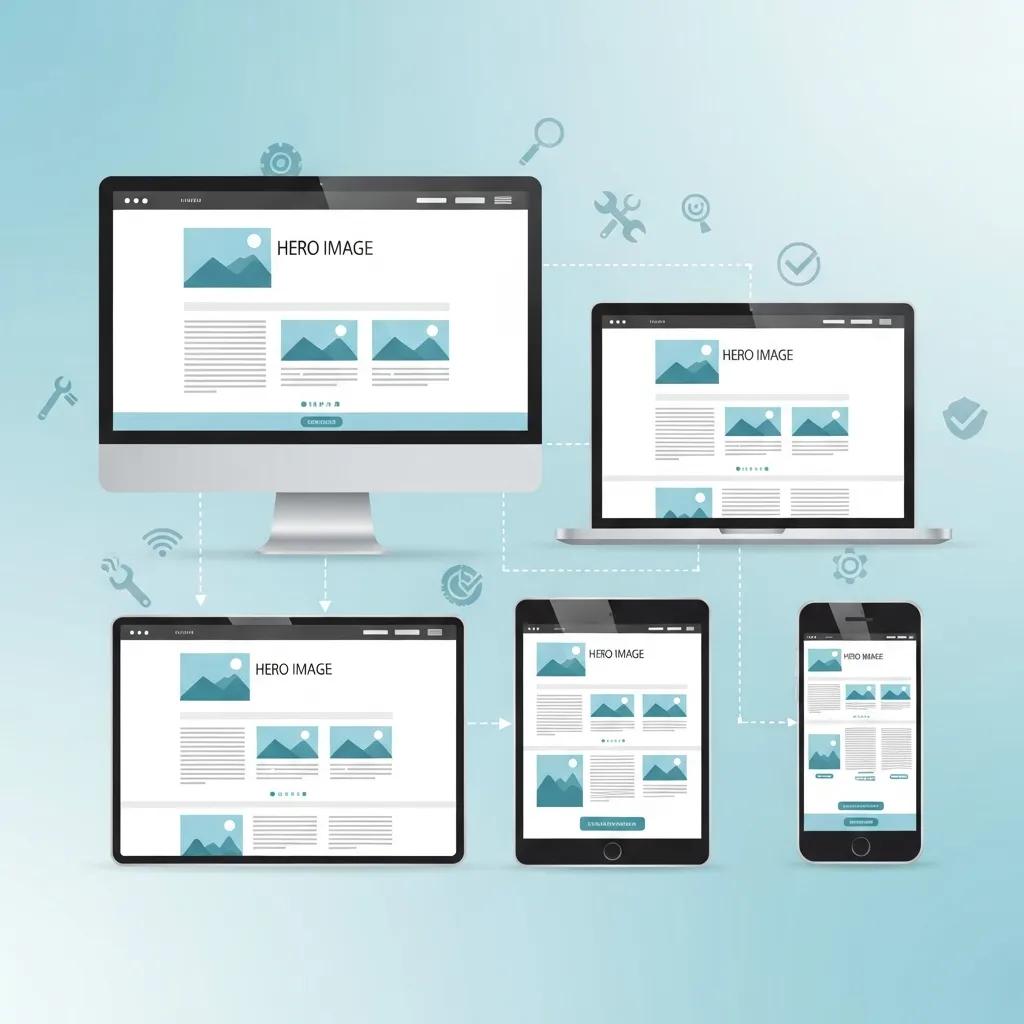
Responsive design is a fundamental approach in modern web development that ensures websites function seamlessly across a variety of devices. This design philosophy is built on three core principles: flexible grids, fluid images, and media queries. Flexible grids allow content to adapt to different screen sizes, ensuring that users have a consistent experience whether they are on a desktop, tablet, or smartphone. Fluid images maintain their aspect ratios, preventing distortion and ensuring that visuals look great on any device. Media queries apply specific styles based on device characteristics, allowing designers to tailor the user experience to the capabilities of the device being used.
Understanding these principles is essential for creating websites that are not only visually appealing but also user-friendly. As we explore creative web design strategies, it becomes clear how these principles can be effectively integrated into various design approaches.
Creative Web Design Strategies
Creative web design strategies focus on enhancing user engagement through innovative layouts and visual storytelling. A user-centric approach prioritizes the needs and preferences of the audience, ensuring that the design resonates with users. Visual hierarchy plays a crucial role in guiding users through content, making it easier for them to navigate and find information. Additionally, accessibility is a key consideration, ensuring that all users, including those with disabilities, can interact with the website effectively.
By implementing these strategies, designers can create websites that not only attract visitors but also keep them engaged. The next section will provide examples of effective templates that embody these principles and strategies.
Examples of Effective Templates
When it comes to selecting a website layout template, certain characteristics define effectiveness. Clean navigation structures, mobile-responsive designs, and consistent color palettes are essential features that enhance user experience. Below are some examples of effective templates that exemplify these qualities:
- Template A: Features a minimalist design with a focus on typography and whitespace, making it easy for users to read and navigate.
- Template B: Offers a grid layout that adapts seamlessly to different screen sizes, ensuring that images and text are displayed optimally.
- Template C: Incorporates interactive elements that engage users, such as hover effects and animations, enhancing the overall experience.
These templates not only provide aesthetic appeal but also prioritize usability, making them ideal choices for designers looking to create impactful websites.
What Are the Best Responsive Web Design Templates for Modern Websites?
Identifying the best responsive web design templates involves evaluating their features, usability, and user feedback. Some of the top templates currently available include:
- Template X: Known for its versatility, this template supports various layouts and is highly customizable, making it suitable for different types of websites.
- Template Y: This template excels in mobile responsiveness, ensuring that content is easily accessible on smartphones and tablets.
- Template Z: With a focus on SEO optimization, this template helps improve visibility in search engines while maintaining a user-friendly design.
How Do Responsive Grid Systems Enhance Mobile Usability?
Responsive grid systems enhance mobile usability by allowing content to flow naturally across different screen sizes. Fluid grids utilize relative units, such as percentages, to ensure that elements resize proportionally. Media queries further adapt layouts based on device characteristics, providing a tailored experience for users. CSS Grid Layout enables complex designs that can adjust seamlessly, making it easier for designers to create visually appealing and functional websites.
Which Template Types Suit Different Device Compatibilities?
Different template types cater to various device compatibilities, ensuring that users have a consistent experience regardless of the device they use. For desktops, traditional grid layouts work well, while flexible layouts are ideal for tablets. Mobile-specific templates often prioritize vertical scrolling and simplified navigation to enhance usability. By understanding these distinctions, designers can select templates that best meet the needs of their target audience.
How to Choose the Right Website Layout Template for Your Design Needs?
Choosing the right website layout template involves assessing your design needs and goals. Considerations include the target audience, the type of content being presented, and the desired user experience. Evaluating customization options is also crucial, as it allows designers to tailor templates to fit their unique branding and functionality requirements.
What UI Layout Examples Demonstrate Effective User Experience?
Effective UI layouts prioritize user engagement and ease of navigation. Examples include:
- Layout A: Features a clear call-to-action button prominently displayed, guiding users toward desired actions.
- Layout B: Utilizes a sidebar for additional navigation options, making it easy for users to explore related content.
- Layout C: Incorporates visual elements that break up text, enhancing readability and keeping users engaged.
These layouts demonstrate how thoughtful design can significantly improve user experience and satisfaction.
Which Factors Influence Template Customization Options?
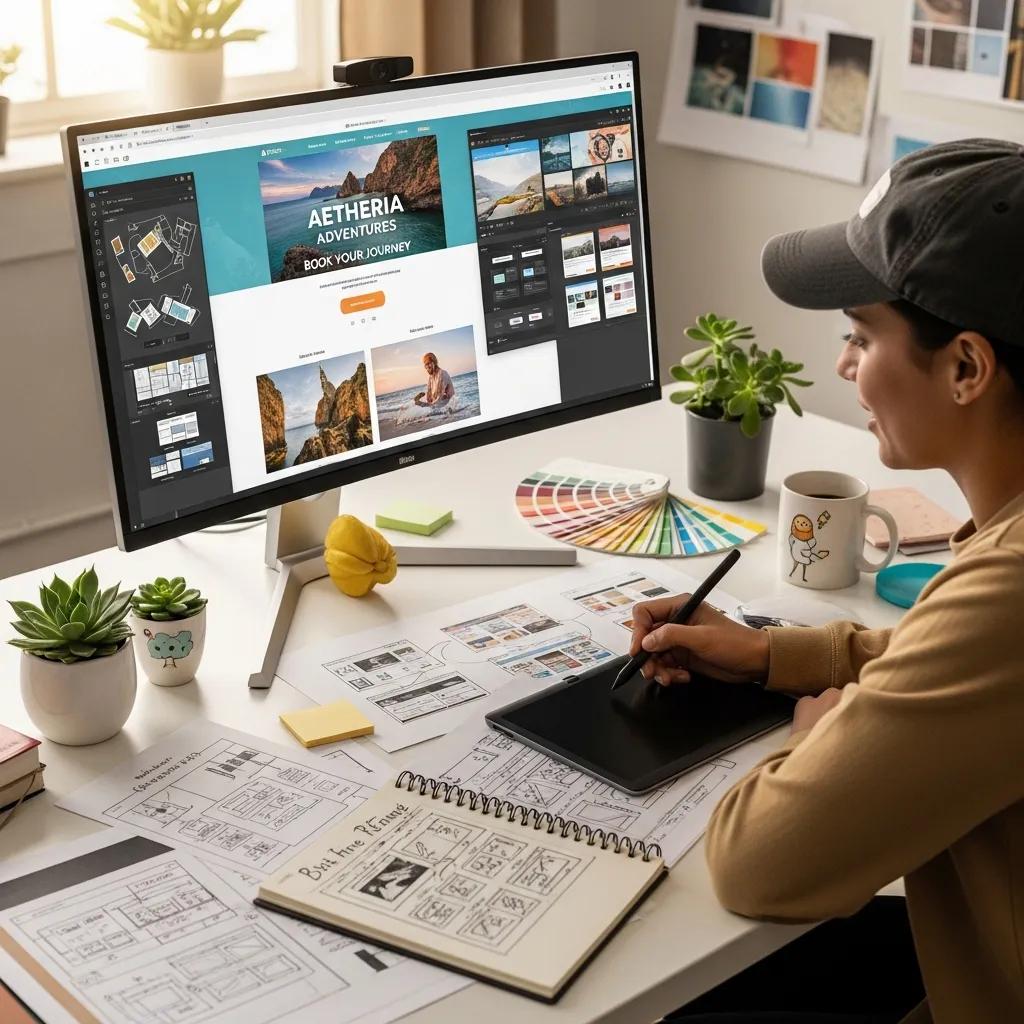
Several factors influence template customization options, including the design tools and software used, user preferences, and the technical skills required for implementation. Popular design tools like Figma and Adobe XD offer extensive customization capabilities, allowing designers to modify templates to align with their vision. Understanding these factors can help designers make informed decisions when selecting and customizing templates.
What Are the Best Website Wireframe Tools to Create and Customize Layouts?
Wireframe tools are essential for creating and customizing website layouts, providing a visual representation of the design before development. Some of the best wireframe tools include:
- Tool A: Offers a user-friendly interface with drag-and-drop functionality, making it easy to create wireframes quickly.
- Tool B: Provides advanced collaboration features, allowing teams to work together in real-time on wireframe designs.
- Tool C: Includes a library of pre-built components, streamlining the wireframing process and ensuring consistency across designs.
How Do Popular Design Tools Like Figma and Adobe XD Support Template Design?
Figma and Adobe XD are popular design tools that support template design through their collaborative features and extensive libraries. Figma allows multiple users to work on a design simultaneously, facilitating real-time feedback and iteration. Adobe XD offers prototyping capabilities, enabling designers to create interactive mockups that showcase how templates will function in practice. Both tools enhance the design process, making it easier for designers to create high-quality templates.
What Tutorials Help Master Template Customization in Design Software?
Mastering template customization in design software requires access to quality tutorials that cover various aspects of the design process. Some valuable resources include:
- Tutorial A: Focuses on the basics of template customization, providing step-by-step instructions for beginners.
- Tutorial B: Offers advanced techniques for modifying templates, including tips on using design tools effectively.
- Tutorial C: Covers best practices for ensuring templates are responsive and user-friendly across devices.
These tutorials equip designers with the knowledge and skills needed to create customized templates that meet their specific needs.
Which Modern Web Page Structures and Creative Web Design Patterns Are Trending in 2026?
As we look toward 2026, several web page structures and design patterns are gaining popularity. These trends emphasize user engagement and innovative layouts. Key trends include:
- Asymmetrical Layouts: Breaking away from traditional grid structures, asymmetrical designs create visual interest and draw users in.
- Micro-Interactions: Subtle animations and interactions enhance user experience by providing feedback and guiding actions.
- Dark Mode Designs: Increasingly popular, dark mode offers a visually appealing alternative that reduces eye strain and enhances readability.
How Do Interactive Web Layouts Improve User Engagement?
Interactive web layouts improve user engagement by creating dynamic experiences that encourage exploration. Features such as hover effects, animations, and interactive elements keep users interested and invested in the content. By incorporating these elements, designers can create websites that not only inform but also entertain, leading to longer visit durations and higher conversion rates.
What Are the Latest Innovations in UI UX Best Practices?
The field of UI/UX design is constantly evolving, with new innovations emerging regularly. Recent best practices focus on enhancing user experience through personalization, accessibility, and data-driven design. Personalization allows websites to cater to individual user preferences, while accessibility ensures that all users can interact with the site effectively. Data-driven design leverages user analytics to inform design decisions, leading to more effective and user-friendly websites.
How Can You Optimize Website Layout Templates for Better User Experience and SEO?
Optimizing website layout templates for user experience and SEO involves implementing best practices that enhance both usability and visibility. Key strategies include:
- SEO Best Practices: Incorporating relevant keywords, optimizing meta tags, and ensuring fast loading times can significantly improve search engine rankings.
- User Experience Improvements: Streamlining navigation, enhancing readability, and ensuring mobile responsiveness contribute to a positive user experience.
- Actionable Tips: Regularly testing and updating templates based on user feedback can help maintain optimal performance and satisfaction.
What Role Do Structured Data and Schema.org Markup Play in Template Visibility?
Structured data and Schema.org markup play a crucial role in enhancing template visibility in search engines. By providing additional context about the content, structured data helps search engines understand the website’s purpose and relevance. Implementing schema markup can lead to rich snippets in search results, improving click-through rates and overall visibility.
How to Implement Internal Linking and Semantic Entity Relationships Effectively?
Effective internal linking and semantic entity relationships enhance website navigation and improve SEO. Key strategies include:
- Linking Relevant Content: Connecting related articles and pages helps users discover more information and keeps them engaged.
- Using Descriptive Anchor Text: Clear and relevant anchor text improves user understanding and encourages clicks.
- Creating a Logical Structure: Organizing content hierarchically ensures that users can easily navigate through the site.
By implementing these strategies, designers can create websites that are not only user-friendly but also optimized for search engines.