Mastering Above the Fold Design in 2026: What Truly Drives Impact
As designers, you are the architects of first impressions. The content you place at the very top of a webpage or app screen dictates whether a user stays, explores, or bounces. It’s the digital handshake, the initial pitch, and the crucial gateway to the rest of your meticulously crafted experience. Forget static layouts; 2026 demands dynamic, intelligent, and highly performant ATF designs that resonate instantly with diverse audiences. Let’s delve into what truly defines an impactful Above the Fold in this sophisticated digital era.
Beyond the Pixel Fold: Redefining “Above the Fold” for Modern Devices
The traditional understanding of “Above the Fold” as a fixed horizontal line is obsolete. In 2026, the fold is fluid, dynamic, and unique to every user’s device, browser, and even their current viewport settings. This fundamental shift requires designers to think responsively and adaptively, moving beyond a single desktop-centric view to embrace a truly multi-device paradigm. You are no longer designing for a single fold, but for an infinite number of potential folds.
Consider the sheer variety of screens your users might be employing: from compact smartwatches and smartphones to tablets, laptops, ultra-wide monitors, and even emerging augmented reality interfaces. Each presents a different “fold” and, consequently, a different initial canvas. This necessitates a mobile-first design philosophy, where the core message and essential interactions are prioritized for the smallest screens first, then progressively enhanced for larger viewports. This approach, championed by industry leaders and best practices, ensures that your most critical content is always visible and accessible, regardless of the device.
Furthermore, the concept of the “fold” is influenced by browser toolbars, operating system interfaces, and even dynamic elements like cookie consent banners or promotional pop-ups that might appear upon initial load. What was once visible might be pushed down by these overlays. Therefore, when you design your ATF, you must account for these potential intrusions, ensuring your core message remains paramount and immediately digestible. The Nielsen Norman Group has consistently highlighted the importance of placing critical information high up, acknowledging that even with scrolling being second nature, users still spend significantly more time viewing content above the fold.
Key considerations for redefining the fold:
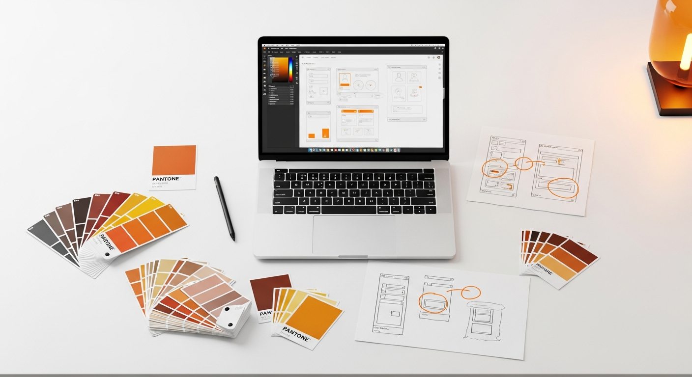
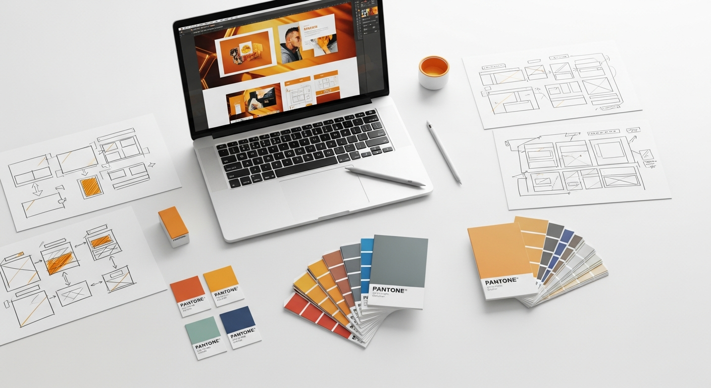
- Responsive Design Principles: Employ flexible grids, fluid images, and media queries to ensure your layout adapts gracefully to any screen size. Tools like Figma and Adobe XD facilitate responsive prototyping, allowing you to visualize your ATF across various breakpoints.
- Viewport Awareness: Design with the understanding that the actual visible area can vary. Test your designs on a wide range of devices and resolutions, not just a few standard ones.
- Dynamic Content: If your ATF includes dynamic elements (e.g., personalized greetings, A/B tested headlines), ensure their loading doesn’t negatively impact initial perceived performance or push crucial content out of view.
- Accessibility Overlays: Be mindful of how elements like “skip to content” links or accessibility widgets might interact with your ATF content.
The Psychological Imperatives: Why the First Glance Matters More Than Ever

In an age of information overload and dwindling attention spans, the psychological impact of your Above the Fold design has become paramount. Users form an opinion about your website or application within milliseconds—a phenomenon often referred to as the “blink test.” This initial judgment is heavily influenced by cognitive biases and deeply ingrained human behaviors. Your ATF is not just a layout; it’s a carefully constructed psychological trigger designed to engage, reassure, and guide the user.
One of the primary psychological principles at play is the serial position effect, specifically the primacy effect, which suggests that items presented first are often remembered better. For your website, this translates to the content above the fold. It’s your opportunity to make a memorable, positive first impression that encourages further exploration.
Users arrive with inherent expectations: they want immediate answers, clear value, and effortless navigation. If your ATF fails to deliver on these expectations, they will quickly disengage. Think about the concept of “scent of information” – users are looking for clues that they are in the right place and that their needs will be met. A strong, clear value proposition above the fold acts as a powerful scent, drawing them deeper into your site.
Furthermore, trust and credibility are established almost instantaneously. Professional aesthetics, clear language, and a sense of organization contribute to a perception of trustworthiness. Conversely, a cluttered, slow-loading, or confusing ATF can breed distrust and frustration, leading to high bounce rates. This is where the principles of Gestalt psychology come into play, emphasizing how users perceive elements as a unified whole, seeking patterns and meaning. Your ATF should present a coherent, digestible narrative.
Consider these psychological drivers for your ATF:
- Instant Gratification: Users seek immediate answers. Your ATF should quickly address “What is this site about?” and “What can it do for me?”
- Cognitive Load Reduction: Minimize the amount of information users need to process. Use clear headings, concise copy, and intuitive visual hierarchy. Avoid jargon.
- Emotional Connection: High-quality imagery, engaging headlines, and relevant messaging can evoke positive emotions, making the user more receptive.
- Trust and Authority: Displaying social proof (testimonials, trust badges) or subtle indicators of expertise can build credibility from the outset.
- Anticipation and Curiosity: While providing immediate value, a well-designed ATF can also pique curiosity, subtly hinting at further engaging content below the fold.
Core Components of an Effective 2026 Above the Fold Experience
Crafting a compelling Above the Fold design in 2026 requires a strategic placement of key elements that collectively communicate value, establish credibility, and guide user action. Each component plays a vital role in creating that crucial first impression and setting the stage for the user’s journey.
The Hero Section: Your Digital Billboard
The hero section is the centerpiece of your ATF. It’s typically the largest visual area and houses the most critical information. In 2026, hero sections are evolving beyond static images to incorporate subtle animations, personalized content, and even interactive elements that enhance engagement without sacrificing performance.
- Compelling Headline: This is your elevator pitch. It must be clear, concise, and immediately communicate your primary value proposition. Use strong action verbs and benefit-oriented language.
- Sub-headline/Supporting Text: Elaborate briefly on the headline, providing context or additional benefits. Keep it succinct and easy to scan.
- High-Quality Visuals: Whether it’s an image, video, or illustration, the visual should be relevant, high-resolution, and emotionally resonant. Avoid generic stock photos. Consider subtle video loops or animations that load quickly.
- Primary Call to Action (CTA): This is arguably the most important element. It should be prominent, clearly worded, and lead to the most desired user action (e.g., “Sign Up,” “Learn More,” “Get a Quote”). Use contrasting colors to make it stand out.
Value Proposition: Why Should They Care?
Your value proposition isn’t just a headline; it’s the core promise you’re making to your users. It needs to be crystal clear and instantly understandable above the fold. In 2026, personalization driven by AI will allow you to tailor this value proposition to specific user segments, making it even more potent. Focus on benefits, not just features.
Navigation: Guiding the Way
Intuitive navigation is non-negotiable. Users need to understand where they are and where they can go next. In 2026, navigation patterns continue to evolve, with a strong emphasis on mobile-first solutions like hamburger menus or tab bars that reveal comprehensive navigation upon interaction. For desktop, clear, concise global navigation is still king.
- Minimalist Approach: Keep the primary navigation links to a minimum, focusing on the most important sections of your site.
- Clear Labeling: Use straightforward, descriptive labels for your navigation items. Avoid jargon.
- Prominent Logo: Your brand logo should be easily identifiable and typically links back to the homepage.
- Search Functionality: For content-heavy sites, a visible search bar or icon is crucial.
Trust Signals and Social Proof
Building trust starts immediately. Above the fold, you can strategically place elements that convey credibility and authority.
- Client Logos: If you serve well-known clients, displaying their logos discreetly can instantly boost trust.
- Awards/Certifications: Relevant industry awards or security certifications can be powerful trust signals.
- Short Testimonials/Ratings: A concise, impactful quote from a satisfied customer or an aggregate star rating can be very persuasive.
Visual Hierarchy and Layout
The arrangement of all these elements dictates what the user sees first and how they process information. In 2026, sophisticated visual design tools and design systems (like Google’s Material Design or Apple’s Human Interface Guidelines) provide robust frameworks for establishing clear hierarchy.
- F-Pattern/Z-Pattern: Understand how users typically scan pages and arrange your critical elements along these natural viewing paths.
- Whitespace: Use ample whitespace to reduce cognitive load and draw attention to key elements. Avoid a cluttered look.
- Color and Typography: Use color strategically to highlight CTAs and important information. Ensure typography is legible and supports your brand’s voice.
Optimizing for Performance and Accessibility: Non-Negotiables for 2026

In 2026, a beautiful Above the Fold design is meaningless if it’s slow to load or inaccessible to a portion of your audience. Performance and accessibility are not merely features; they are foundational requirements for any successful digital product. Google’s Core Web Vitals, for instance, are now critical ranking factors, directly impacting visibility and user experience. Similarly, adherence to Web Content Accessibility Guidelines (WCAG) is not just ethical; it’s often a legal requirement and always a mark of superior design.
Blazing Fast Performance: Speed is a Feature
Users expect instant gratification. A slow-loading ATF can lead to immediate abandonment. The goal is to achieve a perceived instant load, where the most critical content is rendered almost immediately. This requires a deep understanding of frontend optimization techniques.
- Image Optimization: Compress images without sacrificing quality. Use modern formats like WebP or AVIF. Implement lazy loading for images below the fold, but ensure your ATF images are prioritized.
- Minimize HTTP Requests: Reduce the number of files (CSS, JavaScript, fonts) your browser needs to download. Combine and minify these files.
- Critical CSS and JavaScript: Only load the CSS and JavaScript necessary to render the ATF content initially. Defer non-essential scripts.
- Server-Side Rendering (SSR) or Static Site Generation (SSG): For content-heavy sites, these methods can significantly improve initial page load times by delivering fully rendered HTML to the browser.
- Leverage CDNs: Content Delivery Networks distribute your assets globally, reducing latency for users worldwide.
- Prioritize Largest Contentful Paint (LCP): This Core Web Vital measures the render time of the largest image or text block visible within the viewport. Optimize your ATF to ensure your LCP element loads as quickly as possible. Tools like Google Lighthouse provide invaluable insights into these metrics.
Universal Accessibility: Design for Everyone
Designing for accessibility means ensuring that your Above the Fold content is usable by people with a wide range of abilities, including those with visual, auditory, motor, or cognitive impairments. WCAG 2.2 provides a comprehensive set of guidelines that you, as a designer, must integrate into your workflow.
- Semantic HTML: Use appropriate HTML tags (e.g.,
<h1>for the main heading,<nav>for navigation) to provide structure and meaning for screen readers and other assistive technologies. - Contrast Ratios: Ensure sufficient color contrast between text and its background, especially for headlines and CTAs. WCAG recommends a minimum contrast ratio of 4.5:1 for normal text and 3:1 for large text.
- Keyboard Navigation: All interactive elements (buttons, links, form fields) in your ATF must be fully navigable and operable using only a keyboard. Provide clear focus indicators.
- Alt Text for Images: Every meaningful image above the fold must have descriptive
alttext, allowing screen readers to convey its content to visually impaired users. - Clear Form Labels: If your ATF includes a form, ensure all input fields have explicit and correctly associated labels.
- ARIA Attributes: Use Accessible Rich Internet Applications (ARIA) attributes judiciously to enhance the semantics of dynamic content or custom UI components, making them more understandable to assistive technologies.
- Test with Assistive Technologies: Regularly test your ATF designs with screen readers (like NVDA or VoiceOver) and keyboard-only navigation to identify potential barriers.
Data-Driven Design: Measuring and Iterating Your Above the Fold Strategy
In 2026, relying solely on intuition for your Above the Fold design is a recipe for mediocrity. The most impactful ATF experiences are born from a continuous cycle of data collection, analysis, and iteration. By leveraging a suite of analytics tools and user research methods, you can gain deep insights into how users interact with your initial content and identify opportunities for optimization.
Quantitative Data: The Numbers Tell a Story
Quantitative data provides a broad overview of user behavior and helps you identify trends and problem areas.
- Google Analytics (or similar):
- Bounce Rate: A high bounce rate on your landing pages can indicate that your ATF isn’t immediately engaging or relevant to user expectations.
- Exit Rate: Similar to bounce rate, but specific to a particular page.
- Time on Page: While not solely an ATF metric, a very low time on page combined with a high bounce rate points to issues.
- Conversion Rates: Track how many users who land on your page complete your primary CTA above the fold or proceed further down the funnel.
- Device Breakdown: Understand which devices your users are primarily using to access your site, informing your responsive design strategy.
- Heatmaps and Click Maps (e.g., Hotjar, Crazy Egg):
- Click Maps: Visualize where users are clicking above the fold. Are they engaging with your CTA? Are they clicking on non-interactive elements?
- Heatmaps: Show “hot” and “cold” areas of your ATF, indicating where users are paying the most attention.
- Scroll Maps (e.g., Hotjar, Crazy Egg): Although focused on content below the fold, scroll maps can tell you how many users actually scroll past your ATF, giving you an indication of its ability to pique interest.
- A/B Testing Platforms (e.g., Optimizely, Google Optimize):
- Run experiments on different headlines, hero images, CTA copy, button colors, or even entire ATF layouts.
- Measure the impact of these changes on key metrics like conversion rates, click-through rates, and bounce rates.
- Performance Monitoring Tools (e.g., Google Lighthouse, PageSpeed Insights): Continuously monitor your ATF’s loading speed, LCP, and other Core Web Vitals. Performance directly impacts user perception and SEO.
Qualitative Data: Understanding the “Why”
While quantitative data tells you “what” is happening, qualitative data helps you understand “why.”
- User Interviews: Conduct one-on-one sessions with target users, asking them about their first impressions of your ATF, what they expect to find, and what motivates them to scroll or click.
- Usability Testing: Observe users interacting with your ATF in a controlled environment. Give them specific tasks and note where they struggle or get confused. This can reveal issues with clarity, navigation, or visual hierarchy.
- First Click Testing: Present users with your ATF and ask them where they would click first to achieve a specific goal. This helps validate the prominence and clarity of your CTAs and navigation.
- Eyetracking Studies: While more advanced, eyetracking can provide precise data on where users’ gaze lands and in what sequence, offering unparalleled insights into visual hierarchy and attention capture.
- Session Recordings (e.g., Hotjar, FullStory): Watch actual user sessions to see exactly how they interact with your ATF, including mouse movements, clicks, and scroll behavior. This can reveal unexpected patterns or points of friction.
By combining both quantitative and qualitative data, you can form a holistic view of your Above the Fold experience. This data-driven approach allows you to move beyond assumptions, make informed design decisions, and continuously refine your ATF to maximize its impact in 2026 and beyond.
Comparison of Above the Fold Testing Methods
| Method | What it Measures | Pros | Cons | Best For |
|---|---|---|---|---|
| A/B Testing | Impact of design variations on metrics (conversions, clicks) | Directly measures performance impact; statistically significant results | Requires significant traffic; can be slow to run; only tests one variable at a time | Optimizing CTAs, headlines, hero images for specific goals |
| Heatmaps/Click Maps | User attention & interaction patterns (where users click/look) | Visual, easy to understand; reveals unexpected interactions; good for identifying hot/cold spots | Doesn’t explain “why”; can be influenced by design elements (e.g., large images) | Identifying areas of interest, overlooked elements, or “dead clicks” |
| Usability Testing | User task completion, pain points, qualitative feedback | Reveals “why” behind behavior; uncovers unexpected issues; rich qualitative insights | Small sample size; can be time-consuming; requires moderation | Understanding user expectations, clarity of messaging, and navigation flow |
| First Click Testing | User’s initial interaction path & decision-making | Quick and easy to set up; identifies clarity of CTAs and navigation | Limited scope to first interaction; doesn’t show full user journey | Validating CTA prominence, information architecture, and learnability |
| Eyetracking Studies | Precise gaze paths, dwell time, visual attention distribution | Highly accurate, objective data on visual hierarchy and attention | Expensive, complex setup; small sample size; requires specialized equipment | Deep analysis of visual hierarchy, optimal placement of critical elements |
Emerging Trends and Future-Proofing Your Above the Fold Design
The digital landscape is constantly evolving, and what’s cutting-edge today might be standard practice tomorrow. To truly master Above the Fold design in 2026, you must not only adapt to current best practices but also anticipate future trends. Future-proofing your ATF means designing with flexibility, scalability, and an eye towards emerging technologies and shifting user expectations.
AI-Driven Personalization at Scale
This is arguably the most transformative trend for ATF design. In 2026, AI won’t just recommend products; it will dynamically generate and adapt entire Above the Fold experiences based on individual user data, behavior, and intent. Imagine:
- Dynamic Headlines: AI identifies the most effective headline for a specific user segment based on their browsing history or demographic.
- Personalized Hero Imagery: The hero image or video changes to reflect content most relevant to the user’s past interactions or stated preferences.
- Contextual CTAs: The primary call to action adapts based on where the user is in their journey (e.g., “Start Free Trial” for new visitors, “Upgrade Plan” for existing users).
- Predictive Content: AI anticipates user needs and presents the most relevant content snippets or features directly above the fold.
This requires a modular design approach, where ATF components can be easily swapped and reconfigured by an AI engine without breaking the overall layout or brand consistency.
Immersive Micro-interactions and Subtle Storytelling
While performance remains paramount, subtle, delightful micro-interactions are becoming more sophisticated. In 2026, these won’t just be decorative; they’ll serve a functional purpose, guiding attention, providing feedback, and enhancing the perceived responsiveness of the ATF. Think of:
- Animated SVGs: Lightweight and scalable, used to convey complex ideas or add a touch of whimsy without heavy file sizes.
- Parallax Scrolling (Subtle): Used sparingly and thoughtfully to add depth and create a sense of discovery as the user scrolls.
- Interactive Backgrounds: Backgrounds that subtly react to mouse movement or touch, inviting engagement.
The goal is to tell a compelling story within the limited space, using visual cues and subtle interactions to draw the user in.
Ethical AI and Transparent Design
As AI becomes more prevalent in personalization, ethical considerations move to the forefront. Users will demand transparency about how their data is used and how their experience is being tailored. Your ATF design might need to subtly communicate these principles, perhaps through privacy-focused messaging or clear consent mechanisms that don’t disrupt the primary message.
- Clear Privacy Statements: Easily accessible links to privacy policies or concise explanations of data usage.
- Opt-in/Opt-out Controls: Giving users control over personalization settings directly or via accessible preferences.
Augmented and Virtual Reality Integration
While still nascent for general web browsing, AR/VR elements could begin to influence ATF design, especially for specific industries (e.g., e-commerce, real estate). Imagine an ATF that offers a “view in your space” AR option or a link to a VR product tour that is immediately accessible.
Emphasis on Sustainability and Digital Carbon Footprint
With growing awareness of climate change, the environmental impact of digital products is gaining traction. Future-proofing your ATF might involve optimizing for minimal data transfer, using energy-efficient animations, and promoting a lean design philosophy. A fast-loading, efficiently coded ATF contributes to a lower carbon footprint.
By keeping these trends in mind, you can design an Above the Fold experience that is not only effective today but also resilient and adaptable to the technological and societal shifts of tomorrow. The key is to embrace intelligent, user-centric design that prioritizes both impact and integrity.
Practical Strategies for Crafting Your 2026 Above the Fold Masterpiece
Now that you understand the theoretical underpinnings and future trends, let’s translate that knowledge into actionable strategies for designing an Above the Fold experience that truly stands out in 2026. This isn’t a one-size-fits-all checklist, but rather a framework for your design process.
1. Define Your Core Objective and Audience
Before you even open your design tool, clarify the primary goal of your page and who you are designing for. Is it to generate leads, sell a product, inform, or build a community? Your ATF should be laser-focused on this objective. Understand your target audience’s needs, pain points, and motivations. What questions are they asking when they land on your page?
2. Prioritize Content Ruthlessly (Mobile-First)
- Identify the Absolute Essentials: What is the single most important piece of information or action you want users to take? This should be your hero headline and primary CTA.
- Eliminate Clutter: Every element above the fold must earn its place. If it doesn’t contribute directly to your core objective or user understanding, remove it.
- Sketch and Wireframe: Start with low-fidelity sketches for mobile, then tablet, then desktop. This forces you to prioritize and think about content hierarchy before aesthetics. Tools like Balsamiq or even pen and paper are excellent for this.
3. Craft a Crystal-Clear Value Proposition
- Benefit-Oriented Language: Focus on what the user gains, not just what your product does. “Achieve X with Y” is more powerful than “Introducing Y.”
- Concise and Direct: Get straight to the point. Users are scanning, not reading.
- Test Multiple Options: Use A/B testing to determine which headline and sub-headline resonate most effectively with your audience.
4. Design for Visual Hierarchy and Scannability
- Dominant Element: Ensure your hero image or video is engaging and relevant, but doesn’t overshadow your headline or CTA.
- Strategic Whitespace: Give elements room to breathe. Whitespace reduces cognitive load and directs attention.
- Color and Typography Contrast: Use color to guide the eye, especially for CTAs. Ensure text is legible with sufficient contrast (WCAG guidelines).
- F- and Z-Patterns: Arrange elements to follow natural scanning patterns, placing key information where users are most likely to look.
5. Optimize for Speed and Performance from Day One
- Image Optimization: Implement responsive images, lazy loading for below-the-fold content, and modern formats (WebP/AVIF).
- Minimalist Code: Keep CSS and JavaScript lean. Use critical CSS for ATF content.
- Font Loading: Optimize font delivery to prevent text flashes or layout shifts (FOIT/FOUT). Use
font-display: swap;. - Regular Audits: Integrate tools like Google Lighthouse and PageSpeed Insights into your development workflow to catch performance bottlenecks early.
6. Ensure Universal Accessibility
- Semantic HTML: Always use appropriate HTML tags.
- Keyboard Navigation: Test every interactive element for keyboard accessibility.
- Contrast Checkers: Use tools to verify color contrast ratios meet WCAG standards.
- Alt Text: Write descriptive alt text for all meaningful images.
- Screen Reader Testing: Conduct basic testing with a screen reader to catch common issues.
7. Integrate Data-Driven Iteration
- Set Up Analytics: Ensure Google Analytics (or your preferred platform) is correctly configured to track relevant metrics for your ATF.
- Heatmap and Scrollmap Integration: Tools like Hotjar can provide invaluable visual insights into user behavior.
- Plan A/B Tests: Identify specific hypotheses for improving your ATF and design tests to validate them.
- User Feedback Loops: Regularly gather qualitative feedback through surveys, interviews, or usability tests.
8. Embrace Personalization and Dynamic Content
- Modular Design: Structure your ATF components so they can be easily swapped or dynamically loaded.
- A/B/n Testing: Experiment with different personalized versions for various user segments.
- Consider AI Tools: Explore platforms that offer AI-driven content optimization for headlines, images, and CTAs.
By systematically applying these strategies, you can move beyond guesswork and design an Above the Fold experience that is not only aesthetically pleasing but also highly effective, performant, accessible, and ready for the challenges and opportunities of 2026.
Key Takeaways
- The “Above the Fold” concept in 2026 is fluid, demanding a mobile-first, responsive approach that accounts for diverse screen sizes and dynamic content.
- Psychological principles like instant gratification, trust, and clarity are crucial for capturing attention and reducing cognitive load in the first few seconds.
- An effective ATF comprises a clear value proposition, prominent CTA, intuitive navigation, and high-quality visuals, all optimized for immediate impact.
- Performance (fast loading, Core Web Vitals) and accessibility (WCAG compliance, semantic HTML) are non-negotiable foundations for a successful 2026 ATF.
- Data-driven design, leveraging analytics, heatmaps, A/B testing, and user research, is essential for continuous optimization and future-proofing your ATF strategy, especially with the rise of AI-driven personalization.