Mastering Long-Form Landing Page Architecture for Complex Products: A Comprehensive UI/UX Guide
Understanding the “Complex Product” Challenge
Before diving into design, it’s crucial to define what makes a product “complex” from a user experience perspective. It’s not necessarily about the number of features, but rather the cognitive load required for a user to understand its value, how it works, and how it solves their specific problems. This complexity presents unique challenges for a landing page:
- High Information Density: You have a lot to explain – features, benefits, use cases, technical specifications, integrations, pricing models.
- Abstract Value Proposition: The core benefit might not be immediately obvious or tangible, requiring deeper explanation and context.
- Diverse User Personas: Different segments of your audience may have varying levels of technical understanding, pain points, and motivations, necessitating tailored messaging.
- Significant Commitment: Complex products often involve higher price points, longer implementation times, or a steeper learning curve, meaning users need more convincing and reassurance.
- Trust and Credibility: Users need to feel confident that the product can deliver on its promises, especially when the investment is substantial.
Defining Long-Form vs. Short-Form Landing Pages

The choice between a short-form and a long-form landing page isn’t arbitrary; it’s a strategic decision based on your product’s complexity, your audience’s needs, and your conversion goals.
Short-Form Landing Pages
These pages are characterized by minimal content, often focused on a single, clear call to action (CTA). They are ideal for:
- Simple products with easily understood benefits (e.g., a free ebook download, a newsletter signup).
- High-intent users who are already familiar with your brand or offering.
- Specific, low-commitment conversions (e.g., lead generation for a simple service).
- Situations where you want to reduce cognitive load and friction as much as possible.
They typically feature a strong headline, a concise value proposition, a compelling image or video, and a prominent CTA above the fold.
Long-Form Landing Pages
In contrast, long-form landing pages are designed to provide comprehensive information, guiding the user through a detailed narrative. They are essential when:
- The Product is Complex: As discussed, when your product requires significant explanation.
- High-Stakes Conversion: For purchases, sign-ups, or demos that represent a substantial commitment from the user.
- Educational Gap: When users need to be educated about a problem they might not fully realize they have, or about an innovative solution.
- Building Trust and Authority: To establish credibility through detailed explanations, social proof, and transparency.
- Addressing Objections: To preemptively answer common questions and overcome potential hesitations.
The primary advantage of a long-form page is its ability to tell a complete story, addressing multiple facets of a complex product. It allows you to build a persuasive argument step-by-step, nurturing the user through the sales funnel on a single page, reducing the need for them to navigate away to find answers.
The Core Principles of Long-Form Landing Page Design
Effective long-form landing pages are built upon several foundational UI/UX principles that ensure clarity, engagement, and conversion.
1. Clear Narrative and Storytelling
Think of your landing page as a persuasive essay or a compelling story. It should have a beginning (the problem), a middle (your solution and its benefits), and an end (the call to action). Each section should logically flow into the next, building a cohesive argument.
- Problem-Solution Framework: Start by articulating the user’s pain point, then introduce your product as the definitive solution.
- User-Centric Language: Frame everything from the user’s perspective, focusing on “you” and “your” needs, rather than just “we” and “our” features.
- Emotional Connection: Even for complex B2B products, an emotional appeal can be powerful. How does your product make their life easier, more profitable, or less stressful?
2. Strong Visual Hierarchy and Scannability
A long page can feel overwhelming without clear visual guidance. Utilize visual hierarchy to direct the user’s eye and make content scannable.
- Clear Headings and Subheadings: Use varying font sizes, weights, and colors to create a hierarchy that makes scanning easy. Each heading should accurately summarize the content below it.
- Whitespace: Generous use of whitespace prevents visual clutter and improves readability, allowing content blocks to breathe.
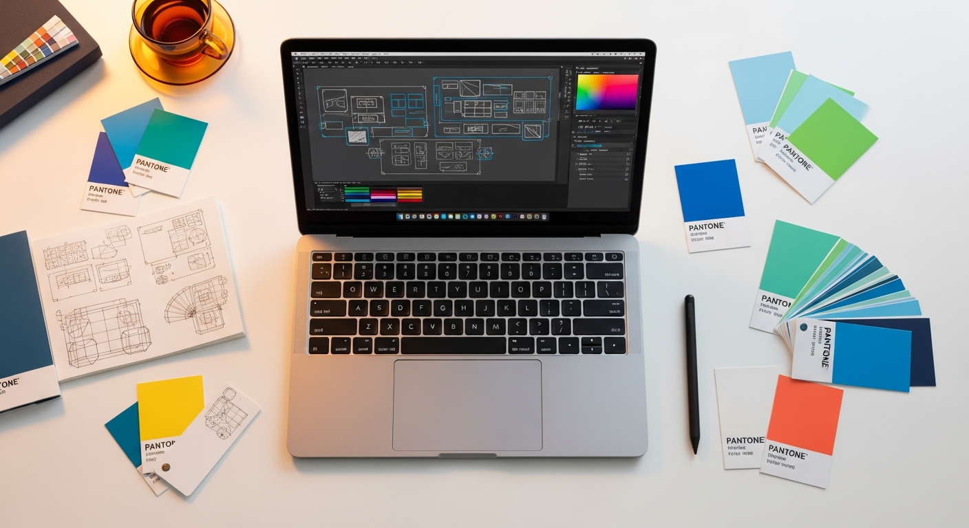
- Visual Cues: Employ icons, illustrations, and imagery to break up text, highlight key points, and convey information quickly.
- Consistent Design Language: Adhere to brand guidelines (colors, typography, spacing) to maintain a professional and trustworthy appearance, drawing inspiration from established design systems like Material Design for consistency.
3. Trust and Credibility Building
Complex products often require significant user investment, making trust paramount. Integrate elements that build confidence:
- Social Proof: Testimonials, case studies, client logos, star ratings, and review snippets demonstrate real-world success.
- Authority: Display awards, certifications, press mentions, or expert endorsements.
- Transparency: Be clear about pricing (if applicable), security measures, and support options.
- Guarantees/Warranties: Reduce perceived risk with clear statements about satisfaction guarantees or refund policies.
4. Accessibility (WCAG Compliance)
Ensuring your long-form landing page is accessible isn’t just good practice; it’s often a legal requirement and always improves the experience for a wider audience. Adhere to WCAG (Web Content Accessibility Guidelines) by:
- Using sufficient color contrast for text and interactive elements.
- Providing descriptive alt text for all images.
- Ensuring keyboard navigability for all interactive components.
- Structuring content with proper semantic HTML (
h1,h2,p,ul, etc.). - Making sure form fields have clear labels and error messages are understandable.
Strategic Content Blocks: Building Your Narrative

The architecture of a long-form landing page is essentially a series of strategically placed content blocks, each serving a specific purpose in the user’s journey. Here’s a common sequence you can adapt:
- Hero Section (Above the Fold):
- Headline: Clear, compelling, and benefit-driven. Immediately communicates the core value.
- Sub-headline: Elaborates on the headline, offering more context.
- Visual: High-quality image or video demonstrating the product in action or illustrating its benefit.
- Primary CTA: A prominent button with action-oriented text.
- Brief Value Proposition: 2-3 sentences summarizing what the product does and for whom.
- Problem Statement & Empathy:
- Clearly articulate the pain points your target audience faces.
- Show that you understand their challenges.
- Solution Introduction:
- Present your product as the answer to the identified problems.
- Focus on the overarching benefit rather than just features.
- Key Features & Benefits (Detailed):
- Break down your product’s capabilities into digestible sections.
- For each feature, explain its benefit to the user. Use icons, short descriptions, and mini-screenshots.
- Consider using a “How It Works” section for complex processes.
- Use Cases/Applications:
- Illustrate how different user personas or industries can leverage your product.
- Helps users visualize themselves using the product and see its relevance to their specific situation.
- Social Proof & Testimonials:
- Customer quotes, logos of reputable clients, star ratings, or short case study summaries.
- Crucial for building trust and validating claims.
- Data & Statistics:
- Quantifiable results, industry research, or performance metrics that back up your claims.
- Adds an analytical layer of persuasion.
- Comparison/Differentiation:
- Subtly (or overtly) highlight what makes your product superior to alternatives.
- Address common objections or misconceptions.
- Pricing/Plans (if applicable):
- Clearly outline different tiers, features included, and pricing.
- Use comparison tables to make choices clear.
- FAQ Section:
- Address common questions to alleviate concerns and provide immediate answers.
- Reduces friction to conversion.
- Secondary CTA & Reassurance:
- Another opportunity for conversion, perhaps with a slightly different offer (e.g., “Request a Demo” vs. “Start Free Trial”).
- Reiterate key benefits or guarantees.
Remember, not every page needs every block, but this comprehensive list provides a toolkit for addressing the needs of complex products.
Visual Hierarchy and Scannability: Guiding the User’s Eye
A long-form landing page, by its nature, demands that users scroll. Your design must make this journey effortless and engaging. Effective visual hierarchy is not just about aesthetics; it’s about guiding the user’s attention and making information digestible.
- Break Up Content: Never present large blocks of uninterrupted text. Use short paragraphs, bullet points, numbered lists, and blockquotes to create visual breaks.
- Strategic Use of Imagery and Video:
- Product Demos: Short, engaging videos illustrating complex features are far more effective than text descriptions.
- Illustrations & Icons: Use custom illustrations to reinforce concepts and icons to visually represent features or benefits.
- High-Quality Photography: Professional imagery adds credibility and visual appeal.
- Typography:
- Font Pairing: Choose fonts that are legible and reflect your brand personality. Limit yourself to 2-3 fonts.
- Size and Weight: Use varying font sizes and weights for headings, subheadings, and body text to establish a clear hierarchy.
- Line Height and Letter Spacing: Optimize these for readability, especially for long paragraphs.
- Color Palette:
- Use color strategically to highlight important information (e.g., CTAs, key statistics).
- Maintain sufficient contrast between text and background colors to meet WCAG guidelines and ensure readability.
- Anchors and Navigation: For very long pages, consider adding a sticky navigation menu with anchor links to major sections. This allows users to jump to relevant content without excessive scrolling, improving user control and freedom, a key Nielsen Norman Group heuristic.
- F-Pattern and Z-Pattern Layouts: Design your most important elements to fall along these natural eye-tracking patterns. Place key headlines, visuals, and CTAs where users naturally look first.
Conversion Optimization Techniques for Long-Form Pages
The ultimate goal of any landing page is conversion. For complex products, this often means guiding users towards a high-commitment action like a demo request, a free trial, or a direct purchase. Here’s how to optimize for it:
1. Multiple, Strategically Placed Calls to Action (CTAs)
Since users scroll through a lot of content, they shouldn’t have to scroll back up to find the CTA. Place primary CTAs:
- In the hero section (above the fold).
- After key information blocks (e.g., after features, after testimonials).
- As a sticky element that remains visible while scrolling.
- In the footer or conclusion section.
Vary the CTA text slightly to match the context of the preceding content, but maintain a consistent primary action. For instance, after a “Features” section, a CTA might say “See All Features in Action,” while after a “Testimonials” section, it could be “Join Our Satisfied Customers.”
2. Clear and Concise Forms
If your conversion involves a form (e.g., “Request a Demo”), keep it as short and simple as possible. Only ask for essential information. Consider:
- Progressive Disclosure: If you need more data, collect it in stages (e.g., after the initial submission).
- Clear Labeling: Use descriptive labels for all fields.
- Inline Validation: Provide real-time feedback on input errors to prevent frustration.
- Privacy Assurance: Reassure users their data is safe and won’t be spammed.
3. Micro-interactions and Animations
Subtle animations and micro-interactions can enhance engagement and guide the user without being distracting. Examples include:
- Hover effects on CTAs.
- Smooth scrolling to anchor links.
- Animations that reveal content as the user scrolls (parallax effects, fade-ins).
- Interactive elements that explain complex features (e.g., an interactive diagram).
However, use these sparingly and purposefully, ensuring they don’t hinder performance or accessibility.
4. Urgency and Scarcity (Use with Caution)
Psychological triggers like urgency (limited-time offers) or scarcity (limited spots) can motivate action, but for complex products, they should be used judiciously and genuinely. Overuse can undermine trust.
5. Exit-Intent Pop-ups
As a last-ditch effort, an exit-intent pop-up can capture users who are about to leave. Offer a valuable alternative, like a resource download, a special discount, or an invitation to chat with a representative.
Testing, Iteration, and Analytics: The Path to Perfection
Designing a long-form landing page is not a one-time event; it’s an ongoing process of optimization. To truly master the architecture, you must embrace a data-driven approach.
1. User Testing and Feedback
Observe real users interacting with your page. This is invaluable for identifying pain points, confusion, and areas where your narrative falls short.
- Usability Testing: Conduct moderated or unmoderated tests. Ask users to perform specific tasks (e.g., “Find information about X,” “Understand how Y works,” “Sign up for a demo”).
- First Click Testing: Understand where users click first and if it aligns with your intended path.
- Five-Second Tests: Show users your hero section for five seconds, then ask what they remember or understood.
- Surveys and Interviews: Gather qualitative feedback directly from your target audience.
2. A/B Testing (Split Testing)
A/B testing allows you to compare two versions of a page (A and B) to see which performs better for a specific goal. For long-form pages, you can test:
- Different headlines or sub-headlines.
- Variations in CTA text, color, or placement.
- The order of content blocks.
- Different types of visuals (image vs. video).
- Length of forms.
- Different social proof elements.
Tools like Optimizely or Google Optimize (though sunsetting, alternatives exist) facilitate this process. Remember to test one variable at a time to isolate its impact.
3. Analytics and Heatmapping
Quantitative data provides insights into user behavior at scale.
- Google Analytics (or similar): Track key metrics such as:
- Conversion Rate: The percentage of visitors who complete your desired action.
- Bounce Rate: The percentage of single-page sessions. A high bounce rate might indicate initial confusion.
- Time on Page: Longer times can indicate engagement, but also potential confusion if conversion rates are low.
- Scroll Depth: How far users scroll down your page. Crucial for long-form pages to see if users are reaching your CTAs.
- Traffic Sources: Understand where your users are coming from.
- Heatmapping Tools (e.g., Hotjar, Crazy Egg): Visualize user behavior:
- Click Maps: Show where users click on the page.
- Scroll Maps: Illustrate how far down the page users scroll before leaving. This is particularly vital for long-form pages to see if your critical content is being viewed.
- Confetti Maps: Show individual clicks segmented by traffic source.
- Session Recordings: Watch actual user sessions to see their entire journey, where they hesitate, and what they interact with.
By continuously analyzing this data and iterating on your design, you can refine your long-form landing page to maximize its effectiveness.
Tools and Technologies for Building Effective Long-Form Pages
The right tools can streamline your design and development process for long-form landing pages. Here’s a look at various categories and specific examples:
1. Design and Prototyping Tools
These are essential for laying out your page, creating visual hierarchy, and prototyping interactions before development.
- Figma: Cloud-based, collaborative, excellent for design systems, prototyping, and developer handoff.
- Sketch: Mac-specific, powerful vector editor for UI design, with a vast plugin ecosystem.
- Adobe XD: Part of the Adobe Creative Cloud, good for UI design, prototyping, and sharing.
- InVision: Primarily a prototyping and collaboration tool, integrates well with other design software.
2. Landing Page Builders & CMS Platforms
For quicker deployment and less reliance on custom code, these platforms offer drag-and-drop interfaces and pre-built templates.
- Unbounce: Specialized landing page builder with A/B testing, dynamic text replacement, and robust analytics.
- Leadpages: Another popular option for creating landing pages, pop-ups, and alert bars, with a focus on ease of use.
- Webflow: A powerful no-code/low-code platform that allows designers to build custom, responsive websites (including landing pages) with semantic HTML, CSS, and JavaScript without writing code. Offers immense design flexibility.
- WordPress with Page Builders (e.g., Elementor, Divi): Offers flexibility and extensibility for building complex pages within a familiar CMS environment.
3. Analytics and Optimization Tools
These are critical for measuring performance and conducting experiments.
- Google Analytics 4 (GA4): Essential for tracking user behavior, conversions, and traffic sources.
- Hotjar: Provides heatmaps, scroll maps, click maps, and session recordings for visual insights into user interaction.
- Optimizely (or VWO, AB Tasty): Leading A/B testing and experimentation platforms for optimizing page elements.
- Clarity (Microsoft): Free alternative for heatmaps and session recordings.
Comparison of Landing Page Builders & Optimization Tools
To help you choose, here’s a brief comparison of some popular options:
| Tool Name | Primary Use | Key Features | Best For | Cost Range (Monthly) |
|---|---|---|---|---|
| Unbounce | Landing Page Creation & Optimization | Drag-and-drop builder, A/B testing, AI copywriting, dynamic text replacement, pop-ups & sticky bars. | Marketers focused on conversion, A/B testing, and lead generation. | $99 – $625+ |
| Leadpages | Landing Page & Website Builder | Drag-and-drop builder, website builder, pop-ups, alert bars, basic A/B testing, integrated payments. | Small businesses, entrepreneurs, and those needing quick deployment with less complexity. | $49 – $99+ |
| Webflow | No-Code Website & CMS | Visual CSS/HTML builder, responsive design, CMS capabilities, custom animations, e-commerce. | Designers and agencies needing full design control without coding, complex custom sites. | $14 – $49+ (site plans) |
| Optimizely | Experimentation & A/B Testing | Robust A/B/n testing, multivariate testing, personalization, feature experimentation, advanced analytics. | Enterprises and data-driven teams focused on advanced experimentation and optimization. | Custom/Enterprise Pricing |
Choosing the right tools depends on your team’s size, budget, technical expertise, and the specific requirements of your project. Often, a combination of these tools yields the best results.
Key Takeaways
- Long-form landing pages are essential for complex products that require extensive explanation and persuasion.
- Structure your page with a clear narrative, guiding users through a problem-solution story with strategic content blocks.
- Prioritize strong visual hierarchy, scannability, and accessibility (WCAG) to make long pages digestible and user-friendly.
- Integrate trust-building elements like social proof and clear value propositions to convert high-commitment users.
- Continuously test, iterate, and analyze user behavior with tools like A/B testing, heatmaps, and analytics to optimize for conversion.
Frequently Asked Questions
Q: How long should a long-form landing page be?
A: The ideal length isn’t a fixed number; it’s determined by the complexity of your product and the amount of information required to educate and persuade your audience. It should be long enough to tell the complete story, address all common objections, and provide sufficient detail for a high-commitment conversion, but no longer. Focus on comprehensive clarity, not arbitrary word count. Tools like scroll maps can help you see if users are reaching the bottom of your page, informing whether content is too long or too short.
Q: Will a long-form landing page hurt my SEO?
A: Not necessarily. In fact, a comprehensive long-form page can be beneficial for SEO if executed correctly. Google often favors content that thoroughly addresses a topic, and a well-structured long page with relevant keywords, clear headings, and internal/external links can rank well. Ensure your page loads quickly, is mobile-responsive, and adheres to good technical SEO practices. The depth of content can signal authority and relevance to search engines, especially for complex, niche topics.
Q: How do I keep users engaged on a long page?
A: Engagement on long pages relies on a combination of strong visual hierarchy, compelling narrative, and interactive elements. Use clear headings, bullet points, and ample whitespace to break up text. Integrate high-quality images, videos, and infographics. Employ micro-interactions, anchor links for navigation, and strategically placed calls to action. Regularly refresh content and test different layouts to maintain freshness and optimize user flow, keeping in mind Nielsen Norman Group’s heuristics for user control and aesthetic design.
Q: What’s the most important element on a long-form landing page?
A: While many elements are crucial, the “hero section” (the content above the fold) is arguably the most important. It’s your first impression and must immediately capture attention, communicate your core value proposition, and encourage users to scroll down. A compelling headline, clear sub-headline, and an engaging visual are non-negotiable here. If this section fails to hook the user, the rest of your meticulously crafted page may never be seen.
Q: Should I use a single CTA or multiple CTAs on a long-form page?
A: For long-form landing pages, it is generally more effective to use multiple, strategically placed calls to action (CTAs). A user might be convinced at different points along their scrolling journey, and having a relevant CTA nearby reduces friction and the need to scroll back up.