Designing Scalable UIs: Crafting a Robust Design Token Architecture for Multi-Brand Systems
This is where a robust design token architecture emerges as a game-changer. Design tokens are the atomic units of a design system—named entities that store design decisions such as colors, typography, spacing, and animation values. They act as the single source of truth, abstracting raw values into meaningful, platform-agnostic variables. For multi-brand systems, design tokens unlock the ability to create a shared foundation while allowing for brand-specific customizations, ensuring consistency at scale and empowering teams to build cohesive, high-quality products more efficiently. This article will guide you through the principles, tools, and best practices for building an effective design token architecture tailored for complex multi-brand environments.
Understanding the Multi-Brand Challenge in UI/UX Design
Operating a multi-brand portfolio presents a unique set of complexities for UI/UX teams. Imagine managing several distinct brands under one corporate umbrella, each targeting different demographics, conveying different messages, and potentially having its own set of brand guidelines. Without a unified strategy, this scenario quickly devolves into a labyrinth of inconsistencies and inefficiencies.
The Inherent Complexities:
- Diverse Brand Identities: Each brand needs to maintain its unique visual and experiential identity, which can mean distinct color palettes, typography, imagery, and interaction patterns.
- Varying User Bases: Different brands often cater to different user segments, requiring tailored experiences that resonate with their specific needs and expectations.
- Product Line Diversification: Even within a single brand, product lines might have subtle variations in design requirements, adding another layer of complexity.
- Platform Proliferation: Brands often exist across multiple platforms—web, iOS, Android, desktop applications—each with its own native design language and technical constraints.
Common Pitfalls Without a Unified System:
- Design Drift: Without a single source of truth, designs tend to diverge over time. A “primary” button might look slightly different across Brand A’s website and Brand B’s mobile app, leading to a disjointed user experience.
- Inconsistent User Experience (UX): Users interacting with different products from the same company might encounter varying interaction patterns, accessibility standards, or visual cues, eroding trust and brand loyalty. The Nielsen Norman Group consistently emphasizes the importance of consistency for usability and learnability.
- Maintenance Nightmares: Updating a single design decision (e.g., changing a brand color) can become a monumental task, requiring manual updates across numerous design files, codebases, and platforms. This is time-consuming, error-prone, and scales poorly.
- Slow Development Cycles: Designers and developers waste valuable time recreating existing patterns or deciphering inconsistent specifications. This bottleneck significantly slows down product development and time-to-market.
- Accessibility Gaps: Without a centralized system to enforce accessibility standards (like WCAG guidelines for color contrast or typography), ensuring all brands meet these requirements becomes incredibly difficult and often overlooked.
While component libraries offer a significant step towards consistency, they often fall short in multi-brand scenarios if they hardcode design values. A component library might define a “Button” component, but if that button’s background color is hardcoded as `#007bff`, it’s not easily adaptable for a second brand that uses `#cc0000` as its primary color. This is precisely why we need an abstract, more granular layer that sits beneath the components: design tokens.
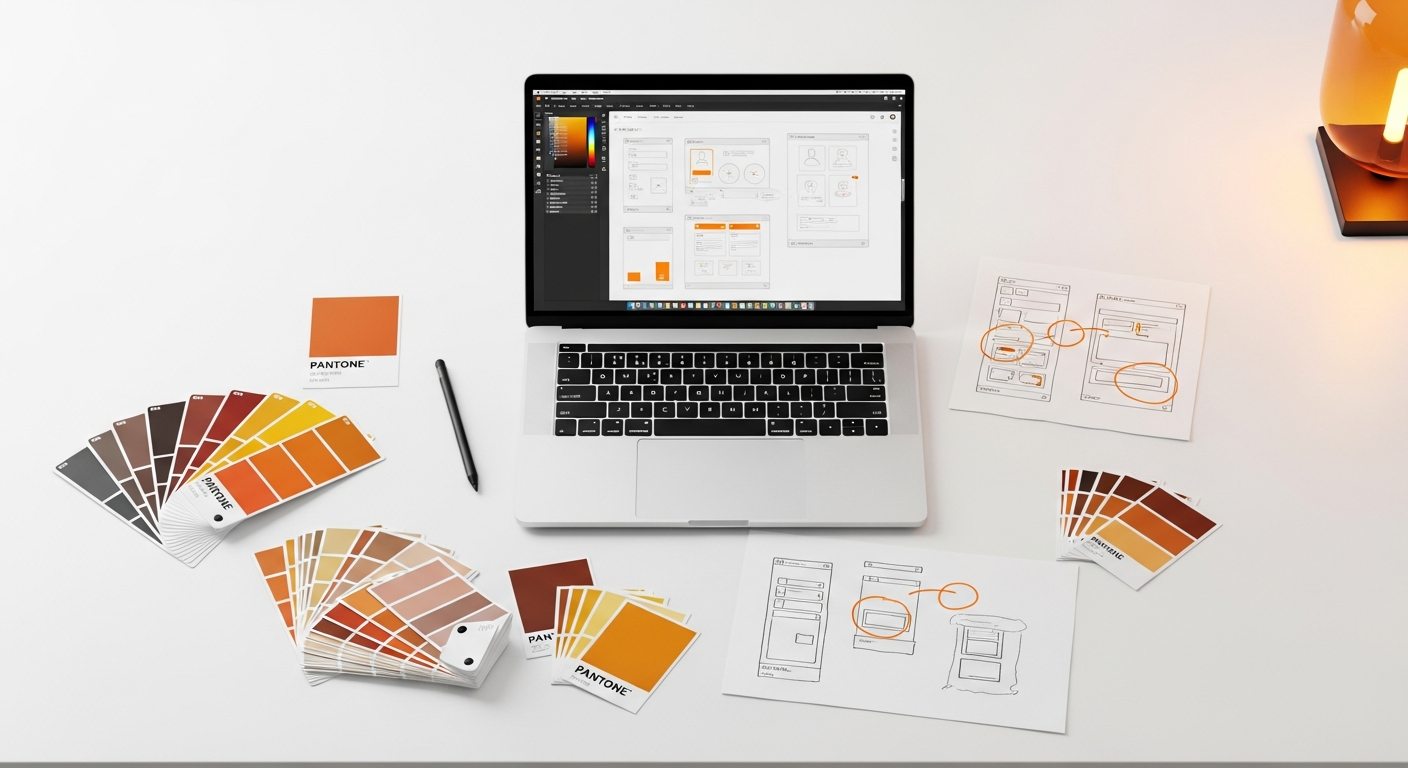
What Are Design Tokens, Really? A Foundation for Scalability
To effectively tackle the multi-brand challenge, we must first deeply understand design tokens. Originating from Salesforce’s Lightning Design System and popularized by Amazon’s Style Dictionary, design tokens are the fundamental building blocks of a design system. They are named entities that store design decisions, acting as the single source of truth for all visual and interactive properties of a user interface.
Defining Design Tokens:
Think of design tokens not as raw values (like #FF0000 or 16px) but as semantic names that represent those values in a context-agnostic way. For example, instead of using #FF0000 directly in your CSS or Sketch file, you would use a token like color-brand-primary, which might resolve to #FF0000 for one brand and #0000FF for another. This abstraction is key.
Design tokens can represent a vast array of design properties, including:
- Colors: Primary, secondary, success, error, background, text, border colors.
- Typography: Font families, font sizes, line heights, letter spacing, font weights.
- Spacing: Margins, paddings, gap sizes.
- Sizing: Component heights, widths, icon sizes.
- Border Radii: Corner roundness for elements.
- Shadows: Box shadows, text shadows.
- Animation & Transition: Durations, easing functions.
- Z-Index: Layering of elements.
Contrast with Hardcoded Values and Variables:
The power of tokens becomes clear when contrasted with other methods:
- Hardcoded Values: Directly using
#007bffor16pxin your code or design tool. This is inflexible and leads to inconsistencies, especially at scale. - CSS Variables (Custom Properties): While CSS variables (e.g.,
--primary-color: #007bff;) are a significant improvement, they are platform-specific (web only). Design tokens are platform-agnostic; they are defined once (often in JSON) and then transformed into CSS variables, Sass variables, iOS Swift constants, Android XML values, etc., for various platforms.
Design tokens are the source of truth; CSS variables (and their equivalents in other platforms) are merely one of the many compiled outputs of those tokens.
Categorization of Tokens:
For multi-brand systems, a hierarchical categorization of tokens is essential to manage complexity and ensure flexibility:
- Global/Core Tokens (Foundation Tokens):
- These are the most abstract and foundational tokens. They represent raw, brand-agnostic values.
- Examples:
color-red-500,spacing-medium,font-stack-sans-serif. - They form the universal palette or scale from which all other tokens draw.
- They are generally immutable or change very rarely.
- Semantic/Alias Tokens (Brand Tokens):
- These tokens apply meaning and context to the global tokens, often mapping them to brand-specific roles.
- This is where brand identity truly comes into play. Each brand will have its own set of semantic tokens.
- Examples:
color-brand-primary(which might map tocolor-blue-600for Brand A andcolor-green-700for Brand B),text-color-body,border-color-default. - They describe the purpose of a value rather than its literal value.
- Component-Specific Tokens (Decision Tokens):
- These tokens are used to fine-tune design properties specifically for individual components, often overriding or extending semantic tokens.
- Examples:
button-primary-background-color(which maps tocolor-brand-primary),card-header-font-size. - They ensure that components adhere to the brand’s look and feel while allowing for specific component-level variations.
This layered approach provides a powerful abstraction. If the global color-blue-600 changes, all semantic tokens that reference it will automatically update, and consequently, all components using those semantic tokens will reflect the change. If Brand A decides to change its primary color, only its color-brand-primary semantic token needs to be updated to point to a different global color, leaving Brand B unaffected.
Building the Multi-Brand Token Hierarchy: A Layered Approach
The success of a design token architecture in a multi-brand environment hinges on a well-defined, hierarchical structure. This layered approach ensures that you can manage a shared foundation while providing the necessary flexibility for each brand to maintain its unique identity.
1. The Core Layer (Global/Foundation Tokens):
This is the bedrock of your entire system. The core layer consists of universal, brand-agnostic values that serve as the fundamental building blocks. These tokens represent raw, unopinionated design decisions.
- Purpose: To establish a consistent, shared scale and palette across all brands, preventing arbitrary values and promoting underlying harmony.
- Examples:
- Colors: A comprehensive grayscale palette (e.g.,
color-gray-0tocolor-gray-1000), a spectrum of primary and secondary hues (e.g.,color-blue-100tocolor-blue-900,color-red-100tocolor-red-900). - Spacing: A defined spacing scale (e.g.,
spacing-0,spacing-xs,spacing-sm,spacing-md,spacing-lg,spacing-xl,spacing-2xl), often based on an 8-point grid system as recommended by many design systems like Material Design. - Typography: Base font families (e.g.,
font-family-sans-serif,font-family-serif), a range of font weights (e.g.,font-weight-light,font-weight-regular,font-weight-bold), and potentially a base font size scale. - Border Radii: Standardized corner roundness (e.g.,
border-radius-none,border-radius-sm,border-radius-md,border-radius-full).
- Colors: A comprehensive grayscale palette (e.g.,
- Characteristics: These tokens should be highly stable and rarely change. Any changes here would have a cascading effect across all brands.
2. The Brand Layer (Semantic/Alias Tokens):
This is where each brand applies its unique identity by mapping the core tokens to semantic, context-specific names. Each brand will have its own set of semantic tokens, ensuring distinctiveness while leveraging the shared foundation.
- Purpose: To translate generic core values into brand-specific design language, defining the “theme” for each brand.
- Examples:
- Colors:
color-brand-primary(maps tocolor-blue-600for Brand A,color-green-700for Brand B),color-text-body(maps tocolor-gray-900),color-background-surface(maps tocolor-white). - Typography:
font-size-heading-1(maps tofont-size-xxl),line-height-body(maps toline-height-md),font-family-brand(maps tofont-family-sans-seriffor Brand A,font-family-seriffor Brand B). - Spacing:
spacing-component-padding(maps tospacing-md),spacing-section-margin(maps tospacing-2xl).
- Colors:
- Characteristics: These tokens are highly brand-specific and are the primary point of customization for each brand. They provide a layer of abstraction between the UI components and the raw design values.
3. The Component Layer (Component-Specific Tokens):
While semantic tokens provide a strong foundation, sometimes specific components require unique styling that deviates slightly from the general brand semantics. Component-specific tokens allow for this fine-tuning.
- Purpose: To provide granular control over individual component properties, often overriding or extending semantic tokens for specific use cases.
- Examples:
button-primary-background-color(maps tocolor-brand-primary).input-field-border-radius(maps toborder-radius-sm).card-shadow-elevation(maps toshadow-level-2).alert-success-icon-color(maps tocolor-status-success).
- Characteristics: These tokens inherit values from the brand layer by default but can be explicitly overridden for unique component needs. They are often defined directly within the component’s scope or alongside its definition in the design system.
Relationship to Design Systems:
This token hierarchy forms the backbone of your multi-brand design system. The core tokens provide the “DNA,” the brand tokens define the “phenotype” for each brand, and the component tokens ensure the individual “organs” (components) function correctly within that phenotype. A shared component library can then consume these brand-specific tokens, allowing the same button component to instantly adapt its appearance for Brand A, Brand B, or Brand C simply by switching the active set of brand tokens. This dramatically reduces duplication and ensures consistency and maintainability across the entire ecosystem.
Tools and Workflows for Managing Design Tokens Across Brands
Implementing a robust design token architecture requires the right tools and a streamlined workflow that bridges the gap between design and development. The goal is to establish a single source of truth for design decisions that can be easily managed, versioned, and transformed into platform-specific code.
Key Token Management Tools:
- Figma Variables/Styles:
- Primary Use: Native management of design tokens directly within Figma design files. Styles (colors, text, effects) have been a long-standing feature, and the introduction of Variables in 2023 significantly enhanced token capabilities, allowing for numerical, string, boolean, and color token types.
- Multi-Brand Support: Excellent. You can create different “modes” (e.g., Brand A, Brand B, Dark Mode) for your variables, allowing components to adapt automatically.
- Output Formats: Primarily for design authoring. Requires plugins or external tools for code generation.
- Learning Curve: Moderate, especially with Variables.
- Cost: Included with Figma subscriptions.
- Tokens Studio for Figma (formerly Figma Tokens plugin):
- Primary Use: A highly robust Figma plugin for advanced token management, offering capabilities beyond native Figma variables, especially for complex theming, token sets, and syncing.
- Multi-Brand Support: Excellent, allows for managing multiple themes/brands within a single file and applying them to layers.
- Output Formats: Exports to JSON (Figma Tokens format), which can then be consumed by tools like Style Dictionary.
- Learning Curve: Moderate to High, due to its extensive feature set.
- Cost: Free tier available, paid subscription for advanced features.
- Style Dictionary (Amazon):
- Primary Use: A powerful open-source command-line tool for transforming design tokens (defined in JSON, YAML, or JS) into various platform-specific formats. It’s the “compiler” for your tokens.
- Multi-Brand Support: Excellent. You can define distinct token sets for each brand and configure Style Dictionary to generate brand-specific outputs.
- Output Formats: Highly versatile, generates CSS, SCSS, LESS, JavaScript (ESM, CJS), TypeScript, Android XML, iOS Swift/Obj-C, React Native, and more.
- Learning Curve: Moderate, requires comfort with command-line tools and JSON configuration.
- Cost: Free (open-source).
- Supernova:
- Primary Use: An end-to-end design system platform that encompasses documentation, component management, and robust design token capabilities.
- Multi-Brand Support: Strong, designed to manage multiple themes and brands within a centralized system.
- Output Formats: Generates code for various platforms, syncs with design tools, and hosts documentation.
- Learning Curve: Moderate.
- Cost: Paid subscription.
Comparison Table: Design Token Management Tools
| Tool | Primary Use Case | Multi-Brand Support | Key Output Formats | Learning Curve | Cost |
|---|---|---|---|---|---|
| Figma Variables | Design authoring, basic theming within Figma | Good (via modes) | Figma files (design assets) | Moderate | Included with Figma |
| Tokens Studio for Figma | Advanced token management, syncing, theming in Figma | Excellent (via token sets/themes) | JSON (Figma Tokens format) | Moderate to High | Free/Paid plugin |
| Style Dictionary | Token compilation & transformation to code | Excellent (via configuration) | CSS, SCSS, JS, Android XML, iOS Swift, etc. | Moderate (CLI-based) | Free (open-source) |
| Supernova | Full design system platform, tokens, docs, code | Strong (centralized) | Code, documentation, design sync | Moderate | Paid subscription |
Typical Workflow Integration:
- Define Tokens in Design Tool: Designers define core, semantic, and component tokens using Figma Variables or Tokens Studio for Figma. They set up different “modes” or “themes” for each brand.
- Export Tokens as JSON: Tokens are exported from Figma (often via Tokens Studio) into a standardized JSON format. This JSON file becomes the single source of truth for all design decisions.
- Version Control: The JSON token file is committed to a version control system (e.g., Git). This treats design decisions as code, enabling tracking, collaboration, and rollbacks.
- Transform Tokens with Style Dictionary: A CI/CD pipeline or a developer runs Style Dictionary. It reads the JSON file and, based on configuration, generates platform-specific code (e.g., CSS variables for web, Swift constants for iOS, XML resources for Android) for each brand.
- Develop with Tokens: Developers integrate the generated code into their respective projects. Instead of hardcoding values, they now reference the token variables (e.g.,
var(--color-brand-primary)in CSS,Theme.Colors.brandPrimaryin Swift). - Document and Maintain: The token system is thoroughly documented, explaining each token’s purpose, usage, and available values. Tools like Storybook can integrate token documentation alongside components.
This workflow ensures that design changes made at the token level are automatically propagated across all brands and platforms, significantly reducing manual effort and potential errors.
Implementation Strategies and Best Practices
Successfully implementing a design token architecture, especially for multi-brand systems, requires careful planning and adherence to best practices. These strategies ensure maintainability, scalability, and broad adoption.
1. Naming Conventions: Semantic and Consistent
A well-thought-out naming convention is paramount. Tokens should be named semantically, indicating their purpose rather than their literal value. This makes the system more robust to changes and easier to understand.
- Avoid Literal Values: Do not name a token
red-color. Instead, usecolor-brand-primaryorcolor-status-error. - Hierarchical Structure: Use dot notation or dashes to indicate hierarchy (e.g.,
color.brand.primaryorcolor-brand-primary). - Categorization: Group tokens by type (
color,spacing,font,shadow). - Semantic Purpose: Focus on what the token does, not what it is (e.g.,
text-color-bodyinstead ofdark-grey-text). - Nielsen Norman Group Principle: Applying principles of findability and learnability to token naming makes the system intuitive for designers and developers alike.
Example Naming Structure:
- Global/Core:
color-blue-500,spacing-md,font-size-base - Semantic/Brand:
color-brand-primary,text-color-default,spacing-component-padding - Component-Specific:
button-primary-bg-color,card-border-radius
2. Versioning: Treat Tokens as Code
Just like any critical codebase, your design tokens should be versioned. Use semantic versioning (e.g., v1.0.0) to track changes and communicate their impact.
- Minor Changes: (e.g., adding new tokens) Increment minor version.
- Patch Changes: (e.g., fixing a token value) Increment patch version.
- Breaking Changes: (e.g., renaming a widely used token, removing a token) Increment major version.
- Git Workflow: Store your token definitions (e.g., JSON files) in a Git repository, allowing for clear commit history, branching, and pull requests for changes.
3. Documentation: Crucial for Adoption
A token system is only as good as its documentation. Clear, comprehensive documentation is essential for both designers and developers to understand, use, and contribute to the tokens.
- Token Catalog: A searchable list of all available tokens, their values, purpose, and usage guidelines.
- Examples: Show how tokens are applied in various contexts (e.g., a button displaying its different states using tokens).
- Usage Guidelines: Explain when to use which token and common pitfalls.
- Tooling Instructions: How to set up and use Style Dictionary or other token management tools.
- Integration with Design Systems: Incorporate token documentation directly into your design system’s documentation platform (e.g., Storybook, Zeroheight, Supernova).
4. Accessibility (WCAG): Built-in Compliance
Design tokens are a powerful mechanism for ensuring accessibility compliance across all brands from the outset. By defining accessible values at the token level, you embed accessibility into the core