Crafting a Robust Design System: A Comprehensive Guide for Lean Teams of Two
Defining Your “Why” and Scope: The Foundation of Your Design System
Before you even open your design software, the most crucial first step for your two-person team is to clearly define the “why” behind your design system. What specific problems are you trying to solve? Is it inconsistent UI, slow development cycles, difficult onboarding for new designers, or a fragmented user experience across different product areas? Articulating these pain points will serve as your north star, guiding every decision you make and helping you prioritize effectively, especially when resources are limited. For a lean team, scope creep is a significant threat, so a clear purpose is your best defense.
Begin by conducting a thorough audit of your existing product’s user interface. This involves:
- Inventorying Existing UI: Document every button, input field, modal, and navigation element. Take screenshots, categorize them, and note their variations. You’ll likely discover a surprising number of inconsistencies.
- Identifying Duplication and Inconsistency: Pinpoint where the same component is styled or behaves differently across your product. These are prime candidates for standardization.
- Assessing Design Debt: Note areas where design decisions were rushed or poorly implemented. Your design system can systematically address this debt over time.
Once you have a clear picture of your current state, you and your partner can then establish realistic goals. Instead of aiming to build Google’s Material Design overnight, focus on an MVP (Minimum Viable Product) for your design system. What are the most critical components that, once standardized, will yield the greatest immediate impact? Perhaps it’s just your core buttons, typography, color palette, and input fields. Nielsen Norman Group often emphasizes starting small and iterating, a principle particularly vital for small teams.
Even with just two designers, securing buy-in from key stakeholders (product managers, engineering leads, even sales) is beneficial. Present your findings from the UI audit and explain how a design system, even a lean one, will benefit the entire organization by:
- Increasing design and development efficiency.
- Improving product consistency and brand recognition.
- Enhancing user experience by reducing cognitive load.
- Accelerating onboarding for new team members.
This early alignment ensures that your efforts are supported and understood across the company, fostering a collaborative environment for your two-person design team.
Strategic Planning and Tool Selection for Lean Operations
With your “why” established, the next critical step for building a design system with two designers total involves meticulous strategic planning and judicious tool selection. Your choices here will significantly impact your workflow, collaboration, and the long-term maintainability of your system. For a small team, flexibility, cost-effectiveness, and seamless integration are key.
Consider the core pillars of your design system and the tools that support them:
- Design Authoring: This is where your components are created and managed.
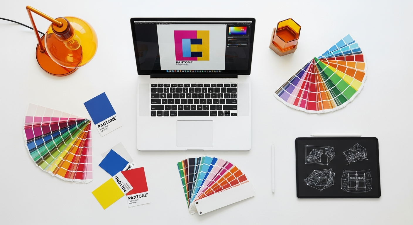
- Figma: Highly recommended for small teams due to its exceptional real-time collaboration, cloud-based nature, and robust component library features. It allows both designers to work simultaneously on the same files without version control headaches. Its plugin ecosystem is also incredibly rich.
- Sketch: A powerful tool, but its local file nature can introduce complexities for version control and real-time collaboration. Abstract or similar tools would be essential if you opt for Sketch.
- Adobe XD: Offers good prototyping features and component management but might not match Figma’s collaborative prowess for a two-person team.
- Documentation & Communication: How you share your system with others and ensure its adoption.
- Storybook: Excellent for showcasing UI components in isolation with live code examples. It’s developer-centric but invaluable for aligning design and code.
- Zeroheight/Frontify: Dedicated design system documentation platforms that bridge design files and code, offering rich content editing and versioning. These can be a significant investment but provide a polished, centralized hub.
- Internal Wiki (Confluence, Notion): A more budget-friendly option for documenting principles, guidelines, and usage. You can embed links to design files and Storybook components.
- Version Control & Handoff: Managing changes and delivering assets to developers.
- Figma’s Version History: Robust built-in history is often sufficient for design files.
- Abstract (for Sketch): Provides Git-like version control for design files, managing branches and merges.
- Zeplin/Inspect Mode (Figma/Sketch): Tools for precise design-to-code handoff, providing specs, assets, and code snippets. Figma’s built-in inspect mode is often sufficient.
- GitHub/GitLab: Essential for managing the code implementation of your design system components. Design tokens can also live here.
When selecting tools, prioritize those that minimize overhead and maximize collaboration. For building a design system efficiently with two designers, a unified platform like Figma often provides the best bang for your buck by handling design authoring, component management, and basic version control all in one place. Consider the learning curve for each tool and how well it integrates into your existing tech stack.
Establishing clear naming conventions from the outset is non-negotiable. This applies to layers, components, styles, and even file names. A consistent naming structure (e.g., BEM methodology for CSS, or a logical hierarchy for Figma components like `Button/Primary/Large`) prevents confusion and ensures discoverability. Your two-person team needs to agree on these standards and rigorously adhere to them. This discipline pays dividends as your system grows, making it easier to manage and scale.
Building Blocks: From Principles to Primitive Components
The core of any design system, especially one built by a small team, lies in its foundational elements and primitive components. This is where you translate your design principles into tangible, reusable assets. Think of this phase as laying the concrete slab before you start framing the house.
Establishing Foundational Principles
Even with just two designers, defining overarching design principles is crucial. These aren’t just abstract ideas; they are actionable guidelines that inform every design decision. Consider principles like:
- Consistency: Ensuring a unified experience across all touchpoints.
- Accessibility: Designing for everyone, regardless of ability (WCAG guidelines are your bible here).
- Clarity: Making sure the interface is easy to understand and use.
- Efficiency: Helping users achieve their goals quickly and effectively.
- Elegance: Striving for a visually appealing and delightful experience.
Reference industry standards like Nielsen Norman Group’s usability heuristics or Apple’s Human Interface Guidelines and Google’s Material Design principles. These provide a robust starting point and ensure your system is built on best practices.
Visual Foundations
Next, focus on the fundamental visual attributes:
- Color Palette: Define primary, secondary, accent, neutral, and semantic (success, warning, error) colors. Crucially, ensure all color combinations meet WCAG 2.1 AA or AAA contrast ratios for accessibility. Use tools like Stark or contrast checkers within Figma to verify. Document hex codes, RGB values, and usage guidelines.
- Typography: Select a typeface (or two) and define a robust typographic scale for headings, body text, captions, and links. Specify font weights, line heights, and letter spacing. Create text styles in your design tool that link directly to your system.
- Spacing & Layout: Establish a consistent spacing system using a base unit (e.g., an 8px grid). This ensures vertical and horizontal rhythm and predictability in your layouts. Define standard padding, margin, and gutter values.
- Iconography: Decide on an icon style (outline, filled, duotone) and create a library of essential icons. Ensure they are scalable (SVG preferred) and accessible (consider alt text for screen readers).
- Elevation/Shadows: Define a set of consistent shadow styles for depth and hierarchy.
Primitive Components (Atomic Design in Action)
Once your visual foundations are solid, you can begin building a design system‘s primitive components. Brad Frost’s Atomic Design methodology is particularly useful here, helping you break down the UI into manageable, reusable pieces. For two designers, starting with atoms and molecules is the most efficient approach:
- Atoms: These are the smallest fundamental UI elements that cannot be broken down further without losing their meaning.
- Buttons (primary, secondary, tertiary, destructive)
- Input fields (text, number, password)
- Checkboxes, radio buttons, toggles
- Avatars
- Links
- Molecules: Groups of atoms bonded together to form a relatively simple, reusable UI component.
- Search input (input field + button + icon)
- Form labels with input fields
- Pagination controls
As you create each component, consider its states (e.g., button: default, hover, active, disabled, loading) and variants (e.g., button: small, medium, large). Document these thoroughly. Focus on creating flexible, well-constrained components in your design tool, making them easy for both designers to use and adapt without breaking the system. This meticulous attention to detail at the atomic level forms a robust foundation for more complex components later on, allowing your small design system team to scale effectively.
Documentation and Communication: Your Design System’s Lifeline
A design system, no matter how well-crafted, is useless without clear, accessible documentation. For a two-person team, robust documentation is even more critical as it serves as your shared brain, ensuring both designers are always on the same page and can work autonomously while maintaining consistency. It also acts as the primary communication channel with developers, product managers, and other stakeholders.
Your documentation should be a living resource, not a static artifact. It needs to be easy to update, understand, and navigate. Here’s what to include and how to approach it:
What to Document:
- Principles & Guidelines: Reiterate your core design principles. Include brand guidelines, voice and tone, and accessibility standards (e.g., “All interactive elements must meet WCAG AA contrast requirements”).
- Foundations: Detailed specifications for your color palette (with usage guidelines), typography scale, spacing units, iconography, and elevation system.
- Components: This is the heart of your documentation. For each component, include:
- Visual Representation: The component in all its states and variants.
- Usage Guidelines: When and how to use the component, and equally important, when NOT to use it. Provide “Dos and Don’ts” examples.
- Props/Attributes: List all available properties and their expected values (e.g., for a button: `variant=’primary’ | ‘secondary’`, `size=’small’ | ‘medium’`).
- Accessibility Notes: Specific considerations for screen readers, keyboard navigation, and ARIA attributes.
- Code Snippets: Link directly to the corresponding code component in Storybook or provide snippets for developers.
- Design Tokens: Map design decisions to specific tokens (e.g., `$color-primary-500`, `$spacing-md`).
- Patterns: Document common UI patterns that combine multiple components (e.g., a login form, a data table with filtering).
- Getting Started Guides: Instructions for new designers and developers on how to use and contribute to the design system.
- Contribution Guidelines: A clear process for requesting new components, proposing changes, and submitting contributions.
Documentation Tools & Strategies:
- Dedicated Platforms (Zeroheight, Frontify): If your budget allows, these tools offer a polished, centralized hub that integrates directly with design files (Figma, Sketch) and code repositories. They streamline the process of syncing design tokens and components, making it easier for your lean design system team to maintain.
- Storybook: Essential for developer-facing documentation. It showcases components in isolation, allows for interactive testing, and provides live code examples. While primarily for developers, designers benefit immensely from seeing how their components are implemented.
- Internal Wiki (Confluence, Notion, GitBook): A more flexible and often more affordable option. You can create pages for each component, embed Figma links, screenshots, and link out to Storybook. This requires more manual effort to keep in sync but offers full control over content.
- Figma Itself: For early stages, you can create dedicated “Design System” pages within your Figma file, using sections for documentation. This keeps everything in one place but can become unwieldy as the system grows.
Crucially, establish a clear process for how your two designers will maintain this documentation. Who is responsible for updating component guidelines when a change occurs? How often will you review the documentation for accuracy and completeness? Regular, scheduled reviews are essential to prevent documentation from becoming stale, which can quickly erode trust in the system. Effective communication between the two designers, and with the broader product and engineering teams, is the bedrock of a successful, well-documented design system.
Integration and Adoption: Getting Developers on Board
A design system is only as effective as its adoption across the entire product team. For your two-designer team, successfully integrating your design system into the development workflow and securing developer buy-in is paramount. This isn’t just about handing off files; it’s about fostering a collaborative partnership.
Bridging the Design-Dev Gap
From the outset, involve your engineering counterparts. They are not just consumers of the design system; they are critical collaborators. Early involvement helps them understand the “why,” anticipate challenges, and feel ownership. Regular syncs, even short ones, are invaluable for this two-person design team.
Key strategies for integration:
- Share Early and Often: Don’t wait until components are “perfect.” Share work in progress, gather feedback, and iterate together. This builds trust and ensures the components are technically feasible and meet developer needs.
- Speak Their Language: Familiarize yourselves with development terminology (e.g., props, state, components, frameworks like React or Vue). This facilitates clearer communication.
- Design Tokens: This is a game-changer for design-to-development handoff. Design tokens are the single source of truth for your design decisions, represented as named entities (e.g., `$color-primary-500`, `$spacing-md`). They abstract away hardcoded values, allowing designers to update values in one place and have them cascade across all platforms (web, iOS, Android) via code. Tools like Style Dictionary or Figma plugins can help manage and export these tokens. This significantly reduces manual work and ensures consistency between design and code.
- Storybook Integration: As mentioned, Storybook is an invaluable tool. Encourage developers to build and document components directly within Storybook. This creates a living component library that serves both designers (for reference) and developers (for implementation and testing).
- Clear Handoff: Utilize your design tool’s inspect mode (Figma) or dedicated handoff tools (Zeplin) to provide precise specifications, assets, and code snippets. Ensure designers are consistent in how they prepare files for handoff.
Pilot Projects and Gradual Rollout
Don’t attempt to overhaul your entire product at once. Identify a small, manageable section of your product or a new feature where you can implement your design system components. This “pilot project” serves several purposes:
- Proof of Concept: Demonstrates the efficiency and consistency benefits of the design system in a real-world scenario.
- Learning Opportunity: Uncovers workflow issues, missing components, or documentation gaps in a low-risk environment.
- Building Momentum: Creates enthusiasm and internal champions among the engineering team.
Start with foundational components (buttons, inputs) and gradually introduce more complex molecules and organisms. This iterative approach allows your small team building a design system to refine processes and components as you go, ensuring a smoother transition for the development team.
Feedback Loops and Iteration
Establish regular feedback loops with developers. This could be a dedicated Slack channel, weekly syncs, or specific review sessions. Encourage them to report bugs, suggest improvements, and request new components. View their feedback as invaluable input that helps refine and strengthen the system. Remember, a design system is never truly “finished”; it’s a living product that evolves with your organization’s needs. Maintaining an open, collaborative dialogue is key to its success and continued adoption.
Maintenance, Governance, and Evolution with Limited Resources
Building a design system is a significant achievement for a two-designer team, but maintaining and evolving it is an ongoing commitment. With limited resources, establishing clear governance and a sustainable maintenance strategy is crucial to prevent your system from becoming outdated or falling into disuse.
Clear Responsibilities and Ownership
Even with just two designers, defining roles and responsibilities is essential. You might decide to:
- Divide and Conquer: One designer focuses on foundational elements and core components, while the other tackles more complex patterns or specific product areas.
- Rotate Ownership: Periodically switch roles to ensure both designers have a comprehensive understanding of the entire system and to cross-pollinate ideas.
- Specialization (if applicable): If one designer has stronger technical skills, they might lead the design token implementation or Storybook integration.
Regardless of the approach, both designers must share a collective ownership of the system’s quality and consistency. Regular check-ins between the two of you are vital for alignment.
Establishing a Review and Contribution Process
As your product evolves, new components will be needed, and existing ones will require updates. For your lean design system team, a lightweight yet effective process is necessary:
- Request Process: How do product teams or developers request a new component or a change to an existing one? A simple form, a dedicated Slack channel, or a Jira/Asana board can work.
- Design Review: Before a new component is added or a significant change is made, both designers should review it against the system’s principles and existing components. This ensures consistency and prevents duplication.
- Developer Review: Involve engineers early in the design review process to assess technical feasibility and impact.
- Versioning Strategy: Adopt a clear versioning scheme, such as Semantic Versioning (SemVer), for your design system.
- Major (1.0.0): Breaking changes, significant overhauls.
- Minor (0.1.0): New features, non-breaking additions (e.g., new components, prop additions).
- Patch (0.0.1): Bug fixes, small tweaks, documentation updates.
Communicate these versions clearly to the wider team.
- Release Notes: Document all changes in release notes, making it easy for users of the system to understand what’s new or updated.
Measuring Impact and Demonstrating Value
To ensure continued investment and support for your design system, especially from stakeholders who might not grasp its immediate value, you need to track and communicate its impact. While direct ROI can be hard to quantify for a two-person design team, you can track metrics like:
- Design Efficiency: Time saved on recurring tasks, faster iteration cycles.
- Development Efficiency: Reduced time to implement UI, fewer UI-related bugs.
- Consistency Scores: Audits showing a decrease in UI inconsistencies over time.
- User Feedback: Improved user experience metrics (e.g., task completion rates, reduced support tickets related to UI confusion).
- Onboarding Time: Faster ramp-up for new designers or developers.
Regularly share these successes with your product and engineering leadership. This reinforces the value of your design system and secures future resources and support.
Planning for Growth and Future Scaling
While you’re currently a team of two, consider how your system might scale if your team grows. Build with flexibility in mind. Document processes thoroughly so that a third designer can quickly get up to speed. By establishing robust foundations, clear governance, and a culture of collaboration, your small team building a design system will create a resilient asset that can evolve alongside your product and organization.
Comparison Table: Design System Documentation Tools
Choosing the right documentation tool is crucial for a small team, balancing features, cost, and ease of use. Here’s a comparison to help your two-designer team decide:
| Tool Name | Key Features | Best For | Considerations |
|---|---|---|---|
| Storybook | Interactive component demos, live code, testing, addon ecosystem. Primarily code-driven. | Developer-centric documentation, showcasing live components, integrating with code. | Requires developer setup and maintenance. Designers can contribute but it’s not a primary design documentation tool. |
| Zeroheight | Centralized hub, syncs with Figma/Sketch, code snippets, rich text editing, versioning, design token integration. | Comprehensive, polished documentation for both designers and developers, strong integration with design files. | Subscription cost can be a factor for very lean budgets. Requires initial setup and ongoing sync. |
| Figma (or Sketch) with Plugins | Native component libraries, style guides, basic documentation pages within the design file. Plugins like “Documenter” for Figma. | Early stages, very lean budgets, keeping documentation extremely close to design files. | Can become unwieldy for large systems. Lacks advanced features like code snippet syncing and robust versioning for documentation content. |
| Notion / Confluence (Internal Wiki) | Flexible content creation, embedding links (Figma, Storybook), collaboration features, custom structure. | Budget-conscious teams, highly customized documentation, integrating design system with broader company knowledge. | Manual syncing of design and code changes. Less automated than dedicated platforms. Requires discipline to maintain consistency. |
| GitBook / Markdown (in Git Repo) | Version-controlled documentation, developer-friendly, plain text editing, static site generation. | Teams with strong developer collaboration, open-source projects, high control over content and hosting. | Requires technical comfort with Git and Markdown. Less visual and interactive than dedicated platforms. |
Key Takeaways
- Start Small & Prioritize: Define your “why,” audit existing UI, and focus on an MVP of foundational components to deliver immediate value.
- Strategic Tool Selection: Choose collaborative, integrated tools like Figma for design and consider Storybook or a flexible wiki for documentation, optimizing for a two-person workflow.
- Embrace Atomic Design: Build from principles to atoms (colors, typography, buttons) up to molecules, ensuring robust, reusable components from the outset.
- Document Relentlessly: Comprehensive, accessible documentation is your shared brain and communication hub, crucial for consistency and adoption by all stakeholders.
- Foster Dev Collaboration: Involve engineers early, use design tokens, integrate Storybook, and establish clear feedback loops for seamless adoption and long-term success.
Frequently Asked Questions
Q: Is it truly feasible for just two designers to build a comprehensive design system?
A: Absolutely. While challenging, it’s highly feasible with a strategic, iterative approach. Focus on an MVP, leverage collaborative tools, and prioritize components that deliver the most impact. Many successful design systems started small and grew over time.
Q: What’s the absolute minimum we need to start building a design system?
A: You need a clear understanding of your product’s core problems, a shared design tool (like Figma) for component creation, and a basic method for documentation (even a shared Notion page or a dedicated section in your Figma file). Start with foundational elements like color, typography, spacing, and essential components like buttons and input fields.
Q: How do we get developer buy-in and ensure they use the design system?
A: Involve developers from the very beginning. Show them how the design system will make their lives easier (faster development, fewer inconsistencies, less guesswork). Use tools like design tokens and Storybook to bridge the design-dev gap, and start with a pilot project to demonstrate value incrementally.
Q: How do we manage updates and versions of the design system with a small team?
A: Establish clear responsibilities, even if shared. Use your design tool’s version history (Figma), and consider a semantic versioning (SemVer) approach for the system as a whole. Document changes in release notes and communicate updates consistently to all users of the system.
Q: When should we consider scaling beyond two designers for our design system?
A: Consider scaling when the maintenance burden consistently outweighs your capacity, when you’re frequently unable to keep up with new component requests, or when