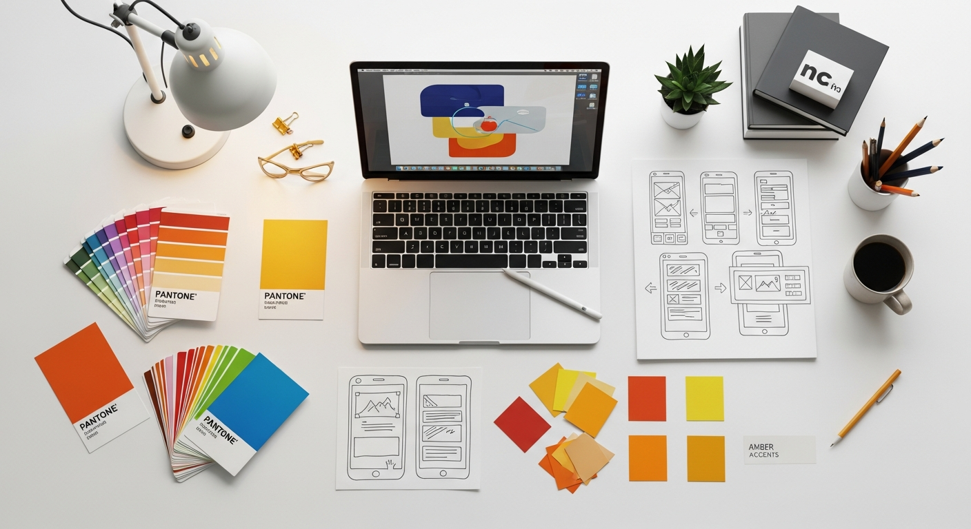
Mastering Microsite Design Patterns for Impactful Product Launches
A microsite is more than just a landing page; it’s a standalone, miniature website with its own domain or subdomain, dedicated to a specific campaign, product, service, or event. Unlike a section on your main site, a microsite offers unparalleled freedom in design, branding, and content, allowing you to create an immersive, uninterrupted narrative around your launch. This article will guide you through the essential UI/UX design patterns, principles, and practical considerations for building microsites that not only look stunning but also perform exceptionally.
We’ll delve into everything from strategic planning and user journey mapping to visual aesthetics, conversion-focused elements, and critical technical considerations. Whether you’re a seasoned designer looking to refine your approach or a design student eager to master a powerful marketing tool, prepare to unlock the full potential of microsite design for your next big product reveal.
The Strategic Imperative of Microsites in Product Launches
Why opt for a microsite when your main website already exists? This question lies at the heart of understanding their strategic value. For product launches, microsites offer distinct advantages that a general corporate site simply cannot replicate. They provide a dedicated stage for your new offering, free from the distractions and broader navigational complexities of a larger site.
Consider the primary goals of a product launch: generating buzz, informing potential customers, capturing leads, driving pre-orders, and establishing a unique brand identity for the new product. A microsite is custom-built to achieve these objectives with unparalleled efficiency. It allows for:
- Hyper-focus: Every element, from content to calls-to-action (CTAs), is geared towards the specific product. This eliminates cognitive load and directs users precisely where you want them to go.
- Agility and Speed: Microsites can be developed and deployed much faster than overhauling sections of a main website. This agility is crucial for time-sensitive launches.
- Unique Branding and Storytelling: You can create a distinct visual and narrative experience that might diverge from your main brand guidelines, allowing the new product to truly shine with its own identity. This is particularly useful for products targeting a new demographic or representing a significant pivot.
- Enhanced Measurability: With a dedicated analytics setup, it’s easier to track specific campaign performance, user behavior, and conversion rates directly related to the launch.
- SEO Targeting: A microsite can be optimized for niche keywords related specifically to the new product, potentially ranking faster and higher for those specific terms than a page buried deep within a larger site structure.
In essence, a microsite serves as a highly effective digital billboard and information hub, concentrating all efforts on a singular, high-stakes goal: a successful product launch. It’s an investment in a focused user experience designed for maximum impact and conversion.
Understanding Core Microsite Design Patterns
Just as there are different types of products, there are various design patterns for microsites, each suited for distinct launch objectives. Choosing the right pattern is the first step towards a successful launch experience. Here are some of the most common and effective microsite design patterns:
-
The Teaser Microsite
Purpose: To build anticipation and generate early interest before a full reveal. This pattern focuses on intrigue and mystery.
- Key Features: Minimal content, captivating visuals (sometimes animated), countdown timers, “notify me” forms, social sharing buttons.
- Design Focus: High visual impact, strong emotional appeal, clear call to action for email sign-up. Think evocative imagery and short, punchy copy.
- Best Use Case: Pre-launch campaigns for highly anticipated products, major updates, or disruptive technologies.
-
The Explainer/Information Microsite
Purpose: To provide detailed information about a new product, its features, benefits, and use cases in an engaging, digestible format.
- Key Features: Rich media (videos, interactive demos), detailed feature breakdowns, FAQs, comparison charts, testimonials, clear CTAs (e.g., “Learn More,” “Buy Now,” “Request a Demo”).
- Design Focus: Clarity, information hierarchy, visual storytelling. Often uses scrolling narratives or distinct sections for different aspects of the product.
- Best Use Case: Products requiring significant explanation, complex software, or innovative hardware.
-
The Gated Content Microsite
Purpose: To capture leads by offering exclusive, valuable content (e.g., whitepapers, case studies, early access demos) in exchange for user information.
- Key Features: Prominent lead capture forms, clear value proposition for the gated content, strong privacy assurances, download links or access instructions upon submission.
- Design Focus: Trust, perceived value of the content, simplicity of the form.
- Best Use Case: B2B product launches, services requiring detailed consideration, or building an early adopter community.
-
The Event-Driven Microsite
Purpose: To support a specific launch event, webinar, or virtual conference related to the product launch.
- Key Features: Event schedule, speaker bios, registration forms, live stream links, interactive Q&A sections, post-event resources.
- Design Focus: Event branding, clear navigation for event logistics, real-time updates.
- Best Use Case: Product reveals at conferences, virtual launch parties, or educational webinars.
Selecting the right pattern early on will significantly influence your UI/UX design decisions, content strategy, and overall launch trajectory.
Microsite Pattern Comparison
| Pattern Type | Primary Purpose | Key Features | Design Emphasis | Best For |
|---|---|---|---|---|
| Teaser Microsite | Build anticipation, generate buzz | Countdown, “Notify Me” forms, minimal info | Intrigue, visual impact, emotional appeal | Highly anticipated products, pre-launch hype |
| Explainer Microsite | Educate, inform, demonstrate value | Rich media, feature lists, FAQs, testimonials | Clarity, storytelling, information hierarchy | Complex products, detailed feature sets |
| Gated Content Microsite | Lead generation, capture user data | Prominent forms, exclusive content offer | Trust, value proposition, form simplicity | B2B launches, early access programs |
| Event-Driven Microsite | Support a launch event/webinar | Schedule, registration, speaker info, live streams | Event branding, clear logistics, real-time updates | Product reveals at virtual/physical events |
Crafting Compelling User Journeys and Information Architecture
A successful microsite isn’t just about good looks; it’s about guiding users effortlessly towards a desired outcome. This requires meticulous planning of the user journey and a streamlined information architecture (IA).
Defining Your Audience and Their Goals
Before sketching a single wireframe, you must deeply understand who your target users are. Create detailed user personas, outlining their demographics, psychographics, needs, pain points, and motivations. What problem does your new product solve for them? What information do they need to make a decision? What actions do you want them to take?
- Example: If launching a new productivity app, your persona might be a “Busy Freelancer” who needs efficiency, easy onboarding, and clear pricing. Their goals might be to understand key features quickly and sign up for a free trial.
Mapping User Flows
Once you know your users, map out their likely paths through the microsite. A typical user flow might look like this:
- Entry Point: User arrives from a social ad, search result, or email campaign.
- Discovery: User quickly scans the hero section, headline, and primary visuals.
- Engagement: User explores key features, watches a video, reads testimonials.
- Consideration: User reviews pricing, FAQs, or case studies.
- Conversion: User signs up for a newsletter, pre-orders, or requests a demo.
- Post-Conversion: User receives a confirmation, thank you message, or next steps.
Visualize these flows using tools like Figma or Sketch, ensuring each step is logical and friction-free. Pay close attention to potential drop-off points and design solutions to mitigate them.
Simplified Information Architecture (IA) for Focus
Unlike a main website with dozens of pages, a microsite thrives on simplicity. Its IA should be lean and purposeful. Aim for a flat hierarchy, where most content is easily accessible within a few clicks or even on a single, long-scrolling page (often called a “one-page microsite”).
- Key IA considerations:
- Clear Navigation: Even on a single-page site, anchor links or a sticky navigation bar can improve usability.
- Content Chunks: Break down information into digestible sections with clear headings (H2, H3) and subheadings.
- Visual Hierarchy: Use size, color, and spacing to guide the user’s eye to the most important information first.
- Minimalism: Avoid unnecessary pages or links that could divert users from the primary goal.
Nielsen Norman Group emphasizes that users often scan rather than read. Your IA should facilitate this scanning behavior, allowing users to quickly find the information they need without feeling overwhelmed.
Content Strategy: Storytelling and Visual Hierarchy
The content on your microsite should tell a compelling story about your product. It’s not just about listing features; it’s about articulating benefits and solving user problems. Use a mix of:
- Benefit-driven headlines: Focus on what the user gains.
- Concise body copy: Get to the point quickly.
- High-quality imagery and video: Show, don’t just tell.
- Infographics and data visualizations: Simplify complex information.
Employ a strong visual hierarchy to ensure that the most critical information stands out. This includes strategic use of typography, color, and negative space to draw attention to key messages and calls to action.
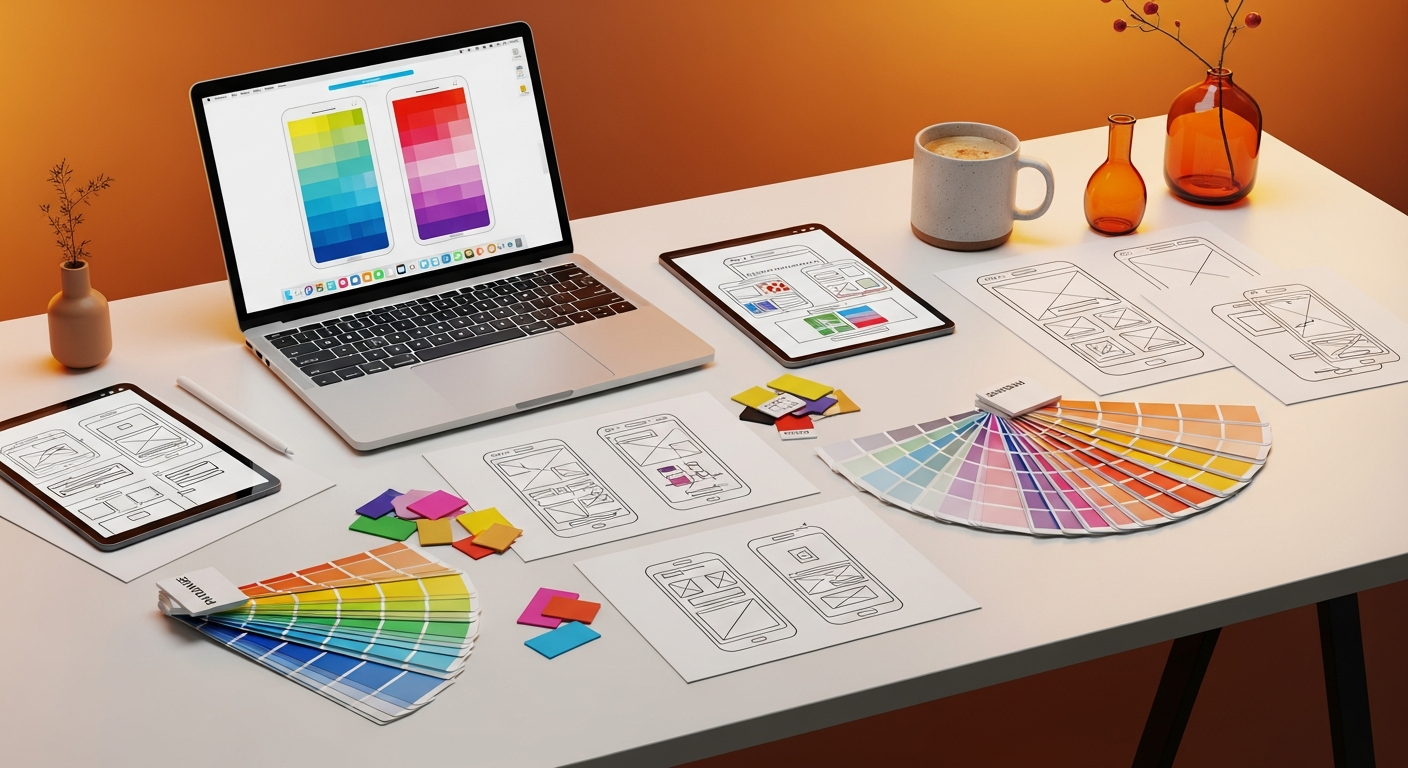
Visual Design and Branding: Making a Lasting Impression

The visual design of your microsite is its personality. It’s what differentiates your product and creates an emotional connection with your audience. While it should resonate with your overall brand, a microsite offers the flexibility to push creative boundaries.
Brand Consistency vs. Creative Freedom
This is a delicate balance. Your microsite should feel like it belongs to your brand family, but it doesn’t need to be identical to your main website. Often, a microsite will adopt a slightly bolder, more experimental aesthetic to match the excitement of a new launch.
- Maintain core brand elements: Logo, primary brand colors (even if used in new combinations), and overall tone of voice.
- Experiment with: Secondary color palettes, unique typography for headlines, fresh imagery styles, and innovative layout structures.
Think of it as a special edition: recognizably part of the collection, but with its own distinct flair.
Color Palettes, Typography, and Imagery
- Color: Choose a palette that evokes the desired emotions for your product. Bright, energetic colors for a tech gadget; calm, sophisticated tones for a financial service. Ensure accessibility by adhering to WCAG contrast ratio guidelines (e.g., AA compliance for text). Tools like Contrast Checker can help.
- Typography: Select fonts that are legible, reflect your product’s personality, and maintain a clear hierarchy. Use distinct fonts for headlines and body text to improve readability and visual interest. Material Design principles offer excellent guidance on type scales and legibility.
- Imagery and Video: High-quality, relevant visuals are non-negotiable. Use professional photography, custom illustrations, or compelling video content. Avoid generic stock photos. Visuals should either explain a concept, evoke an emotion, or demonstrate the product in action. Consider using interactive 3D models or product configurators for an immersive experience.
Animation and Micro-interactions
Subtle animations and micro-interactions can significantly enhance user engagement and delight. They can:
- Provide feedback: Button states, form validations.
- Guide attention: Highlighting new content, drawing the eye to a CTA.
- Add personality: Loading animations, hover effects.
- Improve perceived performance: Masking loading times.
However, use them judiciously. Overuse can lead to distraction and slow down the site. Ensure animations are purposeful and don’t hinder accessibility for users with motion sensitivities.
Mobile-First and Responsive Design
Given that a significant portion of your launch audience will likely access the microsite via mobile devices, a mobile-first approach is critical. Design for the smallest screen first, then progressively enhance for larger viewports. This ensures a seamless experience across all devices.
- Fluid layouts: Use relative units (percentages, `em`, `rem`, `vw`, `vh`) instead of fixed pixels.
- Responsive images: Optimize image sizes and use `srcset` for different screen resolutions.
- Touch-friendly elements: Ensure buttons and interactive areas are large enough for touch targets.
- Performance: Mobile users often have slower connections, so optimize loading times aggressively.
Essential UI/UX Elements for Conversion and Engagement
The ultimate goal of a microsite is conversion, whether that’s a sign-up, a purchase, or a download. Every UI/UX element should be designed with this in mind, driving users towards the primary call to action.
Clear Calls to Action (CTAs)
Your CTAs are the gateways to conversion. They must be:
- Prominent: Visually stand out through color, size, and placement. Consider F-pattern or Z-pattern layouts for optimal CTA visibility.
- Action-Oriented: Use strong verbs like “Get Started,” “Pre-Order Now,” “Download Free Guide,” “Sign Up.”
- Benefit-Driven: Briefly highlight the value a user receives by clicking (e.g., “Unlock Exclusive Features,” “Save 20% Today”).
- Limited in Quantity: Avoid overwhelming users with too many CTAs. Focus on one primary action per section or page.
- Consistent: Maintain a consistent visual style for CTAs across the microsite.
Forms: Simplicity, Validation, and Progressive Disclosure
If your microsite includes forms (for lead capture, pre-orders, etc.), they must be impeccably designed:
- Minimal Fields: Ask only for essential information. Every extra field increases friction.
- Clear Labeling: Use descriptive labels for each field, placed above or to the left of the input.
- Input Masks and Placeholders: Guide users on expected input formats.
- Real-time Validation: Provide immediate feedback on errors, rather than waiting for submission.
- Progressive Disclosure: For longer forms, break them into multiple steps, revealing more fields only when necessary. This reduces cognitive load.
- Strong Privacy Assurance: Clearly state how user data will be used and link to your privacy policy.
Social Proof: Testimonials, Reviews, and Social Shares
People trust recommendations from others. Incorporate social proof to build credibility:
- Testimonials: Feature quotes from early adopters, beta testers, or industry experts. Include names, photos, and company affiliations for authenticity.
- User Reviews/Ratings: If applicable, display aggregated star ratings or snippets of positive reviews.
- Trust Badges: Display logos of partners, awards, or security certifications.
- Social Share Buttons: Make it easy for users to share your microsite content on their social networks, amplifying your reach.
- Press Mentions: Showcase logos of reputable media outlets that have covered your product.
Interactive Elements
Engage users beyond static content with interactive features:
- Product Configurators: Allow users to customize a product (e.g., colors, features) and see the result.
- Calculators: Help users quantify the benefits of your product (e.g., “Calculate Your Savings”).
- Quizzes/Surveys: Engage users while subtly gathering insights or recommending products.
- Interactive Demos/Walkthroughs: Provide a hands-on experience of your software or digital product.
Accessibility (WCAG)
Designing for accessibility isn’t just good practice; it’s often a legal requirement and always an ethical imperative. Adhere to Web Content Accessibility Guidelines (WCAG) to ensure your microsite is usable by everyone, regardless of ability.
- Semantic HTML: Use appropriate HTML tags (e.g., `h1`, `p`, `ul`, `button`) for proper screen reader interpretation.
- Alt Text for Images: Provide descriptive `alt` attributes for all meaningful images.
- Keyboard Navigation: Ensure all interactive elements can be accessed and operated via keyboard (e.g., using `tab` key). Provide clear focus indicators.
- Color Contrast: Meet WCAG AA or AAA contrast ratios for text and interactive elements.
- Form Labels: Properly associate labels with form inputs.
- Transcripts/Captions: Provide for all audio and video content.
Technical Considerations and Performance Optimization
A beautifully designed microsite means little if it’s slow, unsearchable, or breaks down. Technical considerations are integral to the UI/UX experience.
Loading Speed and Performance
Users expect instant gratification. Slow loading times lead to high bounce rates and negatively impact SEO. Aim for a load time under 2-3 seconds.
- Image Optimization: Compress images without sacrificing quality. Use modern formats like WebP. Implement lazy loading for images outside the initial viewport.
- Code Minification: Minify HTML, CSS, and JavaScript files to reduce file sizes.
- Content Delivery Network (CDN): Serve assets from geographically distributed servers to reduce latency.
- Browser Caching: Leverage browser caching to speed up return visits.
- Efficient Hosting: Choose a reliable hosting provider with good uptime and performance.
SEO for Microsites
Even though microsites are temporary, optimizing them for search engines is crucial for discoverability.
- Unique Content: Ensure content is original and not duplicated from your main site to avoid SEO penalties.
- Target Keywords: Research and strategically place keywords relevant to your product launch in headings, body text, and meta descriptions.
- Meta Titles and Descriptions: Craft compelling meta titles and descriptions for each page (even if it’s just one) to improve click-through rates from search results.
- Schema Markup: Implement structured data (Schema.org) for product information, reviews, or events to enhance rich snippets in search results.
- Mobile Friendliness: Google prioritizes mobile-friendly sites in its rankings.
- Clean URLs: Use descriptive, human-readable URLs.
Analytics Integration
Tracking user behavior is essential for understanding performance and making data-driven improvements.
- Google Analytics: Set up GA4 to track page views, bounce rates, conversion goals (e.g., form submissions, CTA clicks), and user demographics.
- Heatmapping Tools: Tools like Hotjar or Microsoft Clarity can visualize where users click, scroll, and spend time, revealing areas of interest or friction.
- A/B Testing: Platforms like Google Optimize (sunsetting in 2023, alternatives like VWO, Optimizely) allow you to test different versions of headlines, CTAs, or layouts to see which performs better.
CMS/Platform Choices
The choice of platform impacts development speed, flexibility, and maintenance.
- Webflow: Excellent for designers who want visual control without extensive coding, offering robust responsive design capabilities and CMS features for dynamic content.
- WordPress: Highly flexible with a vast ecosystem of themes and plugins, suitable for content-rich microsites. Requires more setup and maintenance.
- Custom Build: Offers maximum flexibility and performance but requires significant development resources. Best for highly unique or complex interactive experiences.
- Landing Page Builders: Tools like Unbounce or Leadpages are quick for simple, conversion-focused microsites but may offer less design freedom.
Iteration and Post-Launch Strategy
A product launch isn’t a one-and-done event; it’s a continuous process of learning and refinement. Your microsite strategy should reflect this.
Gathering Feedback and Monitoring Performance
Once your microsite is live, the real work of optimization begins.
- User Testing: Conduct usability tests with real users to identify pain points and areas for improvement. Even remote, unmoderated tests can yield valuable insights.
- Surveys: Implement short, targeted surveys on the microsite to gather direct feedback on user experience and content clarity.
- Analytics Review: Regularly analyze your Google Analytics data. Look for trends in traffic sources, user flows, conversion rates, and bounce rates. Pay attention to pages with high exit rates.
- A/B Testing Results: Implement changes based on successful A/B test variations to continuously optimize for better performance.
Iterative Design Process
The insights gained from feedback and analytics should feed directly back into your design process. Adopt an agile, iterative approach:
- Analyze: Review data and feedback.
- Identify: Pinpoint specific areas for improvement (e.g., a confusing CTA, a slow-loading image).
- Hypothesize: Formulate a hypothesis for how a design change will improve performance.
- Design: Implement the design change.
- Test: A/B test the new design if possible, or monitor its performance post-implementation.
- Deploy: Roll out successful changes.
This continuous loop ensures your microsite evolves to meet user needs and launch goals.
Transitioning Content Post-Launch
The lifespan of a microsite is often finite. Once the launch campaign concludes, you need a strategy for its content.
- Integration: The most common approach is to integrate key content, features, and design elements from the microsite into your main website. This ensures valuable SEO equity and information is not lost.
- Archiving: If the content is highly time-sensitive or specific to a past event, you might archive the microsite, ensuring it’s still accessible but not actively promoted.
- Redirection: Implement 301 redirects from the microsite’s URLs to relevant pages on your main website to preserve SEO rankings and prevent broken links.
- Repurposing: Reformat microsite content (e.g., explainer videos, infographics) into blog posts, social media content, or marketing materials for ongoing promotion.
Plan this transition early in the project lifecycle to avoid last-minute scrambling and ensure a smooth user experience even after the initial launch buzz fades.
Key Takeaways
- Microsites offer focused, agile, and distinct branding opportunities crucial for impactful product launches, driving specific user actions.
- Choose the right microsite design pattern (Teaser, Explainer, Gated, Event-Driven) based on your launch objectives to guide your UI/UX strategy.
- Prioritize user journey mapping and a simplified information architecture to ensure intuitive navigation and clear conversion paths.
- Leverage compelling visual design, responsive layouts, and strategic micro-interactions to create a memorable and engaging brand experience.
- Integrate conversion-focused UI/UX elements like clear CTAs, streamlined forms, and social proof, while adhering to WCAG accessibility standards.
- Optimize for technical performance, SEO, and robust analytics integration from the outset to ensure discoverability and continuous improvement.
Frequently Asked Questions
Q: What’s the main difference between a microsite and a landing page?
A: While both are focused on specific campaigns, a microsite is typically a small, standalone website with multiple pages or sections, its own URL (or subdomain), and a distinct brand identity. A landing page is usually a single page, often part of a larger website, designed for a very specific conversion action with minimal navigation, often used for lead capture or direct sales.
Q: How long should a microsite be kept active?
A: The lifespan of a microsite varies. It can be active for the duration of a specific campaign (e.g., 3-6 months post-launch), or longer if the product requires ongoing dedicated promotion. Some microsites are eventually integrated into the main website, while others are archived or redirected once their primary purpose is served.
Q: Can a microsite hurt my main website’s SEO?
A: Not if done correctly. Issues arise if content is duplicated from your main site without proper canonical tags, or if the microsite competes for the same keywords. To avoid this, ensure unique content, distinct target keywords, and proper use of redirects or canonicalization when integrating content post-launch.
Q: What are some essential tools for designing a microsite?
A: For UI design and prototyping, tools like Figma, Sketch, or Adobe XD are industry standards. For development, platforms like Webflow offer visual development capabilities, while WordPress with page builders (Elementor, Divi) can also be effective. Analytics tools like Google Analytics and heatmapping tools like Hotjar are crucial for post-launch monitoring.
Q: How important is accessibility for a temporary microsite?
A: Accessibility is paramount for any web presence, regardless of its duration. It ensures your product launch reaches the widest possible audience and adheres to ethical design principles and often legal requirements (like WCAG guidelines). Ignoring accessibility can alienate users and damage your brand’s reputation.
In conclusion, designing an effective microsite for a product launch is an intricate yet incredibly rewarding endeavor. It demands a blend of strategic thinking, creative flair, and technical precision. By meticulously planning the user journey, crafting compelling visuals, implementing conversion-focused UI/UX elements, and continually optimizing based on data, you can create a digital experience that not only captivates your audience but also drives tangible results for your new product.
Remember, a microsite is more than just a website; it’s a dedicated stage for your product’s debut, offering a unique opportunity to tell its story and connect with your audience on a deeper level. Embrace the patterns, leverage the principles, and design with purpose.
Article by Sarah Chen, Lead UX Strategist at Innovate Digital.