Understanding UI Design: More Than Just Pretty Pictures
At its core, User Interface (UI) design is the process of building the graphical layout of an application, website, or digital product. It’s about designing all the visual elements a user interacts with: buttons, text, images, sliders, text entry fields, and every single micro-interaction. Think of it as the digital storefront – it needs to be attractive, easy to navigate, and clearly show what’s on offer. However, UI design is far more nuanced than simply making things look appealing. It’s a strategic discipline focused on predicting and understanding what users will need to do and ensuring the interface supports those actions efficiently and enjoyably.
The primary goal of a UI designer is to create an interface that is both aesthetically pleasing and highly functional. This involves a delicate balance of visual hierarchy, color theory, typography, and interactive elements, all working in harmony to guide the user through their digital journey. A well-designed UI should feel intuitive, almost invisible, allowing users to achieve their goals without unnecessary cognitive load or confusion.
It’s crucial to distinguish UI design from its close cousin, User Experience (UX) design. While often intertwined and sometimes performed by the same individual, their scopes are distinct. UI design focuses on the look and feel of the product, the tangible interface. UX design, on the other hand, encompasses the entire experience a user has with a product or service. This includes research, usability testing, information architecture, and the overall journey from discovery to completion. For a deeper dive into this symbiotic relationship, we highly recommend exploring our detailed guide: What Is UX Design And Why It Matters. Understanding UX provides the essential context and strategic framework upon which effective UI is built, ensuring that the beautiful interface serves a meaningful purpose and addresses genuine user needs.
In essence, UI design translates the research and strategy of UX into a tangible, interactive reality. It’s about crafting the digital environment where users live out their interactions, making every click, swipe, and tap feel natural, satisfying, and purposeful. As we move into 2026, the demand for skilled UI designers who can balance aesthetics with functionality continues to grow, making these foundational principles more relevant than ever.
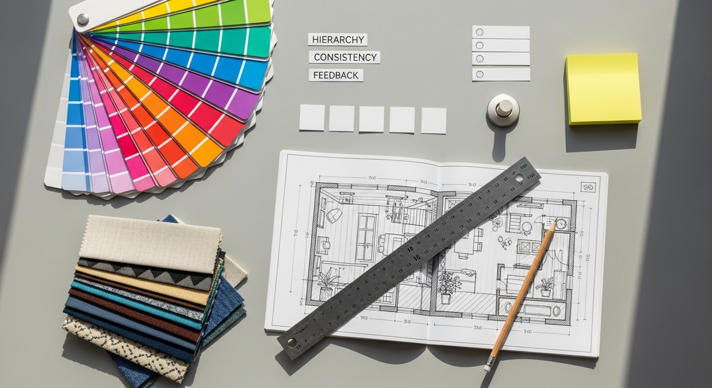
The Foundational Pillars: Core UI Design Principles

Mastering UI design means understanding a set of universal principles that guide the creation of effective and delightful interfaces. These aren’t rigid rules but rather flexible guidelines that ensure your designs are user-centric and robust. Let’s explore the fundamental pillars:
1. Clarity
Clarity is perhaps the most paramount principle in UI design. An interface should be unmistakably clear about what it is, what it does, and what users can do with it. Every element, from a button’s label to an icon’s meaning, should be instantly understandable, leaving no room for ambiguity. Users shouldn’t have to think; they should simply understand. This means using straightforward language, intuitive icons, and clear visual cues. For example, a “Submit” button should clearly indicate its action, rather than an abstract icon that might be misinterpreted. Achieving clarity often involves simplifying complex tasks and presenting information in digestible chunks, ensuring the user’s path is always illuminated.
2. Consistency
Consistency refers to maintaining a uniform experience across all parts of your interface. This includes visual elements (colors, typography, spacing, iconography), interaction patterns (how buttons behave, how navigation works), and even language used. When an interface is consistent, users can transfer their knowledge from one part of the system to another, reducing learning curves and increasing efficiency. If a “save” icon looks and behaves the same way throughout an application, users will quickly learn its function. Inconsistency, on the other hand, can lead to confusion, frustration, and a perceived lack of professionalism. Consistency should also extend beyond your product to established industry standards, leveraging users’ existing mental models of how interfaces work.
3. Feedback
Feedback is about keeping users informed about what is happening. Every action a user takes, whether clicking a button, submitting a form, or encountering an error, should elicit an appropriate and timely response from the system. This could be visual (e.g., a button changing color on click, a loading spinner, a success message), auditory (a notification sound), or haptic (a vibration). Lack of feedback can leave users wondering if their action was registered, leading to repeated clicks, uncertainty, or abandonment. Good feedback reassures users, confirms their actions, and guides them through processes, making the interface feel responsive and alive.
4. Efficiency
An efficient UI allows users to accomplish their tasks quickly and with minimal effort. This involves streamlining workflows, reducing the number of steps required, and optimizing for common use cases. For instance, providing default options, auto-filling forms, or allowing keyboard shortcuts can significantly enhance efficiency. Designers should anticipate user needs and provide shortcuts or smart defaults where appropriate, without overwhelming the user with too many options. The goal is to make the user journey as smooth and frictionless as possible, respecting their time and cognitive resources.
5. Forgiveness & Error Prevention
A forgiving interface anticipates potential user errors and provides mechanisms to prevent them or easily recover from them. This principle is about designing for human fallibility. Examples include confirmation dialogs before irreversible actions (e.g., “Are you sure you want to delete this?”), clear error messages that explain the problem and suggest solutions, and the ubiquitous “undo” function. It’s also about preventing errors in the first place, such as disabling buttons that are not yet actionable or providing input masks for specific data formats. A forgiving UI builds user confidence and reduces anxiety, knowing they can explore and interact without fear of permanent mistakes.
6. Hierarchy
Visual hierarchy is the arrangement of elements in a way that implies importance and guides the user’s eye. By strategically using size, color, contrast, typography, and spacing, designers can draw attention to the most crucial information and actions first. For example, a primary call-to-action button should stand out more than secondary links. Headings should be larger and bolder than body text. A clear hierarchy helps users quickly scan an interface, understand the relationships between different elements, and prioritize information without feeling overwhelmed. This principle is fundamental to organizing information effectively and making complex interfaces navigable.
7. Accessibility
Accessibility means designing interfaces that can be used by everyone, regardless of their abilities or circumstances. This includes users with visual impairments (e.g., color blindness, low vision), hearing impairments, motor disabilities, or cognitive limitations. Adhering to accessibility standards (like WCAG) involves considerations such as sufficient color contrast, keyboard navigation, clear focus states, alternative text for images, and resizable text. Designing for accessibility isn’t just a compliance issue; it expands your audience, improves usability for all users, and demonstrates empathy and inclusivity. It ensures that the digital world is open and usable for every individual.
8. Aesthetics & Delight
While functionality is paramount, aesthetics and delight play a crucial role in creating a positive user experience. A visually appealing and well-crafted interface can evoke positive emotions, build trust, and enhance brand perception. This involves thoughtful use of color palettes, engaging typography, high-quality imagery, and subtle animations or micro-interactions that add personality and joy. Delightful design goes beyond mere usability; it creates memorable moments and fosters a deeper connection with the product. In 2026, users expect not just functionality, but also an experience that is pleasant, engaging, and reflective of modern design sensibilities.
9. Simplicity
Simplicity in UI design means striving for clarity by removing unnecessary elements and focusing on essential functionality. It’s about doing more with less. A simple interface reduces cognitive load, making it easier for users to understand and navigate. This often involves decluttering layouts, minimizing options, and prioritizing core features. While seemingly straightforward, achieving true simplicity is challenging, as it requires careful consideration of what to include and, more importantly, what to omit. A simple UI is not necessarily minimalist, but it is always focused and free from distraction, guiding the user towards their goals efficiently.
10. Learnability
A learnable interface is one that users can easily understand and become proficient with, even if they’ve never encountered it before. This ties into consistency and clarity, as predictable and understandable elements contribute to rapid learning. For beginners, a learnable UI often provides clear onboarding, helpful tooltips, and progressive disclosure of features. It allows users to start with basic functions and gradually discover more advanced capabilities as they gain confidence. An interface that is easy to learn reduces frustration and encourages continued engagement, turning first-time users into confident regulars.
Diving Deeper: Practical Application of UI Principles
Layouts and Grids: The Invisible Structure
Every digital interface benefits from a strong underlying structure, typically provided by layouts and grids. Grids provide an invisible framework that helps align elements, create visual hierarchy, and ensure consistency across pages. They define spacing, margins, and column widths, making it easier to arrange text, images, and interactive components in an organized and aesthetically pleasing manner. Effective use of whitespace (or negative space) is also critical. It’s not empty space; it’s a design element that provides visual breathing room, reduces clutter, and draws attention to key content. A well-structured layout, guided by grids and ample whitespace, significantly enhances clarity and readability.
Typography: More Than Just Words
Typography is a powerful tool in UI design, influencing not only readability but also mood, brand personality, and visual hierarchy. Selecting appropriate font families, sizes, weights, and line spacing is crucial. A good typographic system ensures text is legible at various sizes and on different devices. For instance, headlines should be distinct from body text, and calls-to-action might use a bolder weight. Consistency in typography across an interface reinforces a professional and cohesive brand identity. Poor typography can quickly make an interface feel amateurish, difficult to read, and ultimately, frustrating to use.
Color Theory: Setting the Mood and Guiding the Eye
Color plays a profound role in UI, impacting emotions, drawing attention, and communicating status. Designers use color palettes to establish brand identity, create visual interest, and guide users through the interface. For example, a vibrant color might be used for primary calls-to-action, while muted tones are reserved for background elements. It’s essential to consider color contrast for accessibility, ensuring text and interactive elements are easily distinguishable for all users. Understanding the psychological impact of colors can also help in setting the right mood for an application – serene blues for calm, energetic reds for urgency.
Iconography: Universal Language
Icons are visual representations that convey meaning quickly and efficiently, often transcending language barriers. Well-designed icons are simple, recognizable, and consistent in style and size. They can replace text labels, saving space and making interfaces cleaner. However, relying solely on icons can sometimes lead to ambiguity, so it’s often best practice to pair them with text labels, especially for less common actions. Consistency in iconography across your UI reinforces learnability and clarity, ensuring users don’t have to guess what an unfamiliar icon means.
Imagery and Illustrations: Engaging Visuals
High-quality imagery and illustrations can significantly enhance the visual appeal and storytelling capabilities of a UI. They can break up long blocks of text, convey complex ideas quickly, and add personality to an interface. Whether it’s product photography, hero images, or custom illustrations, visuals should be relevant, high-resolution, and consistent with the overall brand aesthetic. Thoughtful use of imagery can contribute to the delight factor, making the user experience more engaging and memorable. However, overuse or irrelevant imagery can lead to visual clutter and slow loading times, detracting from efficiency.
Interaction Design: Bringing the Interface to Life
While the visual elements form the static appearance, interaction design is about how users engage with those elements. This includes defining how buttons respond to clicks, how forms validate input, how navigation menus expand, and the subtle micro-interactions that provide crucial feedback. Smooth transitions, meaningful animations, and intuitive gestures all contribute to a fluid and responsive user experience. Good interaction design makes an interface feel natural and predictable, reducing friction and enhancing efficiency. It’s the dynamic layer that brings the static design principles into motion.
Tools, Trends, and Continuous Learning in UI Design
The landscape of UI design is dynamic, constantly evolving with new technologies, user expectations, and design methodologies. To excel in 2026 and beyond, beginners must not only grasp foundational principles but also stay abreast of tools and trends.
Essential UI Design Tools
The modern UI designer has access to a powerful suite of digital tools that streamline the design process from concept to prototype. Some of the most popular and robust options include:
- Figma: A cloud-based design tool renowned for its collaborative features, allowing multiple designers to work on the same file simultaneously. Its versatility makes it a favorite for UI design, prototyping, and even basic graphic design.
- Sketch: A vector-based design application popular among UI designers for macOS users. It boasts a vast plugin ecosystem and a strong community, making it highly customizable for various workflows.
- Adobe XD: Part of the Adobe Creative Cloud suite, XD offers a comprehensive platform for UI/UX design, prototyping, and sharing. It integrates seamlessly with other Adobe applications like Photoshop and Illustrator.
- Other notable tools: While not strictly UI design tools, learning to use vector graphics software like Adobe Illustrator or raster image editors like Adobe Photoshop can be incredibly beneficial for creating custom icons, illustrations, or editing imagery that will be incorporated into your UI designs.
Choosing the right tool often comes down to personal preference, team collaboration needs, and operating system. Many offer free trials or starter versions, making it easy for beginners to experiment.
Current and Emerging UI Design Trends for 2026
Staying updated with trends ensures your designs remain fresh, relevant, and effective. Here are a few trends shaping UI design in 2026:
- Minimalism and Clean Aesthetics: The “less is more” philosophy continues to dominate, focusing on clarity, ample whitespace, and essential elements to reduce cognitive load.
- Dark Mode & Theme Switching: Offering users the option to switch between light and dark themes is now a standard expectation, improving eye comfort and battery life.
- Micro-interactions and Delightful Animations: Subtle animations for button clicks, page transitions, or data loading add personality and provide crucial feedback, enhancing the overall user experience.
- AI-Powered Personalization: Interfaces are becoming smarter, leveraging AI to tailor content, recommendations, and even layout based on individual user behavior and preferences.
- Voice User Interfaces (VUIs) & Conversational UI: The rise of voice assistants and chatbots means UI designers need to think beyond visual interfaces, designing for spoken commands and natural language interactions.
- Immersive Experiences (AR/VR): As augmented and virtual reality become more mainstream, UI designers are exploring new paradigms for interaction within three-dimensional spaces.
- Glassmorphism & Neumorphism (Evolving): While some trends like these are debated, they highlight the ongoing exploration of visual styles that add depth and texture to interfaces, continually pushing aesthetic boundaries.
The Importance of Continuous Learning
The digital world is relentlessly innovative. What’s cutting-edge today might be commonplace tomorrow. Therefore, continuous learning is not just an advantage; it’s a necessity for UI designers. Engage with design communities, follow industry leaders, read design blogs (like Layout Scene!), take online courses, and regularly practice your skills. Critically evaluate existing interfaces, identifying what works and what doesn’t. The journey of a UI designer is one of constant curiosity, experimentation, and adaptation.
The Synergy with UX and Other Creative Fields
UI design doesn’t exist in a vacuum. It’s an integral part of a larger ecosystem of creative and technical disciplines, most notably UX design, information architecture, and broader visual communication.
UI as the Face of UX
As touched upon earlier, UI design is the tangible manifestation of UX strategy. While UX designers focus on research, user flows, and overall user journey, UI designers bring those insights to life through visual and interactive elements. A brilliant UX strategy can fall flat with a poor UI, just as a beautiful UI can be useless without thoughtful UX research behind it. They are two sides of the same coin, working collaboratively to create a product that is both usable and delightful. To truly appreciate this interplay and understand the foundational work that precedes UI, revisiting our article, What Is UX Design And Why It Matters, is highly recommended. It explains how understanding user needs and behaviors forms the bedrock upon which effective interfaces are built.
Information Architecture Explained: Structuring for Clarity
Before a single pixel of UI is designed, the product’s information architecture (IA) must be established. IA is the art and science of organizing and labeling content in a way that is understandable and findable. It dictates the structure of a website or application, defining navigation, categorization, and how different pieces of information relate to each other. A strong IA ensures that users can intuitively navigate through the product, finding what they need without confusion. UI designers then take this structured content and create the visual pathways – menus, links, search bars – that reflect the underlying IA. Without a sound IA, even the most beautiful UI can become a labyrinth. For a deeper dive into this critical precursor to UI, our guide Information Architecture Explained offers invaluable insights into creating logical and intuitive content structures.
Branding and Visual Identity: Beyond the Screen
UI design is a direct extension of a brand’s visual identity. The colors, typography, imagery, and overall aesthetic choices made in an interface must align seamlessly with the brand guidelines. A strong brand identity provides a framework for UI design, ensuring consistency across all touchpoints, digital or physical. This not only builds brand recognition and trust but also reinforces the emotional connection users have with a product. UI designers often work closely with brand strategists and graphic designers to translate brand values and personality into the digital realm, creating an experience that is uniquely recognizable.
Content Strategy: The Message Behind the Design
The words, images, and media presented within an interface are just as important as the design itself. Content strategy ensures that the information is relevant, clear, concise, and delivered at the right time. UI designers must work with content strategists and copywriters to ensure the layout supports the content effectively, making it easy to read, scan, and understand. The best UI design can’t compensate for poor content, and vice-versa. They are symbiotic, with the UI providing the stage and the content delivering the performance.
Social Media Graphics Design Guide: Applying UI Principles to Marketing
The principles of UI design extend far beyond applications and websites. Consider, for instance, the creation of effective social media graphics. While not an interactive interface in the traditional sense, a social media graphic is a visual communication tool that benefits immensely from UI principles. Clarity ensures the message is understood instantly. Visual hierarchy directs the eye to the most important information, like a call-to-action or a brand logo. Consistency in branding across various posts builds recognition. Aesthetics and appropriate color use make the graphic stand out in a crowded feed. Even principles like feedback (though indirect, in terms of user engagement) and efficiency (getting the message across quickly) are highly relevant. Our comprehensive resource, Social Media Graphics Design Guide, delves into how these core design principles are applied to create compelling and effective visuals for platforms like Instagram, Facebook, and LinkedIn, demonstrating the broad applicability of what you’re learning here.
By understanding these interconnections, beginners can approach UI design with a holistic perspective, recognizing that their work contributes to a larger, integrated user experience and brand narrative.
Common Pitfalls and How to Avoid Them
As you embark on your UI design journey, it’s just as important to recognize common mistakes as it is to learn best practices. Avoiding these pitfalls will significantly elevate the quality and effectiveness of your designs:
1. Over-designing and Clutter
One of the most frequent mistakes beginners make is trying to cram too much into an interface or adding decorative elements without purpose. This leads to visual clutter, overwhelms users, and detracts from the core message.
How to avoid: Embrace simplicity. Every element on the screen should have a clear purpose. If it doesn’t serve the user or the goal, remove it. Utilize whitespace generously to provide breathing room and draw attention to critical elements. Less is often more in UI design.
2. Inconsistency
Failing to maintain consistency in visual style, interaction patterns, and terminology across an application or website can lead to user confusion and frustration. Users expect predictability.
How to avoid: Develop and adhere to a design system or style guide. Define your color palette, typography, button styles, iconography, and interaction behaviors early on. Use components and symbols in your design tools to ensure uniformity. Conduct regular design reviews to catch inconsistencies.
3. Ignoring Accessibility
Designing for a narrow segment of users and neglecting the needs of individuals with disabilities is a significant oversight. This not only excludes potential users but also creates a less robust and inclusive product.
How to avoid: Integrate accessibility considerations from the very beginning of your design process. Ensure sufficient color contrast, provide keyboard navigation support, use descriptive alt text for images, and test your designs with accessibility tools and diverse users. Make it a core principle, not an afterthought.
4. Poor or Missing Feedback
When users perform an action, they need to know what happened. Lack of feedback can leave them guessing, leading to repeated actions or abandonment.
How to avoid: Design clear and timely feedback mechanisms for every interaction. This includes visual changes (e.g., button states, loading spinners, success/error messages), auditory cues, and haptic feedback. Be explicit about system status.
5. Lack of User Testing and Iteration
Designing in a vacuum without validating assumptions with real users is a recipe for building interfaces that don’t meet actual needs. What seems intuitive to you might not be for your target audience.
How to avoid: Incorporate user testing early and often. Even simple usability tests with a few representative users can uncover major flaws. Be open to feedback and willing to iterate on your designs based on user insights. Design is an iterative process, not a one-time event.
6. Overlooking Information Architecture
Jumping straight into UI design without a solid foundation in information architecture can result in a beautiful but ultimately unusable product with confusing navigation and disorganized content.
How to avoid: Prioritize understanding and defining the information architecture before you start designing the UI. Conduct card sorting, tree testing, and content audits to ensure a logical and intuitive structure. Remember, a great UI needs a great IA underneath it.
By being mindful of these common pitfalls, beginners can sidestep many early challenges and focus on creating truly effective and user-friendly interfaces.
Frequently Asked Questions
Recommended Resources
Learn more about this topic in Benefits Of Automation Software For Small Businesses at Eamped.
Explore Best Productivity Apps 2026 for additional insights.
Industry Standards That Define Great UI
The most respected UI frameworks in the industry provide battle-tested guidance that every beginner should study. Three systems stand out as canonical references:
Google Material Design
Material Design is Google’s open-source design system, first released in 2014 and now on Material Design 3 (Material You). It defines:
- Elevation & shadow: Z-axis layers communicate hierarchy through shadow depth (dp = density-independent pixels)
- Motion principles: Transitions should be 150–300 ms; use standard easing (cubic-bezier 0.4, 0, 0.2, 1) for consistent feel
- Color system: Dynamic color generates a palette from a single seed color across light and dark themes
- Adaptive components: Navigation rail, navigation bar, and navigation drawer adapt to screen width breakpoints
Material Design 3 documentation is freely available at material.io and serves as one of the most comprehensive UI pattern libraries for beginners to study.
Apple Human Interface Guidelines (HIG)
Apple’s Human Interface Guidelines define design standards across iOS, macOS, watchOS, tvOS, and visionOS. Key HIG principles include:
- Aesthetic integrity: Appearance should integrate with function — decorative elements that don’t serve a purpose should be removed
- User control: Interfaces should respond to user actions, not the other way around; never initiate actions without user input
- Feedback: Every user action warrants a physical response — use haptics, animation, and sound to confirm interactions
- Touch targets: Minimum 44×44 pt for iOS interactive elements to accommodate diverse finger sizes
The HIG is available for free at developer.apple.com/design and is essential reading for anyone designing iOS or macOS applications.
Atomic Design (Brad Frost)
Atomic Design, introduced by Brad Frost in 2013, is a methodology for creating design systems from the ground up. It structures UI into five hierarchical levels:
- Atoms: The smallest UI units — buttons, inputs, labels, icons, color swatches, typography scales
- Molecules: Simple groups of atoms forming a functional unit — a search bar (input + button + icon)
- Organisms: Complex, distinct sections — a navigation header (logo + nav links + search bar + CTA)
- Templates: Page-level wireframes showing organism placement without real content
- Pages: Specific instances of templates with real content, the closest to what the user sees
This mental model helps beginners think systematically about building reusable, scalable design components rather than designing every screen from scratch.
Design Tokens, Component Libraries & Design Systems
Modern UI design at scale relies on design systems — documented collections of reusable components, patterns, and guidelines that ensure consistency across an entire product or organization. The building blocks of a design system include:
Design Tokens
Design tokens are the foundational variables that store visual design decisions — colors, typography, spacing, border radii, shadows. Instead of hardcoding #f59e0b in 200 places, you define a token color-primary-500 and reference it everywhere. When the brand color changes, you update one value and the entire system updates automatically.
Common token categories: Color tokens (primary/secondary/semantic: success/warning/error/info), spacing tokens (4px base grid: 4/8/12/16/24/32/48/64px), typography tokens (font family, size scale, weight, line-height), shadow tokens, and border radius tokens.
Key UI Patterns Every Beginner Should Know
| Pattern | Use Case | Best Practice |
|---|---|---|
| Responsive Navigation | Top nav (desktop) → hamburger menu (mobile) | Keep primary actions visible; max 7 nav items |
| Form Design | Registration, checkout, contact | Single column; top-aligned labels; inline validation |
| Error States | Form validation failures, API errors | Red #dc2626 border; error icon + message below field |
| Skeleton Loaders | Content loading states | Gray animated placeholder; better than spinners for layout stability |
| Empty States | No data / first-time user views | Illustration + copy + primary CTA to guide next action |
| Modal Dialogs | Confirmations, alerts, forms | Max 600px wide; always include close/cancel; trap keyboard focus |
WCAG 2.1 Accessibility Standards — The Numbers That Matter
The Web Content Accessibility Guidelines (WCAG) 2.1, published by the W3C, define three conformance levels (A / AA / AAA). Most standards require Level AA. The critical numbers every UI designer must know:
- Color contrast (normal text): Minimum 4.5:1 ratio between text and background for Level AA
- Color contrast (large text): Minimum 3:1 ratio (18pt+ or 14pt+ bold)
- Color contrast (UI components): Minimum 3:1 for interactive elements and graphical objects
- Touch targets: Minimum 24×24 CSS pixels (44×44 pt recommended for iOS, 48×48 dp for Material)
- Focus indicators: Visible keyboard focus required on all interactive elements (WCAG 2.4.7)
- Timing: Users must be able to extend time limits to at least 10× the default (WCAG 2.2.1)
Free tools to check compliance: Colour Contrast Analyser (TPGi), Stark (Figma plugin), axe DevTools (browser extension), and WAVE (WebAIM online checker).