
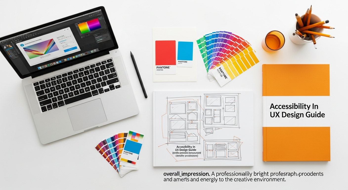
The Imperative of Inclusive Design: Why Accessibility in UX Matters More Than Ever
The term accessibility, when applied to User Experience (UX) design, refers to the practice of designing products, devices, services, or environments so that people with disabilities can use them. It’s about breaking down barriers and fostering an inclusive digital world. In essence, it extends the core principles of What Is UX Design And Why It Matters by ensuring that the positive, intuitive, and efficient experiences we strive for are available to the broadest possible audience. This isn’t just a niche concern; it’s a mainstream necessity that impacts billions globally.
The reasons for prioritizing accessibility are multifaceted and compelling:
- Ethical Responsibility: Fundamentally, it’s the right thing to do. Everyone deserves equal access to information, services, and opportunities in the digital realm. Excluding individuals based on ability is discriminatory and goes against the very spirit of human rights.
- Legal Compliance: A growing number of countries and regions have enacted legislation mandating digital accessibility. Laws like the Americans with Disabilities Act (ADA) in the U.S., the European Accessibility Act, and similar regulations worldwide mean that non-compliance can lead to significant legal penalties, lawsuits, and reputational damage. Designing with accessibility from the outset mitigates these risks.
- Expanded Market Reach: Consider the sheer size of the accessible market. According to the World Health Organization, over 1 billion people worldwide experience some form of disability. This represents a substantial demographic with purchasing power and influence. By making your products accessible, you open your services to a larger customer base, increasing market penetration and potential revenue. An inaccessible product is, by definition, a product that alienates a significant portion of its potential users.
- Enhanced User Experience for Everyone: Often, design improvements made for accessibility benefit all users. Clearer navigation, better color contrast, keyboard shortcuts, and well-structured content improve usability for everyone, including those in challenging environments (e.g., bright sunlight, noisy areas) or those temporarily impaired (e.g., broken arm, carrying a baby). This concept is known as the “curb cut effect,” where a feature designed for one group ends up benefiting many.
- Innovation and Brand Reputation: Companies that embrace accessibility are often seen as leaders and innovators. It fosters a culture of problem-solving and creative thinking, pushing designers to develop more robust and adaptable solutions. A strong commitment to accessibility enhances a brand’s reputation as socially responsible and forward-thinking, attracting talent and loyal customers alike.
- SEO Benefits: Many accessibility best practices naturally align with Search Engine Optimization (SEO). Semantic HTML, proper heading structures, descriptive alt text for images (a crucial element we’d explore in any Social Media Graphics Design Guide), and clear link text all contribute to better crawlability and understanding by search engines, potentially boosting your rankings.
In 2026 and beyond, the digital landscape will become even more integrated into daily life. As such, the expectation for inclusive design will only intensify. UX designers who proactively integrate accessibility into their workflows will not only meet regulatory requirements but also create truly impactful and enduring digital experiences for all.
Understanding the Landscape: Diverse User Needs and Assistive Technologies

To design inclusively, we must first understand the diverse spectrum of human abilities and the challenges individuals may face when interacting with digital interfaces. Disabilities are not monolithic; they vary greatly in type, severity, and how they impact interaction with technology. A key aspect of an effective accessibility in ux design guide is to cultivate empathy and a deep understanding of these varied user needs.
Categories of Disabilities and Their Impact on Digital Interaction:
-
Visual Impairments:
- Blindness: Users rely entirely on assistive technologies like screen readers, which vocalize on-screen content, or refreshable braille displays. They navigate primarily via keyboard.
- Low Vision: Users may use screen magnifiers, adjust font sizes, alter color schemes, or rely on higher contrast. They might still use a mouse but need larger targets and clear visual cues.
- Color Blindness: Difficulty distinguishing between certain colors (most commonly red/green). This impacts design choices where color alone conveys meaning.
Impact: Requires well-structured semantic HTML, descriptive alt text, strong color contrast, scalable text, and keyboard navigability.
-
Auditory Impairments:
- Deafness or Hard of Hearing: Users may not perceive auditory cues, spoken content, or background sounds.
Impact: Requires captions, transcripts, and sign language interpretation for audio and video content. Visual alternatives for auditory alerts are crucial.
-
Motor/Mobility Impairments:
- Limited Dexterity/Motor Control: Users may have difficulty with fine motor movements, precise mouse control, or sustained keyboard input due to conditions like arthritis, Parkinson’s, or spinal cord injuries.
- No Use of Hands: Users might rely on alternative input devices such as speech-to-text, head pointers, eye-tracking systems, or single-switch devices.
Impact: Demands full keyboard navigability, large clickable areas, clear focus indicators, tolerance for imprecise movements, and avoiding time-sensitive interactions.
-
Cognitive/Neurological Impairments:
- Learning Disabilities (e.g., Dyslexia): Users may struggle with reading comprehension, memory, or processing complex information.
- ADHD: Users may have difficulty focusing, be easily distracted, or struggle with sustained attention.
- Autism Spectrum Disorders: Users may prefer clear, predictable interfaces, struggle with abstract concepts, or be sensitive to sensory overload.
- Memory Impairments: Users may have difficulty remembering steps in a process or recalling information.
Impact: Requires clear, concise language, consistent layouts, predictable navigation, minimal distractions, adequate time limits, and chunked information (closely related to principles in Information Architecture Explained).
-
Speech Impairments:
- Difficulty Speaking Clearly: Users may struggle with voice input systems or verbal communication.
Impact: Requires alternative input methods for forms and interactions, and clear text-based communication options.
Common Assistive Technologies (AT):
Assistive technologies are tools that help individuals with disabilities interact with digital content. Designing for AT compatibility is paramount:
- Screen Readers (e.g., JAWS, NVDA, VoiceOver): Software that reads aloud the content of the screen. Users navigate websites and applications using keyboard commands. Designers must ensure semantic HTML, proper heading structure, descriptive link text, and alternative text for images.
- Screen Magnifiers: Software that enlarges portions of the screen. Designers need to ensure layouts are responsive and content remains readable when magnified, avoiding horizontal scrolling.
- Speech-to-Text Software (e.g., Dragon NaturallySpeaking): Allows users to control their computer and input text using their voice. Requires clean, accessible interfaces with clear labels and actionable elements.
-
Alternative Input Devices:
- Head Pointers/Mouth Sticks: Users control a mouse cursor with head movements or a stick held in their mouth.
- Eye-Tracking Systems: Users control the computer with their eye movements.
- Single-Switch Devices: Users interact with the computer by repeatedly pressing a single switch (e.g., with their head, knee, or foot) to scan through options.
All these devices rely heavily on clear focus indicators and full keyboard operability.
- Refreshable Braille Displays: Devices that translate screen content into tactile braille cells. These work in conjunction with screen readers.
By understanding these diverse needs and the technologies users employ, UX designers can move beyond a superficial understanding of accessibility to implement truly effective and empathetic design solutions. It’s about designing for real people, with real lives, in 2026 and beyond.
Core Principles and Standards: Navigating WCAG and Beyond
The POUR Principles of WCAG:
WCAG is structured around four fundamental principles, often remembered by the acronym POUR:
-
Perceivable: Information and user interface components must be presentable to users in ways they can perceive.
- Guideline Example: Provide text alternatives for non-text content (e.g., alt text for images). Provide captions and other alternatives for multimedia. Create content that can be presented in different ways (e.g., simpler layout) without losing information or structure. Ensure sufficient contrast between foreground and background.
-
Operable: User interface components and navigation must be operable.
- Guideline Example: Make all functionality available from a keyboard. Provide users enough time to read and use content. Do not design content in a way that is known to cause seizures or physical reactions. Provide ways to help users navigate, find content, and determine where they are.
-
Understandable: Information and the operation of user interface must be understandable.
- Guideline Example: Make text content readable and understandable. Make web pages appear and operate in predictable ways. Help users avoid and correct mistakes.
-
Robust: Content must be robust enough that it can be interpreted reliably by a wide variety of user agents, including assistive technologies.
- Guideline Example: Maximize compatibility with current and future user agents, including assistive technologies. This largely involves using valid, semantic HTML and ARIA attributes correctly.
WCAG Conformance Levels:
WCAG defines three levels of conformance, indicating the degree to which a website meets accessibility guidelines:
- Level A (Minimum): The lowest level, addressing fundamental accessibility issues. Achieving A conformance means overcoming significant barriers for some users.
- Level AA (Target for Most): This is the most common target for organizations and often required by law. It addresses the most common and significant barriers for a broad range of users. Achieving AA conformance means your site is generally usable by people with a wide variety of disabilities.
- Level AAA (Highest): The highest level, providing the most comprehensive accessibility. While laudable, AAA conformance can be difficult to achieve for entire websites, especially those with complex content or dynamic interfaces, as some criteria might conflict with specific design goals or user needs. It’s often pursued for specific, critical components rather than the entire site.
Beyond WCAG: The Spirit of Accessibility:
While WCAG provides an invaluable technical framework, it’s crucial to remember that it is a baseline, not the absolute ceiling for inclusive design. Designing for accessibility goes beyond simply ticking boxes:
- User-Centered Approach: Always prioritize the real experiences of people with disabilities. Conduct user testing with diverse participants, gather feedback, and iterate.
- Empathy Over Compliance: Aim for genuine usability and delight for all users, rather than merely avoiding legal repercussions.
- Continuous Improvement: Accessibility is not a one-time project but an ongoing commitment. Technologies evolve, user needs change, and new best practices emerge. Regular audits and updates are essential.
- Universal Design Principles: Embrace the philosophy of Universal Design – the design and composition of an environment so that it can be accessed, understood, and used to the greatest extent possible by all people, regardless of their age, size, ability, or disability. This proactive approach benefits everyone.
By grounding your design process in the POUR principles of WCAG and extending your efforts with a user-centered, empathetic approach, you can create digital experiences that are not just compliant, but truly inclusive and empowering for everyone in 2026 and for years to come.
Practical Strategies for Accessible UX Design


Moving from principles to practice, this section provides actionable strategies for embedding accessibility into every stage of your UX design process. These guidelines ensure that your digital products are not only compliant with standards like WCAG but also genuinely user-friendly for individuals with diverse abilities. This is where the rubber meets the road for any accessibility in ux design guide.
Information Architecture and Navigation
A well-structured Information Architecture (IA) is the backbone of an accessible experience. As highlighted in Information Architecture Explained, clear organization and navigation are paramount for all users, especially those using screen readers or who have cognitive impairments.
-
Logical Content Structure: Use semantic HTML (
<header>,<nav>,<main>,<article>,<section>,<aside>,<footer>) to define regions and content types. Screen readers rely on this structure to help users understand page layout and jump between sections. -
Clear and Consistent Headings: Use
<h1>through<h6>tags correctly and sequentially to create an outline of your content. Don’t skip heading levels for visual styling. Users of assistive technologies often navigate by headings. - Descriptive Link Text: Avoid vague link text like “click here” or “read more.” Instead, use text that clearly describes the link’s destination or purpose (e.g., “Learn more about our accessibility initiatives”). This is crucial for screen reader users who often scan lists of links.
- Consistent Navigation: Ensure navigation menus and patterns remain consistent across your site. Predictability reduces cognitive load for all users and is vital for those with cognitive impairments.
- Skip Links: Provide a “skip to main content” link at the top of each page, visible on focus. This allows keyboard and screen reader users to bypass repetitive navigation menus.
Visual Design and Readability
Visual elements play a significant role in accessibility, especially for users with visual impairments or cognitive challenges.
- Color Contrast: Ensure sufficient color contrast between text and its background. WCAG 2.1 AA requires a contrast ratio of at least 4.5:1 for normal text and 3:1 for large text. Use online contrast checkers during your design process.
- Don’t Rely on Color Alone: Never use color as the sole means of conveying information. For example, use an icon or text label in addition to color to indicate an error state or important status. This accommodates users with color blindness.
-
Font Choices and Typography:
- Choose legible fonts with clear character distinctions.
- Ensure sufficient line height and letter spacing.
- Avoid overly decorative or condensed fonts for body text.
- Allow users to resize text up to 200% without loss of content or functionality.
- Focus Indicators: Ensure that the keyboard focus indicator (the outline that appears around interactive elements when tabbed to) is always visible and clear. This is vital for keyboard navigation.
Interactive Elements and Input
Interactive components must be accessible to users who may not use a mouse or have precise motor control.
- Full Keyboard Navigability: Every interactive element (buttons, links, form fields, sliders, modals) must be reachable and operable using only the keyboard (Tab, Shift+Tab, Enter, Spacebar, arrow keys). The tab order should be logical and match the visual flow.
- Large Touch Targets: For touch interfaces, ensure interactive elements (buttons, links) are large enough to be easily tapped, reducing errors for users with motor impairments or those using imprecise input methods. WCAG recommends a target size of at least 44×44 CSS pixels.
-
Form Accessibility:
-
Labels: Always associate form fields with explicit
<label>tags using theforattribute. Place labels close to their input fields. Placeholder text is not a substitute for a label. - Error Handling: Provide clear, specific, and programmatically identifiable error messages. Explain what went wrong and how to fix it, ideally with focus automatically moving to the erroneous field or error summary.
- Instructions: Provide clear instructions or examples for complex fields.
-
Required Fields: Clearly indicate required fields, both visually (e.g., asterisk) and programmatically (e.g.,
aria-required="true").
-
Labels: Always associate form fields with explicit
Media Accessibility
Multimedia content, while enriching, can pose significant barriers if not made accessible.
-
Alt Text for Images: Provide concise, descriptive
alttext for all meaningful images. This text is read by screen readers and displayed if an image fails to load. For purely decorative images, use empty alt text (alt=""). This principle is central to effective Social Media Graphics Design Guide as well, ensuring your visuals reach everyone. -
Captions and Transcripts for Audio/Video:
- Captions: Provide synchronized captions for all pre-recorded and live video content.
- Transcripts: Offer full text transcripts for audio-only content and for video content (supplementing captions).
- Audio Descriptions: For video content that conveys important visual information not available in the audio, provide audio descriptions.
Content Clarity and Simplicity
Accessible content is clear, concise, and easy to understand for everyone, especially users with cognitive or learning disabilities.
- Plain Language: Use straightforward language, avoiding jargon, complex sentence structures, and idioms where possible.
- Chunking Information: Break down large blocks of text into smaller, digestible paragraphs. Use lists (like this one!) and bullet points to improve readability.
- Glossaries: For technical terms, provide a glossary or explanations.
- Readability Scores: Utilize tools to check the readability of your content (e.g., Flesch-Kincaid grade level).
Dynamic Content and ARIA
Modern web applications often feature dynamic content that changes without a full page reload. This requires special attention for accessibility.
-
ARIA (Accessible Rich Internet Applications): Use ARIA attributes to enhance the semantics of HTML elements and convey roles, states, and properties of dynamic UI components to assistive technologies.
-
Roles: Define the type of UI element (e.g.,
role="button",role="dialog"). -
States: Indicate the current condition (e.g.,
aria-expanded="true",aria-checked="false"). -
Properties: Provide additional information (e.g.,
aria-labelledby,aria-describedby).
Important: Use ARIA sparingly and correctly. “No ARIA is better than bad ARIA.” Always prefer native HTML elements with inherent semantics where possible.
-
Roles: Define the type of UI element (e.g.,
-
Live Regions: For dynamic content updates that happen outside the user’s current focus (e.g., status messages, search results), use
aria-liveregions to alert screen readers to the changes.
By systematically applying these practical strategies throughout your design and development phases, you can build digital experiences that are not only aesthetically pleasing but also genuinely accessible and usable for everyone in 2026 and beyond.
Integrating Accessibility into Your UX Workflow
Accessibility isn’t a feature to be bolted on at the end of a project; it’s a fundamental quality attribute that must be woven into the fabric of your entire UX workflow. Proactive integration saves time, resources, and prevents costly reworks. For any comprehensive accessibility in ux design guide, outlining this integration is paramount.
1. Accessibility from Conception:
- Early Planning and Strategy: Begin thinking about accessibility during project initiation. Include accessibility requirements in your project brief, scope documents, and user stories. Define your target WCAG conformance level (e.g., AA).
- Stakeholder Buy-in: Educate stakeholders (product owners, executives, marketing teams) on the importance and benefits of accessibility, covering ethical, legal, and business advantages.
- Team Training: Ensure your entire team – designers, developers, content creators, QA testers – has a foundational understanding of accessibility principles and best practices.
2. User Research with Diverse Participants:
- Inclusive Recruitment: Actively seek out and include participants with various disabilities in your user research, interviews, and usability testing. Their insights are invaluable.
- Empathy Sessions: Conduct empathy sessions where team members try to navigate interfaces using only a keyboard or a screen reader to better understand challenges faced by users with disabilities.
- Persona Development: Create accessibility personas that highlight the needs, pain points, and assistive technologies used by individuals with specific disabilities.
3. Design Phase (Wireframing, Prototyping, Visual Design):
- Accessible Wireframes and Flowcharts: Even at low fidelity, consider keyboard navigation paths, logical content order, and clear calls to action.
- Inclusive Prototyping: Use tools that allow for basic accessibility checks. Think about how screen readers would interpret your components.
-
Visual Design Checks:
- Apply WCAG color contrast ratios diligently.
- Design clear and consistent focus indicators.
- Ensure legible typography and adequate text sizing.
- Avoid relying solely on color to convey meaning.
- Content Strategy: Work with content strategists to ensure plain language, logical heading structures, and descriptive link text are prioritized from the start, tying back to the principles of Information Architecture Explained.
4. Development Phase:
- Semantic HTML: Developers should prioritize semantic HTML. This provides inherent accessibility features without extra effort.
- ARIA Implementation: Correctly apply ARIA attributes for custom or complex UI components where native HTML lacks sufficient semantic meaning.
- Keyboard Support: Ensure all interactive elements are fully keyboard operable with visible focus states.
- Responsive Design: Build responsive layouts that adapt gracefully to different screen sizes and zoom levels, without breaking accessibility.
- Accessibility Linting: Integrate accessibility linters and automated checkers into your development environment to catch common issues early.
5. Testing and Quality Assurance:
- Automated Accessibility Testing: Use tools like Lighthouse, axe DevTools, or WAVE to scan for common accessibility violations. While effective for about 30-50% of issues, they don’t catch everything.
- Manual Accessibility Testing: This is crucial. Perform manual checks for keyboard navigation, focus management, color contrast, and content structure.
- Assistive Technology Testing: Test with actual screen readers (e.g., NVDA, JAWS, VoiceOver) and other assistive technologies. This provides the most realistic user experience feedback.
- User Acceptance Testing (UAT) with Disabled Users: The most important step. Involve real users with disabilities in your UAT phase to validate usability and identify barriers that automated tools or internal testing might miss.
- Accessibility Audits: Consider engaging third-party accessibility experts for comprehensive audits.
6. Ongoing Maintenance and Iteration:
- Regular Reviews: Conduct periodic accessibility reviews and audits, especially after major updates or content changes.
- Feedback Loop: Establish clear channels for users to report accessibility issues and ensure these are prioritized for resolution.
- Documentation: Maintain accessibility documentation, including your accessibility statement, internal guidelines, and a roadmap for continuous improvement.
By embedding accessibility as a continuous thread throughout your entire UX workflow, from the initial sketch to post-launch maintenance, you ensure that your digital creations are not just compliant, but truly inclusive and enriching for every user in 2026 and the foreseeable future. This proactive approach transforms accessibility from a compliance burden into a driver of superior design and innovation.
The Future of Inclusive Design: Beyond Compliance in 2026
As we look towards 2026 and beyond, the realm of inclusive design is poised for exciting transformations, moving far beyond mere compliance to become a cornerstone of innovation and user experience excellence. The foundations laid by guides like this accessibility in ux design guide will evolve, driven by technological advancements, shifting societal expectations, and a deeper understanding of human diversity.
AI and Machine Learning for Enhanced Accessibility:
- Automated Accessibility Testing: AI will continue to improve the accuracy and breadth of automated accessibility testing tools, identifying more complex issues that currently require manual review.
- Personalized Experiences: AI and ML can enable highly personalized accessibility settings, automatically adapting interfaces based on a user’s known preferences, assistive technologies, or even real-time contextual factors (e.g., lighting conditions, noise levels).
- Enhanced Content Accessibility: AI-powered tools will become more sophisticated in automatically generating accurate captions, audio descriptions, and complex alt text for images, including those used in Social Media Graphics Design Guide contexts. They will also assist in simplifying complex language for cognitive accessibility.
- Predictive Accessibility: AI could potentially predict potential accessibility barriers during the design phase, offering proactive suggestions to designers before code is even written.
Accessibility as an Innovation Driver:
- Mainstream Integration: Accessibility will increasingly move from a specialized discipline to an inherent part of general UX and product design education and practice. Universities and design bootcamps will fully integrate inclusive design principles into their core curricula.
- Innovation in Input and Output: New forms of interaction, such as advanced voice interfaces, gesture control, haptic feedback, and brain-computer interfaces, will be designed with accessibility at their core, opening up digital worlds to even more users.
- Augmented and Virtual Reality (AR/VR): As immersive technologies become more prevalent, the challenge and opportunity for accessibility will grow. Designing for AR/VR will require novel approaches to spatial audio, haptic cues, and customizable visual overlays to ensure inclusivity.
- Ethical AI and Algorithmic Bias: The intersection of AI and accessibility will also bring a heightened focus on ethical AI, ensuring that algorithms are not biased against individuals with disabilities and that AI-driven accessibility solutions are truly empowering.
Shifting Societal Expectations and Policy:
- Global Harmonization of Standards: While WCAG remains dominant, we may see further efforts towards greater harmonization of international accessibility laws and standards, simplifying compliance for global businesses.
- Accessibility as a Competitive Advantage: Companies that genuinely embrace inclusive design will see it as a significant competitive differentiator, attracting a broader customer base and fostering brand loyalty.
- User Empowerment: Users with disabilities will have more sophisticated tools and a stronger voice to advocate for their needs, driving designers to create truly empowering and delightful experiences.
The future
Recommended Resources
Check out Best Accounting Software For Startups And Smbs on Eamped for a deeper dive.
Related reading: How To Avoid Burnout Working Remotely (Bookmark Sharer).