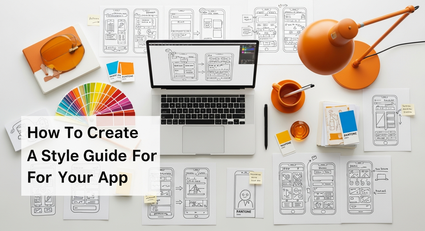
Understanding the Core Purpose of an App Style Guide
At its heart, an app style guide is a comprehensive set of standards that governs the design and development of your application. Think of it as the ultimate source of truth for all visual and interactive elements, a living document that outlines everything from typography and color palettes to iconography, component states, and even the voice and tone of your copy. Its primary purpose is to ensure absolute consistency across every screen, every feature, and every interaction within your app.
Why is this level of consistency so critical? For starters, it directly impacts the user experience. A user encountering a coherent and predictable interface feels more comfortable, confident, and in control. When buttons always look and behave the same way, when text styles are consistent, and when visual cues are familiar, users can navigate and interact with your app intuitively. This seamless experience is a cornerstone of good UX design, and a robust style guide is instrumental in achieving it. Without one, designers might inadvertently introduce variations, and developers might interpret specifications differently, leading to a fragmented and potentially frustrating user journey. This is where the principles of What Is UX Design And Why It Matters truly come to life; a style guide is a practical application of those principles, ensuring that the user’s journey is smooth, logical, and enjoyable.
Beyond user experience, a style guide offers immense benefits to your development team. It acts as a shared language, streamlining communication between designers, developers, product managers, and even marketing teams. Instead of constantly asking for clarification on button styles or color codes, everyone can refer to a single, authoritative document. This drastically reduces design debt, prevents costly errors, and accelerates the development process. New team members can onboard faster, understanding the established design patterns and brand guidelines from day one. It fosters efficiency, allowing designers to focus on innovation rather than recreating existing elements, and developers to build with confidence, knowing that the components they implement are precisely as intended.
Furthermore, a well-defined style guide reinforces your brand identity. Your app is often a primary touchpoint for your brand in the digital realm. Every visual element contributes to how users perceive your brand – its personality, professionalism, and trustworthiness. A consistent style guide ensures that your app always presents a unified, recognizable, and strong brand image. It’s not just about looking good; it’s about building recognition, fostering loyalty, and differentiating your app in a crowded marketplace. In essence, an app style guide is not a luxury; it’s a fundamental necessity for any team committed to building a high-quality, user-centric, and scalable digital product in 2026 and beyond.
Pre-Requisites and Discovery: Laying the Foundation

Before you even think about picking colors or choosing fonts, the most crucial step in creating an effective app style guide is thorough preparation and discovery. This foundational phase ensures that your style guide isn’t just aesthetically pleasing but is deeply rooted in your app’s purpose, your brand’s essence, and your users’ needs. Skipping this step is akin to building a house without a solid foundation – it might look good initially, but it won’t stand the test of time or pressure.
Understanding Your Brand Identity
Your app style guide must be a direct extension of your overarching brand identity. This means having a crystal-clear understanding of your brand’s mission, vision, values, and personality. Ask yourself:
- What is our brand’s core message?
- What emotions do we want to evoke in our users?
- Is our brand playful, serious, innovative, traditional, luxurious, accessible?
- What are our brand’s unique selling propositions?
These questions will inform every design decision, from the choice of typography to the tone of voice in your microcopy. If your brand is known for being bold and innovative, your app’s design should reflect that with modern fonts and vibrant colors. If it’s about trust and security, a more subdued, professional aesthetic might be appropriate. Ensure you have existing brand guidelines (logo usage, primary colors, etc.) that your app style guide can build upon and expand for the digital context.
Defining Your Target Audience
Who are you building this app for? Understanding your target audience is paramount. Their demographics, psychographics, technological proficiency, and even their cultural background will heavily influence design choices.
- What are their needs, goals, and pain points when using an app like yours?
- What devices do they primarily use? (Mobile, tablet, desktop)
- What are their visual preferences?
- Are there any accessibility considerations crucial for this audience?
Creating user personas can be incredibly helpful here. A style guide for a gaming app targeting teenagers will look vastly different from one for a financial management tool aimed at business professionals. Design decisions should always be user-centric, ensuring the guide facilitates an experience tailored to those who will actually use the app.
Clarifying App Goals and Functionality
What is the primary objective of your app? Is it to increase sales, streamline a process, provide information, or foster community? The app’s core functionality and overarching goals will dictate the hierarchy of information and the prominence of certain UI elements. This ties directly into Information Architecture Explained; a style guide provides the visual and interactive language for the structure defined by your information architecture. If your IA prioritizes quick access to certain features, your style guide should ensure those elements are visually distinct and easily discoverable. Consider:
- What are the most critical user flows?
- Which features are essential, and which are secondary?
- What platforms will the app be available on (iOS, Android, web)? This will influence platform-specific guidelines.
Research and Inspiration
While your style guide should be unique to your brand, it’s wise to conduct competitive analysis and draw inspiration from successful apps within your industry or even unrelated ones.
- What are industry best practices for app design?
- Are there common design patterns that users expect?
- What are your competitors doing well, and where do they fall short in terms of design consistency and user experience?
- Explore design trends, but be cautious about following fads that might quickly become outdated.
This research helps you identify opportunities, avoid common pitfalls, and ensure your style guide is both modern and effective. By meticulously laying this groundwork, you create a robust framework upon which your entire app’s visual and interactive identity can be built, ensuring it is purposeful, user-friendly, and distinctly yours.
Key Components of a Comprehensive App Style Guide
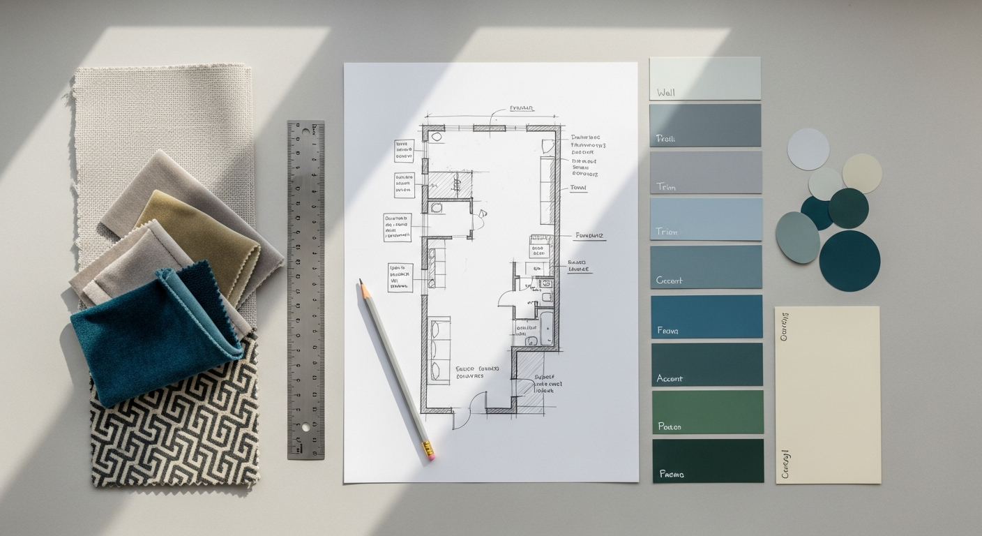
Colors
Color is one of the most powerful tools in design, conveying emotion, hierarchy, and brand identity. Your style guide must meticulously define your color palette:
- Primary Colors: Your main brand colors, used most frequently.
- Secondary Colors: Complementary colors that expand the palette without overshadowing primary colors.
- Accent Colors: Used sparingly to draw attention to key actions or information (e.g., call-to-action buttons).
- Semantic Colors: Colors with specific meanings (e.g., red for error, green for success, yellow for warning, blue for informational).
- Neutral Colors: Grays, whites, and blacks for backgrounds, text, and borders.
- Usage Guidelines: Specify hex codes, RGB values, HSL values, and sometimes even CMYK for print (though less common for apps). Define contrast ratios for accessibility, especially for text and interactive elements, ensuring compliance with WCAG standards.
- Gradients: If used, define direction, colors, and specific stop points.
Typography
Typography defines the readability and tone of your app’s text. This section is critical for legibility and visual hierarchy.
- Font Families: Primary and secondary fonts, specifying weights (e.g., Light, Regular, Semi-bold, Bold).
- Font Sizes: Define a scale for headings (H1, H2, H3, H4, H5, H6), body text (large, medium, small), captions, and button labels. Specify sizes in pixels (px), rems, or ems for responsiveness.
- Line Height (Leading): Guidelines for optimal readability, especially for body text.
- Letter Spacing (Kerning): Adjustments for specific font sizes or headings.
- Text Styles: Examples of how different text elements should appear (e.g., disabled text, link text, placeholder text).
- Usage Rules: When to use specific fonts and sizes, ensuring a consistent visual hierarchy across the app.
Iconography
Icons are powerful visual shortcuts that enhance usability.
- Icon Set: Define the complete library of icons used within the app.
- Style: Are they outline, filled, glyph, or duotone? Ensure a consistent aesthetic (e.g., corner radius, line weight).
- Sizes: Standard sizes for different contexts (e.g., navigation, buttons, lists).
- Colors: How icons should be colored in various states (default, hover, active, disabled).
- Usage Guidelines: When to use specific icons, clear space requirements, and accessibility considerations (alt text for screen readers).
Imagery & Illustrations
Visual assets like photos and illustrations contribute significantly to the app’s personality.
- Tone & Style: Define the desired mood (e.g., realistic, abstract, whimsical, corporate).
- Subject Matter: Guidelines on appropriate content.
- Color Palette: How imagery should align with the app’s color scheme.
- Cropping & Sizing: Rules for maintaining consistency.
- Accessibility: Requirements for descriptive alt text for all meaningful images.
- Illustration Style: If custom illustrations are used, define their aesthetic, line weight, color usage, and overall feel.
Logo Usage
Even though it’s often covered in broader brand guidelines, specific rules for app environments are crucial.
- Variations: Approved logo versions (full, icon-only, dark/light backgrounds).
- Clear Space: Minimum space around the logo.
- Minimum Size: Smallest acceptable size.
- Placement: Preferred locations within the app (e.g., header, loading screens).
Components & UI Elements
This is where the style guide truly shines, detailing every reusable interface element.
- Buttons: Primary, secondary, tertiary, ghost, icon-only. Define states (default, hover, active, focused, disabled, loading). Specify typography, padding, corner radius, and colors for each state.
- Forms: Input fields (text, number, password, email), text areas, checkboxes, radio buttons, toggles, dropdowns. Define states (default, focused, error, success, disabled) and associated helper text styles.
- Navigation: Tab bars, bottom navigation, side drawers, headers. Define structure, iconography, text styles, and active states.
- Cards & Modals: Structure, padding, shadows, border radius, header/body/footer styles.
- Alerts & Toasts: Visual style, placement, duration, and messaging for notifications.
- Loaders & Spinners: Animation style, size, and color.
- Empty States: Design for screens with no content, including illustrations and microcopy.
Spacing & Layout
Consistency in spacing ensures visual harmony and readability.
- Grid System: Define columns, gutters, and margins for responsive design.
- Spacing Scale: A predefined set of values for padding and margins (e.g., 4px, 8px, 16px, 24px, 32px). This prevents arbitrary spacing.
- Alignment: Rules for aligning elements horizontally and vertically.
- Responsiveness: How layouts adapt to different screen sizes and orientations.
Voice & Tone
How your app communicates with users is as important as how it looks.
- Brand Personality: Is it friendly, formal, witty, empathetic?
- Key Principles: (e.g., concise, clear, human, actionable).
- Vocabulary: Specific terms to use or avoid.
- Examples: Microcopy for error messages, success confirmations, onboarding flows, empty states.
Accessibility Guidelines
Ensuring your app is usable by everyone is not just good practice, it’s often a legal requirement.
- Contrast Ratios: Minimum ratios for text and interactive elements.
- Text Alternatives: Guidelines for alt text on images, ARIA labels for interactive components.
- Keyboard Navigation: Focus states and tab order.
- Touch Target Sizes: Minimum sizes for interactive elements.
- Color Blindness Considerations: Avoiding reliance solely on color to convey information.
Animation & Motion
Subtle animations can enhance the user experience and provide feedback.
- Principles: (e.g., purposeful, subtle, fast).
- Durations: Standard timings for transitions, fades, and micro-interactions.
- Easing: Types of easing curves (e.g., ease-in, ease-out, linear).
- Examples: Loading animations, screen transitions, button feedback.
By meticulously documenting each of these components, your app style guide becomes an invaluable resource, ensuring a cohesive, professional, and user-friendly experience across your entire application.
The Process of Creation and Implementation

Creating an app style guide isn’t a one-time event; it’s a process that requires collaboration, iteration, and strategic implementation. Getting it right ensures that the guide is not just a document, but a living, breathing asset that genuinely benefits your team and product.
Choosing the Right Tools
The tools you use will significantly impact the efficiency and accessibility of your style guide. Modern design tools offer features specifically for creating and managing design systems:
- Design Software: Tools like Figma, Sketch, and Adobe XD are excellent for creating UI components, defining styles, and sharing libraries. Figma, in particular, excels in collaborative environments and offers robust design system capabilities.
- Documentation Platforms: Dedicated platforms like Storybook, Zeplin, or zeroheight help bridge the gap between design and development by documenting components, providing code snippets, and ensuring all assets are easily accessible. Even a well-structured Confluence or Notion page can serve the purpose for smaller teams.
- Version Control: For code-based style guides or design tokens, Git is essential for tracking changes and managing different versions.
The key is to select tools that integrate well with your existing workflow and facilitate seamless collaboration between designers and developers.
A Phased and Iterative Approach
Don’t try to build the entire style guide in one go. It’s often more effective to adopt a phased and iterative approach:
- Start Simple: Begin with the most fundamental elements: colors, typography, and perhaps core buttons. These are the building blocks.
- Build as You Go: As new features are designed and developed, identify reusable components and patterns. Document them in the style guide. This organic growth ensures the guide remains relevant and practical.
- Prioritize: Focus on the elements that are most frequently used or are causing the most inconsistency issues first.
- Iterate and Refine: Style guides are living documents. Be prepared to revisit, refine, and update sections as your app evolves, new design trends emerge, or user feedback highlights areas for improvement.
Fostering Collaboration and Buy-In
A style guide is only effective if everyone on the team uses it. This requires active collaboration and securing buy-in from all stakeholders:
- Involve Developers Early: Developers are crucial users of the style guide. Involve them in the creation process to ensure feasibility, understand technical constraints, and get their input on component structure and naming conventions. This also helps in creating design tokens that can be directly consumed by code.
- Engage Product Managers: Product managers need to understand the value of the style guide for consistency, efficiency, and brand representation. Their support is vital for allocating resources and prioritizing style guide maintenance.
- Cross-Functional Workshops: Host workshops where designers, developers, and product managers can review components, discuss usage, and provide feedback. This builds a shared sense of ownership.
- Educate and Communicate: Clearly communicate the purpose, benefits, and how-to of the style guide. Regular updates and reminders can help reinforce its importance.
Documentation and Accessibility
The style guide itself must be well-documented and easily accessible:
- Clear Structure: Organize content logically with clear headings and a table of contents.
- Visual Examples: Show rather than just tell. Include clear examples of components, their states, and correct/incorrect usage.
- Code Snippets: For developers, providing code snippets (e.g., CSS, React components) alongside design specifications is incredibly helpful.
- Searchable: Ensure the guide is easily searchable so team members can quickly find the information they need.
- Centralized Location: Host the style guide in a readily accessible location (e.g., an internal wiki, a dedicated design system platform, or a shared cloud drive).
Version Control and Maintenance
A style guide is not static. It needs a strategy for ongoing maintenance:
- Version Naming: Implement a clear versioning system (e.g., v1.0, v1.1).
- Change Log: Maintain a log of all changes, additions, and deprecations, including dates and who made the changes.
- Design System Manager: Consider designating a “design system manager” or a small team responsible for curating, updating, and advocating for the style guide.
- Regular Reviews: Schedule periodic reviews (e.g., quarterly or biannually in 2026) to assess the guide’s relevance, identify outdated components, and incorporate new patterns or technologies.
By following these steps, you can create and implement an app style guide that is not only comprehensive but also practical, usable, and truly integrated into your product development workflow.
Maintaining and Evolving Your Style Guide
A common misconception about style guides is that once they are created, the work is done. In reality, a style guide is a living document, a dynamic asset that must adapt and evolve alongside your app, your brand, and the ever-changing digital landscape. Stagnation is the enemy of effectiveness; a static style guide quickly becomes outdated, irrelevant, and ultimately, unused. Proactive maintenance and continuous evolution are key to its long-term success.
Embrace It as a Living Document
The first step in effective maintenance is to shift your mindset: view your style guide not as a finished product, but as an ongoing project. Your app will introduce new features, your brand might subtly shift its messaging, and new platforms or technologies could emerge. Each of these changes will inevitably impact your design language. A living style guide is one that is regularly revisited, updated, and refined to reflect these realities.
Establish a Review Cadence
To ensure your style guide remains current and relevant, establish a regular review cadence. This could be quarterly, biannually, or annually, depending on the pace of your product development and the size of your team. For instance, planning a comprehensive review in late 2026 allows you to reflect on design trends, user feedback, and internal team needs from the past year. During these reviews, consider:
- Are all documented components still in use?
- Are there new components or patterns that have emerged organically that need to be formalized?
- Are there any inconsistencies that have crept into the app despite the guide?
- Does the guide still align with the latest brand guidelines?
- Are there any accessibility updates or new industry standards that need to be incorporated?
Implement a Clear Feedback Loop
Your team members are the primary users of the style guide, and their feedback is invaluable. Create an easy and accessible way for designers, developers, and product managers to submit suggestions, point out ambiguities, or flag inconsistencies. This could be a dedicated Slack channel, a form, or even specific commenting features within your design system tool.
- Regular Syncs: Hold regular meetings with key stakeholders to discuss proposed changes and gather collective input.
- Design Critiques: Use design critique sessions not just for individual features, but also to identify opportunities to improve the style guide itself.
- Developer Input: Developers often identify practical challenges or opportunities for optimization within the code-level components of a design system. Their input is crucial for maintaining a truly functional style guide.
Handling New Features and Platform Changes
New features are a constant in app development. When designing a new feature, designers should first check if existing components or patterns can be reused or adapted from the style guide. If a truly new component is required, it should be designed with the intention of being added to the style guide, complete with all its states and usage guidelines. Similarly, if your app expands to a new platform (e.g., from iOS to Android, or introducing a web version), your style guide will need to adapt to accommodate platform-specific conventions while maintaining core brand consistency.
Measuring Impact and Demonstrating Value
To secure ongoing support and resources for maintaining your style guide, it’s helpful to demonstrate its value. While some benefits (like faster onboarding) are qualitative, others can be measured:
- Design-to-Development Handoff Time: Track how much faster it becomes.
- Number of UI Bugs Related to Inconsistency: Aim for a reduction.
- Time Saved in Design & Development: Estimate time saved by reusing components.
- User Feedback: Monitor user comments related to app usability and consistency.
By actively maintaining, evolving, and demonstrating the value of your app style guide, you ensure it remains a powerful tool that drives efficiency, consistency, and an exceptional user experience, underpinning the success of your digital product for years to come.
Beyond the App: Extending Your Brand’s Visual Language
While the primary focus of this article is on creating a style guide for your app, it’s important to recognize that a well-crafted app style guide rarely exists in isolation. It’s often a crucial component of a larger, more encompassing design system that dictates your brand’s visual and interactive language across all touchpoints. Thinking beyond the app allows you to leverage the effort invested in your app style guide to create a truly unified and powerful brand presence.
A Cohesive Brand Ecosystem
Your app is just one part of your brand’s ecosystem. Users interact with your brand through a myriad of channels: your website, social media profiles, marketing emails, print materials, physical products, and customer support interfaces. When the design language is consistent across all these touchpoints, it creates a seamless and trustworthy experience for the user. A strong app style guide can serve as a blueprint, providing the core principles and specific components that can be adapted for other platforms.
For example, the color palette, typography hierarchy, and even the iconography defined in your app style guide can be directly applied to your website design, ensuring visual harmony. The voice and tone guidelines crafted for your app’s microcopy can inform the language used in your email marketing campaigns or customer service scripts. This holistic approach strengthens brand recognition and reinforces your brand’s identity every time a user encounters it, regardless of the medium.
Informing Other Digital Assets
Consider how your app style guide can inform the creation of other critical digital assets:
- Website Design: Many app components (buttons, forms, navigation patterns) can be directly translated or adapted for your website, creating a unified user experience between your app and web presence.
- Email Templates: The color scheme, font choices, and image style from your app can be used to design consistent and on-brand email marketing templates.
- Marketing Materials: Digital ads, banners, and promotional content can adopt the visual style, imagery, and messaging defined in your app guide.
- Presentations: Internal and external presentations can utilize the same font pairings, color emphasis, and graphical elements to maintain a professional brand image.
This synergy not only enhances brand consistency but also creates significant efficiencies. Once a design language is established for the app, it becomes much faster and easier to design other assets because the core decisions have already been made.
The Link to Social Media Graphics Design
A particularly strong connection exists between your app style guide and your Social Media Graphics Design Guide. Social media platforms are often where potential users first discover your app or where existing users engage with your brand outside the app itself. The graphics you post on platforms like Instagram, Facebook, LinkedIn, or X (formerly Twitter) should immediately be recognizable as belonging to your brand.
- Visual Identity: The color palette, font styles, and illustration/photography guidelines from your app style guide should directly influence your social media graphics. This ensures that when someone sees an ad or a post from your brand, there’s an instant visual connection to your app.
- Iconography: If your app uses a distinct icon style, consider incorporating similar iconography into your social media visuals for brand reinforcement.
- Voice and Tone: The established voice and tone for your app’s communication should extend to your social media captions and interactions, creating a consistent brand personality.
By ensuring your social media presence mirrors the aesthetic and personality of your app, you create a seamless brand experience that builds trust and recognition. It helps potential users easily identify your app in the app store after seeing a compelling social media graphic, and it reinforces brand loyalty for existing users.
In conclusion, while an app style guide is a powerful tool for consistency and efficiency within your application, its true potential is unlocked when it’s viewed as a foundational element of your broader brand design system. By extending its principles and components to other digital and even physical touchpoints, you create a cohesive, recognizable, and impactful brand presence that resonates with users across every interaction. This holistic approach is not just about aesthetics; it’s about building a strong, unified brand identity that stands out in the competitive digital landscape of 2026 and beyond.
Frequently Asked Questions
Recommended Resources
For more on how to create, see How To Back Up Your Computer Data on Bookmark Sharer.
Explore How To Scale Your Startup Fast for additional insights.