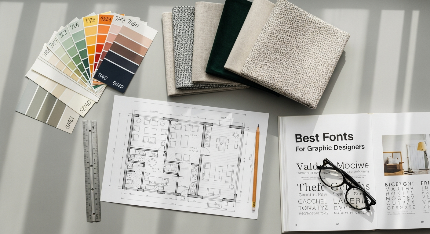
The Evolving Landscape of Typography in 2026: Beyond Aesthetics
The year 2026 heralds a new era for typography, where the lines between art and functionality are increasingly blurred. Graphic designers are no longer merely selecting fonts based on their visual appeal; they are making strategic choices that impact user interaction, brand perception, and overall digital accessibility. The shift towards a more holistic design approach means that understanding the underlying principles of user experience (UX) is paramount.
One of the most critical considerations for graphic designers in 2026 is What Is UX Design And Why It Matters. Typography is a cornerstone of UX. A well-chosen font enhances readability, guides the user’s eye, and establishes an intuitive hierarchy of information. Conversely, poor font choices can lead to frustration, misinterpretation, and a premature exit from a website or application. Designers must evaluate fonts not just for their beauty, but for their ability to contribute to a seamless and enjoyable user journey. This includes assessing factors like legibility at various sizes, character distinctiveness, and the overall rhythm of text blocks.
The digital-first imperative continues its dominance, pushing fonts to perform optimally across an unprecedented array of devices and screen resolutions. Responsive typography, once a niche concern, is now a standard expectation. Designers are increasingly looking for font families that offer extensive weights and styles, allowing for granular control over visual density and emphasis, ensuring text remains clear and impactful whether viewed on a smartwatch or a large desktop monitor. This adaptability is crucial for maintaining brand consistency and message clarity across diverse touchpoints.
Accessibility is another non-negotiable aspect of modern typographic selection. In 2026, compliance with WCAG (Web Content Accessibility Guidelines) is no longer just a legal requirement but a moral and ethical imperative for inclusive design. This means prioritizing fonts with clear, open counters, appropriate x-heights, and sufficient contrast ratios. Designers are actively seeking typefaces that minimize visual fatigue and cater to users with various visual impairments, ensuring that content is universally accessible. The thoughtful application of accessible typography not only broadens reach but also enhances the overall quality and professionalism of a design.
Furthermore, brand storytelling through typography has become more sophisticated. Fonts are powerful conveyors of brand personality, capable of evoking trustworthiness, innovation, playfulness, or authority. In 2026, brands are investing heavily in unique typographic identities, often commissioning custom typefaces or making very specific choices from a curated selection to stand out in a crowded marketplace. The goal is to create an immediate, visceral connection with the audience, reinforcing brand values through every letterform. As graphic designers, our role is to select fonts that not only look good but actively contribute to the brand’s narrative, making every word a part of a larger, compelling story.
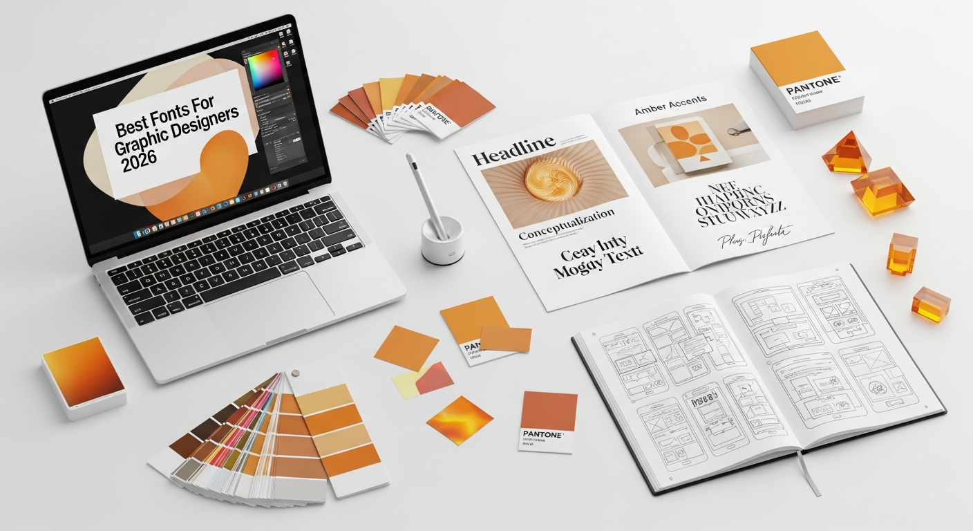
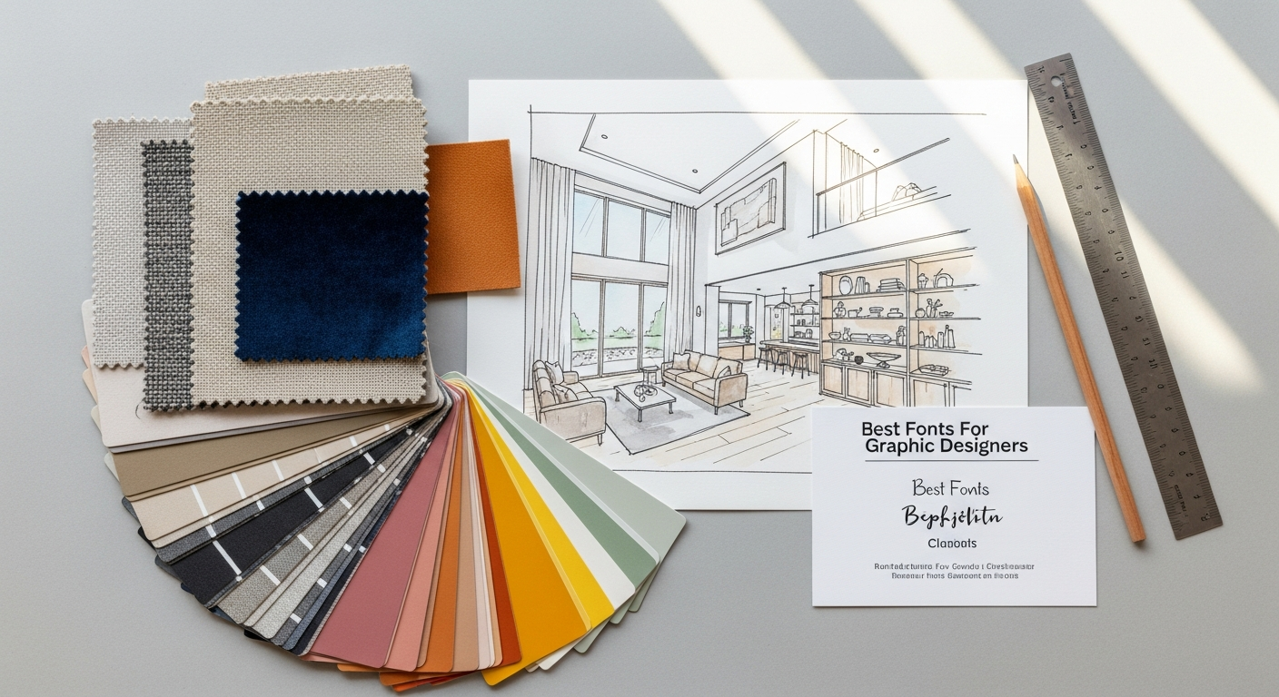
Key Considerations When Choosing Fonts for Graphic Design in 2026
Selecting the perfect font goes far beyond personal preference; it’s a strategic decision rooted in understanding context, audience, and purpose. In 2026, with the sheer volume of available typefaces, a systematic approach is essential for graphic designers to make informed choices that elevate their work.
Firstly, Legibility and Readability are paramount. While often used interchangeably, they refer to distinct qualities. Legibility is about how easily individual characters can be distinguished from each other (e.g., distinguishing ‘I’ from ‘l’ or ‘0’ from ‘O’). Readability, on the other hand, refers to how easily blocks of text can be read and understood. A font might be legible, but if its letter spacing is too tight or its lines too long, it can be tiresome to read. For body text, prioritizing high legibility and readability is crucial for effective communication and a positive user experience. This directly ties into the principles of What Is UX Design And Why It Matters, where the ease of consuming information is a direct measure of design success.
Secondly, consider the Brand Identity and Message. Every font carries an inherent personality. A sophisticated serif might convey tradition and authority, while a minimalist sans-serif could suggest modernity and efficiency. A playful script font might be perfect for a children’s brand but entirely inappropriate for a financial institution. Your font choice must align seamlessly with the brand’s core values, target audience, and the message you wish to convey. It’s about creating a visual voice that resonates authentically with the brand’s essence.
Thirdly, Versatility and Scalability are increasingly important. A comprehensive font family with a wide range of weights (light, regular, medium, bold, black), styles (italic, condensed, extended), and even variable font capabilities offers immense flexibility. This allows designers to maintain typographic consistency across different applications – from headlines and subheadings to body text and captions – while still providing enough contrast and hierarchy. Furthermore, fonts need to render beautifully and consistently at various sizes, from tiny footnotes to large-scale billboard graphics, without losing their integrity or legibility.
Fourthly, Licensing and Usage Rights cannot be overlooked. Before committing to a font, always verify its licensing terms. Free fonts often come with restrictions on commercial use, while paid licenses can vary widely depending on the number of users, web usage (page views), app embedding, and print circulation. Ignoring licensing can lead to legal complications and unexpected costs. Always budget for appropriate font licenses as part of your project expenses.
Fifthly, the Technical Performance of a font matters, especially in digital environments. Factors like file size can impact website loading times, which in turn affects user experience and SEO. Well-optimized web fonts are crucial. Additionally, ensure the font supports all necessary characters, including extended Latin, Cyrillic, or other language sets, as well as special symbols and ligatures, especially for global brands or multilingual projects.
Finally, the principle of How To Conduct A Heuristic Evaluation can be applied to font selection itself. When evaluating potential typefaces, consider “visibility of system status” (does the font clearly indicate hierarchy?), “match between system and the real world” (does it align with user expectations for the content type?), “consistency and standards” (does it work well with other design elements and brand guidelines?), and “aesthetic and minimalist design” (is it clean and uncluttered?). By critically assessing fonts through a usability lens, designers can identify potential issues early and ensure their choices contribute to an overall harmonious and effective design. This rigorous evaluation process ensures that typographic selections are not just aesthetically pleasing but also functionally robust and user-centric.
Top Serif Fonts Poised for Dominance in 2026
1. Playfair Display Pro
Playfair Display Pro remains a powerhouse in the serif category, and for good reason. Its high contrast and delicate hairlines, inspired by the letterforms of the late 18th century, give it a luxurious and elegant feel. In 2026, its expanded character set and variable font capabilities (in its Pro version) make it incredibly adaptable. It excels in headlines, titles, and short bursts of text where impact and style are paramount. While not typically recommended for extensive body copy due to its high contrast, it pairs beautifully with clean sans-serifs like Montserrat or Lato for body text. Its refined aesthetic makes it a top choice for fashion brands, editorial layouts, and high-end product packaging. The deliberate strokes and graceful curves of Playfair Display Pro command attention, signifying quality and an appreciation for detail.
2. Lora
Lora strikes a perfect balance between classic elegance and contemporary readability. It’s a well-balanced contemporary serif with roots in calligraphy, making it feel organic and warm. Its moderate contrast and robust construction ensure excellent readability across various sizes, making it suitable for both headlines and longer body text. In 2026, Lora is favored for its versatility in digital environments, offering a friendly yet authoritative voice. It’s an excellent choice for blogs, content-heavy websites, and book design, where sustained reading comfort is essential. Lora’s ability to adapt to different contexts while maintaining its distinct personality positions it as a go-to serif for designers seeking both beauty and functionality. Its subtle serifs and gentle curves create an inviting reading experience, embodying a sense of gentle sophistication that appeals to a broad audience.
3. Merriweather
Designed specifically for screens, Merriweather is a remarkably readable serif font that continues its reign in 2026. Its large x-height, condensed letterforms, and strong serifs contribute to its clarity and robustness, even at smaller sizes. Merriweather is known for its open counters and slightly robust stroke, which aids in legibility on digital displays. It’s a workhorse font ideal for extensive body copy, news websites, and any application where long-form reading is anticipated. Its slightly traditional yet modern appearance makes it a safe and effective choice for a wide range of projects, from corporate communications to personal blogs. The solid construction of Merriweather provides a sense of stability and reliability, making it an ideal choice for conveying serious or informational content without appearing overly formal or stuffy.
4. EB Garamond
A digital revival of Claude Garamond’s timeless typefaces, EB Garamond brings historical elegance to modern design. In 2026, its popularity stems from its unparalleled classicism, beautiful proportions, and exquisite detailing. It’s a font that breathes sophistication and tradition, making it perfect for luxury branding, academic publications, and any design requiring a touch of refined heritage. While it exudes formality, its careful digital rendering ensures it remains highly readable for body text, especially in print or high-resolution digital media. Designers often pair EB Garamond with minimalist sans-serifs to create a striking contrast that feels both classic and contemporary. Its graceful curves and precise serifs evoke a sense of history and gravitas, lending an air of intellectual authority and timeless beauty to any design project.
5. Cormorant Garamond
For those seeking the elegance of Garamond with a slightly more contemporary feel and a wider range of weights, Cormorant Garamond is an excellent choice. This open-source font family offers a beautiful balance of classic proportions and modern refinement, making it incredibly versatile. Its delicate serifs and elegant curves lend themselves well to headlines, body text, and even display use when appropriately scaled. In 2026, its comprehensive family (including display, italic, and bold options) allows designers to achieve sophisticated typographic hierarchies. It’s a go-to for editorial design, wedding invitations, and branding that aims for an upscale yet approachable aesthetic. Cormorant Garamond provides a harmonious blend of tradition and accessibility, proving that classic forms can thrive in modern contexts. Its refined aesthetic and multiple weights allow for intricate typographic compositions that are both elegant and highly functional.
Leading Sans-Serif Fonts for Modern Design in 2026
Sans-serif fonts, characterized by their lack of decorative serifs, continue to be the backbone of modern graphic design. Valued for their clean lines, versatility, and exceptional readability, especially on digital screens, sans-serifs are indispensable for conveying clarity, efficiency, and a contemporary aesthetic. In 2026, the best sans-serifs offer extensive families, robust hinting, and an inherent ability to adapt to diverse design needs.
1. Inter
Designed specifically for user interfaces, Inter has rapidly ascended to become one of the most beloved sans-serifs, a trend that will only strengthen in 2026. Its meticulous design focuses on optimal legibility at small sizes and across various screen resolutions. Inter features a tall x-height, clear differentiation between similar characters (like ‘I’ and ‘l’), and a comprehensive range of weights and variable font support. This makes it incredibly versatile for web design, app interfaces, and digital product design where clarity and user experience are paramount. Its neutral yet friendly tone also makes it suitable for branding that aims for approachability and modernity. Inter is a prime example of a font where What Is UX Design And Why It Matters is embedded in its very creation, ensuring maximum usability.
2. Montserrat
Inspired by old posters and signs from the traditional Montserrat neighborhood of Buenos Aires, Montserrat exudes urban charm and geometric precision. Its clean, open letterforms make it highly legible, while its extensive family of weights and styles offers immense flexibility. In 2026, Montserrat remains a staple for branding, web design, and print materials that seek a contemporary, approachable, and slightly humanist feel. It pairs wonderfully with high-contrast serifs or stands strong on its own for a minimalist aesthetic. Its wide adoption speaks to its enduring appeal and functional excellence in a variety of design contexts.
3. Poppins
A geometric sans-serif with a warm and inviting personality, Poppins is a fantastic choice for designers in 2026. Derived from pure circles and geometric shapes, it offers a clean, modern look with a touch of playfulness. Poppins is highly readable and comes with a vast array of weights, making it suitable for headlines, body text, and UI elements. Its versatility makes it a popular choice for educational materials, tech startups, and any brand aiming for a friendly, innovative, and accessible image. Its generous spacing and open forms contribute to a comfortable reading experience, even in dense information displays.
4. Lato
Meaning “summer” in Polish, Lato is a semi-rounded, humanist sans-serif that radiates warmth and friendliness while maintaining a professional appearance. Its strong yet approachable character makes it a perennial favorite. In 2026, Lato continues to be a reliable workhorse for corporate communications, web content, and mobile applications. Its range of weights allows for excellent typographic hierarchy, and its well-crafted letterforms ensure legibility across various sizes. Lato’s balance of personality and practicality makes it a go-to for designers who need a dependable and aesthetically pleasing sans-serif for diverse projects.
5. Roboto Flex (Variable Font)
While Roboto has been a long-standing Google favorite, 2026 sees the rise of Roboto Flex, its variable font iteration. This advancement offers designers unprecedented control over typography. Instead of choosing from a fixed set of weights and widths, Roboto Flex allows for continuous adjustment along multiple axes, such as weight, width, optical size, and even grade. This means a single font file can adapt perfectly to any design context, optimizing legibility and aesthetic balance dynamically. Roboto Flex represents the future of responsive design, enabling precise typographic control for branding, complex data visualizations, and highly dynamic digital interfaces. Its technical sophistication makes it a powerful tool for achieving pixel-perfect typography and demonstrating how variable fonts are revolutionizing design workflows.
6. Manrope
Manrope is a modern, geometric sans-serif that embodies clarity and efficiency. With a clean, balanced aesthetic, it’s designed for high readability on screens and boasts a comprehensive set of weights and styles. In 2026, Manrope is gaining traction for its contemporary feel and robust performance in UI design, branding, and editorial layouts. Its slightly wider proportions and open counters ensure legibility, while its geometric foundation gives it a sturdy yet elegant presence. Manrope is an excellent choice for designers looking for a fresh, professional sans-serif that can carry a modern brand identity with confidence and clarity.
Script and Display Fonts Making Waves in 2026
While serifs and sans-serifs form the foundation, script and display fonts are the flourish, the personality, and the attention-grabbers of graphic design. In 2026, these categories are evolving, offering more refined, versatile, and emotionally resonant options. They are crucial for creating impactful headlines, logos, and special design elements where a unique voice is needed. When used judiciously, they can transform a design, injecting it with character and memorability.
1. Tan Paradiso (Display)
Tan Paradiso exemplifies the trend of elegant, high-contrast display fonts. With its striking thin-to-thick strokes and sophisticated curves, it delivers an immediate sense of luxury and artistic flair. In 2026, such fonts are highly sought after for branding that aims for exclusivity, editorial headlines in fashion or lifestyle magazines, and high-impact packaging design. Tan Paradiso is not meant for body text; rather, it shines when given ample space to breathe, allowing its unique letterforms to captivate the viewer. Its bold presence makes it ideal for hero sections on websites or prominent social media graphics where a strong visual statement is key. This is where a Social Media Graphics Design Guide would emphasize the importance of distinct display fonts for immediate brand recognition and message delivery.
2. Bright Script (Script)
Moving away from overly ornate scripts, 2026 favors those that are elegant, legible, and possess a natural flow. Bright Script fits this perfectly. It offers a beautiful, flowing calligraphic style that feels authentic and personal without sacrificing readability. Its versatility comes from its range of ligatures and stylistic alternates, allowing designers to customize its appearance for various applications. It’s an excellent choice for wedding stationery, product branding that evokes handcrafted quality, and elegant invitation designs. Bright Script adds a touch of human warmth and bespoke charm, making a design feel unique and thoughtfully crafted.
3. Space Grotesk (Display/Geometric Sans Hybrid)
While primarily a sans-serif, Space Grotesk often functions as a display font due to its distinctive, slightly condensed, and futuristic aesthetic. Its geometric purity combined with unexpected quirks gives it a unique edge. In 2026, this font is perfect for tech brands, avant-garde editorial designs, and any project that wants to convey innovation, precision, and a modern, slightly edgy vibe. It performs excellently in headlines and short, impactful statements. Its clean lines and robust structure ensure it holds up well in digital contexts, making it a powerful tool for striking visual communication that stands out from the crowd.
4. Fraunces (Variable Display Serif)
Fraunces is a variable display serif that truly showcases the power of contemporary font technology. Inspired by early 20th-century display serifs, it boasts an incredible range of optical sizes, weights, and even a “softness” axis, allowing for unparalleled customizability. In 2026, Fraunces is a designer’s dream for creating highly expressive and dynamic headlines, logos, and branding elements. Its ability to adapt its form precisely for different uses—from sharp and elegant to soft and inviting—makes it incredibly versatile for editorial design, high-end packaging, and sophisticated digital interfaces where nuanced typography is appreciated. Fraunces proves that display serifs can be both historically rich and technologically advanced.
5. Pacifico (Script)
Still a beloved choice in 2026, Pacifico offers a vibrant and friendly brush script aesthetic. Its casual, yet confident, strokes evoke a sense of freedom and fun. It’s often used for projects that require a retro, handcrafted, or laid-back feel – think beach-themed brands, artisanal food packaging, or lively social media campaigns. While not for formal contexts, Pacifico’s consistent popularity lies in its ability to inject immediate personality and approachability into a design. It’s particularly effective in limited text applications like logos, t-shirt designs, or call-to-action buttons where its expressive quality can shine. When considering assets for a Social Media Graphics Design Guide, a font like Pacifico could be highlighted for its ability to quickly convey a specific mood or brand voice with minimal text.
6. DM Serif Display (Display Serif)
For designers seeking a powerful and elegant display serif with a strong personality, DM Serif Display is a standout in 2026. With its high contrast and sharp, sophisticated serifs, it commands attention and imparts a sense of luxury and authority. It draws inspiration from classic transitional serifs but has been optimized for modern digital use. DM Serif Display is perfect for mastheads, prestigious branding, and editorial headlines where a sophisticated and impactful statement is desired. Its clear letterforms and striking appearance ensure that even a single word can convey significant weight and style, making it a valuable asset for designs that need to impress and inform with gravitas.
Embracing Variable Fonts and AI-Powered Typography in 2026
The world of typography is undergoing a quiet revolution, driven by technological advancements that promise unprecedented control and efficiency for graphic designers. In 2026, two significant trends are reshaping how fonts are created, selected, and implemented: Variable Fonts and AI-Powered Typography. These innovations are not just about aesthetics; they are fundamentally changing workflows, enhancing user experience, and pushing the boundaries of what’s typographically possible.
Variable Fonts: The Future of Flexibility
Variable fonts, first introduced with OpenType 1.8, consolidate an entire font family into a single, compact file. Instead of distinct files for regular, bold, italic, condensed, etc., a variable font contains “axes” of variation. These axes can control parameters like weight, width, slant, optical size, and even custom attributes like contrast or serif size. The designer can then smoothly interpolate along these axes, creating an infinite number of typographic styles from a single font file.
The benefits for graphic designers in 2026 are immense:
- Unparalleled Customization: Imagine a font that can precisely match any visual requirement. Need a slightly bolder weight than ‘semi-bold’ but lighter than ‘bold’? A variable font allows for that exact degree of control, enabling hyper-fine-tuned typography.
- Enhanced Responsiveness: For web and UI design, variable fonts are a game-changer. A font’s weight or optical size can be dynamically adjusted based on screen size, user preferences, or even available space, ensuring optimal legibility and aesthetic balance across all devices. This directly contributes to a superior user experience, aligning perfectly with the principles of What Is UX Design And Why It Matters.
- Reduced File Sizes: A single variable font file is often significantly smaller than a collection of separate font files for an entire family. This leads to faster loading times for websites and applications, improving performance and user satisfaction.
- Creative Expression: Designers can use variable fonts for dynamic animations, creating text that subtly changes weight or width in response to user interaction, adding a new layer of engagement and visual interest.
Leading foundries are increasingly releasing new typefaces as variable fonts or updating existing popular families. As seen with Roboto Flex or Fraunces mentioned earlier, these are not just experimental concepts but practical tools already making a significant impact.
AI-Powered Typography: The Intelligent Assistant
Artificial intelligence is beginning to play a transformative role in typography, moving beyond simple font recommendations to more sophisticated applications:
- Automated Font Pairing: AI algorithms can analyze the aesthetic and functional characteristics of fonts, recommending harmonious pairings that might take a human designer hours to discover. This speeds up the ideation phase and suggests creative combinations.
- Intelligent Layout and Hierarchy: AI tools are emerging that can suggest optimal font sizes, line heights, and spacing based on content, target audience, and design constraints. They can even propose typographic hierarchies for complex documents, ensuring clarity and readability. This directly aids in applying the insights from How To Conduct A Heuristic Evaluation, by pre-optimizing layouts for usability and consistency.
- Custom Font Generation: While still in its nascent stages, AI is being used to assist in the creation of entirely new typefaces. Designers can provide initial sketches or parameters, and AI can generate variations, refine curves, and even automate the tedious process of generating an entire character set, dramatically accelerating font development.
- Personalized Typography: Imagine a future where content is delivered with typography customized to an individual user’s reading preferences or visual needs, dynamically adjusting font characteristics for optimal comfort. AI could power such personalized experiences.
For graphic designers in 2026, embracing variable fonts means unlocking a new dimension of typographic control and responsiveness. Integrating AI-powered tools into their workflow offers efficiency gains and opens doors to innovative design solutions, allowing them to focus more on creative vision and less on repetitive tasks. These technologies are not replacing the designer’s eye but augmenting their capabilities, making typography more dynamic, accessible, and intelligently applied than ever before. The intersection of these technologies will redefine how designers approach visual communication, particularly in contexts like digital interfaces and complex data presentations, where precision and adaptability are paramount.
Strategic Application of Typography in 2026: Beyond the Canvas
Choosing the right font is only half the battle; knowing how to strategically apply it across various design contexts is where true mastery lies. In 2026, graphic designers are expected to wield typography as a powerful tool for communication, branding, and user engagement, extending its influence far beyond static print.
For Digital Interfaces and Web Design, typography is inextricably linked to user experience. The legibility and readability of a font directly impact how easily users can navigate a website or app, find information, and complete tasks. Designers must consider font choices that not only align with brand aesthetics but also perform optimally on diverse screens, from mobile phones to large desktops. Variable fonts, as discussed, are revolutionizing this space by allowing dynamic adjustments for optical size and weight, ensuring text remains clear and comfortable to read regardless of screen dimensions. When conducting a How To Conduct A Heuristic Evaluation of a website or app, typographic choices are a major factor in assessing principles like “recognition rather than recall” (clear labels), “consistency and standards” (uniform type hierarchy), and “aesthetic and minimalist design” (uncluttered text presentation). Prioritizing fonts with good hinting and a broad character set ensures universal accessibility and a seamless user journey.
In Branding and Identity Design, fonts are the silent ambassadors of a brand’s personality. A well-chosen typeface can evoke trust, innovation, luxury, or playfulness instantaneously. In 2026, brands are increasingly seeking unique typographic identities, sometimes even commissioning custom typefaces, to stand out in a crowded market. The chosen font family must be versatile enough to work across all brand touchpoints – from logos and marketing materials to packaging and digital ads. Consistency in typography reinforces brand recognition and builds a cohesive visual language, making the brand instantly identifiable and memorable. The strategic selection of a primary and secondary font, along with clear guidelines for their usage, is essential for maintaining this consistency across all brand assets.
For Social Media Graphics, typography plays a critical role in grabbing attention and conveying a message quickly in a highly visual and fast-paced environment. Here, impact and immediate readability are key. Bold display fonts, clear sans-serifs, and expressive scripts (used sparingly) can make a significant difference. A Social Media Graphics Design Guide would emphasize choosing fonts that are legible at small sizes, contrast well with background images, and align with the brand’s voice. Fonts that are too ornate or thin can become unreadable on social feeds. The goal is to create graphics that are not only visually appealing but also communicate their message effectively within seconds, driving engagement and brand recall. Animated text and subtle typographic effects are also gaining traction to add dynamic flair to social content.
In Editorial and Publication Design, both print and digital, typography is about guiding the reader through long-form content. Serifs like Lora or Merriweather excel here, providing comfort and rhythm for extended reading. Establishing a clear typographic hierarchy with distinct styles for headlines, subheadings, body text, captions, and quotes is crucial for readability and information organization. Designers must consider line length, leading (line spacing), and tracking (letter spacing) to create an optimal reading experience. The selection of fonts should enhance the content, making it inviting and easy to digest, rather than distracting from it.
The future of typography in 2026 is about intelligent, purposeful selection and application. It’s about understanding that every typographic choice has a consequence, influencing everything from emotional response to conversion rates. By staying abreast of font trends, embracing new technologies like variable fonts and AI, and rigorously applying principles of UX and heuristic evaluation, graphic designers can ensure their typographic decisions are not just aesthetically pleasing, but strategically powerful, creating designs that truly resonate and perform.
Frequently Asked Questions
Recommended Resources
Learn more about this topic in How To Create A Content Marketing Strategy That Works at Eamped.
Related reading: Remote Work Tips For Beginners (Bookmark Sharer).