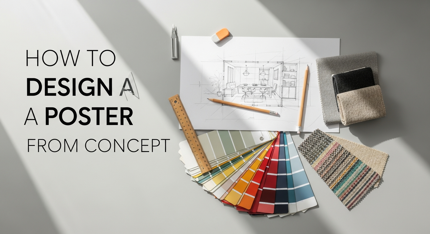
The Foundation: Understanding Your Poster’s Purpose and Audience
Before you even think about opening design software or sketching your first line, the most crucial step in learning how to design a poster from scratch is to establish its core purpose and identify its intended audience. This foundational understanding acts as your compass, guiding every subsequent design decision and ensuring that your final output is not just aesthetically pleasing, but also highly effective.
Defining Your Poster’s Objective
Every poster has a job to do. Is it meant to inform, persuade, entertain, or provoke thought? Clearly articulating this objective will shape your content, tone, and visual approach. For instance, a poster advertising a charity gala will have a different emotional appeal and call to action than one promoting a rock concert or an academic conference. Ask yourself:
- What specific message do I want to convey? Boil it down to a single, concise statement.
- What is the desired outcome or action? Do you want people to buy tickets, visit a website, remember a date, or simply feel inspired?
- What is the overall tone? Is it urgent, celebratory, serious, playful, or elegant?
This clarity prevents your design from becoming a jumbled collection of pretty elements without a cohesive message. It ensures that every component serves the poster’s ultimate goal, making it a true workhorse of visual communication.
Identifying Your Target Audience
Just as an interior designer meticulously considers the lifestyle and preferences of a homeowner, a poster designer must deeply understand the people who will be viewing their work. Your audience dictates the visual language you employ, the complexity of your message, and even the channels through which your poster will be displayed. This is where the principles of user experience (UX) design become incredibly relevant. Understanding What Is UX Design And Why It Matters extends beyond digital interfaces; it’s about designing an experience that is intuitive, engaging, and effective for the end-user – in this case, the poster viewer.
Consider the following demographic and psychographic factors:
- Age Group: Different age groups respond to different aesthetics, typography, and imagery. A poster for teenagers will likely be vibrant and edgy, while one for an older demographic might prioritize readability and classic elegance.
- Interests and Values: What resonates with your audience? Are they environmentally conscious, tech-savvy, art enthusiasts, or budget-focused? Tapping into their values creates an immediate connection.
- Cultural Background: Be mindful of cultural sensitivities regarding colors, symbols, and imagery to avoid misinterpretations or unintended offense.
- Prior Knowledge: How much does your audience already know about the topic? This helps determine how much background information you need to include versus what can be implied.
- Viewing Environment: Will the poster be seen up close in a gallery, from a distance on a busy street, or as a digital graphic on a small screen? This impacts font size, contrast, and overall visual density.
By putting yourself in your audience’s shoes, you can design a poster that speaks directly to them, captures their attention amidst visual clutter, and encourages them to engage with your message. This empathetic approach is the cornerstone of effective design, ensuring your poster doesn’t just look good, but also performs its intended function brilliantly.
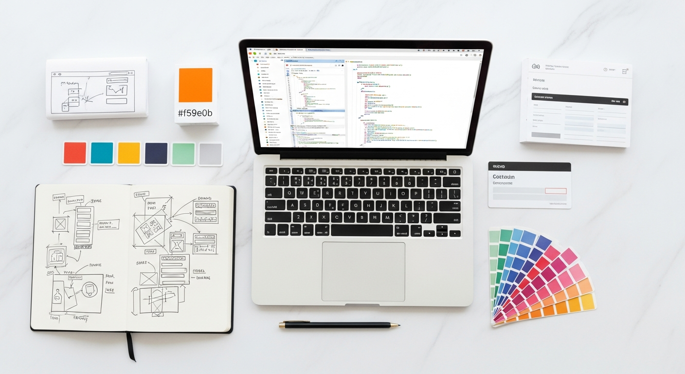
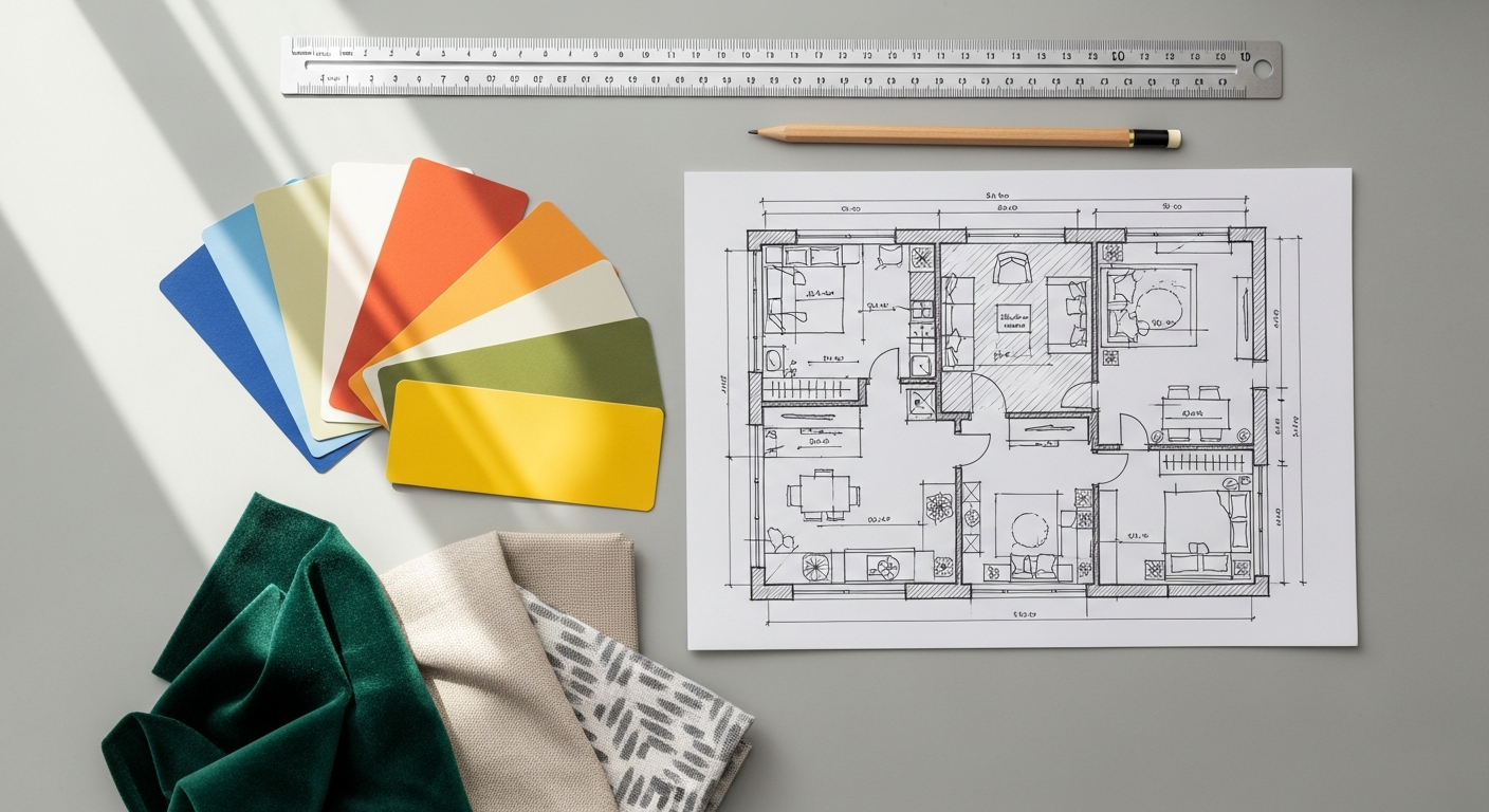
Gathering Inspiration and Crafting Your Concept
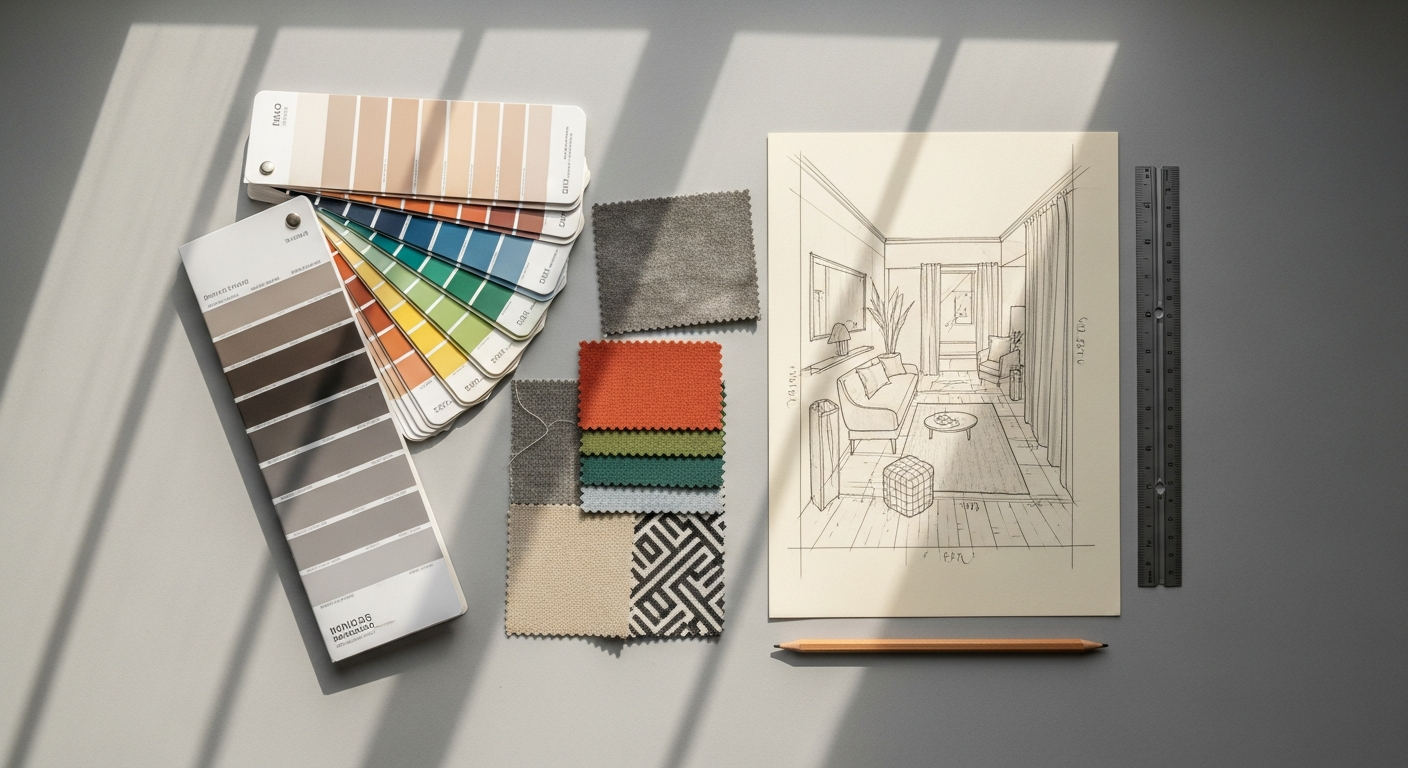
Once you have a crystal-clear understanding of your poster’s purpose and its intended audience, the exciting journey of creative exploration begins. This phase is about brainstorming, researching, and allowing ideas to coalesce into a unique and compelling concept. It’s a blend of structured methodology and free-form creativity, essential for anyone learning how to design a poster from scratch.
Brainstorming and Researching Visuals
Every great design starts with a spark, but that spark often needs kindling. Begin by immersing yourself in a wide range of visual stimuli. Don’t limit yourself to just other posters; look at album covers, magazine layouts, advertisements, art installations, architectural details, and even interior design trends. The goal here is not to copy, but to build a rich mental library of styles, compositions, color palettes, and typographic treatments that you can draw upon.
- Mind Mapping: Start with your core message or keyword and branch out with related ideas, emotions, colors, symbols, and imagery. This helps uncover unexpected connections.
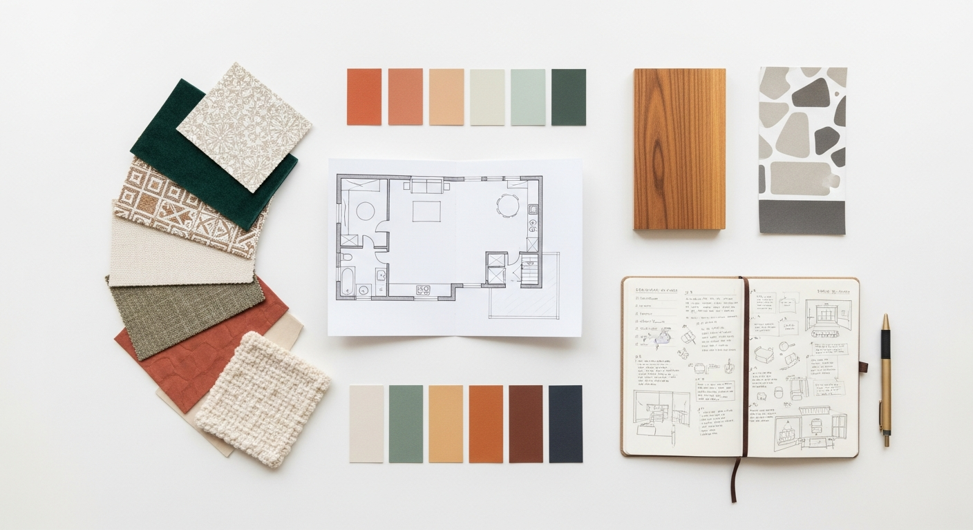
- Mood Boards: Collect images, textures, color swatches, and typography samples that evoke the desired feeling and aesthetic for your poster. Digital tools like Pinterest or physical boards can be incredibly effective for this. A mood board helps establish a cohesive visual language early on.
- Competitor Analysis: Look at what similar posters in your niche are doing. What works well? What falls flat? How can your poster stand out and offer a fresh perspective?
- Design Trends: While it’s important not to be enslaved by trends, being aware of current design aesthetics can inform your choices and keep your poster feeling contemporary. For instance, in 2026, we might see continued emphasis on organic shapes, bold gradients, or nostalgic retrofuturism.
During this research phase, pay close attention to how different designers use visual hierarchy to guide the viewer’s eye, how color impacts mood, and how typography communicates personality. This observation will refine your own visual vocabulary.
Developing a Unique Concept and Message
With a wealth of inspiration at your fingertips, it’s time to distill your findings into a distinct concept. A concept is the underlying idea or narrative that ties all your design elements together. It’s the “big idea” that makes your poster memorable and impactful.
- Identify Your Unique Selling Proposition (USP): What makes your event, product, or message different or special? How can this be visually represented?
- Storytelling: Even a static poster can tell a story. What narrative can you weave through your imagery, text, and overall composition? A compelling story creates an emotional connection.
- Simplicity vs. Complexity: Decide whether your concept will be minimalist and abstract, or rich with detail and literal imagery. Often, the most powerful posters convey a complex idea with deceptive simplicity.
- Metaphors and Symbolism: Can you use visual metaphors or symbols to communicate your message more creatively and memorably?
Don’t be afraid to experiment with multiple concepts at this stage. Sketch them out roughly on paper, even if you don’t consider yourself an artist. These quick visual explorations help you determine which ideas have the most potential before you commit to digital design. A strong concept is the backbone of a successful poster, ensuring it cuts through the noise and delivers its message with clarity and impact.
Mastering the Elements of Poster Design
Typography: The Voice of Your Poster
Typography is far more than just choosing pretty fonts; it’s about giving your message a voice, establishing hierarchy, and ensuring readability. A poster’s primary function is often to convey information quickly, so good typography is paramount.
- Readability vs. Legibility: Readability refers to how easily large blocks of text can be read, while legibility concerns how easily individual characters can be distinguished. Both are crucial for posters. Avoid overly decorative fonts for main information.
- Hierarchy: Use different font sizes, weights (bold/light), and styles to create a clear visual hierarchy. The most important information (headline) should be the largest and most prominent, followed by secondary details, and then supporting text.
- Font Pairing: Limit yourself to 2-3 complementary fonts. A common strategy is to pair a strong sans-serif for headlines with a readable serif for body text, or vice-versa. Ensure they have contrasting personalities but don’t clash.
- Kerning, Tracking, and Leading: Pay attention to the spacing between letters (kerning), words (tracking), and lines (leading). Proper spacing significantly impacts readability and aesthetic appeal. Too tight, and text becomes a blob; too loose, and it fragments.
- Size and Placement: Consider the viewing distance. Fonts that look great on a screen might be too small for a poster viewed from across a room.
The right typography can imbue your poster with personality, whether it’s classic elegance, modern minimalism, or playful whimsy.
Color Theory: Setting the Mood and Guiding the Eye
Color is arguably the most powerful tool in your design arsenal for evoking emotion and capturing attention. Understanding basic color theory is essential.
- Color Psychology: Different colors elicit different emotional responses. Red suggests energy or urgency, blue conveys trust or calmness, yellow implies optimism, and green relates to nature or growth.
- Color Palettes: Choose a cohesive color scheme (monochromatic, analogous, complementary, triadic) that aligns with your poster’s message and mood. Tools like Adobe Color or Coolors can help generate harmonious palettes.
- Contrast: Ensure sufficient contrast between text and background, and between different elements, to maintain readability and visual separation. High contrast creates impact; low contrast can create subtlety but risks poor legibility.
- Brand Colors: If designing for a specific brand or event, adhere to their established color guidelines to maintain consistency.
Strategic use of color can create focal points, guide the viewer’s eye through the composition, and reinforce your message without words.
Imagery and Graphics: The Visual Hook
Whether you use photography, illustration, or abstract graphics, your primary image is often the first thing that draws a viewer in. It needs to be compelling and relevant.
- Quality and Resolution: Always use high-resolution images. Pixelated or blurry graphics will instantly undermine your poster’s professionalism. For print, aim for 300 DPI (dots per inch).
- Relevance: The image should directly relate to your message or concept. Avoid generic stock photos if they don’t genuinely enhance your story.
- Composition within the Image: Even if you’re using a pre-existing photo, consider how it’s cropped and framed within your poster layout. The focal point of the image should align with your overall design hierarchy.
- Style Consistency: If using multiple images or illustrations, ensure they share a consistent style to maintain visual harmony.
- Copyright: Always ensure you have the legal right to use any images or graphics, whether through licensing, public domain, or original creation.
A powerful image can communicate complex ideas instantly and create an emotional connection before a single word is read.
Layout and Composition: The Blueprint of Visual Flow
Layout is how you arrange all your elements on the canvas, while composition is the art of making that arrangement visually appealing and effective. This is where your design comes together as a cohesive whole.
- Visual Hierarchy: Guide the viewer’s eye from the most important information to the least. Use size, color, contrast, and placement to establish a clear reading order. Typically, a poster should have one dominant focal point.
- Grids and Alignment: Using a grid system (even an invisible one) helps you align elements precisely, creating a sense of order, balance, and professionalism. Consistent alignment is crucial.
- Balance: Achieve visual balance, either symmetrically (elements mirrored on both sides) or asymmetrically (elements of different visual weights balanced against each other). Asymmetrical balance often feels more dynamic.
- White Space (Negative Space): Don’t be afraid of empty areas. White space gives your elements room to breathe, prevents clutter, and helps emphasize your focal points. It’s a design element, not just empty space.
- Rule of Thirds: Imagine dividing your canvas into a 3×3 grid. Placing key elements along these lines or at their intersections often creates a more dynamic and pleasing composition.
- Proximity: Group related items together. Text and an associated image should be close to each other, creating a logical visual unit.
A well-composed poster doesn’t just display information; it choreographs the viewer’s journey through its message, making it easy to understand and remember.
Branding Elements (If Applicable)
For commercial or organizational posters, integrating branding elements seamlessly is crucial.
- Logo Placement: Ensure the logo is visible but doesn’t overpower the main message. Its size and placement should reflect its importance within the overall hierarchy.
- Brand Guidelines: Adhere strictly to any existing brand guidelines for colors, fonts, and imagery to maintain consistency across all marketing materials.
- Contact Information/Call to Action: Clearly display relevant contact details, social media handles, or website URLs, and make the call to action prominent.
By mastering these fundamental elements, you transform raw ideas into a polished, impactful poster that effectively communicates its message and captivates its audience.
Tools of the Trade: Software and Resources
With a solid understanding of design principles, the next step in learning how to design a poster from scratch involves choosing the right tools. The market offers a wide array of software and resources, catering to different skill levels and project requirements. Selecting the appropriate platform can significantly impact your workflow and the quality of your final output.
Professional Design Software
For those seeking maximum control, flexibility, and professional-grade results, industry-standard software suites are the go-to choice. These tools offer a comprehensive feature set for intricate designs, precise typography, and complex image manipulation.
- Adobe Photoshop: Best for image-heavy posters, photo manipulation, and creating raster-based graphics. Its robust editing capabilities allow for detailed adjustments to photographs, textures, and digital painting. If your poster relies heavily on stunning visuals, Photoshop is invaluable.
- Adobe Illustrator: The king of vector graphics, Illustrator is ideal for creating logos, custom illustrations, complex typography, and scalable graphics. Since vector art retains its crispness at any size, it’s perfect for posters that might be printed at very large dimensions without loss of quality.
- Adobe InDesign: While often associated with multi-page layouts like magazines and brochures, InDesign is also an excellent choice for posters that are text-heavy or require precise layout control, especially for print. It excels at managing text frames, grid systems, and print-ready file preparation.
- Affinity Designer/Photo/Publisher: A popular, more affordable alternative to the Adobe suite, Affinity offers a similar range of capabilities. Designer is a vector graphic editor, Photo is a raster image editor, and Publisher is for layout. They are powerful tools for both beginners and seasoned professionals looking for a perpetual license model.
Mastering these professional tools requires a learning curve, but the investment in time pays off with unparalleled creative freedom and precision.
Beginner-Friendly and Online Design Tools
For those new to design or needing to create posters quickly without a steep learning curve, several accessible tools offer intuitive interfaces and ready-made templates.
- Canva: An immensely popular online graphic design platform known for its user-friendliness and extensive library of templates, fonts, images, and graphics. Canva makes it incredibly easy to drag-and-drop elements and create visually appealing posters, even with no prior design experience. It’s excellent for rapid prototyping and general purpose posters, especially if they are destined for digital distribution or smaller prints.
- Figma: Primarily known as a collaborative interface design tool, Figma has robust vector editing capabilities that make it suitable for poster design, particularly for digital posters or those with a clean, modern aesthetic. Its real-time collaboration features are a bonus for team projects.
- PosterMyWall: Specifically designed for posters, flyers, and social media graphics, PosterMyWall offers a vast collection of templates and easy customization options. It’s a great option for event posters or promotional materials.
These tools are fantastic for getting started and for projects that don’t require highly specialized or complex design elements. They provide a quick path to creating attractive posters, empowering anyone to tackle the challenge of how to design a poster from scratch.
Essential Design Resources
Beyond software, a wealth of online resources can significantly enhance your poster design process.
- Stock Photo and Illustration Sites:
- Unsplash, Pexels, Pixabay: Offer high-quality, free-to-use stock photography.
- Adobe Stock, Shutterstock, Getty Images: Provide premium, licensed photography, illustrations, and vector graphics.
- Freepik, Vecteezy: Excellent sources for free and premium vector illustrations and icons.
Always check the licensing terms for commercial use.
- Font Resources:
- Google Fonts: A vast library of high-quality, free-to-use web fonts that can also be downloaded for desktop use.
- Adobe Fonts: Included with an Adobe Creative Cloud subscription, offering thousands of professional fonts.
- MyFonts, Font Squirrel, DaFont: Websites for discovering and downloading both free and premium fonts.
- Color Palette Generators:
- Adobe Color: Helps create harmonious color schemes based on various color rules.
- Coolors.co: A fast generator for creating and exploring color palettes.
- Icon Libraries:
- The Noun Project, Font Awesome: Provide a wide range of scalable icons that can add visual interest and convey information concisely.
By leveraging these tools and resources effectively, you can streamline your design workflow, access high-quality assets, and elevate your poster designs to a professional standard, regardless of your starting point.
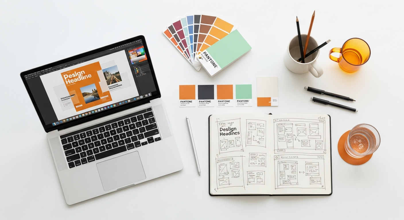
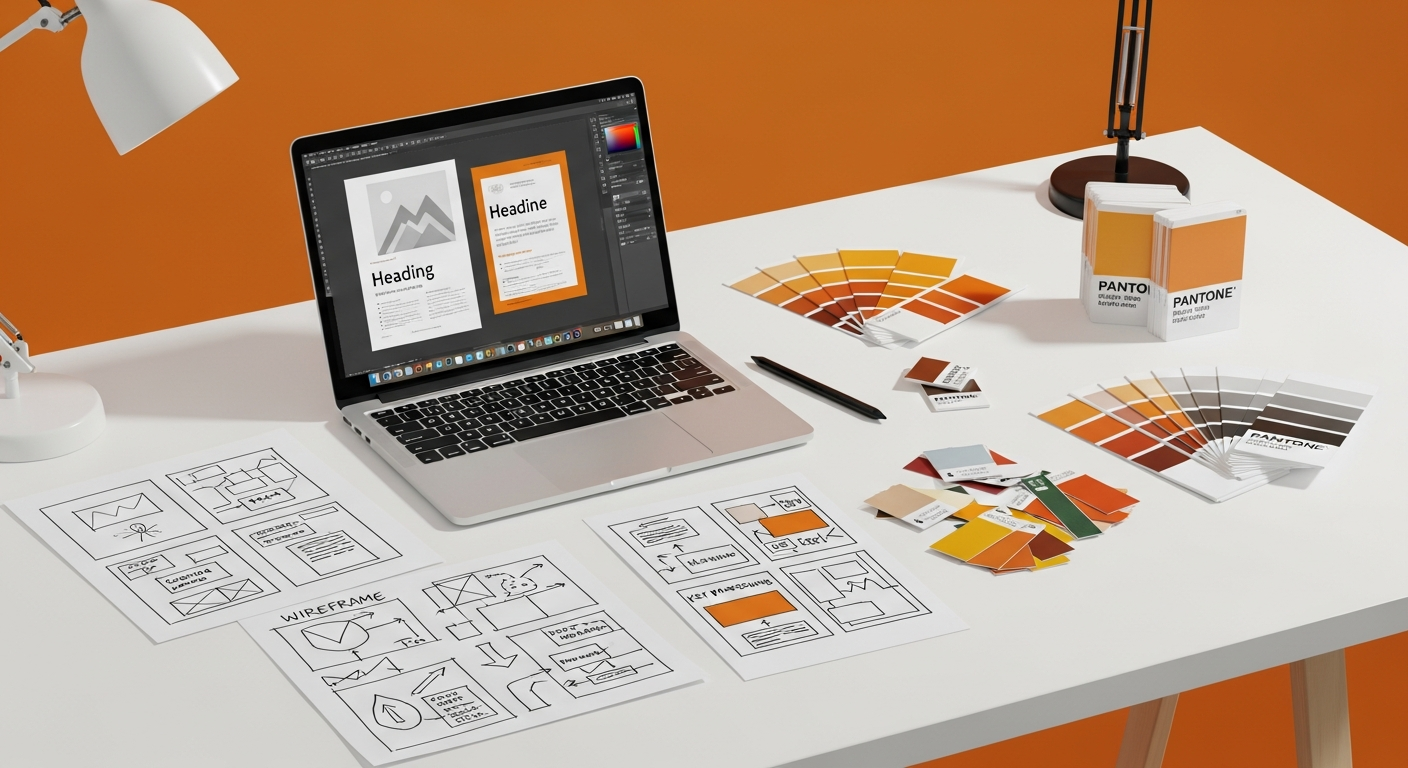
The Design Process: From Draft to Final Polish
With your concept refined and your tools ready, you’re now poised to bring your poster to life. The design process is iterative, involving creation, critique, and refinement. It’s a journey from a rough idea to a polished, impactful visual, and a critical phase in mastering how to design a poster from scratch.
Initial Drafting and Digital Creation
This is where you translate your sketches and mood board into a digital canvas. Don’t aim for perfection in the first pass; focus on getting your core elements in place.
- Set Up Your Canvas: Start with the correct dimensions and resolution for your poster. For print, use CMYK color mode and a minimum of 300 DPI. For digital, RGB and 72-150 DPI are usually sufficient.
- Establish Layout and Hierarchy: Place your primary headline, main image, and call to action first. Use your grid system to ensure initial alignment. Think about the viewer’s eye path – where do you want them to look first, second, and third?
- Rough Placement of Elements: Drag and drop your chosen images, rough out text blocks, and apply preliminary font choices. Don’t spend too long on minute details yet.
- Color Blocking: Experiment with your chosen color palette to define background areas, text colors, and accent colors. See how different combinations feel.
- Iterate Quickly: Create a few different rough layouts or variations of your design. Sometimes seeing multiple options helps clarify which direction is strongest. This initial phase is about exploration and establishing the broad strokes of your design.
Think of this as building the skeleton of your poster, providing the structure upon which you’ll add the flesh and skin.
Iteration, Feedback, and Refinement
No design is perfect on the first try. The iterative process of seeking feedback and refining your work is what separates good designs from truly great ones. This stage is crucial for identifying areas for improvement and ensuring your poster effectively communicates its message.
- Step Away and Review: After completing a draft, take a break. Come back with fresh eyes. You’ll often spot issues you missed when you were deeply engrossed in the creation process.
- Seek Constructive Criticism: Share your drafts with trusted colleagues, friends, or a design mentor. Ask specific questions:
- “Is the main message clear?”
- “Is the call to action obvious?”
- “Does it evoke the right emotion?”
- “Is anything confusing or hard to read?”
- “What’s the first thing your eye goes to?”
Be open to feedback, even if it challenges your initial ideas.
- Conduct a Self-Assessment (Heuristic Evaluation): Before finalizing, consider conducting a self-assessment, similar to How To Conduct A Heuristic Evaluation in digital product design. Evaluate your poster against established design principles:
- Clarity: Is the message unambiguous?
- Consistency: Are fonts, colors, and styles uniform?
- Efficiency: Can the message be grasped quickly?
- Aesthetics: Is it visually appealing and professional?
- Error Prevention: Are there any elements that could mislead or confuse the viewer?
This structured approach helps you identify usability and aesthetic flaws.
- Refine and Iterate: Based on feedback and your self-evaluation, make adjustments. This might involve tweaking colors, adjusting text sizes, repositioning elements, or even revisiting your image choice. Don’t be afraid to make significant changes if the feedback warrants it. Repeat this cycle of feedback and refinement until you are confident in the design.
This feedback loop is invaluable. It helps you catch overlooked details, improve readability, and strengthen the overall impact of your design, ensuring your poster is robust and effective.
Preparing for Print and Digital Distribution
The final stage is preparing your masterpiece for its intended destination. The requirements for print and digital outputs differ significantly, and understanding these distinctions is vital for a flawless presentation.
- Print Preparation:
- Color Mode: Convert your file to CMYK (Cyan, Magenta, Yellow, Key/Black) for print. RGB (Red, Green, Blue) is for digital screens and can result in dull colors when printed.
- Resolution: Ensure all images are 300 DPI at their final print size. Lower resolutions will result in pixelated output.
- Bleed: If your design extends to the edge of the paper, you’ll need to add a “bleed” – an extra margin of design that extends beyond the trim edge. This prevents unsightly white edges if the cutting machine is slightly off. Typically, 0.125 to 0.25 inches (3-6mm) is standard.
- Crop Marks: These marks indicate where the paper should be trimmed. Your printer will usually require them.
- File Format: Save your final print-ready file as a high-resolution PDF/X, TIFF, or EPS, as specified by your printer. Avoid JPEG for print as it’s a lossy compression format.
- Digital Preparation:
- Color Mode: Keep your file in RGB for digital display.
- Resolution: 72 DPI is often sufficient for web and screen use, but 150 DPI can offer better clarity on high-resolution displays.
- File Format: JPEGs are good for photos due to their small file size, while PNGs are excellent for graphics with transparency or sharp edges. GIFs are suitable for simple animations.
- Size Optimization: Optimize file size for faster loading on websites or social media without compromising visual quality.
- Adaptation for Social Media: Once your stunning poster is complete, remember its potential beyond print. Elements can be repurposed and adapted into compelling visual content. Referencing a Social Media Graphics Design Guide can help you understand how to resize, re-crop, and re-emphasize key messages for various platforms like Instagram, Facebook, or X (formerly Twitter). Often, a simplified version of your poster, focusing on one key visual and a concise message, works best for the fast-paced nature of social feeds.
By meticulously preparing your files for their intended use, you ensure that your beautifully designed poster looks exactly as you envisioned, whether it’s adorning a wall or gracing a digital screen in 2026.
Enhancing Impact: Advanced Tips for Striking Posters
Beyond the fundamental elements and processes, there are subtle yet powerful techniques that can elevate your poster from merely good to truly unforgettable. These advanced tips are for those who want to push their understanding of how to design a poster from scratch to create visuals that deeply resonate and stand out in a visually saturated world.
Storytelling Through Visuals
A poster isn’t just a collection of information; it’s an opportunity to tell a story. Even without extensive text, visuals can evoke narratives, create intrigue, and build an emotional connection with the viewer. Think about:
- Narrative Arc: Can your imagery suggest a beginning, middle, and end, or a cause and effect? For example, a poster promoting a historical event might use imagery that transitions from an old photograph to a modern interpretation.
- Character/Subject Focus: If your poster features people or objects, how do they interact with their environment or with each other? Their expressions, posture, or placement can tell a silent story.
- Symbolism and Metaphor: Use visual symbols or metaphors to convey deeper meanings without being overly literal. A broken chain for freedom, or a blooming flower for growth, are simple examples.
- Juxtaposition: Placing contrasting elements side-by-side can create tension, highlight differences, or spark curiosity, inviting the viewer to interpret the relationship.
When your poster tells a story, it becomes more than just an advertisement; it becomes an experience, leaving a lasting impression on the viewer’s mind.
Creating a Powerful Focal Point
Every effective poster needs a clear focal point – the dominant element that immediately captures attention and guides the viewer’s eye. Without it, the design can feel chaotic and unfocused.
- Size and Scale: Make your most important element the largest or most visually imposing.
- Color and Contrast: Use a contrasting color, a bright accent, or a high-contrast pairing to make an element pop.
- Placement: Place the focal point strategically, often near the center, or using the rule of thirds for dynamic compositions.
- Isolation: Surrounding an element with plenty of white space can draw attention to it.
- Directional Cues: Use lines, shapes, or even the gaze of a subject within an image to point towards your focal point.
A well-defined focal point ensures that your primary message is received quickly and efficiently, even by viewers glancing at the poster for only a few seconds.
Understanding Different Poster Sizes and Their Implications
The physical dimensions of your poster are not arbitrary; they influence design choices significantly. Different sizes serve different purposes and demand different approaches.
- Small Posters (A4/Letter): Often seen indoors, in cafes, or on notice boards. They allow for more detailed text and imagery
Recommended Resources
For more on how to design, see How To Set Up Two Factor Authentication For Your Team on Eamped.
Learn more about this topic in Best Laptops For Work 2026 at Bookmark Sharer.