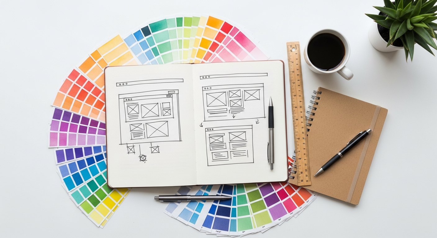
What is White Space (Negative Space) in Design?
At its core, white space refers to the areas of a design that are intentionally left blank. These are the spaces between graphics, images, text, columns, and other elements on a page or screen. The term “white space” is somewhat of a misnomer, as it doesn’t necessarily have to be white; it simply represents the absence of content. It could be any color, a background texture, or even an image, as long as it serves to separate and define other elements.
Understanding white space requires a shift in perspective. Many beginners, and even some experienced designers, perceive blank areas as wasted space, a missed opportunity to cram in more information or visual flair. This common misconception often leads to cluttered, overwhelming designs that fail to communicate effectively. In reality, white space is not an absence of design; it is a critical design element in itself. It’s the silence between the notes that makes the music, the pause that emphasizes the word.
- Macro White Space: This refers to the larger blank areas between major elements of a design. Think of the margins around a page, the space between different sections of a website, or the empty area around a headline. Macro white space plays a significant role in establishing the overall structure and flow of a design. It helps segment information, guiding the user’s eye and creating a sense of balance and order.
- Micro White Space: In contrast, micro white space is the smaller, more granular blank areas within elements. This includes the spacing between lines of text (leading), the gaps between individual letters (kerning), the padding within a button, or the space between items in a list. While seemingly subtle, micro white space dramatically impacts readability, legibility, and the overall comfort of consuming content.
Both macro and micro white space work in tandem to create a cohesive and effective design. They are not merely decorative but functional, serving critical roles in visual hierarchy, readability, and user experience. Ignoring their power is to undermine the potential impact of your entire design.
The Psychology Behind White Space: Why It Works
The effectiveness of white space isn’t just an aesthetic preference; it’s deeply rooted in human psychology and cognitive science. Our brains are constantly trying to make sense of the visual information presented to them, and white space plays a crucial role in facilitating this process. When designs are properly utilizing negative space, they align with fundamental principles of perception and cognitive processing.
Cognitive Load Reduction
One of the primary psychological benefits of white space is its ability to reduce cognitive load. Cognitive load refers to the amount of mental effort required to process information. When a design is cluttered with too many elements, colors, or text blocks, the brain has to work harder to filter, organize, and understand the content. This leads to mental fatigue, frustration, and a higher likelihood of users abandoning the design or missing key information.
By strategically introducing white space, designers can break down complex information into digestible chunks. This allows the user’s brain to process one piece of information at a time, making the overall experience less taxing and more enjoyable. It’s akin to taking a breath between sentences; the pause makes the message clearer and easier to absorb.
Enhancing Visual Hierarchy and Focus
White space is an unparalleled tool for establishing visual hierarchy. Our eyes naturally gravitate towards areas of contrast and distinction. By surrounding important elements with ample negative space, designers can draw the user’s attention to those elements, making them stand out from the surrounding content. This creates a clear path for the eye to follow, guiding users through the design in a logical and intuitive manner.
Consider a headline: if it’s jammed against a paragraph of text, its impact is diluted. But if it’s given room to breathe with significant white space above and below, it immediately commands attention and signals its importance. This deliberate use of space helps users quickly scan a page, identify key messages, and understand the relationships between different pieces of content.
Leveraging Gestalt Principles
The psychological underpinnings of white space are closely tied to Gestalt principles of perception, particularly the principle of proximity. Gestalt psychology suggests that humans perceive objects as organized patterns and whole units rather than individual parts. The principle of proximity states that elements that are close to each other tend to be perceived as a group.
White space effectively manipulates proximity. By placing related items closer together and separating unrelated items with more white space, designers can visually group elements. For example, a paragraph of text and its accompanying image will be perceived as a single unit if they are close together, surrounded by more white space from other content blocks. This natural grouping makes the design feel organized and coherent, allowing users to understand relationships without conscious effort.
Conveying Sophistication and Quality
Beyond its functional benefits, white space also carries significant psychological implications regarding brand perception. Designs that incorporate generous amounts of white space often convey a sense of luxury, sophistication, and minimalism. Think of high-end fashion brands, art galleries, or premium tech companies – their websites and marketing materials frequently utilize expansive negative space to evoke an aura of exclusivity and quality.
This perception stems from the idea that a brand confident in its message doesn’t need to shout or fill every available inch. It implies clarity, intentionality, and a focus on essential value rather than overwhelming detail. In the competitive landscape of 2026, where digital noise is constant, a clean, spacious design can be a powerful differentiator, signaling professionalism and thoughtful curation.
Key Benefits of Strategic White Space Application
Improved Readability and Comprehension
Perhaps the most immediate and profound benefit of white space is its impact on readability. When text is cramped and lines are too close together, it creates a dense block that is tiring to read. Ample line height (the vertical space between lines of text) and paragraph spacing make text much easier on the eyes. Similarly, sufficient margins around blocks of text prevent the content from feeling overwhelming and allow the reader’s eyes to track lines more comfortably.
This improved readability directly translates to better comprehension. When readers aren’t struggling to decipher individual words or differentiate between paragraphs, their cognitive resources are freed up to focus on the message itself. This is critical for any content-heavy design, ensuring that the information you want to convey is not just seen, but truly understood.
Enhanced Focus and Attention
In a world saturated with information, capturing and maintaining user attention is paramount. White space acts as a spotlight, drawing the eye to specific elements by creating contrast and isolation. By strategically placing key calls to action, important images, or crucial headlines in areas surrounded by negative space, designers can ensure these elements receive the attention they deserve.
This directed focus minimizes distractions, helping users to concentrate on the most relevant parts of the design without being overwhelmed by peripheral information. It’s about curating the user’s visual journey, ensuring they encounter the most important information in the intended sequence.
Creation of Clear Visual Hierarchy
Visual hierarchy is the arrangement or presentation of elements in a way that implies importance. White space is a fundamental tool in establishing this hierarchy. By varying the amount of space around different elements, designers can signal their relative importance and group related items together. For instance, a larger gap between sections than between paragraphs within a section clearly communicates the structural organization of the content.
A well-defined visual hierarchy makes a design scannable and intuitive. Users can quickly grasp the structure of the information, identifying headings, subheadings, and body text with ease. This organization is vital for user experience, as it reduces the effort required to navigate and understand the content, particularly on complex interfaces.
Increased Brand Perception and Professionalism
As touched upon in the psychological benefits, designs that embrace white space often project an image of professionalism, sophistication, and quality. A clean, uncluttered aesthetic suggests confidence and attention to detail. It communicates that the brand values clarity and quality over quantity or unnecessary embellishment.
For brands aiming for a premium or minimalist identity, white space is indispensable. It can evoke feelings of calm, elegance, and trustworthiness. In the competitive market of 2026, where brand identity is crucial, leveraging white space can significantly differentiate a product or service, making it appear more refined and thoughtfully curated.
Improved User Experience (UX)
Ultimately, all these benefits converge to significantly enhance the user experience. A design that effectively uses white space is easier to navigate, more pleasant to interact with, and more efficient in conveying its message. Users are less likely to feel overwhelmed, frustrated, or lost.
This directly ties into the principles discussed in articles like What Is UX Design And Why It Matters. UX design is fundamentally about creating products and experiences that are useful, usable, and desirable. White space contributes profoundly to usability by improving readability and learnability. It makes interfaces feel less daunting and more inviting, leading to higher engagement, longer dwell times, and ultimately, a more positive impression of the brand or product.
In interior design, for example, white space (or negative space in a physical room) ensures that furniture isn’t crammed, pathways are clear, and focal points are allowed to shine. It creates a sense of calm and order, making a space feel more comfortable and luxurious, rather than chaotic and cramped. The same principles apply whether you’re designing a website or a living room.
Practical Techniques for Implementing White Space
Understanding the theory and benefits of white space is one thing; effectively applying it in practice is another. Here are several practical techniques that designers across various disciplines can employ to harness the power of negative space:
Margins and Padding
These are perhaps the most fundamental applications of white space.
- Margins: Define the space outside of an element, separating it from other elements or the edge of the canvas. Generous page margins in a document or spacious outer margins on a webpage create a breathable frame for the content, preventing it from feeling cramped against the edges.
- Padding: Refers to the space inside an element, between its content and its border. For instance, padding within a button ensures the text isn’t touching the button’s edge, making it feel more clickable and less constrained. Similarly, padding around an image within a container prevents it from feeling too tight.
Consistent and adequate use of margins and padding is crucial for establishing visual rhythm and ensuring that different elements have enough room to exist without overlapping or competing for attention.
Line Height (Leading) and Paragraph Spacing
For text-heavy designs, micro white space is paramount for readability.
- Line Height: The vertical distance between the baselines of consecutive lines of text. Too little line height makes text dense and difficult to read, while too much can make it feel disconnected. A good rule of thumb is often 1.4 to 1.6 times the font size for body text, but this can vary depending on font choice and line length.
- Paragraph Spacing: The vertical space between paragraphs. This is essential for breaking up long blocks of text into manageable chunks, making the content scannable and less intimidating. It signals a clear break in thought or topic.
These adjustments, though subtle, dramatically impact how comfortably a user can read and process information.
Letter Spacing (Kerning and Tracking)
These fine-tune the horizontal spacing of text.
- Kerning: Adjusts the space between specific pairs of characters to improve their visual balance (e.g., between ‘A’ and ‘V’).
- Tracking: Adjusts the spacing uniformly over a range of characters.
While often handled automatically by design software, manual adjustments can be critical for headlines and logos to ensure optimal legibility and aesthetic appeal. Overly tight or loose letter spacing can hinder readability and make text look amateurish.
Grouping Related Elements
Utilizing the Gestalt principle of proximity, white space helps group related items. By placing elements that belong together in closer proximity and separating them from unrelated elements with more white space, you create clear visual relationships. For example, a product image, its name, and price should be grouped closely, with more space separating this product block from the next one.
This technique is invaluable for organizing complex information, whether it’s a detailed product listing, a menu on a website, or different zones within an interior space. It allows users to quickly understand which pieces of information belong together.
Creating Visual Hierarchy with Space
Beyond simple grouping, white space is a powerful tool for establishing hierarchy. More white space around an element typically implies greater importance.
- Headlines: Give headlines significantly more space than body text to make them stand out.
- Call-to-Action Buttons: Surround important buttons with ample white space to make them pop and guide the user’s eye directly to them.
- Key Images/Graphics: Allow impactful visuals to breathe by giving them generous negative space, making them focal points.
This intentional layering of space helps direct the user’s attention, ensuring they see the most critical information first.
Utilizing Grid Systems
Grid systems are frameworks that help designers organize content on a page or screen. They provide a structured way to apply white space consistently. By defining columns, rows, and gutters (the white space between columns), grids ensure that elements are aligned and spaced predictably. This consistency not only makes the design look professional but also enhances usability by creating a predictable visual rhythm.
Whether for web design, magazine layouts, or even planning the layout of furniture in a room, a grid system provides the underlying structure that makes the strategic application of white space intuitive and effective.
White Space Across Different Design Disciplines
While the core principles of white space remain consistent, its application manifests uniquely across various design disciplines. Understanding these nuances is key to mastering its power in your specific field.
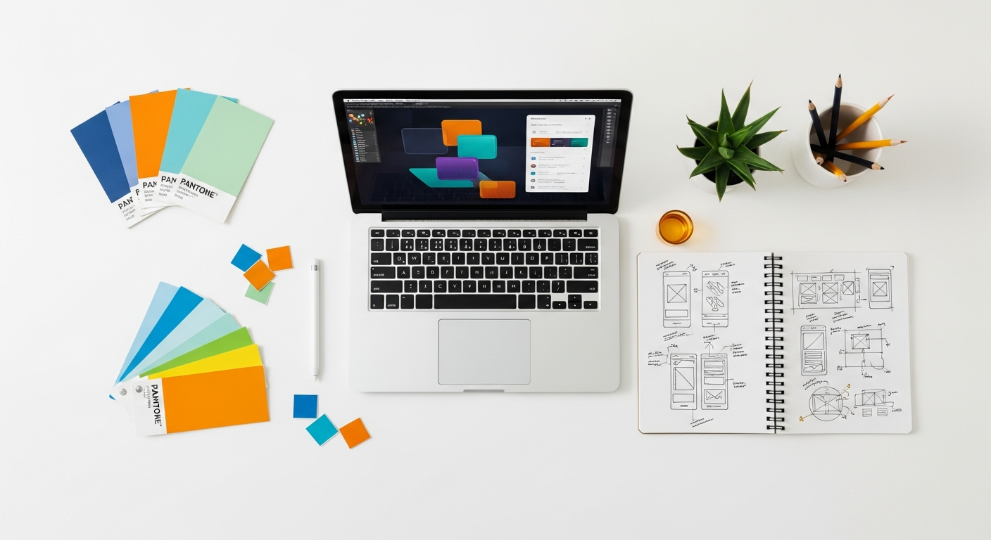
Web Design and UI/UX
In web design, white space is arguably one of the most critical elements for creating intuitive and user-friendly interfaces. Given the diverse screen sizes and the need for quick information retrieval, white space helps:
- Improve Navigation: Ample space between navigation links and menu items makes them easier to click or tap, reducing user error.
- Enhance Content Scannability: Breaking up long blocks of text with generous paragraph spacing, short line lengths, and clear margins allows users to quickly scan and find relevant information. This is directly related to the principles found in What Is UX Design And Why It Matters, where ease of use and efficiency are paramount.
- Define Interactive Elements: Buttons, forms, and other interactive components benefit from surrounding white space, making them clearly identifiable and actionable.
- Reduce Clutter: Prevents “information overload,” which is a common pitfall in web design. A clean, spacious layout feels modern and professional, reducing bounce rates and improving user satisfaction.
In 2026, with the increasing complexity of web applications and the demand for seamless user experiences, the judicious use of white space in UI/UX design is non-negotiable.
Print Design (Books, Magazines, Brochures)
Print media has long recognized the power of white space to create elegant and readable layouts.
- Margins: Generous margins in books and magazines provide a comfortable holding space for readers and prevent text from feeling cramped at the edges of the page.
- Gutter Space: The space in the fold of a book or magazine is crucial for readability, ensuring no text disappears into the binding.
- Text Blocks: Judicious use of line height, paragraph spacing, and column gutters in multi-column layouts prevents visual fatigue and aids comprehension.
- Visual Impact: In advertising and brochure design, placing a key image or headline in isolation, surrounded by significant white space, can create a powerful, sophisticated visual statement that commands attention.
The tactile nature of print means that the perceived weight and balance of elements, heavily influenced by white space, contribute significantly to the overall aesthetic and user experience.
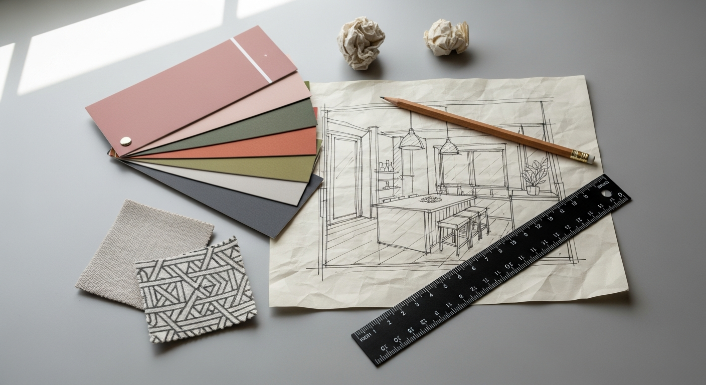
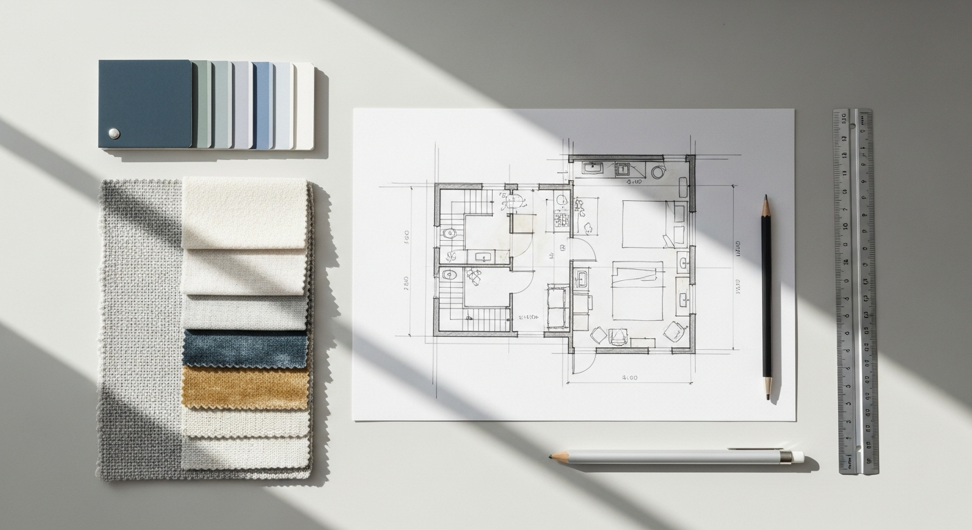
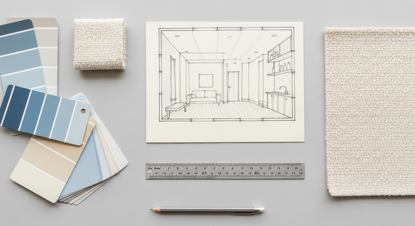
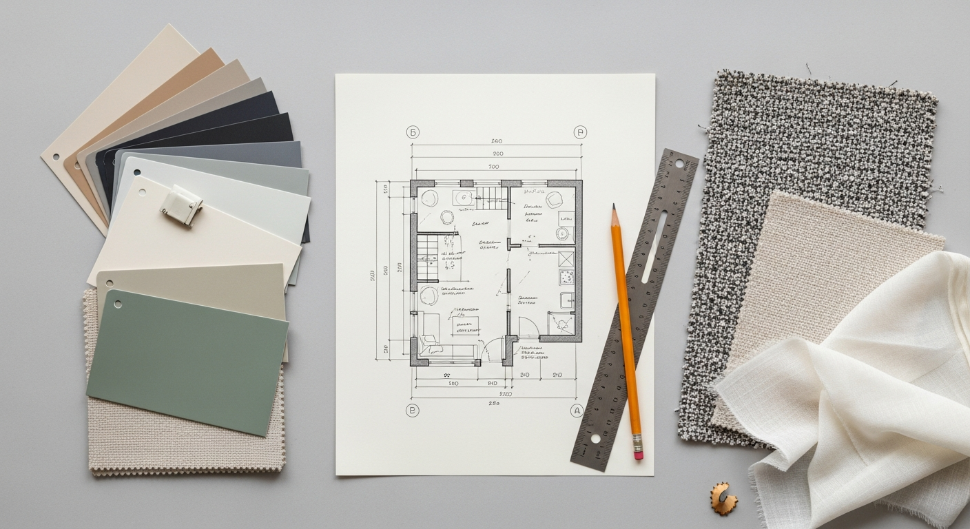
Interior Design and Architecture
For Layout Scene’s core audience, the application of white space in interior design is particularly relevant. Here, it’s often referred to as “negative space” or “breathing room.”
- Furniture Placement: Just as elements on a page need space, furniture needs room to breathe. Over-furnishing a room creates a cramped, cluttered, and often stressful environment. Strategic negative space around furniture allows each piece to be appreciated and creates clear pathways for movement.
- Focal Points: In a well-designed room, a piece of art, a fireplace, or a distinctive piece of furniture often serves as a focal point. Surrounding it with negative space enhances its prominence and allows it to stand out.
- Flow and Movement: Clear sightlines and unobstructed pathways are created by effective use of negative space. This improves the flow of a room, making it feel more open, inviting, and functional.
- Balance and Harmony: Negative space contributes to the overall balance of a room. It prevents areas from feeling too heavy or too sparse, creating a harmonious and aesthetically pleasing environment. A minimalist interior design, for example, heavily relies on negative space to achieve its clean, calm, and uncluttered aesthetic.
Just as a well-designed webpage feels easy to navigate, a well-designed room feels easy to inhabit and enjoy.
Graphic Design (Logos, Posters, Social Media)
Graphic design, in its diverse forms, relies heavily on white space for impact and clarity.
- Logo Design: Effective logos often employ negative space not just around the mark but sometimes within it (e.g., the FedEx arrow). This creates a clean, memorable, and versatile mark that works across various applications.
- Poster Design: A poster with too much information becomes a chaotic mess. Strategic white space around key headlines, images, and event details ensures that the most important message is instantly conveyed, even from a distance.
- Social Media Graphics: In the fast-paced world of social media, clarity is king. As detailed in a comprehensive Social Media Graphics Design Guide, white space is crucial for making posts stand out in a crowded feed. It helps brand logos remain visible, ensures calls to action are clear, and prevents information from getting lost amidst visual noise. A cluttered graphic is easily scrolled past; a clean, well-spaced one captures attention.
Regardless of the medium, white space is a universal language of clarity, elegance, and effective communication.
Common Pitfalls and How to Avoid Them
While the benefits of white space are clear, its misapplication can be as detrimental as its complete absence. Understanding common pitfalls can help designers harness its power effectively.
Too Much White Space
Paradoxically, excessive white space can also be a problem. While it’s essential for clarity, too much can lead to:
- Disconnection: Elements that are too far apart can appear unrelated, even if they are meant to be grouped. This can break the visual flow and make it difficult for users to understand relationships between content.
- Feeling Empty or Sparse: A design with an abundance of white space might feel unfinished, cold, or lacking in content. For certain contexts, like a dense news site, this might not be appropriate.
- Excessive Scrolling/Clicking: In digital interfaces, too much white space can push important content below the fold, requiring users to scroll excessively or navigate through too many pages to find what they need, leading to frustration.
How to Avoid: Find a balance. Use a grid system to maintain consistent relationships. Conduct user testing to see if users understand groupings and if content is accessible without undue effort. Remember that white space is about intentional breathing room, not just emptiness.
Too Little White Space (Clutter)
This is the most common pitfall and the one white space aims to combat. Insufficient white space leads to:
- Overwhelming Design: Too many elements crammed together creates visual noise, making the design feel chaotic and difficult to process.
- Poor Readability: Text without adequate line height, paragraph spacing, or margins becomes a dense block that strains the eyes and reduces comprehension.
- Lack of Focus: When everything competes for attention, nothing stands out. Important calls to action or key messages get lost in the visual cacophony.
- Amateurish Appearance: Cluttered designs often look unprofessional and untrustworthy, negatively impacting brand perception.
How to Avoid: Be ruthless in editing content and visuals. Prioritize information. Use margins, padding, line height, and paragraph spacing generously. Employ visual grouping. Ask yourself: “Does this element absolutely need to be here, and does it have enough room to breathe?”
Inconsistent Application of White Space
Even if you use white space, inconsistency can undermine its effectiveness:
- Confusing Visual Hierarchy: Varying amounts of space around similar elements (e.g., sometimes a lot of space around subheadings, sometimes very little) confuse the user about their relative importance.
- Lack of Professionalism: Inconsistent spacing makes a design look messy and unplanned, eroding trust and perceived quality.
- Disrupted Rhythm: A predictable visual rhythm, created by consistent spacing, makes a design feel harmonious and easy to follow. Inconsistency breaks this rhythm, creating a jarring experience.
How to Avoid: Develop a design system or style guide that defines specific spacing rules (e.g., “all H2s have 40px top margin and 20px bottom margin”). Use grid systems consistently. Regularly review your designs against these guidelines to ensure uniformity across all pages or materials. Tools and components in modern design software can help enforce consistency.
Not Seeing White Space as an Active Element
The biggest pitfall is failing to recognize white space as a deliberate design choice, rather than just the absence of content. Treating it as an afterthought means missing its strategic potential.
How to Avoid: Actively plan for white space. When sketching layouts, consider the negative space as much as the positive elements. Ask: “How can I use space to guide the eye, separate ideas, or emphasize this point?” Incorporate white space considerations from the very beginning of your design process, not just as a final polish.
Measuring the Impact: White Space and UX
The aesthetic appeal of white space is often immediately apparent, but its true power lies in its measurable impact on user experience and overall design effectiveness. For designers in 2026, understanding how to quantify the benefits of white space is crucial for making data-driven decisions and justifying design choices.
User Testing and A/B Testing
One of the most direct ways to measure the impact of white space is through user testing. Present different versions of a layout (one with more white space, one with less, or variations in micro vs. macro space) to a group of target users and observe their interactions.
- Observation: Do users struggle to find specific information? Do they appear overwhelmed? Do they easily navigate the interface?
- Task Completion: Measure how quickly and accurately users complete tasks on different layouts. A design with well-applied white space should ideally lead to faster task completion and fewer errors.
- Subjective Feedback: Ask users directly about their experience. Do they find the design clean, organized, easy to read, or cluttered and confusing?
A/B testing, specifically for digital products, allows you to compare two versions of a page or component (A and B) with different white space treatments. By tracking metrics like conversion rates, bounce rates, time on page, and click-through rates, you can objectively determine which layout performs better. For instance, a call-to-action button surrounded by more white space might see a significantly higher conversion rate than one that is tightly packed.
Heuristic Evaluation
As discussed in guides like How To Conduct A Heuristic Evaluation, expert reviews against established usability principles can provide valuable insights into the effectiveness of white space. Heuristic evaluation involves a small group of usability experts examining an interface and judging its compliance with recognized usability principles (heuristics).
When evaluating white space, experts would look at principles such as:
- Aesthetic and minimalist design: Does the design avoid irrelevant or rarely needed information? Proper white space helps achieve this.
- Recognition rather than recall: Is information presented clearly and grouped logically so users don’t have to remember where to find things? White space aids in logical grouping.
- Consistency and standards: Is the spacing consistent throughout the interface, making it predictable and easy to learn?
- Error prevention: Does the spacing prevent accidental clicks or misinterpretations?
A heuristic evaluation can identify areas where white space is insufficient or poorly utilized, leading to recommendations for improvement that are grounded in usability best practices.
Analytics and Performance Metrics
For digital designs, analytics tools offer quantitative data that can indirectly reflect the impact of white space:
- Bounce Rate: A high bounce rate might indicate that users are overwhelmed or confused by a cluttered page and leave quickly. A cleaner layout with more white space could reduce this.
- Time on Page/Session Duration: If users spend more time on pages with effective white space, it suggests better engagement and comprehension.
- Conversion Rates: For e-commerce sites or landing pages, increased white space around key elements (product images, add-to-cart buttons, forms) can often lead to higher conversion rates by improving focus and reducing cognitive friction.
- Scroll Depth: While too much white space can increase scrolling, strategically placed white space can encourage users to scroll further down a page if it improves readability and makes the content more engaging.
By monitoring these metrics before and after implementing white space adjustments, designers can gain concrete evidence of its impact on user behavior and business objectives.
Accessibility Considerations
White space also plays a vital role in accessibility, ensuring that designs are usable by people with various disabilities. Adequate line height and paragraph spacing benefit users with cognitive disabilities or reading difficulties. Clear separation of interactive elements with white space makes interfaces easier to navigate for users with motor impairments. Measuring the accessibility compliance of a design, often through automated tools and manual checks, can indirectly assess the effectiveness of white space in promoting inclusivity.
In conclusion, white space is not merely an aesthetic choice; it is a strategic element with a profound impact on user experience and the overall success of a design. By embracing its principles and measuring its effects, designers can create more effective, engaging, and impactful layouts in any medium, truly understanding What Is UX Design And Why It Matters for every project in 2026.
Frequently Asked Questions About White Space in Design
What is the difference between white space and negative space?
The terms “white space” and “negative space” are often used interchangeably, and for most practical purposes in design, they refer to the same concept: the empty or unused areas around and between elements in a design. “White space” is a more common term in graphic and web design, harking back to physical paper. “Negative space” is often preferred in art and photography as it emphasizes the active role of the empty space in defining positive shapes and forms. Regardless of the term, the principle remains the same: it’s the intentional absence of content that serves a functional purpose in design.
How much white space is too much?
Determining “too much” white space is subjective and depends heavily on context, audience, and design goals. For a luxury brand website, extensive white space might convey sophistication, while for a dense news portal, it could lead to excessive scrolling and a perceived lack of content. Generally, white space becomes “too much” when it starts to disconnect related elements, makes the design feel empty or sparse, or forces users to exert unnecessary effort (like excessive scrolling) to find key information. The goal is balance: enough space for clarity and focus, but not so much that it hinders usability or content discovery. User testing and feedback are crucial for finding this sweet spot.
Can white space be a color other than white?
Absolutely! The term “white space” is a convention and does not imply that the space must literally be white. It refers to any area of a design that is left free of content or primary design elements. This space can be any color, a background image, a subtle texture, or even a transparent area. The key is that it functions as a separator, a breather, or a visual anchor for other elements, regardless of its hue or pattern. The background color of a webpage, the color of a wall in an interior design, or the blank area on a poster are all examples of white space, even if they’re black, blue, or patterned.
How does white space improve user experience (UX)?
White space significantly improves UX by enhancing readability, reducing cognitive load, and creating clear visual hierarchy. It makes content easier to scan and digest, preventing users from feeling overwhelmed by information. By separating elements, it guides the user’s eye, helping them navigate an interface or understand content flow more intuitively. This reduces frustration, improves task completion rates, and fosters a sense of clarity and professionalism, ultimately making the design more usable, efficient, and enjoyable for the user. It’s a core component of effective UX design, ensuring that interactions are seamless and pleasant.
What’s the role of white space in interior design?
In interior design, white space (often called negative space) plays a crucial role in creating functional, aesthetically pleasing, and comfortable environments. It refers to the empty areas within a room—the space between furniture, around architectural features, and the open floor area. Strategic use of negative space prevents a room from feeling cluttered and cramped, allows individual pieces of furniture or art to stand out as focal points, and ensures clear pathways for movement. It contributes to the room’s balance, flow, and overall sense of calm and spaciousness, much like it does in graphic or web design by providing visual breathing room.
How can I ensure consistent white
Recommended Resources
Check out How To Use Google Workspace Effectively on Bookmark Sharer for a deeper dive.
Related reading: How To Build An Email List From Scratch (Eamped).