Understanding Visual Hierarchy: The Foundation of Effective Design
At its heart, visual hierarchy is the strategic arrangement of elements to indicate their order of importance. It dictates how the human eye perceives and processes information on a page, screen, or within a physical environment. Without a clear hierarchy, designs become chaotic, overwhelming, and difficult to navigate, leaving users frustrated and confused. It’s the art and science of prioritizing information, ensuring that the most critical messages or actions stand out, while supporting details are appropriately subdued.
Think of it as a conversation. When someone speaks, certain words are emphasized, pauses are used, and tone varies to convey meaning and importance. Visual hierarchy performs the same function for design elements. It creates a natural flow, leading the user through content in a logical and intuitive sequence. This is profoundly linked to What Is UX Design And Why It Matters. A strong visual hierarchy is a cornerstone of good user experience (UX) because it reduces cognitive load, minimizes decision fatigue, and allows users to quickly find what they’re looking for, achieving their goals with minimal effort. It answers the implicit question: “Where should I look first?” and “What should I do next?” without the user ever having to consciously ask it.
The Core Principles of Visual Hierarchy
To effectively implement visual hierarchy, designers leverage a set of fundamental principles that manipulate perception and guide attention. Mastering these tools allows for precise control over how information is consumed.
Size and Scale
Perhaps the most straightforward principle, size immediately communicates importance. Larger elements naturally draw more attention than smaller ones. A headline is typically larger than body text for this very reason. In interior design, a grand fireplace or a striking piece of art instantly becomes a focal point due to its scale relative to other objects in the room. By varying the size of text, images, buttons, or even architectural features, designers can establish a clear pecking order.
Color and Contrast
Color is a powerful emotional and attentional tool. Bright, saturated colors tend to jump out, while muted tones recede. High contrast between elements (e.g., dark text on a light background, or a vibrant call-to-action button against a subdued interface) grabs attention, making those elements more prominent. Conversely, low contrast can be used to de-emphasize secondary information. Thoughtful color palettes not only enhance aesthetics but also serve a functional purpose in guiding the eye. For example, a website might use a brand’s primary color for interactive elements to make them easily discoverable.
Proximity and Spacing
The Gestalt principle of proximity states that elements that are close to each other are perceived as being related. By grouping similar items together and creating generous spacing between unrelated ones, designers can establish clear categories and relationships. Ample white space (negative space) around an element can also make it stand out by giving it “room to breathe,” separating it from visual clutter and drawing the eye directly to it. This is crucial for readability and scanability, preventing an overwhelming wall of text or an overly dense visual landscape.
Alignment and Grids
Alignment brings order and structure to a design. Elements that are aligned create a visual connection, making the layout feel organized and professional. Grids provide an underlying framework that ensures consistency in alignment, spacing, and proportion across a design. Whether it’s left-aligned text, centered images, or a multi-column grid system, consistent alignment creates a sense of unity and makes content easier to follow. Misaligned elements, on the other hand, can create visual dissonance and signal disorganization, disrupting the flow.
Repetition and Consistency
Repeating visual elements—such as specific fonts, colors, icons, or spacing patterns—creates a sense of unity and recognition. Consistency reinforces the hierarchy established elsewhere in the design. If all primary headings use the same font, size, and color, users quickly learn to identify them as important navigational cues. This principle builds familiarity and predictability, making the user experience smoother and more intuitive across different pages or sections of a design. In branding, consistent application of a logo and brand colors ensures immediate recognition and reinforces brand identity.
White Space (Negative Space)
Often overlooked, white space is not merely empty space; it’s an active design element that significantly impacts visual hierarchy. It provides breathing room, defines relationships between elements, and helps to draw attention to focal points by isolating them from surrounding content. Generous white space can make a design feel sophisticated, clean, and easier to digest, reducing visual clutter and cognitive overload. It’s the silent partner that empowers other hierarchical principles to shine.
Typography
Beyond just size, the choice of typeface, font weight (boldness), style (italic), and case (uppercase/lowercase) are powerful hierarchical tools. Different font families can convey different levels of importance or tone. A heavy, sans-serif font for a headline will stand out more than a light, serif font for body text. Variations in line height, letter spacing, and paragraph spacing also contribute to readability and the perceived hierarchy of textual information. A well-considered typographic system is essential for guiding the reader through written content.
Movement and Direction (Gestalt Principles)
Humans are naturally drawn to movement and implied direction. Gestalt principles like the Law of Common Fate (elements moving in the same direction are perceived as a group) or the Law of Continuity (the eye tends to follow lines and curves) play a role. Designers can use visual cues like arrows, leading lines, or even the gaze of a person in an image to direct the user’s attention towards a specific point or action. This creates a psychological path for the eye to follow, enhancing the user’s journey through the design.
Why Visual Hierarchy is Indispensable for UX Design
Without a thoughtfully constructed visual hierarchy, even the most innovative features or compelling content can be lost in a sea of undifferentiated elements. Users will struggle to find primary navigation, discern calls to action, or understand the relationship between different pieces of information. This leads to frustration, increased task completion times, and ultimately, a poor user experience. Conversely, a well-executed visual hierarchy provides numerous benefits:
- Reduced Cognitive Load: By clearly prioritizing information, users don’t have to expend mental energy trying to figure out what’s important. The design tells them. This frees up cognitive resources for understanding the content itself rather than navigating the interface.
- Improved Navigation: Clear hierarchy in navigation menus, headings, and interactive elements ensures users can quickly and easily find their way around a website or application. They can scan for key information without reading every word.
- Enhanced Comprehension: When information is presented in a logical, prioritized manner, it’s easier for users to grasp the main message and supporting details. This aids in learning and retention.
- Faster Task Completion: If crucial elements like “Add to Cart” buttons or “Submit” forms are visually prominent, users can complete their intended actions more quickly and efficiently.
- Increased Engagement: A clear, aesthetically pleasing layout that guides the eye smoothly through content is more engaging. Users are more likely to explore and interact with a design that feels intuitive and well-organized.
- Professionalism and Trust: A design with strong visual hierarchy appears polished, credible, and trustworthy. It signals attention to detail and a user-centric approach, which builds confidence in the brand or product.
In essence, visual hierarchy is the silent language that facilitates a smooth, efficient, and enjoyable interaction between the user and the design. It’s the difference between a cluttered, confusing street map and a clear, color-coded subway diagram.
Implementing Visual Hierarchy in Various Design Contexts
The principles of visual hierarchy are universal, applying across diverse design disciplines, from digital interfaces to physical spaces. Understanding how to apply these concepts contextually is key to their effectiveness.
Web Design and User Interfaces
In web and UI design, visual hierarchy is paramount. Websites and applications are complex systems of information and interaction, and users need clear guidance. Headlines, subheadings, and body text are differentiated by size and weight. Call-to-action buttons use contrasting colors and larger sizes to stand out. Navigation menus are often placed prominently and consistently. Key information, like pricing or important alerts, is often highlighted using bold typography or distinct background colors. The strategic use of white space around critical elements, such as input fields or images, helps users focus on immediate tasks and avoids visual overwhelm. Effective hierarchy ensures that users can scan a page, identify key information, and perform desired actions (like making a purchase or signing up) without confusion.
Print Media and Editorial Layouts
Magazines, newspapers, books, and brochures rely heavily on visual hierarchy to guide readers through content. Editors and designers use varying font sizes for headlines, subheadings, and body text. Pull quotes are often styled differently to draw attention. Images are strategically placed and sized to break up text and add visual interest, with captions usually in a smaller font. Margins, columns, and gutters (the space between columns) define relationships and create a structured flow. The cover of a magazine is a masterclass in hierarchy, with the main headline, featured image, and secondary teasers all vying for attention in a carefully orchestrated manner.
Branding and Marketing Collateral
From logos and business cards to brochures and advertisements, visual hierarchy is crucial for brand communication. A logo itself often employs hierarchy, with a primary brand mark and a smaller tagline. In an advertisement, the headline and main visual are designed to grab immediate attention, followed by the body copy and then the call to action and contact information. Consistency in brand colors, typography, and imagery across all marketing materials reinforces hierarchy and brand recognition. The goal is to quickly convey the brand’s message and value proposition, guiding the audience toward desired actions.
Social Media Graphics Design Guide
Creating compelling visuals for platforms like Instagram, Facebook, or LinkedIn requires a keen understanding of visual hierarchy, especially given the rapid-fire consumption of content. As explored in our Social Media Graphics Design Guide, a successful social media graphic must convey its primary message almost instantly. This means using strong contrast for key text, a clear focal point in the image, and minimal clutter. The headline or main offer must be the largest and most prominent element. Supporting text should be concise and legible, often in a contrasting color or bolded font. Calls to action (e.g., “Learn More,” “Shop Now”) need to stand out clearly from the background and other text, guiding the viewer’s next step. Effective hierarchy ensures that even in a crowded feed, your message cuts through the noise and captures attention.
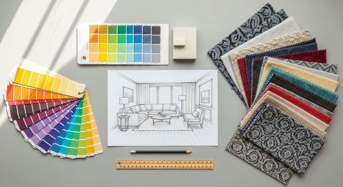
Interior Design and Spatial Arrangements
While often discussed in digital contexts, visual hierarchy is profoundly relevant to interior design and architecture—a core focus for Layout Scene. In a room, designers create focal points using size (a large sofa), color (an accent wall), texture (a statement rug), or unique lighting (a dramatic chandelier). These focal points immediately draw the eye and establish the room’s primary purpose or aesthetic. Secondary elements, like side tables or decorative accessories, support the main focal point without competing with it. Proximity dictates furniture groupings, defining conversational areas or functional zones. White space (open floor plans, clear pathways) prevents a room from feeling cluttered and allows individual pieces to be appreciated. The overall arrangement guides movement through a space, from the entrance to a seating area or a dining space, creating an intuitive and comfortable flow. Just as a well-designed webpage leads a user through information, a well-designed interior guides an inhabitant through an experience.
Strategies for Creating Effective Visual Hierarchy
Building a robust visual hierarchy isn’t just about applying a single principle; it’s about a strategic combination of techniques tailored to your specific design goals. Here are practical strategies to employ:
- Define Your Goals and Prioritize Content: Before you even begin designing, clearly identify the primary purpose of your design. What is the most important message? What action do you want users to take? What information is secondary, and what can be tertiary? List your content and actions in order of importance. This prioritization forms the blueprint for your visual hierarchy.
- Start with the Big Picture: Begin by establishing the broadest hierarchical elements—major sections, primary navigation, main headlines. Use size, position, and color to differentiate these. Only then move to finer details within each section.
- Leverage a Consistent Design System: Develop a style guide that defines your typography scale (H1, H2, body text), color palette (primary, secondary, accent colors), spacing rules, and component styles. Consistent application of these elements across your design ensures predictable hierarchy and a cohesive look.
- Don’t Be Afraid of White Space: Embrace negative space as a powerful tool. It isolates elements, reduces clutter, and makes key information pop. A crowded design is a confusing design.
- Use Repetition Mindfully: While repetition creates consistency, ensure it’s not monotonous. Vary elements enough to keep the design interesting while maintaining predictable patterns for important information.
- Test and Iterate: Visual hierarchy is not a one-and-done process. Conduct user testing to see if users are naturally drawn to the intended focal points and if they can easily complete tasks. Techniques like eye-tracking or simply observing user behavior can reveal if your hierarchy is working as intended. This is where insights from our guide on How To Conduct A Heuristic Evaluation become invaluable, allowing you to systematically assess the usability and discoverability of your design’s hierarchical structure.
- Seek and Incorporate Feedback: Get fresh eyes on your design. What stands out to others? Where do their eyes go first? Constructive feedback can highlight areas where your intended hierarchy might not be translating effectively.
Common Pitfalls to Avoid
Even seasoned designers can fall prey to common mistakes that undermine visual hierarchy. Being aware of these can help you sidestep them:
- Too Many Competing Elements: When everything tries to be the most important, nothing is. Overuse of bolding, bright colors, large fonts, or busy patterns creates visual noise and confusion.
- Lack of Sufficient Contrast: If elements meant to be distinct don’t have enough contrast in size, color, or weight, they blend together, making it hard to differentiate importance. This is especially critical for accessibility.
- Inconsistent Styling: Using different styles for similar elements (e.g., varying heading sizes on different pages) breaks predictability and forces users to re-learn the hierarchy.
- Ignoring User Flow: Designing elements in isolation without considering the overall user journey can lead to a disjointed experience, even if individual components look good.
- Over-reliance on a Single Principle: While size is important, relying solely on it can lead to monotonous or imbalanced designs. Combine various principles for a richer, more effective hierarchy.
- Poor Readability for Body Text: While headlines need to stand out, ensuring the main content is easy to read (appropriate font size, line height, contrast) is crucial for sustained engagement.
The Future of Visual Hierarchy in Design (2026 Perspective)
As we look ahead to 2026, the principles of visual hierarchy will remain timeless, but their application will continue to evolve alongside technological advancements and shifting user expectations. We anticipate several key trends:
- AI-Powered Personalization: AI and machine learning will play an increasingly sophisticated role in dynamically adjusting visual hierarchy based on individual user preferences, past behavior, and real-time context. Imagine a website where the primary call to action subtly shifts based on whether you’re a returning customer or a new visitor, or where product recommendations are visually prioritized based on your browsing history.
- Voice and Multimodal Interfaces: As voice interfaces become more prevalent, visual hierarchy will need to integrate seamlessly with auditory cues. When a screen is present, visual elements will confirm or support voice commands, perhaps highlighting the “active” area of interaction.
- Immersive Experiences (AR/VR): In augmented and virtual reality, visual hierarchy will extend into three-dimensional space. Designers will need to consider depth, proximity in a virtual environment, and how movement within that space directs attention to virtual objects or information.
- Emphasis on Accessibility: The importance of inclusive design will continue to grow, pushing designers to create visual hierarchies that are effective for users with diverse needs, including those with visual impairments or cognitive disabilities. This means a greater focus on robust contrast ratios, clear focus states, and logical tab orders.
- Micro-interactions and Subtle Cues: While bold elements will always have their place, the future will see an increased use of subtle micro-interactions, animations, and transitions to guide attention and reinforce hierarchy without being overtly distracting.
The core objective of visual hierarchy—to guide and inform—will never change. However, the tools and contexts through which we achieve this will become more dynamic, intelligent, and deeply integrated into the fabric of the user experience. Mastering these fundamental principles now will ensure designers are well-equipped to navigate the exciting design landscape of 2026.
Frequently Asked Questions
Recommended Resources
Learn more about this topic in Benefits Of Saas Vs On Premise Software at Eamped.
Explore Remote Work Tips For Beginners for additional insights.