The Foundational Power of Mood Boards in Design
At its core, a mood board is a curated collage of images, textures, colours, fonts, and descriptive words that collectively communicate the aesthetic, emotional, and thematic direction of a design project. It’s a visual narrative, a sensory story, designed to evoke a specific feeling or atmosphere. While often associated with interior design, the utility of a mood board spans across virtually every creative discipline, from fashion and graphic design to product development and user experience (UX) design. Its power lies in its ability to transcend verbal descriptions, offering an immediate and intuitive grasp of a concept.
Imagine trying to describe the precise feeling of a “cozy, modern farmhouse living room with a touch of industrial edge” or the “vibrant, tech-forward brand identity for a sustainable energy startup” using only words. While detailed descriptions are essential, they often fall short in conveying the nuanced interplay of elements, the specific shade of a colour, or the exact texture of a material. A mood board bridges this gap, providing a universal visual language that speaks volumes. It acts as a central reference point, a North Star that keeps all stakeholders aligned throughout the design process.
For interior designers, a mood board can encapsulate the desired ambiance of a room, showcasing furniture styles, fabric swatches, paint colours, lighting fixtures, and decorative accents. For graphic designers, it might feature typography examples, logo styles, colour palettes, photographic aesthetics, and illustrative motifs. In product design, it could illustrate material finishes, ergonomic forms, and user interaction metaphors. Regardless of the discipline, the objective remains consistent: to establish a cohesive visual and emotional framework.
The benefits of dedicating time to this foundational step are manifold. Firstly, it fosters clarity and communication. By presenting a tangible visual, designers can ensure their interpretation of the brief aligns perfectly with the client’s vision, minimizing miscommunications and costly revisions down the line. Secondly, it acts as a potent creative catalyst. The act of gathering and arranging diverse elements often sparks new ideas and unexpected connections, pushing the boundaries of initial concepts. Thirdly, it serves as an invaluable decision-making tool. When faced with countless options for materials, finishes, or stylistic choices, the mood board provides a benchmark against which every potential element can be measured. Does this new sofa fabric resonate with the “industrial edge” we established? Does this font convey the “tech-forward” vibe?
Moreover, mood boards are not static artifacts; they are dynamic documents that evolve. They provide a safe space for exploration and experimentation before committing to more complex and expensive design phases. They empower designers to articulate complex ideas simply and eloquently, building confidence in their vision and securing buy-in from clients and collaborators alike. In essence, mastering how to create a mood board for design projects is about laying a robust, inspired, and communicative foundation for every successful design endeavor.
Pre-Mood Board Preparation: Research, Briefs, and Understanding Your Vision
Before you even begin collecting images or swatches, the most crucial step in creating an effective mood board is thorough preparation. This foundational phase is about understanding the project’s core, defining its parameters, and internalizing the client’s aspirations. Without this clarity, your mood board risks becoming a beautiful but ultimately unfocused collection of visuals.
The starting point for any design project is the client brief. This document, whether formal or informal, outlines the project’s objectives, scope, constraints, and desired outcomes. Dive deep into it. Ask probing questions to uncover not just what the client wants, but why they want it. What problems are they trying to solve? What emotions do they want to evoke? Who is the target audience for this design? For instance, if you’re designing an office space, is it for a dynamic startup or a traditional law firm? The answers will profoundly influence the mood board’s direction.
This initial research phase strongly echoes principles found in user experience (UX) design, where understanding the end-user is paramount. Just as we might explore What Is UX Design And Why It Matters for a digital product, for an interior or graphic design project, we must understand the “user” – the occupant, the customer, the brand’s audience. What are their needs, preferences, and pain points? A mood board for a children’s playroom will differ vastly from one for a minimalist bachelor pad, precisely because their target users have different needs and expectations. Consider the functional requirements alongside the aesthetic ones. A beautiful kitchen must also be highly functional and durable.
Beyond the client’s explicit requests, conduct your own preliminary research. If it’s an interior project, research the architectural style of the building, the geographical location, and local cultural influences. For a branding project, explore competitors, industry trends, and the brand’s history. This broader context can provide rich layers of inspiration and ensure your design is relevant and unique.
Once you have a solid grasp of the brief and your preliminary research is complete, begin to extract key adjectives and keywords. These words will form the linguistic backbone of your mood board. Think about words that describe:
- The desired feeling: Calm, energetic, luxurious, playful, sophisticated, rustic, modern, industrial, serene.
- The aesthetic style: Minimalist, maximalist, bohemian, Scandinavian, art deco, mid-century modern.
- Specific materials/textures: Warm wood, polished concrete, soft linen, rough brick, sleek metal.
- Colours: Earthy tones, jewel tones, monochromatic, vibrant, muted.
Create a list of 10-20 such words. These keywords will be your search terms when you begin collecting visual inspiration, ensuring your gathering process remains focused and purposeful. They act as filters, helping you discern what belongs on your board and what doesn’t.
Another critical aspect is defining the project’s budget and timeline early on. While a mood board is primarily aesthetic, an awareness of these practical constraints can subtly influence the direction. For instance, if the budget is modest, your mood board might lean towards clever DIY solutions and readily available materials rather than bespoke, high-end finishes. Conversely, a generous budget allows for more luxurious and unique elements.
Finally, consider the deliverables. How will this mood board be used? Is it purely for internal team alignment, or will it be presented to a discerning client? Understanding its ultimate purpose will help you determine the level of polish and detail required in its creation. This meticulous pre-planning ensures that when you move to the collection phase, every piece of inspiration you gather serves a clear and defined purpose, setting a strong foundation for a truly impactful mood board.
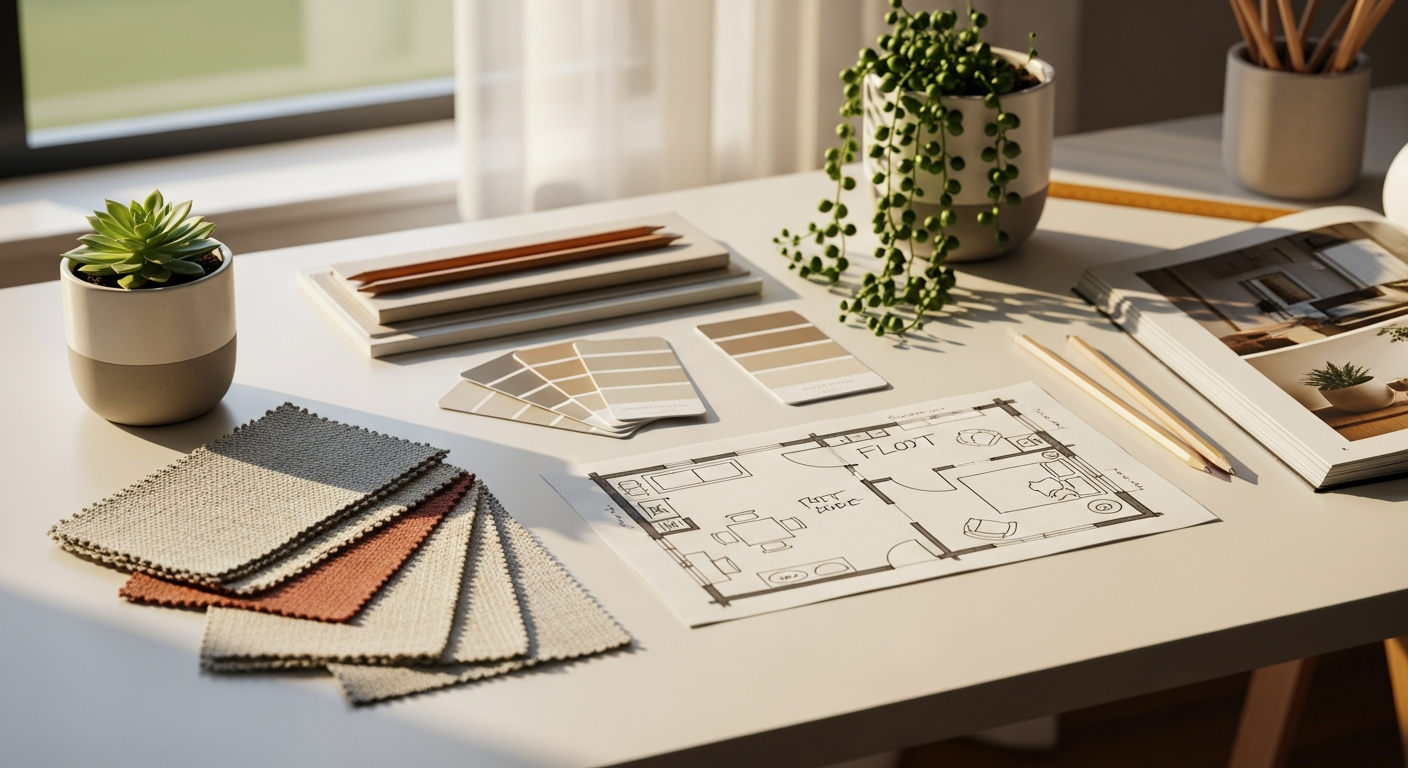
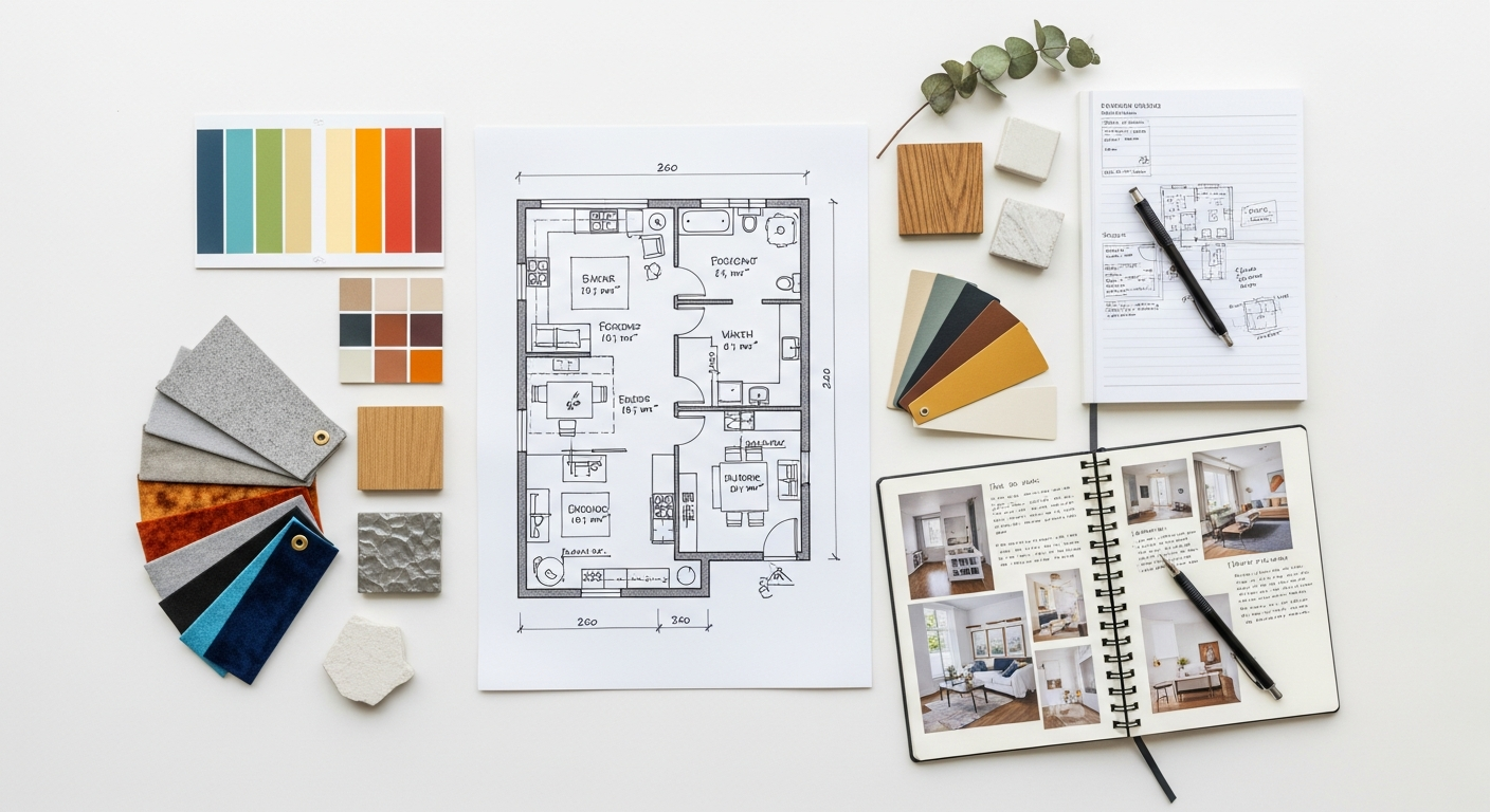
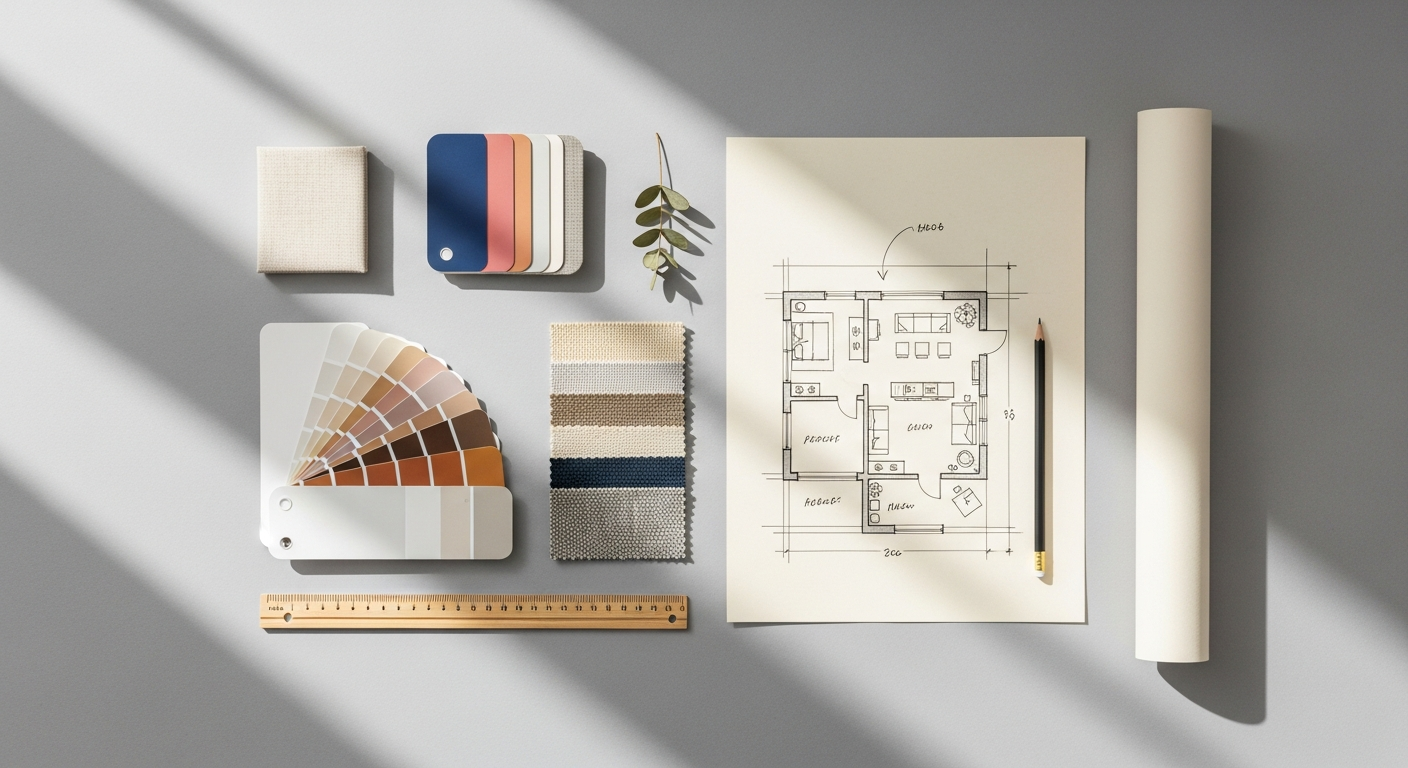
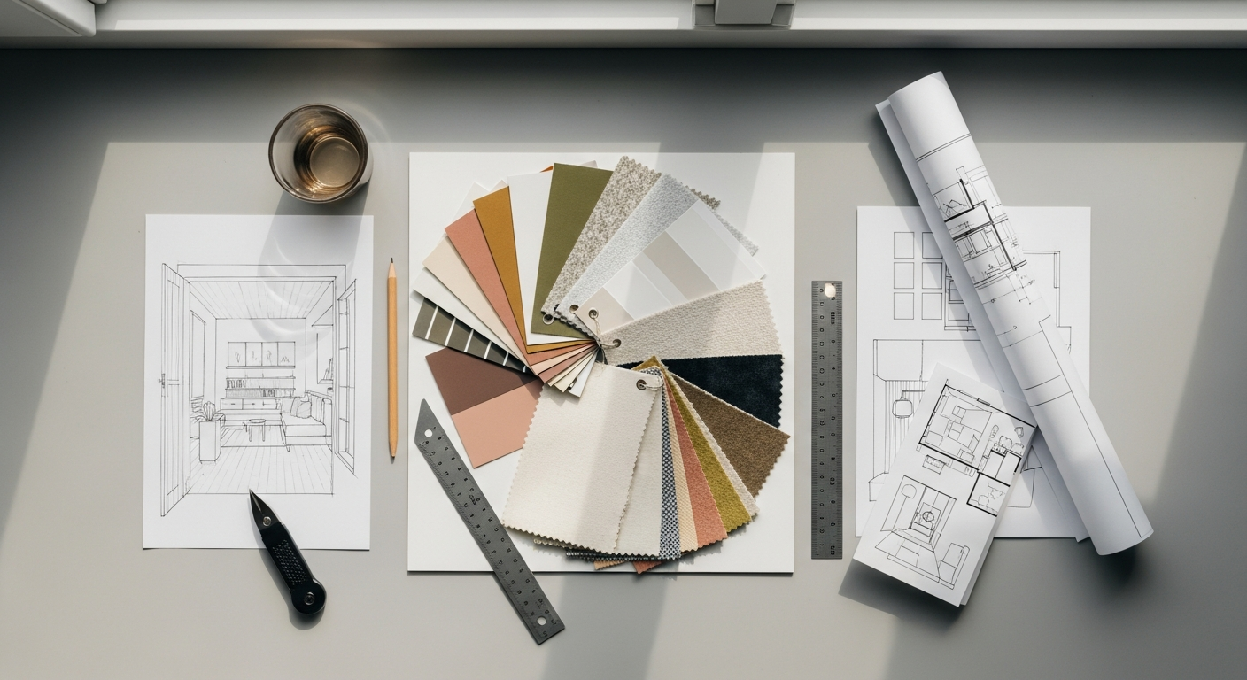
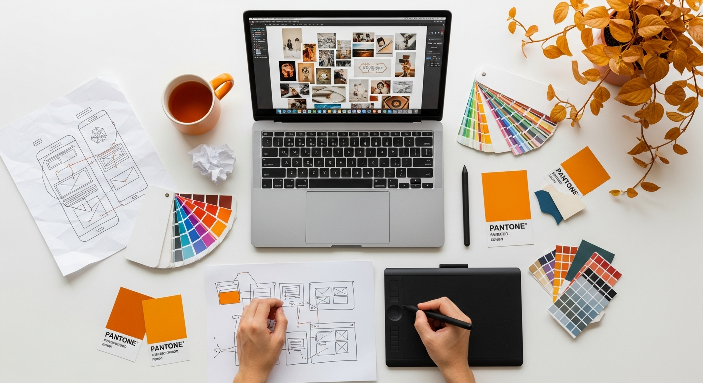
Gathering Your Inspiration: Sources and Strategies for Material Collection
Embracing the Tangible: Physical Sources
- Magazines and Books: Interior design, architecture, fashion, art, and travel magazines are treasure troves of curated imagery. Don’t limit yourself to obvious design publications; a fashion spread might offer a striking colour combination, or a travelogue might inspire a textural palette. Tear out pages, cut out compelling images, and collect interesting headlines or font examples.
- Fabric Swatches & Material Samples: For interior and product design, physical samples are invaluable. Visit fabric stores, hardware stores, paint shops, and material showrooms. Collect samples of upholstery fabrics, drapery materials, wallpaper textures, paint chips (in various finishes like matte, eggshell, gloss), wood veneers, stone samples, metal finishes, and even carpet tiles. The tactile experience of these materials is something digital images cannot fully replicate.
- Natural Elements: Don’t underestimate the power of nature. A dried leaf, a polished pebble, a piece of driftwood, a feather, or a sprig of greenery can introduce organic shapes, textures, and a sense of grounding to your board.
- Found Objects & Ephemera: Keep an eye out for interesting objects during your daily life. A unique button, a vintage postcard, an interestingly shaped piece of packaging, or a ticket stub can all contribute unexpected character and narrative to your mood board. These elements often add a layer of authenticity and personality.
- Photography & Art: Collect prints of artwork, photographs, or illustrations that evoke the desired mood or colour scheme. These can be from art books, gallery visits, or even personal photographs that capture a specific atmosphere.
Navigating the Digital Realm: Online Sources
The internet offers an unparalleled wealth of visual inspiration, making digital mood boards increasingly popular, especially for projects with a rapid turnaround or remote collaboration.
- Pinterest: This platform is arguably the reigning champion for visual discovery. Create dedicated boards for each project and pin images that align with your keywords and aesthetic. Its algorithm is excellent at suggesting similar visuals, leading you down inspiring rabbit holes.
- Instagram: Follow designers, architects, artists, brands, and trend forecasters whose work resonates with your project. Use the save feature to curate collections of inspiring posts. Pay attention to colour stories, composition, and lifestyle imagery.
- Behance & Dribbble: These platforms are fantastic for graphic design, web design, and digital product inspiration. Explore case studies, branding projects, and UI/UX designs to gather examples of typography, iconography, colour usage, and overall aesthetic.
- Design Blogs & Websites: Layout Scene, along with countless other design blogs (e.g., Dezeen, ArchDaily, Design Milk, AIGA Eye on Design), regularly feature inspiring projects and trend reports. Screenshot relevant images or save articles for later reference.
- Stock Photo & Texture Sites: Websites like Unsplash, Pexels, and Pixabay offer high-quality, free-to-use images that can fill gaps in your mood board. For specific textures or patterns, explore sites dedicated to digital assets.
- Colour Palette Generators: Tools like Coolors.co or Adobe Color CC can help you generate and extract colour palettes from images, providing precise hex codes for digital designs.
Strategic Collection Tips:
- Quantity Over Quality (Initially): In the initial gathering phase, don’t be overly critical. Collect everything that vaguely resonates with your keywords and brief. You’ll refine and curate later. Think of it as brainstorming with visuals.
- Look Beyond the Obvious: If you’re designing a kitchen, don’t just look at kitchens. Seek inspiration from fashion for colour combinations, from nature for textures, from architecture for structural forms, or even from film for lighting and atmosphere.
- Document Your Finds: If you’re collecting physical items, keep them organized in a box or folder. For digital finds, ensure you save images with descriptive filenames or use a tool that allows for tagging and categorization. Note down why a particular image or item caught your eye.
- Consider All Sensory Inputs: While primarily visual, a good mood board hints at other senses. A rough texture suggests touch, a warm colour palette suggests a comfortable temperature, and an image of a bustling street might suggest sound.
- Diversify Your Sources: Relying on just one type of source (e.g., only Pinterest) can lead to a narrow or derivative mood board. Mix and match physical and digital, high-end and everyday, to create a rich and unique tapestry of inspiration.
By casting a wide net and employing a strategic approach to gathering, you’ll accumulate a diverse and compelling array of elements, setting the stage for the crucial next step: curation. This abundance of inspiration is key to understanding how to create a mood board for design projects that truly stand out.
The Art of Curation: Selecting and Refining Your Elements
After the exhilarating phase of gathering inspiration, you’ll likely find yourself with an abundance of images, swatches, and ideas – perhaps even an overwhelming pile. This is precisely why the curation phase is so critical. It’s where you transition from collector to editor, refining your vast collection into a focused, cohesive, and impactful narrative. This step is less about quantity and more about quality, relevance, and the ability of each element to contribute to the overall mood and message.
The Culling Process: What to Keep, What to Discard
Begin by reviewing everything you’ve collected. Be ruthless. The goal is not to include every single interesting piece, but to select only those that most powerfully and clearly communicate your desired aesthetic and emotional tone.
- Revisit Your Keywords: Go back to the list of adjectives and themes you generated in the preparation stage. Does each image, texture, or colour sample align with at least one of these core concepts? If an item doesn’t strongly resonate with your defined mood, it likely doesn’t belong.
- Identify Redundancy: You might have multiple images conveying the same idea. Choose the strongest, most representative example and discard the others. Avoid visual clutter; simplicity often leads to greater impact.
- Assess Emotional Impact: Does the element evoke the right feeling? If your project is meant to feel “serene,” does a bustling city street image truly fit, unless it’s specifically contrasting? Each piece should pull its weight in contributing to the emotional narrative.
- Look for Visual Harmony: Even at this stage, start to consider how elements might relate to one another. Do certain colours clash? Do textures feel out of place when considered together? While you won’t assemble the final board yet, a preliminary sense of harmony is helpful.
- Consider the “Why”: For every piece you consider keeping, ask yourself: Why is this here? What specific message or feeling does it convey? If you can’t articulate a clear reason, it’s probably best to let it go.
Identifying Key Themes and Elements
As you refine your collection, certain patterns and themes will begin to emerge. This is where you start to solidify the core components of your mood board:
- Dominant Colour Palette: Identify 3-5 primary colours that repeatedly appear and feel essential to your mood. Also, note accent colours. Collect specific paint chips, fabric swatches, or digital colour samples that represent these.
- Key Textures and Materials: Pinpoint the textures that define your aesthetic. Is it rough concrete, smooth marble, soft wool, rustic wood, or sleek metal? Gather samples or high-quality images of these.
- Recurring Shapes and Forms: Are organic curves prevalent, or sharp geometric lines? Do you see a preference for minimalist forms or ornate details?
- Lighting and Atmosphere: Do your chosen images depict bright, airy spaces, or dim, moody environments? What kind of natural or artificial light sources are present?
- Overall Style and Vibe: Distill the overarching style. Is it industrial chic, bohemian eclectic, ultra-modern, traditional, or something entirely unique?
- Typographic Direction (for branding/graphic design): Even for interior projects that might involve branded elements (e.g., custom signage, menu design), consider the kind of typography that aligns with the mood. Is it elegant serif, bold sans-serif, or a playful script?
Crafting the Narrative: Storytelling Through Selection
A powerful mood board tells a story. Each selected element is a word in that story, and together they form a coherent plot. Think about the narrative you want to convey. For example:
- “This space is a sanctuary of calm, with natural light, soft textures, and muted greens, evoking a connection to nature and mindfulness.”
- “This brand is dynamic and innovative, using bold geometric shapes, a vibrant colour palette, and clean, modern typography to project energy and forward-thinking.”
The selection process is an iterative one. You might add a few items back in, or remove more as you gain clarity. Don’t be afraid to experiment. Lay out your physical items on a large surface or arrange digital images on a canvas to see how they interact. This preview allows you to make final adjustments before committing to the final assembly.
Remember, the goal is not to create a detailed blueprint of the final design, but rather a powerful emotional and aesthetic framework. Every element on your curated board should feel intentional, contributing to a unified vision that speaks volumes without a single word. This careful selection process is paramount in mastering how to create a mood board for design projects that are both beautiful and strategically sound.
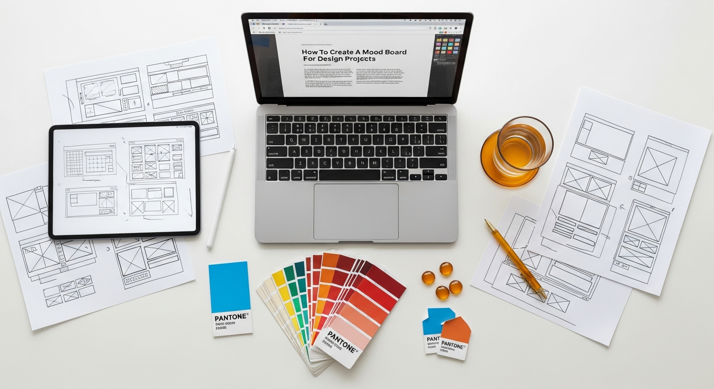
Assembling Your Masterpiece: Layout, Composition, and Digital vs. Physical Approaches
Once you’ve meticulously curated your collection, the next exciting step is to assemble your mood board. This is where your chosen elements come together to form a cohesive visual story. The approach you take—physical or digital—will influence your tools and techniques, but the underlying principles of composition and visual storytelling remain universal.
The Physical Mood Board: Tactile and Immersive
Creating a physical mood board is a deeply tactile and immersive experience, offering a sensory richness that digital formats can sometimes lack.
- Choose Your Base: A sturdy foam core board, cork board, or even a large piece of heavy cardstock makes an excellent base. White or a neutral colour is often best to let your elements shine, though a dark background can create drama for certain moods.
- Adhesives: Use spray adhesive for larger paper items, glue sticks for smaller pieces, and strong double-sided tape or hot glue for fabric swatches and heavier materials. Pins can be used on cork boards for flexibility.
- Layering and Depth: Don’t just stick everything flat. Create depth by layering elements. Place larger, foundational images or swatches at the back, and smaller, accent pieces on top. Overlap elements slightly to create a sense of cohesion and visual flow.
- Composition:
- Focal Point: Identify one or two key images or swatches that encapsulate the core mood and place them prominently.
- Balance: Distribute visual weight evenly across the board. Avoid clustering all heavy elements in one corner.
- Flow: Arrange elements so the eye moves naturally across the board, guiding the viewer through your narrative.
- Whitespace: Don’t feel compelled to fill every inch. Strategic use of empty space can give elements room to breathe and prevent the board from looking cluttered.
- Adding Text: Hand-written notes, keywords, or printed quotes can be incorporated to reinforce the mood. Consider different fonts and hand-lettering styles to match the aesthetic.
- Texture Integration: This is where physical boards truly shine. Place fabric swatches, wood samples, metal pieces, and natural elements directly onto the board. Encourage viewers to touch and experience the textures.
The Digital Mood Board: Flexible and Shareable
Digital mood boards offer unparalleled flexibility, ease of sharing, and the ability to iterate quickly, making them ideal for remote teams and client presentations in 2026.
- Tools of the Trade:
- Specialized Mood Board Tools: Platforms like Milanote, Moodboard.co, or SampleBoard are designed specifically for this purpose, offering intuitive drag-and-drop interfaces, collaboration features, and templates.
- Graphic Design Software: Adobe Photoshop, Illustrator, or InDesign offer complete control over layout, typography, and image manipulation. Canva is an excellent user-friendly alternative for those without extensive graphic design experience.
- Presentation Software: Even PowerPoint or Google Slides can be used, though they offer less creative freedom for organic layouts.
- Canvas Setup: Start with a large canvas size (e.g., 1920×1080 pixels or larger for web, or a print-ready size if it will be printed).
- Image Quality: Ensure all digital images are high-resolution to avoid pixelation, especially if the board will be displayed on a large screen or printed.
- Composition Principles (same as physical, but with digital advantages):
- Grids and Guides: Use digital grids and guides to help align elements and maintain visual consistency.
- Layering: Digital tools allow for easy layering and adjustments. Experiment with opacity and blending modes to create interesting effects.
- Colour Palettes: Directly integrate exact colour swatches with their hex codes or RGB values.
- Typography: Experiment with different font pairings that complement the mood. Include examples of headlines, body text, and any specific branding fonts.
- Integrating Text: Digital boards make it easy to add descriptive keywords, short phrases, quotes, or even URL links to inspiration sources. Ensure text is legible and well-integrated into the design.
- Organisation: Keep your digital files organised. Create folders for different categories of images (e.g., “colours,” “textures,” “furniture styles”).
Universal Composition Principles for Both Approaches:
- Color Harmony: The colour palette is often the most impactful element. Ensure your chosen colours work together harmoniously, creating the desired emotional response. Use a dominant colour, a few secondary colours, and an accent.
- Texture Contrast: Juxtapose different textures to add visual interest – e.g., a smooth marble next to a rough wood, or a sleek metal against a soft fabric.
- Visual Hierarchy: Guide the viewer’s eye. What are the most important elements you want them to notice first? Use size, placement, and contrast to establish this hierarchy.
- Rhythm and Repetition: Repeating certain shapes, colours, or patterns can create a sense of rhythm and reinforce the overall theme.
- Narrative Flow: Arrange elements in a way that tells a coherent story, moving from one idea to the next without abrupt transitions.
Whether you choose the tangible charm of a physical board or the dynamic flexibility of a digital one, the goal is to create a compelling visual narrative. The careful assembly and thoughtful composition are what elevate a simple collection of images into a powerful design tool, demonstrating your mastery of how to create a mood board for design projects that truly inspires.
Presenting and Iterating: Bringing Your Mood Board to Life and Beyond
The creation of a mood board is not an end in itself; it’s a powerful tool for communication, validation, and ongoing guidance throughout the design process. Presenting your mood board effectively and being open to iteration are crucial steps in ensuring its full potential is realized.
Presenting Your Vision with Confidence
When presenting your mood board, whether to a client, a design team, or a collaborator, remember that you are telling a story.
- Set the Stage: Begin by reiterating the project brief and the key objectives. This reminds everyone of the problem you are trying to solve and the goals you aim to achieve.
- Explain Your Thought Process: Don’t just show the board; explain why each element was chosen. Connect specific images, colours, or textures back to your keywords, the client’s brief, and the desired emotional response. For example, “This rough concrete sample was chosen to convey the ‘industrial edge’ you mentioned, contrasting with the soft linen to maintain warmth and comfort.”
- Focus on Emotion and Atmosphere: Emphasize the overall feeling the board evokes. Use descriptive language to articulate the mood. Is it calm, vibrant, sophisticated, playful?
- Encourage Feedback: Open the floor for discussion. Ask specific questions: “Does this feel like the direction you envisioned?” “Are there any elements that don’t quite resonate?” Frame feedback as a collaborative effort to refine the vision.
- Be Prepared to Justify: While being open to feedback, also be ready to articulate the design intent behind your choices. A well-justified decision can help the client understand your perspective.
The Mood Board as a Living Document and Iteration
A mood board should rarely be a static artifact. It’s a foundational document that informs subsequent design phases and can evolve as the project progresses.
- Client Feedback Integration: Based on the feedback received, be prepared to make adjustments. This might involve swapping out a few images, tweaking a colour palette, or even creating an alternative version if there are significantly different preferences. Embrace iteration as a natural part of the creative process. This collaborative refinement ensures that the final mood board is a truly shared vision.
- Guiding Subsequent Design Decisions: Once the mood board is approved, it becomes your primary reference point. Every subsequent design choice – from selecting specific furniture pieces, fabric patterns, or wall finishes for an interior project, to choosing fonts, imagery, or UI elements for a graphic or digital project – should be vetted against the mood board. Does this element align with the established mood and aesthetic? This consistent alignment is critical for a cohesive final design.
- A Benchmark for Evaluation: The mood board acts as an initial “heuristic” – a set of guiding principles – against which later design decisions can be evaluated. Just as UX designers might refer to How To Conduct A Heuristic Evaluation to assess the usability and consistency of a digital interface, you can use your mood board to evaluate whether a proposed design element maintains the integrity of the initial vision. If a new material or graphic element doesn’t align with the mood board, it’s a signal to reassess.
- Informing Brand and Marketing: The aesthetic established by your mood board can extend beyond the immediate project. For instance, if you’re designing a new restaurant, the mood board for the interior can inform the visual style of its menu, website, and even its social media presence. The principles of a good Social Media Graphics Design Guide, such as consistent branding, colour palettes, and imagery, are often born from the foundational work done in the mood board phase. The mood board sets the tone for all visual communication.
- Maintaining Focus: In long-term projects, it’s easy to drift from the original intent. The mood board serves as a constant reminder of the core vision, helping you and your team stay focused and avoid creative detours.
The mood board, therefore, is not merely a pretty picture; it’s a dynamic, communicative, and evaluative tool that underpins the entire design process. By mastering its presentation and embracing its iterative nature, you empower your projects to remain true to their initial inspiration, leading to more successful, cohesive, and impactful outcomes into 2026 and beyond. This comprehensive approach underscores the true value of understanding how to create a mood board for design projects.
Advanced Mood Board Techniques and Common Pitfalls to Avoid
While the fundamental steps of creating a mood board are straightforward, there are advanced techniques that can elevate your boards from simple collections to sophisticated tools of design communication. Conversely, being aware of common pitfalls can save you time, frustration, and ensure your mood board remains an effective guide rather than a misleading distraction.
Advanced Mood Board Techniques
- Storytelling Through Sequence: For presentations, consider arranging your digital mood board elements in a sequence that tells a story. Start with broad concepts, move to specific details (e.g., a macro shot of a texture), then introduce people interacting with the space or product. This guided narrative can be incredibly impactful.
- Creating Multiple Mood Boards for Options: Sometimes a client might be unsure between two distinct directions (e.g., “minimalist” vs. “bohemian”). Instead of trying to blend them into one confusing board, create two separate, distinct mood boards. This clearly presents the options and allows for more focused feedback. This is especially useful in the early stages of a project where divergent paths are being explored.
Recommended Resources
Related reading: What Is Venture Capital And How Does It Work (Eamped).
Explore How To Be Productive Working From Home for additional insights.