The Unseen Architect: Understanding Editorial Design Layout Principles
Editorial design is far more than just making things look pretty; it is a strategic discipline focused on the organization and presentation of content to optimize readability, comprehension, and engagement. Imagine walking into a beautifully designed room; every piece of furniture, every color, and every texture has been thoughtfully placed to create a harmonious and functional space. Editorial design operates on the same premise for visual content. It considers how a reader’s eye moves across a page, how different elements interact, and how the overall composition contributes to the message being conveyed. In an era where information overload is common, effective editorial design acts as a crucial filter, helping readers navigate complex narratives and absorb key insights effortlessly.
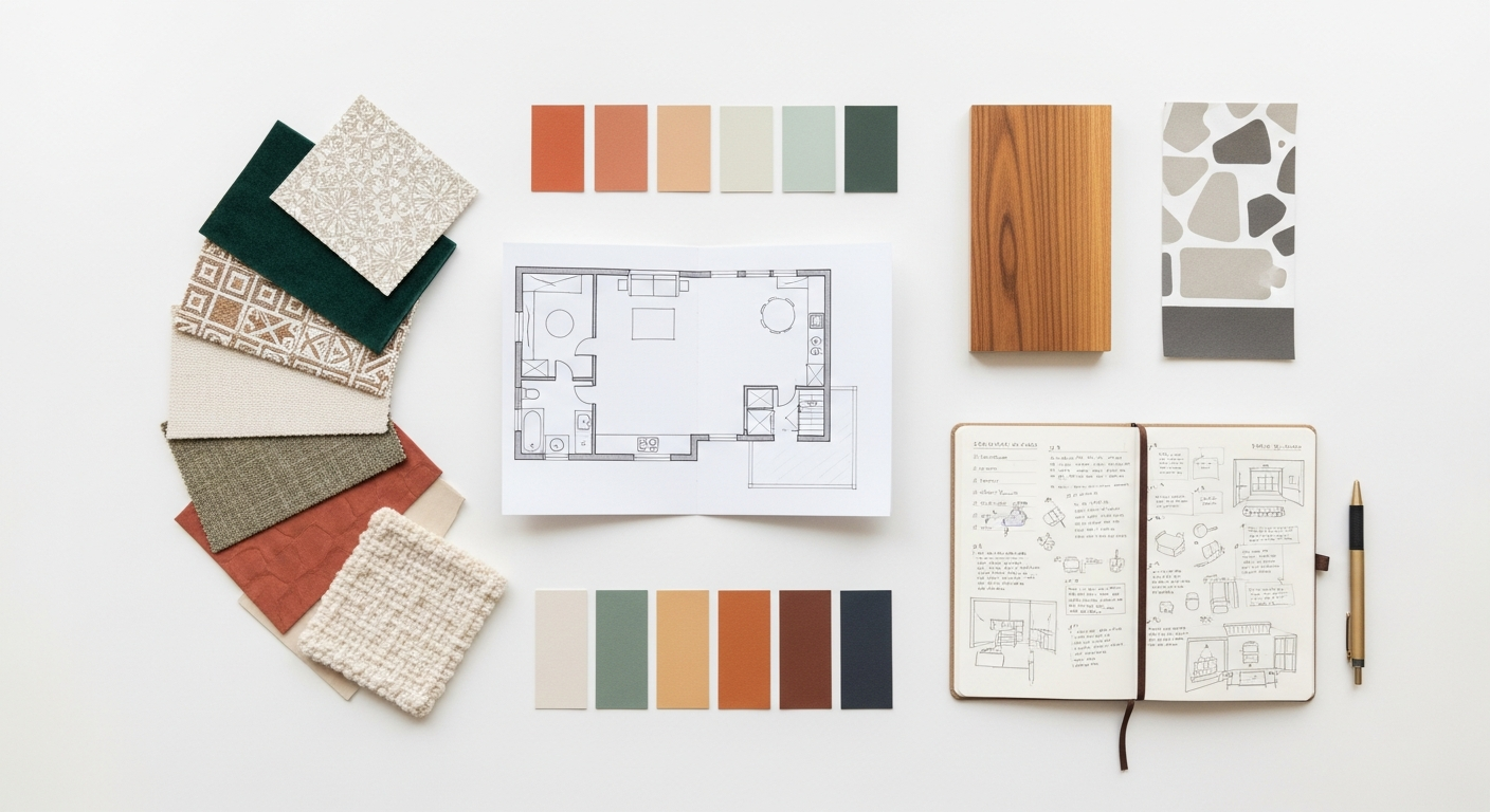
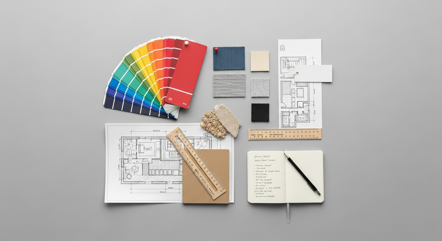
At Layout Scene, we recognize that the principles guiding a well-laid-out article are akin to those dictating a well-designed interior. Both aim to create environments that are inviting, functional, and aesthetically pleasing. A cluttered room is as jarring as a cluttered page. A room with no focal point is as confusing as a layout without clear hierarchy. The goal of editorial design, therefore, is to create a visual journey that is both logical and delightful. It involves a delicate balance of art and science, blending creative expression with psychological understanding of human perception and information processing. This holistic approach ensures that the design not only catches the eye but also holds attention, facilitating a deeper connection with the content. As we move further into 2026, the demand for sophisticated and user-centric editorial design will only intensify, making these principles more vital than ever for content creators across all platforms.
A well-executed editorial layout can significantly enhance the perceived credibility and professionalism of the content. Think of a meticulously crafted magazine versus a hastily assembled flyer; the difference in presentation immediately impacts how seriously the information is taken. This isn’t merely about superficial aesthetics; it’s about building trust and demonstrating respect for the reader’s time and intelligence. When content is presented clearly, logically, and attractively, it communicates a level of care and attention to detail that resonates deeply with the audience. Furthermore, strong editorial design aids in brand recognition, creating a consistent visual identity that becomes synonymous with quality and authority. From the choice of fonts and color palettes to the strategic use of imagery and white space, every decision contributes to a cohesive brand experience that reinforces the message and leaves a lasting impression. It’s the silent storyteller, shaping perception and enhancing the impact of every word and image.
Foundation First: The Power of Grid Systems and Layout Structures
At the heart of every effective editorial layout lies a robust grid system. Think of a grid as the invisible scaffolding upon which all elements of your design are built. Just as an architect relies on blueprints and structural frameworks, a designer uses grids to bring order, consistency, and harmony to a page or screen. Without a grid, layouts can quickly become chaotic, making content difficult to read and understand. Grids provide a predictable structure, ensuring that text blocks, images, and other graphic elements align perfectly, creating a sense of balance and professionalism.
There are several types of grid systems, each suited to different design needs. The most common include the column grid, which divides the page into vertical segments, ideal for multi-column text layouts seen in newspapers and magazines. The modular grid extends this by adding horizontal divisions, creating a series of modules or units that allow for more precise placement of elements, particularly useful for complex layouts involving diverse content types like infographics or image galleries. Finally, the hierarchical grid is less rigid, often used for single-page designs or websites where content flow is less linear, emphasizing specific elements through scale and position rather than strict alignment. Regardless of the type, the core principle remains: to provide a consistent framework that guides the placement of elements.
Beyond simple alignment, grids also define crucial spatial relationships. Margins, the space around the edges of your content, provide necessary breathing room, preventing the design from feeling cramped and making it easier for the eye to focus on the main content. Gutters are the spaces between columns or modules, separating elements clearly and enhancing readability. A well-defined baseline grid ensures that the baselines of text lines align across columns and pages, creating a rhythmic and cohesive visual texture. This meticulous attention to spacing, often overlooked by the untrained eye, is paramount for creating a polished and professional look.
The application of mathematical principles like the Golden Ratio and the Rule of Thirds can further enhance a grid’s effectiveness. The Golden Ratio, approximately 1.618, is often found in nature and art, creating aesthetically pleasing proportions. Incorporating this ratio into your column widths, image placement, or overall page dimensions can imbue your layout with an inherent sense of balance and beauty. Similarly, the Rule of Thirds suggests placing points of interest along imaginary lines that divide the page into nine equal sections, or at their intersections, to create more dynamic and engaging compositions. These principles, when combined with a well-chosen grid, elevate a layout from merely organized to truly captivating.
For designers working on digital platforms, understanding responsive grid systems is critical. As content is consumed on a myriad of devices in 2026, from large desktop monitors to small smartphone screens, layouts must adapt seamlessly. A responsive grid ensures that the underlying structure fluidly adjusts, reflowing content and scaling elements to maintain readability and visual integrity across all breakpoints. This adaptability is key to delivering a consistent and optimal user experience, reinforcing the idea that a robust structural foundation is not just an aesthetic choice, but a functional imperative for effective editorial design in the modern landscape.
Guiding the Eye: Hierarchy, Visual Flow, and Readability
Visual hierarchy is established through a variety of design elements. Size is perhaps the most direct method: larger headlines immediately signal importance. Weight (boldness) and color can also draw attention, making specific words or phrases pop. Position on the page plays a significant role; elements placed at the top or center of a layout often command more attention. Furthermore, the use of white space to isolate and emphasize elements can dramatically impact perceived importance. By strategically manipulating these visual cues, designers can create a compelling visual flow that directs the reader’s gaze along a predetermined path.
Understanding common reading patterns is essential for designing effective visual flow. Research has shown that users typically scan digital content in F-patterns (reading across the top, down the left side, then across again) or Z-patterns (across the top, diagonally down, then across the bottom). For print, the natural flow is typically left-to-right, top-to-bottom. Designing with these patterns in mind means placing critical information, headlines, and call-to-actions in areas where the eye naturally falls. This strategic placement ensures that even if a reader is only scanning, they are likely to encounter the most important parts of your message. This directly relates to What Is UX Design And Why It Matters: a layout with clear hierarchy and intuitive flow significantly enhances the user experience by reducing cognitive load and improving information discoverability. A user who can easily find what they’re looking for and understand the content quickly is a satisfied user.
Readability is another cornerstone of effective visual flow. It refers to how easily individual words and sentences can be distinguished and processed. Several factors contribute to readability: line length, for instance, should be optimized. Lines that are too long can make it difficult for the eye to track from the end of one line to the beginning of the next, while lines that are too short can create a choppy reading experience. Generally, 45-75 characters per line is considered ideal for body text. Leading (the space between lines of text) is equally important; insufficient leading can make text feel dense and claustrophobic, while excessive leading can break the visual connection between lines. Similarly, tracking (the uniform spacing between letters) and kerning (the spacing between specific pairs of letters) ensure that words appear balanced and legible.
By meticulously attending to these details, designers create a harmonious and inviting reading experience. A layout that thoughtfully guides the reader’s eye through a clear hierarchy and ensures optimal readability transforms information into a narrative. It allows the reader to absorb complex ideas effortlessly, making the content not just comprehensible, but genuinely engaging. This meticulous approach to guiding the reader’s journey is fundamental to delivering impactful and memorable editorial content, reinforcing that good design is ultimately about effective communication.
The Voice of Content: Mastering Typography in Editorial Layout
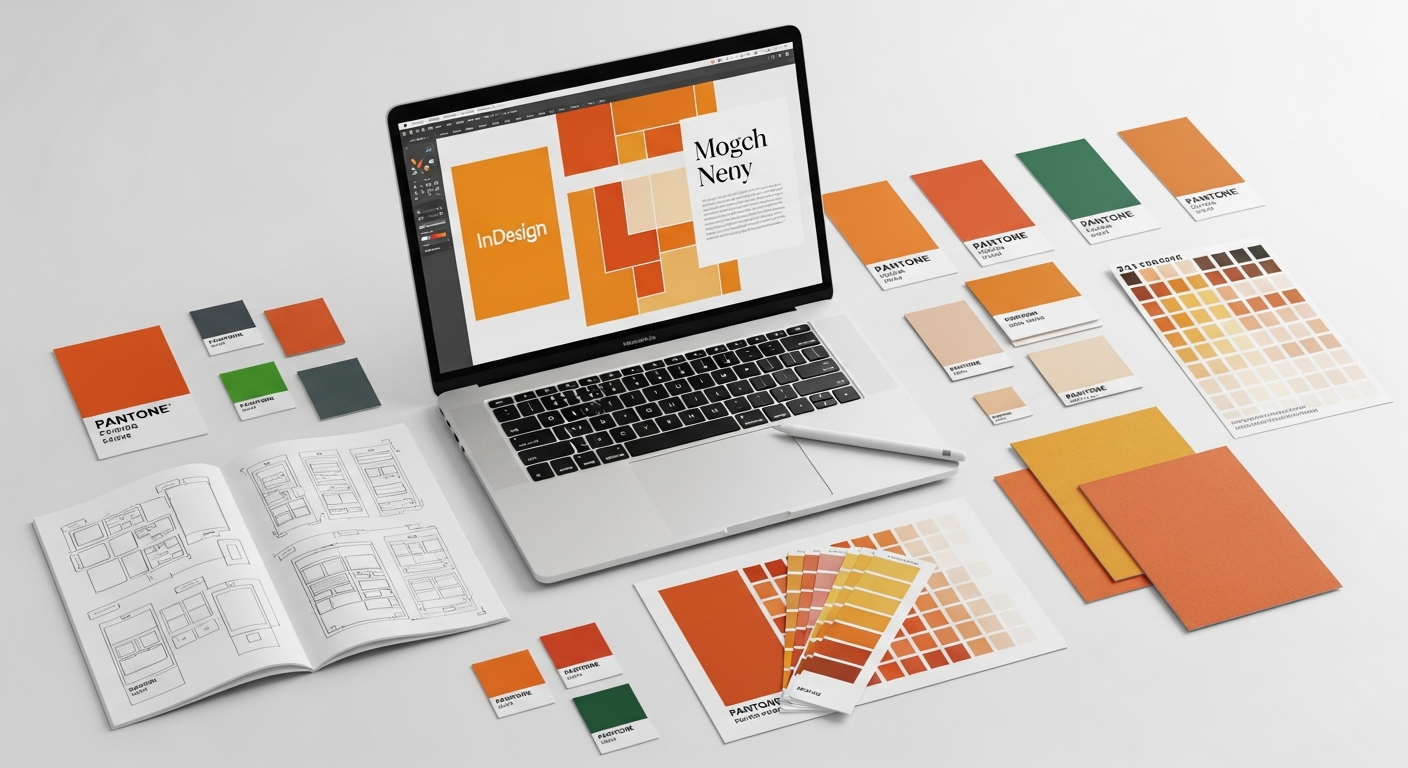
Typography is the silent narrator of your content, lending it a distinct voice, personality, and tone. It’s more than just choosing pretty fonts; it’s about making deliberate decisions that impact legibility, readability, and the emotional resonance of your message. In editorial design, typography plays a pivotal role in establishing hierarchy, guiding the reader, and reinforcing brand identity. A poorly chosen or executed typeface can undermine even the most brilliant content, while masterful typography elevates it to an art form.
The first step in mastering typography is understanding the different categories of typefaces. Serif fonts, characterized by the small decorative strokes (serifs) at the end of their letters, are often associated with tradition, authority, and readability in long-form print contexts. Think of classic newspapers and books. Sans-serif fonts, without these strokes, convey modernity, cleanliness, and efficiency, and are widely preferred for digital screens due to their crisp appearance. Then there are display fonts, which are highly decorative and best reserved for headlines, logos, or short bursts of text where impact and personality are paramount. Script and decorative fonts fall into this category.
Choosing the right typeface involves considering the context and the message. A financial report might benefit from a serious, authoritative serif, while a creative blog post for Layout Scene could employ a more contemporary sans-serif or even a playful display font for headings. Font pairing is an art in itself. The goal is to select two (rarely more than three) typefaces that complement each other without competing. Common strategies include pairing a serif with a sans-serif for contrast, or choosing fonts from the same “superfamily” that offer different weights and styles. The key is to create visual interest while maintaining harmony and clarity.
Beyond selecting typefaces, the application of typography within a layout is critical. Different weights (light, regular, bold, black), sizes, and styles (italic, condensed, expanded) are used to create a clear hierarchy. Headlines demand strong, prominent typefaces to grab attention. Subheadings break up text and introduce new sections. Body copy, the bulk of your content, requires a typeface that is highly legible and comfortable to read for extended periods. Captions for images, pull quotes, and footnotes each have their own typographic requirements, typically smaller sizes and sometimes different styles to differentiate them from the main text.
Legibility refers to how easily individual characters can be distinguished from one another, while readability, as discussed earlier, concerns the ease with which blocks of text can be read. Both are paramount. Factors like the x-height (the height of lowercase letters), character width, and the distinctiveness of individual letters all contribute to legibility. For digital content, ensuring that fonts are optimized for screen rendering and that they scale effectively across various devices is crucial. This consideration is particularly important as we approach 2026, with diverse screen sizes becoming the norm. The judicious use of capitalization, line spacing (leading), letter spacing (tracking), and individual character spacing (kerning) further refines the typographic experience, ensuring that every word is not only seen but truly read and absorbed.
Ultimately, typography is about amplifying the message. It can evoke emotions, establish credibility, and guide the reader through complex information with ease. Mastering typography means understanding that every character, every word, and every paragraph contributes to the overall narrative and the user’s journey, making it a powerful tool in the editorial designer’s arsenal.
Palette and Picture: Leveraging Color, Imagery, and Data Visualization
Color and imagery are the emotional heart of editorial design, capable of instantly setting a mood, conveying complex information, and captivating an audience. While typography speaks to the intellect, visuals speak directly to the senses, creating immediate impact and enhancing memorability. When used strategically, they transform a static layout into a vibrant, engaging experience that resonates deeply with the reader.
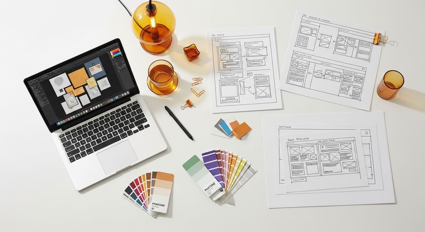
Color is a potent psychological tool. Different colors evoke distinct emotions and associations: blues often convey trust and calm, reds passion and energy, greens nature and growth. In editorial design, a carefully chosen color palette not only enhances aesthetic appeal but also reinforces brand identity and hierarchy. A consistent color scheme across an entire publication or website helps establish a cohesive visual language, making the content instantly recognizable and professional. Accent colors can be used strategically to highlight important information, delineate sections, or draw attention to calls to action. However, moderation is key; an overly complex or clashing palette can distract and overwhelm, diminishing readability and professionalism.
Imagery – photographs, illustrations, and iconography – serves multiple critical functions. Photographs can transport the reader, provide context, evoke empathy, or simply add visual interest. High-quality, relevant photography is indispensable for breaking up text-heavy sections and making content more approachable. Illustrations offer a more stylized approach, allowing for greater creative expression and the ability to convey abstract concepts or create a unique brand aesthetic. Icons, on the other hand, are invaluable for quickly communicating complex ideas or guiding users through interfaces, particularly in digital editorial design. The placement, cropping, and sizing of images are crucial; they should complement the text, not overpower it, and always be accompanied by informative captions that add value to the narrative.
Integrating Infographic Design Tips And Best Practices is where the power of visuals truly shines in conveying complex data and information. In an increasingly data-rich world, editorial design frequently involves transforming statistics, trends, and processes into easily digestible visual formats. Effective infographics leverage a combination of color, icons, charts, and diagrams to:
- Simplify Complexity: Break down intricate data into understandable chunks.
- Enhance Engagement: Make dry facts more appealing and memorable.
- Improve Retention: Visual information is often recalled more easily than text alone.
- Show Relationships: Illustrate connections and patterns that might be hard to discern from raw data.
When designing infographics for editorial layouts, focus on clarity, accuracy, and visual hierarchy. Use consistent color coding, clear labels, and a logical flow to guide the viewer through the data story. Avoid clutter and unnecessary embellishments, prioritizing the information itself. Good infographic design ensures that the visual elements not only decorate the page but actively contribute to the reader’s understanding and engagement with the content.
The synergy between color, imagery, and data visualization elements is what creates truly impactful editorial design. Each component should be selected and positioned with purpose, working in concert to tell a compelling story, reinforce the message, and elevate the overall user experience. By carefully crafting these visual elements, designers can transform information into an immersive and unforgettable journey for the reader.
The Art of Absence: White Space and Its Strategic Role
In a world often obsessed with filling every available inch, the concept of white space might seem counterintuitive. Yet, in editorial design, white space – also known as negative space – is not merely an empty void; it is a powerful design element, an unsung hero that dramatically enhances readability, clarity, and overall aesthetic appeal. It’s the art of absence, the strategic use of blank areas around and between design elements to create balance, focus, and a sense of sophistication.
The primary function of white space is to provide breathing room. Just as a well-designed interior needs open areas to feel spacious and inviting, a page or screen needs white space to prevent visual clutter and overwhelm. When elements are crammed together without adequate spacing, the design feels dense, chaotic, and difficult to process. White space acts as a visual palate cleanser, allowing the reader’s eye to rest and preventing fatigue, especially in long-form content.
Beyond simply clearing clutter, white space plays a crucial role in improving focus and hierarchy. By strategically surrounding key elements with ample negative space, designers can draw immediate attention to them. A headline, an image, or a pull quote isolated by white space instantly stands out, signaling its importance and guiding the reader’s eye. This creates a clear visual hierarchy, making it easier for readers to quickly identify and absorb the most critical information without distraction. Think of a single, exquisite piece of art displayed on a vast, empty gallery wall; the surrounding space amplifies its significance.
White space also significantly contributes to legibility and readability. Ample space between lines of text (leading), between words, and between paragraphs makes text blocks easier to scan and comprehend. Without sufficient leading, lines of text merge into a solid block, making reading a strenuous task. Similarly, generous margins around the entire content block improve the reading experience by framing the text and preventing the eye from getting lost at the edges of the page or screen. This thoughtful application of white space directly enhances the user experience, making content consumption more pleasant and efficient.
Furthermore, the judicious use of white space can elevate the perceived quality and sophistication of a design. Designs that embrace negative space often convey a sense of elegance, minimalism, and premium quality. It suggests confidence and intention, rather than a desperate attempt to fill every void. This perception of quality can significantly impact how a brand or publication is viewed, fostering trust and authority. In an era of increasing digital noise, a clean, spacious layout can be a refreshing and highly effective way to capture and retain attention.
For designers, mastering white space means understanding its strategic power. It’s not about leaving blank areas by accident, but about intentionally using them to create visual balance, direct attention, enhance readability, and evoke a desired mood. Whether it’s micro white space (the small gaps between letters, words, and lines) or macro white space (the larger areas around blocks of text and images), every empty pixel or millimeter serves a purpose. Embracing the art of absence is fundamental to creating editorial layouts that are not only beautiful but also supremely functional and user-friendly, a principle that remains timeless even in the rapidly evolving digital landscape of 2026.
Cohesion and Credibility: Consistency, Brand Identity, and Digital Adaptation
In the dynamic world of content creation, especially for blogs like Layout Scene, establishing cohesion and credibility is paramount. This is achieved through unwavering consistency in design and the meticulous cultivation of a strong brand identity. Editorial design principles are not merely applied once; they form a continuous visual language that speaks volumes about your content and your brand across all platforms. As we look towards 2026, the need for adaptability to diverse digital environments while maintaining this core identity becomes even more critical.
Consistency in editorial design refers to the uniform application of design elements across all pieces of content. This includes consistent use of typefaces, color palettes, image styles, grid structures, and even the tone of voice in captions and headings. When a reader encounters your content, whether it’s a new blog post, an archived article, or a social media graphic, a consistent visual style immediately signals that it belongs to your brand. This familiarity builds trust and reinforces your brand’s presence, making the content feel reliable and professionally curated. Inconsistency, on the other hand, can create a disjointed and unprofessional impression, leading to confusion and eroding reader confidence.
The consistent application of design principles directly contributes to the development of a strong brand identity. Your editorial design choices—from the boldness of your headlines to the warmth of your chosen colors—collectively define your brand’s personality and values. A brand with a sophisticated and minimalist aesthetic will use white space generously and select clean, elegant typefaces. A vibrant and playful brand might opt for bolder colors and more expressive imagery. This visual identity is not static; it evolves but always maintains core elements that make it uniquely recognizable. It’s about creating an experience that is distinctly yours, fostering loyalty and distinguishing your content in a crowded digital space.
However, the challenge for modern editorial design lies in adapting these principles for the digital realm. Print and digital have different affordances and constraints. A beautiful magazine spread designed for a physical page may not translate effectively to a smartphone screen. This is where the principles of responsive design become indispensable. Digital editorial layouts must be flexible, capable of scaling and reorganizing content fluidly across various devices—from large desktop monitors to tablets and mobile phones. Elements like navigation, interactive components, and loading speed also come into play, which are less relevant in static print.
This digital adaptation brings us directly to the importance of user experience (UX) and evaluation. To ensure that your digital editorial design is effective, it’s crucial to understand What Is UX Design And Why It Matters. UX design focuses on creating products and experiences that are useful, usable, and desirable for the end-user. In the context of editorial design, this means ensuring that your layouts are not only aesthetically pleasing but also intuitive to navigate, easy to read on any device, and provide a seamless content consumption journey. A well-designed digital layout anticipates user needs, minimizes friction, and maximizes engagement.
To assess the effectiveness of digital editorial layouts, one can How To Conduct A Heuristic Evaluation. This systematic inspection method involves evaluating an interface against a set of established usability principles (heuristics). For editorial design, this would include assessing:
- Visibility of system status: Is it clear where the user is in the content?
- Match between system and the real world: Does the language and visual design feel natural and intuitive?
- User control and freedom: Can users easily navigate, zoom, or share content?
- Consistency and standards: Are design elements consistent across the site?
- Error prevention: Is the layout designed to minimize user errors?
- Recognition rather than recall: Are options and information easily discoverable?
- Flexibility and efficiency of use: Does it cater to both new and experienced users?
- Aesthetic and minimalist design: Is the layout clean, uncluttered, and free from irrelevant information?
- Help users recognize, diagnose, and recover from errors: Are error messages clear and helpful?
- Help and documentation: Is support readily available if needed?
By conducting such an evaluation, designers can identify usability issues in their digital editorial layouts and make informed improvements, ensuring that the design not only looks good but also performs optimally for its audience in 2026 and beyond. This continuous process of design, evaluation, and refinement is what builds truly credible and user-centric content experiences.
Frequently Asked Questions
Recommended Resources
Related reading: How To Improve Wi Fi Speed At Home (Bookmark Sharer).
Related reading: What Is A Sales Funnel And How To Build One (Eamped).