
html
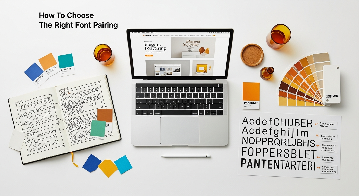
In the intricate world of design, every element plays a crucial role in conveying a message, evoking an emotion, and ultimately, engaging an audience. Among these elements, typography stands as a silent yet powerful storyteller, shaping perception and guiding the user’s journey. Just as interior designers carefully select furniture, colors, and textures to create a cohesive and inviting space, digital and print designers must master the art of font pairing. Choosing the right font combination isn’t merely an aesthetic choice; it’s a strategic decision that impacts readability, brand identity, and user experience. A well-chosen font pairing can transform a mundane design into a captivating masterpiece, establishing visual hierarchy, reinforcing your message, and creating a memorable impression. Conversely, a mismatched pair can lead to confusion, undermine credibility, and detract from an otherwise brilliant concept. This comprehensive guide from Layout Scene will unravel the complexities of typography, providing you with the knowledge and practical strategies needed to confidently select font pairings that resonate, perform, and truly elevate your design projects in 2026 and beyond.
Understanding the Building Blocks: Font Classifications and Their Personalities
Before diving into the intricacies of pairing, it’s essential to grasp the fundamental characteristics of individual fonts. Each typeface belongs to a classification, carrying with it a historical legacy, a set of design principles, and an inherent personality. Recognizing these distinctions is the bedrock of intelligent font pairing, allowing you to select fonts that not only look good together but also communicate the desired mood and message.
Serif Fonts: The Traditionalists
- Characteristics: Serif fonts are distinguished by the small decorative strokes, or “serifs,” at the end of their letterforms. Think of classic newspaper print or book text.
- Personality: They exude a sense of tradition, authority, reliability, and sophistication. They can feel formal, established, and trustworthy.
- Common Uses: Ideal for body text in print (as serifs can guide the eye along lines of text), headlines in traditional branding, and projects requiring a classic or elegant feel. Examples include Times New Roman, Georgia, and Garamond.
Sans-Serif Fonts: The Modernists
- Characteristics: As their name suggests (“sans” meaning “without”), sans-serif fonts lack the decorative strokes found in serifs. They feature clean, straight lines.
- Personality: They are often perceived as modern, clean, minimalist, approachable, and highly versatile. They can convey simplicity, efficiency, and a contemporary feel.
- Common Uses: Extremely popular for digital displays (where serifs can sometimes appear pixelated at small sizes), body text in web design, branding for tech companies, and any design aiming for a clean, modern aesthetic. Examples include Helvetica, Arial, Open Sans, and Montserrat.
Script Fonts: The Artisans
- Characteristics: Script fonts mimic handwriting, ranging from elegant calligraphy to casual cursive. They often feature flowing strokes and connected letters.
- Personality: They evoke elegance, creativity, personal touch, warmth, and sometimes a whimsical or luxurious feel.
- Common Uses: Best reserved for headlines, logos, invitations, and short bursts of text where a distinct, personal, or celebratory touch is desired. Due to their intricate nature, they are generally unsuitable for body text. Examples include Pacifico, Great Vibes, and Brush Script.
Display Fonts: The Showstoppers
- Characteristics: Also known as decorative fonts, display fonts are designed to grab attention and are typically used in large sizes for headlines, titles, and logos. They often have unique, highly stylized designs.
- Personality: Their personality is diverse, ranging from playful and quirky to bold and dramatic, depending on their specific design. They are meant to be expressive.
- Common Uses: Perfect for branding, posters, book covers, and any application where the primary goal is visual impact and a strong brand statement. They should be used sparingly. Examples include many custom-designed typefaces and highly stylized fonts like Lobster or Bebas Neue.
Monospace Fonts: The Technicians
- Characteristics: In monospace fonts, every letter and character occupies the same horizontal space, similar to a typewriter.
- Personality: They convey a sense of precision, technicality, retro charm, and often have a utilitarian or coding aesthetic.
- Common Uses: Popular for coding environments, technical documentation, tables, and designs aiming for a retro computing or industrial look. Examples include Courier New, Consolas, and Space Mono.
By understanding these fundamental classifications, you begin to build a mental library of fonts and their inherent characteristics. This knowledge is your first step in discerning which fonts might naturally complement each other and which might clash, laying the groundwork for effective font pairing.
Why Font Pairing Matters: Beyond Pure Aesthetics

While the visual appeal of a design is undeniably important, the strategic choice of font pairings extends far beyond mere aesthetics. Effective typography is a cornerstone of good design, directly influencing how users interact with and interpret your content. It’s a critical component of user experience (UX), brand communication, and the overall success of any creative project.
Enhancing Readability and Legibility
At its core, typography’s primary function is to make text readable. Legibility refers to how easily individual characters can be distinguished, while readability refers to how easily blocks of text can be read and understood. A good font pairing ensures that both headline and body text are clear and comfortable for the eye. Imagine reading a website where the main paragraphs are set in an ornate script font – it would quickly become frustrating. Conversely, a well-paired headline (perhaps a bold serif) with a clear body text (a simple sans-serif) guides the reader smoothly through the content, preventing eye strain and cognitive overload.
Establishing Visual Hierarchy
Font pairing is a powerful tool for creating visual hierarchy, which is the arrangement of design elements in order of importance. By choosing different fonts, weights, sizes, and styles for various text elements (e.g., headlines, subheadings, body text, captions), you can visually direct the user’s eye, indicating what information is most important and how different pieces of content relate to each other. This is crucial for guiding users through complex layouts and ensuring they grasp key messages quickly. Without clear hierarchy, a page can appear as a monolithic block of text, overwhelming the user.
Reinforcing Brand Identity and Tone
Just as a company’s logo and color palette convey its identity, its chosen fonts speak volumes about its brand personality. A sleek sans-serif might suit a tech startup, while an elegant serif could be perfect for a luxury brand. The combination of fonts you choose should align with your brand’s values, mission, and target audience. Inconsistent or mismatched fonts can dilute your brand message, making it appear unprofessional or confused. A strong font pairing, however, reinforces your brand’s unique voice and helps build trust and recognition.
Elevating User Experience (UX)
This brings us directly to the critical concept of user experience. As explored in discussions around What Is UX Design And Why It Matters, the goal of UX is to create products and experiences that are useful, usable, and desirable. Font pairing plays a significant role in usability and desirability. When fonts are well-chosen, they contribute to a seamless and intuitive user journey. Content becomes easier to consume, navigation feels more natural, and the overall interaction is more pleasant.
Poor font choices, on the other hand, can lead to a frustrating UX. Illegible text, a lack of visual hierarchy, or fonts that clash with the content’s tone can cause users to abandon a website, overlook crucial information, or develop a negative perception of a brand. Thoughtful font pairing, therefore, is not just about making things look good; it’s about making them function effectively and delight the user. It ensures that the information architecture is visually clear, reducing cognitive load and improving engagement.
Guiding Emotional Response
Fonts, through their shapes and historical associations, carry emotional weight. A whimsical script can evoke joy, a bold sans-serif might convey strength, and a classic serif can suggest timeless elegance. By carefully pairing fonts, you can orchestrate a specific emotional response from your audience, aligning it with the message you wish to convey. This subtle psychological influence contributes deeply to the overall impact and memorability of your design.
In essence, font pairing is a strategic design decision that underpins the success of any visual communication. It’s about creating a harmonious visual language that is not only beautiful but also highly functional, deeply communicative, and optimized for the user.
Principles of Harmonious Font Pairing
Achieving perfect font harmony isn’t a mystical art; it’s a skill built upon understanding a few core design principles. These guidelines will help you navigate the vast sea of typefaces and create pairings that are both aesthetically pleasing and functionally effective.
1. Contrast Without Conflict: The Golden Rule
This is perhaps the most crucial principle in font pairing. Your chosen fonts should be different enough to create visual interest and establish hierarchy, but not so different that they clash or create visual noise. Imagine trying to read two wildly decorative fonts side-by-side; it would be jarring. The contrast can come in several forms:
- Classification: Pairing a serif with a sans-serif is a classic example.
- Weight: A light font with a heavy font.
- Size: A large headline with smaller body text.
- Mood/Personality: A playful display font with a serious sans-serif.
- Era: A vintage-inspired font with a modern one.
The key is to ensure the differences are intentional and serve a purpose, rather than being random. They should complement, not compete.
2. Establish Clear Hierarchy
As discussed earlier, font pairing is instrumental in creating a visual hierarchy. Your font choices should immediately communicate the importance of different text elements.
- Headlines: Often larger, bolder, and sometimes more distinctive to grab attention.
- Subheadings: Slightly less prominent than headlines, but still distinct from body text. They might use a different weight or a slightly larger size of the body font, or a complementary font from the headline family.
- Body Text: Prioritizes readability above all else. It should be clear, comfortable to read for extended periods, and generally less “noisy” than a headline font.
- Captions/Ancillary Text: Often smaller and sometimes in a lighter weight or italicized version of the body font.
A well-defined hierarchy guides the reader’s eye effortlessly through your content, ensuring they absorb information in the intended order.
3. Consider the Mood and Message
Every design project has an underlying message and a desired mood. Your font pairing should amplify these. Are you designing for a whimsical children’s book, a corporate annual report, a cutting-edge tech blog, or a serene interior design portfolio?
- A playful, rounded sans-serif paired with a clean script might work for a bakery.
- A strong, architectural sans-serif with a reliable serif could suit a financial institution.
- An elegant serif paired with a minimalist sans-serif might fit a luxury brand.
The fonts you choose should resonate with the core identity and purpose of your project, creating a cohesive and authentic visual narrative.
4. Prioritize Legibility and Readability
While visual appeal is important, if your text can’t be read, the design fails. Always test your font pairings for legibility (can individual letters be distinguished?) and readability (is a block of text comfortable to read?).
- Size Matters: Ensure body text is large enough, especially for digital displays.
- Line Height (Leading): Adequate space between lines of text prevents them from merging.
- Letter Spacing (Kerning/Tracking): Too tight or too loose can hinder readability.
- Color Contrast: Ensure sufficient contrast between text and background.
Even the most beautiful font pairing is useless if it causes eye strain or confusion. Always view your chosen fonts on different devices and at various sizes to confirm their usability.
5. Maintain Consistency and Cohesion
Once you’ve chosen your font pairing, stick with it. Consistency across all your design elements – from your website to your social media graphics, print materials, and infographics – builds brand recognition and reinforces professionalism. While you might use different weights or styles within your chosen font families, introducing too many new typefaces will lead to a disjointed and amateurish look. A well-chosen, consistent font palette creates a sense of unity and strengthens your overall design language.
By consciously applying these principles, you’ll move beyond guessing and start making informed, strategic decisions about your font pairings, resulting in designs that are not only beautiful but also highly effective and user-friendly.
Practical Strategies for Successful Font Pairing
Theory is one thing; practical application is another. With the principles of harmonious pairing in mind, let’s explore actionable strategies you can employ to create compelling and effective font combinations. Remember, these are starting points, and experimentation is key!
Strategy 1: The Classic Contrast – Serif and Sans-Serif
This is arguably the most common and consistently successful font pairing strategy, offering a beautiful balance of tradition and modernity, structure and simplicity.
- How it works: Pair a traditional serif font for headlines or titles with a clean, modern sans-serif for body text, or vice versa. The serifs provide a sense of gravitas and elegance, while the sans-serif offers clarity and a contemporary feel.
- Why it works: The inherent contrast in their classifications immediately establishes visual hierarchy and interest without clashing. Serifs often lend themselves well to print-like aesthetics, guiding the eye, while sans-serifs are highly readable on screens.
-
Examples:
-
Headline (Serif): Playfair Display (elegant, high contrast)
Body (Sans-serif): Open Sans (neutral, highly readable)
-
Headline (Sans-serif): Montserrat (modern, geometric)
Body (Serif): Lora (classic, warm)
-
Headline (Serif): Playfair Display (elegant, high contrast)
Strategy 2: The Same Superfamily – Variety Within Unity
Many professional font families (or superfamilies) are designed with a wide range of weights, styles (italic, oblique), and sometimes even different classifications (e.g., a serif and a sans-serif version) that are inherently compatible.
- How it works: Choose a single, versatile font family and use different weights (light, regular, bold, black) or styles (italic) for your headline, subheadings, and body text. Some superfamilies even include complementary serif and sans-serif versions, giving you built-in harmony.
- Why it works: This approach guarantees harmony because all fonts are designed by the same hand, ensuring consistent underlying structures, x-heights, and visual rhythms. It’s a foolproof way to create a polished and cohesive look.
-
Examples:
-
Headline: Lato Black
Subheading: Lato Bold
Body: Lato Regular
-
Headline: Roboto Slab Bold (serif version of Roboto)
Body: Roboto Regular (sans-serif version)
-
Headline: Lato Black
Strategy 3: The Statement Piece – Display/Script with a Simple Sans-Serif
When you want a strong, unique personality for your headlines or a specific design element, a display or script font can be incredibly effective. However, they need a quiet partner.
- How it works: Select a highly distinctive display or script font for your main headline or logo. Pair it with a very clean, simple, and highly readable sans-serif font for all other textual elements (subheadings, body text).
- Why it works: The simple sans-serif acts as a neutral canvas, allowing the unique personality of the display or script font to shine without overwhelming the design or compromising readability. The contrast is high in personality and complexity, but low in visual competition.
-
Examples:
-
Headline (Script): Great Vibes
Body (Sans-serif): Montserrat Light
-
Headline (Display): Bebas Neue (tall, condensed)
Body (Sans-serif): Roboto Condensed Regular
-
Headline (Script): Great Vibes
Strategy 4: The “Opposites Attract” Approach (with Caution)
For experienced designers, sometimes pairing two seemingly disparate fonts can create a unique, dynamic, and memorable effect. This requires a keen eye and a deep understanding of font personalities.
- How it works: Choose two fonts that are distinct but share a subtle, underlying characteristic (e.g., both have a slightly condensed feel, or both have a geometric base) or represent a clear conceptual contrast (e.g., old vs. new). The contrast should be intentional and meaningful to the design’s narrative.
- Why it works: When done correctly, this creates a visually exciting and unconventional pairing that can define a brand’s unique edge. When done incorrectly, it looks chaotic.
-
Examples (use with extreme care):
- A very modern, geometric sans-serif with a chunky, retro slab serif.
- A refined, high-contrast serif with a raw, handwritten sans-serif (if the project theme supports this tension).
Strategy 5: Limit Your Palette – Less is Often More
A common beginner mistake is using too many different fonts, leading to a cluttered and unprofessional appearance.
- How it works: Aim for 2-3 fonts maximum for most projects. One for headlines, one for body text, and perhaps a third for accents or specific call-outs if absolutely necessary. Often, a single font family with multiple weights can cover all your needs.
- Why it works: A limited palette ensures consistency, maintains visual harmony, and prevents your design from looking fragmented. It allows each font to play its intended role without competing with others.
By applying these practical strategies, you can begin to build a library of effective font pairings tailored to various design challenges. Always remember to test your choices in context and iterate until you achieve the desired balance and impact.
Tools and Resources for Discovering Perfect Pairings
The journey to finding the ideal font pairing doesn’t have to be a solo expedition. The digital landscape offers a wealth of tools and resources designed to inspire, assist, and even automate parts of the font selection process. Leveraging these can significantly streamline your workflow and open doors to creative combinations you might not have considered.
Online Font Libraries: Your Starting Point
These platforms are invaluable for discovering new fonts and often provide curated pairing suggestions.
- Google Fonts: A vast, free, and open-source library. Google Fonts is a powerhouse, offering hundreds of typefaces. Crucially, it often suggests popular pairings directly on each font’s page, giving you a strong foundation to build upon. You can filter by classification, popularity, and even visual characteristics.
- Adobe Fonts: Included with an Adobe Creative Cloud subscription, this library offers high-quality fonts that integrate seamlessly with Adobe applications. Like Google Fonts, it provides excellent filtering options and often highlights font families designed to work together.
- Font Squirrel: A curated collection of free, commercially licensed fonts. Font Squirrel is excellent for finding unique typefaces that are still professional quality. While it doesn’t always suggest pairings, it’s a great place to discover headline fonts.
- MyFonts: A commercial marketplace for professional typefaces. While many fonts here are premium, MyFonts is an incredible resource for inspiration, showcasing fonts in action and often featuring detailed descriptions of their intended uses and ideal companions.
AI-Powered and Curated Pairing Tools: Instant Inspiration
For those seeking quick suggestions or wanting to explore new combinations, dedicated pairing tools can be incredibly helpful.
- Fontjoy: This innovative tool uses machine learning to generate font pairings. You can lock in fonts you like and have the AI suggest complementary options based on concepts of contrast and similarity. It’s a fantastic way to experiment and break out of your usual font habits.
- Typ.io: A website dedicated to showcasing beautiful font combinations used in real-world designs. You can browse by popular pairings, categories, or even specific fonts to see how professionals use them. This is an excellent source of practical inspiration.
- Canva’s Font Combinations: While primarily a design tool, Canva offers a built-in font pairing generator that provides aesthetically pleasing combinations with a single click, ideal for quick design tasks.
Inspiration from Existing Designs: Learning from the Best
One of the best ways to train your eye for good font pairing is to observe and analyze successful designs around you.
- Design Portfolios: Browse platforms like Behance, Dribbble, and Awwwards. Pay close attention to how designers use typography to create hierarchy, evoke emotion, and reinforce their brand.
- Magazines and Books: Print media often features highly refined typography. Analyze the interplay between headlines, subheadings, and body text.
- Websites and Apps: Critically examine the typography of well-designed websites and popular applications. What fonts are they using? How do they create contrast and hierarchy?
The Role of Experimentation and Iteration: Testing Your Choices
No tool can replace your discerning eye and critical evaluation. Once you have a potential pairing, it’s crucial to test it thoroughly.
- Mock-ups: Apply your chosen fonts to actual content and design mock-ups. See how they look in various contexts (headlines, paragraphs, buttons, captions).
- Different Sizes and Weights: Check how the fonts perform at different sizes, from very small (e.g., footnotes) to very large (e.g., hero headlines). Experiment with different weights (light, regular, bold) to see their impact.
- User Feedback: If possible, get feedback from others. A fresh pair of eyes can often spot issues you’ve overlooked.
This iterative testing process is akin to How To Conduct A Heuristic Evaluation in UX design. You’re essentially conducting a mini-evaluation of your font choices against usability principles like consistency, aesthetic and minimalist design, and error prevention (in terms of readability). Ask yourself: Is the pairing consistent across all elements? Is it aesthetically pleasing without being overly decorative? Does it prevent errors in comprehension? Does it help users achieve their goals by making information easily accessible? By applying these evaluative methods, you ensure your font pairings are not only beautiful but also highly functional and user-centric.
Beyond Fonts: Considering Layout and Infographic Design
Remember that fonts don’t exist in a vacuum. Their effectiveness is heavily influenced by the surrounding layout and design elements. When designing complex visual information, such as infographics, font pairing becomes even more critical. As highlighted in Infographic Design Tips And Best Practices, clear and concise typography is paramount for data visualization. You might use a bold, impactful sans-serif for infographic titles and key data points, paired with a simpler, highly legible sans-serif for labels and explanatory text. The contrast should guide the viewer’s eye through the narrative without visual clutter, ensuring that complex information is digestible and engaging. The careful balance of font styles, weights, and sizes within an infographic directly impacts how effectively your data story is told and understood.
By combining insightful resources with rigorous testing and an awareness of the broader design context, you can consistently discover and implement font pairings that elevate your projects to new heights.
Common Pitfalls to Avoid in Font Pairing
While the world of typography offers endless creative possibilities, it also presents several common traps that can derail an otherwise promising design. Being aware of these pitfalls will help you sidestep them and ensure your font pairings are always professional, effective, and visually appealing.
1. Using Too Many Fonts (The “Font Salad”)
This is perhaps the most frequent mistake made by aspiring designers. Introducing a multitude of different typefaces into a single design creates visual chaos, overwhelms the viewer, and dilutes your brand’s message. It makes a design look amateurish and inconsistent.
- Why it’s a pitfall: It destroys visual hierarchy, makes the design feel disjointed, and significantly increases cognitive load for the user. Each new font demands attention, making it harder for the eye to find a focal point or follow a logical flow.
- Solution: Stick to a maximum of 2-3 fonts for most projects. Often, two is plenty – one for headlines and one for body text. Utilize different weights, styles (italic), and sizes within these chosen families to create variation and hierarchy.
2. Pairing Fonts That Are Too Similar
While contrast is key, some designers fall into the trap of choosing fonts that are almost, but not quite, identical. This doesn’t create contrast; it creates confusion and an unsettling visual tension. The fonts look like they were meant to be the same but are slightly off, making the design appear sloppy rather than harmonious.
- Why it’s a pitfall: Instead of complementing each other, these fonts compete. The subtle differences become distracting rather than intentional, hindering readability and visual appeal.
- Solution: Ensure there’s a clear, discernible difference between your chosen fonts. If you’re pairing two serifs, for example, one might be a classic old-style serif and the other a modern slab serif, with distinct x-heights, stroke contrasts, and overall personalities. The contrast should be obvious and deliberate.
3. Ignoring Readability and Legibility
Prioritizing aesthetics over functionality is a critical error. A beautiful font pairing is useless if the text cannot be easily read and understood, especially for body copy. Highly decorative, thin, or low-contrast fonts can look stunning in isolation but become illegible in paragraphs or at small sizes.
- Why it’s a pitfall: It alienates users, makes content inaccessible, and ultimately fails the primary purpose of typography: communication.
- Solution: Always test your font pairings in context. View them on different devices, at various sizes, and with different background colors. Ensure sufficient contrast between text and background. For body text, opt for fonts known for their clarity and readability (e.g., Open Sans, Lato, Merriweather). Avoid overly condensed, expanded, or intricate fonts for long blocks of text.
4. Misaligning Fonts with the Project’s Tone or Brand
Every font carries a personality and historical baggage. Using a whimsical script font for a law firm’s website or a rigid, corporate sans-serif for a bohemian craft shop creates a dissonance that can confuse your audience and undermine your message.
- Why it’
Recommended Resources
Related reading: How To Validate Your Startup Idea Before Building (Eamped).
Related reading: Best Mechanical Keyboards For Productivity (Bookmark Sharer).