What Are Figma Components and Why They’re Essential for Designers?
At its core, a Figma component is a reusable UI element that you can create and manage in a single place. Think of it as a master template for anything from a simple button to a complex navigation bar, a consistent avatar, or even a standardized icon for your interior design mood boards. When you create a component, you define its appearance and behavior once, and then you can use instances of that component throughout your design files. Any change made to the main component will automatically propagate to all its instances, saving countless hours of manual adjustments and ensuring unparalleled consistency across your projects.
The importance of components cannot be overstated, especially when considering the principles of UX design. A consistent user experience is a cornerstone of effective design, and components are the engine that drives this consistency. When a user interacts with an application or website, they expect elements like buttons, input fields, and navigation items to behave predictably and look familiar, regardless of where they encounter them. This predictability reduces cognitive load, improves learnability, and ultimately leads to a more satisfying user journey. By establishing a robust component library, designers inherently elevate the user experience, ensuring consistency across all touchpoints – a core tenet of What Is UX Design And Why It Matters.
The Undeniable Benefits of Embracing Components
- Consistency: This is arguably the most significant advantage. Components ensure that every iteration of an element looks and behaves identically, maintaining visual harmony and brand integrity across all designs. For interior designers, this means standardized elements for floor plans, furniture tags, or material swatches that always adhere to project guidelines.
- Efficiency: No more copying and pasting or manually adjusting every single element. Once a component is created, it can be reused infinitely. Updates to the main component are instant, eliminating repetitive tasks and freeing up valuable time for more creative problem-solving. Imagine updating a brand color in one place and seeing it reflected across hundreds of artboards.
- Scalability: As projects grow in complexity and scope, a component-based system becomes indispensable. It allows teams to manage large design systems with ease, ensuring that new features and pages can be built quickly and consistently. This is crucial for large-scale interior design projects, where hundreds of unique elements need to maintain a unified aesthetic.
- Collaboration: Components facilitate seamless teamwork. Designers can work on different parts of a project using the same shared components, ensuring everyone is on the same page and adhering to the established design language. This minimizes discrepancies and streamlines the handoff process to developers or other stakeholders.
- Maintainability: Over time, design systems evolve. Components make these evolutions manageable. Instead of hunting down every single instance of an element, you only need to modify the master component. This significantly reduces the risk of errors and ensures that your design system remains robust and up-to-date.
In the context of creative and interior design, components can extend beyond traditional UI elements. Imagine a component for a standardized furniture icon, a consistent label for material samples, or even a template for a mood board section. This level of reusability ensures that even visual assets adhere to a unified style, making your presentations and project documentation much more professional and coherent.
Understanding Figma Variants: The Power of Flexibility
While components provide the foundation for reusability and consistency, Figma variants take this concept to an entirely new level, introducing unparalleled flexibility and adaptability. Variants allow you to group multiple versions of a single component into a single, cohesive unit. Instead of creating separate components for a “primary button,” a “secondary button,” and a “disabled button,” you can create one “Button” component with different “states” or “types” as variants.
This powerful feature simplifies your component library dramatically. Instead of a sprawling list of individual components, you have fewer, more organized master components, each housing its entire family of variations. This makes your design system cleaner, easier to navigate, and far more intuitive to use, especially as your projects grow in complexity. It’s about consolidating choice and making design decisions more efficient.
How Variants Work: Properties and Values
Variants are defined by properties and their respective values. For instance, a “Button” component might have properties like “State,” “Size,” and “Icon.”
- Property: State
- Values: Default, Hover, Pressed, Disabled
- Property: Size
- Values: Small, Medium, Large
- Property: Icon
- Values: True, False
By combining these properties, you can create a vast array of button variations from a single master component. For example, you could have a “Button / State=Hover / Size=Medium / Icon=True.” This structured approach not only organizes your components but also makes them incredibly versatile. Designers can quickly swap between these variations directly from the inspector panel, rather than hunting for a specific component in the assets panel.
Why Variants Are a Game-Changer for Modern Design
- Reduced Clutter: Variants significantly reduce the number of individual components in your assets panel, making it much easier to find and manage elements. A single “Card” component can house variations for different content types, image positions, or interactive states, rather than having separate components for “Product Card,” “Blog Card,” “Team Member Card,” etc.
- Enhanced Scalability: As your design system matures, you’ll inevitably need new variations of existing components. Variants make it easy to add these without creating entirely new components or disrupting your established structure. You simply add a new property value or a new property altogether.
- Improved Discoverability: With variants, designers don’t need to memorize a multitude of component names. They can select a base component and then intuitively adjust its properties in the sidebar, exploring available variations with ease. This significantly lowers the learning curve for new team members.
- Faster Iteration: The ability to quickly swap between component states or sizes allows for rapid prototyping and iteration. Designers can experiment with different UI configurations on the fly, accelerating the design process and facilitating quick feedback loops.
- Smarter Documentation: A well-structured variant system inherently provides a clearer picture of your design system’s capabilities. It allows for more concise documentation, as you can explain the rules and usage of a component family rather than detailing each individual element. This also ties into how one might present Infographic Design Tips And Best Practices, by having consistent visual language elements.
For creative projects, imagine designing a family of icons where each icon component has variants for different fill styles (outline, solid, duotone) or different sizes. Or for interior design, a “Fixture” component could have variants for “Type (Pendant, Sconce, Recessed),” “Material (Metal, Glass, Wood),” and “Finish (Matte Black, Polished Chrome).” This level of organization ensures that all your visual assets are both consistent and highly adaptable.
Building Your First Figma Component: A Step-by-Step Guide
Step 1: Design the Base Element
Begin by designing the initial visual representation of your element. For a button, this would typically involve:
- Create a Text Layer: Type out the button label, for example, “Click Me.” Choose your desired font, size, and color.
- Create a Shape Layer: Draw a rectangle behind the text. This will be the button’s background. Apply a fill color, corner radius, and perhaps a subtle shadow.
- Arrange and Group: Center the text layer within the rectangle. Select both layers and group them (
Ctrl/Cmd + G). Name this group something descriptive, like “Button Base.” - Apply Auto Layout (Optional but Recommended): With the group selected, click the “Auto layout” plus icon in the right sidebar. This is a crucial step for responsive components. Auto layout ensures that padding remains consistent around the text, even if the text content changes. It automatically adjusts the button’s width or height based on its content, making it highly flexible.
At this stage, you have a well-structured, single instance of your button.
Step 2: Create the Main Component
Once your base element is designed and ideally has Auto Layout applied:
- Select the Group: Make sure your “Button Base” group (or whatever you named your Auto Layout frame) is selected.
- Create Component: You have a few ways to do this:
- Click the “Create component” icon (the four diamonds) in the top toolbar.
- Right-click on the selected element and choose “Create component.”
- Use the keyboard shortcut:
Ctrl/Cmd + Alt + K.
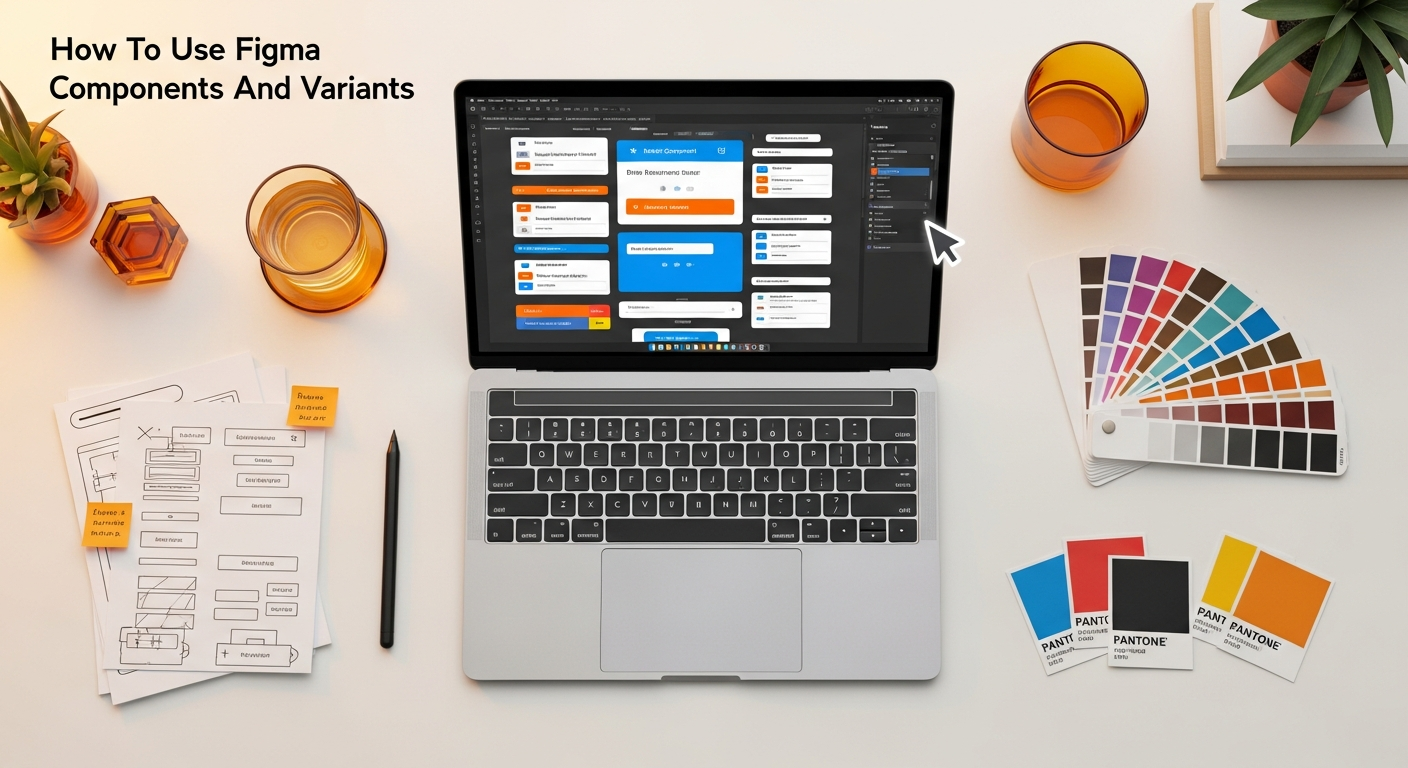
Upon creation, your layer will transform into a purple-colored frame, indicating it’s now a main component. Figma also creates a new entry in your “Assets” panel, where you can find this component for future use. The original element you converted is now the main component. If you copy and paste it, you will create instances.
Step 3: Using Component Instances
Now that you have a main component, you can create instances of it across your design. There are several ways to do this:
- Drag from Assets Panel: Open the “Assets” panel (usually on the left sidebar), find your “Button Base” component, and drag it onto your canvas.
- Copy and Paste: Select your main component on the canvas, copy it (
Ctrl/Cmd + C), and paste it (Ctrl/Cmd + V) elsewhere. Each paste will create a new instance.
These instances are linked to the main component. Try changing the fill color of your main component, and you’ll see all instances update instantly. This immediate feedback loop is where the efficiency of components truly shines.
Step 4: Overriding Instances
One of the most powerful features of components is the ability to override properties of individual instances without detaching them from the main component. You can change:
- Text Content: Double-click on the text layer within an instance and type new text (e.g., “Submit,” “Learn More”). The button’s width will adjust automatically if you used Auto Layout.
- Colors: Select a shape layer within an instance and change its fill or stroke color.
- Visibility: Hide or show layers within an instance.
- Swapping Nested Instances: If your component contains other components (e.g., an icon component inside a button component), you can swap them out for different components from your assets panel.
These overrides are local to the instance. If you reset an instance (right-click -> “Reset all overrides”), it will revert to the main component’s appearance. This flexibility allows for unique variations while maintaining the core structure and link to the master.
Building a solid component library is an iterative process. As you design, identify repeating elements and turn them into components. Over time, your efficiency will skyrocket, and the consistency of your designs will be unparalleled. This disciplined approach is critical for designers who want to ensure their work aligns with best practices, including those detailed in resources like How To Conduct A Heuristic Evaluation, where consistency across UI elements is a major evaluation criterion.
Mastering Variants: Creating Dynamic and Adaptive Designs

Now that you’re comfortable with basic components, let’s elevate our design system by implementing variants. This is where your component library truly becomes dynamic and incredibly powerful.
Step 1: Convert Your Component to a Variant Set
Let’s continue with our “Button Base” component from the previous section. We want to create different states for this button (Default, Hover, Pressed, Disabled).
- Select the Main Component: Click on your “Button Base” main component on the canvas.
- Add Variant Property: In the right sidebar, under the “Component” section, you’ll see an “Add property” button. Click it and choose “Variant.”
- Rename Property: By default, it will be named “Property 1.” Rename it to “State.” The default value will be “Default.”
Your main component now has a property called “State” with a value of “Default.”
Step 2: Create Additional Variants
Now, let’s add the other button states:
- Add a New Variant: With the main component (now a variant set) selected, click the “Add new variant” icon (the plus sign in the purple box) in the top toolbar or within the “Variants” section of the right sidebar. Figma will create a duplicate of your “Default” button.
- Rename and Style the New Variant:
- Select the new variant. In the right sidebar, change its “State” property value to “Hover.”
- Modify its styling to reflect a hover state (e.g., slightly darker background fill, a subtle shadow).
- Repeat for Other States: Add another variant, set its “State” to “Pressed,” and style it accordingly (e.g., even darker background, no shadow, maybe a slight inward press effect). Add a final variant, set its “State” to “Disabled,” and style it (e.g., lighter gray background, desaturated text, no interactivity).
You now have a single “Button Base” component that contains four variants: Default, Hover, Pressed, and Disabled. They are grouped within a single purple bounding box.
Step 3: Using Variants in Your Designs
To use your new variant set:
- Drag an Instance: From the “Assets” panel, drag an instance of your “Button Base” component onto your design canvas.
- Change Properties: With the instance selected, look at the right sidebar. You’ll now see a dropdown menu for “State.” Click it and choose “Hover,” “Pressed,” or “Disabled.” The instance will instantly update to reflect the selected variant’s styling.
This is the magic of variants! You no longer need to swap out entire components; you simply change a property value on the instance.
Step 4: Adding More Properties (e.g., Size)
Let’s make our button even more versatile by adding a “Size” property:
- Select the Variant Set: Click the purple bounding box that encompasses all your button variants.
- Add New Variant Property: In the right sidebar, click “Add property” again and choose “Variant.” Name this new property “Size.” The default value will be “Default.”
- Organize Existing Variants: You’ll now see that each of your existing variants (Default, Hover, Pressed, Disabled) has a “Size” property set to “Default.” This is good.
- Create New Size Variants:
- Select all your existing “Default” sized variants.
- Copy and paste them within the same variant set. Figma will duplicate them.
- For the newly duplicated variants, change their “Size” property to “Large.”
- Now, go through each of these “Large” variants and adjust their Auto Layout padding and font sizes to make them visually larger.
You now have a button component with two properties: “State” (Default, Hover, Pressed, Disabled) and “Size” (Default, Large). This provides 4 x 2 = 8 unique button variants all managed under one main component. The possibilities are endless when you start combining properties like “Icon,” “Type (Primary, Secondary),” etc.
Mastering variants transforms your design process from a series of individual element creations into a systematic assembly of highly adaptable building blocks. This approach aligns perfectly with creating robust design systems that are easy to maintain and scale, which is crucial for efficiency in any creative field. For instance, when designing elements for infographics, using variants for different chart types, icon styles, or annotation boxes ensures that your visual data storytelling adheres to Infographic Design Tips And Best Practices by maintaining a consistent look and feel across all visual elements.
Organizing Your Component Library for Maximum Efficiency
Having powerful components and variants is only half the battle; without proper organization, even the most robust system can become a chaotic mess. A well-structured component library is the bedrock of an efficient workflow, fostering collaboration, ensuring consistency, and making your design system a joy to use. Think of it as meticulously organizing your art supplies or material samples – everything has its place, and you can find what you need instantly.
Naming Conventions: The Cornerstone of Organization
Consistent and logical naming is paramount. Figma uses a hierarchical naming system based on forward slashes (/) to create folders in your assets panel. This allows for clear categorization and easy navigation.
- Category/Type/Element: A common and effective structure.
Button/Primary/DefaultButton/Primary/HoverButton/Secondary/SmallInput Field/Text/DefaultInput Field/Text/ErrorCard/Product/DefaultCard/Product/Discount
- Variant Properties in Names (Optional but helpful): While variants handle property values, sometimes including key properties in the main component name can be useful for initial identification. However, rely primarily on variant properties for granular control.
The goal is to make component names intuitive and predictable. Anyone looking at your assets panel should be able to quickly understand the purpose and variations of each component.
Structuring Your Figma Files and Pages
Beyond naming, how you structure your Figma files and pages plays a significant role in library organization:
- Dedicated Design System File: For larger projects or teams, it’s best practice to create a separate Figma file solely for your main components. This “Design System” file acts as the single source of truth. All other project files would then “publish” or “link” to this library, pulling in instances of these main components.
- Pages for Categorization within the Design System File: Within your design system file, use pages to categorize components logically.
● Intro(Overview, guidelines)● Colors(Color palette)● Typography(Text styles)● Icons(Icon sets)● Buttons(All button components and variants)● Inputs(All form input components)● Navigation(Headers, footers, sidebars)● Cards(Various card types)● Interior Assets(Furniture, fixtures, material swatches for creative projects)
- Separate Playground/Sandbox Pages: Within your design system file, create a “Playground” or “Sandbox” page where designers can experiment with new components or variations without cluttering the main library pages.
Documenting Your Component Library
Even the most perfectly organized library can be challenging without proper documentation. For each main component (especially those with many variants), consider adding:
- Usage Guidelines: When should this component be used? What are its primary use cases?
- Do’s and Don’ts: Specific rules about how the component should (or shouldn’t) be modified or combined with other elements.
- Property Explanations: Clearly define what each variant property does and what its values represent.
- Accessibility Notes: Any important considerations for accessibility (e.g., color contrast, focus states).
This documentation can live directly on the Figma canvas next to your components, or in a linked external tool. Clear documentation is vital for maintaining the integrity of your design system, especially as teams grow and projects evolve. It acts as a living style guide that informs every design decision.
Regular Audits and Maintenance
A component library is not a “set it and forget it” system. Regular audits are essential to ensure its health and relevance:
- Remove Duplicates: Periodically identify and consolidate redundant components.
- Update Outdated Components: As design trends or brand guidelines change, update your main components.
- Review Naming Conventions: Ensure consistency is maintained as new components are added.
- Gather Feedback: Regularly solicit feedback from designers, developers, and other stakeholders on the usability and effectiveness of the library.
This ongoing maintenance ensures that your component library remains a valuable asset, not a burden. By keeping your library clean and well-documented, you inherently support practices like How To Conduct A Heuristic Evaluation, as a consistent and predictable library simplifies the evaluation process of any product built upon it. It ensures that the building blocks themselves meet usability standards before they’re assembled into a larger experience.
Integrating Components & Variants into Your Workflow for 2026
As we look ahead to 2026, the integration of Figma components and variants into design workflows is no longer a luxury but a fundamental necessity for efficiency and innovation. The shift towards design systems, atomic design principles, and collaborative remote work environments makes these features indispensable. Here’s how to effectively weave them into your daily creative process.
Start Small, Scale Gradually
Don’t feel pressured to componentize everything at once. Begin by identifying the most frequently used elements in your designs: buttons, form fields, navigation items, or even basic text styles. As you become more comfortable, gradually expand your component library to include more complex elements like cards, modals, and entire page sections. This iterative approach prevents overwhelm and allows your team to adapt smoothly.
Collaborative Component Creation
Figma’s real-time collaboration features shine when building and maintaining component libraries. Design teams can work synchronously on the same component file, providing immediate feedback and ensuring alignment. Encourage pair design sessions where one designer creates a component and another reviews its structure, naming, and variant properties. This shared ownership fosters a stronger, more robust design system.
Leveraging Shared Libraries for Team Projects
For teams, publishing your component file as a shared library is crucial. This makes all your main components and their variants accessible to every designer across multiple project files. When updates are made to the main components in the library file, designers using instances in their project files will receive notifications to update their instances. This ensures everyone is working with the latest, most consistent elements, preventing design drift and speeding up development handoffs.
Streamlining Handoff to Development
Components and variants significantly improve the design-to-development handoff. Developers can inspect component instances in Figma’s Dev Mode (or through plugins) to understand their properties and values. A well-structured variant system directly maps to code components, making it easier for developers to translate design elements into reusable code, accelerating the development cycle. This consistency also reduces back-and-forth communication, saving time and reducing errors.
Furthermore, by creating a comprehensive design system with components and variants, you are essentially providing developers with a visual and functional spec that is tightly coupled to the code. This bridges the gap between design and engineering, leading to more accurate implementations and fewer deviations from the intended user experience.
Beyond UI: Applying Components to Creative Visualizations
The utility of components and variants extends far beyond traditional UI design. For creative agencies, marketing teams, or interior design studios, these features can revolutionize how you produce visual assets:
- Branding Kits: Create components for logos, brand marks, social media icons, and even specific color palettes, all with variants for different contexts (e.g., full color, monochrome, inverse).
- Infographic Elements: Design reusable components for charts, graphs, icons, and data labels. With variants, a single “Chart Bar” component can have properties for “Value,” “Color,” and “State (Active/Inactive),” ensuring all your data visualizations adhere to Infographic Design Tips And Best Practices by maintaining a consistent, branded look and feel. This makes updating complex infographics a breeze in 2026.
- Interior Design Mood Boards & Floor Plans: Imagine components for furniture pieces (sofa, chair, table) with variants for different styles (modern, classic, minimalist) or materials (leather, fabric, wood). Create components for lighting fixtures, plants, or even architectural elements like windows and doors, each with properties for size, material, or color. This allows for rapid prototyping of interior concepts and ensures consistency across all visual representations.
- Presentation Templates: Develop components for slide titles, bullet points, image placeholders, and call-to-action buttons for internal and client presentations. Variants can handle different brand themes or presentation types.
By thinking creatively about what can be componentized, designers can apply Figma’s power to almost any visual project, dramatically enhancing efficiency and maintaining brand integrity across diverse creative outputs. This holistic approach to leveraging components and variants will be a distinguishing factor for leading design practices in 2026.
Beyond UI: Applying Figma Components to Creative & Interior Design Visualizations
Layout Scene’s core audience thrives on creativity and precision in visual communication, particularly within interior design. While Figma is renowned for UI/UX, its component and variant capabilities are profoundly beneficial for creative visualization, mood boarding, and even architectural concepting. Let’s explore how these features can be uniquely applied to elevate your non-UI design projects.
Standardizing Interior Elements and Furniture
Imagine designing a new office space or a residential living room. Instead of redrawing or finding new assets for every furniture piece, you can build a library of components:
- Furniture Components: Create a “Sofa” component. Its variants could include “Style” (e.g., Contemporary, Mid-Century, Chesterfield), “Material” (e.g., Leather, Linen, Velvet), and “Color” (e.g., Grey, Navy, Emerald). You can even have variants for different orientations or views (top-down, front elevation).
- Fixture Components: Build “Lighting Fixture” components with variants for “Type” (e.g., Pendant, Sconce, Recessed), “Finish” (e.g., Brushed Brass, Matte Black, Chrome), and “Bulb Type” (e.g., Edison, LED Spotlight).
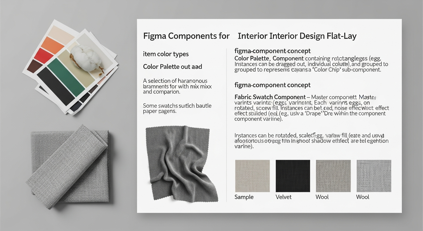
- Material Swatches: For mood boards, create “Material Swatch” components. Variants could represent different “Texture” (e.g., Wood Grain, Marble, Concrete), “Color Family” (e.g., Warm Neutrals, Cool Tones), or “Finish” (e.g., Matte, Gloss, Polished). This ensures consistency in how material samples are presented, a crucial aspect of professional interior design communication.
This allows you to quickly swap out furniture styles or material finishes on a floor plan or mood board, experimenting with different aesthetics without starting from scratch. It’s a rapid prototyping tool for physical spaces.
Enhancing Mood Board Creation
Mood boards are vital for conveying design intent, but they can often become inconsistent without a structured approach. Components and variants can transform this process:
- Image Placeholders: Create “Image Frame” components with variants for different aspect ratios (1:1, 16:9, 4:3) or border styles (thick, thin, no border). This ensures all your inspirational images are presented uniformly.
- Text Overlays and Labels: Standardize text blocks for descriptions, captions, or headings. A “Text Block” component could have variants for “Type” (e.g., Heading, Caption, Quote) and “Color Scheme” (e.g., Light Background, Dark Background), ensuring brand consistency even on creative boards.
- Iconography for Themes: If your mood board has thematic icons (e.g., a leaf for nature, a gear for industrial), make them components with variants for fill, outline, or color, ensuring a unified visual language. This directly supports the principles found in Infographic Design Tips And Best Practices, where consistent iconography is key to clear communication.
By using components for mood board elements, you maintain visual coherence, making your presentations more polished and professional.
Streamlining Architectural and Floor Plan Annotations
For more technical visualizations like floor plans, components are invaluable for standardization:
- Dimension Lines: Create a “Dimension Line” component with variants for different scales, arrow styles, or text placements.
- Labels and Callouts: Design “Room Label” components with variants for “Room Type” (e.g., Living Room, Kitchen, Bedroom) and “Area” display.
- Door and Window Symbols: Standardize symbols for doors (single, double, sliding) and windows (casement, double-hung) with variants for different opening directions or sizes.
This ensures that all annotations and symbols on your floor plans are consistent, professional, and easy to interpret. This level of precision and consistency is paramount in architectural visualization, where clarity can prevent costly errors.
Building Reusable Graphics for Presentations and Infographics
Creative professionals often need to present data or concepts visually. Figma components are perfect for this:
- Chart Elements: Build components for bar segments, pie slices, or line graph points. Variants could control their color, value display, or active state. This allows you to quickly assemble complex charts while maintaining a consistent visual style, which is a core tenet for effective infographic design.
- Icon Sets: Create a comprehensive icon library with variants for different styles (solid, outline, duotone) or sizes. This ensures all visual metaphors are consistent across all your presentations and marketing materials.
Recommended Resources
Explore How To Use Social Proof To Increase Conversions for additional insights.
Explore Best Task Manager Apps 2026 for additional insights.