The Ultimate Dark Mode UI Design Guide: Best Practices for 2026
Why Dark Mode Matters More Than Ever in 2026
The widespread adoption of dark mode across major operating systems and applications signals a clear user preference. But beyond aesthetics, there are compelling practical reasons why mastering dark mode is crucial for designers today:
- User Comfort and Eye Strain: In low-light environments, a dark interface significantly reduces glare and eye strain. Bright screens in dark rooms can cause discomfort, fatigue, and even disrupt sleep patterns. Dark mode offers a more comfortable viewing experience, especially during extended use or late-night browsing.
- Accessibility and Inclusivity: While often associated with aesthetics, dark mode can be a powerful accessibility tool. For users with certain visual impairments, such as photophobia or light sensitivity, a dark theme can make digital content far more legible and less painful to interact with. It’s a key component of creating inclusive designs.
- Battery Life for OLED Screens: For devices equipped with OLED or AMOLED displays, dark pixels consume significantly less power than bright pixels. This translates directly to extended battery life, a tangible benefit that users appreciate deeply. As OLED technology becomes even more prevalent, this advantage only grows.
- Modern Aesthetic and Brand Perception: A well-executed dark mode conveys sophistication, modernity, and attention to detail. It signals that a brand is forward-thinking and committed to providing a premium user experience. Conversely, an app lacking a proper dark mode can feel dated or incomplete to many users.
- Market Demand and User Expectation: From operating systems like macOS, Windows, iOS, and Android, to popular applications like Figma, Notion, Slack, and countless others, dark mode is now a default expectation. Users actively seek and often prefer apps that offer this option, making it a competitive differentiator.
Ignoring dark mode in 2026 is akin to ignoring responsive design a decade ago – it’s a disservice to your users and a missed opportunity for your product.
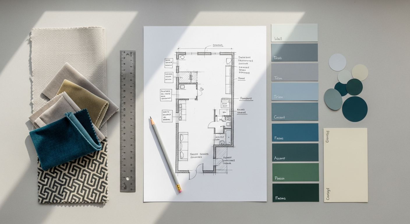
Beyond Black: Crafting Your Dark Mode Color Palette

The most common pitfall in dark mode design is the “pure black background with pure white text” approach. This creates harsh contrast, can cause “halation” or “blooming” effects on OLED screens, and often feels heavy and uninviting. Instead, we need a thoughtful, nuanced color strategy.
The “Not Pure Black” Rule
Avoid `hsl(0, 0%, 0%)` or `#000000` for your primary background. Pure black can create a jarring contrast with lighter elements, causing eye fatigue. It also makes shadows disappear and can make text appear to “vibrate.”
- Primary Dark Surface: Start with a dark gray as your base. Material Design, for example, often uses `#121212` or `#1A1A1A` for its primary dark surface. These subtle shades of gray provide enough contrast for white or light-colored text to be legible without being overpowering. They also allow for the use of shadows and subtle color variations to create depth.
Elevation and Depth
In light mode, shadows are our primary tool for conveying elevation and hierarchy. On a dark background, shadows are far less effective. Instead, we use progressively lighter shades of your dark base color to indicate elevated surfaces.
- Layered Grays: Think of your dark mode palette as a series of stacked surfaces. Your base background might be `#121212`. A card resting on it could be `#1F1F1F`. A floating action button might be `#2C2C2C`. This subtle shift in luminosity creates a sense of depth and hierarchy without relying on shadows that would be invisible.
- Subtle Borders/Glows: For elements that need to stand out significantly, like active inputs or selected items, a very subtle, low-opacity border or a faint accent glow can be more effective than a shadow.
Semantic Colors for Dark Mode
Your brand’s primary, secondary, success, warning, and error colors need careful adaptation. Simply inverting them usually doesn’t work.
- Desaturate and Brighten: Take your vibrant brand colors and slightly desaturate them, then brighten them. This makes them less intense against a dark background, preventing them from “vibrating” or overwhelming the interface. For example, a bright red for an error message might become a slightly softer, lighter red.
- Contrast Check: Always run your semantic colors through a contrast checker like Stark or the WebAIM Contrast Checker to ensure they meet WCAG accessibility guidelines (at least 4.5:1 for normal text).
Text Colors for Readability
Text contrast is paramount for readability.
- Primary Text: Use a light color, but not pure white. A very light gray (e.g., `#E0E0E0` or `#FFFFFF` with a very subtle tint) provides excellent contrast without being harsh.
- Secondary Text: For supporting information, labels, or hints, use a medium gray (e.g., `#B0B0B0`). This creates visual hierarchy.
- Tertiary/Disabled Text: For less important elements or disabled states, use a darker gray (e.g., `#808080`).
Tools: Leverage Figma’s color styles and variables, or Adobe XD’s color assets, to define and manage your dark mode palette. Using design tokens (e.g., via Style Dictionary) can help ensure consistency across design and development.
Typography and Readability in the Dark
While your font families generally remain the same, typography needs subtle adjustments to maintain optimal readability on a dark background.
- Contrast Ratios (WCAG): Reiterate the importance of meeting WCAG 2.1 AA standards: at least 4.5:1 for normal text and 3:1 for large text (18pt or 14pt bold). This is non-negotiable for accessibility. Regularly test your text/background combinations.
- Font Weight: Lighter font weights can sometimes appear thinner or “washed out” on dark backgrounds compared to their appearance on light backgrounds. Conversely, very bold fonts can feel too heavy. You might need to slightly adjust font weights or use a slightly heavier weight for certain elements in dark mode to achieve the same perceived visual weight as in light mode.
- Line Height & Letter Spacing: Slightly increasing line height (leading) and letter spacing (tracking) can improve readability on dark backgrounds by providing more breathing room around characters and lines of text. This reduces the visual density and makes text easier to scan.
- Text Hierarchy: While color is crucial (as discussed above), continue to use size and weight to establish clear typographic hierarchy. Ensure that headings, subheadings, and body text are clearly distinguishable, even with the adjusted color palette.
Iconography, Imagery, and Illustrations

Visual assets require careful consideration to ensure they integrate seamlessly into your dark theme without losing their meaning or impact.
Icons
- Adapt Stroke and Fill Colors: For outline icons, change the stroke color to a lighter shade that contrasts well with your dark background. For filled icons, consider inverting the fill or simplifying them to outlines if the original fill color clashes.
- Consistency: Ensure all icons across your interface are adapted consistently. If you have a system of icons, apply the same dark mode rules to all of them.
Imagery
Images, especially photographs, can be tricky. Bright, high-contrast images can be jarring against a dark background.
- Subtle Dark Overlay: The most common technique is to apply a subtle, low-opacity dark overlay (e.g., a 10-20% black semi-transparent layer with a `multiply` or `overlay` blend mode) over images. This reduces their overall luminosity, helping them blend more naturally into the dark theme without completely obscuring their content.
- Desaturation: Slightly desaturating vibrant images can also help them feel less aggressive against a dark backdrop.
- Image Replacement: For critical images, such as branding elements, infographics, or product shots where color accuracy is paramount, consider providing dark mode-specific versions. These might have adjusted color palettes or different compositions to work better in the dark theme. For example, a logo that is black in light mode might need a white or lighter version for dark mode.
Illustrations
Illustrations, being highly stylized, offer more flexibility but also require more deliberate adaptation.
- Palette Modification: Adjust the color palette of your illustrations to complement your dark mode. Replace bright whites and light grays with darker, muted tones from your dark mode palette. Ensure key elements still stand out.
- Shadows and Highlights: Re-evaluate shadows and highlights within illustrations. Shadows might need to be lighter or replaced with subtle glows, and highlights might need to be toned down.
- Vector Assets (SVG): If your illustrations are vector-based (SVG), they are much easier to adapt programmatically or through design tools like Figma or Adobe XD, allowing you to quickly swap out colors using styles or variables.
Interaction Design & Component Adaptation
Every interactive element and UI component needs to be re-evaluated to ensure clarity, usability, and visual consistency in dark mode.
States (Hover, Active, Disabled)
How users perceive interaction changes on a dark background. Visual feedback needs to be clear.
- Hover: Instead of a shadow, a subtle background color change (e.g., a slightly lighter shade of your dark surface), a faint border, or a gentle text color shift works well.
- Active/Selected: A clear, brighter accent color or a distinct background change should indicate an active or selected state. For example, a selected navigation item might have a brighter text color and a subtle accent bar.
- Disabled: Lower opacity and desaturation are effective ways to signal disabled states, making elements appear faded and inactive.
Forms
Input fields, checkboxes, and radio buttons need clear boundaries.
- Input Fields: Ensure text input fields have a distinct background color (e.g., a slightly lighter dark gray than the surrounding surface) and a clear, light border. Placeholder text should have enough contrast to be visible but not so much that it’s mistaken for actual input.
- Checkboxes/Radio Buttons: Their states (checked/unchecked) must be unambiguous. Use a clear accent color for the checked state.
Buttons
Buttons carry significant weight in guiding user action.
- Primary Buttons: A primary button might transition from a solid, vibrant color in light mode to an outlined button with a vibrant text color in dark mode, or a less intense solid background. The goal is to make it stand out without being overly aggressive.
- Secondary/Tertiary Buttons: These might rely more on text color changes, subtle background shifts, or very light borders.
Shadows and Elevation Reimagined
As discussed with color, traditional shadows are ineffective. Material Design’s approach to dark mode elevation is a great reference: instead of shadows, elevated surfaces become progressively lighter shades of the base dark color. This creates a subtle “lifting” effect. For example, a modal on top of a screen will be lighter than the screen itself, which is lighter than the background.
Animations
Ensure that any micro-interactions or larger animations remain smooth and don’t introduce flickering or jarring effects on a dark background. Test animations thoroughly to confirm they enhance, rather than detract from, the dark mode experience.
Workflow & Implementation: A Step-by-Step Approach
Designing for dark mode effectively requires a structured approach. Here’s a practical workflow to integrate it into your design process:
Step 1: Audit Your Existing Light Mode Design (if applicable)
Before you even think about dark colors, thoroughly understand your current light mode design.
- Identify Core Components: List all unique UI components (buttons, cards, navigation, forms, alerts, etc.).
- Document Color Usage: Map out all semantic and functional colors. Which colors are used for primary actions, errors, success, backgrounds, text, etc.?
- Review Typography: Note all font sizes, weights, line heights, and letter spacing.
- Assess Visual Assets: Identify all icons, images, and illustrations and consider how they currently convey meaning.
This audit creates a baseline and helps you anticipate challenges.
Step 2: Define Your Dark Mode Color System
This is the most critical step. Don’t just invert colors; build a new, complementary palette.
- Establish Base Dark Surface: Choose your primary dark gray (e.g., `#1A1A1A`).
- Create Elevation Tiers: Define 2-3 progressively lighter dark grays for elevated surfaces (e.g., `#2C2C2C`, `#3F3F3F`).
- Adapt Semantic Colors: Take your brand’s primary, secondary, success, warning, and error colors. Desaturate and brighten them slightly to work against your dark surfaces.
- Define Text Colors: Establish primary (light gray), secondary (medium gray), and tertiary/disabled (darker gray) text colors.
- Accent Colors: Ensure your accent colors provide sufficient contrast and visual pop without being overwhelming.
Tool Tip: Use a tool like ColorBox by Lyft Design or Material Design’s color tool to generate harmonious palettes. In Figma, define these as color styles and variables. In Adobe XD, add them to your Assets panel.
Step 3: Component-Level Adaptation
Go through your audited components one by one and apply your new dark mode color system.
- Backgrounds: Apply the appropriate dark surface colors based on elevation.
- Text: Adjust text colors based on hierarchy.
- Icons: Modify icon colors or provide dark mode-specific versions.
- States: Redesign hover, active, and disabled states using dark mode principles (e.g., lighter backgrounds for hover, desaturation for disabled).
- Borders/Separators: Use subtle, light gray borders for separation.
Tool Tip: In Figma, leverage component variants and properties to manage light and dark mode versions of your components efficiently. This allows you to toggle between modes with ease and maintain a single source of truth.
Step 4: Imagery & Illustration Review
Integrate your visual assets into the new theme.
- Apply Overlays: Add subtle dark overlays to photographic images.
- Adjust Illustrations: Modify illustration palettes to match your dark theme.
- Replace Critical Assets: Identify and create dark mode-specific versions for logos, banners, or complex infographics that don’t translate well.
Step 5: Testing & Iteration
Design is an iterative process, especially with dark mode.
- Usability Testing: Conduct user testing with individuals in various lighting conditions (bright room, dim room, outdoors) to gauge comfort and legibility.
- Accessibility Checks: Use contrast checkers rigorously. Test with screen readers to ensure all elements are properly announced regardless of the theme.
- Device Testing: Test your dark mode on different screen types (OLED vs. LCD) and device sizes to catch any display quirks or color shifts.
- Designer Peer Review: Get feedback from fellow designers. A fresh pair of eyes can spot issues you’ve become blind to.
Step 6: Developer Hand-off
Clear communication is key for a successful implementation.
- Documentation: Provide comprehensive documentation of your dark mode color palette, component states, and any specific asset requirements.
- Design Tokens: If you’re using design tokens, ensure they are clearly defined for both light and dark modes (e.g., `color-primary-background-light` and `color-primary-background-dark`). This streamlines developer implementation.
- CSS Variables: Encourage the use of CSS variables (e.g., `–primary-background-color`) that can be easily swapped based on the user’s preferred theme.