Seamless Handoff in 2026: Your Definitive Guide to Designing for Developers
The Evolving Landscape of Design Handoff in 2026
Gone are the days of designers simply tossing static mockups over a wall to developers. The digital product landscape in 2026 demands more. Modern development cycles are agile, iterative, and deeply integrated. This means the concept of “handoff” has transformed into “collaboration.” We’re moving from a sequential process to a concurrent one, where designers and developers work side-by-side from conception to deployment and beyond. The shift is driven by several factors: the rise of sophisticated design tools, the increasing complexity of user interfaces, and a shared understanding that product success hinges on both aesthetic appeal and technical robustness.
Today, design systems are not just nice-to-haves; they are foundational to efficient collaboration. Tools like Figma have revolutionized how we share, iterate, and document our designs, offering features like Dev Mode that speak directly to developers’ needs. Similarly, front-end frameworks and component libraries (like those documented in Storybook) mirror design systems in code, creating a single source of truth for both disciplines. This convergence means designers must understand the implications of their choices on the development process, and developers must appreciate the underlying design principles. It’s about cultivating empathy and a common language, ensuring that every design decision is understood, and every technical constraint is considered early on. The goal for 2026 is not just to deliver designs, but to facilitate the creation of exceptional digital products through continuous, informed partnership.
Laying the Foundation: Pre-Handoff Preparation

The success of your handoff isn’t determined at the moment you share files; it’s built much earlier. Robust pre-handoff preparation is the bedrock of seamless design-dev collaboration. Think of this phase as creating a detailed blueprint and a shared vocabulary before construction even begins.
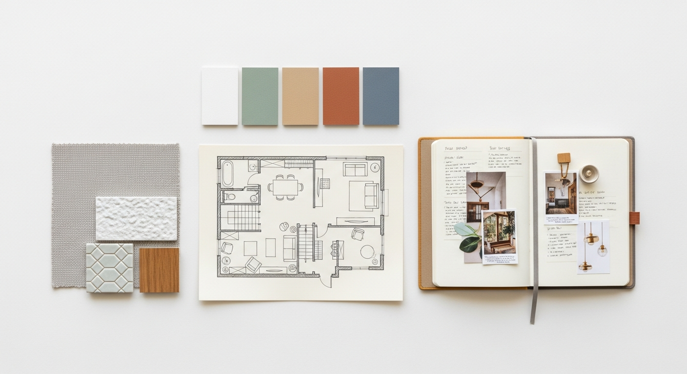
Design System & Component Library
This is arguably the most critical element. A well-constructed design system, built on Atomic Design principles, provides a single source of truth for both design and code. Your design system should encompass:
- Components: Define reusable UI elements (buttons, cards, inputs) with all their states (default, hover, active, disabled, error). Ensure these components are clearly named and organized in your design tool (e.g., Figma components and variants).
- Design Tokens: Abstract primitive values like colors, typography scales, spacing, and border-radii into named variables (e.g.,
--color-primary-500,--spacing-md). Tools like Figma variables allow you to define and manage these directly, making them ready for developer consumption via tools like Style Dictionary. - Documentation: Clearly document the purpose, usage guidelines, and accessibility considerations for each component. This should live in a centralized location, accessible to both designers and developers. Platforms like Zeroheight or Notion can host this documentation, linking directly to your design files and code components (e.g., Storybook).
A robust design system significantly reduces guesswork, ensures consistency, and accelerates development by providing pre-built, production-ready components.
Clear Information Architecture (IA) & User Flows
Developers don’t just build screens; they build experiences. They need to understand the “why” and “how” users move through your product.
- User Flows: Annotate your user flows to illustrate user journeys, decision points, and system responses. Tools like Miro or FigJam are excellent for mapping these out collaboratively.
- Wireframes & Low-Fidelity Prototypes: Share these early and often. They help developers grasp the core functionality and structure before diving into pixel-perfect details, allowing for early technical feasibility discussions.
- Edge Cases: Explicitly design and document error states, empty states, loading states, success messages, and character limits. These are frequently overlooked but critical for a complete user experience.
Accessibility (A11y) & Internationalization (i18n)
Integrating these from the start saves immense rework later.
- Accessibility: Document color contrast ratios (using tools like Stark), focus states for keyboard navigation, clear visual hierarchy, and considerations for screen readers (e.g., alternative text for images).
- Internationalization: Consider how text expands or contracts in different languages, potential changes in reading direction (RTL languages), and cultural nuances. Design for flexible layouts that can accommodate varied content lengths.
By proactively addressing these areas, you empower developers to build a truly inclusive and globally-ready product.
Crafting the Handoff Package: What Developers Really Need
Once your foundation is solid, it’s time to assemble the actual “handoff package.” This isn’t just about sharing a Figma link; it’s about providing a comprehensive, organized, and easily digestible resource that answers developers’ questions before they even ask them.
Interactive Prototypes
Static mockups are dead. Interactive prototypes are essential for communicating interaction design.
- Flows & Interactions: Use your design tool (Figma, Adobe XD, Framer) to create interactive prototypes that demonstrate user flows, screen transitions, and micro-interactions (e.g., button hovers, form field focus states).
- Animation & Motion: If specific animations are crucial, provide clear specifications or even small video clips. Tools like LottieFiles allow designers to export animations as JSON, which developers can easily integrate.
- User Testing: Share these prototypes with developers early. This allows them to experience the intended flow and provides an opportunity for technical feedback before extensive coding begins.
Detailed Specifications & Annotations
This is where precision matters. Developers need exact measurements and values.
- Measurements & Spacing: Ensure all spacing (margins, padding) and sizing are consistent and based on your design system’s spacing tokens (e.g., increments of 4px or 8px). Figma’s Dev Mode is invaluable here, providing instant CSS/component code snippets.
- Typography: Specify font families, weights, sizes, line heights, and letter spacing for every text style. Link these directly to your typography tokens.
- Colors: Provide hex, RGB, HSL, and ideally, your design token names for all colors used.
- Responsive Breakpoints: Clearly define breakpoints for different screen sizes (mobile, tablet, desktop) and demonstrate how components and layouts adapt at each. Show designs for multiple viewports.
- Interaction Details: Document all states for interactive elements: default, hover, focus, active, disabled, error. Explain expected behaviors.
- Edge Cases: Reiterate and visually present all edge cases you designed for: empty states, error messages, loading indicators, character limits for input fields.
Tools like Figma’s Dev Mode or plugins for Zeplin and Avocode streamline this process by generating code snippets and specifications directly from your designs, significantly reducing manual annotation.
Asset Management
Provide all necessary assets in optimized formats.
- Icons & Illustrations: Export these primarily as SVG files for scalability and small file size. Ensure they are optimized (e.g., using SVGOMG).
- Images: Export raster images (JPG, PNG) in appropriate resolutions and optimize them for web performance (e.g., using ImageOptim or webp formats). Provide different sizes for responsive image delivery if needed.
- Naming Conventions: Use clear, consistent naming conventions for all assets (e.g.,
icon-arrow-left.svg,illustration-onboarding.svg).
Design Tokens (Revisited)
While mentioned in pre-handoff, their inclusion in the package is key.
- Token Export: If your design tool supports it, export your design tokens (colors, typography, spacing, border-radius) in a format developers can consume, such as JSON. This ensures parity between design decisions and implemented styles.
By providing this level of detail, you empower developers to build with confidence and accuracy, minimizing assumptions and rework.
Bridging the Gap: Communication & Collaboration Strategies

Even the most meticulously prepared handoff package is only as good as the communication surrounding it. Effective collaboration transforms a static delivery into a dynamic partnership, ensuring design intent is fully realized.
Regular Syncs & Walkthroughs
Scheduled touchpoints are non-negotiable.
- Dedicated Handoff Meetings: Schedule a specific meeting where you walk developers through the designs. Explain the user flows, key interactions, and any complex logic. This is an opportunity for them to ask questions and raise potential technical challenges.
- Sprint Planning & Daily Stand-ups: Actively participate in these ceremonies. Offer design context during sprint planning, and be available to answer quick questions during daily stand-ups. Your presence reinforces that design is an ongoing part of the development process.
- Design Reviews with Developers: Before final implementation, conduct informal design reviews where developers can provide early feedback on feasibility or suggest alternative technical approaches that still achieve the design goal.
Use tools like Zoom, Google Meet, or Microsoft Teams for these virtual or hybrid meetings.
Shared Understanding & Empathy
Cultivating empathy on both sides of the aisle is paramount.
- Designers Understanding Technical Constraints: Take the time to learn about the tech stack, existing code limitations, and common development challenges. Ask “how hard would this be?” or “what are the implications of this approach?”
- Developers Understanding Design Intent: Clearly articulate the “why” behind your design decisions. Explain the user problem you’re solving, the usability principles applied, and the desired emotional response.
- Pair Design/Dev Sessions: Occasionally, sit together to work through a particular challenge. This could involve a designer sketching while a developer explains technical implications, or a developer coding a component while a designer provides real-time feedback.
Feedback Loops
Establish clear, accessible channels for ongoing dialogue.
- Asynchronous Communication: Leverage tools like Slack, Microsoft Teams, or comments directly within Figma/Zeplin for quick questions and clarifications. Ensure designers are responsive.
- Centralized Issue Tracking: Use project management tools like Jira or Asana to log design-related questions or implementation issues. This ensures nothing falls through the cracks and provides a clear record of discussions and decisions.
- Iterative Feedback: Encourage developers to share in-progress builds. Provide constructive feedback, focusing on the user experience and adherence to design specifications, rather than just pointing out “mistakes.”
Version Control
Keeping track of changes is crucial in an iterative environment.
- Design Tool Version History: Utilize your design tool’s built-in version history (e.g., Figma’s version control) to track changes. Clearly label versions (e.g., “Sprint 5 Handoff,” “Feedback Incorporated”).
- Communication of Changes: If significant design changes occur after handoff, proactively communicate them to developers. Don’t assume they’ll notice; highlight what changed and why.
By fostering an environment of open communication and mutual respect, you transform handoff from a potential bottleneck into a powerful accelerator for product development.
Post-Handoff: Ensuring Design Integrity & Quality Assurance
The “handoff” is complete, but the designer’s job isn’t over. The critical phase of ensuring design integrity and quality assurance begins. This is where you verify that the implemented product truly reflects the intended design and provides the best possible user experience.
Design QA (Quality Assurance)
This is your opportunity to review the implemented designs against your specifications.
- Thorough Review: Systematically go through every screen and interaction. Check for pixel-perfect alignment, correct spacing, typography, colors, and asset usage. Pay close attention to responsive behavior across different screen sizes and devices.
- Interaction & Animation Check: Verify that all interactive elements (buttons, forms, navigation) behave as designed, including hover states, focus states, active states, and error validations. Confirm that animations and transitions match the intended feel and timing.
- Edge Case Testing: Test all those edge cases you designed for: empty states, error messages, loading indicators, and character limits. Ensure they are handled gracefully and provide clear user feedback.
- Accessibility Audit: Perform basic accessibility checks – can you navigate with a keyboard? Are color contrasts sufficient? Does the content make sense out of context? For more rigorous checks, use browser developer tools or dedicated tools like Axe.
- Constructive Feedback: When identifying discrepancies, provide specific, actionable feedback. Instead of “This looks wrong,” say “The padding on this button should be 16px vertical, 24px horizontal, as specified in the design system.” Provide screenshots or short video recordings to illustrate the issue.
- Visual Regression Testing: For larger projects, consider integrating visual regression testing tools (e.g., Chromatic for Storybook components) into the development pipeline. These tools automatically compare screenshots of components or pages against a baseline, flagging any unintended visual changes.
Iterative Refinement
Design QA often leads to a cycle of refinement.
- Prioritize & Collaborate: Work with the development team and product manager to prioritize identified issues. Some might be quick fixes, others might require more significant development effort. Understand the concept of technical debt and help make informed decisions.
- Micro-Adjustments: Be prepared to make small design adjustments in response to technical realities or unforeseen implementation challenges. Flexibility and problem-solving are key.
Documentation & Updates
The product is live, but your work isn’t done.
- Update Design System: Ensure your design system and component library reflect any final changes or new patterns that emerged during development. The design system should always be a living document, reflecting the current state of the product.
- Knowledge Sharing: Document any new learnings or best practices gained from the development cycle. Share these insights with your design and development teams to continuously improve future handoffs.
By staying engaged through the post-handoff phase, designers ensure that their vision is not only implemented but also maintained and improved upon, contributing to a high-quality, consistent user experience over time.