Mastering Brochure Design for 2026: Your Blueprint for Impactful Layouts
The Enduring Power of Brochures in Today’s Digital Ecosystem
While our screens dominate much of our professional and personal lives, the physical world still offers unparalleled opportunities for connection. Brochures, when designed thoughtfully, are far more than just paper flyers; they are carefully curated brand experiences. They offer a focused, uninterrupted narrative that digital platforms, with their endless distractions, often can’t provide.
Think about it: a prospective client might quickly scroll past an ad online, but a beautifully designed brochure picked up at an event, left on a reception desk, or mailed directly to their home becomes a physical artifact. It’s a leave-behind, a tangible reminder of your brand, product, or service that can be revisited, shared, and truly absorbed at their leisure. In 2026, this tangibility is increasingly valuable, cutting through the noise and offering a premium, considered touchpoint.
The modern brochure also excels at bridging the gap between physical and digital. It’s no longer just about static information. With integrated QR codes, augmented reality (AR) triggers, or even NFC chips, a physical brochure can seamlessly guide users to landing pages, video content, interactive portfolios, or direct contact forms. This fusion enhances the user journey, leveraging the strengths of both mediums.
Before you even open a design program, understanding your target audience and defining clear objectives are paramount. Who are you trying to reach? What are their pain points, their aspirations? What emotions do you want to evoke? And what, specifically, do you want this brochure to achieve? Is it to generate leads for a new service, announce an event, showcase a product line, or simply enhance brand awareness? A clear purpose will inform every design decision, from content hierarchy to color palette.
Pre-Design Strategy: Laying the Foundation for Success
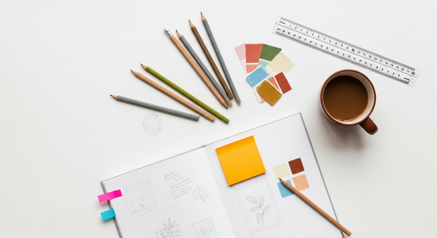
A truly effective brochure isn’t born in a vacuum; it’s the result of meticulous planning and strategic thinking. Before you even consider layouts or color schemes, you need a robust blueprint.
First and foremost, content is king. What message are you trying to convey? Prioritize information, ensuring a clear and compelling narrative flow. Identify your key selling points, testimonials, and, most critically, your Call to Action (CTA). Every element on the page should guide the reader towards that desired action, whether it’s visiting a website, making a call, or scanning a QR code. Work with copywriters early in the process to ensure the text is concise, engaging, and perfectly aligned with your brand voice.
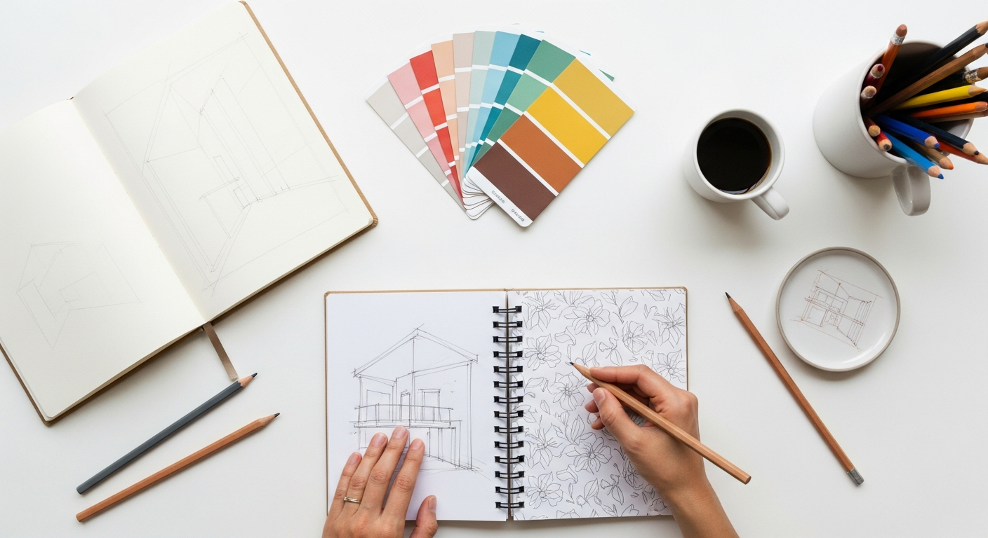
Next, consider the format and fold choices. This is where the physical nature of the brochure truly comes into play.
* Bi-fold: Simple, elegant, and effective for concise messaging, often used for company overviews or event programs. It offers four panels (front, back, two inside).
* Tri-fold: The most common, offering six panels (front, back, four inside) for more detailed information, often used for product showcases or service menus. It folds into a compact size.
* Z-fold: Similar to a tri-fold but folds like an accordion, which can create a continuous visual flow across panels when fully opened. Great for timelines or step-by-step processes.
* Gatefold: A premium option where two outer panels fold inward to meet in the middle, revealing a larger central panel. Ideal for dramatic reveals, impressive visuals, or high-end product launches.
* Accordion fold: Multiple parallel folds, suitable for presenting a lot of information in a sequential manner, like maps or detailed guides.
Each fold type creates a unique reading experience and dictates how your content and visuals will be organized. Sketching these out early helps visualize the journey.
While you might be designing digitally, paper stock and finishes play a crucial role in the final tactile experience. These considerations inform your design choices.
* Matte: Non-glossy, sophisticated, and excellent for readability, often used for corporate or artistic brochures.
* Gloss: Shiny, vibrant, and makes colors pop, ideal for photography-heavy brochures or those needing a high-impact feel.
* Uncoated: Natural, tactile, and often perceived as eco-friendly. Great for brands emphasizing authenticity.
* Special finishes: Spot UV (glossy finish on specific areas), embossing (raised elements), debossing (indented elements), foil stamping. These add a premium, luxurious feel but also impact budget. Even if you’re only creating a digital mock-up, understanding these options helps you design with the end product in mind, creating visual cues that hint at these textures.
Finally, think about budget and distribution. How many will be printed? How will they be distributed? A brochure for a trade show will have different requirements than one for a direct mail campaign. These practicalities will influence everything from page count to paper choice and ultimately, your design decisions.
Core Design Principles for Impactful Brochures
Great brochure design, like any powerful visual communication, hinges on fundamental design principles. Mastering these will elevate your work from merely functional to truly unforgettable.
Visual Hierarchy: This is about guiding the reader’s eye, ensuring they absorb information in a logical and impactful sequence. Use variations in size, color, contrast, and placement to emphasize key elements. Headings should be prominent, subheadings slightly less so, and body copy readable. Your CTA should always stand out. Think about the “F” or “Z” patterns of reading and design your panels to leverage these natural eye movements.
Typography: Beyond just choosing pretty fonts, typography is about readability and personality. Select typefaces that align with your brand’s voice – modern and clean, classic and elegant, bold and dynamic. Limit yourself to 2-3 font families to maintain consistency. Pay close attention to leading (line spacing), tracking (space between letters), and kerning (space between specific letter pairs) to ensure optimal legibility, especially in print where resolution is critical. A common mistake is using too many typefaces or type that is too small for the intended audience and viewing distance.
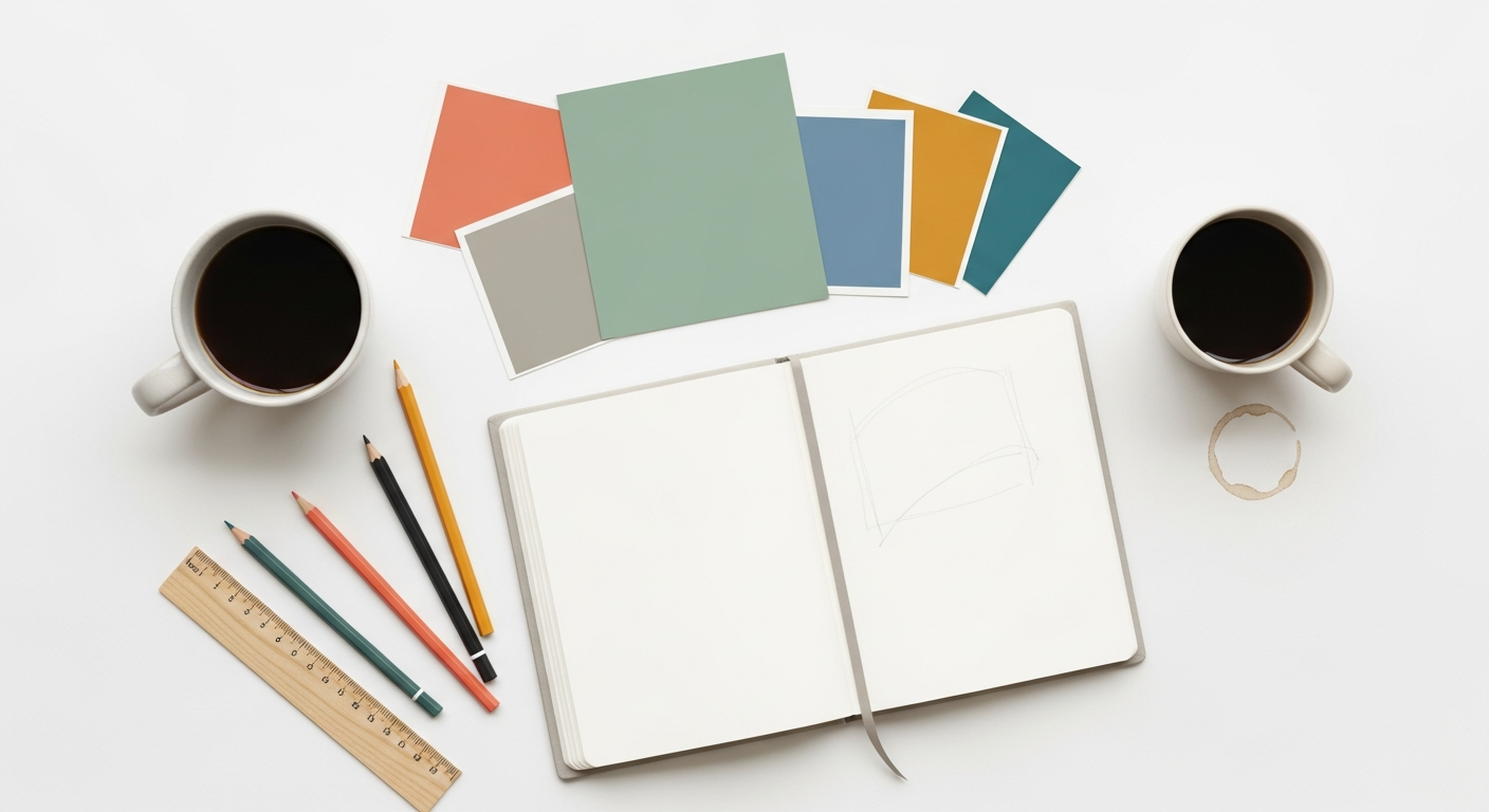
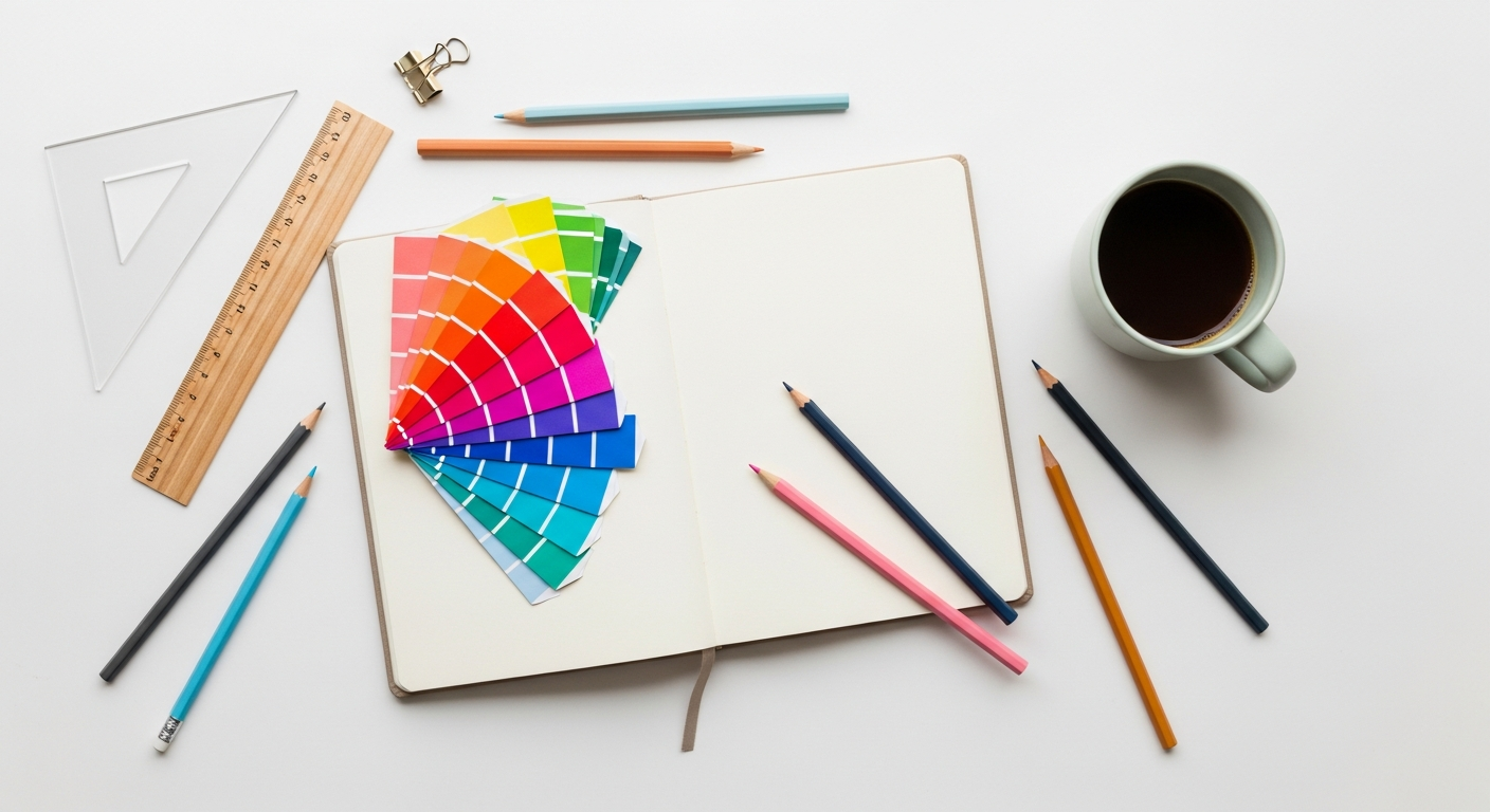
Color Theory & Branding: Color evokes emotion and reinforces brand identity. Use your brand’s established color palette consistently. Understand the psychological impact of different colors – blue for trust, green for nature/growth, red for urgency/passion. For print, remember to design in CMYK (Cyan, Magenta, Yellow, Key/Black) mode, not RGB, as this color space is used by printers and ensures accurate color reproduction. Always get a physical proof to check color accuracy before a full print run.
Imagery & Graphics: High-quality, relevant, and evocative visuals are non-negotiable. Whether it’s photography, illustrations, or infographics, every image should serve a purpose, enhance the message, and maintain a consistent visual style. Avoid generic stock photos if possible; invest in custom photography or illustrations that truly represent your brand. Infographics are particularly effective in brochures for presenting complex data in an easily digestible, visually appealing format. Ensure all images are high-resolution (at least 300 DPI for print) to avoid pixelation.
White Space: Often overlooked, white space (or negative space) is the unsung hero of good design. It provides breathing room, prevents visual clutter, and draws attention to key elements. Don’t be afraid to leave areas blank; it creates a sense of sophistication and makes the content that is there feel more important and easier to digest. Overcrowding a brochure is a sure way to overwhelm and disengage your reader.
Grid Systems: Grids provide structure, consistency, and a professional look. They help align elements, maintain consistent spacing, and ensure a harmonious layout across all panels. Whether you use a simple column grid or a more complex modular grid, sticking to a system will make your design process more efficient and your final product more polished. Think of the grid as the invisible backbone that supports your entire design.
Layout Techniques & Tools for 2026
Designing a compelling brochure requires not just an understanding of principles but also proficiency with the right tools and modern layout techniques.
While the final output is print, the design process often begins digitally. Adobe InDesign remains the industry standard for print layout, offering unparalleled control over typography, grids, master pages, and pre-press settings. Its strengths lie in handling multi-page documents, precise text wrapping, and advanced print features. For creating individual graphic assets like logos, illustrations, or complex icons, Adobe Illustrator is indispensable. For image editing and manipulation, Adobe Photoshop is your go-to.
However, for initial wireframing, mood boards, and collaborative design, tools like Figma and Adobe XD are increasingly valuable, even for print-focused projects. While they aren’t designed for complex print layouts with bleed and CMYK output in the same way InDesign is, they excel at:
* Rapid Prototyping & Wireframing: Quickly sketch out panel layouts, content blocks, and visual flow.
* Collaborative Design: Share concepts with clients and team members, gather feedback in real-time.
* Mood Boards & Style Tiles: Develop visual direction, color palettes, and typography explorations.
* Simple Layouts: For very basic bi-fold or tri-fold concepts, you can even create visual mock-ups within these tools before moving to InDesign for final production.
When thinking about layouts, consider the concept of “responsive layout thinking” even for print. How do elements flow from one panel to the next when the brochure is opened? How does the front cover entice the reader to open it? How does the back panel act as a final call to action or contact point?
Modern brochures also embrace interactive elements to bridge physical and digital experiences.
* QR Codes: These are ubiquitous and easy to implement, linking directly to websites, video tours, digital forms, or contact information.
* Augmented Reality (AR) Triggers: Using apps like Artivive or Zappar, you can embed AR experiences that, when scanned with a smartphone, overlay digital content (videos, 3D models, animations) onto the physical brochure. This offers a truly immersive and memorable experience.
* NFC (Near Field Communication) Chips: For high-end, premium brochures, tiny NFC chips can be embedded, allowing users to simply tap their smartphone to the brochure to instantly access digital content, similar to a contactless payment.
When it comes to actual layouts, there are common successful approaches:
* Product Showcase: Dedicate panels to individual products, using high-quality imagery and concise descriptions.
* Service Overview: Break down services into digestible sections, perhaps using a Z-fold to show a step-by-step process.
* Event Promotion: Use a bi-fold for key details, dates, and a prominent CTA for registration.
* Company Profile: A tri-fold can cover mission, values, team, and contact info.
Don’t reinvent the wheel entirely; look at successful examples in your industry or leverage templates from resources like Adobe Stock, Envato Elements, or Creative Market as starting points. Just remember to customize them thoroughly to reflect your unique brand.
The Design Process: From Concept to Print-Ready
A structured design process is your best friend for delivering high-quality brochures on time and on budget.
Phase 1: Research & Discovery. This is where you gather all the essential information. Conduct a thorough briefing with your client (or yourself). Understand the target audience, the brochure’s objectives, key messages, brand guidelines, budget, and distribution plan. Collect any existing assets like logos, brand fonts, and imagery.
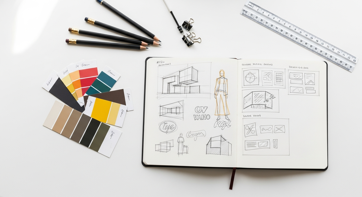
Phase 2: Ideation & Wireframing. Don’t jump straight into high-fidelity design. Start with rough sketches on paper to explore different fold types and content flows. Then, move to digital wireframes using tools like Figma or Adobe XD. Focus on content hierarchy, panel organization, and CTA placement. This phase is about structure, not aesthetics. Get client approval on the wireframes before moving forward.
Phase 3: Visual Design & Content Integration. Now, bring your brand to life. In Adobe InDesign (or your chosen layout software), apply your brand’s color palette, typography, and imagery. Integrate the finalized copy, ensuring it flows naturally within your grid system. Pay close attention to detail – alignment, spacing, and visual balance. Create mock-ups (digital or physical) to visualize the final product.
Phase 4: Feedback & Iteration. Present your designs to the client for review. Be prepared for feedback and iterate as necessary. Use tools like Adobe Acrobat’s commenting features or Figma’s comment mode for clear communication. It’s often helpful to provide multiple layout options or variations to give the client choices. Ensure all copy is proofread multiple times by different eyes to catch any errors.
Phase 5: Pre-Press & Hand-off. This is the most critical phase for print success.
* Bleed: Extend background colors and images past the trim edge by typically 0.125 inches (3mm) on all sides. This ensures no unprinted edges appear after trimming.
* Crop Marks: These indicate where the printer should trim the paper.
* Color Profile: Ensure all colors are in CMYK mode. Convert any RGB images or elements to CMYK.
* Resolution: All images must be at least 300 DPI (dots per inch) at their final print size.
* Fonts: Embed all fonts or convert text to outlines to prevent font substitution errors at the printer.
* File Format: Export your final design as a high-resolution PDF/X file (e.g., PDF/X-1a:2001 or PDF/X-4). This format is specifically designed for reliable print reproduction.
* Printer Communication: Always communicate directly with your printer. They can provide specific templates, guidelines, and answer any questions to ensure a smooth printing process.
For brochures that will also be distributed digitally (e.g., as a downloadable PDF on your website), consider creating a separate, optimized version. This might involve reducing file size, adding clickable links, and ensuring it’s accessible for screen readers.