Mastering Infographic Design: Your Essential Guide to Creating Impactful Data Visuals in 2026
Understanding Your Data & Audience: The Foundation of Impactful Infographics
Before a single pixel is placed, the most critical step in infographic design is a deep dive into your data and a thorough understanding of your intended audience. This foundational work dictates every design choice you’ll make, ensuring your infographic is not just pretty, but purposeful and persuasive.
Data Deep Dive: Unearthing the Story
Begin by treating your data like a detective treats a crime scene. What story is it trying to tell? What are the key insights, the surprising correlations, or the compelling trends? Don’t just look at the numbers; interrogate them. Identify your core message – the single most important takeaway you want your audience to grasp. If your data set is large, consider tools like Microsoft Excel, Google Sheets, or even basic Python/R scripts for more advanced statistical analysis to help you identify patterns and outliers. This phase also involves meticulous data cleaning and verification. Inaccurate or misleading data will erode your credibility faster than any design flaw, so ensure your sources are robust and your figures are correct.
Audience Empathy: Who Are You Talking To?
Once you understand your data, shift your focus to your audience. Who are they? What is their existing knowledge level on the topic? Are they experts, novices, or somewhere in between? Tailor your language, complexity, and visual metaphors to resonate with them. For instance, a technical audience might appreciate more granular detail and complex chart types, while a general audience will need simpler visuals and clearer explanations. Most importantly, what action or understanding do you want your audience to gain after viewing your infographic? Defining this desired outcome will help you craft a focused narrative and choose visuals that support it directly.
Defining the Narrative: Storytelling with Data
An infographic isn’t just a collection of charts; it’s a visual story. Develop a clear narrative arc: a beginning that introduces the problem or context, a middle that presents the key data points and insights, and an end that provides a conclusion or call to action. Think about the flow. How will you guide the viewer’s eye through the information? What’s the “aha!” moment you’re building towards? Sketching out a basic narrative flow on paper or a digital whiteboard tool like Miro can be incredibly helpful at this stage, allowing you to prioritize information and establish a logical progression.
Choosing the Right Visual Metaphor: Chart Types & Layout Strategies

With your data understood and your narrative defined, it’s time to translate those insights into compelling visuals. This isn’t just about making data look good; it’s about making it immediately understandable and engaging.
Beyond Bar & Pie: Selecting Effective Chart Types
While bar and line charts are workhorses, don’t limit yourself. The key is to choose the chart type that best represents your data relationship.
- Comparisons: Bar charts are excellent for comparing discrete categories. Stacked bar charts can show part-to-whole relationships over categories.
- Trends Over Time: Line charts are ideal for showing changes or trends over a continuous period. Area charts can emphasize the magnitude of the change.
- Part-to-Whole: While pie charts are common, they are often misused. They are best for showing simple part-to-whole relationships with very few categories (ideally 2-3). For more categories, consider a stacked bar chart or a treemap for hierarchical data.
- Relationships/Correlations: Scatter plots reveal relationships between two numerical variables. Bubble charts add a third dimension (size of the bubble).
- Geographical Data: Choropleth maps use color intensity to show data across regions.
- Process/Flow: Sankey diagrams illustrate flows and transfers.
- Hierarchy: Treemaps and sunburst charts are great for hierarchical data.
As a rule of thumb, always ask: “Does this chart type accurately and clearly represent the data point I’m trying to make?” Avoid “chart junk” – any unnecessary visual elements that distract from the data itself. The data-ink ratio principle suggests maximizing the ink used for data and minimizing non-data ink.
Layout Principles: Guiding the Eye
The layout is the architecture of your infographic. It dictates how easily your audience can navigate and comprehend the information.
- Hierarchy: Use size, color, and placement to establish a clear visual hierarchy. Your most important information should be the most prominent. Think about how people naturally scan content – often in an F-pattern or Z-pattern on web pages.
- Flow and Direction: Guide the viewer’s eye through the narrative using arrows, connecting lines, or a clear progression of sections.
- Whitespace: This is your secret weapon. Ample whitespace prevents visual clutter, improves readability, and allows elements to breathe, making your infographic feel sophisticated and less overwhelming.
- Grids: Employ a grid system to ensure consistency, alignment, and balance across all elements. This creates a sense of order and professionalism.
- CRAP Principles: Remember Contrast, Repetition, Alignment, and Proximity. Use contrast to differentiate elements, repetition for consistency, alignment for order, and proximity to group related items.
Before diving into digital tools, sketch out several layout ideas on paper or a digital canvas in Figma or Adobe XD. This rapid prototyping helps you iterate quickly and identify the most effective structure.
Crafting Visual Excellence: Aesthetics, Typography & Color Theory
Once the structure is in place, it’s time to infuse your infographic with visual appeal, ensuring it’s not only informative but also beautiful and engaging. This is where your design skills truly shine.
Visual Language & Branding: Consistency is Key
Your infographic should align with your brand’s existing visual identity. Use consistent fonts, colors, and graphic styles. If you’re designing for a client, ensure you have their brand guidelines handy. This consistency builds trust and reinforces brand recognition.
Color Psychology & Palettes: More Than Just Pretty Hues
Color is a powerful communication tool. Understand the psychological impact of different colors (e.g., blue for trust, green for growth, red for urgency). Choose a palette that supports your data’s narrative and evokes the right emotions.
- Limited Palette: Resist the urge to use too many colors. A cohesive palette typically consists of 3-5 primary colors, with a few accent colors.
- Contrast: Ensure sufficient contrast between text and background, and between different data segments. This is crucial for readability and accessibility. Use online contrast checkers (like WebAIM’s) to meet WCAG standards.
- Tools: Explore Adobe Color, Coolors, or Paletton to generate harmonious color schemes. Consider colorblind-safe palettes when designing, especially for analytical data.
Typography for Clarity & Impact: Choosing Your Words Wisely
Typography is often overlooked but is vital for readability and conveying tone.
- Hierarchy: Use different font sizes, weights, and styles to create a clear typographic hierarchy for titles, subtitles, body text, and annotations.
- Font Pairing: Typically, pair a strong, readable serif or sans-serif for headings with a clean, highly legible sans-serif for body text. Aim for no more than 2-3 font families to maintain consistency.
- Readability: Pay attention to line height, letter spacing, and paragraph width. Long lines of text are harder to read. Ensure font sizes are adequate for all viewing contexts (desktop, mobile, print).
- Accessibility: Always choose fonts that are clear and legible, especially for numerical data.
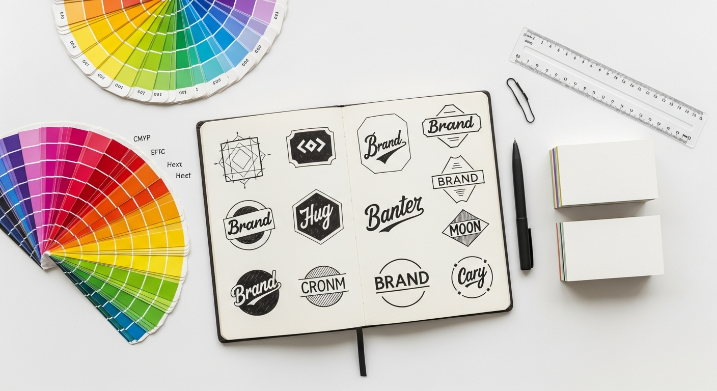
Iconography & Illustrations: Simplifying Complexity
Icons and simple illustrations can significantly enhance an infographic by breaking up text, highlighting key points, and simplifying complex ideas.
- Consistency: Ensure all icons and illustrations share a consistent style (e.g., outline, filled, flat, isometric).
- Relevance: Each visual element should add value and clarity, not just decoration.
- Sources: Utilize resources like The Noun Project for high-quality, scalable icons. For custom illustrations, tools like Adobe Illustrator or Affinity Designer are indispensable for creating unique vector graphics.
Bringing it to Life: Design Tools & Prototyping

Now that you have your blueprint and aesthetic principles, it’s time to translate your vision into a polished digital product. The right tools can streamline your workflow and unlock creative possibilities.
Vector Design Powerhouses: Your Go-To Tools
For pixel-perfect precision, scalability, and intricate detailing, vector-based software is essential for infographic design.
- Figma: A collaborative, cloud-based powerhouse, Figma is excellent for UI/UX designers. Its robust vector editing capabilities, component libraries, and extensive plugin ecosystem (many of which can help generate charts) make it a strong contender for infographic creation, especially when working in teams. You can easily create complex layouts, manage styles, and even prototype interactive elements.
- Adobe Illustrator: The industry standard for vector graphics, Illustrator offers unparalleled control over paths, shapes, and typography. It’s ideal for intricate illustrations, complex data visualizations, and print-ready output. While it has a steeper learning curve, its capabilities are unmatched for professional-grade infographics.
- Affinity Designer: A powerful, one-time purchase alternative to Illustrator, Affinity Designer offers a comprehensive suite of vector tools with a user-friendly interface. It’s a fantastic option for designers looking for professional quality without a subscription model.
Data Visualization Specific Tools: Efficiency and Interactivity
For certain types of data visualization, especially if you need to generate charts rapidly or create interactive elements, specialized tools can be invaluable.
- Datawrapper / Infogram / Canva: These user-friendly, template-based platforms are excellent for quickly generating common chart types and assembling simple infographics. They are particularly useful for designers who need to produce visuals on a tight deadline or for those less experienced with complex vector software. They often have built-in data import features.
- Tableau / Power BI: While primarily designed for business intelligence dashboards, these tools can generate highly sophisticated and interactive charts. You can often export static versions of these charts to integrate into your vector design software for further customization and branding.
- Adobe XD (for interactive infographics): If your infographic needs to be interactive – perhaps with hover states, click-through sections, or micro-animations – Adobe XD (or Figma’s prototyping features) allows you to design and prototype these interactions. This can significantly enhance engagement for web-based infographics.
Workflow & Iteration: The Design Process is Fluid
Your workflow might involve starting with data in Excel, sketching layouts in Figma, creating custom icons in Illustrator, assembling the final piece in Figma, and then prototyping interactions in Adobe XD. Utilize the strengths of each tool. Leverage components and styles in Figma or Illustrator to maintain consistency and allow for rapid changes. Remember that design is an iterative process. Be open to feedback, test different visual approaches, and refine your infographic until it effectively communicates your message with clarity and impact. Don’t be afraid to revisit earlier stages if new insights emerge or if initial designs aren’t hitting the mark.
Optimizing & Sharing: Ensuring Reach and Accessibility
The final stage of infographic design involves preparing your creation for the world. Optimization ensures it performs well across various platforms, while thoughtful sharing strategies maximize its reach and impact.
Performance Optimization: Fast, Crisp & Responsive
How your infographic is delivered affects its reception.
- File Formats:
- SVG (Scalable Vector Graphics): Ideal for web use. SVGs are resolution-independent, meaning they look crisp on any screen size and can be easily animated or made interactive.
- PNG: Best for web images with transparency or complex graphics that don’t need to scale infinitely. Optimize PNGs to balance quality and file size.
- JPG: Suitable for infographics with photographic elements or complex gradients, where file size is a major concern and transparency isn’t needed.
- PDF: Excellent for print, downloadable reports, or high-fidelity sharing where interactivity isn’t required.
- Compression: Always compress your images using tools like TinyPNG or through your design software’s export settings. Smaller file sizes mean faster load times, which is crucial for web performance and user experience.
- Responsive Design: Consider how your infographic will appear on different devices. While a single long infographic might work for desktop, a mobile-first approach might require breaking it into smaller, scrollable sections or adapting the layout for vertical viewing. Design for flexibility from the outset.
Accessibility (WCAG): Design for Everyone
Designing for accessibility isn’t just a best practice; it’s a moral imperative and often a legal requirement.
- Alt Text: Provide descriptive alt text for your infographic image, summarizing its key findings for visually impaired users who rely on screen readers.
- Color Contrast: As mentioned, ensure all text and critical graphical elements meet WCAG 2.1 AA or AAA color contrast standards.
- Logical Reading Order: Ensure the visual flow of your infographic translates into a logical reading order for screen readers.
- Data Tables/Transcripts: For complex infographics, consider providing the raw data in an accessible table format or offering a plain-text transcript of the information presented visually.
- Font Choices: Use clear, legible fonts and adequate font sizes.
Distribution Strategies: Getting Your Message Out
A beautifully designed infographic is only effective if people see it.
- Website Embeds: Embed your infographic directly into blog posts, articles, or dedicated landing pages.
- Social Media: Optimize different versions for various platforms (e.g., square for Instagram, wide for Twitter/LinkedIn, vertical for Pinterest/Stories). Include compelling captions and relevant hashtags.
- Presentations: Break down your infographic into slides for a presentation, using each section as a talking point.
- Email Marketing: Include a snippet or thumbnail in newsletters with a link to the full infographic.
- Call to Action: Don’t forget to include a clear call to action if applicable – whether it’s to visit a website, download a report, or share the infographic.
Measuring Success: What Defines Impact?
After launch, track how your infographic performs. Metrics might include:
- Page views/Impressions: How many people saw it?
- Engagement (scroll depth, time on page): How much of it did they consume?
- Shares/Backlinks: How widely was it distributed?
- Conversions: Did it lead to desired actions (e.g., sign-ups, downloads)?
Analyzing these metrics helps you understand what resonates with your audience and informs your future infographic design projects.