Mastering Harmony: Your Definitive Guide to the Best Color Palette Tools for Designers in 2026
The challenge intensifies with the rapid evolution of digital interfaces and the growing demand for inclusive design. Designers in 2026 need more than just an artistic eye; they need intelligent, efficient, and reliable tools to navigate the complexities of color theory, accessibility standards, and cross-platform consistency. Whether you’re a seasoned professional or an aspiring design student, harnessing the right color palette tools is paramount to streamlining your workflow and elevating your design output. This comprehensive guide will arm you with the knowledge and resources to select and utilize the best color palette tools, ensuring your designs are not only beautiful but also highly effective and accessible for years to come.
The Psychology and Principles Behind Effective Color Palettes
Before diving into the tools, it’s crucial to understand the foundational principles that govern effective color usage. Color is inherently psychological, with different hues evoking distinct emotional responses and cultural associations. For instance, blues often convey trust and stability, while reds signify passion or urgency. Understanding these nuances is the first step in crafting a palette that resonates with your target audience and aligns with your brand’s message.
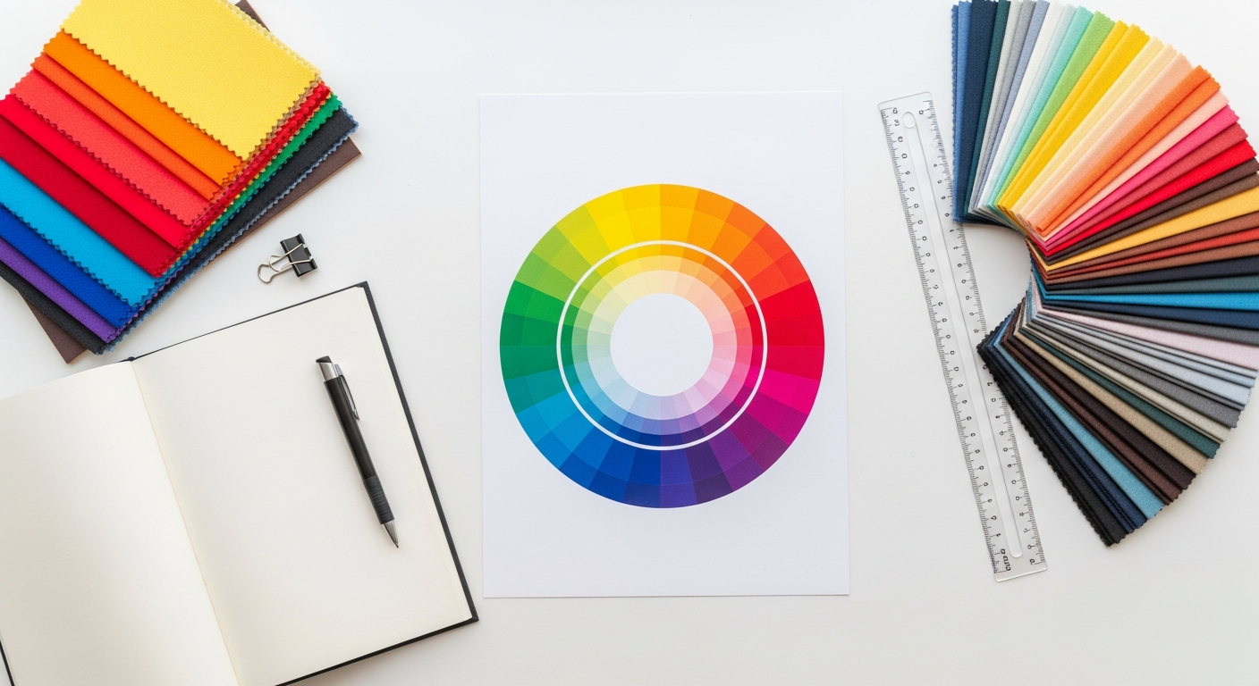
Core Color Theory Principles
A solid grasp of traditional color theory remains indispensable, even with advanced tools. Here are the key schemes:
- Monochromatic: Variations in lightness and saturation of a single hue, offering a cohesive and calming feel.
- Analogous: Colors adjacent on the color wheel, creating harmonious and comfortable designs.
- Complementary: Colors opposite each other on the color wheel, providing high contrast and visual energy.
- Triadic: Three colors evenly spaced around the color wheel, offering vibrant and balanced palettes.
- Tetradic (Double Complementary): Four colors arranged into two complementary pairs, providing rich and complex designs, though challenging to balance.
Accessibility and Usability: Non-Negotiable Standards
In 2026, accessibility is not an afterthought; it’s a fundamental design requirement. The Web Content Accessibility Guidelines (WCAG) 2.1, and increasingly 2.2, provide the benchmark for digital accessibility. Specifically, designers must pay close attention to:
- Contrast Ratios: Ensuring sufficient contrast between text and its background. WCAG 2.1 AA requires a minimum ratio of 4.5:1 for normal text and 3:1 for large text. AAA standards are even stricter.
- Color Blindness Considerations: Designing palettes that remain legible and functional for users with various forms of color vision deficiency (e.g., protanopia, deuteranopia, tritanopia). This often means not relying solely on color to convey information.
- Focus Indicators: Ensuring interactive elements have clear visual indicators when focused, often involving a distinct color or outline.
Essential Features to Look for in a Modern Color Palette Tool
The landscape of color palette tools is constantly evolving. To select the best color palette tools for designers in 2026, you need to look beyond basic generators. Here are the critical features that define a powerful and efficient tool:
- Intelligent Color Theory Application: Tools that can automatically generate palettes based on selected color schemes (monochromatic, analogous, complementary, etc.) and allow for fine-tuning.
- Robust Accessibility Checkers: Integrated contrast ratio checkers, color blindness simulators (protanopia, deuteranopia, tritanopia), and suggestions for accessible alternatives. This is non-negotiable for modern design.
- Flexible Export Options: The ability to export palettes in various formats such as HEX, RGB, HSL, CMYK, CSS/SCSS variables, JSON, and directly into design software libraries (Figma, Sketch, Adobe XD).
- Seamless Design Software Integration: Plugins or direct API integrations with popular design tools like Figma, Sketch, Adobe XD, and even creative suites like Adobe Photoshop and Illustrator.
- AI/Machine Learning Capabilities: Tools that learn your preferences, suggest harmonious combinations, extract palettes from images, or even generate unique palettes based on mood or keywords.
- Palette Organization and Management: Features to save, categorize, tag, and share your created palettes, making it easy to manage multiple projects and design systems.
- Inspiration Galleries and Trend Analysis: Access to curated collections of palettes, trending colors, and the ability to explore how colors are used in real-world designs.
- Responsive Design Considerations: Tools that help visualize how palettes might appear across different screen sizes and light/dark modes.
- Version Control and Collaboration: For team environments, the ability to track changes, comment, and collaborate on shared palettes.
Top-Tier AI-Powered Color Palette Generators for 2026
Artificial intelligence is revolutionizing how designers approach color, offering smart suggestions, personalized experiences, and unprecedented efficiency. These tools are leading the charge for the best color palette tools for designers in 2026:
1. Coolors.co: The Speed Demon of Palette Generation
Coolors has long been a favorite for its incredible speed and intuitive interface. In 2026, it continues to evolve with enhanced AI capabilities. You can generate infinite palettes with a single keypress, lock desired colors, and explore variations. Its AI algorithms are now more sophisticated, suggesting combinations that are not just aesthetically pleasing but also consider potential harmony and contrast. Coolors offers robust export options, including integration with Adobe products and CSS variables, making it a staple for rapid prototyping and ideation.
- Key Features: Instant palette generation, image-to-palette extraction, gradient builder, contrast checker, extensive export options.
- Best For: Designers needing quick inspiration, iterative palette exploration, and seamless integration into various workflows.
2. Khroma: Your Personalized AI Color Assistant
Khroma stands out by learning your color preferences through a simple selection process. By choosing 50 of your favorite colors, its AI engine generates an endless stream of personalized palettes, gradients, and typography combinations specifically tailored to your taste. This level of personalization makes Khroma incredibly powerful for designers looking to develop a unique style or explore combinations they might not have considered. It’s like having a design assistant who intimately understands your aesthetic sensibilities.
- Key Features: AI-driven personalized palette generation, color combination exploration, accessibility checks for text and background.
- Best For: Designers seeking highly personalized inspiration, exploring unique color relationships, and deep color exploration.
3. Adobe Color (formerly Kuler): The Industry Standard Reimagined
Adobe Color remains a powerhouse, especially for those embedded in the Adobe Creative Cloud ecosystem. Its AI enhancements in 2026 focus on intelligent theme generation, trend analysis, and seamless integration across Photoshop, Illustrator, and XD. You can create palettes based on various color rules, extract themes from images, and explore an immense library of user-generated palettes. Its accessibility tools are also top-notch, providing comprehensive contrast checks and color blindness simulations directly within the platform.
- Key Features: Advanced color wheel, AI-powered trend exploration, extract themes from images, accessibility tools, direct integration with Adobe apps.
- Best For: Professionals in the Adobe ecosystem, anyone needing robust features for color theory application and trend research.
Accessibility-Focused Color Tools You Can’t Ignore
Ensuring your designs are accessible is not just good practice; it’s an ethical and often legal imperative. The best color palette tools for designers in 2026 prioritize accessibility from the ground up. These tools are indispensable for meeting WCAG standards and creating inclusive experiences.
1. Stark: The Comprehensive Accessibility Suite
Stark is more than just a color tool; it’s an all-in-one accessibility platform available as a plugin for Figma, Sketch, and Adobe XD. While it offers contrast checking and color blindness simulation, its 2026 iteration includes advanced features like automated WCAG reporting, intelligent suggestions for contrast fixes, and even a “Focus Order” checker. For color, it allows you to test your palette against various accessibility requirements, ensuring compliance and providing actionable insights for improvement. It’s a must-have for any designer serious about inclusive design.
- Key Features: Contrast checker, color blindness simulator, WCAG compliance reporting, focus order checker, smart suggestions.
- Best For: Designers who need rigorous accessibility checks directly within their design environment, ensuring WCAG 2.1/2.2 compliance.
2. Color Safe: Generate Accessible Palettes by Design
Rather than just checking an existing palette, Color Safe allows you to generate accessible color palettes based on WCAG guidelines. You input a background color, desired font size, and weight, and Color Safe provides a range of foreground colors that meet the specified contrast ratios. This proactive approach to accessibility ensures that your palette is compliant from its inception, saving valuable time in remediation. It’s particularly useful for establishing a primary text and UI color system.
- Key Features: Proactive accessible palette generation, WCAG 2.1 AA/AAA compliance, customizable font parameters.
- Best For: Designers wanting to build accessible text and UI color systems from scratch, ensuring compliance from the outset.
3. WhoCanUse: Practical Contrast Checking for Web
WhoCanUse is a straightforward, web-based tool that simplifies contrast checking. You input foreground and background HEX codes, and it immediately tells you if the combination passes WCAG 2.1 AA and AAA for both normal and large text. What makes it particularly useful is its clear visual presentation and explanation of why a combination passes or fails, making it easy for designers and developers to understand and rectify issues quickly. It’s an excellent quick-check tool for any web project.
- Key Features: Simple foreground/background contrast checker, clear WCAG 2.1 AA/AAA pass/fail indicators, visual examples.
- Best For: Quick and easy contrast checks, developers integrating colors, and anyone needing a reliable web-based accessibility validator.
Advanced Tools for Deep Dive Color Exploration and Management
Sometimes, you need more granular control or a different approach to color selection. These advanced tools offer unique functionalities for detailed exploration and robust management of your color systems.
1. Paletton: The Precision Color Wheel
Paletton is a sophisticated online tool centered around a highly customizable color wheel. It allows you to select a base color and then generate monochromatic, analogous, complementary, triadic, tetradic, and even custom-defined schemes with incredible precision. You can fine-tune hue, saturation, and lightness for each color, generating a vast array of shades and tints. Its detailed export options and live examples make it perfect for designers who need absolute control over every aspect of their palette.
- Key Features: Highly customizable color wheel, advanced scheme generation, detailed hue/saturation/lightness control, export presets.
- Best For: Designers needing precise control over color relationships, creating complex schemes, and in-depth color theory application.
2. Pigment: Mood-Driven Color Generation
Pigment takes a unique approach by allowing you to generate palettes based on “lightness” and “hue” sliders, combined with an interactive color space. It’s less about strict color theory rules and more about exploring unexpected and visually interesting combinations. You can introduce “randomness” to create truly unique palettes that evoke specific moods or atmospheres. It’s an excellent tool for breaking out of conventional choices and finding fresh inspiration.
- Key Features: Interactive lightness/hue sliders, mood-driven generation, randomizer for unique combinations, gradient explorer.
- Best For: Creative exploration, generating unique and mood-specific palettes, breaking away from traditional color schemes.
3. Happy Hues: Curated Palettes with UI Examples
Happy Hues isn’t a generator in the traditional sense, but an invaluable resource for visual inspiration. It provides a collection of beautifully curated color palettes, each presented with examples of how those colors might be applied in a real UI (e.g., button states, typography, backgrounds). This practical demonstration helps designers visualize the impact of a palette in context, making it easier to choose or adapt a theme. It’s perfect for understanding how colors interact in a live environment.
- Key Features: Curated palettes, live UI examples for each color, practical application demonstrations.
- Best For: Visual learners, understanding color in context, quick inspiration for UI application, design students.
4. Figma/Sketch/Adobe XD Native Color Features & Plugins
Modern design tools themselves have robust color management capabilities. Figma’s Styles, Sketch’s Color Variables, and Adobe XD’s Assets panel allow designers to define and manage color palettes as part of their design system. Furthermore, each platform has an ecosystem of plugins that enhance color functionality:
- Figma Plugins: “Color Palettes” for importing/exporting, “Themefy” for generating themes, “Color Blind” for simulation.
- Sketch Plugins: “Color Variables” for advanced variable management, “Contrast” for accessibility checks.
- Adobe XD Plugins: “Color Tools” for generating harmonies, “Accessibility” for contrast analysis.
Leveraging these native features and plugins is crucial for maintaining consistency and efficiency within your primary design environment.
The Future of Color Palette Design: Trends for 2026 and Beyond
The landscape of UI/UX design is never static, and color is no exception. As we look towards 2026 and beyond, several key trends will shape how designers approach color palettes:
- Personalization and Adaptive Interfaces: Expect AI-driven tools to offer even more sophisticated personalized palettes that adapt not only to user preferences but also to environmental factors (time of day, ambient light), user mood, or even biometric data. Interfaces will become truly context-aware in their color schemes.
- Dynamic Theming and System-Level Integration: The demand for seamless light/dark modes and custom user themes will push tools to offer more robust, automated solutions for dynamic theming. Operating systems and platforms will provide deeper APIs for applications to integrate with system-wide color preferences.
- 3D, Immersive, and Spatial Computing Color: As VR, AR, and spatial computing become more prevalent, color palettes will need to account for depth, lighting, and environmental interactions in three-dimensional spaces. Tools will emerge to help designers simulate and optimize colors for these immersive experiences.
- Sustainability and Ethical Color Choices: With growing awareness of environmental impact, designers may consider the “energy cost” of colors. Dark modes, for instance, are known to consume less power on OLED screens. Future tools might offer insights into the energy efficiency of certain palettes or encourage more sustainable color practices.
- Cross-Platform and Multi-Modal Consistency: Ensuring a consistent brand experience across web, mobile, smart devices, and even voice interfaces will be critical. Color tools will need to provide unified systems that can translate palettes effectively across diverse interaction modalities.
- AI as a Creative Partner: AI won’t replace human creativity but will act as an increasingly powerful creative partner, offering novel color combinations, predicting user response to palettes, and automating tedious aspects of color management, freeing designers to focus on higher-level strategic thinking.
Comparison of Top Color Palette Tools for Designers in 2026
To help you make an informed decision, here’s a comparative overview of some of the best color palette tools discussed:
| Tool Name | Primary Focus | Key Features | Best For | Accessibility Integration |
|---|---|---|---|---|
| Coolors.co | Rapid palette generation & exploration | Instant generation, image extraction, gradient builder, saved palettes | Quick inspiration, iterative design, general UI/UX projects | Basic contrast checker |
| Khroma | AI-powered personalized color discovery | Learns preferences, personalized palettes, gradients, typography combos | Deep personalized exploration, unique style development | Built-in text/background contrast checker |
| Adobe Color | Comprehensive color theory & trend analysis | Advanced color wheel, AI trend insights, image theme extraction, CC integration | Adobe Creative Cloud users, in-depth color research, brand guidelines | Robust contrast checker, color blindness simulator |
| Stark | All-in-one accessibility suite for design tools | Contrast checker, color blindness simulator, WCAG reporting, focus order | Rigorous WCAG compliance, inclusive design, team collaboration | Extensive WCAG 2.1/2.2 compliance tools (AA/AAA) |
| Paletton | Precise color scheme generation & fine-tuning | Detailed color wheel, advanced scheme controls, hue/sat/light adjustments | Granular control, complex color relationships, specific brand colors | Limited, requires manual checking or external tools |
| Color Safe | Proactive accessible palette generation | Generates WCAG-compliant foreground colors based on background & text size | Building accessible text/UI systems from scratch | Core feature is WCAG 2.1 AA/AAA compliant color generation |
Key Takeaways
- Color is a critical element in UI/UX, impacting emotion, brand identity, and usability; effective tools are essential for success.
- A strong foundation in color psychology and theory (monochromatic, analogous, complementary) remains vital, even with advanced tools.
- Accessibility, particularly WCAG 2.1/2.2 contrast ratios and color blindness considerations, is a non-negotiable standard for all modern designs.
- AI-powered tools like Coolors, Khroma, and Adobe Color streamline palette generation, offering speed, personalization, and intelligent suggestions.
- Dedicated accessibility tools like Stark and Color Safe are indispensable for ensuring your designs are inclusive and meet industry standards.
- The future of color design involves greater personalization, dynamic theming, considerations for immersive experiences, and AI as a creative partner.
Frequently Asked Questions
What’s the most important factor to consider when choosing a color palette tool?
The most important factor is often accessibility integration. In 2026, any tool you choose should offer robust contrast checking and color blindness simulation to ensure your designs are inclusive and meet WCAG standards. Beyond that, consider its integration with your primary design software (Figma, Sketch, Adobe XD) and its ability to generate palettes efficiently based on your workflow needs.
How often should I refresh my brand’s color palette?
While a brand’s core color palette should be relatively stable to maintain recognition, it’s wise to review and potentially refresh it every 3-5 years, or when undergoing a major rebrand. This allows you to address evolving design trends, new accessibility standards, or shifts in your target audience’s preferences. Small updates can keep your brand feeling modern without losing familiarity.
Can AI fully replace human intuition in color design?
No, AI is a powerful assistant, not a replacement for human intuition. While AI-powered tools can generate countless palettes, suggest harmonies, and even learn your preferences, the final decision on which palette best communicates a brand’s message, evokes the right emotion, and creates a compelling user experience still requires human judgment, creativity, and understanding of context. AI streamlines the process, but the art remains with the designer.
What’s the difference between Hex, RGB, and HSL, and when should I use each?
These are different ways to represent color digitally:
- HEX (Hexadecimal): A six-digit alphanumeric code (e.g., #FF0000 for red). It’s compact and commonly used in web design (CSS, HTML) for its brevity and universal support.
- RGB (Red, Green, Blue): Defines color by the intensity of red, green, and blue light, each ranging from 0 to 255 (e.g., rgb(255, 0, 0) for red). It’s intuitive for screen-based design as screens emit light.
- HSL (Hue, Saturation, Lightness): Defines color using a hue angle (0-360 degrees), saturation percentage (0-100%), and lightness percentage (0-100%) (e.g., hsl(0, 100%, 50%) for red). HSL is often preferred by designers for its human-readable nature, as it’s easier to adjust a color’s lightness or saturation without changing its hue significantly.
Use HEX for most web development. Use RGB when working in graphics software or if you need to specify transparency (RGBA). Use HSL for more intuitive color adjustments and creating harmonious variations of a single hue.
How do I ensure my color palette works for users with various forms of color blindness?
To ensure your palette is color-blind friendly:
- Don’t rely solely on color to convey information: Always provide a secondary indicator (text labels, icons, patterns, underlines) alongside color to distinguish elements.
- Use Color Blindness Simulators: Tools like Stark, Adobe Color, or browser extensions allow you to view your designs through the lens of different color vision deficiencies (protanopia, deuteranopia, tritanopia).
- Prioritize Contrast: Even if colors are distinguishable to the fully sighted, ensure high contrast ratios between foreground and background elements, as this helps all users, including those with color blindness.
- Test with Real Users: Whenever possible, conduct user testing with individuals who have color vision deficiencies to gather direct feedback.
As we navigate the complexities of digital design in 2026, the power of color remains unmatched in its ability to shape user perception and experience. The right color palette can transform an interface from merely functional to truly engaging, accessible, and memorable. By embracing the best color palette tools available – from AI-powered generators that spark creativity to dedicated accessibility suites that ensure inclusivity – you equip yourself with the means to craft visually stunning and highly effective designs.
Remember, tools are extensions of your craft. While they offer incredible efficiency and insight, your understanding of color theory, psychology, and empathy for your users will always be the guiding force. Continuously experiment, learn, and leverage these resources to push the boundaries of what’s possible in UI/UX design. The future of color is bright, dynamic, and incredibly exciting.