The Profound Impact of Color: More Than Just Aesthetics
Color is arguably the most powerful element in the designer’s arsenal. It possesses an innate ability to evoke emotions, communicate messages, and even influence behavior without uttering a single word. Understanding this profound impact is the crucial first step in creating a truly effective color palette. From the tranquility of a cool blue bedroom to the energetic buzz of a vibrant orange branding campaign, every shade tells a story and sets a specific tone.
At its core, color psychology explores the mental and emotional effects of colors on human beings. Red, for instance, often symbolizes passion, energy, and urgency, making it a common choice for call-to-action buttons or accent walls in a dining area. Blue, conversely, is frequently associated with serenity, trust, and professionalism, ideal for corporate branding or a calming home office. Green signifies nature, growth, and balance, while yellow radiates optimism and warmth. These associations are not arbitrary; they are deeply ingrained in our culture, biology, and personal experiences. A designer who grasps these underlying psychological principles can intentionally steer the perception and emotional response of their audience, whether they are walking into a meticulously designed living room or interacting with a new mobile application.
This deep connection between color and human response is precisely why What Is UX Design And Why It Matters cannot be overstated, especially when discussing color palettes. User Experience (UX) design focuses on optimizing the interaction between users and a product or service. A crucial component of this is visual design, where color plays a starring role. An intuitive and pleasing color palette enhances usability and creates a positive user journey. Imagine a website where interactive elements like buttons and links are indistinguishable from static text due to poor color contrast, or where error messages are displayed in a calming green instead of an alerting red. Such inconsistencies and misapplications of color can lead to frustration, confusion, and a poor user experience, directly undermining the goals of UX design. Conversely, a well-chosen and consistently applied color palette guides the user’s eye, highlights important information, establishes visual hierarchy, and reinforces brand identity, making the interaction feel seamless and enjoyable. It builds trust and makes the product feel reliable and professional. Therefore, when crafting a color palette, always consider the psychological implications and how they will contribute to the overall user experience.
The Psychological Resonance of Key Colors:
- Red: Energy, passion, danger, urgency, love.
- Blue: Calm, trust, security, stability, sadness.
- Yellow: Happiness, optimism, warmth, caution, intellect.
- Green: Nature, growth, harmony, freshness, wealth.
- Orange: Enthusiasm, creativity, warmth, stimulation, affordability.
- Purple: Royalty, luxury, mystery, spirituality, creativity.
- Black: Sophistication, power, elegance, mystery, grief.
- White: Purity, cleanliness, simplicity, peace, innocence.
- Grey: Neutrality, balance, sophistication, formality, sadness.
Understanding these fundamental associations allows designers to make intentional choices that align with their project’s objectives, whether it’s designing an inviting retail space, a calming spa interior, or a dynamic digital interface for 2026.
Decoding Color Theory: Your Foundation for Harmony
Before you can expertly mix and match hues, a solid grasp of color theory is indispensable. This foundational knowledge provides a systematic approach to understanding how colors relate to each other and how they can be combined to achieve specific aesthetic and emotional outcomes. Think of it as the grammar of visual communication; once you know the rules, you can break them intentionally and effectively.
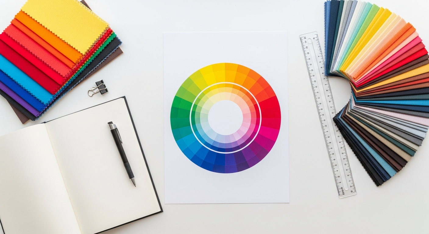
The Color Wheel: Your Primary Map
The color wheel is the most essential tool in color theory, visually representing the relationships between colors. It typically organizes colors into three main categories:
- Primary Colors: Red, Yellow, and Blue. These are the foundational colors from which all other colors can be mixed. They cannot be created by combining other colors.
- Secondary Colors: Green, Orange, and Purple. These are created by mixing two primary colors (e.g., Red + Yellow = Orange).
- Tertiary Colors: Red-Orange, Yellow-Orange, Yellow-Green, Blue-Green, Blue-Violet, Red-Violet. These are formed by mixing a primary color with a secondary color adjacent to it on the color wheel.
Key Color Relationships and Harmonies:
Understanding these relationships is crucial for building cohesive palettes:
- Hue: The pure color itself (e.g., red, blue, green).
- Saturation (or Chroma): The intensity or purity of a color. A highly saturated color is vibrant; a desaturated color appears duller or grayer.
- Value (or Lightness/Brightness): How light or dark a color is. Adding white creates a tint; adding black creates a shade; adding grey creates a tone.
Common Color Schemes:
These are proven formulas for creating harmonious palettes:
- Monochromatic: Uses variations in lightness and saturation of a single hue. It’s simple, elegant, and always harmonious, often creating a very sophisticated feel. Think of a room with different shades of blue, from a light sky blue to a deep navy.
- Analogous: Combines colors that are adjacent to each other on the color wheel (e.g., blue, blue-green, green). These palettes are often found in nature and create a serene and comfortable feel, offering more richness than monochromatic schemes without high contrast.
- Complementary: Pairs colors directly opposite each other on the color wheel (e.g., red and green, blue and orange, yellow and purple). These combinations offer high contrast and vibrancy, creating visual excitement and energy. They should be used carefully, often with one color dominating and the other as an accent.
- Triadic: Uses three colors equally spaced around the color wheel (e.g., red, yellow, blue). These palettes are vibrant and balanced, offering strong visual contrast while maintaining harmony. They are often a good choice for playful or bold designs.
- Split-Complementary: A variation of the complementary scheme. It uses a base color and the two colors adjacent to its complement (e.g., blue, and then yellow-orange and red-orange instead of just orange). This provides high contrast but with less tension than a direct complementary scheme, offering more nuance.
- Tetradic (or Rectangular/Square): Uses four colors arranged in a rectangle or square on the color wheel. These are rich and complex schemes, offering a wide range of possibilities but requiring careful balance to avoid overwhelming the viewer. One color should usually be dominant, with the others serving as accents.
By understanding these fundamental color relationships and schemes, you gain the power to intentionally craft palettes that achieve your desired aesthetic and emotional impact, laying a robust foundation for any design project in 2026 and beyond.
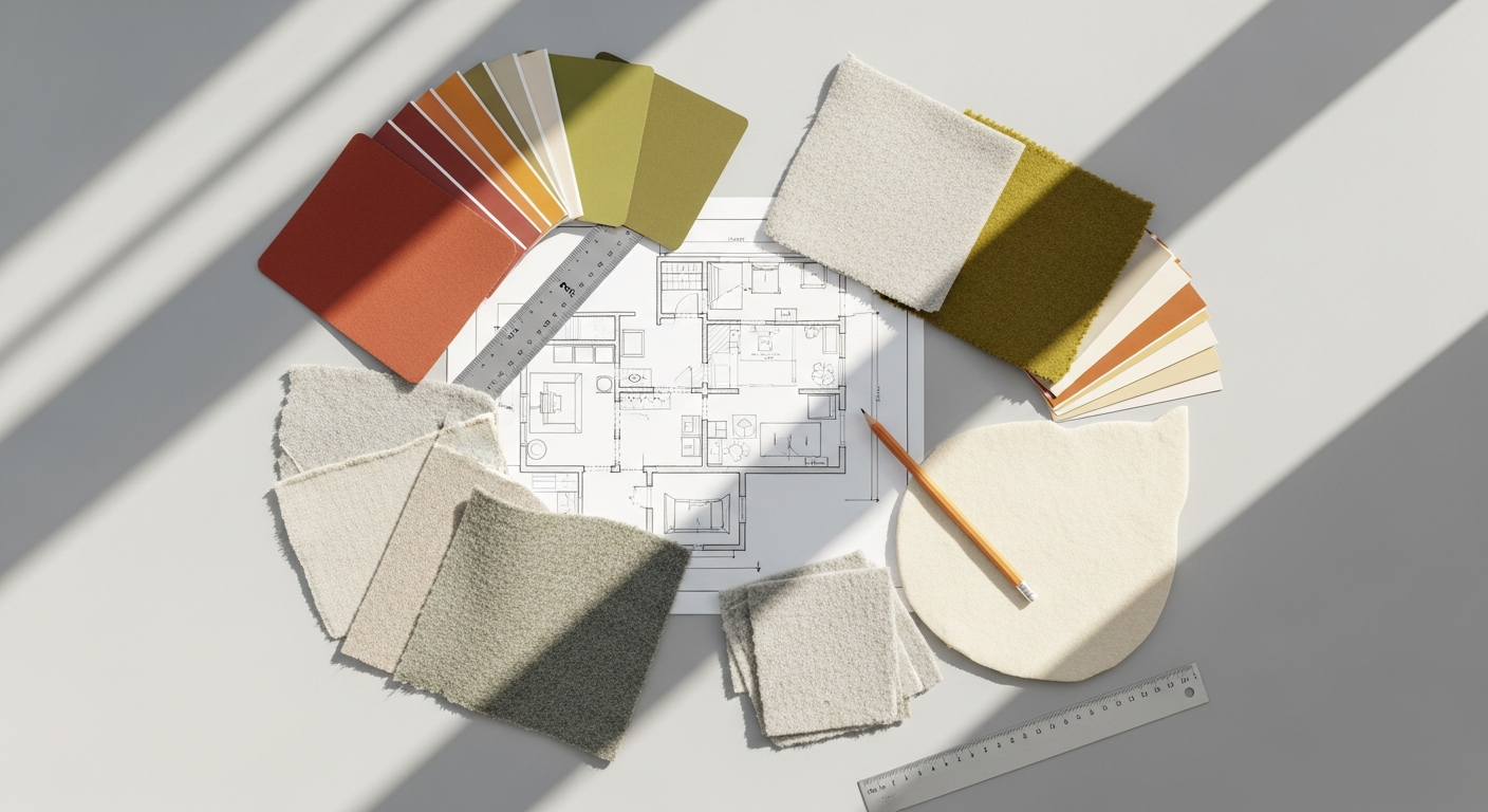
The Step-by-Step Guide to Crafting Your Signature Palette
Step 1: Define Your Project and Purpose
Before you even think about colors, clarify what you’re designing for. Is it an interior space (a cozy living room, a vibrant kitchen)? A brand identity? A website? Social media graphics? Each project has unique requirements and target audiences.
Ask yourself:
- What is the overall mood or feeling I want to evoke (e.g., calm, energetic, luxurious, playful)?
- Who is the target audience, and what are their preferences or expectations?
- What message do I want to convey?
- Are there any existing brand guidelines or constraints?
Step 2: Gather Inspiration and Create a Mood Board
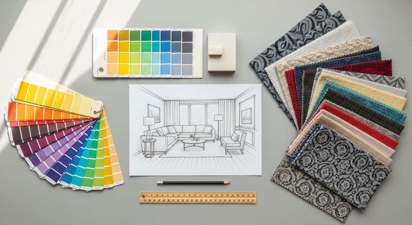
Inspiration can come from anywhere: nature, art, fashion, photography, travel, or even historical periods. Start collecting images, textures, patterns, and existing palettes that resonate with your project’s purpose. A physical or digital mood board is an invaluable tool for visualizing these elements together. Look for common threads, recurring colors, or a general atmosphere that emerges from your collection. This visual exploration helps translate abstract ideas into tangible color directions.
Step 3: Choose Your Dominant Color
This is often the most significant color in your palette, setting the overall tone and occupying the largest visual real estate. It should align directly with the primary mood and message identified in Step 1. Your dominant color might be inspired by a key piece of furniture, a brand’s core value, or a prominent feature in your inspiration board. This color acts as the anchor for the entire palette.
Step 4: Select Your Supporting Colors
Once your dominant color is established, use color theory (monochromatic, analogous, complementary, etc.) to select 2-3 supporting colors. These colors will complement and enhance your dominant hue, adding depth and visual interest.
Consider:
- Analogous colors for a harmonious, subtle flow.
- Complementary colors for vibrant contrast and energy (use sparingly as accents).
- Triadic colors for a balanced, lively feel.
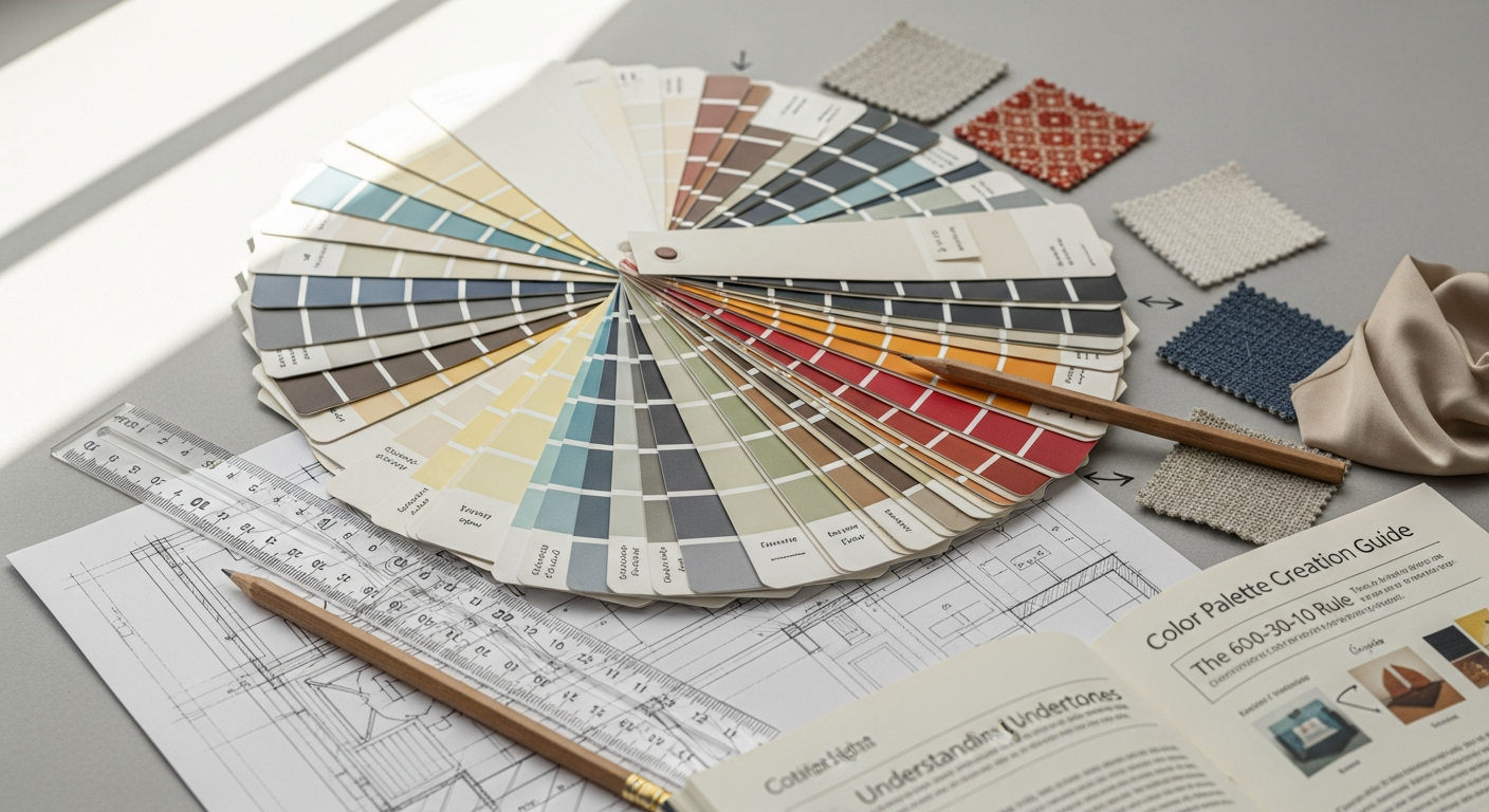
Aim for a balanced distribution. A common guideline is the 60-30-10 rule: 60% dominant color, 30% secondary color, and 10% accent color. This provides a clear hierarchy and prevents visual chaos.
Step 5: Incorporate Neutrals
Neutrals (whites, off-whites, greys, beiges, browns) are the unsung heroes of any palette. They provide breathing room, balance, and sophistication, allowing your chosen colors to truly shine. They also offer practical benefits, especially in interior design, by providing a backdrop that can easily adapt to changing trends or decorative elements. Don’t underestimate the power of a warm grey or a creamy off-white to ground a vibrant palette.
Step 6: Test and Refine Your Palette
This is where your palette comes to life and where you can apply a critical eye. Create mock-ups, paint swatches, or digital renderings to see how your chosen colors interact in real-world applications.
When testing, consider:
- Harmony: Do the colors feel balanced and pleasing together?
- Contrast: Is there enough contrast for readability and visual interest, especially for text or interactive elements? This is particularly vital for digital applications and ties directly into accessibility guidelines.
- Impact: Does the palette achieve the desired mood and communicate the intended message?
- Consistency: Can this palette be consistently applied across all necessary touchpoints (e.g., walls, furniture, branding, website)?
This testing phase is akin to performing a mini How To Conduct A Heuristic Evaluation on your visual design. While a full heuristic evaluation typically covers broader usability principles, applying its spirit here means systematically checking your color choices against established principles of good design: aesthetic and minimalist design, consistency and standards, and flexibility and efficiency of use. For example, are interactive elements clearly differentiated? Is the color scheme consistent across different pages or rooms? Does it create confusion or clarity? This rigorous self-assessment helps catch potential issues before they become larger problems, ensuring your palette is not only beautiful but also functional and effective for 2026.
Step 7: Document Your Palette
Once you’ve finalized your palette, document it thoroughly. Record the specific color codes (HEX, RGB, CMYK, Pantone if applicable) for each color. This ensures consistency across all applications, from print to digital, and makes it easy to share with collaborators or implement in future projects. A well-documented palette is a professional palette.
Essential Tools and Digital Resources for Color Exploration
The digital age has blessed designers with an incredible array of tools and resources that simplify and enhance the color palette creation process. Gone are the days of relying solely on physical swatches; now, powerful software and online platforms can help you discover, test, and apply colors with unprecedented precision and efficiency. Leveraging these tools is crucial for any designer looking to create compelling palettes for 2026.
Online Color Palette Generators & Explorers:
These web-based tools are fantastic starting points for inspiration and experimentation. They allow you to generate palettes based on various color theories, extract colors from images, and test different combinations rapidly.
- Adobe Color (color.adobe.com): A robust and widely used tool that allows you to explore harmonious color schemes (monochromatic, analogous, complementary, etc.) using an interactive color wheel. You can extract palettes from uploaded images, explore trending palettes, and save your creations directly to your Adobe Creative Cloud library. Its accessibility features also allow you to check for color blindness.
- Coolors (coolors.co): Known for its speed and ease of use, Coolors lets you generate endless palettes by simply pressing the spacebar. You can lock specific colors, adjust hues, saturation, and brightness, and save or export your palettes in various formats. It also includes an image-to-palette extractor.
- Paletton (paletton.com): Offers a more detailed color wheel interface, allowing for fine-tuned selection of base colors and the generation of monochromatic, analogous, complementary, and triadic schemes with various shades and tones. It’s excellent for exploring subtle variations within a scheme.
- Canva Color Palette Generator (canva.com/colors/color-palette-generator): Simply upload an image, and Canva will instantly generate a color palette from it. This is incredibly useful when you have a specific photograph or visual inspiration you want to base your colors on.
Color Pickers and Eyedroppers:
These tools are indispensable for capturing colors from any source, whether on your screen or from a physical image.
- Browser Extensions: Many browser extensions (e.g., ColorZilla for Chrome/Firefox) allow you to pick colors from any webpage, getting their exact HEX, RGB, and HSL values.
- Built-in OS Tools: Both macOS (Digital Color Meter) and Windows (using tools within graphics software) have built-in eyedropper functionalities to sample colors from your screen.
- Software Eyedroppers: Design software like Adobe Photoshop, Illustrator, Figma, and even Microsoft PowerPoint/Word include eyedropper tools to sample colors from images or elements within your document.
Design Software Capabilities:
Professional design software offers advanced features for managing and applying color palettes.
- Adobe Creative Suite (Photoshop, Illustrator, InDesign): These programs allow you to create, save, and manage color swatches, apply global colors for easy updates, and work with various color modes (RGB, CMYK, Lab). They integrate seamlessly with Adobe Color.
- Figma/Sketch/Adobe XD: For UI/UX designers, these tools are paramount. They allow you to define color styles, create component libraries with consistent color applications, and easily experiment with design systems. They are critical for ensuring consistency across digital products and are a fundamental part of the toolkit for anyone considering What Is UX Design And Why It Matters in practice.
- Canva: While often seen as a beginner-friendly tool, Canva has robust color management features, allowing users to define brand kits with specific color palettes, fonts, and logos. This makes it incredibly easy for individuals or small businesses to maintain brand consistency across all their creative assets, including Social Media Graphics Design Guide elements.
Accessibility Checkers:
Ensuring your palette is accessible is not just good practice; it’s essential for inclusive design. Accessibility checkers help you evaluate contrast ratios between text and background colors to meet WCAG (Web Content Accessibility Guidelines) standards.
- WebAIM Contrast Checker: A free online tool that allows you to input foreground and background HEX codes and instantly tells you if the contrast ratio meets WCAG AA or AAA levels.
- Chrome DevTools: Built into the Chrome browser, the DevTools provide an accessibility tab that can highlight contrast issues on live web pages.
By effectively utilizing these digital resources, designers can streamline their workflow, explore a wider range of possibilities, ensure consistency, and create palettes that are not only beautiful but also functional and inclusive for any project moving into 2026.
Applying Your Palette: Consistency Across All Touchpoints
Creating a beautiful color palette is only half the battle; the true mastery lies in its consistent and effective application across all relevant touchpoints. Whether you’re designing an interior space, developing a brand identity, or crafting digital content, maintaining color consistency is paramount for reinforcing your message, building recognition, and creating a cohesive aesthetic experience. Disjointed color use can lead to confusion, dilute your brand, and undermine the effort put into the initial palette creation.
Interior Design Applications:
- Walls and Ceilings: Often the dominant color or a neutral base. These large surfaces set the foundation.
- Furniture: Upholstery, wood finishes, and case goods can introduce secondary colors or complementary textures.
- Textiles and Soft Furnishings: Rugs, curtains, pillows, and throws are excellent for introducing accent colors, patterns, and varying textures, adding depth and warmth.
- Art and Decor: Artwork, sculptures, and decorative objects are perfect opportunities to tie in all elements of your palette, offering pops of accent colors or reinforcing the dominant theme.
- Lighting: The color temperature of lighting can significantly impact how your palette is perceived, so consider this early in the design process.
The goal is to create a flow between rooms and elements, ensuring that even distinct areas feel part of a larger, unified design narrative. This careful consideration of how colors interact within a physical space is crucial for creating an interior that feels intentional and cohesive.
Branding and Digital Interfaces:
For brands, a consistent color palette is a cornerstone of identity. It’s what makes a logo instantly recognizable, a website feel professional, and marketing materials look cohesive. This consistency is vital for building brand trust and recall.
- Logo: The primary representation of your brand, its colors should be iconic and reflect core values.
- Website and Apps: Colors should be used to establish visual hierarchy, guide user interaction, and maintain brand recognition. Interactive elements (buttons, links) should have consistent coloring, and calls to action should stand out. This directly impacts user experience, reinforcing the principles of What Is UX Design And Why It Matters.
- Marketing Materials: Brochures, business cards, email newsletters, and advertisements must all adhere to the established brand palette to present a unified and professional image.
Social Media Graphics Design Guide:
In the fast-paced world of social media, where attention spans are fleeting, a consistent and appealing color palette is a game-changer. It’s a powerful tool for instant brand recognition and for making your content visually appealing in a crowded feed. This is where the principles of a strong Social Media Graphics Design Guide truly come into play, with color being a primary differentiator.
- Brand Recognition: When your followers see a post with your distinct color scheme, they should instantly know it’s from your brand, even before reading the text. This builds familiarity and loyalty.
- Cohesive Feed: A consistent palette creates a visually appealing and professional-looking social media feed. This is especially important for platforms like Instagram, where the overall grid aesthetic can attract new followers.
- Content Categorization: You can use subtle variations or specific colors from your palette to categorize different types of content (e.g., one color for tips, another for promotions, another for behind-the-scenes).
- Mood and Message: As with any design, the colors used in social media graphics convey mood and reinforce your message. A vibrant palette for an energetic announcement, or a muted, sophisticated palette for a serious update.
When designing social media graphics for 2026, remember that while trends may shift, the power of a consistent, well-applied color palette remains timeless. Utilize templates within tools like Canva or Figma that incorporate your brand colors to streamline content creation and ensure every post, story, and ad reinforces your visual identity. Regular review of your social media presence, much like conducting a simplified How To Conduct A Heuristic Evaluation for visual consistency, can help ensure your palette is being applied effectively and resonating with your audience.
By consciously applying your color palette across all these touchpoints, you create a harmonious and impactful experience that strengthens your message and leaves a lasting impression, whether in a physical space or the digital realm.
Mastering Your Palette for 2026: Trends, Adaptability, and Longevity
The design world is constantly evolving, with new trends emerging and old ones recirculating. While it’s tempting to chase every fleeting trend, true mastery of color palette creation for 2026 and beyond lies in developing a strategy that balances contemporary appeal with timeless longevity and adaptability. A well-crafted palette should feel current without being overly prescriptive, allowing for subtle evolution without requiring a complete overhaul.
Embrace Adaptability, Not Just Trends:
Instead of merely adopting the “color of the year,” consider the underlying reasons for popular color trends. Often, they reflect broader societal moods, technological advancements, or a yearning for specific emotions (e.g., sustainability, digital escapism, comfort).
For 2026, we can anticipate a continued emphasis on:
- Nature-Inspired Hues: Greens, earthy browns, muted blues, and terracotta tones will likely remain strong, reflecting a desire for connection to nature and wellness.
- Digital & Metaverse Influences: Expect to see vibrant, sometimes fluorescent, accents or gradients that signify technological advancement and digital fluidity, often paired with more grounded neutrals.
- Comfort & Nostalgia: Softer, warmer tones, and comforting pastels or vintage-inspired palettes may continue to provide a sense of security and familiarity.
- Personal Expression: Bold, unconventional combinations that allow for individuality and unique storytelling will likely gain traction.
The key is to understand these macro trends and see how they can subtly inform your core palette without dictating it entirely. A timeless palette often has a strong neutral foundation that allows for trendy accent colors to be swapped in and out with ease. For instance, a living room with a base of warm greys and creams can easily update its feel by introducing accent pillows in 2026’s trending “digital lavender” or “moss green.”
Designing for Longevity:
A truly effective color palette possesses an inherent longevity. This means it remains relevant and appealing for years, even as styles shift. To achieve this, consider:
- Timeless Foundations: Anchor your palette with classic neutrals (whites, greys, beiges, blacks) or universally appealing foundational colors (e.g., a deep navy, a rich forest green). These provide stability.
- Balance and Harmony: Palettes based on sound color theory principles (monochromatic, analogous, split-complementary) tend to have an enduring appeal because they are inherently harmonious.
- Contextual Relevance: Ensure your palette aligns with the long-term identity and purpose of your project. A brand aiming for sophisticated luxury should avoid overly playful or childish colors, regardless of current trends.
- Strategic Use of Accents: Utilize accent colors as your primary vehicle for incorporating trends. These are easier and less expensive to update in interiors (e.g., throw pillows, small decor) or digital designs (e.g., call-to-action buttons, seasonal social media banners). This allows your core identity to remain constant while adapting to the spirit of 2026.
Evolving Your Palette Gracefully:
No palette should be entirely static. As your brand evolves, your personal style matures, or the market shifts, your palette might need a refresh. This doesn’t mean starting from scratch.
- Introduce New Accents: The simplest way to update is by swapping out or adding a new accent color that reflects current trends or a refreshed brand message.
- Adjust Tints and Shades: You can subtly shift the mood of your palette by adjusting the lightness, darkness, or saturation of your existing colors. A slightly dustier rose or a brighter teal can feel very current without altering the core hues.
- Expand the Neutral Range: Introduce a new neutral to your palette, perhaps a warmer grey instead of a cooler one, or a deeper cream instead of a stark white, to shift the overall temperature.
- Consider Texture and Finish: How a color is applied can also update its feel. A matte finish will look different from a glossy one, even if the hue is the same. Incorporating new textures (e.g., boucle fabric, brushed metal, digital gradients) can give existing colors a fresh context.
By approaching color palette creation with an eye towards adaptability and longevity, you empower your designs to remain fresh and relevant, successfully navigating the aesthetic landscape of 2026 and well into the future, without sacrificing your unique identity or requiring constant, costly overhauls.
Frequently Asked Questions
Recommended Resources
Related reading: How To Avoid Burnout Working Remotely (Bookmark Sharer).
You might also enjoy What Is Influencer Marketing And How To Get Started from Eamped.