What is a Design System? Design System Basics Explained
At its heart, a design system is a complete set of standards, documentation, and reusable UI components that help teams build and maintain a consistent user interface. Think of it as the ultimate source of truth for your brand’s visual and interactive language. Unlike a mere style guide, which primarily focuses on visual aesthetics like colors, typography, and logos, or a UI kit, which is a collection of pre-designed interface elements, a design system encompasses all these and much more. It includes not only the visual and interactive elements but also the underlying principles, the code that brings them to life, and the guidelines for how and when to use them.
The primary goal of a design system is to create a unified language for design and development teams, ensuring that every element, from a simple button to an entire page layout, adheres to a consistent standard. This consistency is crucial for building trust with users and reducing cognitive load, making products intuitive and enjoyable to use. Imagine navigating a website where every button looks and behaves differently – the frustration would be immense. A design system prevents this by providing a predictable and familiar experience, which is a cornerstone of good user experience (UX) design. Indeed, understanding What Is UX Design And Why It Matters becomes clearer when you see how a design system directly contributes to creating delightful and effective user journeys.
Beyond consistency, a design system is a strategic asset for efficiency and scalability. By providing ready-to-use components and clear instructions, designers can focus on solving complex user problems rather than reinventing the wheel with every new feature. Developers, in turn, can build faster and more reliably, knowing they are using pre-approved, tested, and documented code. This shared understanding and set of tools foster better collaboration between design, development, and even content teams, breaking down silos and accelerating product delivery.
The Core Components of a Design System

To truly grasp the concept of a design system, it’s essential to understand its foundational components. These elements work together harmoniously to create a cohesive and functional system.
- Design Principles: These are the guiding philosophies that inform every design decision. They articulate the core values of the brand and product, such as “clarity over complexity,” “user-centricity,” or “elegant simplicity.” These principles help teams make consistent choices even when specific guidelines aren’t available, acting as a compass for the entire system.
-
Design Tokens: These are the atomic units of a design system. They are named entities that store visual design attributes, such as color values, font sizes, spacing units, animation durations, and border radii. Instead of hardcoding values like
#FFFFFFor16px, you use tokens like--color-brand-primaryor--font-size-body. This allows for easy global updates; change the token value once, and it updates everywhere it’s used. Design tokens are incredibly powerful for maintaining consistency and enabling theme switching or dark mode implementations with minimal effort. -
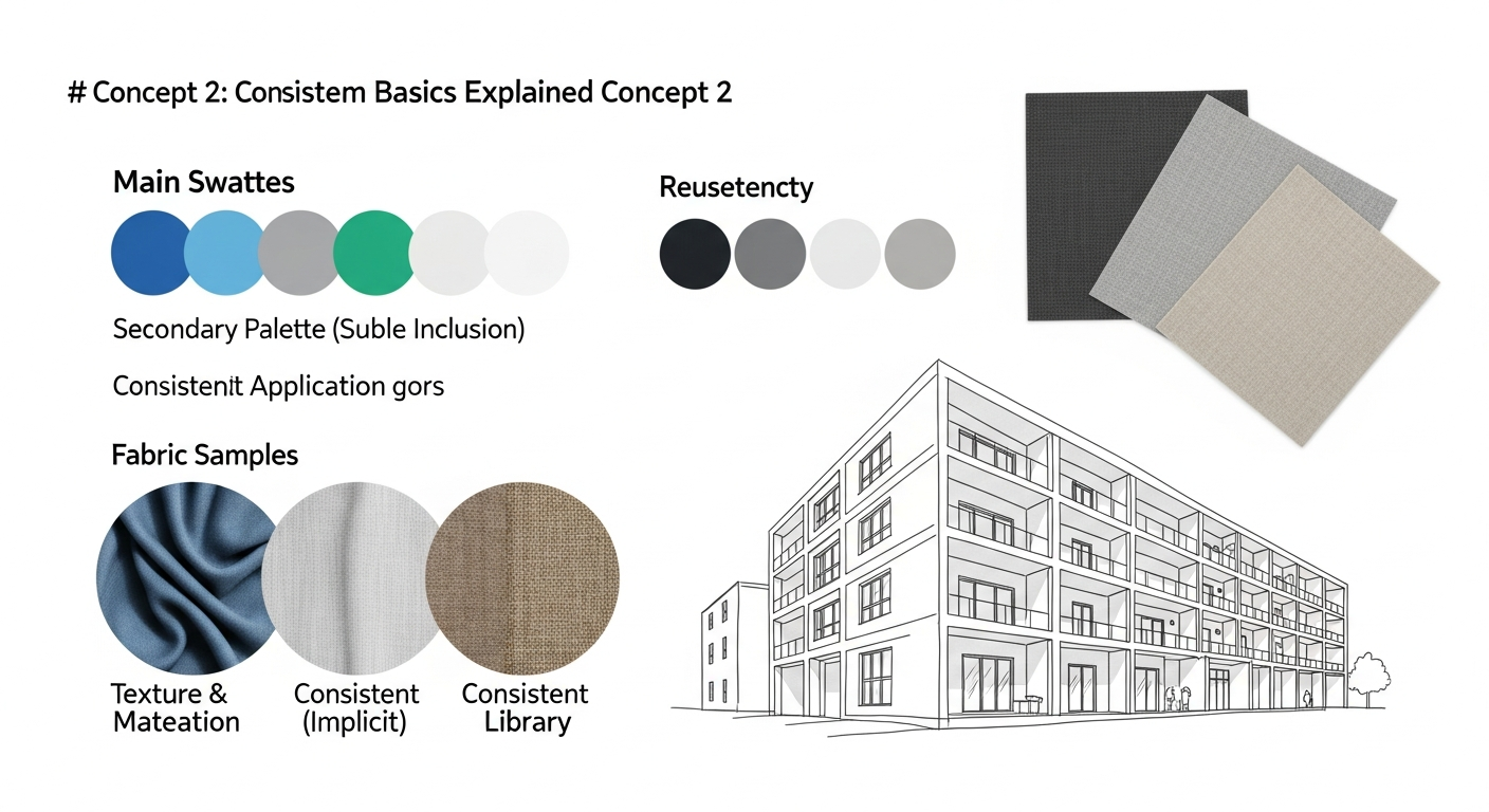
Visual Style Guide: While a design system is more than a style guide, a comprehensive visual style guide is a crucial component within it. This section details the brand’s visual identity, including:
- Color Palette: Primary, secondary, accent, and semantic colors (e.g., success, error).
- Typography: Font families, sizes, weights, line heights, and usage for headings, body text, and other elements.
- Iconography: A library of icons, their usage guidelines, and styling rules.
- Imagery & Illustration: Guidelines for photography style, illustration style, and usage.
- Logo Usage: Rules for how and where the brand logo can be used.
- Component Library (UI Kit): This is arguably the most tangible part of a design system. It’s a collection of reusable UI components, built and documented according to the system’s principles and tokens. Examples include buttons, form inputs, navigation bars, cards, modals, and alerts. Each component comes with its design specifications, code snippets (for various platforms like web, iOS, Android), usage guidelines, and accessibility considerations. These components are often built in development environments like Storybook, allowing designers and developers to preview and test them in isolation.
- Pattern Library: While components are individual elements, patterns are combinations of components used to solve specific user problems or achieve common user flows. For instance, a “login form” pattern might combine input fields, buttons, and error messages in a predefined layout. A “product card” pattern might combine an image, title, price, and “add to cart” button. Patterns provide guidance on how to assemble components effectively and consistently.
- Content Guidelines: Often overlooked but incredibly important, content guidelines ensure that the language used within the product is consistent in tone, voice, and terminology. This includes rules for microcopy, error messages, calls to action, and even accessibility considerations for written content.
- Documentation & Governance: A design system is only as good as its documentation. This includes detailed explanations of how to use each component, why certain decisions were made, and who is responsible for maintaining the system. Governance defines the process for updating, adding, or deprecating components and guidelines, ensuring the system remains a living, evolving resource. This aspect heavily relies on clear Information Architecture Explained principles to ensure navigability and discoverability of information within the system itself.
Building Blocks: From Atoms to Organisms
- Atoms: These are the smallest, indivisible building blocks of an interface. They are the foundational HTML tags and basic visual styles. Examples include labels, inputs, buttons, or individual icons. They are the design tokens brought to life as simple UI elements. An atom on its own might not be useful, but it’s the bedrock.
- Molecules: When atoms combine, they form molecules. In design, molecules are simple groups of UI elements that function together as a unit. For instance, a form label, an input field, and a submit button could combine to form a “search form” molecule. They are still relatively simple but gain functionality through their combination.
- Organisms: Organisms are complex UI components composed of groups of molecules and/or atoms. They represent distinct sections of an interface. A “header” organism might include a logo (atom), navigation links (molecules), and a search bar (molecule). These are more substantial and can be recognized as standalone sections of a page.
- Templates: Templates are page-level objects that place organisms into a layout, illustrating the page’s underlying content structure. They are essentially wireframes with actual components in place but without real content. A “product detail page” template would show the layout of the product image organism, description organism, and “add to cart” organism.
- Pages: Pages are specific instances of templates, populated with real content. This is where you see the design system fully realized, demonstrating how components and patterns look and behave with actual data. A “Nike Air Max product page” would be a page instance of the “product detail page” template.
Atomic Design provides a clear mental model for how to construct a design system, moving from the smallest, most abstract elements to the most concrete, fully realized pages. This systematic approach ensures reusability, consistency, and makes it easier to manage complexity as products grow.
The Benefits of Implementing a Design System
The decision to invest in a design system is a strategic one, yielding a multitude of benefits that impact not just design and development but the entire organization. By 2026, many leading companies have recognized these advantages and made design systems a cornerstone of their product strategy.
- Enhanced Consistency: This is perhaps the most immediate and visible benefit. A design system ensures that every element across all products and platforms adheres to the same visual and interactive standards. This creates a predictable and reliable user experience, fostering trust and making products easier to learn and use. For a brand, consistency reinforces identity and professionalism, whether it’s on a website, a mobile app, or even in the visual elements used for Social Media Graphics Design Guide.
- Increased Efficiency and Speed: With a library of pre-built, tested, and documented components, designers no longer need to create common elements from scratch, and developers don’t have to code them repeatedly. This significantly speeds up the design and development process, allowing teams to focus on innovation and solving unique user problems rather than repetitive tasks. New features can be rolled out faster, and product iterations become more agile.
- Improved Scalability: As products grow and teams expand, maintaining consistency becomes increasingly challenging. A design system provides the necessary infrastructure to scale effectively. New team members can quickly get up to speed with established guidelines and components, reducing onboarding time and ensuring that growth doesn’t compromise quality or brand cohesion. It allows a small team to build big, and a big team to stay organized.
- Better Collaboration: A design system acts as a shared language and single source of truth for cross-functional teams. Designers, developers, product managers, and even content writers can refer to the same documentation and component library, reducing miscommunication and fostering a more collaborative environment. Everyone is literally on the same page, working with the same building blocks.
- Higher Quality and Accessibility: By centralizing components and enforcing best practices, a design system inherently improves the quality of the product. Components can be thoroughly tested for functionality, responsiveness, and accessibility before being added to the system. This ensures that accessibility standards are baked in from the start, making products usable for a wider audience, which is a critical aspect of responsible UX design.
- Stronger Brand Identity: A consistent visual and interactive language reinforces brand identity across all touchpoints. When users encounter a brand’s products, whether digital or physical, the unified experience strengthens their perception of the brand’s values and professionalism.
- Reduced Technical Debt: By promoting the reuse of well-maintained and tested code, design systems help to minimize technical debt. Instead of having multiple variations of the same component floating around with different codebases, the system provides one authoritative version, making updates and bug fixes more manageable.
Design Systems in Practice: Who Uses Them and Why
Design systems are not just theoretical concepts; they are practical tools adopted by companies of all sizes across various industries. From tech giants to burgeoning startups, the benefits of a structured approach to design and development are widely recognized. Understanding who uses them and why illuminates their real-world impact.
Large Enterprises and Tech Companies: Companies like Google (with Material Design), IBM (with Carbon Design System), Airbnb (with DLS), and Shopify (with Polaris) are pioneers in design system implementation. For these organizations, managing a vast ecosystem of products, services, and teams across global offices would be virtually impossible without a robust design system. They use design systems to:
- Maintain Brand Cohesion: Ensure that every product, from search engines to cloud services, feels distinctly “Google” or “IBM.”
- Scale Development: Enable thousands of designers and developers to contribute to multiple products concurrently without creating fragmentation.
- Onboard New Talent: Provide a comprehensive toolkit and documentation for new hires to quickly understand and contribute to the company’s design language.
- Drive Innovation: Free up resources from repetitive tasks, allowing teams to focus on groundbreaking features and user experiences.
Startups and Growing Businesses: While often associated with large enterprises, design systems are increasingly valuable for smaller, rapidly growing companies. For a startup, establishing a design system early can:
- Accelerate MVP Development: Quickly assemble initial product versions with consistent, high-quality components.
- Future-Proof Growth: Lay the groundwork for scalable design and development practices as the team and product portfolio expand.
- Attract Talent: Demonstrate a commitment to organized, efficient, and high-quality product development.
Agencies and Freelancers: Creative agencies and independent designers can also leverage design system principles, even if they don’t build a full-fledged system for every client. Creating component libraries and style guides for recurring clients or specific project types can:
- Improve Client Consistency: Ensure all deliverables for a client maintain a unified look and feel.
- Increase Project Efficiency: Reuse components and patterns across different client projects, saving time and resources.
- Standardize Deliverables: Provide clients with well-organized, maintainable design assets.
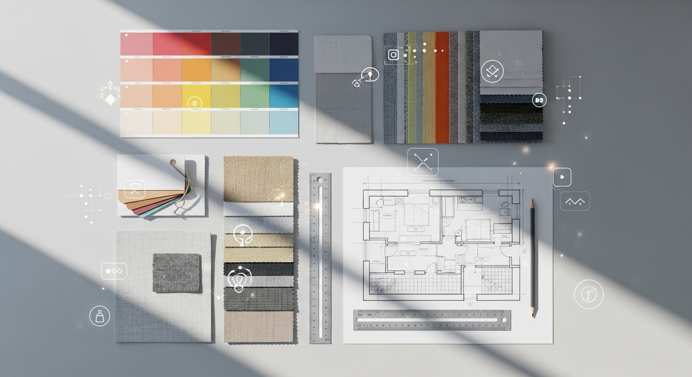
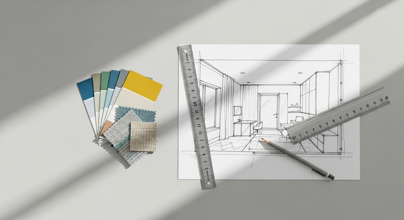
Beyond Digital Products: While design systems are predominantly discussed in the context of digital interfaces, their underlying principles of standardization, modularity, and consistency can be applied to other creative fields. For example, in interior design, a “design system” could manifest as a curated set of furniture modules, material palettes, lighting fixtures, and spatial arrangement principles that ensure a consistent aesthetic and functional quality across different projects or within a branded chain of establishments. Similarly, a Social Media Graphics Design Guide is essentially a mini-design system for visual communication, ensuring brand consistency across various platforms and campaigns. The core idea remains: establish clear rules and reusable elements to achieve predictable, high-quality outcomes.
Getting Started with Your Own Design System
Embarking on the journey of building a design system can seem daunting, but with a structured approach, it’s an achievable and highly rewarding endeavor. Here’s a practical guide to help you get started:
- Gain Stakeholder Buy-in: Before you even open a design tool, it’s crucial to get leadership and cross-functional team members on board. Explain the benefits – consistency, efficiency, scalability, and improved user experience. Highlight how it will save time and money in the long run. This foundational step is critical for securing resources and ensuring adoption.
- Conduct a UI Audit: Look at your existing products and identify all unique UI elements. Document every button, input field, color, font size, and spacing unit. You’ll likely discover a surprising amount of inconsistency and redundancy. This audit provides a baseline and helps prioritize which components to standardize first. It’s an exercise in understanding your current “information architecture” of design elements.
- Define Your Design Principles: What are the core values that should guide all design decisions? Are you striving for simplicity, innovation, accessibility, or something else? These principles will act as your north star, helping teams make consistent choices even without explicit rules for every scenario.
-
Establish Foundational Elements (Tokens): Start with the basics:
- Color Palette: Define your brand colors, semantic colors (for success, error, warning), and grayscale values. Create design tokens for each.
- Typography Scale: Choose your primary and secondary fonts, define a consistent scale for headings, body text, and smaller elements, and create tokens for sizes, weights, and line heights.
- Spacing Scale: Establish a consistent set of spacing units (e.g., 4px, 8px, 16px, 24px) to ensure harmonious layouts and create tokens for them.
- Iconography: Select or design a consistent icon set and define usage guidelines.
-
Build Your First Components: Begin with the most common and reusable UI elements. Buttons, form inputs, and alerts are often good starting points. For each component:
- Design it: Create the visual design in your chosen design tool (Figma, Sketch, Adobe XD).
- Document it: Explain its purpose, states (hover, active, disabled), accessibility considerations, and usage guidelines.
- Code it: Develop the component in your chosen framework (React, Vue, Angular, etc.), ensuring it’s robust, accessible, and uses your design tokens.
- Test it: Verify its functionality and visual integrity across different browsers and devices.
-
Choose Your Tools:
- Design Tools: Figma, Sketch, or Adobe XD are popular choices for creating and managing design libraries. Figma, in particular, excels in collaborative design system management.
- Development Tools: Storybook is widely used to develop, document, and test UI components in isolation. It acts as a living style guide for developers.
- Documentation Platforms: Confluence, Notion, or dedicated platforms like Zeroheight can host your design system’s guidelines and documentation, making it easily accessible. The structure of this documentation is where principles of Information Architecture Explained become invaluable for ensuring clarity and ease of navigation.
- Start Small, Iterate, and Grow: Don’t try to build the entire system at once. Begin with a minimum viable design system (MVDS) that addresses your most pressing needs. Roll it out to a small team, gather feedback, and iterate. A design system is a living product that evolves over time.
Maintaining and Evolving Your Design System
Building a design system is a significant undertaking, but its true value is realized through ongoing maintenance and evolution. A design system is not a static artifact; it’s a living product that needs continuous care to remain relevant and effective. Neglecting its upkeep can lead to it becoming outdated, unused, and ultimately, a source of frustration rather than efficiency.
Establishing Governance: A critical aspect of maintenance is defining a clear governance model. This outlines who is responsible for what. Common roles and responsibilities include:
- Core Team: A dedicated group of designers, developers, and product managers responsible for the overall health, updates, and strategic direction of the system.
- Contributors: Wider team members who can propose new components, suggest improvements, or report issues.
- Review Process: A defined workflow for submitting, reviewing, approving, and integrating new components or changes into the system. This ensures quality and consistency.
Continuous Feedback Loop: Encourage teams to provide feedback on the design system. Are components easy to use? Is the documentation clear? Are there missing components or patterns? Regular communication channels, such as dedicated Slack channels, regular meetings, or issue tracking systems, can facilitate this. Actively listen to the needs of the product teams using the system, as they are your primary “users.”
Regular Updates and Versioning: As products evolve and design trends shift, the design system must adapt. This means:
- Adding New Components: As new UI patterns emerge or are needed for specific product features, they should be designed, documented, and coded into the system.
- Updating Existing Components: Improvements in accessibility, performance, or visual design might necessitate updates to existing components.
- Deprecating Components: Components that are no longer used or have been replaced by better alternatives should be clearly marked for deprecation, with guidance on migration paths.
- Versioning: Implement a versioning strategy (e.g., semantic versioning) for your design system. This helps product teams understand the impact of updates and manage their adoption.
Documentation as a Living Resource: The documentation must be kept up-to-date with every change to the system. Outdated documentation is worse than no documentation, as it can lead to confusion and incorrect usage. This includes:
- Usage Guidelines: Clear instructions on how and when to use each component.
- Code Examples: Up-to-date code snippets for developers.
- Design Specs: Detailed visual specifications for designers.
- Accessibility Notes: Information on how components meet accessibility standards.
- Release Notes: Documentation of changes in each new version.
Promoting Adoption and Education: A design system is only valuable if it’s used. Continuously educate new team members and remind existing ones about its benefits and how to leverage it effectively. Workshops, tutorials, and regular communication about system updates can help maintain high adoption rates. Highlighting successful implementations within the company can also serve as powerful encouragement.
By treating your design system as a product in itself, with its own users (your internal teams), roadmap, and maintenance cycle, you ensure it remains a powerful engine for consistency, efficiency, and innovation for years to come, truly making it a foundational element for your creative and development efforts in 2026 and beyond.
Frequently Asked Questions
Recommended Resources
Check out What Is Data Analytics And How To Use It For Business on Eamped for a deeper dive.
You might also enjoy Pomodoro Technique Guide How To Use from Bookmark Sharer.