Embracing the Figma Revolution: Why It Matters for Every Creative Professional
Figma isn’t just another design tool; it’s a paradigm shift in how digital products and creative assets are conceived, designed, and iterated upon. Born from the need for seamless collaboration and accessibility, Figma operates entirely within your web browser, eliminating the common hurdles of software installations, version control nightmares, and operating system compatibility issues. This browser-first approach means you can access your projects from anywhere, on any device, making it a truly flexible partner in your creative journey.
For beginners, the allure of Figma lies in its intuitive interface, which, despite its depth, manages to present a clean and approachable workspace. Unlike traditional design software that often feels overwhelming with countless menus and panels, Figma strategically organizes its tools, allowing new users to grasp the basics quickly while still offering advanced functionalities for seasoned professionals. This balance makes it an ideal starting point for anyone entering the world of digital design.
Beyond its technical advantages, Figma fosters a culture of collaboration. Multiple users can work on the same file simultaneously, observing each other’s changes in real-time. Imagine sketching out an initial concept while a colleague refines the typography, and another adds interactive prototypes – all happening concurrently without saving, sending, or merging files. This collaborative power significantly streamlines workflows, reduces feedback loops, and accelerates project delivery, making it a cornerstone for modern creative teams. For individuals, it means easier sharing of ideas with clients or stakeholders, transforming feedback into an active, integrated part of the design process.
Furthermore, Figma’s ecosystem extends beyond basic design. It supports prototyping, allowing you to transform static designs into interactive user flows that simulate real-world application experiences. It boasts an extensive plugin architecture, enabling users to expand its capabilities with specialized tools for everything from accessibility checks to content generation. This versatility is why Figma is not just for UI/UX designers but also for graphic designers creating social media assets, marketing professionals drafting presentations, and even interior design enthusiasts building detailed mood boards. By understanding Figma, you’re not just learning a tool; you’re adopting a methodology that prioritizes efficiency, collaboration, and creative freedom.
Getting Started with Figma: Your First Steps into Digital Design
Embarking on your Figma journey is remarkably straightforward. As a cloud-based platform, the entry barrier is minimal, requiring only an internet connection and a web browser. Here’s how to get your creative engine running.
Creating Your Figma Account
The very first step is to create a free account. Navigate to figma.com and click on the “Get started for free” button. You can sign up using your Google account for quick access or with any email address. Figma’s free tier, known as the “Starter” plan, offers a surprisingly robust set of features, including unlimited files in drafts, up to three project files, and unlimited collaborators, making it perfect for beginners to explore and learn without financial commitment.
Understanding the Figma Environment: Web vs. Desktop App
While Figma is celebrated for its web-based accessibility, it also offers a dedicated desktop application for both macOS and Windows. Both versions provide virtually identical functionality, but the desktop app can sometimes offer minor performance improvements and better integration with system fonts. For beginners, starting with the web application is perfectly fine, as it requires no installation and provides the full Figma experience. You can switch between them seamlessly, as all your files are stored in the cloud.
Your First File: Navigating the Dashboard
Once logged in, you’ll land on your Figma dashboard. This is your central hub for managing projects and files. On the left sidebar, you’ll see:
- Drafts: This is where all your personal, unsaved, or unorganized files reside. It’s an excellent place to experiment and learn without affecting shared projects.
- Teams: If you join or create a team, your team projects and shared files will appear here. This is where collaborative work truly shines.
- Recent: Quickly access files you’ve recently worked on.
- Community: Explore thousands of free templates, plugins, and resources shared by the global Figma community – an invaluable asset for learning and inspiration.
To create your first design file, simply click the “Design file” button in the top right corner of the dashboard. This will open a new, blank canvas, ready for your creative input. Alternatively, you can browse community templates to get a head start, perhaps by searching for “mood board template” or “social media post template” to see how others structure their designs.
A Quick Look at the Basic Interface
Upon opening a new design file, you’ll be greeted by Figma’s main interface. Don’t worry if it looks a bit busy at first; we’ll break it down in detail. For now, observe the three main sections:
- Left Sidebar: This panel typically houses your Layers, Assets, and Pages. It’s where you manage the structure and hierarchy of your design.
- Canvas (Center): This is your main workspace where you’ll create and arrange all your design elements. It’s infinite, allowing for extensive projects.
- Right Sidebar: This contextual panel changes based on what you have selected. It’s where you’ll find design properties (colors, fonts, effects), prototyping controls, and inspection details for development.
This initial overview provides a solid foundation. With your account set up and a basic understanding of the environment, you’re now ready to delve deeper into mastering the Figma interface and its powerful tools.
Mastering the Figma Interface: Tools and Panels Explored
The Top Toolbar: Your Command Center
At the very top of your Figma canvas, you’ll find the toolbar, packed with essential tools and options:
- Menu Button (Figma Icon): Located on the far left, this icon opens a dropdown menu with global file options, preferences, plugins, and more. It’s your gateway to advanced settings.
- Move Tool (V): The default selection tool. Use it to select, move, and resize objects on your canvas.
- Frame Tool (F): Crucial for organizing your designs. Frames act like artboards or canvases within your infinite workspace. You can choose from preset frame sizes (e.g., iPhone 13, Desktop, Social Media) or draw your own.
- Shape Tools (R, P, O, T): This dropdown offers basic shapes like rectangles (R), lines (L), arrows, ellipses (O), polygons, and stars. The pen tool (P) is for creating custom vector shapes, and the text tool (T) allows you to add typography.
- Drawing Tools (P, Shift+P): The Pen tool (P) is for creating custom vector paths, while the Pencil tool (Shift+P) is for freehand drawing.
- Text Tool (T): For adding and editing text layers. We’ll dive deeper into typography later.
- Hand Tool (H): Use this to pan around your canvas without accidentally selecting or moving objects.
- Comment Tool (C): Essential for collaboration. Click anywhere on the canvas to leave a comment for your teammates, making feedback precise and contextual.
- Zoom Level: Displays your current zoom percentage.
- File Name: The name of your current design file.
- Share Button: Instantly share your file with others, invite collaborators, or generate a public link.
- Present Button: Launches your prototype in presentation mode, allowing you to test interactions.
The Left Sidebar: Structure and Assets
This panel is your navigator for the design file’s hierarchy and resources.
- Layers Tab: Displays a list of all elements on your current page in a hierarchical order. Think of it like a stack of transparent sheets. You can select, rename, group, lock, or hide layers here. A well-organized layers panel is key for complex designs.
- Assets Tab: This is where your reusable components live. Once you create components, they appear here, making it easy to drag and drop instances of them onto your canvas, ensuring consistency across your designs.
- Pages Tab: Figma files can contain multiple “pages,” each acting as a distinct canvas for different flows, screens, or design explorations. This helps keep large projects organized.
The Right Sidebar: Contextual Properties and Controls
This dynamic panel changes its content based on what you have selected on your canvas or which tab you’re on.
- Design Tab: When a design element (shape, text, frame) is selected, this tab displays all its editable properties:
- Alignment and Distribution: Tools to precisely position and space elements.
- Constraints: Define how elements resize when their parent frame changes size (e.g., left, right, top, bottom, center, scale).
- Fill: Control the color, gradient, or image fill of an object.
- Stroke: Add borders or outlines, customize their color, thickness, and style.
- Effects: Apply shadows, blur, and other visual effects.
- Export: Define export settings for selected layers (e.g., PNG, JPG, SVG, PDF).
- Text Properties: If text is selected, you’ll see font family, size, weight, line height, letter spacing, and more.
- Prototype Tab: When nothing is selected, or you switch to this tab, you define interactions between frames. This is where you connect screens, add animations, and simulate user flows. We’ll delve into this more later.
- Inspect Tab: Primarily for developers. This tab displays code snippets (CSS, iOS, Android) for selected design elements, making handoff to development teams incredibly efficient. It’s an invaluable feature for ensuring design fidelity in implementation.
By familiarizing yourself with these core areas, you gain control over Figma’s powerful capabilities. Practice selecting different tools, creating basic shapes, and observing how the right sidebar changes. This hands-on exploration is the quickest way to build muscle memory and confidence.
Core Design Principles in Figma: Frames, Shapes, and Text
Now that you’re familiar with the interface, let’s dive into the fundamental building blocks of any design in Figma. Mastering frames, shapes, and text is crucial, as they form the foundation for everything from simple graphics to complex user interfaces. This section will also illuminate how these elements contribute to the broader discipline of design, especially in the context of user experience.
Frames: Your Digital Canvases
In Figma, a frame is essentially an artboard or a container for your design elements. Think of it as a blank sheet of paper within your infinite digital workspace. Frames are incredibly versatile and are used to:
- Define Screen Sizes: For UI/UX design, you’ll use frames to represent different device screens (e.g., iPhone 15, Android Tablet, Desktop).
- Organize Content: You can nest frames within other frames to create logical groupings of elements, which is vital for maintaining structure.
- Create Components: Frames are often the foundation for creating reusable components.
- Establish Clipping Masks: Content within a frame is clipped to its boundaries, keeping your designs tidy.
To create a frame, select the Frame tool (F) from the top toolbar. You can then either click and drag to draw a custom frame or choose from the preset dimensions listed in the right sidebar (e.g., Phone, Tablet, Desktop, Watch, Paper, Social Media). Experiment with different frame sizes to understand how they function as distinct design canvases.
Working with Shapes: The Visual Foundation
Basic shapes are the elementary particles of visual design. Figma provides tools for creating rectangles (R), lines (L), ellipses (O), polygons, and stars. Once a shape is drawn, you can manipulate its properties using the Design panel on the right sidebar:
- Fill: Change the background color, apply linear or radial gradients, or even use an image as a fill. The color picker offers HSL, RGB, CSS, and HEX options, along with an eyedropper tool.
- Stroke: Add an outline to your shape. You can control its color, thickness, position (inside, center, outside), and even create dashed lines.
- Effects: Apply drop shadows, inner shadows, layer blur, or background blur to add depth and visual interest.
- Corner Radius: For rectangles, you can round the corners to create softer, more approachable designs.
Shapes are fundamental for creating buttons, icons, background elements, and even complex illustrations when combined using Boolean operations (Union, Subtract, Intersect, Exclude), found in the top toolbar.
Mastering Text: Conveying Your Message
Text is paramount in almost all digital designs, providing information, guiding users, and establishing brand voice. The Text tool (T) allows you to add text layers to your canvas. Once selected, the Design panel transforms to offer comprehensive typographic controls:
- Font Family: Choose from an extensive library of Google Fonts, or access your local system fonts.
- Font Size and Weight: Adjust the size and boldness of your text.
- Line Height (Leading): Control the vertical spacing between lines of text.
- Letter Spacing (Tracking): Adjust the horizontal spacing between characters.
- Paragraph Spacing: Define the space between paragraphs.
- Text Alignment: Left, center, right, or justified.
- Text Decoration: Underline, strikethrough.
- Case: Uppercase, lowercase, title case.
- List Styles: Create bulleted or numbered lists.
Effective typography is critical for readability and hierarchy. For instance, in an article like this, headings are larger and bolder than body text, guiding your eye through the content. Figma makes it easy to experiment with these properties to find the perfect visual balance.
Connecting to UX Design: What Is UX Design And Why It Matters
Understanding these core elements in Figma is not just about aesthetics; it’s foundational to understanding What Is UX Design And Why It Matters. User Experience (UX) design is the process of enhancing user satisfaction by improving the usability, accessibility, and pleasure provided in the interaction between the user and a product. Every frame you create represents a potential screen or state a user might encounter. The shapes you draw can be buttons, icons, or visual containers that guide user attention. The text you choose and style dictates how easily information is consumed and understood.
In Figma, you don’t just design pretty screens; you design experiences. You use frames to map out user flows, creating a logical progression from one interaction to the next. You employ consistent shapes and colors to build familiarity and predictability, reducing cognitive load. You select legible fonts and establish clear typographic hierarchies to ensure critical information stands out and is easy to read. By thoughtfully combining frames, shapes, and text, you are actively shaping how a user interacts with, perceives, and feels about a digital product. Figma provides the canvas for these critical UX considerations, making it an indispensable tool for anyone serious about creating intuitive and user-centric designs.
Advanced Figma Features for Enhanced Workflow and Design Systems
Once comfortable with the basics, Figma truly shines with its advanced features designed to streamline workflows, ensure consistency, and facilitate scalable design systems. These tools are game-changers for both individual designers and large teams, dramatically boosting productivity and maintaining design integrity.
Components: The Power of Reusability
Components are reusable UI elements that can be instances of a master component. Think of them as templates for elements like buttons, navigation bars, cards, or input fields. When you create a master component, any changes made to it are automatically reflected across all its instances throughout your entire file or even across multiple files if published to a team library.
To create a component, select an object or group of objects and click the “Create Component” icon in the top toolbar (or right-click and choose “Create component”). You can then drag instances of this component from the Assets panel onto your canvas. Instances can have local overrides (e.g., different text labels or colors) without detaching them from the master, providing immense flexibility while maintaining a single source of truth for your design system. This reusability is crucial for efficiency and consistency, especially in large-scale projects.
Auto Layout: Responsive Design Made Easy
Auto Layout is one of Figma’s most powerful features for creating responsive and adaptable designs. It allows you to create frames that automatically adjust their size and the spacing of their contents based on changes to their children’s size or visibility. This is incredibly useful for:
- Buttons: A button with Auto Layout will automatically expand or shrink its padding when the text label changes.
- Navigation Bars: Elements within a nav bar can maintain consistent spacing even if items are added or removed.
- Lists and Cards: Create dynamic lists where items automatically stack or wrap.
To apply Auto Layout, select a frame or a group of objects and click the “+” icon next to “Auto layout” in the Design panel. You can then control padding, spacing between items, direction (horizontal or vertical), and alignment. Auto Layout significantly reduces manual adjustments and ensures your designs are inherently responsive.
Constraints: Defining Resizing Behavior
Constraints define how elements behave when their parent frame is resized. Located in the Design panel, constraints allow you to pin objects to the top, bottom, left, or right of their parent, center them, or scale them proportionally. For example:
- A logo might be constrained to “Left & Top” to stay in the top-left corner.
- A button might be constrained to “Left & Right” and “Center Vertically” to stretch horizontally while remaining vertically centered.
- An image might be set to “Scale” to maintain its aspect ratio when the frame resizes.
Understanding and applying constraints correctly is vital for creating flexible designs that adapt gracefully to different screen sizes without requiring manual repositioning of every element.
Prototyping: Bringing Designs to Life
Figma’s Prototyping features allow you to transform static designs into interactive user flows. By switching to the “Prototype” tab in the right sidebar, you can connect frames with “hotspots” and define interactions:
- Triggers: What action initiates the interaction (e.g., On Click, On Drag, While Hovering).
- Actions: What happens when the trigger is activated (e.g., Navigate To, Open Overlay, Scroll To).
- Animations: How the transition occurs (e.g., Instant, Dissolve, Smart Animate, Move In/Out).
Prototyping is essential for testing usability, gathering feedback, and presenting interactive experiences to stakeholders. It allows you to simulate the user journey long before any code is written, saving significant time and resources.
Plugins: Extending Figma’s Capabilities
The Figma Community offers a vast library of plugins that extend Figma’s native functionality. From generating realistic placeholder content to checking accessibility, optimizing images, or importing stock photos, plugins can supercharge your workflow. To explore and install plugins, go to the Figma menu > Plugins > Browse Plugins in Community. Some popular and highly useful plugins include:
- Unsplash: Quickly insert high-quality stock images.
- Content Reel: Generate placeholder text, avatars, and icons.
- Lorem Ipsum: Create dummy text for layouts.
- Remove BG: Instantly remove backgrounds from images.
- Iconify: Access thousands of vector icons.
Plugins can automate repetitive tasks, introduce new features, and significantly enhance your design process.
Information Architecture Explained: Organizing for Clarity
The effective use of advanced features like Components, Auto Layout, and Prototyping is deeply intertwined with good Information Architecture Explained. Information Architecture (IA) is the structural design of shared information environments. It’s about organizing, structuring, and labeling content in an effective and sustainable way. In Figma, this translates directly to how you structure your frames, organize your layers, name your components, and design your navigation flows.
When you create a robust design system with well-defined components, you’re essentially building a clear IA for your interface elements. Auto Layout helps maintain consistent spacing and alignment, which contributes to a predictable and understandable layout – a key principle of good IA. Prototyping allows you to test if your proposed navigation and content organization (your IA) actually makes sense to users. If users get lost in your prototype, it’s a strong indicator that your information architecture needs refinement.
By consciously applying IA principles within Figma, you ensure that your designs are not only visually appealing but also logical, intuitive, and easy to navigate. This holistic approach, facilitated by Figma’s advanced features, is what elevates good design to great user experience.
Beyond UI: Figma for Diverse Creative Projects
While Figma is renowned for its prowess in UI/UX design, its versatile toolset and collaborative nature make it an exceptional platform for a wide array of creative projects far beyond just app and website interfaces. For the Layout Scene community, this broad applicability makes Figma an invaluable addition to your creative toolkit.
Crafting Engaging Presentations and Pitches
Forget the limitations of traditional presentation software. Figma’s infinite canvas, precise vector tools, and robust text styling options make it ideal for designing stunning, bespoke presentations. You can:
- Design Custom Slides: Create unique layouts, infographics, and visual elements that perfectly align with your brand or topic.
- Utilize Components: Build reusable master slides, headers, footers, and branded elements to ensure consistency across your entire deck.
- Collaborate in Real-Time: Work with team members on a presentation, gathering feedback through comments and making instant revisions.
- Export in Various Formats: Export your frames as individual slides (e.g., PNG, JPG, PDF) or use the prototyping feature to create an interactive click-through presentation.
Whether you’re pitching a new interior design concept, showcasing a marketing strategy, or conducting a workshop, Figma provides the creative freedom and precision to make your presentations truly stand out.
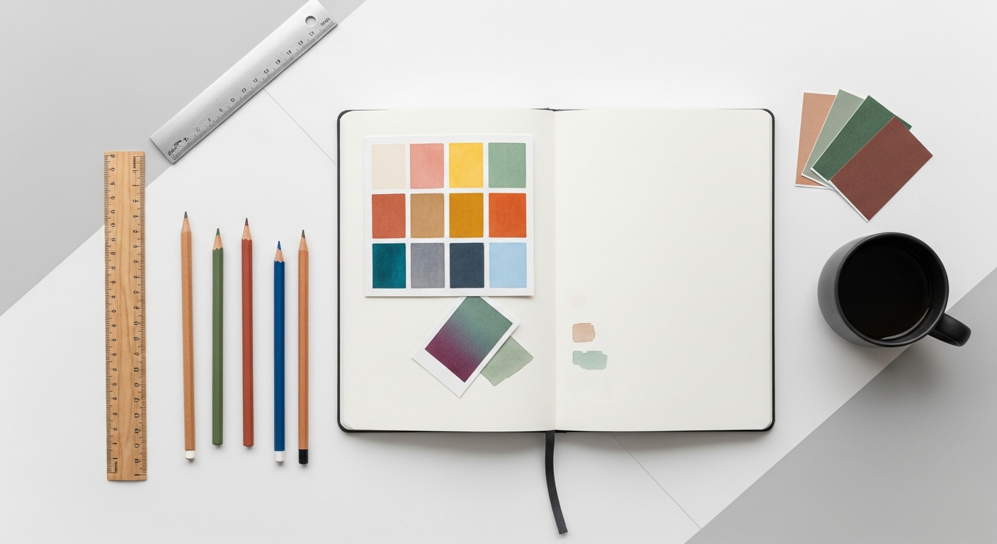
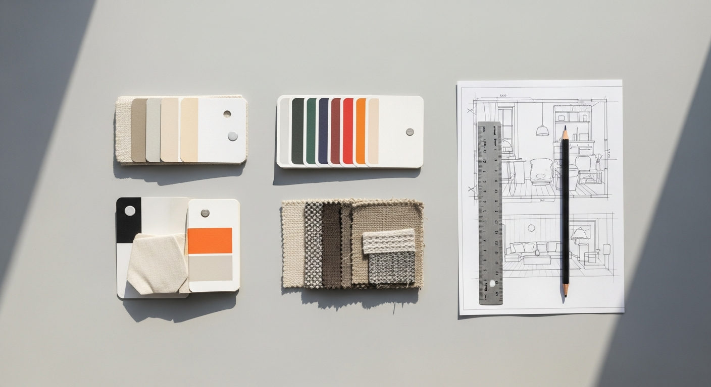
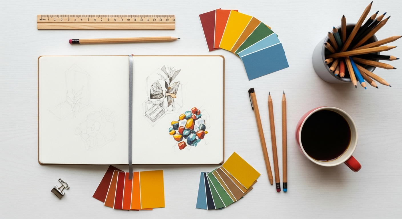
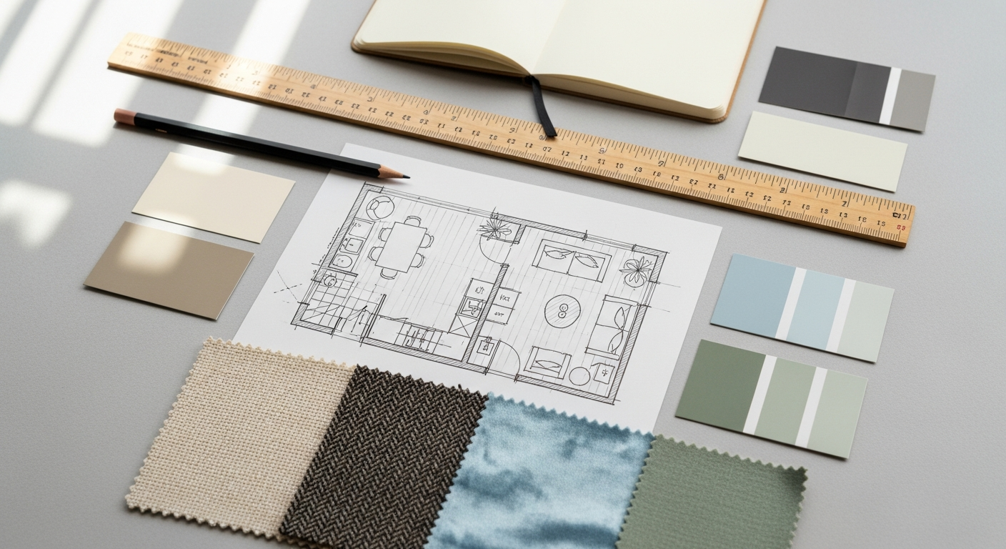
Developing Visual Mood Boards and Concept Collages
For interior designers, stylists, and visual artists, mood boards are an essential tool for communicating aesthetic direction and gathering inspiration. Figma is perfectly suited for this:
- Drag-and-Drop Imagery: Easily import images, textures, color palettes, and typography samples directly onto your canvas.
- Experiment with Layouts: Arrange and rearrange elements freely on the infinite canvas, experimenting with different compositions and visual hierarchies.
- Annotate and Organize: Use text tools to add notes, inspirations, and explanations for each element. Group related items within frames for better organization.
- Share and Gather Feedback: Share your mood board with clients or colleagues and collect their comments directly within the file, streamlining the approval process.
Figma transforms the traditional physical mood board into a dynamic, editable, and shareable digital artifact, making it easier to refine concepts and ensure everyone is aligned on the creative vision.
Brainstorming and Whiteboarding Sessions
Beyond polished designs, Figma can serve as a powerful digital whiteboard for ideation and brainstorming. Its collaborative nature makes it perfect for:
- Sticky Notes and Diagrams: Use simple shapes and text to create virtual sticky notes for ideas, user flows, or project outlines.
- Mind Mapping: Visually connect ideas and concepts using lines and shapes, helping to organize complex thoughts.
- Flowcharts: Map out processes, user journeys, or system architectures.
- Real-Time Collaboration: Facilitate remote brainstorming sessions where team members can simultaneously contribute, move elements around, and vote on ideas, fostering dynamic engagement.
This functionality transforms Figma into a versatile canvas for early-stage conceptualization, making it more than just a design tool but a platform for collective intelligence.
Social Media Graphics Design Guide: Creating Engaging Content
In today’s digital age, a strong social media presence is non-negotiable for businesses and individuals alike. Figma is an outstanding tool for developing a consistent and compelling visual identity across all your social platforms, making it an essential companion to any Social Media Graphics Design Guide. Here’s how it helps:
- Preset Frame Sizes: Figma offers preset frame sizes for various social media platforms (e.g., Instagram Post, Facebook Cover, Twitter Header), ensuring your graphics are perfectly dimensioned.
- Template Creation: Design reusable templates for common post types (e.g., quotes, promotions, announcements, carousel slides). Use components for elements like logos, hashtags, and call-to-action buttons to maintain brand consistency effortlessly.
- Batch Exporting: Create multiple variations of a graphic within a single Figma file and export them all at once, saving significant time.
- Brand Consistency: Define and save your brand’s color palettes, typography styles, and graphic elements within Figma, ensuring every social media post adheres to your visual guidelines.
- Animated Stories and Posts: While not a full-fledged animation tool, you can use Figma’s prototyping features to create simple click-through animations or interactive elements for stories, providing a more engaging experience.
- Collaborate on Campaigns: Work with marketing teams to design and review social media campaigns in real-time, streamlining the content creation and approval process.
By leveraging Figma for your social media graphics, you empower yourself to produce high-quality, on-brand content efficiently, elevating your online presence and engaging your audience effectively. From conceptualizing an interior design project to crafting a compelling Instagram story for your latest blog post, Figma proves its worth as a truly multi-faceted creative powerhouse for 2026 and beyond.
Optimizing Your Figma Workflow: Tips for Success in 2026
To truly master Figma and integrate it seamlessly into your creative process for 2026, it’s not enough to know the tools; you must also optimize your workflow. Efficiency, organization, and smart practices will elevate your designs and collaborations.
Embrace Version History: Never Lose a Step
One of Figma’s unsung heroes is its robust Version History. Every few minutes, Figma automatically saves a new version of your file, allowing you to revert to previous states, compare changes, and recover lost work. You can also manually save named versions at critical milestones (e.g., “Client Review 1,” “Final Design for Homepage”). To access it, go to the Figma menu > File > Show version history. This feature provides immense peace of mind, especially when working on complex projects or collaborating with multiple designers.
Leverage Keyboard Shortcuts: Speed Up Your Process
Becoming proficient with keyboard shortcuts is one of the fastest ways to boost your productivity in any software, and Figma is no exception. While there are many, focus on learning the most common ones first:
Recommended Resources
You might also enjoy How To Protect Yourself From Cybersecurity Threats from Bookmark Sharer.
Related reading: Best Accounting Software For Startups And Smbs (Eamped).
Figma Pricing Plans: What’s Free vs. Paid in 2026
One of the most common beginner questions: Is Figma actually free? Yes — and the free tier is genuinely capable. Here’s what each plan includes:
| Plan | Price | What You Get | Best For |
|---|---|---|---|
| Starter | Free | Unlimited Drafts; 3 collaborative files; unlimited FigJam files; 30-day version history; unlimited collaborators (view/comment) | Solo learners, freelancers, students |
| Professional | $12/editor/mo (annual) | Unlimited project files; full version history; shared libraries; advanced prototyping; dev mode (basic) | Freelancers, small teams |
| Organization | $45/editor/mo (annual) | Org-wide libraries; branching & merging; private plugins; SSO; design systems analytics; advanced admin controls | Large teams, enterprises |
| Enterprise | $75/editor/mo (annual) | Everything in Org + dedicated workspaces, advanced security, custom contracts, priority support | Large enterprises with compliance needs |
Key distinction: Editors (who create and edit designs) are billed per seat. Viewers and commenters are always free on all plans — so you can invite clients, stakeholders, or developers to review your work at no extra cost.
Can You Use Figma Offline or on Mobile?
Offline: Figma is cloud-native and requires an internet connection for most functionality. The desktop app caches files for limited offline viewing, but you cannot edit files without connectivity. For true offline design work, tools like Sketch (macOS only) are better suited.
Mobile: Figma offers a free Figma Mirror app (iOS and Android) that lets you preview your designs in real-time on a mobile device as you edit on desktop — invaluable for checking how interfaces look on actual screen sizes. Full editing on mobile is not available; the Mirror app is view-only.
Components & Variants: The Design System Superpower
Once you understand basic components, Variants unlock a far more powerful workflow. Variants allow you to group multiple versions of a component (states, sizes, types) into a single, organized component set.
Why Variants Matter
Imagine a Button component. Without variants, you’d create separate components for: Default, Hover, Pressed, Disabled, Loading — and repeat for Primary, Secondary, Destructive button types. That’s 15+ separate components to maintain. With Variants, you define properties (Type, State, Size) and Figma generates a structured grid of all combinations in one component set.
How to create Variants:
- Create your base component (e.g., a Primary Default button)
- Duplicate and modify for each variant (Hover, Pressed, Disabled)
- Select all versions and click “Combine as Variants” in the right sidebar
- Name your properties clearly (State: Default/Hover/Pressed/Disabled; Type: Primary/Secondary)
- Instances on your canvas will show a property panel where you can switch between variants instantly
FigJam: Figma’s Whiteboarding Tool
FigJam is Figma’s dedicated online whiteboard — a separate product included with all Figma plans (including free). It’s built for ideation, brainstorming, and collaboration before design begins. Key FigJam capabilities:
- Sticky notes: Color-coded virtual Post-it notes for ideas and feedback sorting
- Voting & reactions: Team members can vote on ideas with stamps or emoji reactions in real-time sessions
- Templates: Pre-built templates for user journey maps, retrospectives, mind maps, org charts, and sprint planning
- Timer: Built-in facilitation timer for structured workshop exercises
- Sections & zones: Organize whiteboard content into labeled regions for complex multi-team exercises
The typical creative workflow: ideate in FigJam → wireframe in Figma Design → prototype in Figma Design → hand off via Figma Dev Mode.
Figma vs. Sketch vs. Adobe XD vs. Framer
Beginners often ask: Should I start with Figma or another tool? Here’s how the major players compare in 2026:
| Feature | Figma | Sketch | Adobe XD | Framer |
|---|---|---|---|---|
| Platform | Web + Desktop (Mac/Win) | macOS only | Mac/Win (limited updates) | Web + Desktop (Mac/Win) |
| Free Tier | Yes — robust Starter plan | $10/mo (no free tier) | Discontinued 2023 | Free with limitations |
| Real-time Collaboration | Native, industry-leading | Limited (Sketch for Teams) | Basic co-editing | Good |
| Prototyping | Built-in, advanced | Built-in (basic) | Was strong, now stagnant | Advanced (code-based) |
| Code Export | CSS/iOS/Android (Dev Mode) | CSS via plugins | CSS/iOS/Android | React code export |
| Best For | UI/UX, teams, beginners | macOS-only iOS designers | Adobe Creative Cloud users | Interactive prototyping |
Verdict for beginners: Start with Figma. Its free tier, cross-platform availability, and best-in-class collaboration make it the industry standard. Adobe XD discontinued new feature development in 2023. Sketch requires macOS and a paid subscription. Framer is powerful but better suited to designers with coding knowledge.
Essential Figma Keyboard Shortcuts
| Shortcut | Action | Shortcut | Action |
|---|---|---|---|
V |
Move/Select | Ctrl/Cmd+Z |
Undo |
F |
Frame tool | Ctrl/Cmd+D |
Duplicate |
R |
Rectangle | Ctrl/Cmd+G |
Group selection |
T |
Text tool | Ctrl/Cmd+Alt+G |
Frame selection |
P |
Pen tool | Ctrl/Cmd+[ / ] |
Move layer backward/forward |
H |
Hand/Pan | Ctrl/Cmd+E |
Export selection |
Ctrl/Cmd+\ |
Toggle panels | Shift+A |
Add Auto Layout |
Ctrl/Cmd+Alt+K |
Create component | Ctrl/Cmd+Shift+H |
Flip horizontal |