The Foundation: Understanding Graphic Design Principles
At its heart, graphic design is about solving visual problems and communicating messages effectively. It’s not merely about making things look pretty; it’s about strategically arranging elements to guide the viewer’s eye, evoke specific emotions, and convey information with clarity and purpose. The tools of a graphic designer – software like Adobe Photoshop, Illustrator, or Figma – are just instruments. The true artistry and effectiveness come from a deep understanding and application of fundamental graphic design principles.
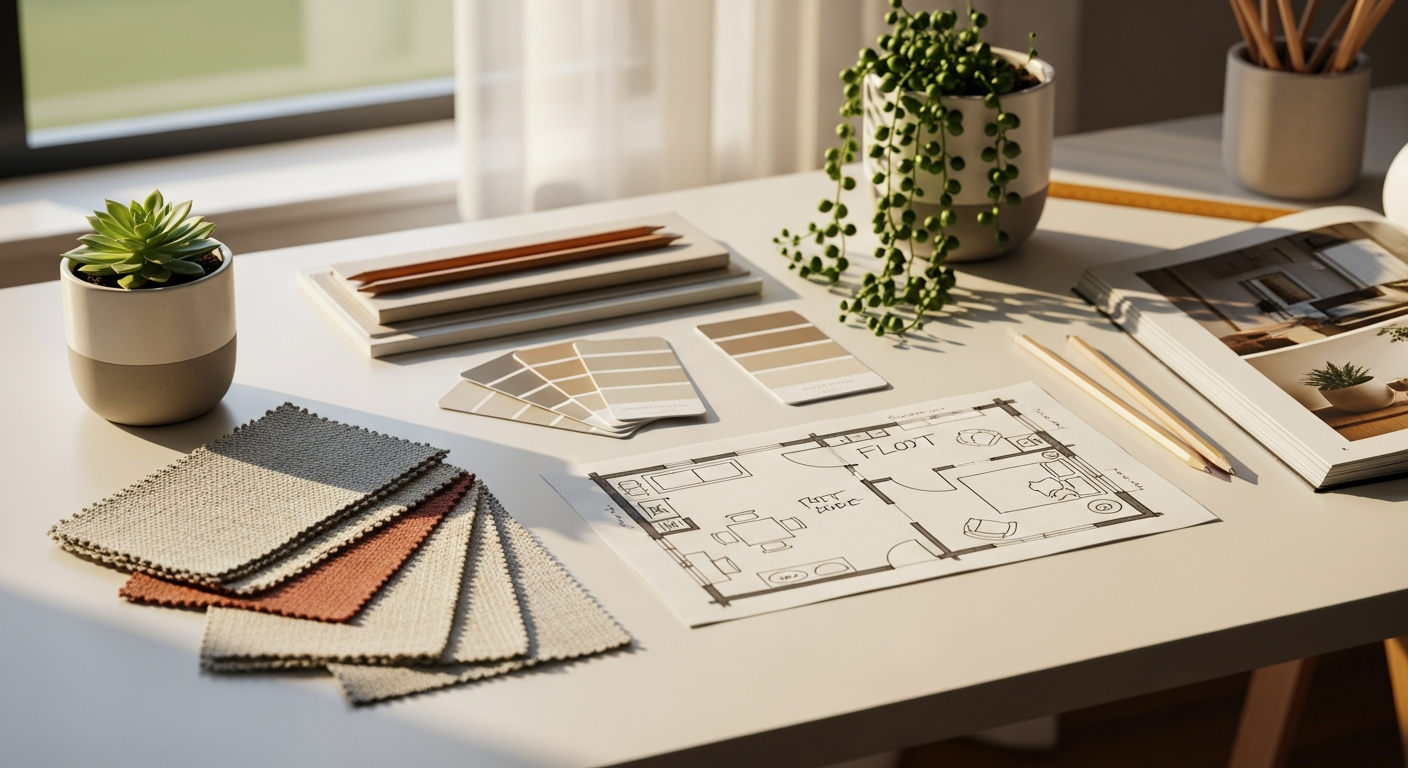
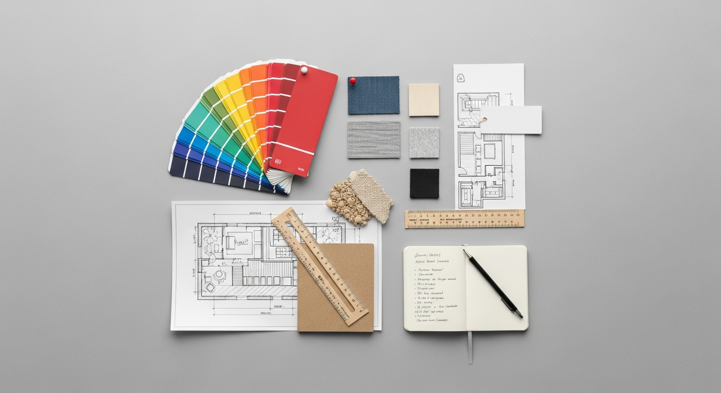
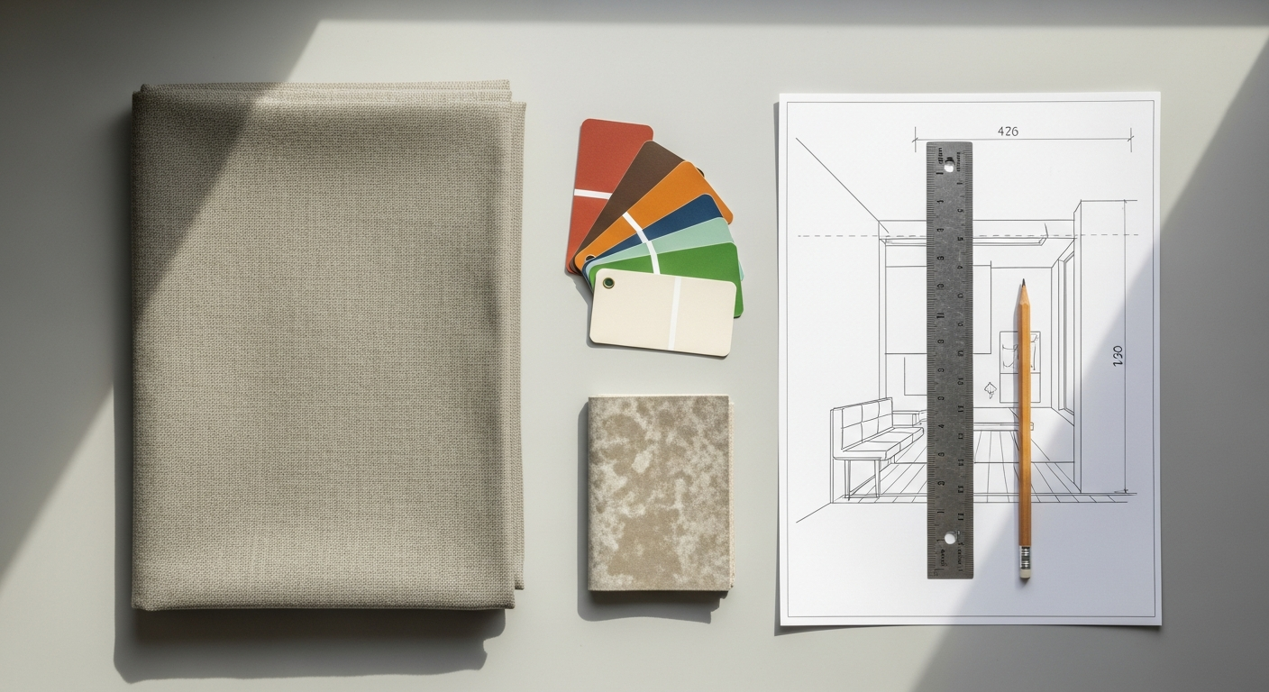
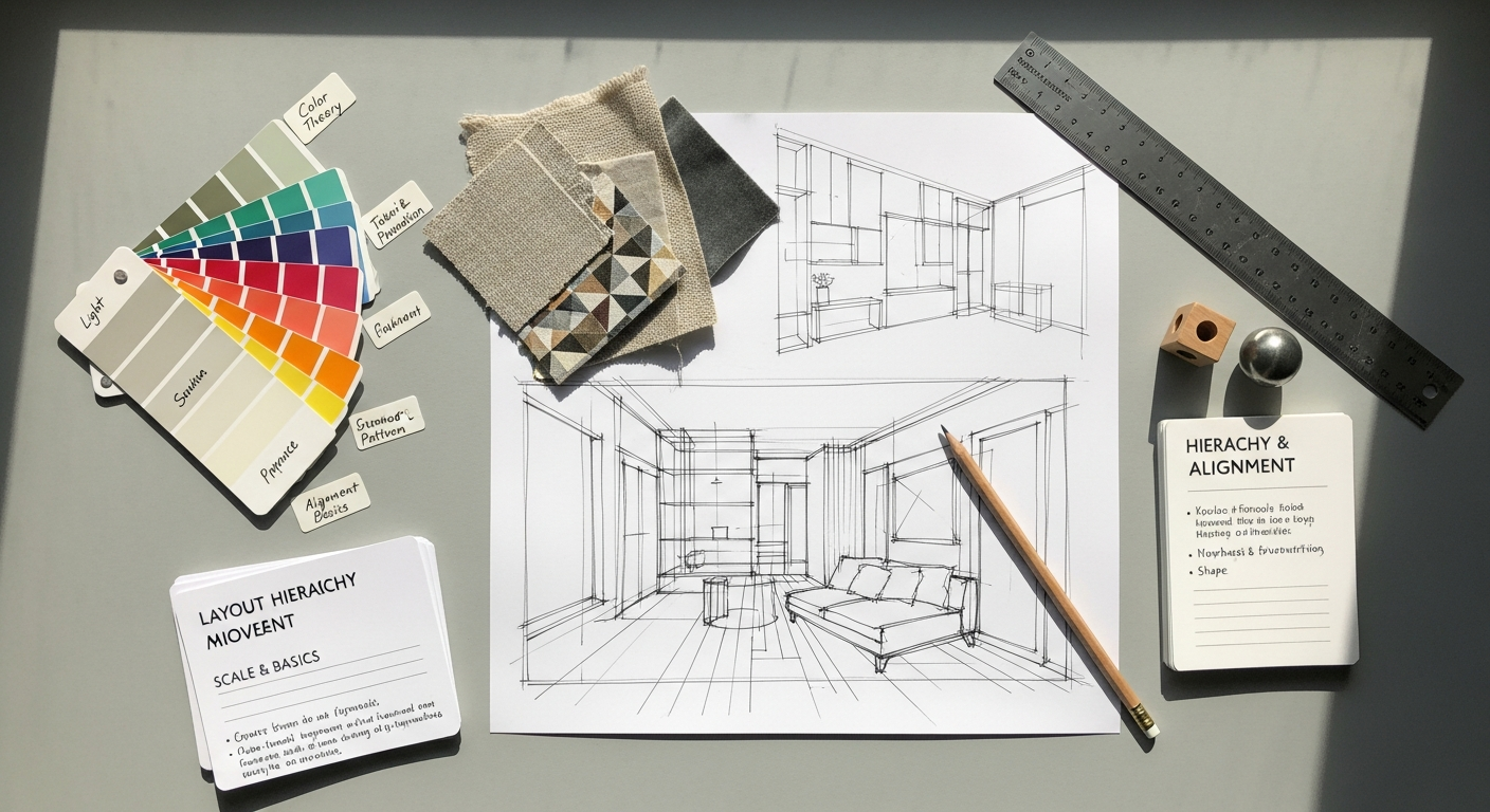
Think of these principles not as rigid rules, but as timeless guidelines derived from centuries of human perception and aesthetic appreciation. They are the universal language of visual communication, dictating how elements like lines, shapes, colors, and typography interact to form a cohesive and meaningful whole. Just as an interior designer understands how furniture placement, lighting, and texture create balance and flow within a room, a graphic designer uses these principles to establish order, hierarchy, and harmony on a canvas.
Why are these principles so crucial for beginners? Without them, design can feel haphazard, confusing, or simply uninspired. You might find yourself staring at a blank screen, unsure why your elements aren’t “working” together. By grasping these foundational concepts, you gain a framework for analyzing existing designs, critiquing your own work constructively, and making informed creative decisions. They provide a roadmap for transforming abstract ideas into tangible, effective visuals, giving you a professional edge whether you’re designing a simple flyer, a complex website layout, or an inspiring social media graphic. Mastering these principles means you’re not just decorating; you’re designing with intent and impact.
The Core Seven: Essential Graphic Design Principles
While there are many principles designers discuss, these seven form the bedrock of almost every successful visual composition. Understanding and applying them will dramatically elevate your design capabilities.
Contrast
Contrast is perhaps the most fundamental principle, crucial for readability, visual interest, and establishing hierarchy. It refers to the difference between two or more elements in a design. High contrast elements stand out, while low contrast elements blend in.
- Purpose: To create emphasis, draw the eye, make elements distinct, and improve readability.
- How to achieve it:
- Color: Pairing dark text on a light background (or vice-versa), using complementary colors (e.g., blue and orange) to make elements pop.
- Size: Making one element significantly larger or smaller than others.
- Shape: Contrasting organic shapes with geometric ones.
- Typography: Using a bold, heavy font next to a light, delicate one; mixing serif and sans-serif fonts.
- Texture: Smooth vs. rough, detailed vs. plain.
- Space: Placing a small, isolated element in a large expanse of whitespace.
- Example: A bold, black headline against a crisp white background immediately grabs attention due to strong color and size contrast.
Repetition
Repetition involves using the same visual elements (color, shape, texture, font, image style) consistently throughout a design or series of designs. It’s about establishing patterns and reinforcing themes.
- Purpose: To create unity, consistency, and a sense of rhythm. It makes a design feel cohesive, organized, and professional, and aids in brand recognition.
- How to achieve it:
- Using a consistent color palette.
- Employing the same two or three fonts across all materials.
- Repeating a specific graphic element or icon.
- Maintaining a consistent layout or grid structure.
- Example: A brand’s logo, specific brand colors, and consistent font usage across its website, social media posts, and print materials demonstrate repetition. This consistency is vital for building a recognizable brand identity, much like a recurring motif in an interior design scheme creates harmony.
Alignment
Alignment refers to the arrangement of elements on a page so that their edges or centers line up. It’s the principle that brings order and structure to a design.
- Purpose: To create a sense of order, cleanliness, and professionalism. Well-aligned elements appear organized and easy to read, while misaligned elements can look sloppy and accidental.
- How to achieve it:
- Edge Alignment: Lining up elements along their left, right, top, or bottom edges.
- Center Alignment: Centering elements horizontally or vertically.
- Grid Systems: Using invisible lines or columns to guide placement.
- Example: Text blocks that are all left-aligned create a strong, clean edge, making the content easier to scan and giving the page a professional look. Even in a seemingly “random” collage, subtle alignment can be used to create underlying structure.
Proximity
Proximity is the principle that dictates that related items should be grouped together visually, appearing as a single, cohesive unit rather than disparate parts. It leverages the human tendency to perceive closely placed elements as belonging together.
- Purpose: To organize information, reduce clutter, and improve readability and understanding. It helps the viewer quickly grasp which elements are related.
- How to achieve it:
- Placing text captions close to their corresponding images.
- Grouping related paragraphs or bullet points with less space between them than between unrelated sections.
- Using boxes or background colors to visually contain related items.
- Example: In a contact form, the label for a field (e.g., “Email Address:”) should be placed very close to its input box, much closer than to the next field, so users immediately understand their relationship.
Hierarchy
Hierarchy is the arrangement of elements in a design to show their order of importance. It guides the viewer’s eye through the content, ensuring that the most critical information is seen first.
- Purpose: To convey importance, direct attention, and facilitate easy scanning and comprehension of information.
- How to achieve it:
- Size: Larger elements are perceived as more important.
- Color: Using brighter or more saturated colors for key elements.
- Placement: Placing crucial information at the top or center of a page.
- Typography: Using bolding, italics, different font weights, or distinct typefaces for headlines, subheadings, and body text.
- Whitespace: Isolating an element with ample whitespace can make it stand out.
- Example: A website headline is typically the largest and boldest text, followed by a slightly smaller subheading, and then standard body text. This visual progression immediately tells the viewer what to read first.
Balance
Balance refers to the visual weight of elements within a design. It creates a sense of stability and harmony, preventing the design from feeling lopsided or chaotic.
- Purpose: To distribute visual weight evenly, creating a sense of stability, harmony, or dynamic tension.
- How to achieve it:
- Symmetrical Balance: Elements are distributed equally on either side of a central axis, creating a formal, stable, and often traditional feel.
- Asymmetrical Balance: Achieved by balancing dissimilar elements that have equal visual weight (e.g., a large, simple shape balanced by several smaller, complex shapes). This creates a more dynamic and modern feel.
- Radial Balance: Elements are arranged around a central point, like spokes on a wheel.
- Example: A symmetrical magazine spread with a large image on one page and a corresponding text block of similar visual weight on the opposite page feels formal. An asymmetrical composition might place a large, impactful photo on one side and a smaller block of text with a bold headline on the other, still feeling balanced because of their combined visual gravity.
Whitespace (Negative Space)
Often overlooked, Whitespace (also known as negative space) is the empty area around and between elements in a design. It’s not just “nothing”; it’s a powerful design tool.
- Purpose: To provide breathing room, improve readability, create focus on specific elements, and give a design a sophisticated, uncluttered feel. It can also be used to define shapes and create implied forms.
- How to achieve it:
- Leaving generous margins around text and images.
- Increasing line spacing (leading) and letter spacing (tracking) in typography.
- Creating intentional gaps between groups of elements.
- Example: A minimalist poster featuring a single, small logo in the center of a large, plain background uses whitespace to draw immediate attention to the logo and convey elegance and simplicity.
Beyond the Basics: Typography and Color Theory
Typography: The Art of Visible Language
Typography is more than just choosing fonts; it’s the art and technique of arranging type to make written language legible, readable, and appealing when displayed. It’s a critical component of graphic design that directly impacts how your message is perceived.
- Readability vs. Legibility:
- Legibility refers to how easily individual characters can be distinguished from each other. (e.g., Is that an ‘I’ or an ‘l’?).
- Readability refers to how easily words, phrases, and blocks of text can be read and understood. (e.g., Can you comfortably read this paragraph for an extended period?).
- Typeface Families:
- Serif: Fonts with small decorative strokes (serifs) at the ends of character strokes (e.g., Times New Roman, Georgia). Often associated with tradition, authority, and readability in print.
- Sans-Serif: Fonts without serifs (e.g., Arial, Helvetica, Open Sans). Often perceived as modern, clean, and highly readable on screens.
- Script: Fonts that mimic handwriting or calligraphy (e.g., Pacifico, Brush Script MT). Best used sparingly for emphasis or decorative purposes.
- Display/Decorative: Highly stylized fonts for headlines or short bursts of text (e.g., impacted by current trends like those discussed in a Social Media Graphics Design Guide).
- Font Pairing: Combining different fonts effectively relies on principles like contrast and harmony. A common strategy is to pair a strong sans-serif for headlines with a readable serif for body text, or vice-versa, ensuring enough contrast to differentiate but enough harmony to avoid visual chaos.
- Hierarchy in Typography: Using different sizes, weights (bold, regular, light), colors, and styles of fonts to create a visual hierarchy that guides the reader through the information.
- Micro-Typography: Paying attention to details like line height (leading), letter spacing (kerning), and paragraph spacing is crucial for readability and a polished look. Even small adjustments can significantly impact the overall feel of a text block.
Color Theory: The Language of Emotion
Color is one of the most powerful tools in a designer’s arsenal, capable of evoking strong emotions, establishing mood, and attracting attention. Understanding color theory allows you to use color intentionally and effectively.
- The Color Wheel: A foundational tool that illustrates the relationships between colors.
- Primary Colors: Red, Yellow, Blue (the building blocks).
- Secondary Colors: Green, Orange, Purple (created by mixing primaries).
- Tertiary Colors: (e.g., Red-Orange, Blue-Green) (created by mixing a primary and a secondary).
- Color Schemes/Harmonies:
- Monochromatic: Variations of a single hue (different shades, tints, tones). Creates a sophisticated, harmonious feel.
- Analogous: Colors adjacent on the color wheel (e.g., blue, blue-green, green). Often found in nature, creating a serene and pleasing effect.
- Complementary: Colors directly opposite each other on the color wheel (e.g., red and green, blue and orange). Creates strong contrast and vibrancy, often used for emphasis.
- Triadic: Three colors equally spaced on the color wheel (e.g., red, yellow, blue). Offers strong visual contrast while retaining balance.
- Color Psychology: Colors carry different meanings and evoke various emotions, often influenced by culture. Red signifies passion or danger, blue connotes trust or calm, green suggests nature or growth. Understanding these associations is vital for conveying the right message.
- Hue, Saturation, Brightness:
- Hue: The pure color (e.g., red, blue).
- Saturation: The intensity or purity of the color (e.g., vibrant red vs. dull red).
- Brightness (Value): How light or dark a color is (e.g., light blue vs. dark blue).
- Application: Using a complementary color to make a call-to-action button stand out (contrast), or employing an analogous palette to create a calming background (harmony). Just as in interior design, a well-chosen color palette can define the entire mood and aesthetic of a space.
Applying Principles in Practice: From Concept to Creation
Understanding principles theoretically is one thing; applying them practically is where the magic happens. The design process is iterative, involving several stages where these principles are consistently applied and refined.
The Design Process for Beginners:
- Understand the Brief/Goal: What is the purpose of this design? Who is the audience? What message needs to be conveyed? (e.g., promote a new product, inform about an event, build brand awareness).
- Research and Inspiration: Look at designs you admire. Analyze how they use principles like contrast, hierarchy, and color. Gather visual references.
- Sketching/Wireframing: Before jumping into software, sketch out ideas. This helps you focus on layout, proximity, and hierarchy without getting bogged down by details. Think about where elements will be placed and how they will flow.
- Digital Execution: Choose your tools (even free ones like Canva or GIMP are great for beginners). Start bringing your sketches to life, consciously applying the principles.
- Iteration and Refinement: Design is rarely perfect on the first try. Continuously review your work against the principles and make adjustments.
Designing for Digital Spaces: Social Media Graphics and UX
The digital realm, particularly social media and user experience (UX) design, offers excellent practical applications for these principles. In a fast-paced environment where attention spans are fleeting, well-designed visuals are paramount.
Social Media Graphics Design Guide
Social media platforms demand graphics that are instantly engaging and communicative. Here, graphic design principles are your secret weapon:
- Contrast for Impact: Your call-to-action (CTA) button or key message needs to pop. Use contrasting colors or a larger, bolder font (hierarchy) to ensure it stands out amidst the scroll.
- Hierarchy for Quick Comprehension: What’s the most important piece of information? Make it the largest, most prominent element. Next, the supporting detail. Finally, the brand logo or less critical info. This guides the viewer’s eye swiftly.
- Repetition for Brand Identity: Consistent use of your brand’s colors, fonts, and a particular graphic style across all your social media posts (e.g., Instagram stories, Facebook banners, LinkedIn updates) reinforces your brand identity and makes your content instantly recognizable. This aligns with the “Layout Scene” ethos of consistent aesthetic.
- Proximity for Clarity: Group related text and images closely together. If you’re showcasing a product, ensure its features are clearly associated with it through close placement. Avoid clutter by giving distinct groups enough breathing room.
- Whitespace for Professionalism: Don’t cram too much information into a small social media graphic. Ample whitespace makes your design look clean, professional, and easier to digest, making it more likely to stop the scroll.
What Is UX Design And Why It Matters
User Experience (UX) design focuses on creating products that provide meaningful and relevant experiences to users. While UX often deals with interaction and functionality, its visual component – UI (User Interface) design – is directly built upon graphic design principles. Understanding what is UX design and why it matters reveals how fundamental these principles are to digital success:
- Hierarchy for Navigation: In a website or app, clear visual hierarchy guides users through menus, content, and interactive elements. The primary navigation should be prominent, secondary actions less so.
- Proximity for Grouping: Related interactive elements (e.g., form fields, buttons belonging to a single action) are grouped using proximity. This makes interfaces intuitive and reduces cognitive load.
- Alignment for Order: Consistent alignment of UI elements creates a sense of order and professionalism, making the interface feel reliable and easy to use. Misaligned elements can make an app feel buggy or unfinished.
- Contrast for Accessibility and Action: Sufficient color contrast is not just aesthetically pleasing; it’s crucial for accessibility, ensuring text is readable for users with visual impairments. Strong contrast also highlights interactive elements like buttons, making their function clear.
- Repetition for Consistency: Consistent use of colors, button styles, icons, and typography across an entire digital product ensures a cohesive user experience. Users learn patterns quickly, making the interface predictable and easy to navigate. This is key to a positive user journey.
In essence, good UX design is invisible; it just works. And a significant part of that “working” is the seamless application of graphic design principles that make the interface intuitive, aesthetically pleasing, and effective.
Refining Your Eye: Critiquing and Improving Your Work
Learning graphic design principles isn’t a one-time event; it’s a continuous journey of observation, application, and critique. Developing a critical eye for design is paramount for growth. This involves not just creating, but also evaluating – both your own work and the work of others.
The Art of Self-Critique
Once you’ve created a design, step back. Take a break, and then return with fresh eyes, asking yourself a series of questions guided by the principles you’ve learned:
- Contrast: Is there enough visual separation between elements? Does the most important information stand out sufficiently? Is any text difficult to read due to low contrast?
- Hierarchy: Is the order of information clear? Does my eye naturally go to the most important elements first, then flow logically through the rest?
- Alignment: Do all elements appear intentionally placed? Are there any stray objects that break the grid or disrupt the flow? Does it feel neat and organized?
- Proximity: Are related items grouped together? Is there enough space between unrelated elements to avoid confusion?
- Repetition: Is there a consistent visual theme? Are my fonts, colors, and graphic styles used cohesively across the design?
- Balance: Does the design feel stable and harmonious, or does it feel heavy on one side? Is there a good distribution of visual weight?
- Whitespace: Does the design feel cramped or cluttered? Is there enough breathing room for elements to stand out? Does the negative space enhance the overall composition?
By systematically reviewing your work through the lens of these principles, you can identify areas for improvement and transform good designs into great ones.
Seeking and Receiving Feedback
While self-critique is vital, an outside perspective is invaluable. Share your work with peers, mentors, or even a trusted friend (explaining the principles can help them give better feedback). Learn to:
- Be Specific: When asking for feedback, guide the conversation. Instead of “Do you like it?”, ask “Is the main message clear?” or “Does the color palette feel cohesive?”
- Be Open-Minded: Not all feedback will resonate, but listen actively. Someone else might spot something you’ve overlooked.
- Iterate: Use the feedback to refine your design. Remember, design is a process of continuous improvement.
How To Conduct A Heuristic Evaluation (An Advanced Critique Method)
For those delving deeper, particularly into digital design, understanding how to conduct a heuristic evaluation can be a powerful formal method of critique. While often applied to usability, its principles are deeply rooted in visual design effectiveness:
- A heuristic evaluation involves assessing a design against a set of established “heuristics” or rules of thumb. Jakob Nielsen’s 10 Usability Heuristics are a famous example.
- Many of these heuristics directly relate to graphic design principles:
- Consistency and Standards: Directly tied to the principle of repetition and alignment. Inconsistent visual elements (fonts, buttons, spacing) lead to poor usability.
- Aesthetic and Minimalist Design: Emphasizes the importance of whitespace, hierarchy, and avoiding clutter. Designs that are visually clean and focused are easier to use.
- Visibility of System Status: Requires clear visual feedback, often achieved through effective use of contrast and color (e.g., a green checkmark for success, a red alert for error).
- Match Between System and the Real World: Relies on clear, understandable iconography and imagery, which in turn are designed using principles like contrast and proximity to convey meaning quickly.
- Even if you’re not conducting a formal evaluation, internalizing these heuristics will sharpen your critical eye, allowing you to assess not just the beauty of a design, but also its functionality and user-friendliness, directly linking back to how graphic design principles enable an intuitive experience.
The Future of Design: Staying Relevant in 2026
The world of design is in constant flux, driven by technological advancements, evolving user behaviors, and shifting aesthetic trends. As we look towards 2026 and beyond, new tools and platforms will emerge, but the core graphic design principles you’ve learned today will remain timeless and indispensable.
Emerging technologies like Artificial Intelligence (AI) are already impacting the design landscape, offering tools that can automate tasks, generate variations, or even assist in content creation. However, AI, in its current form, is a powerful assistant, not a replacement for human creativity and understanding of fundamental principles. It can execute, but it needs human direction and discernment to produce truly impactful and meaningful designs. Your ability to direct these tools effectively, informed by a strong grasp of design principles, will be a key differentiator.
We are also seeing a rise in immersive experiences, from augmented reality (AR) in retail (imagine virtually placing furniture in your home before buying, a concept relevant to Layout Scene’s audience) to virtual reality (VR) environments. Designing for these spatial and interactive mediums requires an even deeper understanding of how balance, proximity, and hierarchy function in three dimensions and dynamic contexts. The principles of visual weight, flow, and user guidance become more complex
Recommended Resources
Learn more about this topic in Best Tools For Remote Collaboration 2026 at Bookmark Sharer.
For more on graphic design principles, see Benefits Of Automation Software For Small Businesses on Eamped.