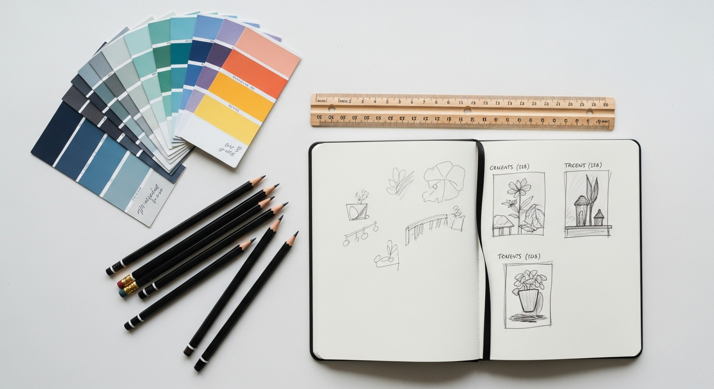
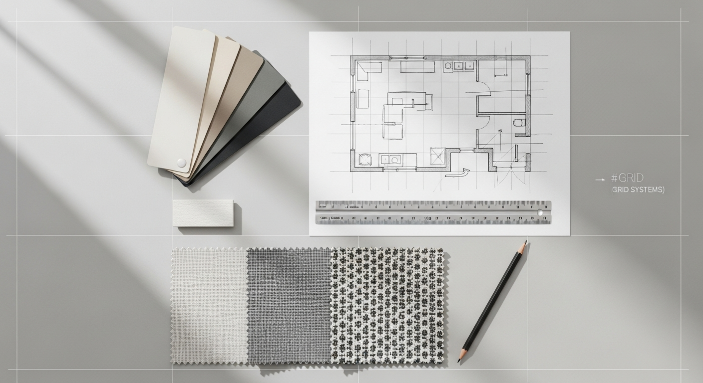
What Exactly Are Grid Systems in Web Design?
At its core, a grid system in web design is a framework of intersecting horizontal and vertical lines that defines a structured layout for content. Imagine it as a series of invisible columns and rows meticulously laid out across your webpage. This foundational structure serves as a blueprint, guiding the placement of text, images, videos, and interactive elements, much like an architect uses a grid to plan the spatial relationships within a building. Far from being a rigid constraint, a grid system is a powerful tool for achieving visual consistency, balance, and hierarchy across a website.
The concept isn’t new; grids have been an integral part of print design for centuries, from newspaper layouts to magazine spreads, ensuring readability and aesthetic appeal. In the digital age, their importance has only magnified, particularly with the proliferation of diverse screen sizes and devices. A well-implemented grid ensures that content scales gracefully and remains organized, whether viewed on a desktop monitor, a tablet, or a smartphone.
Think of it this way: when you plan an interior space, you consider the flow of traffic, the placement of furniture, and the overall balance of elements within the room. A grid system applies this same methodical approach to a webpage. It helps designers make conscious decisions about white space, content alignment, and visual weight, leading to designs that are not only beautiful but also inherently functional and easy to navigate. It’s the silent workhorse that elevates a good design to a great one, providing a predictable yet flexible framework that accommodates both creative expression and practical usability.
The Unseen Architects: Why Grid Systems are Indispensable for 2026
In the competitive digital arena of 2026, where user expectations are higher than ever, a website’s underlying structure is as crucial as its visual appeal. Grid systems are no longer a luxury but a fundamental necessity for creating engaging, efficient, and future-proof web experiences. Their benefits ripple through every aspect of the design and development process, ultimately impacting the end-user profoundly.
Clarity, Readability, and Visual Hierarchy
One of the most immediate and tangible benefits of using a grid system is the profound improvement in content clarity and readability. By providing clear boundaries and relationships between elements, grids reduce visual clutter and guide the user’s eye through the content logically. This structured approach helps establish a strong visual hierarchy, ensuring that important information stands out and the user can easily distinguish between headings, body text, images, and calls to action. A well-defined grid makes complex layouts digestible, reducing cognitive load and making the website a pleasure to consume rather than a chore.
Consistency and Brand Identity
Just as a consistent brand guide dictates the use of logos, colors, and typography across all marketing materials, a grid system ensures visual consistency across an entire website. From the homepage to internal articles, product pages, and contact forms, the underlying grid maintains a harmonious look and feel. This consistency is vital for reinforcing brand identity and building trust with your audience. When users encounter a predictable and organized layout, it communicates professionalism and attention to detail. This principle extends beyond web design; a strong understanding of visual consistency, honed through grid systems, is also paramount when developing a Social Media Graphics Design Guide, ensuring your brand message is cohesive everywhere it appears.
Efficiency in Design and Development Workflows
For designers, a grid system acts as a powerful guide, streamlining the layout process. Instead of guessing where to place elements, designers have a predefined structure to work within, accelerating mock-up creation and revisions. For developers, this translates into cleaner, more predictable CSS and easier implementation. When the design is based on a clear grid, it minimizes ambiguity and reduces the back-and-forth between design and development teams, leading to faster project completion and fewer errors. This efficiency is invaluable, especially for large-scale projects or when working within agile methodologies.
Responsiveness and Adaptability Across Devices
In an age dominated by multi-device usage, responsive design is non-negotiable. Grid systems are the backbone of effective responsive web design. By defining content within a flexible framework, designers can easily dictate how elements should reflow, resize, or rearrange themselves as the screen size changes. Whether it’s collapsing a multi-column layout into a single column on a mobile device or expanding it on a large monitor, the underlying grid ensures that the content remains organized and accessible. This adaptability is key to providing a seamless user experience regardless of the viewing context.
Enhanced User Experience (UX)
Ultimately, all the benefits of grid systems converge to create a superior user experience. A well-organized layout is inherently more intuitive and user-friendly. When content is structured logically, users can quickly find the information they’re looking for, navigate effortlessly, and interact with the site without frustration. This directly ties into the principles discussed in our article, What Is UX Design And Why It Matters. A good grid system reduces cognitive load, prevents visual fatigue, and fosters a sense of control and predictability, all of which are crucial components of positive UX. Users are more likely to stay longer, engage more deeply, and return to a website that offers a clear, comfortable, and intuitive experience.
Improved Information Architecture (IA)
Grid systems are inextricably linked to effective Information Architecture Explained. By providing a structured canvas, grids help designers organize content in a way that reflects its inherent relationships and hierarchy. This means grouping related items, creating clear distinctions between different sections, and establishing a logical flow that mirrors the user’s mental model. A strong grid system ensures that the underlying IA is visually supported and communicated effectively, making it easier for users to understand the site’s content and navigate its structure. It’s about presenting information in the most intuitive and accessible way possible, ensuring users can find what they need when they need it.
Deconstructing the Grid: Key Components and Terminology
- Columns: These are the vertical divisions of your grid, serving as the primary containers for content. Most web grid systems are column-based, often using a 12-column structure (as 12 is easily divisible by 2, 3, 4, and 6, offering great flexibility). Content elements, such as text blocks or images, are typically sized to span a certain number of columns. For example, a main content area might span 8 columns, while a sidebar spans 4.
- Rows: While less explicitly defined in some pure column-based systems, rows represent horizontal divisions. They are crucial for stacking content vertically and defining distinct sections of a page. With modern CSS Grid, rows can be explicitly defined and managed, allowing for more complex, two-dimensional layouts.
- Gutters: These are the spaces between columns (and sometimes rows). Gutters are critical for readability and visual separation. Without them, content from adjacent columns would merge, creating a cluttered and confusing experience. Consistent gutter widths across a design contribute significantly to its overall cleanliness and professionalism.
- Margins: Distinct from gutters, margins are the spaces around the outer edges of the grid, separating the content from the browser window or the page’s canvas. They provide breathing room and prevent content from feeling cramped against the screen edges. Like gutters, consistent margins are key to a balanced and aesthetically pleasing layout.
- Modules: A module is a unit of content that occupies a specific area within the grid. This could be a text block, an image, a video player, or an entire component like a navigation bar or a footer. Modules are composed of one or more grid cells and are the actual pieces of content that designers arrange within the grid framework.
- Grid Lines: These are the actual horizontal and vertical lines that form the grid. In CSS Grid, you can refer to these lines by number, making it easy to position items precisely.
- Grid Cells: The smallest unit of a grid, formed by the intersection of a column line and a row line. Think of it as a single square or rectangle within the grid. Content items can span multiple cells.
- Breakpoints: These are specific points (screen widths) at which a website’s layout adjusts to better suit the device it’s being viewed on. For example, a 12-column desktop layout might transition to an 8-column tablet layout, and then a single-column mobile layout at different breakpoints. Grids are instrumental in defining how content reflows at these crucial points.
Popular Grid System Paradigms
While the core components remain consistent, grid systems can be implemented and interpreted in various ways, each suited to different design needs and content types.
Column-Based Grids
This is by far the most prevalent type of grid system in web design. It primarily focuses on vertical divisions, typically 12 or 16 columns wide. The 12-column grid is particularly popular due to its high divisibility, allowing for flexible arrangements (e.g., 2, 3, 4, 6, or 12 equal-width columns). Content elements are then designed to span a certain number of these columns. This system is excellent for creating clean, ordered, and responsive layouts that maintain consistency across different screen sizes. It’s the foundation of many popular CSS frameworks like Bootstrap and Foundation.
Modular Grids
Modular grids extend the column-based approach by adding explicit horizontal divisions, creating a network of equally sized “modules” or cells. Think of a checkerboard pattern. Each module can then serve as a container for a piece of content, or multiple modules can be combined to form larger content blocks. This type of grid is powerful for designs with a high density of information, such as news websites, portfolios, or e-commerce sites, where precise vertical alignment and rhythm are as important as horizontal distribution. It allows for highly structured, almost newspaper-like layouts where every element has its designated space.
Hierarchical Grids
Hierarchical grids are less about uniform columns and rows and more about emphasizing specific content areas based on their importance. Instead of an evenly distributed grid, certain areas are given more visual weight and larger dimensions to draw the user’s attention. This might involve creating a dominant hero section, a prominent image gallery, or a large feature article area that breaks the traditional grid flow. While still based on underlying grid principles, hierarchical grids allow for more dynamic and visually engaging layouts, often used for artistic portfolios, landing pages, or designs where a strong focal point is desired. They require a careful balance to ensure they don’t devolve into visual chaos.
Asymmetrical Grids
Breaking away from perfect symmetry, asymmetrical grids introduce an intentional imbalance to create visual interest and dynamism. While still utilizing columns and rows, the distribution of content is deliberately uneven, with different column widths, varying gutter sizes, or content blocks that do not perfectly align. This approach can be highly effective for creative, artistic, or avant-garde websites seeking to make a bold statement. However, designing with asymmetrical grids requires a keen eye for balance and tension, as a poorly executed asymmetrical layout can quickly appear chaotic rather than captivating. When done well, it can lead to unique and memorable user experiences.
Implementing Grids in the Digital Realm: Tools and Techniques
The theoretical understanding of grid systems translates into practical application through modern web technologies. CSS Grid Layout and Flexbox are the primary tools that empower developers to build sophisticated and responsive grid-based designs.
CSS Grid Layout: The Powerhouse for 2D Layouts
Introduced as a native CSS module, CSS Grid Layout is arguably the most powerful and comprehensive tool for creating two-dimensional grid systems directly within the browser. It allows designers and developers to define both rows and columns simultaneously, giving unprecedented control over the entire layout of a page or a major section of it.
- Defining the Grid: You can create a grid container by setting
display: grid;on an element. Then, you define the columns and rows using properties likegrid-template-columnsandgrid-template-rows. For example,grid-template-columns: 1fr 2fr 1fr;would create three columns, with the middle one being twice as wide as the outer two, using flexible units (fr). You can also use fixed units (px,em,rem) or percentages. - Placing Items: Once the grid is defined, individual items (children of the grid container) can be precisely placed within it using properties like
grid-column-start,grid-column-end,grid-row-start, andgrid-row-end. Shorthand properties likegrid-columnandgrid-rowmake this even more concise. For instance,grid-column: 2 / span 2;would make an item start at column line 2 and span two columns. - Gutters: CSS Grid makes managing gutters incredibly easy with properties like
grid-gap(orrow-gapandcolumn-gap), allowing you to define the spacing between grid cells with a single line of code. - Named Grid Areas: For even greater readability and maintainability, you can name specific areas of your grid using
grid-template-areas. This allows you to visually map out your layout in CSS, making it easier to understand and adjust.
CSS Grid is ideal for overall page layouts, complex dashboards, and any scenario where precise control over both horizontal and vertical alignment is required. Its ability to create truly two-dimensional layouts sets it apart and makes it an indispensable tool for modern web design in 2026.
Flexbox (Flexible Box Layout): The Workhorse for 1D Layouts
While CSS Grid excels at two-dimensional layouts, Flexbox is the master of one-dimensional alignment and distribution. It’s designed to arrange items within a single row or a single column, making it perfect for navigation bars, card layouts within a section, or distributing items evenly within a container.
- Flex Container and Items: You declare an element as a flex container by setting
display: flex;. Its direct children then become flex items. - Main and Cross Axis: Flexbox operates along a main axis (defaulting to horizontal) and a cross axis (defaulting to vertical). You can change the main axis with
flex-direction(e.g.,row,column). - Alignment and Distribution: Properties like
justify-contentcontrol how items are distributed along the main axis (e.g.,space-between,center,flex-start).align-itemscontrols how items are aligned along the cross axis (e.g.,center,flex-start,stretch). - Flexibility of Items: Individual flex items can have properties like
flex-grow,flex-shrink, andflex-basisto control how they grow or shrink to fill available space.
Flexbox is often used in conjunction with CSS Grid. You might use CSS Grid for the overarching page layout (e.g., header, main content, sidebar, footer) and then use Flexbox within those grid areas to align items within a navigation bar, distribute content cards, or center elements vertically.
CSS Frameworks (Briefly)
While not strictly “tools” in the same way CSS Grid and Flexbox are, CSS frameworks like Bootstrap and Foundation have historically provided their own pre-built grid systems. These frameworks abstract away much of the raw CSS, offering classes (e.g., col-md-6) that apply predefined column widths and responsive behaviors. While they can speed up development, understanding native CSS Grid and Flexbox provides greater flexibility and often results in leaner code, especially in 2026 where browser support for modern CSS is excellent.
Mastering the Grid: Best Practices and Considerations for 2026
Implementing grid systems effectively goes beyond merely knowing the CSS properties. It involves strategic thinking, user-centric design principles, and a commitment to continuous refinement. For successful web design in 2026, consider these best practices:
1. Start with Content, Not the Grid
One of the most common pitfalls is to design a grid first and then try to force content into it. A truly effective grid system serves the content, enhancing its readability and accessibility. Begin by understanding your content hierarchy, its volume, and its relationships. Sketch out your content areas, then design a grid that best accommodates and organizes that information. The grid is a tool for the content, not the other way around.
2. Embrace a Mobile-First Approach
With the majority of web traffic originating from mobile devices, designing mobile-first is no longer optional. Start by designing your grid for the smallest screens, ensuring optimal readability and interaction. Then, progressively enhance the layout as screen real estate increases for tablets and desktops. This ensures a solid foundation for all users and forces you to prioritize essential content and functionality.
3. Prioritize Accessibility
A well-structured grid contributes significantly to web accessibility. Ensure that your grid layouts maintain a logical tab order for keyboard navigation and that content remains legible and navigable when zoomed or with screen readers. Pay attention to sufficient contrast and font sizes within your grid modules. An organized layout, facilitated by a grid, helps assistive technologies parse your content more effectively, making your site usable for everyone.
4. Leverage Visual Hierarchy and White Space
Use the grid to establish a clear visual hierarchy. Larger grid modules and prominent placement can draw attention to key elements. White space (or negative space), defined and managed by the grid’s margins and gutters, is just as important as the content itself. It provides breathing room, reduces clutter, and allows elements to stand out, improving readability and overall aesthetic appeal. Don’t be afraid to leave some grid cells empty; sometimes, less is more.
5. Be Consistent, But Flexible
Consistency in your grid usage across a website builds familiarity and trust. However, don’t let the grid become a straightjacket. There will be times when a slight deviation or a unique layout for a specific section is necessary to achieve a particular visual effect or emphasize certain content. The key is to be intentional and thoughtful about when and why you break the grid, ensuring it enhances the user experience rather than detracts from it.
6. Test Extensively Across Devices
Even with a robust responsive grid, thorough testing is crucial. Check your layouts on a variety of devices, screen sizes, and browser types. Pay attention to how content reflows, images scale, and interactive elements behave at different breakpoints. Identify and address any visual glitches or usability issues that arise, iterating on your grid design as needed.
7. Consider Your Content Management System (CMS)
When designing a grid system, especially for clients, think about how it integrates with their CMS. Will the content editors be able to easily populate the grid modules? Can they add new sections that adhere to the grid without breaking the layout? Designing a flexible grid that anticipates potential content variations and fits within the capabilities of the CMS will save headaches down the line.
8. Stay Updated with Evolving CSS Techniques
The landscape of CSS is constantly evolving. Keep an eye on new CSS properties and techniques related to layout, such as subgrid (an extension of CSS Grid) and container queries, which offer even more granular control over responsive layouts. Staying current ensures your grid systems remain cutting-edge and efficient in 2026 and beyond.
Conclusion
In the dynamic world of web design, where technology and aesthetics converge, grid systems stand as an enduring testament to the power of structured thinking. Far from being a restrictive set of rules, they are a liberating framework that empowers designers to create order out of chaos, transform complex information into intuitive experiences, and craft digital spaces that are both beautiful and highly functional. From ensuring seamless responsiveness across an ever-growing array of devices to bolstering brand consistency and significantly enhancing user experience, the benefits of a well-implemented grid are profound and far-reaching.
Just as a masterful interior designer meticulously plans every element within a room to create harmony and purpose, a skilled web designer leverages grid systems to construct digital environments that guide, engage, and delight their audience. By embracing the principles of columns, rows, gutters, and modules, and by harnessing the power of modern CSS Grid and Flexbox, you’re not just arranging pixels; you’re building accessible, performant, and memorable web experiences that stand the test of time and evolving digital trends. For Layout Scene, the grid is more than a tool; it’s the invisible foundation upon which all great digital design is built, ensuring that every pixel has a purpose and every layout tells a clear, compelling story.
Frequently Asked Questions
Recommended Resources
You might also enjoy How To Choose A Monitor For Work from Bookmark Sharer.
Learn more about this topic in What Is A Business Model Canvas And How To Use It at Eamped.