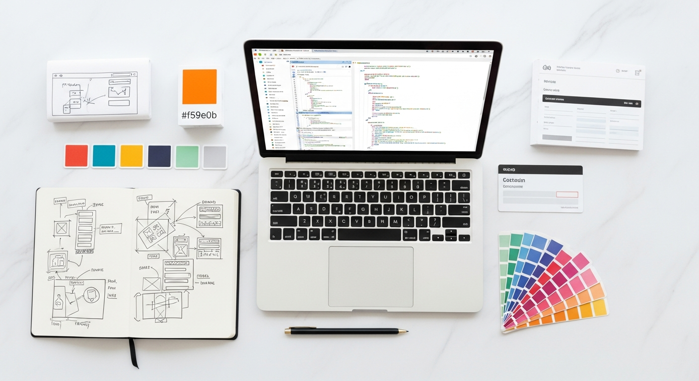
Mastering the Modern Web: Grid vs. Flexbox for Layout Design
The landscape of frontend development has shifted dramatically over the last decade, evolving from the fragile hacks of float-based layouts to the robust, native capabilities of modern CSS. For web designers and frontend developers in 2026, the question is no longer “Which one should I learn?” but rather “Which one is the right tool for this specific component?” Understanding the nuance between CSS Grid and Flexbox is the hallmark of a senior-level developer. While both modules are designed to solve alignment and distribution challenges, they operate on fundamentally different philosophies. One prioritizes the content, allowing the elements to dictate their own space, while the other prioritizes the container, forcing elements into a predefined architectural map. In this comprehensive guide, we will dissect the mechanical differences, explore high-level use cases, and demonstrate why a hybrid approach is the gold standard for high-performance, responsive web design in the current era.
Understanding the Fundamental Philosophy: One-Dimensional vs. Two-Dimensional
At its core, the distinction between Flexbox and Grid is mathematical and structural. Flexbox is fundamentally a **one-dimensional** layout model. This means it handles layout in one direction at a time—either as a row or as a column. While Flexbox can wrap elements onto multiple lines, it does not have a concept of a relationship between the items in the first row and the items in the second row. Each line acts as an independent flex container.
CSS Grid, conversely, is a **two-dimensional** layout system. It allows developers to align content across both rows and columns simultaneously. This structural awareness allows for complex overlaps, precise alignment of disparate elements, and the creation of “white space” that is just as manageable as the content itself.
The industry often refers to Flexbox as “content-first” and Grid as “layout-first.” In Flexbox, you define the container, and the items inside it determine their size based on their content, pushing other items around as needed. In Grid, you define the structure—the tracks and cells—and then place content into those predefined slots. Recognizing this distinction is the first step toward writing cleaner, more maintainable CSS.
When to Use CSS Flexbox: The Power of Content-First Alignment
Flexbox shines in scenarios where the size of the items is unknown or dynamic, and you want them to flow naturally within a container. Because it is one-dimensional, it is the perfect tool for components that exist in a linear sequence.
#
Use Case: Navigation Bars and Toolbars
A standard website header is the quintessential Flexbox use case. You might have a logo on the left, a set of links in the center, and a “Call to Action” button on the right. With `justify-content: space-between`, Flexbox handles the distribution effortlessly, regardless of the width of the text inside the links.
#
Use Case: Centering Elements
Before Flexbox, vertical centering was a notorious headache for developers. Today, a simple `display: flex; align-items: center; justify-content: center;` on a container solves the problem for any child element. This remains the most efficient way to handle modals, hero section content, and icons within buttons.
#
Use Case: Small Components and Micro-Layouts
Think about a “User Profile” card. You have an avatar, a name, and a bio. These elements are usually stacked vertically or aligned horizontally in a simple row. Using Flexbox here allows the container to shrink-wrap the content, ensuring that the layout feels organic and responds immediately to different lengths of names or varying image sizes without breaking a strict grid.
When to Use CSS Grid: Mastering Complex, Layout-First Structures
CSS Grid is the architect’s tool. It is designed for the macro-layout—the “big picture” of the page. If you find yourself trying to align elements in both horizontal and vertical planes, or if you are using `margin` and `padding` hacks to force elements to line up across different rows, you should be using Grid.
#
Use Case: Main Page Architecture
The classic “Holy Grail” layout—header, footer, main content, and two sidebars—is trivial with CSS Grid. By using `grid-template-areas`, you can define a visual map of your page in plain English within your CSS. This makes the code incredibly readable and allows you to rearrange the entire page layout for mobile devices by simply changing the area map in a media query.
#
Use Case: Masonry and Magazine-Style Layouts
Grid excels at asymmetrical designs. If you are building a portfolio or a news site where some images need to span two rows while others span three columns, Grid’s `grid-column` and `grid-row` properties provide surgical precision. The `span` keyword allows elements to grow into the layout without disrupting the alignment of neighboring items.
#
Use Case: The “FR” Unit and Gap Management
Grid introduced the `fr` (fractional) unit, which represents a fraction of the free space in the grid container. This is far more powerful than percentages because it accounts for gutters automatically. Speaking of gutters, the `gap` property (which originated in Grid before moving to Flexbox) is more native to the Grid mental model, allowing for consistent spacing between complex “cells” without the need for “negative margin” hacks on the container.
The Hybrid Approach: Combining Grid and Flexbox for Sophisticated UIs
In 2026, the most proficient frontend developers do not choose between Grid and Flexbox; they nest them. A modern web application is a fractal of layouts. You use CSS Grid for the outer shell of the application (the dashboard sidebar, the main content area, and the top navigation container) and Flexbox for the individual components inside those areas.
For example, imagine a “Task Management” dashboard.
1. **The Macro Layout (Grid):** You define a 2-column grid where the first column is a fixed 250px sidebar and the second column is `1fr` (the remaining space).
2. **The Content Area (Grid):** Inside the main area, you might use another grid to display a series of “Project Cards” in a responsive auto-fit pattern (`grid-template-columns: repeat(auto-fit, minmax(300px, 1fr))`).
3. **The Component (Flexbox):** Inside each Project Card, you use Flexbox to align the “Priority Tag,” the “Due Date,” and the “Assigned User” icons in a single row that handles spacing gracefully.
This hybrid strategy leverages the structural stability of Grid for the “skeleton” and the fluid flexibility of Flexbox for the “muscles” and “tendons” of the UI. This reduces the amount of CSS you need to write and makes your layouts significantly more predictable across different screen sizes.
Performance, Browser Support, and the State of Web Standards in 2026
As we move through 2026, browser support for both Grid and Flexbox is essentially universal. The days of worrying about Internet Explorer compatibility are long gone, allowing developers to utilize advanced features like **CSS Subgrid**.
Subgrid is a game-changer for layout design. Historically, if a child of a grid item wanted to align with the parent’s grid lines, it was difficult. Subgrid allows nested grids to inherit the tracks of the parent grid. This is perfect for complex forms or card-based layouts where you want the headers and footers of separate cards to align perfectly with one another, regardless of the content length inside the cards.
From a performance perspective, native CSS layouts are vastly superior to JavaScript-based layout engines or heavy frameworks. Browsers have optimized the rendering engines for Grid and Flexbox to the point where they can handle thousands of elements with minimal reflow overhead. Furthermore, the reduction in “div-itis” (nesting endless wrapper divs just for layout) leads to a shallower DOM, which improves both memory usage and SEO crawlability.
Best Practices and Accessibility Considerations for Layout Engines
While Grid and Flexbox offer immense power, they also come with responsibilities—particularly regarding accessibility (A11y). One of the most common pitfalls is the “Visual vs. Source Order” conflict.
#
Logical Source Order
Both Grid and Flexbox allow you to move elements visually using properties like `order` or by placing items in specific grid areas. However, screen readers and keyboard navigation follow the **DOM order**, not the visual order. If you move a “Submit” button to the top of the screen visually but it remains at the bottom of your HTML, a keyboard user will have to tab through the entire page before reaching it. Always ensure your HTML structure makes sense as a standalone document.
#
Responsive Design without Media Queries
In 2026, we aim for “intrinsic design.” Using Grid’s `auto-fit` and `minmax()` functions allows layouts to respond to the available space without requiring dozens of media query breakpoints. This results in a much smoother experience on foldable devices and ultra-wide monitors, as the layout fluidly adjusts based on content constraints rather than fixed device widths.
#