Understanding Heuristic Evaluation: A Core UX Tool for Creative Professionals
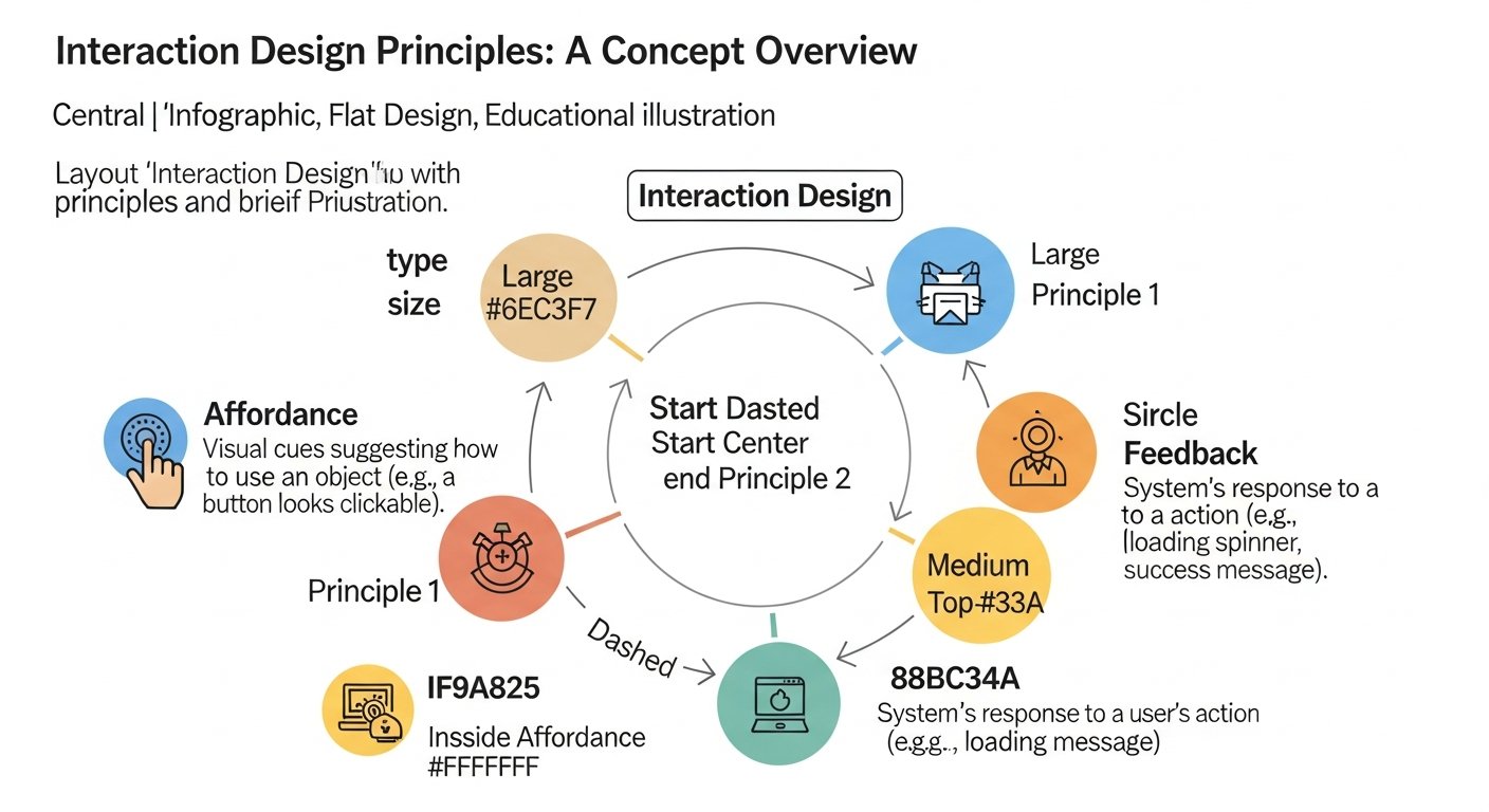
At its heart, a heuristic evaluation is a usability inspection method for computer software that helps to identify usability problems in the user interface (UI) design. It involves a small group of evaluators (typically 3-5 experts) examining the interface and judging its compliance with recognized usability principles, known as “heuristics.” These heuristics are broad rules of thumb, not specific guidelines, that have been distilled from extensive research into human-computer interaction. The goal is to catch usability issues early in the design process, making it a cost-effective and efficient method for improving user experience.
For those deeply invested in creative fields, the parallel between designing a physical space and a digital one is striking. Just as an interior designer considers flow, accessibility, and the emotional response of an occupant within a room, a UX designer must consider these same factors for a digital environment. A heuristic evaluation provides a structured framework to assess these digital characteristics. It’s an expert-based method, meaning evaluators bring their knowledge of UX principles and user behavior to the table, rather than relying on direct user testing (though heuristic evaluation often complements user testing beautifully).
Consider the overarching question of What Is Ux Design And Why It Matters. UX design, broadly, encompasses all aspects of the end-user’s interaction with the company, its services, and its products. It’s about creating products that are useful, usable, and desirable. Heuristic evaluation directly contributes to the “usable” aspect. If a user cannot intuitively navigate a website, find the information they need, or complete a desired action, then the design has failed, regardless of its visual appeal. In a competitive market, a superior user experience can be a significant differentiator, ensuring that your creative work is not only seen but also easily understood and interacted with.
The beauty of heuristic evaluation lies in its versatility. It can be applied to websites, mobile applications, software interfaces, or even specific features within a larger system. For a creative blog like Layout Scene, this means you could evaluate your own website’s navigation, the ease of finding
Recommended Resources
Related reading: How To Write A Business Plan For A Startup (Eamped).
Related reading: How To Use Ai For Writing Content (Bookmark Sharer).