Understanding the Foundation: UX and User-Centricity
Before a single pixel is placed or a line of code is written, the most crucial phase of mobile app interface design begins: understanding your user. This is where the principles of User Experience (UX) design come into play, forming the bedrock of any successful digital product. A visually appealing interface without a solid UX foundation is like a beautiful house built on sand – it looks great but won’t stand the test of time or user interaction.
The Paramountcy of User Experience (UX)
At its core, UX design is about enhancing user satisfaction by improving the usability, accessibility, and pleasure provided in the interaction with a product. When we discuss What Is Ux Design And Why It Matters, we are emphasizing that UX goes beyond the visual appeal to encompass the entire journey a user takes when interacting with your app. It’s about how they feel, how easily they can achieve their goals, and whether their overall experience is positive and memorable. A strong UX strategy ensures that your app solves a real problem for its users, making it indispensable rather than merely decorative.
Consider the myriad of apps available today. The ones that truly resonate are those that anticipate user needs, minimize friction, and provide clear pathways to desired outcomes. This means thinking about every touchpoint, from the moment a user downloads the app to their daily interactions and even how they leave it. Prioritizing UX early in the design process saves significant time and resources down the line, preventing costly redesigns and user dissatisfaction.
Conducting Comprehensive User Research
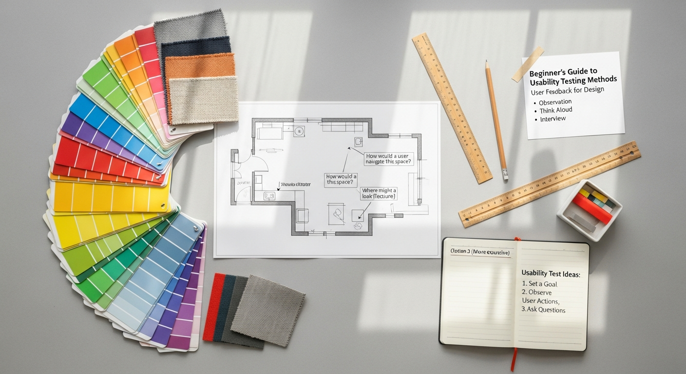
To design for your users, you must first know them intimately. User research is the investigative phase where you gather insights into your target audience’s behaviors, motivations, pain points, and goals. This isn’t about guesswork; it’s about data-driven understanding. Techniques such as interviews, surveys, focus groups, and observational studies can yield invaluable qualitative and quantitative data.
For instance, conducting interviews allows you to hear directly from potential users about their current challenges related to the problem your app aims to solve. Surveys can help you gather broader demographic information and preferences from a larger audience. Observational studies, where you watch users interact with existing solutions or prototypes, can uncover unspoken needs or usability issues that users themselves might not articulate.
The output of this research often includes persona development – creating fictional representations of your ideal users based on real data. These personas embody specific user characteristics, needs, and behaviors, serving as a constant reference point throughout the design process to ensure decisions are always user-centered. Each persona should have a name, demographics, motivations, frustrations, and even a quote that encapsulates their attitude towards your app’s domain.
Defining Your Target Audience and Their Needs
With research in hand, the next step is to clearly define your target audience and articulate their specific needs. This involves synthesizing the data to identify common patterns, emerging requirements, and critical pain points. Understanding who your app is for and what problems it solves is paramount. Is it for busy professionals needing efficient task management? Students seeking collaborative learning tools? Or perhaps a broad demographic looking for a new way to socialize?
Once your audience is defined, you can then articulate their core needs. These needs should be framed in a way that directly informs design decisions. For example, if your research reveals that users struggle with complex navigation in similar apps, a defined need might be “users need a straightforward and intuitive way to access core features.” This directly translates into design requirements for simplified menus and clear calls to action.
Furthermore, consider the contexts in which your users will interact with the app. Will they be on the go, often with limited attention spans? In brightly lit outdoor environments? Or primarily in a quiet, focused setting? These contextual factors profoundly influence aspects like font size, color contrast, and the amount of information displayed on a single screen. By truly understanding your users and their environment, you lay a robust foundation for an interface that is not only functional but truly empathetic.
The Blueprint: Information Architecture and Wireframing
Once you have a deep understanding of your users and their needs, the next critical phase involves structuring your app’s content and functionality. This is where you move from abstract concepts to concrete blueprints, ensuring that your app is organized logically and intuitively. This stage is less about visual aesthetics and more about underlying structure and flow, setting the stage for a seamless user experience.
Structuring Content with Information Architecture
Information Architecture (IA) is the art and science of organizing and labeling content within your app to make it understandable and findable. When we talk about Information Architecture Explained, we’re referring to the systematic arrangement of information that guides users through your app effortlessly. A well-designed IA prevents users from feeling lost or overwhelmed, allowing them to predict where to find what they’re looking for and how to navigate between different sections.
Key components of IA include:
- Sitemaps: These are hierarchical diagrams that map out all the screens and sections of your app, showing how they relate to each other. A good sitemap provides a bird’s-eye view of your app’s entire structure, ensuring no critical pages are missed and the flow is logical.
- Navigation Systems: This defines how users move through the app. Common mobile navigation patterns include tab bars, hamburger menus, and breadcrumbs. The choice of navigation depends heavily on the app’s complexity and the primary user flows identified during research.
- Labeling Systems: How you name categories, buttons, and menu items significantly impacts usability. Labels should be clear, concise, and consistent, using language that resonates with your target audience rather than internal jargon.
Effective IA is crucial for discoverability and learnability. Users should be able to quickly grasp the app’s structure and easily find the information or functionality they need. Poor IA, conversely, leads to frustration, increased cognitive load, and ultimately, app abandonment.
Mapping User Journeys and Flows
While IA focuses on the static structure, user journeys and flows illustrate the dynamic path a user takes to complete specific tasks within the app. These flows are step-by-step representations of user interactions, mapping out decisions, actions, and the different screens they encounter. For example, a “user onboarding flow” might detail every screen and interaction from first opening the app to successfully creating an account.
Creating user flows helps you:
- Identify potential roadblocks: By visualizing the entire process, you can spot areas where users might get confused or stuck.
- Optimize for efficiency: Streamlining steps and reducing clicks can significantly improve the user experience.
- Ensure logical progression: Each step should naturally lead to the next, guiding the user towards their goal.
- Inform wireframing: User flows provide the context for what needs to be on each screen and how screens connect.
These flows are often represented visually using flowcharts, with different shapes indicating actions, decisions, and specific screens. They are invaluable tools for both designers and developers, providing a shared understanding of how the app is intended to function from a user’s perspective.
The Power of Wireframing: From Concept to Structure
With your IA and user flows defined, it’s time to translate these abstract concepts into tangible layouts through wireframing. Wireframes are low-fidelity, black-and-white representations of your app’s screens, focusing purely on layout, content hierarchy, and functionality, without any visual distractions like colors, fonts, or images. They are the skeletal framework of your app.
There are typically two types of wireframes:
- Low-Fidelity Wireframes: Often hand-drawn sketches or very basic digital representations. These are quick to create and ideal for exploring multiple layout ideas early in the process. They emphasize speed and iteration over precision.
- High-Fidelity Wireframes: More detailed digital representations that include precise sizing, spacing, and placeholder content. While still devoid of visual styling, they provide a clearer sense of the final layout and content arrangement.
The benefits of wireframing are numerous:
- Focus on Functionality: By removing visual elements, wireframes force you to concentrate on the core functionality and user flow.
- Early Feedback: They are easy to share with stakeholders and potential users for early feedback, allowing for quick and inexpensive revisions before significant design work is invested.
- Foundation for UI: Once approved, wireframes serve as a clear blueprint for the UI design phase, guiding where visual elements will be placed.
- Cost-Effective Iteration: Changes made at the wireframing stage are far less costly and time-consuming than changes made during visual design or development.
Effective wireframing ensures that the fundamental structure of your app is robust, logical, and user-friendly before you embark on the more visually intensive UI design process. It’s a critical step in bridging the gap between abstract ideas and a functional digital product.
Bringing it to Life: UI Design Principles and Visuals
Mastering Core UI Design Principles
Great UI design adheres to a set of fundamental principles that guide visual decision-making and ensure a cohesive, user-friendly interface:
- Consistency: This is paramount. Elements like buttons, typography, color schemes, and interaction patterns should remain consistent across the entire app. Consistency reduces cognitive load, making the app predictable and easy to learn.
- Clarity: Every element on the screen should have a clear purpose and be easily understandable. Buttons should look like buttons, text should be legible, and navigation should be unambiguous.
- Feedback: Users need to know that their actions have been registered. Visual cues (e.g., a button changing color when tapped, a loading spinner) or haptic feedback (vibrations) confirm interactions and provide a sense of control.
- Efficiency: Design the interface to help users accomplish their tasks quickly and with minimal effort. This involves optimizing workflows, reducing unnecessary steps, and placing frequently used actions within easy reach.
- Forgiveness: A good UI anticipates user errors and provides mechanisms for recovery. This could be an “undo” option, clear error messages, or confirmation prompts for irreversible actions.
- Hierarchy: Visual hierarchy guides the user’s eye, indicating the most important elements on a screen. This is achieved through varying sizes, colors, contrasts, and positioning.
Adhering to these principles ensures that your app is not only aesthetically pleasing but also highly functional and intuitive, creating a positive user experience that encourages repeated engagement.
Crafting a Visually Cohesive Aesthetic
Beyond principles, the visual elements themselves are crucial for creating a distinctive and memorable interface. This involves a careful selection and application of various design components:
- Color Theory: Colors evoke emotions and can guide user attention. Choose a primary color palette that aligns with your brand identity and secondary colors for accents, feedback, and interactive elements. Ensure sufficient contrast for readability, especially for text and interactive components.
- Typography: The choice of fonts significantly impacts readability and the app’s overall tone. Select a legible font family, define a clear typographic hierarchy for headings, subheadings, and body text, and ensure appropriate line height and letter spacing for optimal reading on mobile screens.
- Iconography: Icons provide visual shortcuts to actions and concepts. Use a consistent icon style (outline, filled, duotone) throughout the app. Ensure icons are universally recognizable and, where necessary, accompanied by text labels for clarity.
- Imagery and Illustrations: High-quality images and custom illustrations can enhance engagement and convey personality. Use them strategically to break up text, illustrate concepts, or provide visual interest without overwhelming the user or slowing down performance.
Just as a Social Media Graphics Design Guide ensures brand consistency across various digital platforms, a robust UI style guide is essential for your mobile app. This guide documents all visual elements – colors, fonts, icons, spacing rules, and component states – ensuring that every designer and developer on the team adheres to a unified aesthetic, resulting in a polished and professional product.
Mobile-First Considerations and Accessibility
Designing for mobile apps means acknowledging the unique constraints and opportunities of the mobile form factor. A “mobile-first” approach means designing for the smallest screen and most restrictive environment first, then scaling up for larger screens. This forces you to prioritize content and functionality, leading to a cleaner, more focused design.
Key mobile-first considerations include:
- Screen Sizes and Resolutions: Design adaptably to accommodate the vast array of mobile device sizes and screen densities. Responsive design principles are crucial here.
- Touch Targets: Buttons and interactive elements must be large enough to be easily tapped by a finger. Guidelines often suggest a minimum touch target size of 44×44 pixels.
- Gestures: Leverage common mobile gestures like swiping, pinching, and long-pressing where appropriate, but ensure they are intuitive and provide clear feedback.
- Thumb Zones: Consider how users hold their phones. Placing primary actions within easy thumb reach (the “thumb zone”) significantly improves usability, especially for one-handed use.
Accessibility is not an afterthought; it’s a fundamental aspect of inclusive design. Your app should be usable by as many people as possible, including those with disabilities. This means:
- High Contrast: Ensure sufficient color contrast between text and background for users with visual impairments.
- Scalable Text: Allow users to adjust font sizes without breaking the layout.
- Alternative Text: Provide descriptive alt text for images for screen readers.
- VoiceOver/TalkBack Support: Design elements that are properly labeled and navigable for screen reader users.
By integrating mobile-first thinking and accessibility from the outset, you create an app that is not only beautiful but also usable and enjoyable for a broader audience, demonstrating a commitment to inclusive design principles.
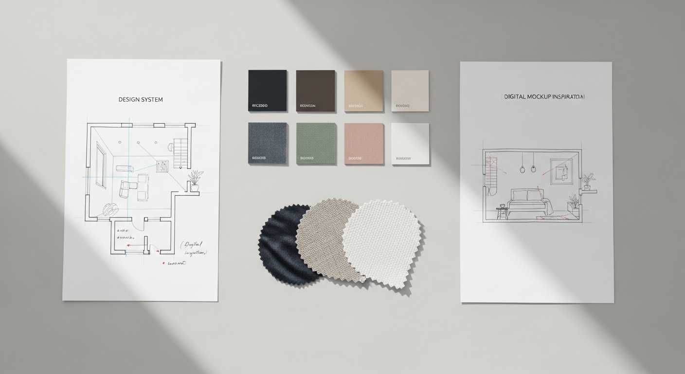
Leveraging Design Systems and Style Guides
As your app grows in complexity and as teams expand, maintaining consistency and efficiency in UI design becomes challenging. This is where design systems and style guides prove invaluable. A design system is a complete set of standards, documentation, and components that allow teams to build and scale products consistently. It’s more than just a style guide; it includes:
- Component Libraries: Reusable UI elements (buttons, input fields, navigation bars) with defined states and behaviors.
- Design Tokens: Abstract values (e.g., color hex codes, font sizes, spacing units) that can be applied across different platforms and tools.
- Guidelines: Rules for usage, accessibility, and best practices for all design elements.
- Tools and Workflows: Recommendations for software and collaborative processes.
A style guide, often a part of a larger design system, specifically focuses on visual branding and presentation. It dictates the consistent use of:
- Branding elements: Logos, brand colors, imagery style.
- Typography: Font families, sizes, weights, and hierarchies.
- Iconography: Style, size, and usage guidelines for icons.
- Spacing: Consistent margins, padding, and grid systems.
By establishing a comprehensive design system and style guide, you empower your team to work faster and more efficiently, reduce design debt, and ensure a unified, high-quality user experience across all iterations of your mobile app interface. This strategic investment pays dividends in scalability and brand recognition, especially as your app evolves in 2026 and beyond.
Interaction and Prototyping: Making it Usable
Designing a static, beautiful interface is only half the battle. A mobile app truly comes alive through its interactions – the way users tap, swipe, and input information. This stage is about breathing life into your UI designs, making them dynamic, responsive, and intuitive. Prototyping plays a pivotal role here, allowing you to simulate user interactions and test the flow before committing to development, ensuring that the app is not just visually appealing but also a joy to use.
Designing Intuitive Interactions
Interactions are the conversations between the user and the app. Every tap, swipe, and input should feel natural, predictable, and provide immediate feedback. Here are key aspects of designing intuitive interactions:
- Buttons and Calls to Action (CTAs): Design clear, prominent buttons that indicate their purpose. Use strong visual cues (color, size, label) to differentiate primary CTAs from secondary ones. Ensure they are easily tappable.
- Forms and Input Fields: Minimize the number of input fields. Use clear labels, placeholder text, and appropriate keyboard types (numeric, email, text) to streamline data entry. Provide real-time validation and helpful error messages.
- Animations and Micro-interactions: These small, subtle animations can significantly enhance the user experience. They provide visual feedback (e.g., a button subtly bouncing after being tapped), guide user attention (e.g., an element sliding in), and add delight (e.g., a “like” button animation). However, use them judiciously to avoid distraction or slow performance.
- Gestural Navigation: Leverage common mobile gestures like swiping to navigate between screens, pinching to zoom, or long-pressing for contextual menus. Ensure these gestures are discoverable and consistent within your app.
- State Changes: Clearly indicate the state of interactive elements (e.g., active, inactive, hovered, pressed). A button should look different when it’s disabled versus when it’s ready to be pressed.
The goal is to create an interface where users instinctively know what to do, how to do it, and what to expect as a result of their actions. Every interaction should contribute to a smooth and efficient user journey, minimizing frustration and maximizing satisfaction.
The Art of Prototyping: Bringing Static Designs to Life
Prototyping is the process of creating interactive models of your app design. It bridges the gap between static wireframes and a fully functional application, allowing you to simulate user flows and interactions. Prototypes aren’t meant to be perfect; they are tools for exploration, testing, and refinement.
Different levels of fidelity in prototyping serve different purposes:
- Low-Fidelity Prototypes: Often created from wireframes, these are basic clickable mockups that demonstrate the flow between screens. They are quick to build and ideal for early-stage user testing to validate fundamental navigation and task completion.
- Medium-Fidelity Prototypes: Incorporate more visual detail and some interactive elements, resembling the final UI more closely. These are useful for testing specific interactions, animations, and the overall look and feel.
- High-Fidelity Prototypes: Closely mimic the final product, featuring full visual design, detailed interactions, and animations. These are used for comprehensive usability testing, stakeholder presentations, and for providing developers with a clear understanding of the desired user experience.
The beauty of prototyping lies in its iterative nature. You can quickly create a prototype, test it with users, gather feedback, make adjustments, and repeat the process. This allows for continuous refinement of the interface and interactions before significant development resources are invested.
Choosing the Right Prototyping Tools
The market offers a wide array of prototyping tools, each with its strengths and learning curve. The best tool for you will depend on your team’s needs, budget, and the desired fidelity of your prototypes.
Popular prototyping tools include:
- Figma: An all-in-one design and prototyping tool that excels in collaboration. It allows for high-fidelity prototyping with rich interactions and animations directly within the design file. Its cloud-based nature makes it ideal for remote teams.
- Adobe XD: Offers a streamlined workflow for designing, prototyping, and sharing. It integrates well with other Adobe Creative Cloud applications and provides features for component states and micro-interactions.
- Sketch: A vector-based design tool primarily for macOS, often paired with plugins like InVision or Marvel for prototyping functionality. It’s known for its robust plugin ecosystem and popularity among UI designers.
- InVision: While also a design tool, InVision gained popularity for its strong prototyping and collaboration features, allowing designers to link screens and add interactive hotspots.
- Principle: Specializes in creating highly detailed animations and interactive designs for mobile apps, offering granular control over motion.
When selecting a tool, consider factors like ease of use, collaborative features, integration with other design software, the fidelity of prototypes it can produce, and its ability to handle complex interactions. Regardless of the tool chosen, the objective remains the same: to create a tangible, interactive representation of your mobile app interface that can be tested, refined, and ultimately guide the development process towards a truly usable and engaging product.
Testing, Iteration, and Launch: Refining Your Interface
Designing a mobile app interface is not a linear process; it’s a cyclical one. Even the most carefully crafted designs benefit immensely from real-world testing and iterative refinement. This crucial stage ensures that your app not only meets user needs and expectations but also performs flawlessly in diverse scenarios, paving the way for a successful launch and sustained user satisfaction.
Conducting Effective User Testing
User testing is the ultimate reality check for your designs. It involves observing real users interacting with your prototype or early version of the app to identify usability issues, validate design decisions, and gather authentic feedback. This is where you uncover whether your assumptions about user behavior hold true in practice.
Various methods of user testing can be employed:
- Usability Testing: Users are given specific tasks to complete within the app, while their interactions, thought processes, and challenges are observed and recorded. This can be moderated (with a facilitator) or unmoderated (users complete tasks independently).
- A/B Testing: When you have two different versions of a design element (e.g., button color, headline text), A/B testing allows you to show each version to a segment of your audience and measure which performs better against a specific metric (e.g., click-through rate, conversion).
- Beta Testing: A broader release of a near-final version of the app to a larger group of target users before the official launch. Beta testers provide feedback on bugs, performance issues, and overall user experience in a real-world environment.
- First Click Testing: Measures what users click first when trying to complete a task. This helps validate the clarity of your navigation and the discoverability of key features.
- Five-Second Tests: Users are shown a screen for only five seconds and then asked what they remember, understood, or felt. This helps gauge the immediate impact and clarity of your visual design and messaging.
The key to effective user testing is to recruit participants who genuinely represent your target audience. Observing even a small number of users (often as few as five) can reveal a significant percentage of usability problems. The insights gained from testing are invaluable for making data-driven improvements to your interface.
The Iterative Design Cycle: Refine and Enhance
User testing rarely results in a perfect outcome on the first try. Instead, it fuels the iterative design cycle: Test → Analyze → Design → Implement → Test again. This continuous loop of feedback and refinement is essential for honing your mobile app interface.
When analyzing test results, focus on patterns of behavior and recurring pain points rather than isolated incidents. Prioritize issues based on their severity and impact on the user experience. For example, if users consistently struggle to complete a core task, that’s a high-priority issue to address immediately.
The “Design → Implement” phase involves making the necessary adjustments to your prototype or code based on the feedback. This might mean redesigning a navigation menu, clarifying button labels, optimizing a form, or even rethinking an entire user flow. After implementing changes, it’s crucial to go back and test again to ensure the new design effectively solves the identified problems without introducing new ones.
This iterative approach, often guided by agile methodologies, ensures that your app continuously evolves based on real user needs and feedback, leading to a highly polished and user-centric final product. It embraces the philosophy that design is never truly “finished” but rather continuously improved.
Preparing for a Seamless Launch
Once your mobile app interface has been thoroughly tested and refined, the final stages involve preparing for a successful launch. This requires meticulous attention to detail and seamless collaboration between design, development, and marketing teams.
- Asset Handoff: Designers must provide developers with all necessary assets (icons, images, font files) in the correct formats and resolutions. This also includes providing a comprehensive design system or style guide that details specifications for colors, typography, spacing, and component behaviors. Tools like Figma, Zeplin, or Inspect in Adobe XD facilitate this process by generating code snippets and specifications directly from design files.
- Developer Collaboration: Maintain open lines of communication with developers throughout the final stages. Clarify any ambiguities, answer questions about design intent, and address any technical constraints that may arise. A close partnership ensures that the implemented interface precisely matches the design vision.
- Performance Optimization: A beautiful interface means little if the app is slow or buggy. Designers should work with developers to ensure that images are optimized for fast loading, animations are smooth, and the overall app performance is excellent.
- App Store Assets: Design compelling app icons, screenshots, and promotional videos that effectively showcase your app’s interface and features in the App Store (iOS) and Google Play Store (Android). These assets are crucial for attracting initial downloads.
- Marketing and Branding: Coordinate with marketing to ensure that the app’s branding and messaging are consistent across all promotional materials, including social media campaigns, landing pages, and press releases. Remember how a strong social media graphics design guide reinforces brand identity; the same principle applies to your app’s pre-launch and post-launch marketing.
A well-orchestrated launch maximizes your app’s chances of gaining traction and positive reviews, setting the stage for long-term success. But even after launch, the work isn’t over; continuous monitoring of user feedback, analytics, and market trends will inform future updates and iterations of your mobile app interface.
Future-Proofing Your Design in 2026 and Beyond
The mobile technology landscape is in a constant state of flux, with new trends, devices, and user expectations emerging at a rapid pace. To ensure your mobile app interface remains relevant and competitive, it’s essential to design with an eye towards the future. Future-proofing your design means building in adaptability, embracing emerging technologies, and anticipating the evolving needs of users in 2026 and beyond.
Anticipating Emerging Mobile Design Trends
Staying ahead of the curve requires an understanding of where mobile design is heading. Here are some trends that are likely to shape app interfaces in 2026:
- AI Integration and Personalization: Expect more sophisticated AI-driven features, offering highly personalized experiences. This includes intelligent recommendations, predictive interfaces that anticipate user actions, and adaptive layouts that change
Recommended Resources
Check out How To Communicate Effectively In Remote Teams on Bookmark Sharer for a deeper dive.
Related reading: Best Accounting Software For Startups And Smbs (Eamped).