Crafting Icons That Click: Your 2026 Guide to Effective Icon Design
The Enduring Power of Icons in UI/UX
Why do icons continue to be such a cornerstone of effective user interfaces? The answer lies in their unparalleled ability to convey complex ideas quickly and universally. In a world increasingly dominated by visual communication, icons cut through language barriers and reduce cognitive load, allowing users to grasp functionality at a glance. Think about it: a magnifying glass icon instantly means “search” to almost anyone, regardless of their native tongue. This universality is a powerful asset in creating truly global digital products.
Beyond mere function, icons are also critical for aesthetic appeal and brand identity. They contribute significantly to the overall look and feel of an application or website, reflecting the brand’s personality – be it playful, professional, minimalist, or luxurious. A well-designed icon system elevates the user experience from merely functional to truly delightful. They add visual interest, break up text-heavy interfaces, and guide the user’s eye through a flow with subtle cues.
In today’s fast-paced digital landscape, where users expect instant gratification and intuitive interactions, effective icons are more important than ever. They act as visual anchors, helping users navigate complex systems with ease, reducing the learning curve, and ultimately fostering a more satisfying and efficient user journey. The clarity, consistency, and context of your icons can make or break the usability of your product, directly impacting user engagement and retention.
Fundamental Principles of Effective Iconography
Before we dive into the “how,” let’s solidify the “what.” Great icons are built upon a bedrock of core design principles. Mastering these will ensure your icons are not just visually appealing, but also highly functional and user-centric.
-
Clarity & Recognizability
This is paramount. An icon’s primary job is to communicate its meaning instantly. If a user has to pause and think, or worse, guess, the icon has failed. Strive for universally understood metaphors. Avoid abstract or overly clever concepts that might confuse. Test your icons with users from various backgrounds to ensure their meaning is clear and unambiguous.
-
Consistency
Consistency is the glue that holds an icon system together. This means maintaining a uniform visual language across all your icons. Pay attention to:
- Style: Are they outline, filled, glyph, or duotone? Stick to one primary style.
- Stroke Weight: If using outlines, ensure the stroke thickness is uniform.
- Corner Radius: Maintain a consistent degree of roundedness or sharpness.
- Perspective: Are all icons viewed from the same angle (e.g., isometric, flat)?
- Level of Detail: Avoid having some icons be highly detailed while others are minimalist.
- Grid Adherence: Design all icons within a consistent grid system to ensure visual harmony and alignment.
Inconsistency creates visual noise and makes an interface feel disjointed and unprofessional.
-
Simplicity
The best icons are often the simplest. Strip away unnecessary details and focus on the core essence of the object or action you’re representing. Every line, curve, and fill should serve a purpose. Simplicity aids clarity, improves scalability, and reduces visual clutter, making icons easier to interpret at smaller sizes.
-
Scalability
Your icons will be displayed across various screen sizes and resolutions, from tiny mobile notifications to large desktop displays. This is why vector-based design is non-negotiable. Using tools like Figma or Adobe Illustrator ensures your icons can be scaled up or down without losing quality or becoming pixelated. Pay particular attention to pixel-perfect alignment at common display sizes (e.g., 24x24px, 16x16px) to prevent blurry edges.
-
Context
Icons rarely live in isolation. Consider how they interact with surrounding elements like text labels, buttons, and other interface components. An icon that makes perfect sense on its own might become ambiguous or redundant when paired with certain text. Ensure the icon and its accompanying label (if any) complement each other, providing clarity without repetition.
-
Accessibility
Effective icons are accessible to all users. This involves several considerations:
- Contrast: Ensure sufficient contrast between the icon and its background for users with visual impairments.
- Tap Target Size: For interactive icons, ensure they have a large enough touch target (e.g., 44x44px for mobile) to be easily activated.
- Alternative Text/ARIA Labels: Provide descriptive alt text or ARIA labels for screen readers, explaining the icon’s purpose for visually impaired users.
The Icon Design Workflow: From Concept to Implementation
Designing effective icons is a systematic process, not a purely artistic endeavor. Following a structured workflow helps ensure consistency, quality, and usability. Here’s a practical, step-by-step approach:
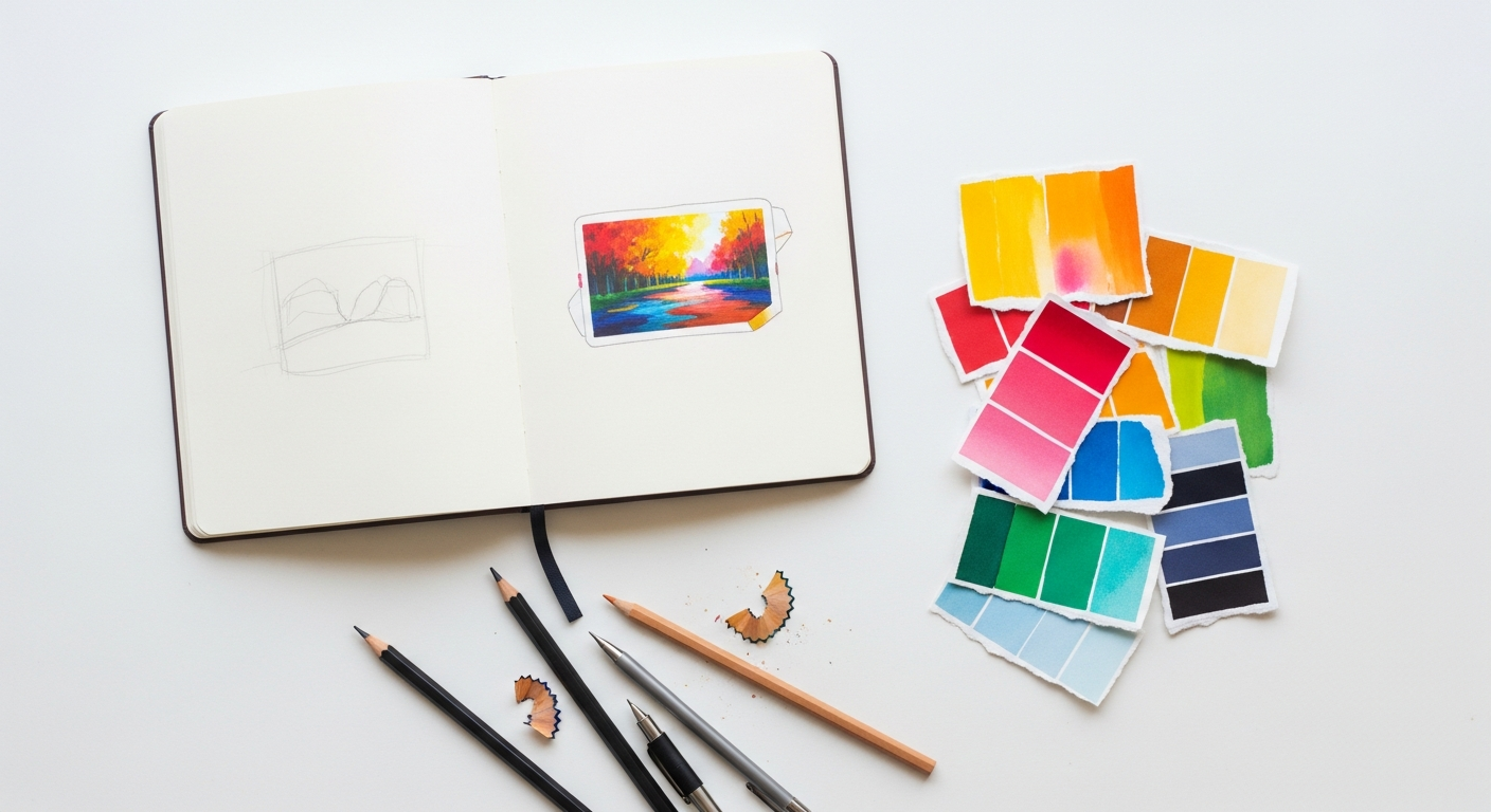
Step 1: Research & Discovery
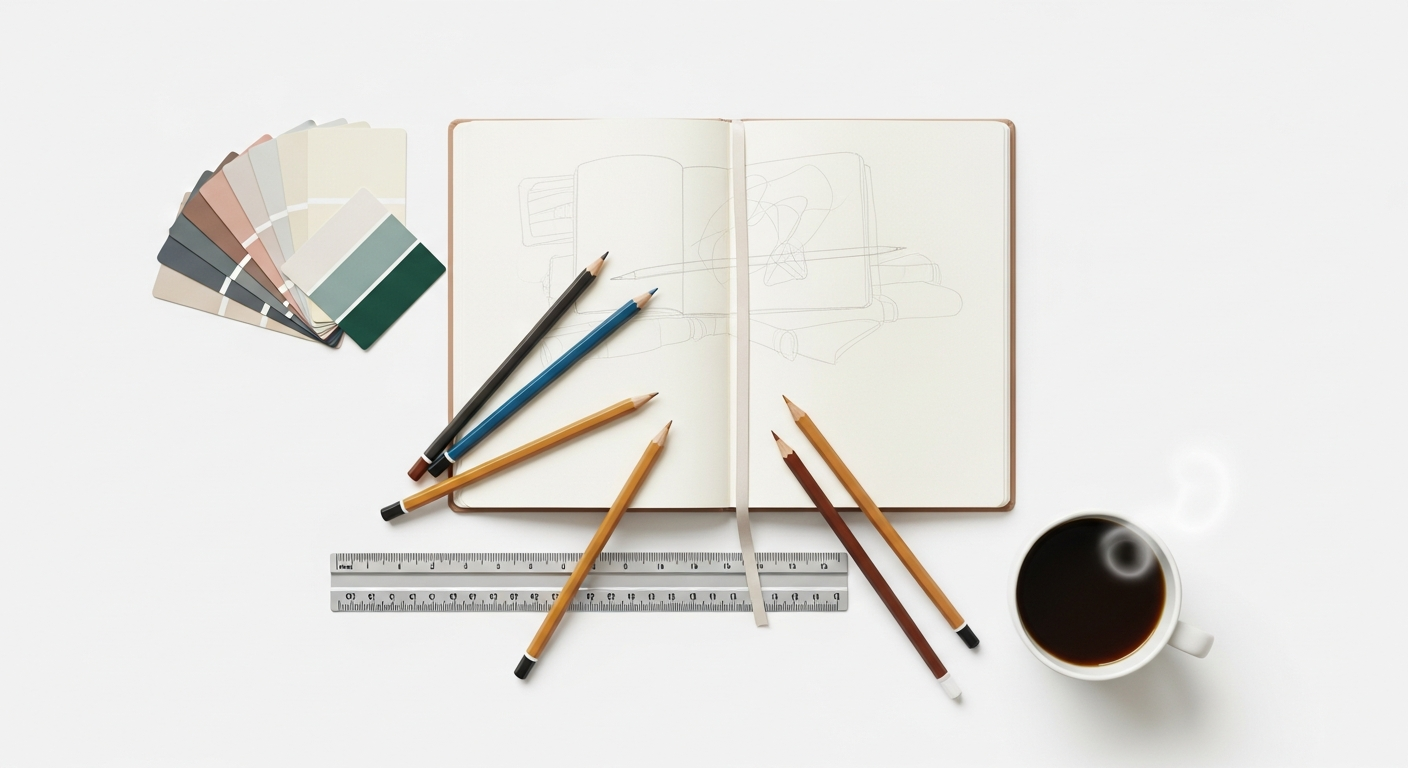
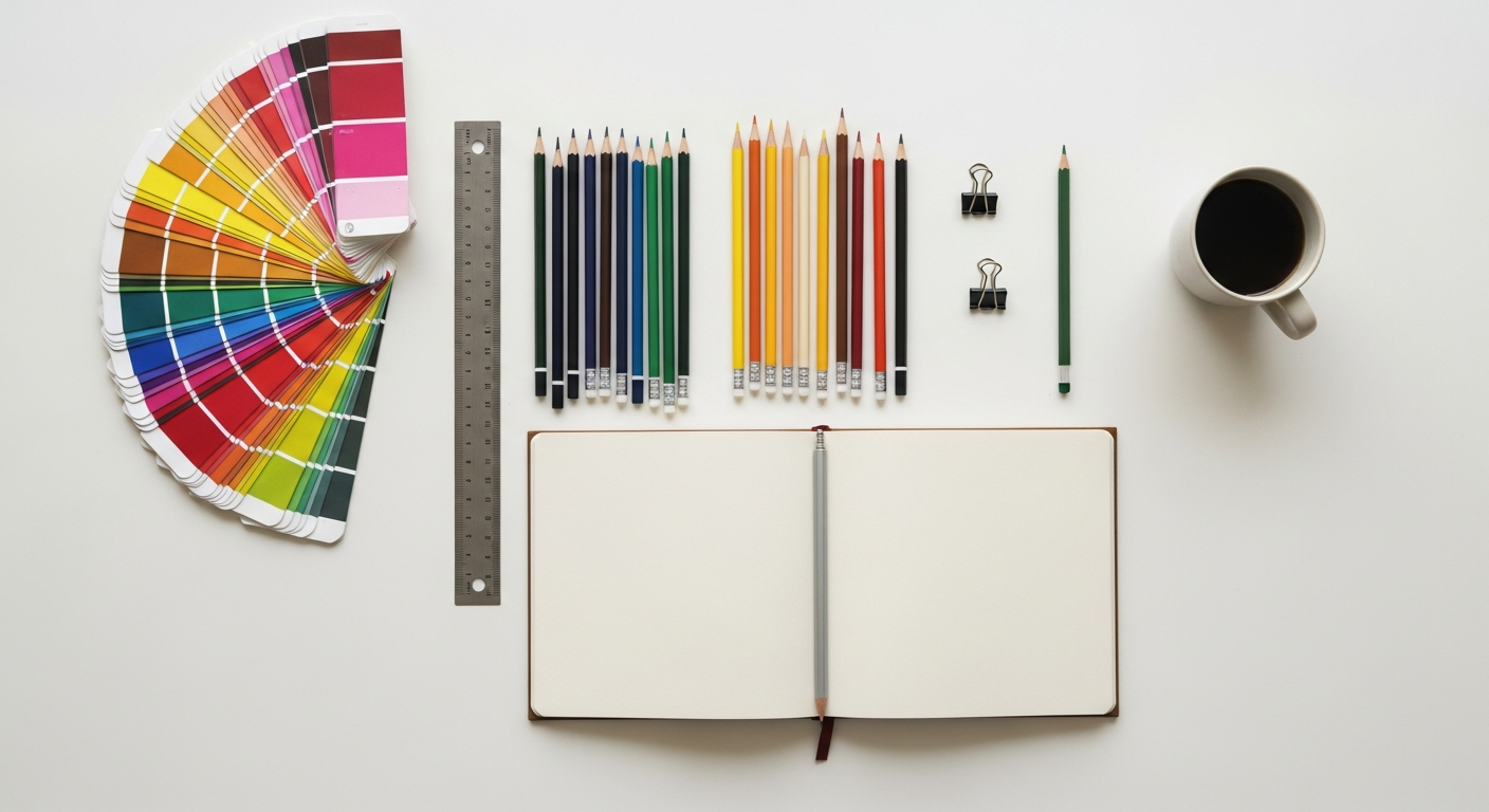
Before you even open your design software, immerse yourself in research. Understand the target audience, the platform (web, iOS, Android, desktop), and the specific context in which the icons will be used. What are the common metaphors for the actions or objects you need to represent? Look at existing icon sets – both within your industry and leading platforms – to understand established conventions and identify opportunities for unique yet intuitive solutions. Sketch out rough ideas on paper or a digital whiteboard to explore different concepts quickly.
Step 2: Conceptualization & Ideation
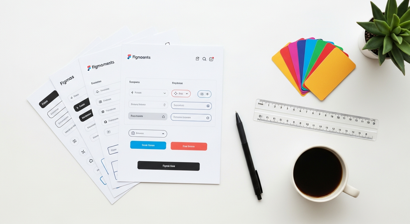
This is where you translate abstract ideas into visual forms. Brainstorm various metaphors for each concept. If you need an “add to cart” icon, consider a shopping bag, a trolley, or a plus sign within a circle. Don’t be afraid to sketch many variations. Rapid sketching is crucial here; it’s about quantity over perfection at this stage. Once you have a few promising concepts, start thinking about structure. This is where the grid comes in. Most professional icon sets are built on a foundational grid (e.g., 24x24px, 32x32px) and a set of keylines (circles and squares that define consistent proportions and alignments). Using a grid ensures visual harmony and consistency across your entire icon library.
Step 3: Digital Creation & Refinement
Now, it’s time to bring your sketches to life using vector graphics software. My go-to tools are:
- Figma: Excellent for collaborative design, creating component libraries, and real-time feedback. Its vector editing capabilities are robust.
- Adobe Illustrator: The industry standard for vector graphics, offering unparalleled precision and a vast array of tools for complex shapes.
- Sketch: A strong contender, especially popular within the Mac design community, known for its intuitive UI/UX features.
- Adobe XD: Good for rapid prototyping and integrating icons into full UI designs.
- Affinity Designer: A powerful, one-time purchase alternative to Illustrator.
Within these tools, focus on:
- Vector Shapes: Start with basic geometric shapes (circles, squares, rectangles, triangles) and combine them using Pathfinder or Boolean operations (unite, subtract, intersect, exclude). This ensures clean, scalable geometry.
- Stroke vs. Fill: Decide whether your icons will be primarily outline (stroke) or solid (fill). Maintain consistency. If using strokes, ensure they are vector strokes (expand stroke to shape if exporting as SVG for maximum control).
- Pixel Perfection: Even though they are vector, ensure your icons align perfectly to the pixel grid at their intended display sizes. This prevents blurry or fuzzy edges, especially on non-retina displays. In Figma, you can enable “Pixel Preview” to check this.
- Color Palette: Apply your brand’s color palette. Ensure good contrast and accessibility.
- Iteration: Don’t settle for the first digital version. Tweak, refine, and compare variations. Zoom out to see how icons look at small sizes and in context with other icons.
Step 4: Testing & Feedback
Never skip this crucial step. What makes sense to you might not be clear to your users. Conduct usability tests: ask users to identify the meaning of icons without labels, or to perform tasks using the icons. A/B test different icon variations if you’re unsure which performs better. Gather feedback from peers and stakeholders. Be open to constructive criticism and iterate based on the insights you gain.
Step 5: Export & Implementation
Once your icons are finalized, they need to be prepared for development. Common export formats include:
- SVG (Scalable Vector Graphics): The gold standard for web icons. They are vector-based, lightweight, and can be styled with CSS. They scale perfectly without loss of quality.
- PNG (Portable Network Graphics): A raster format, useful for cases where SVG isn’t supported or for specific resolutions. Export at 1x, 2x, and 3x for retina displays.
- WebP: A modern raster format offering superior compression to PNG and JPEG, gaining wider browser support.
Consider how developers will implement them. Will they use an icon font (e.g., Font Awesome, custom icon fonts)? Or SVG sprites, which offer more control and better accessibility? For larger systems, maintaining a clear naming convention (e.g., icon-home.svg, icon-search.svg) is essential for organization and developer handoff.
Advanced Techniques and Considerations for 2026
As technology evolves, so do the opportunities for icon design. Here are some advanced techniques and considerations shaping the future of effective iconography:
Adaptive Iconography
The digital landscape is no longer static. Users expect interfaces to adapt to their preferences and environments. Adaptive icons respond to themes like dark mode, dynamic color palettes, or even user-defined accent colors. Designing icons that can seamlessly transition between light and dark modes, or automatically adopt a brand’s secondary color, requires careful planning of fill and stroke properties and potentially using CSS variables for implementation.
Animated Icons
Subtle, well-executed animations can elevate an icon from static to engaging. Animated icons can provide immediate feedback (e.g., a checkmark morphing from a loading spinner), draw attention to critical actions, or simply add a touch of delight to the user experience. Tools like LottieFiles (exporting JSON animations from After Effects or Figma plugins) or CSS animations are excellent for creating lightweight, performant icon animations. The key is subtlety; avoid animations that are distracting or unnecessarily long.
3D/Skeuomorphic vs. Flat/Minimalist
Design trends are cyclical. While flat and minimalist design has dominated for years, we’re seeing a resurgence of depth, gradients, and even subtle skeuomorphism, often termed “neumorphism” or “glassmorphism.” The choice between these styles should always be driven by context and brand identity. A minimalist e-commerce site might stick to flat icons, while a creative portfolio or a gaming interface might embrace more textured or 3D elements. The most important thing is to maintain consistency within your chosen style.
Icon Systems & Libraries
For any product with a significant number of icons, building a robust icon system is crucial. This involves creating a centralized library of reusable icon components, complete with documentation on usage, styling, and accessibility. Tools like Figma’s component library, Sketch’s symbols, or even dedicated platforms like Storybook, allow designers and developers to manage, share, and scale icon sets efficiently, ensuring consistency and reducing design debt over time.
AI-Assisted Icon Design
While AI won’t replace human creativity in icon design, it’s increasingly becoming a powerful assistant. AI tools can help generate initial concepts based on text prompts, suggest style variations, or even automate tedious tasks like pixel-perfect alignment. Expect to see AI integration in design tools become more sophisticated, speeding up workflows and allowing designers to focus on higher-level conceptualization and refinement.
Common Pitfalls to Avoid
Even seasoned designers can fall into common traps. Being aware of these will help you steer clear:
- Inconsistency is the Enemy: This cannot be stressed enough. Mixing stroke weights, corner radii, perspectives, or levels of detail will make your interface look unprofessional and confuse users.
- Over-complication: Trying to pack too much detail into a small icon. Remember, simplicity is key for clarity and scalability. If it needs a magnifying glass to see the details, it’s too complex.
- Lack of Context: Designing icons in isolation without considering how they’ll appear within the actual UI. Always test icons within a live mock-up.
- Ignoring Accessibility: Overlooking contrast, tap target size, or semantic meaning for screen readers. Design for everyone.
- Using Unlicensed Assets: Never use icons or elements you haven’t created or properly licensed. This can lead to legal issues and dilute your brand’s unique identity.
- Not Testing with Real Users: Your assumptions about an icon’s meaning might be wrong. User testing is invaluable for identifying ambiguities early.