The Indispensable Role of a Logo in Forging Brand Identity
Before delving into the granular steps of creation, it’s crucial to grasp why a logo holds such profound significance. A logo is the most immediate visual representation of a brand, often the first point of contact a potential customer has with a business. It’s the symbol that encapsulates a company’s mission, vision, and values, translating abstract concepts into a tangible, memorable form. Think of it as the face of your brand; it needs to be distinctive, relevant, and capable of conveying your unique story without uttering a single word. In an increasingly visual world, where attention spans are fleeting and digital interactions dominate, a powerful logo acts as a silent ambassador, speaking volumes about professionalism, credibility, and personality.
A successful logo does more than just identify; it evokes emotion, fosters recognition, and builds trust. It’s the central element around which an entire visual identity system is built – from website aesthetics and marketing materials to product packaging and social media presence. Without a strong, thoughtfully designed logo, a brand risks appearing disjointed, unprofessional, or easily forgotten. It’s an investment in your future, a cornerstone for brand loyalty, and a critical tool for differentiation. The psychological impact of a well-executed logo cannot be overstated; it shapes perceptions, influences purchasing decisions, and contributes significantly to the overall user experience (UX) of interacting with a brand. Just as a well-designed interior space enhances the experience of its occupants, a well-designed logo enhances the user’s perception and engagement with a brand. It sets the tone, communicates trustworthiness, and lays the foundation for a consistent, compelling brand narrative across all touchpoints, ensuring that every interaction, whether online or offline, reinforces the brand’s core message.
Phase 1: Discovery & Strategy – Laying the Groundwork for Design
The initial phase of the logo design process step by step is arguably the most critical, as it involves deep understanding and strategic planning. Skipping or rushing this stage often leads to designs that miss the mark, fail to resonate with the target audience, or quickly become outdated. This is where you transform assumptions into informed decisions, ensuring the creative work that follows is purposeful and effective.
1. The Client Brief and Deep Dive
- Understanding the Business: Begin with an exhaustive client brief. This isn’t just about what they like visually, but about their core business. What services or products do they offer? What problems do they solve? What are their long-term goals and aspirations for 2026 and beyond?
- Defining Brand Values & Personality: Ask probing questions to uncover the brand’s essence. Is it modern, traditional, playful, serious, luxurious, accessible, innovative, eco-friendly? These attributes will heavily influence visual style.
- Identifying the Unique Selling Proposition (USP): What makes this business stand out from its competitors? How can the logo visually communicate this distinction?
- Target Audience Analysis: Who are they trying to reach? Understanding demographics (age, gender, location, income) and psychographics (lifestyles, interests, values) is paramount. A logo designed for Gen Z will look vastly different from one targeting high-net-worth individuals. This directly ties into What Is UX Design And Why It Matters – a logo must be designed with its end-users in mind, ensuring it’s legible, appealing, and relevant to their sensibilities and expectations. A logo that confuses or alienates its audience has failed its primary UX objective.
2. Market Research and Competitor Analysis
- Industry Landscape: Research the broader industry. Are there common visual tropes, color palettes, or typographic styles? Understanding these can help a brand either conform to expectations or intentionally break away to stand out.
- Competitor Review: Analyze direct and indirect competitors’ logos. What works well for them? What are their weaknesses? How can the new logo differentiate itself while still being perceived as credible within the industry? The goal is to create something unique that doesn’t inadvertently mimic another brand’s identity.
- Trend Awareness vs. Timelessness: While it’s good to be aware of current design trends, a truly effective logo aims for timelessness. Trends can make a logo feel dated quickly. The focus should be on enduring appeal and flexibility.
3. Defining Project Scope and Timeline
- Deliverables: Clearly outline what the client will receive (e.g., logo variations, file formats, brand guidelines).
- Timeline: Establish realistic deadlines for each phase, including client feedback rounds.
- Budget: Ensure there’s a clear understanding of the financial investment, matching expectations with resources.
This discovery phase acts as the compass for the entire creative journey. It ensures that every stroke, every color choice, and every typographic decision made in subsequent stages is informed by a deep understanding of the brand’s strategic objectives and its audience’s needs.
Phase 2: Ideation & Conceptualization – From Insight to Inspiration
1. Brainstorming and Mind Mapping
- Keyword Association: Start by jotting down all keywords associated with the brand, its values, target audience, and industry. Think about synonyms, antonyms, metaphors, and abstract concepts. For instance, for a sustainable interior design firm, keywords might include “nature,” “growth,” “harmony,” “balance,” “eco,” “modern,” “classic,” “home,” “shelter.”
- Visual Metaphors: Explore how these keywords can be represented visually. Can “growth” be an ascending line, a leaf, or a sprouting seed? Can “harmony” be interlocking shapes or a balanced composition?
- Mind Mapping: Create visual maps connecting these keywords and visual associations. This helps uncover unexpected links and new creative directions, often leading to truly original ideas.
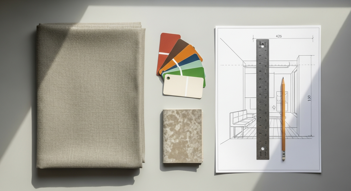
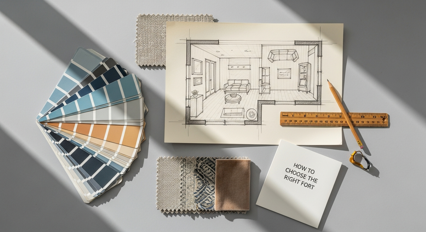
2. Mood Board Creation
- Visual Inspiration: A mood board is a curated collection of images, textures, color palettes, typography samples, and existing designs that evoke the desired aesthetic and emotional tone of the brand. It’s not about copying, but about defining the visual language and atmosphere.
- Defining Style: Does the brand feel minimalist, opulent, rustic, futuristic? The mood board helps solidify these stylistic choices before any actual logo design begins. It acts as a shared visual language between the designer and client, ensuring alignment on the creative direction.
- Color Psychology: Begin considering potential color schemes and their psychological implications. Red for passion, blue for trust, green for nature – how do these align with the brand’s message?
3. Sketching – The Foundation of Visual Design
- Rapid Idea Generation: This is arguably the most crucial step in the conceptualization phase. Grab a pen and paper and start sketching. Don’t worry about perfection or detail at this stage; focus on volume and variety. Sketch dozens, even hundreds, of different ideas. Explore various symbols, typographic treatments, abstract forms, and combinations thereof.
- Exploring Forms and Compositions: Experiment with different layouts – icon above text, icon to the side, integrated icon, wordmark only, monogram. Consider positive and negative space. How does the logo look when flipped, inverted, or simplified?
- Benefits of Analog Sketching: Sketching allows for quick, fluid exploration without the constraints of digital tools. It encourages raw creativity and helps to distill complex ideas into simple, powerful forms. Many iconic logos began as simple sketches. This physical act of drawing helps to solidify the conceptual connection between the brand’s essence and its visual representation, ensuring that the final digital product is rooted in a strong, well-thought-out idea rather than just aesthetic appeal.
By thoroughly engaging in this ideation and conceptualization phase, designers ensure that the subsequent digital creation is built upon a rich tapestry of ideas, meticulously explored and thoughtfully considered. This iterative process of brainstorming, mood boarding, and sketching lays a robust foundation for distinctive and meaningful logo designs.
Phase 3: Digitalization & Refinement – Bringing Concepts to Life
Once a plethora of sketches has been generated and the most promising concepts identified, the logo design process step by step transitions into the digital realm. This is where raw ideas are transformed into polished, scalable vector graphics, ready for application across various mediums. This phase demands precision, attention to detail, and a deep understanding of design software and principles.
1. Selecting the Strongest Concepts
- Critical Review: Review all sketches, evaluating them against the initial brief and strategic goals. Which concepts best communicate the brand’s values? Which are most unique, memorable, and adaptable?
- Simplification: Often, the most effective logos are the simplest. Can a concept be distilled further without losing its meaning? Simplicity aids memorability and versatility.
- Choosing a Few Directions: Select 3-5 of the strongest, most distinct concepts to develop digitally. Presenting too many options can overwhelm the client later.
2. Vectorization and Initial Digital Drafts
- Using Vector Software: Translate the chosen sketches into digital vector formats using professional software like Adobe Illustrator. Vector graphics are crucial because they are resolution-independent, meaning they can be scaled to any size (from a favicon to a billboard) without losing quality or becoming pixelated.
- Precision and Geometry: Pay close attention to lines, curves, and shapes. Ensure symmetry, balance, and visual harmony. Use grids and guides to maintain precision. Every element should feel intentional and well-constructed.
- Negative Space: Actively consider the negative space within and around the logo. Often, clever use of negative space can add another layer of meaning or visual interest, making the logo more intriguing and memorable.
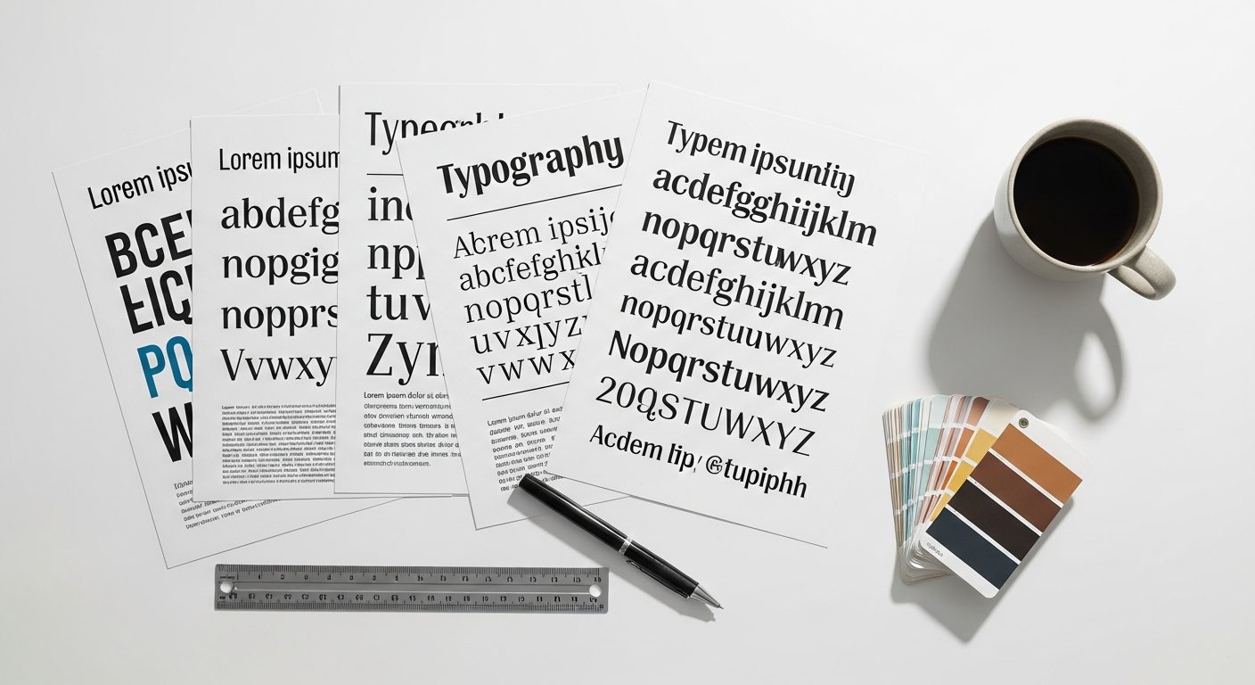
3. Typography Exploration and Selection
- Brand Personality Through Type: Typography plays a monumental role in conveying brand personality. A sleek sans-serif can imply modernity, while a decorative script might suggest luxury or tradition. Explore various font families (serif, sans-serif, script, display) that align with the brand’s defined attributes.
- Legibility and Hierarchy: Ensure the chosen typeface is highly legible at various sizes and across different applications. If the logo includes a tagline, establish a clear visual hierarchy between the brand name and the accompanying text. This is a key aspect of user experience; a logo that cannot be easily read fails its primary communicative purpose.
- Customization: Often, professional logo design involves customizing existing typefaces or even creating bespoke lettering to ensure uniqueness and a perfect fit for the brand. This can involve adjusting kerning, tracking, modifying letterforms, or creating ligatures.
4. Color Palette Development
- Psychology of Color: Revisit the color psychology considered during mood boarding. Select a primary color palette that evokes the desired emotions and reinforces the brand’s message. Consider secondary and accent colors that complement the primary palette.
- Versatility: Test how the logo looks in full color, single color (monochrome), reversed (white on dark background), and grayscale. A strong logo should work effectively in all these variations.
- Accessibility: Ensure sufficient contrast, especially for digital applications, to meet accessibility standards and ensure the logo is perceptible to all users. This is another area where UX principles, similar to those discussed in What Is UX Design And Why It Matters, are paramount.
5. Iteration and Refinement
- Variations: Develop several variations of each selected concept. This might include different icon-to-text lockups, stacked versus horizontal versions, or slight adjustments in proportion or detail.
- Simplification and Versatility Check: Continuously ask: Can this be simpler? Does it work well as a small icon (e.g., a favicon)? Does it look good on a dark background? This iterative process ensures the logo is robust and adaptable for all future uses. This stage is also an opportune moment to apply principles akin to How To Conduct A Heuristic Evaluation. Evaluate each digital draft against established design heuristics: Is it clear? Is it efficient? Is it aesthetically pleasing? Does it prevent misinterpretation? Does it offer flexibility? By critically assessing these factors, designers can identify potential usability issues or areas for improvement before presenting to the client, ensuring the chosen concepts are not only visually appealing but also functionally sound and intuitive.
By meticulously working through the digitalization and refinement phase, designers transform initial creative sparks into professional, scalable, and versatile brand assets, ready to embark on their journey as the face of a brand.
Phase 4: Presentation & Feedback – Guiding the Vision
The presentation phase is a critical juncture in the logo design process step by step. It’s not merely about unveiling designs; it’s about storytelling, educating the client, and guiding them through the rationale behind each creative choice. A well-executed presentation can significantly influence client perception and facilitate constructive feedback, leading to a smoother revision process and a more successful outcome.
1. Developing a Compelling Presentation
- Tell the Story: Don’t just show logos; explain the journey. Start by reiterating the initial brief, brand values, and target audience insights gathered during the discovery phase. Then, connect each design concept directly back to these strategic foundations. Explain why certain shapes, colors, and fonts were chosen and how they visually communicate the brand’s essence.
- Limit Options: Presenting too many options can overwhelm and confuse the client. Typically, 2-3 strong, distinct concepts are ideal. These should offer different approaches while still adhering to the core brief.
- Contextual Mockups: Show the logos in real-world applications. This is paramount for helping clients visualize how their new brand mark will actually look and function. Mockups should include:
- On a business card or letterhead.
- On a website header or app icon.
- On signage or product packaging.
- As a social media profile picture and banner (crucial for understanding its digital presence, linking to best practices from a Social Media Graphics Design Guide).
- In different color variations (full color, monochrome, reversed).
These mockups provide invaluable context and help the client evaluate the logo’s versatility and effectiveness across various touchpoints.
- Explanation of Versatility: Demonstrate how the logo will adapt to different sizes and applications, from tiny favicons to large banners, ensuring its legibility and impact are maintained.
2. Guiding the Client Feedback Process
- Educate on Design Principles: Remind the client that logo design is not purely subjective. Guide them to evaluate designs based on objective criteria such as memorability, versatility, relevance, simplicity, and uniqueness, rather than just personal preference.
- Structured Feedback: Provide a clear framework for feedback. Encourage them to provide specific, constructive comments related to the brief, rather than vague statements like “I don’t like it.” Ask questions like: “Does this logo speak to our target audience?” “Does it align with our brand values?” “Is it distinguishable from our competitors?”
- Handle Feedback Professionally: Listen actively, take detailed notes, and ask clarifying questions. It’s important to understand the root of their feedback. Sometimes a client’s “I don’t like the red” might actually mean “the red feels too aggressive for our nurturing brand.”
3. Revisions and Iterations
- Defined Revision Rounds: Clearly outline the number of revision rounds included in the project scope. This manages expectations and prevents endless cycles of changes.
- Strategic Adjustments: Implement feedback thoughtfully. Not all feedback should be taken literally; sometimes it requires a designer’s interpretation to address the underlying concern while maintaining design integrity. Explain when a requested change might compromise the logo’s effectiveness or strategic intent.
- Presenting Revisions: When presenting revised concepts, highlight the changes made and explain how they address the client’s feedback while still adhering to the project’s goals.
The presentation and feedback phase is a collaborative dance. By taking a proactive, educational approach, designers can steer the process toward a mutually satisfying outcome, ensuring the final logo is not only aesthetically pleasing but also strategically sound and enthusiastically embraced by the client.
Phase 5: Finalization & Deliverables – The Brand’s New Face
Upon receiving final approval from the client, the logo design process step by step moves into its conclusive phase: finalization and delivery. This stage is about meticulous preparation, ensuring the client receives all necessary assets in the correct formats, along with clear guidelines for their use. It’s about empowering the client to consistently apply their new brand identity effectively across all platforms.
1. Securing Final Approval
- Written Sign-Off: Always obtain formal written approval (email is usually sufficient) on the chosen final logo design. This prevents misunderstandings and serves as a record of client acceptance.
2. Preparing Comprehensive File Deliverables
A professional logo package should include a variety of file formats to accommodate every possible application, ensuring versatility and quality:
- Vector Files (for scalability and print):
- .AI (Adobe Illustrator): The native working file, fully editable.
- .EPS (Encapsulated PostScript): A universal vector format, ideal for professional printing and signage.
- .SVG (Scalable Vector Graphics): Essential for web use, providing crisp, scalable graphics without quality loss.
- Raster Files (for digital and general use):
- .PNG (Portable Network Graphics): For web and digital use, supporting transparent backgrounds (crucial for overlaying on various colors/images). Provided in various sizes (e.g., web resolution, high resolution).
- .JPG (Joint Photographic Experts Group): For general digital use where transparency is not required (e.g., email signatures, basic documents). Provided in various sizes and resolutions.
- Color Variations: Provide the logo in:
- Full color (CMYK for print, RGB for screen, Hex for web, Pantone if specified).
- Monochrome (1-color black and white).
- Reversed (white on a dark background).
- Grayscale.
- Layout Variations: If applicable, include different lockups (e.g., horizontal, stacked, icon-only, wordmark-only) to ensure flexibility for various applications.
- Favicon: A small, optimized version for browser tabs and app icons.
3. Developing a Robust Brand Guidelines Document
This document is indispensable for maintaining brand consistency, especially as the brand grows and involves multiple stakeholders (internal teams, external vendors, marketing agencies). It serves as the authoritative manual for how the logo and overall brand identity should be applied.
- Logo Usage:
- Clear space requirements (minimum distance around the logo).
- Minimum size for legibility.
- Examples of correct and incorrect usage (e.g., stretching, altering colors, adding effects).
- Approved logo variations and their appropriate contexts.
- Color Palette:
- Primary and secondary brand colors with precise values (CMYK, RGB, Hex codes, Pantone codes).
- Guidance on color pairings and usage.
- Typography:
- Primary and secondary brand fonts.
- Usage guidelines (e.g., for headlines, body text, captions).
- Fallback fonts for digital applications.
- Imagery & Tone of Voice: (Optional but highly recommended)
- Guidance on photographic style, illustration style, and overall visual mood.
- Description of the brand’s voice and messaging style.
This comprehensive document is vital for ensuring that every application of the brand, particularly across digital channels, aligns perfectly with the intended identity. It directly relates to the principles outlined in a Social Media Graphics Design Guide, ensuring that social media profiles, posts, and advertisements consistently reflect the brand’s aesthetic and messaging. Without clear guidelines, even the best logo can be diluted or misrepresented, undermining the entire branding effort.
4. Copyright and Licensing
- Transfer of Ownership: Clarify the terms of ownership for the final logo design. Typically, full copyright is transferred to the client upon final payment.
- Designer Portfolio Rights: Ensure the designer retains the right to display the logo in their portfolio and marketing materials.
By meticulously handling the finalization and deliverables, designers provide clients with a complete toolkit to confidently launch and manage their new brand identity, ensuring its integrity and effectiveness for years to come.
Phase 6: Launch & Beyond – Evolving with the Brand
The journey of a logo doesn’t end with its final delivery; in fact, it’s just beginning. The final phase in the logo design process step by step encompasses the launch of the new identity and its ongoing management and evolution. A logo is a living asset, destined to grow and adapt alongside the brand it represents, and its strategic deployment is crucial for its long-term success.
1. Strategic Brand Launch
- Integrated Rollout: Once the logo and brand guidelines are finalized, plan a strategic rollout across all brand touchpoints. This includes updating:
- Website and digital platforms.
- Social media profiles (banners, avatars, post templates). This is where the wisdom from a Social Media Graphics Design Guide becomes invaluable, ensuring seamless integration and optimal visual impact across diverse platforms like Instagram, LinkedIn, and TikTok.
- Print materials (business cards, letterheads, brochures).
- Product packaging and signage.
- Internal communications and uniforms.
- Announcement Strategy: Consider how the brand will announce its new visual identity. This could involve a press release, a social media campaign, or a dedicated launch event, depending on the scale of the brand.
2. Monitoring and Adaptation
- Initial Feedback Collection: After launch, monitor public perception and initial feedback regarding the new logo. While personal opinions shouldn’t dictate design changes, consistent patterns of confusion or misinterpretation might warrant minor adjustments or clearer communication.
- Performance Review: Over time, evaluate how the logo is performing in various real-world scenarios. Does it stand out effectively in crowded environments? Is it memorable? Does it resonate with the target audience as intended?
3. Evolution of Brand Identity
- Timelessness vs. Modernization: While a good logo is designed for timelessness, brands and markets evolve. What works well in 2026 might need a subtle refresh in 2036. A truly successful logo has the inherent flexibility to be modernized without losing its core essence.
- Brand Extensions: As a brand grows and introduces new products or services, the logo and brand identity system should be robust enough to accommodate these extensions, perhaps through sub-brands or consistent visual themes.
- Staying Relevant: Periodically, brands should assess their visual identity against current market trends and their own evolving strategic goals. This doesn’t necessarily mean a complete redesign but perhaps a minor refinement or an update to the brand guidelines to ensure continued relevance and impact.
The launch and ongoing management of a logo underscore its dynamic nature. It’s not a static image but a living asset that requires careful nurturing and strategic oversight. By embracing this final phase, brands ensure their visual identity remains a powerful, consistent, and evolving representation of who they are and where they are headed, solidifying their presence and connection with their audience for years to come.
Frequently Asked Questions
Recommended Resources
Learn more about this topic in Best Cloud Storage Services 2026 at Bookmark Sharer.
Check out Best Tools For Remote Team Management on Eamped for a deeper dive.