What Are Micro-interactions? The Unseen Architects of User Delight
At its core, a micro-interaction is a single, contained moment within a product that revolves around a single use case—a tiny piece of functionality. Think of the subtle animations when you ‘like’ a post, the gentle vibration confirming a successful payment, or the visual feedback indicating a form field is incorrect. These aren’t just decorative flourishes; they are purposeful design elements that serve crucial functional and emotional roles. They provide immediate feedback, communicate status, help users manipulate data, and make the overall experience more human and intuitive. While often overlooked by users because of their seamless integration, their absence would instantly create a sense of friction, confusion, or even frustration. They are the unsung heroes that prevent users from asking, “Did that work?” or “What’s happening now?”
The concept of micro-interactions was popularized by Dan Saffer, who meticulously broke down their components and significance. He highlighted that these small moments are not just about aesthetics but about enhancing usability and creating a more meaningful interaction. In essence, micro-interactions are the silent conversations happening between the user and the interface, confirming actions, suggesting next steps, and injecting personality into an otherwise static digital space. Their impact is profound because they address fundamental human needs for feedback, clarity, and control. Without them, even the most robust and feature-rich applications can feel sterile, unresponsive, and ultimately, unsatisfying.
Understanding micro-interactions is crucial for any designer, including those working on physical layouts or creative projects, as the principles of intuitive interaction and clear communication transcend mediums. Just as a well-designed physical space guides visitors naturally, effective micro-interactions guide digital users. They are a testament to the power of detail, demonstrating that even the smallest elements can have the largest impact on user perception and satisfaction. By mastering the art of micro-interactions, designers can craft experiences that are not only functional but also genuinely delightful and memorable, fostering loyalty and engagement in a competitive digital landscape.
The Psychology Behind the “Aha!” Moment: Why Micro-interactions Resonate

The effectiveness of micro-interactions isn’t merely anecdotal; it’s deeply rooted in principles of human psychology and cognitive science. They tap into our innate need for feedback, our desire for control, and our appreciation for aesthetics and seamlessness. When a user performs an action, their brain immediately seeks confirmation that the action was received and processed. Micro-interactions provide this immediate, clear, and often visually engaging feedback loop, satisfying our cognitive need for closure and reducing cognitive load.
Consider the concept of affordance. Just as a door handle affords pulling or pushing, a digital button needs to communicate its clickable nature and the outcome of clicking it. Micro-interactions enhance this by providing visual cues (e.g., a button subtly changing color on hover or press), auditory feedback (a soft click sound), or haptic feedback (a gentle vibration). This instant gratification and clear communication reduce uncertainty and build confidence, making the user feel competent and in control of the interface. This sense of mastery is a powerful psychological motivator, encouraging continued engagement and fostering a positive emotional connection with the product.
Furthermore, micro-interactions inject a sense of personality and humanity into digital products. They can evoke emotions ranging from surprise and delight to reassurance and satisfaction. A charming animation when an email is sent successfully, or a friendly bounce when a list is refreshed, can turn a utilitarian moment into a pleasurable one. This emotional connection is vital for building brand loyalty and differentiating a product in a crowded market. It aligns perfectly with the broader objectives of What Is UX Design And Why It Matters, where the goal is not just to build functional products but to craft experiences that are efficient, enjoyable, and meaningful for the user.
From a behavioral perspective, micro-interactions act as positive reinforcement. When a user completes a task, and the interface responds with a satisfying animation or sound, it creates a positive association with that action and the product itself. This can encourage repetitive behaviors, such as liking posts or completing forms, by making these actions feel rewarding rather than tedious. This subtle psychological priming is a powerful tool for guiding user behavior and fostering long-term engagement, making micro-interactions an indispensable component of modern UI design.
Anatomy of a Micro-interaction: The Four Key Stages
1. Triggers: The Initiator
Every micro-interaction begins with a trigger. This is the event that initiates the interaction. Triggers can be user-initiated or system-initiated.
- User-initiated Triggers: These are explicit actions taken by the user, such as clicking a button, swiping an item, typing in a field, hovering over an element, or tapping on a screen. For example, clicking a “Submit” button or dragging a file into a drop zone.
- System-initiated Triggers: These are events that occur without direct user intervention but are predetermined by the system. Examples include an incoming notification, a page loading completely, a timer expiring, or new data becoming available. For instance, an alert appearing when a new message arrives or a progress bar animating automatically during a download.
The trigger must be clear and intuitive, signaling to the user that an action can be performed or that something significant has occurred. A well-designed trigger minimizes ambiguity and sets the stage for a smooth interaction.
2. Rules: The Blueprint
Once a trigger is activated, rules dictate what happens next. Rules define the sequence, timing, and nature of the micro-interaction. They are the behind-the-scenes logic that determines how the interface responds to the trigger.
- Logic and Constraints: Rules define the conditions under which the interaction will occur and what parameters it will follow. For example, if a user clicks a “Like” button, the rule might be: “change icon color to red, increment counter by one, play a subtle sound, and animate the icon.”
- State Changes: Rules also govern how elements change their state. If an input field is empty and the user tries to submit, the rule might be: “highlight the field in red, display an error message, and prevent submission.”
Rules ensure consistency and predictability. They are the invisible framework that makes the interaction feel natural and expected, preventing jarring or illogical responses from the interface.
3. Feedback: The Response
Feedback is the most visible and often most impactful part of a micro-interaction. It’s how the system communicates to the user that their action has been received, processed, and what the outcome is. Without feedback, users are left guessing, leading to frustration and confusion.
- Visual Feedback: This is the most common form, including animations (e.g., a checkmark appearing after a successful upload, an element bouncing), color changes (e.g., a button turning green), size changes, or text updates (e.g., “Loading…” message).
- Auditory Feedback: Sound effects can reinforce actions, such as a subtle ‘whoosh’ when an item is added to a cart, or a gentle ‘ding’ for a new notification.
- Haptic Feedback: Vibrations, especially on mobile devices, provide tactile confirmation, such as a short buzz when a form is submitted or an action is completed.
Effective feedback should be immediate, clear, and appropriate to the action. It confirms, reassures, and guides the user, making them feel informed and in control.
4. Loops & Modes: The Ongoing Experience
The final stage addresses the longevity and persistence of the micro-interaction. How does it behave over time, and does it change based on context?
- Loops: Some micro-interactions are designed to repeat or revert to a previous state. For example, a loading spinner loops indefinitely until the content loads. A toggle switch has two states (on/off), and each tap loops between them.
- Modes: Modes define how a micro-interaction behaves under different conditions or contexts. For instance, the animation for an “undo” action might be different from a “redo” action, or a notification might behave differently depending on whether the user is active in the app or not.
Loops and modes ensure that the micro-interaction remains relevant and functional across various user scenarios, adding a layer of sophistication and adaptability to the overall user experience.
Types of Micro-interactions: Enhancing Every Digital Touchpoint

Micro-interactions are incredibly versatile and can be applied across virtually every touchpoint in a digital interface. Their purpose often falls into several broad categories, each designed to improve specific aspects of the user experience.
1. Communicating Status and Providing Feedback
This is perhaps the most fundamental type. Users need to know what’s happening in the system, especially during processes that take time or involve background operations.
- Loading Indicators: Spinners, progress bars, skeleton screens, and shimmer effects inform users that content is being fetched or an action is being processed. Instead of a frozen screen, these cues manage user expectations and reduce perceived waiting time.
- Form Validation: Immediate feedback on input fields, such as highlighting an error in red, displaying a checkmark for correct input, or explaining why a password is weak, prevents submission errors and guides users to correct mistakes in real-time.
- System Status: Alerts for network connectivity issues, successful saves, or failed operations provide crucial information. A subtle toast notification confirming “Item added to cart” is a classic example.
2. Data Input and Manipulation
Micro-interactions make the process of entering information or manipulating data more intuitive and less prone to errors.
- Toggles and Switches: Animated switches (like a light switch) clearly indicate an on/off state, making their function immediately understandable.
- Sliders: When adjusting values, sliders often provide visual feedback on the chosen value as the user drags the handle.
- Drag-and-Drop: As an item is dragged, it might change appearance, and target zones might highlight, indicating where it can be dropped. Upon dropping, a subtle bounce or fade confirms placement.
- Pull-to-Refresh: A classic mobile interaction where pulling down on a list reveals a loading animation, refreshing the content.
3. Calling to Action (CTAs) and Guiding Navigation
Micro-interactions can subtly encourage users to take desired actions and make navigation more intuitive.
- Button States: Hover effects, press animations, and disabled states on buttons provide clear visual cues about their interactivity and current status. A button might subtly glow when hovered over, signaling it’s clickable.
- Navigation Menus: Hamburger menus that animate into an ‘X’ to close, or menu items that highlight upon selection, make navigation feel responsive and clear.
- Interactive Icons: Icons that animate to indicate new notifications (e.g., a bouncing mail icon) or change appearance when an action is performed (e.g., a heart filling with color when ‘liked’) grab attention and reinforce actions. This is particularly relevant when thinking about effective Social Media Graphics Design Guide principles, where clear CTAs and engaging visual feedback are paramount for driving user interaction.
4. Onboarding and Education
They can also be used to introduce users to new features or guide them through complex processes.
- Walkthroughs: Subtle animations highlighting a new button or a brief guiding arrow can draw attention to key elements during first-time use.
- Tutorials: Interactive elements that respond to user input can make learning a new interface more engaging than static instructions.
5. Delight and Branding
Beyond pure functionality, micro-interactions are powerful tools for injecting personality and reinforcing brand identity.
- Celebration Animations: A shower of confetti for a successful purchase or a playful character animation upon completing a task can add joy and create memorable moments.
- Brand Consistency: The specific style, timing, and sound of micro-interactions can be tailored to align with a brand’s visual and auditory identity, contributing to a cohesive brand experience across all touchpoints.
By thoughtfully applying these various types, designers can craft interfaces that are not only functional but also intuitive, engaging, and genuinely delightful, significantly enhancing the overall user experience.
Designing for Delight: Best Practices for Effective Micro-interactions
Crafting effective micro-interactions requires more than just adding animations; it demands a strategic approach rooted in user-centered design principles. The goal is to enhance, not distract. Here are some best practices for designing micro-interactions that truly delight and serve a purpose:
1. Keep Them Purposeful and Functional
Every micro-interaction should serve a clear purpose. Is it providing feedback? Preventing errors? Guiding the user? Enhancing comprehension? If an animation or response doesn’t add value, it’s likely just a distraction. Avoid gratuitous animations that slow down the interface or don’t communicate anything meaningful. The primary aim is always to improve usability and clarity, not merely to entertain.
2. Make Them Subtle and Non-Intrusive
The best micro-interactions often go unnoticed consciously but are deeply felt subconsciously. They should be quick, smooth, and seamless, integrating naturally into the user flow. Overly elaborate or long animations can quickly become annoying, especially with repeated use. Aim for brevity and elegance; a few milliseconds can make all the difference between delightful and distracting.
3. Prioritize Speed and Performance
Latency kills delight. Micro-interactions must execute instantly. Any delay will negate their purpose of providing immediate feedback and can make the interface feel sluggish. Optimize animations and transitions to be lightweight and performant across various devices and network conditions. A micro-interaction should never be the cause of perceived slowness.
4. Ensure Consistency and Predictability
Users build mental models of how an interface works. Consistent micro-interactions reinforce these models, making the interface predictable and easy to learn. If clicking a button always results in a certain type of visual feedback, users will quickly understand the system’s language. Inconsistencies, on the other hand, lead to confusion and frustration. This consistency extends to the overall brand experience, ensuring that even the smallest interactions reflect the brand’s identity and tone.
5. Provide Clear and Actionable Feedback
The feedback provided by a micro-interaction must be unambiguous. Users should instantly understand the outcome of their action. If an error occurs, the feedback should clearly indicate what went wrong and, ideally, suggest how to rectify it. For successful actions, a clear confirmation (e.g., a checkmark, a success message) is essential for reassurance.
6. Consider Context and User State
Micro-interactions should adapt to the context. A first-time user might benefit from more explicit animations or guidance than a seasoned user. Similarly, the urgency of feedback might differ based on the criticality of the action. Design for different modes (e.g., editing mode vs. viewing mode) and user states (e.g., online vs. offline) to ensure the interactions remain appropriate and helpful.
7. Design for Accessibility
Not all users experience interfaces in the same way. Ensure that micro-interactions do not create barriers for users with disabilities. Provide options to reduce motion for those prone to motion sickness. Use sufficient contrast for visual cues. Ensure that critical feedback is conveyed through multiple channels (e.g., visual and auditory) or through clear textual descriptions that can be read by screen readers. Accessibility is not an afterthought but a foundational aspect of good design.
8. Iterate and Test
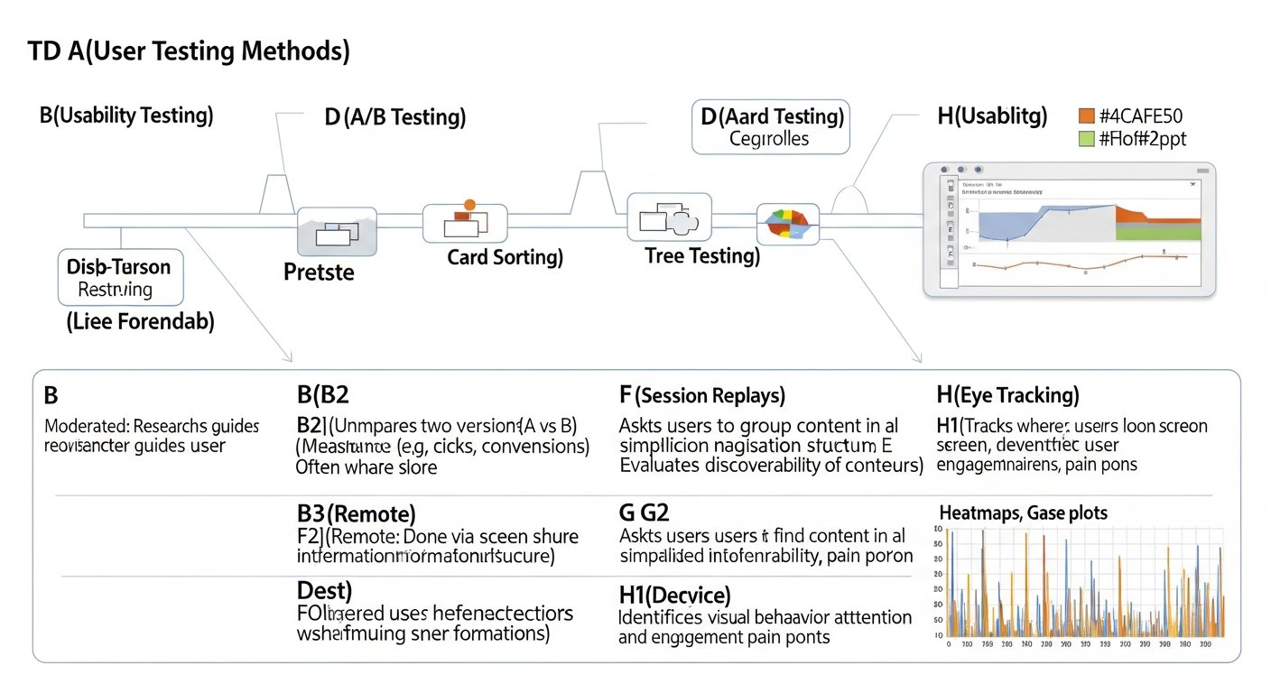
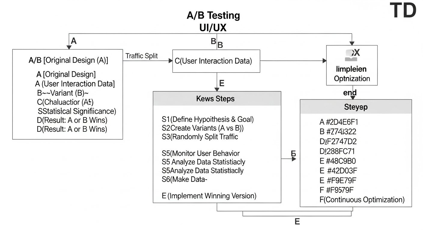
Like any design element, micro-interactions benefit from iterative design and user testing. What seems delightful to a designer might be distracting to a user. Use tools and methods similar to How To Conduct A Heuristic Evaluation to assess their usability, impact, and adherence to design principles. Observe users interacting with your designs. Are they noticing the feedback? Is it clarifying or confusing? A/B test different animations or timings to see which performs best in terms of user satisfaction and task completion. Refine based on real-world feedback.
By adhering to these best practices, designers can harness the immense power of micro-interactions to create digital experiences that are not only efficient and functional but also deeply human, intuitive, and truly delightful.
Measuring Success: How Micro-interactions Impact UX and Business Goals
While micro-interactions are subtle, their cumulative impact on User Experience (UX) and, consequently, on business goals, is significant. It’s not enough to simply implement them; understanding how to measure their effectiveness is crucial for continuous improvement and demonstrating their value. This ties directly into the broader question of What Is UX Design And Why It Matters, as micro-interactions are a core component of a positive user journey.
Direct UX Metrics:
- Task Completion Rate: Do micro-interactions help users complete tasks more efficiently and with fewer errors? For example, does real-time form validation (a micro-interaction) reduce form abandonment?
- Error Rate: Effective micro-interactions can significantly reduce user errors by providing immediate feedback and guidance. Tracking error rates before and after implementing or refining micro-interactions can show a direct impact.
- Perceived Usability and Satisfaction: Surveys (e.g., System Usability Scale – SUS, Net Promoter Score – NPS) can gauge user sentiment. Users might not explicitly mention a micro-interaction, but their overall feeling of delight or ease of use is heavily influenced by these small details. Qualitative feedback through user interviews and usability testing sessions can often reveal direct positive comments about specific interactions.
- Time on Task: While some micro-interactions might slightly extend the visual duration, well-designed ones often reduce the cognitive load, leading to quicker task completion overall.
- Learnability: Do micro-interactions help new users understand the interface faster? Animated onboarding cues are a good example.
Indirect Business Metrics:
- Conversion Rates: In e-commerce, a smooth “add to cart” animation or clear checkout process feedback can reduce friction, leading to higher conversion rates.
- Retention and Engagement: Delightful and intuitive micro-interactions contribute to a more enjoyable experience, encouraging users to return and engage more frequently with the product. Track repeat visits, session duration, and feature usage.
- Brand Perception: A polished, responsive interface infused with thoughtful micro-interactions reflects positively on the brand, enhancing its image as user-centric and modern. This is particularly relevant for creative brands on platforms requiring a strong Social Media Graphics Design Guide, where every interaction contributes to brand identity.
- Support Costs: By preventing errors and clarifying processes, effective micro-interactions can reduce the need for users to contact support, leading to lower operational costs.
Evaluation Methodologies:
To measure these impacts effectively, designers can employ several methodologies:
- A/B Testing: Compare a version of an interface with a specific micro-interaction against one without it, or with a different variation, to see which performs better on key metrics.
- User Testing: Directly observe users interacting with the product. Pay attention to moments of hesitation, confusion, or delight. Ask users to think aloud. Their immediate reactions to micro-interactions are invaluable.
- Analytics: Track user flows, drop-off points, and engagement with interactive elements. While not always directly attributing to a specific micro-interaction, changes in these metrics can indicate the overall impact of design improvements.
- Heuristic Evaluation: As part of a broader usability assessment, a heuristic evaluation can be conducted to specifically examine if micro-interactions adhere to established usability principles (e.g., visibility of system status, error prevention, aesthetic and minimalist design). For instance, does a loading animation clearly show system status? Is feedback consistent?
By integrating measurement into the design process, designers can move beyond subjective opinions and make data-driven decisions, proving the tangible value of these tiny, yet mighty, interactions in achieving both superior UX and robust business outcomes.
Future-Proofing Your Designs: Micro-interactions in 2026 and Beyond
The landscape of digital interaction is constantly evolving, and micro-interactions, being at the forefront of user feedback and delight, are no exception. As technology advances and user expectations shift, the role and form of micro-interactions will continue to expand, offering exciting new possibilities for designers in 2026 and well into the future.
1. Hyper-Personalization and Contextual Awareness
In 2026, micro-interactions will become even more intelligent and personalized. Leveraging AI and machine learning, systems will anticipate user needs and adapt micro-interactions based on individual preferences, past behavior, and real-time context. Imagine a payment confirmation animation that subtly changes based on the amount spent, or a notification sound that adjusts its urgency based on your current activity or location. Contextual awareness will lead to interactions that feel less like predefined animations and more like intuitive, empathetic responses tailored to the user’s immediate situation.
2. Enhanced Multimodal Feedback: Haptics, Auditory, and Beyond
While visual micro-interactions remain dominant, the integration of haptic feedback (vibrations) and sophisticated auditory cues will become more prevalent and refined. Haptic engines are becoming more precise, allowing for a broader range of tactile sensations that can convey different types of feedback – a gentle tap for a successful action, a stronger pulse for an error. Spatial audio will enable more immersive and informative auditory micro-interactions, guiding users without demanding visual attention. Furthermore, as augmented and virtual reality gain traction, micro-interactions will extend into 3D space, involving gaze tracking, gestural input, and even subtle environmental changes.
3. Seamless Integration with AI and Voice Interfaces
As AI assistants and voice interfaces become ubiquitous, micro-interactions will play a crucial role in bridging the gap between spoken commands and visual feedback. When you ask a smart display to set a timer, a subtle visual animation confirming the timer’s start or showing its countdown provides essential, non-verbal reassurance. Micro-interactions will help to humanize AI interactions, providing visual and auditory cues that make AI responses feel more natural, understandable, and less like a black box. Expect to see more animated conversational UI elements that respond dynamically to voice input.
4. Cross-Platform Consistency and Adaptive Design
With users interacting across an ever-growing array of devices—smartphones, tablets, smartwatches, smart home displays, and even automotive interfaces—maintaining a consistent and delightful experience will be paramount. Micro-interactions will need to be inherently adaptive, gracefully translating across different screen sizes, input methods, and sensory capabilities. A ‘like’ animation on a smartwatch might be a quick haptic pulse and a subtle icon change, while on a desktop, it could be a more elaborate visual flourish. The underlying principles of feedback and delight will remain, but their manifestation will be fluid and context-aware.
5. Tools and Workflows for Rapid Prototyping and Implementation
The complexity of creating sophisticated micro-interactions will be met with more powerful and intuitive design and development tools. Expect advancements in no-code/low-code platforms that enable designers to prototype and implement complex animations and feedback loops with greater ease. AI-powered design tools might even suggest optimal micro-interaction patterns based on user data and established best practices, further streamlining the creative process for designers and developers alike.
In 2026, micro-interactions will continue to be the invisible glue that holds digital experiences together, but they will be smarter, more responsive, and deeply integrated into our multimodal and AI-driven interactions. For designers, this means a continued focus on empathy, an understanding of cognitive psychology, and a willingness to explore new technologies to craft truly magical and intuitive digital moments that feel inherently human.
FAQ: Micro-interactions in UI Design
What is the primary purpose of micro-interactions in UI design?
The primary purpose of micro-interactions in UI design is to enhance the user experience by providing immediate, clear, and engaging feedback on user actions or system status. They transform typically mundane tasks into more intuitive and delightful moments, building a sense of trust, control, and connection between the user and the interface. Essentially, they answer the user’s unspoken questions like “Did my click register?” or “What’s happening now?”, preventing confusion and frustration, and making the digital journey feel smoother and more human.
How do micro-interactions contribute to overall UX?
Micro-interactions contribute significantly to overall UX by improving several key areas: Usability (making interfaces easier to learn and use), Feedback (communicating system status and results of actions), Error Prevention and Recovery (guiding users away from mistakes and helping them correct errors), Engagement (making interactions more delightful and encouraging continued use), and Brand Perception (injecting personality and professionalism into the product). They are a critical component of What Is UX Design And Why It Matters, as they ensure that the user’s journey is not just functional but also efficient, enjoyable, and memorable.
Can micro-interactions be overused, and what are the risks?
Yes, micro-interactions can absolutely be overused, leading to several risks. Excessive or overly elaborate animations can become distracting, slow down the interface, and increase cognitive load, making the user experience frustrating rather than delightful. Risks include: Increased Load Times (heavy animations can impact performance), Distraction and Annoyance (too much motion can overwhelm users, especially with repeated use), Reduced Accessibility (can trigger motion sickness or make it harder for users with cognitive disabilities to focus), and Loss of Purpose (when animations are added merely for decoration without a clear functional goal, they lose their value). The key is balance and purposeful design, ensuring every micro-interaction serves a clear objective.
What tools are commonly used to create micro-interactions?
A wide array of tools can be used to create micro-interactions, depending on the complexity and desired fidelity. For prototyping and conceptualizing, tools like Figma, Sketch, and Adobe XD offer robust animation features. Dedicated animation tools like Principle, ProtoPie, and After Effects (often with plugins like Lottie for export) provide more granular control and sophisticated effects. For front-end development, common technologies include CSS Transitions and Animations, JavaScript (e.g., GreenSock Animation Platform – GSAP), and specialized animation libraries for frameworks like React or Vue. Even 3D software can be used for highly complex effects, though these are less common for typical UI micro-interactions.
How do micro-interactions relate to branding and design consistency?
Micro-interactions are powerful tools for reinforcing branding and ensuring design consistency. The specific style, timing, and sound of micro-interactions can be meticulously crafted to align with a brand’s visual identity, tone of voice, and overall personality. For example, a playful brand might use bouncy, vibrant animations, while a sophisticated financial app might opt for subtle, smooth, and understated transitions. Consistent application of these branded micro-interactions across all digital touchpoints helps create a cohesive and recognizable brand experience, making the product feel more polished, professional, and uniquely “them.” This aligns with principles found in a Social Media Graphics Design Guide, where consistent visual elements contribute to a strong brand presence.
Are micro-interactions important for accessibility?
Yes, micro-interactions are incredibly important for accessibility, though careful design is required to ensure they enhance rather than hinder. Well-designed micro-interactions can improve accessibility by providing clear, multi-sensory feedback (visual, auditory, haptic) that helps users with cognitive or visual impairments understand system status and interaction outcomes. For example, clear focus states for keyboard navigation, error messages with distinct visual cues, or haptic feedback for successful actions can be invaluable. However, designers must also offer options to reduce or disable motion for users prone to motion sickness or vestibular disorders, ensuring that animations do not become a barrier. Prioritizing accessibility means designing micro-interactions that are perceivable, operable, understandable, and robust for all users.
Recommended Resources
Learn more about this topic in How To Build A Mobile App For Your Business at Eamped.
For more on micro interactions in, see Best Productivity Apps 2026 on Bookmark Sharer.