The Foundational Divide: Medium, Purpose, and Perceptual Experience
At the heart of the print versus digital design debate lies the fundamental difference in their chosen medium. Print design, by its very nature, is tethered to the physical world. It manifests as ink on paper, a tangible artifact that can be held, touched, and even smelled. This physicality imbues print with a unique set of characteristics. A beautifully designed book cover, a glossy magazine spread, or an intricately embossed business card offers a sensory experience that digital simply cannot replicate. The permanence of print also plays a significant role; once printed, the design is fixed, immutable, and exists as a standalone object. Its purpose often leans towards creating a lasting impression, conveying authority, and providing a deep, focused reading experience without the distractions inherent in digital environments. Consider a high-end luxury brochure: its weight, the quality of the paper, and the precision of the print all contribute to an unspoken message of quality and exclusivity. This permanence, however, comes with a trade-off: costly revisions and a slower distribution cycle.
Digital design, on the other hand, lives in an ephemeral, ever-changing landscape of pixels and light. It is experienced through screens – be it a smartphone, tablet, desktop monitor, or a smart billboard. This medium offers unparalleled flexibility and interactivity. Digital designs can incorporate animations, videos, sound, and user input, transforming a static image into a dynamic, engaging experience. The purpose of digital design often revolves around immediate engagement, broad accessibility, and the ability to update content instantaneously. Websites, mobile applications, social media graphics, and email newsletters are prime examples where interactivity and real-time information are paramount. For instance, an e-commerce website allows users to browse products, filter options, read reviews, and make purchases all within a seamless, interactive flow. The ease of distribution and the global reach of digital content are undeniable advantages, allowing messages to traverse continents in milliseconds. However, this fluidity also means digital designs must contend with a myriad of screen sizes, resolutions, and user behaviors, demanding a more adaptive and responsive approach to layout and visual hierarchy. While print aims for a singular, perfect output, digital embraces continuous evolution and adaptation.
Color Models, Resolution, and Image Quality: A Visual Tug-of-War
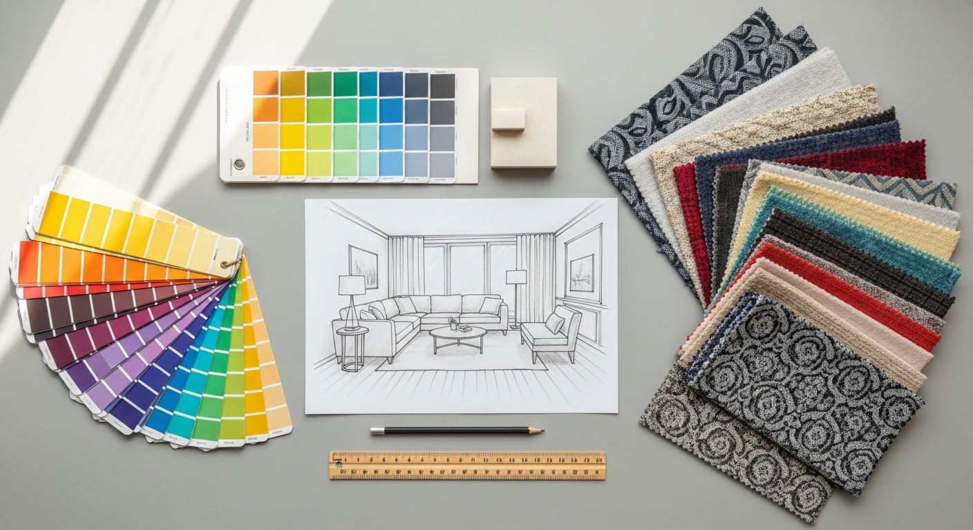
One of the most critical technical divergences between print and digital design lies in their respective color models and resolution requirements. These technical distinctions profoundly influence how designers prepare their visual assets and what they can expect in terms of final output fidelity. For print design, the industry standard color model is CMYK (Cyan, Magenta, Yellow, Key/Black). This is a subtractive color model, meaning colors are created by subtracting light from a white background, mirroring how ink absorbs light on paper. When designing for print, accuracy in CMYK conversion is paramount. What appears vibrant on a screen (which uses RGB) may look dull or different once printed in CMYK due to the smaller color gamut of the latter. Designers must often work with color swatches, proofs, and printer profiles to ensure color consistency, a process that requires a deep understanding of pre-press production. Furthermore, print demands high resolution, typically measured in DPI (dots per inch). For most professional print jobs, images need to be at least 300 DPI at their intended print size to avoid pixelation and ensure crisp detail. A lower DPI would result in a blurry or jagged image when printed. Elements like bleed (extending design beyond the trim edge) and trim lines are also crucial considerations to prevent unwanted white edges after the physical cutting process, adding another layer of technical precision to the print workflow.
Digital design, conversely, operates predominantly within the RGB (Red, Green, Blue) color model. This is an additive color model, where colors are created by adding light, much like how pixels on a screen emit light. RGB offers a much wider color gamut than CMYK, allowing for brighter, more saturated colors that are ideal for screen display. Designers working in digital environments will typically specify colors using hexadecimal codes (e.g., #FF0000 for red) or RGB values. Since screens are illuminated, the perception of color can vary based on device calibration, screen type, and ambient lighting, making absolute color consistency a perpetual challenge across different user experiences. Resolution in digital design is measured in PPI (pixels per inch). However, unlike print, the effective resolution for digital is often much lower, typically 72 PPI for web graphics, because screens display pixels directly. Higher PPI for digital assets would only result in larger file sizes without a noticeable improvement in visual quality on standard displays. The focus shifts from physical print quality to optimizing for web performance, ensuring fast loading times, and adapting to responsive design principles, where layouts fluidly adjust to various screen sizes. This responsive approach is fundamental to providing a consistent user experience across the myriad devices people use to consume digital content. The goal is not just visual appeal but also functional efficiency and universal accessibility.
Interaction, User Experience, and Dynamic Content: Beyond the Static Page
Digital design, however, thrives on interactivity and dynamism. It invites users to actively participate in their experience. Hyperlinks allow non-linear navigation, animations guide attention and communicate processes, videos and audio enhance storytelling, and forms enable direct input and feedback. This is where the principles of What Is UX Design And Why It Matters become critically important. UX (User Experience) design, a discipline almost exclusive to the digital realm, focuses on creating products that provide meaningful and relevant experiences to users. It encompasses the entire process of acquiring and integrating a product, including aspects of branding, design, usability, and function. A good UX designer considers how a user feels when interacting with a digital interface – is it intuitive? Is it efficient? Is it enjoyable? For example, a website isn’t just a collection of static pages; it’s a carefully crafted journey with calls to action, navigation menus, search functions, and personalized content, all designed to guide the user towards a specific goal. Digital designers must think beyond aesthetics to consider user flows, information architecture, accessibility, and responsiveness across various devices. They build prototypes, conduct user testing, and iterate designs based on feedback and analytical data, constantly refining the interactive experience. The ability to track user behavior and gather data is a game-changer, allowing for continuous optimization that is impossible in the static world of print. The dynamism of digital content means that a design is never truly “finished” but rather evolves and improves over time based on user engagement and changing requirements.
Workflow, Tools, and Design Principles: Adapting to the Canvas
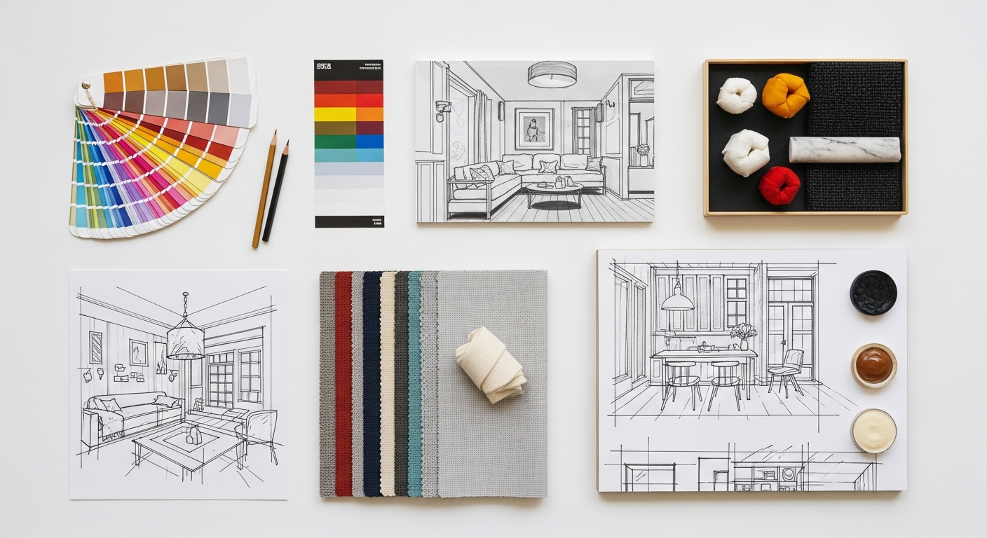
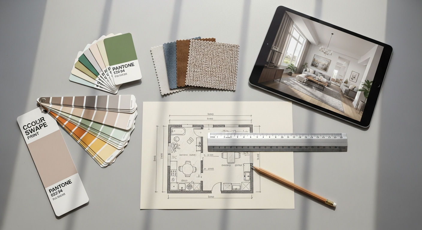
The operational workflows and preferred software tools for print and digital design diverge significantly, reflecting the unique demands of their respective mediums. In print design, the workflow traditionally involves meticulous planning and precision. Designers often begin with sketches and mock-ups, followed by layout creation in specialized software like Adobe InDesign, which is purpose-built for multi-page documents, brochures, and magazines. Vector graphics, ideal for logos and illustrations that need to scale without losing quality, are typically created in Adobe Illustrator. Raster images, such as photographs, are edited and optimized in Adobe Photoshop. A critical part of the print workflow involves understanding pre-press requirements: setting up correct bleeds, margins, color profiles (CMYK), and ensuring fonts are embedded or outlined. Proofing, both digital and physical, is an essential stage to catch errors before mass production, as errors in print are costly and irreversible. The design process tends to be more linear and less iterative once the final files are sent to the printer. Attention to detail in typography, kerning, leading, and the physical properties of paper are paramount. The design principles often emphasize readability, visual hierarchy for a fixed layout, and creating a cohesive aesthetic that translates effectively onto a tangible surface. Designers must also consider the cost implications of color usage (e.g., spot colors vs. CMYK), paper stock, and finishing techniques like embossing or foiling.
Digital design workflow, conversely, is often more agile and iterative. Designers might start with wireframes and user flows before moving to visual design. Tools like Figma, Sketch, or Adobe XD are favored for their collaborative features, prototyping capabilities, and focus on screen-based design. These tools facilitate the creation of user interfaces (UI) and user experiences (UX), allowing designers to simulate interactivity and test user journeys before development. While Photoshop and Illustrator still play roles in asset creation (e.g., icons, images), the primary focus shifts to optimizing assets for web performance – compressing images, using SVG for scalable vectors, and ensuring responsiveness across various screen sizes. Unlike print, digital design requires a keen understanding of web standards, accessibility guidelines, and the limitations and capabilities of different platforms (web, iOS, Android). The iterative nature means that designs can be rapidly tested, refined, and deployed, often in cycles of feedback and improvement. Designers frequently collaborate closely with developers, ensuring that their visual designs are technically feasible and performant. Design principles in the digital realm extend beyond aesthetics to include usability, accessibility, and responsiveness. Considerations like touch targets for mobile, clear calls to action, intuitive navigation, and consistent branding across various digital touchpoints are critical. Furthermore, the ability to track user engagement through analytics allows for continuous post-launch optimization, a luxury not afforded to print.
Audience Engagement, Distribution, and Longevity: Reaching Your World
The strategies for audience engagement, methods of distribution, and the inherent longevity of design outputs also present stark contrasts between print and digital. Print design typically targets a more defined and often geographically localized audience. Its distribution channels are physical: mail, newsstands, retail stores, or direct handouts at events. This focused distribution can create a sense of exclusivity or targeted relevance. For example, a local community newspaper or a university prospectus reaches a specific demographic with tailored content. The engagement with print is often deep and sustained; a reader might spend hours with a book or magazine, returning to it multiple times. This deliberate, unhurried consumption fosters a different kind of connection, often leading to a higher perceived value or authority. The longevity of print is literal: a physical object can endure for years, becoming a keepsake or a reference document. A beautifully bound art book or a limited-edition poster can retain its aesthetic and informational value for decades, embodying a sense of permanence and legacy. However, updating content in print is costly and time-consuming, making it unsuitable for information that changes rapidly. Its reach is limited by the logistics and cost of physical distribution, making global dissemination a significant undertaking.
Digital design, by its very nature, offers unparalleled global reach and instantaneous distribution. Content can be published online and accessed by anyone with an internet connection, anywhere in the world, at any time. This allows for massive audience engagement, often facilitated by shareable content and viral potential. Social media platforms, websites, and email campaigns are designed to reach vast, diverse audiences, and their effectiveness can be measured in real-time through analytics. For instance, creating effective Social Media Graphics Design Guide content for platforms like Instagram or LinkedIn requires understanding platform-specific dimensions, audience demographics, and engagement patterns to maximize reach and interaction. Digital engagement is often characterized by its breadth rather than depth; users might skim content, interact briefly, or share it quickly. While this can lead to massive exposure, it also means designers must create compelling visuals and concise messages that capture attention instantly. The longevity of digital content is fluid. While it can theoretically exist online indefinitely, its relevance and visibility are constantly challenged by new content, algorithm changes, and evolving trends. A website design from 2026 might look dated by 2030, necessitating redesigns and updates. However, this fluidity also allows for instant updates, corrections, and iterative improvements, making digital the ideal medium for dynamic information, news, and interactive services. The ability to personalize content for individual users further enhances engagement, a feature largely impossible in static print.
Measuring Success and Iteration: The Feedback Loop
The methods for measuring success and the opportunities for iteration represent another fundamental divergence between print and digital design. In the print world, measuring success is often an indirect and delayed process. Metrics might include circulation numbers, sales figures, subscription rates, or reader surveys. Gauging the direct impact of a specific design element can be challenging. For instance, did the new font choice in a magazine lead to increased readership, or was it the compelling article content? Feedback is typically gathered retrospectively, making it difficult and expensive to implement changes. Once a print run is complete, the design is fixed. Any identified issues, whether typographical errors or ineffective visual layouts, cannot be corrected without incurring significant reprinting costs. This necessitates a “get it right the first time” mentality, placing immense pressure on the pre-press proofing and approval stages. The long feedback loop means that designers must rely heavily on their experience, established design principles, and rigorous pre-production checks to minimize errors and maximize the chances of success, often without direct quantitative data on user interaction with the design itself.
Digital design, in stark contrast, offers a wealth of direct, real-time data for measuring success and facilitating continuous iteration. Analytics tools (like Google Analytics, Adobe Analytics, or platform-specific insights for social media) track every user interaction: clicks, views, scroll depth, time on page, conversion rates, bounce rates, and more. This data provides invaluable insights into what’s working and what isn’t. A/B testing allows designers to compare two versions of a design element (e.g., button color, headline wording) to see which performs better with real users. User feedback can be collected through surveys, usability testing, and heatmaps that show where users are clicking or looking on a page. This robust feedback loop empowers designers to make data-driven decisions and iterate rapidly. If a call-to-action button isn’t generating enough clicks, its color, size, or placement can be adjusted and re-tested almost immediately. This continuous improvement cycle is a hallmark of digital product development. An essential tool for this iterative process is the ability to How To Conduct A Heuristic Evaluation. A heuristic evaluation is a systematic inspection method for computer user interfaces to identify usability problems. It involves a small set of evaluators examining the interface and judging its compliance with recognized usability principles (heuristics). This method helps uncover issues like consistency, error prevention, flexibility, and aesthetic design, enabling designers to refine digital experiences before extensive user testing or launch. The ability to measure, analyze, and quickly adapt designs based on real-world performance is a monumental advantage of digital design, ensuring that products remain relevant, effective, and user-centric in an ever-evolving digital landscape.
The Evolving Landscape: Blurring Lines and Future Prospects
As we navigate the mid-2020s, the once clear-cut distinctions between print and digital design are beginning to blur, giving rise to fascinating hybrid approaches. While their core technical and conceptual differences remain, designers are increasingly leveraging the strengths of one medium to enhance the other. QR codes on print materials lead users to dynamic digital content, augmented reality (AR) apps bring static print pages to life with interactive overlays, and digital publications are designed with the aesthetic rigor traditionally reserved for high-end print. This convergence signifies not the obsolescence of one over the other, but rather an evolution towards integrated communication strategies. A marketing campaign in 2026 might deploy a beautifully designed print ad to capture initial attention and establish brand authority, then seamlessly transition the user to an interactive digital experience via a QR code or specific URL for deeper engagement and conversion tracking. Conversely, digital content might be designed with print-friendly layouts, allowing users to easily print articles or documents for offline reading, demonstrating a reciprocal relationship.
The future of design will undoubtedly demand a more versatile and cross-disciplinary designer—one who not only understands the nuances of CMYK versus RGB, but also grasps the intricacies of UX design, responsive layouts, and performance optimization. Specialization will continue to exist, but a foundational understanding of both realms will become increasingly valuable. The goal is no longer to choose between print or digital, but to strategically deploy each where its strengths best serve the overall communication objective. Print will continue to thrive in areas where tangibility, permanence, and a focused sensory experience are paramount—think luxury branding, art books, limited editions, or official documents. Digital will dominate where interactivity, real-time updates, broad reach, and data-driven iteration are essential—websites, apps, social media, and dynamic advertising. The most impactful designs of tomorrow will likely be those that masterfully orchestrate both mediums, creating holistic and memorable experiences that resonate across all touchpoints, proving that print and digital are not adversaries but powerful allies in the grand narrative of visual communication.
Frequently Asked Questions
Recommended Resources
For more on print design vs, see How To Create A Landing Page That Converts on Eamped.
Check out Best Standing Desks For Home Office 2026 on Bookmark Sharer for a deeper dive.