The Foundation: Understanding Your Brand and Audience
Before you even open a design tool, the most crucial step in creating effective social media graphics is to deeply understand two core elements: your brand identity and your target audience. These two pillars will inform every design decision you make, from color palettes to typography, ensuring your visuals are not just aesthetically pleasing but also strategically impactful.
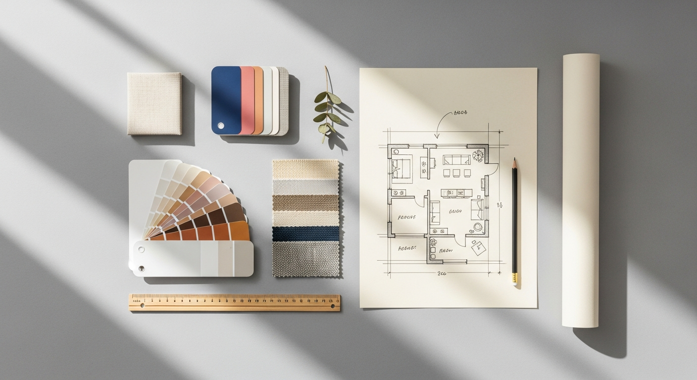
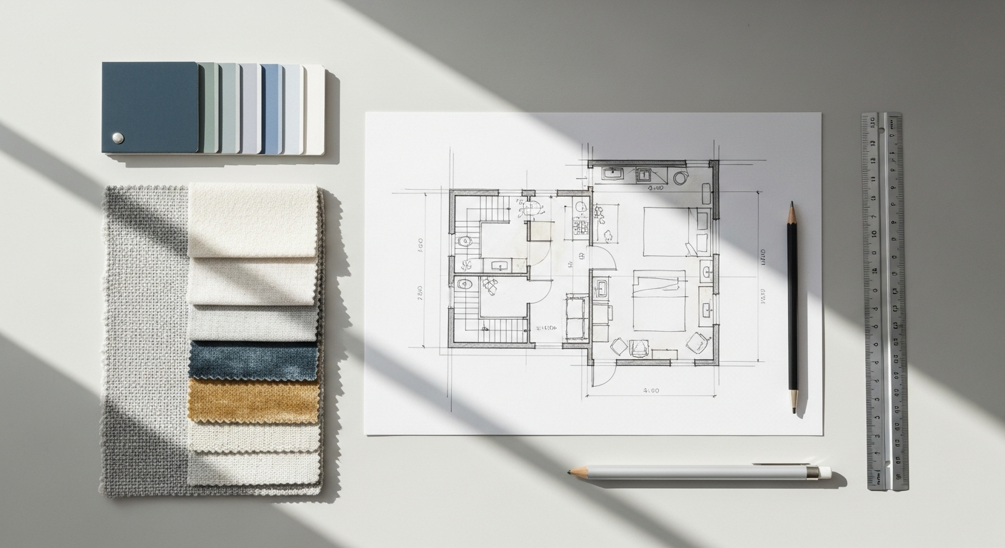
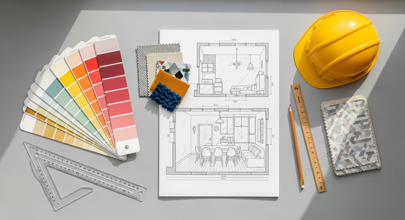
Defining Your Brand Identity Visually
Your brand identity is more than just a logo; it’s the sum total of how your business is perceived. For creative professionals, this is particularly vital, as your brand often reflects your personal style, ethos, and unique design philosophy. When translating this into social media graphics, consider:
- Logo: Ensure your logo is consistently applied, clear, and appropriately sized for various platforms. It’s your signature, a mark of authenticity and professionalism.
- Color Palette: Beyond primary brand colors, establish a secondary and tertiary palette that complements your core hues. These colors should evoke the emotions and atmosphere associated with your brand (e.g., calming blues for wellness spaces, vibrant yellows for playful designs, earthy tones for sustainable architecture). Consistency in color use builds instant recognition.
- Typography: Select a set of fonts – typically one for headings and another for body text – that reflects your brand’s personality. Is it elegant and refined, bold and modern, or quirky and whimsical? Ensure these fonts are legible on small screens and consistent across all your graphics.
- Imagery Style: What kind of photography or illustration style aligns with your brand? Do you prefer minimalist shots, rich textures, abstract art, or realistic renders? Maintaining a consistent visual style across your images helps create a cohesive feed that feels curated and professional.
- Tone of Voice: While not strictly visual, your brand’s tone of voice influences the textual elements within your graphics. Is it informative, inspirational, humorous, or luxurious? The visual design should complement this verbal tone, creating a harmonious message.
Developing a comprehensive brand style guide, even a simple one, can be immensely helpful. This document outlines all these visual elements, ensuring anyone creating graphics for your brand maintains a unified aesthetic.
Audience Analysis: Designing for Who You Serve
Understanding your audience is akin to understanding the user in a UX design context. Just as What Is UX Design And Why It Matters emphasizes creating user-centric experiences, social media graphics must be audience-centric. Who are you trying to reach? What are their preferences, pain points, and aspirations? Consider:
- Demographics: Age, gender, location, income level, occupation. For instance, a graphic targeting young, urban professionals might differ significantly from one aimed at established homeowners in suburban areas.
- Psychographics: Interests, values, lifestyle, personality traits. Are your clients interested in sustainable living, luxury aesthetics, minimalist design, or vibrant, eclectic spaces? Your graphics should speak to these intrinsic motivations.
- Platform Usage: Which social media platforms do they frequent most? Each platform has its own culture and visual language. Instagram is highly visual and aspirational, Pinterest is discovery-focused, LinkedIn is professional and informative, while TikTok thrives on short, engaging videos.
- Content Preferences: Do they respond better to inspirational quotes, behind-the-scenes glimpses, educational content, polls, or product showcases? Tailor your graphics to match these preferences.
By understanding your audience deeply, you can design graphics that resonate, evoke emotion, and drive engagement. This user-centric approach ensures your visuals are not just seen, but felt and acted upon.
Essential Design Principles for Social Media Graphics
Great social media graphics are not merely a collection of images and text; they are carefully constructed visual compositions that employ fundamental design principles to communicate effectively and aesthetically. Mastering these principles will elevate your graphics from amateur to professional, ensuring they capture attention and convey your message with clarity.
Visual Hierarchy: Guiding the Eye
Visual hierarchy is the arrangement of elements in a way that implies importance. It dictates the order in which the human eye perceives what it sees. Just as in a well-designed interior space where the focal point draws your attention, effective social media graphics guide the viewer’s eye through the content, ensuring the most crucial information is absorbed first. This principle is deeply rooted in What Is UX Design And Why It Matters, as it directly impacts usability and comprehension. To establish strong visual hierarchy:
- Size: Larger elements naturally attract more attention. Use size to emphasize headlines, key calls-to-action, or the most important visual.
- Color and Contrast: Bright, saturated colors tend to stand out against muted backgrounds. Use contrasting colors to highlight critical information or to separate distinct sections.
- Placement: Elements placed at the top or center of a graphic often receive more attention. Strategic placement can direct the viewer’s gaze.
- Typography: Varying font sizes, weights (bold, regular), and styles can create hierarchy within text. A bold headline, followed by a lighter sub-headline, and then standard body text, clearly defines importance.
- Whitespace: Giving important elements more breathing room (whitespace) around them makes them stand out and prevents visual clutter.
By consciously applying visual hierarchy, you ensure your audience processes your message efficiently, leading to better understanding and engagement.
Color Theory: Psychology and Branding
Colors evoke emotions and convey meaning. For an interior design blog, understanding color theory is second nature, but its application to social media graphics is equally critical. Use colors intentionally to reinforce your brand identity and influence audience perception:
- Brand Consistency: Stick to your established brand color palette. This builds recognition and strengthens brand association.
- Emotional Impact: Red signifies energy or urgency; blue often conveys trust and calm; green relates to nature and growth; yellow can be optimistic or attention-grabbing. Choose colors that align with the message and emotion you want to evoke.
- Contrast and Accessibility: Ensure sufficient contrast between text and background colors for readability, a key aspect of accessibility and good UX. Tools exist to check color contrast ratios, which is vital for inclusivity.
- Harmonious Combinations: Learn about color schemes (monochromatic, analogous, complementary, triadic) to create visually pleasing and balanced graphics.
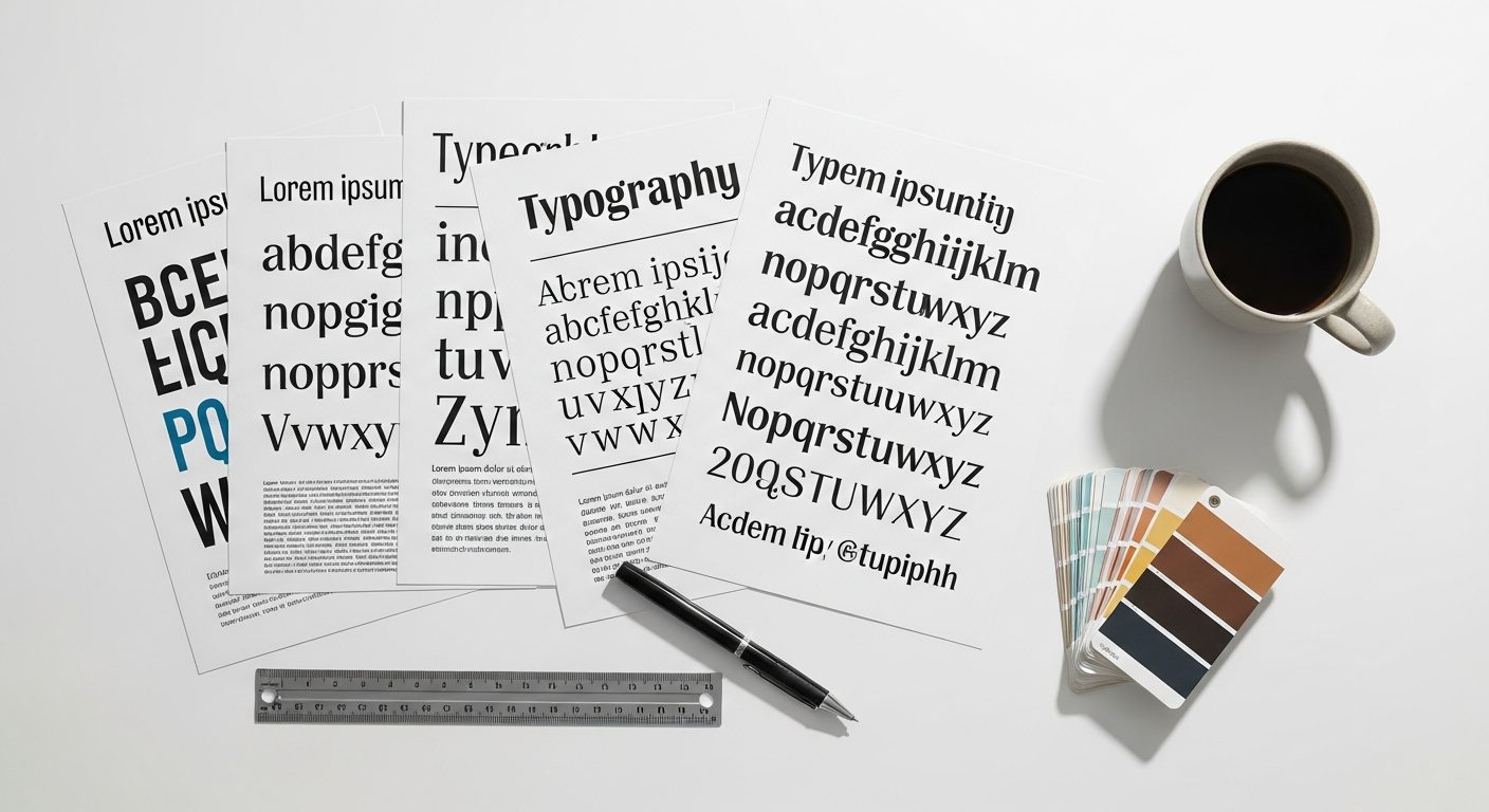
Typography: Readability and Personality
Typography is the art and technique of arranging type to make written language legible, readable, and appealing. On social media, where attention spans are fleeting, clear typography is non-negotiable.
- Legibility: Choose fonts that are easy to read, especially on small screens. Avoid overly decorative or thin fonts for body text.
- Readability: Ensure adequate line spacing (leading) and letter spacing (kerning). Long lines of text can be daunting; break them up.
- Brand Personality: Your font choices should reflect your brand’s character. A serif font might convey tradition and elegance, while a sans-serif font often suggests modernity and simplicity.
- Limit Font Usage: Typically, use no more than two or three fonts per graphic – one for headings, one for body text, and perhaps an accent font. Too many fonts create visual chaos.
- Hierarchy with Type: Use varying font sizes, weights (bold, light), and capitalization to create visual hierarchy within your text, guiding the viewer’s eye to the most important information first.
Composition and Layout: Structure and Balance
Composition refers to the arrangement of visual elements within a design. A strong composition creates balance, harmony, and a clear path for the viewer’s eye. Principles to consider include:
- Rule of Thirds: Imagine dividing your graphic into nine equal sections by two horizontal and two vertical lines. Placing key elements along these lines or at their intersections can create more dynamic and engaging compositions than simply centering everything.
- Balance: This can be symmetrical (elements are evenly distributed on either side of a central axis) or asymmetrical (elements of different weights are balanced to create equilibrium).
- Proximity: Group related items together to create a sense of unity and reduce clutter.
- Alignment: Aligning elements (left, right, center, top, bottom) creates a clean, organized, and professional look. Misaligned elements appear sloppy.
- Repetition: Repeating visual elements such as colors, shapes, textures, or patterns creates a sense of unity and rhythm.
Whitespace: Clarity and Focus
Whitespace (or negative space) is the empty area around and between elements in a design. Far from being “empty,” whitespace is a powerful design tool that:
- Improves Readability: It provides breathing room for text, making it easier to read and comprehend.
- Highlights Key Elements: By isolating an element with whitespace, you draw attention to it, emphasizing its importance.
- Reduces Clutter: It prevents designs from looking busy and overwhelming, creating a sense of calm and sophistication.
- Enhances Aesthetics: Generous use of whitespace often conveys a sense of luxury, minimalism, and modernity, which is particularly relevant for many creative brands.
Image Quality: High-Resolution and Relevant
This may seem obvious, but using high-resolution, professional-quality images is non-negotiable. Pixelated, blurry, or low-quality images immediately undermine your brand’s credibility, especially in visual industries like interior design.
- High Resolution: Always use images that are clear and sharp. If you’re designing for a large format (e.g., a LinkedIn banner), ensure the image source is high-res enough to scale without distortion.
- Relevance: Images should always be relevant to your message and brand. For interior designers, this means showcasing your work, inspiring spaces, or behind-the-scenes glimpses that align with your aesthetic.
- Licensing: Ensure you have the proper rights or licenses for any stock photography or graphics you use.
By meticulously applying these essential design principles, your social media graphics will not only look professional but will also communicate your message with maximum impact, fostering greater engagement and brand recall.
Platform-Specific Optimization: Sizing, Formats, and Best Practices
General Principles for All Platforms
- Aspect Ratio Matters: While exact pixel dimensions change, understanding common aspect ratios (e.g., 1:1 square, 4:5 vertical, 16:9 horizontal) will help you design more flexibly.
- Safe Zones: Design with “safe zones” in mind, especially for profile pictures or cover photos where text or important elements might be obscured on different devices. Keep critical information away from edges.
- File Formats: JPEG is generally good for photos (smaller file size), while PNG is better for graphics with text, logos, or transparent backgrounds (retains sharpness). GIFs are great for short, looping animations.
- Text Readability: Any text on your graphic must be easily readable on a mobile device, which is where the majority of social media consumption occurs.
- Mobile-First Design: Always preview your graphics on a mobile device before posting. What looks good on a desktop screen might be illegible or cluttered on a phone. This is a core tenet of good UX design – designing for the primary user context.
Platform-Specific Guidelines for 2026
While exact pixel dimensions can shift slightly over time, the general aspect ratios and best practices tend to remain consistent. Here are the optimal guidelines for 2026:
- Profile Picture: 170×170 pixels (displays as 170×170 on desktop, 128×128 on smartphones). Renders as a circle.
- Cover Photo: 851×315 pixels (desktop), 640×360 pixels (smartphone). Keep important content in the center to avoid cropping.
- Image Post (Link Share): 1200×630 pixels (recommended).
- Image Post (Standalone):
- Square: 1200×1200 pixels (1:1 aspect ratio).
- Landscape: 1200×630 pixels (1.91:1 aspect ratio).
- Portrait: 720×960 pixels (4:5 aspect ratio).
- Facebook Stories: 1080×1920 pixels (9:16 aspect ratio). Leave space at the top and bottom for profile icon and calls-to-action.
- Facebook Ads: Varies by ad type, but generally follow image post guidelines, often with a 1:1 or 4:5 aspect ratio for feed ads. Adhere to the “20% text rule” for image ads (though Facebook’s enforcement has become more flexible, it’s still a good principle for clarity).
Instagram is the visual powerhouse, making high-quality graphics absolutely critical.
- Profile Picture: 320×320 pixels (displays as 110×110). Renders as a circle.
- Feed Photos/Videos:
- Square: 1080×1080 pixels (1:1 aspect ratio).
- Landscape: 1080×566 pixels (1.91:1 aspect ratio).
- Vertical: 1080×1350 pixels (4:5 aspect ratio). This vertical format often gets more screen real estate.
- Instagram Stories/Reels: 1080×1920 pixels (9:16 aspect ratio). This full-screen immersive format is dominant.
- Carousel Posts: All images in a carousel should have the same aspect ratio (1:1, 4:5, or 1.91:1) and dimensions (e.g., 1080×1080 for square).
- Reel Cover Photo: After uploading a Reel, you can select a frame from the video or upload a custom cover. The aspect ratio for the cover in the feed is 1:1 (1080×1080), but the full Reel cover (when viewed on the Reel page) is 9:16 (1080×1920). Design your cover for both contexts.
Pinterest is a visual search engine, where vertical, high-quality images dominate. Users are actively looking for inspiration and solutions.
- Profile Picture: 165×165 pixels.
- Standard Pin: 1000×1500 pixels (2:3 aspect ratio). This is the most common and recommended size.
- Long Pin: 1000×2100 pixels (or more, but ideally keep ratio around 1:2.1). Use sparingly, as excessively long pins can be truncated.
- Story Pins: 1080×1920 pixels (9:16 aspect ratio).
- Collection Pins: Ideal for showcasing multiple products or ideas. Uses multiple images within one pin.
Infographic Design Tips And Best Practices are particularly relevant for Pinterest. Think about how to convey information clearly and attractively within a single visual, using minimal text and strong visuals to grab attention and encourage clicks.
LinkedIn is a professional network, so your graphics should reflect a polished, authoritative, and informative tone.
- Profile Picture: 400×400 pixels (minimum).
- Personal Profile Background Photo: 1584×396 pixels. Keep important elements centered as it crops differently on mobile.
- Company Logo: 300×300 pixels (square).
- Company Cover Image: 1128×191 pixels.
- Image Post:
- Square: 1200×1200 pixels.
- Landscape: 1200×627 pixels.
- Article Cover Image: 1200×644 pixels.
Twitter (X)
Twitter is fast-paced, so graphics need to be eye-catching and concise.
- Profile Photo: 400×400 pixels.
- Header Photo: 1500×500 pixels.
- Image in Tweet: 1600×900 pixels (16:9 aspect ratio) is optimal for landscape, but 1:1 and 4:5 vertical also work well.
TikTok
While primarily video-focused, static graphics (like text overlays, opening screens, or thumbnails) play a role.
- Profile Photo: 200×200 pixels (minimum).
- Video Dimensions: 1080×1920 pixels (9:16 aspect ratio).
- Thumbnail: Design a compelling frame from your video or create a custom static graphic that entices viewers.
By adhering to these platform-specific guidelines, you ensure your meticulously designed graphics are displayed optimally, enhancing your brand’s professional appearance and maximizing their impact across all your social media channels in 2026.
Crafting Engaging Content: Beyond Just Pretty Pictures
While aesthetic appeal is crucial, truly effective social media graphics go beyond mere prettiness. They are strategic tools designed to engage your audience, convey information, and drive action. For creative businesses like Layout Scene, this means infusing your visuals with purpose, storytelling, and clear calls-to-action.
Call-to-Action (CTA) Integration
Every graphic should ideally have a purpose. What do you want your audience to do after seeing your post? A clear Call-to-Action (CTA) guides them. Without one, even the most stunning visual might leave viewers admiring but not acting.
- Be Specific: Instead of “Learn More,” try “Download Our Free E-Book,” “Shop the New Collection,” “Book a Consultation,” or “Visit Our Project Gallery.”
- Placement: Place your CTA prominently but not intrusively. Often, a button-like element or bold text at the bottom or center of the graphic works well.
- Contrast: Ensure your CTA stands out through color, font size, or a distinct background.
- Urgency/Benefit: Sometimes adding a sense of urgency (“Limited Time Offer”) or a clear benefit (“Transform Your Space”) can boost effectiveness.
Remember that the graphic is often just the first step; the post caption and the link provided will elaborate and complete the conversion path.
Storytelling Through Visuals
Humans are wired for stories. Your social media graphics can be powerful narrative tools, especially for interior design where transformation and aspiration are key themes. Instead of just showcasing a finished room, consider:
- Before & After: A classic and highly effective storytelling format. Show the journey of a space.
- Process/Behind-the-Scenes: Share snippets of your design process, mood boards, material selections, or installation. This builds trust and gives a human touch.
- Client Testimonials: Overlay a compelling quote from a satisfied client onto a beautiful image of their transformed space.
- Problem/Solution: Visually present a common design dilemma (e.g., “Small living room?”) followed by a graphic offering a clever design solution.
- Series/Carousel Posts: Use multiple slides in a carousel to unfold a mini-story, step-by-step guide, or a gallery of related images.
Each graphic should contribute to a larger narrative about your brand, expertise, and the value you provide.
Text Overlays: Keep it Concise and Readable
Text on graphics can be highly effective for conveying quick messages, quotes, statistics, or headlines. However, it’s easy to get it wrong.
- Less is More: Social media is fast. Keep text minimal and to the point. The graphic should complement the caption, not replace it entirely.
- High Contrast: Always ensure a strong contrast between your text and background. Avoid busy backgrounds that make text illegible. Use overlays or solid color blocks behind text if necessary.
- Legibility: Choose clear, readable fonts at an appropriate size. Test on mobile.
- Hierarchy: Use font size, weight, and color to establish hierarchy, guiding the eye to the most important words first.
- Brand Fonts: Stick to your brand’s chosen typography for consistency.
Incorporating Multimedia: Short Videos and GIFs
While the focus of this guide is graphics, it’s important to acknowledge the power of motion. Short videos and GIFs often outperform static images in terms of engagement on many platforms. Consider:
- Animated Graphics: Simple animations of text appearing, elements sliding in, or subtle movements can make a static graphic more dynamic.
- Short Video Tours: A quick 15-30 second walk-through of a newly completed project.
- Time-Lapse: Show a design installation or room transformation in fast motion.
- Boomerangs/Short Loops: Quick, fun, attention-grabbing clips.
These formats can inject energy and life into your content strategy, providing an engaging alternative to purely static images.
Accessibility Considerations: Alt Text and Color Contrast
Designing for accessibility is not just good practice; it’s a moral imperative and reflects a professional, inclusive brand. Integrating accessibility into your social media graphics means thinking about users with visual impairments or other disabilities.
- Alt Text: Always add descriptive alt text to your images when posting. This text is read aloud by screen readers, describing the image content to visually impaired users. Be descriptive and concise (e.g., “Luxurious modern living room with large sectional sofa, glass coffee table, and abstract art”).
- Color Contrast: As mentioned earlier, ensure sufficient contrast between text and background. Tools like WebAIM’s Contrast Checker can help you verify compliance with WCAG guidelines.
- Text Size: Avoid excessively small text that is difficult for anyone to read, regardless of vision.
These practices align directly with the principles of What Is UX Design And Why It Matters, ensuring your content is usable and enjoyable for the widest possible audience.
Many of these principles, especially around conveying information clearly and concisely, draw parallels with Infographic Design Tips And Best Practices. When designing a social media graphic that needs to communicate data, steps, or features, think like an infographic designer: simplify complex information, use icons, ensure clear visual flow, and chunk content into easily digestible segments. This strategic approach ensures your graphics are not just visually appealing but also highly effective at communicating your brand’s value and engaging your audience.
Tools, Workflow, and Staying Ahead in 2026
In the fast-evolving digital landscape of 2026, efficient workflows, the right tools, and a commitment to continuous learning are indispensable for maintaining a cutting-edge social media presence. For creative professionals, leveraging technology effectively means more time for actual design work and less time struggling with graphic creation.
Choosing the Right Design Tools
The “best” tool often depends on your skill level, budget, and specific needs. Here’s a breakdown of popular options:
- Canva:
- Pros: Extremely user-friendly, vast library of templates, stock photos, and elements. Excellent for quick, professional-looking graphics with minimal design experience. Many features for team collaboration.
- Cons: Limited customization compared to professional software. Can be easy to create generic-looking designs if templates aren’t adapted significantly.
- Best for: Small businesses, marketers, individuals, rapid content creation, maintaining brand consistency with pre-set templates.
- Adobe Creative Suite (Photoshop, Illustrator, InDesign):
- Pros: Industry-standard professional tools offering unparalleled control, customization, and quality. Photoshop for photo editing and raster graphics, Illustrator for vector graphics (logos, illustrations), InDesign for multi-page layouts (though less common for single social graphics).
- Cons: Steep learning curve, subscription cost, can be overkill for very simple graphics.
- Best for: Professional graphic designers, agencies, brands needing highly customized, unique, and high-quality visuals, complex photo manipulation, or original illustrations.
- Figma:
- Pros: Cloud-based, excellent for collaborative design, strong vector editing capabilities, good for creating scalable graphics and prototyping. Increasingly popular for UI/UX and web design, but also highly capable for social media.
- Cons: Primarily vector-based, so less ideal for heavy photo manipulation. Learning curve for those unfamiliar with vector software.
- Best for: Design teams, UI/UX designers, those who appreciate a collaborative, web-based workflow, creating consistent design systems.
- Other Tools:
- Adobe Express (formerly Spark): A simpler, more template-driven version of Adobe tools, great for quick social graphics and videos.
- Desygner/Crello: Canva alternatives with similar template-based approaches.
- Snappa: Focuses on speed for social media graphics.
Establishing an Efficient Workflow
A streamlined workflow is key to consistency and productivity.
- Brand Kit/Templates: Create a brand kit within your chosen tool (Canva, Figma, etc.) with your logos, color palettes, fonts, and common assets. Develop templates for frequently used graphic types (e.g., quote graphics, event announcements, blog post promotions). This ensures consistency and saves immense time.
- Content Calendar: Plan your social media content well in advance. This allows you to batch design tasks, align visuals with campaigns, and maintain a consistent posting schedule.
- Batching: Design multiple graphics for the week or month in one dedicated session. This allows for greater efficiency and maintains a cohesive visual theme.
- Asset Management: Organize your photos, illustrations, and design elements in a structured way (e.g., cloud storage like Google Drive, Dropbox) so they are easily accessible.
- Review and Approval Process: If working with a team or clients, establish a clear process for reviewing and approving graphics before they go live.
Team Collaboration
For larger teams or agencies, collaborative tools are a game-changer. Figma excels here, allowing multiple designers to work on the same file simultaneously. Canva also offers robust team features for sharing designs, brand kits, and managing approvals. Effective collaboration ensures brand consistency and efficient division of labor.
Staying Updated with Trends in 2026
The social media landscape is constantly evolving. What was popular last year might be passé in 2026. Staying ahead means:
- Monitoring Platform Updates: Social media platforms frequently introduce new features (e.g., new sticker types, interactive elements, video formats). Integrate these into your strategy where appropriate.
- Observing Industry Trends: Pay attention to what successful brands (especially in your niche) are doing visually. What aesthetic trends are emerging in interior design, and how can they translate to your graphics?
- AI Integration: AI tools are increasingly impacting design. AI-powered image generation (e.g., Midjourney, DALL-E) can inspire or even create unique visual elements, while AI-driven content optimization tools can suggest improvements. Experiment with how AI can augment your creative process, but always maintain your unique brand voice and aesthetic.
- Interactive Elements: Look for opportunities to use polls, quizzes, or interactive stickers in stories or posts to boost engagement.
- Augmented Reality (AR) Filters: For brands in creative industries, exploring custom AR filters on Instagram or Snapchat can offer a unique, immersive way to engage your audience and showcase your style.
Measuring Performance: Analytics
Recommended Resources
Related reading: How To Build A Founding Team For Your Startup (Eamped).
You might also enjoy How To Set Up A Home Network from Bookmark Sharer.