
What Is UX Writing and Why It Matters for Your Creative Endeavors
At its core, UX writing is the practice of crafting all the text that users interact with within a digital product or service. This includes everything from button labels, menu items, and error messages to onboarding instructions, tooltips, and confirmation screens. Unlike traditional copywriting, which often focuses on persuasion and marketing, UX writing prioritizes clarity, conciseness, and user-centricity. Its primary goal is to make the user’s journey as smooth, efficient, and enjoyable as possible, removing friction and building trust through thoughtful, empathetic language.
To truly appreciate the significance of UX writing, it’s essential to understand its place within the broader discipline of UX design. Just as an architect designs a building with the user’s movement and comfort in mind, What Is UX Design And Why It Matters outlines the comprehensive approach to creating products that provide meaningful and relevant experiences to users. UX writing is the voice within that experience, the silent guide that whispers instructions, offers reassurance, and celebrates success. Without clear, intuitive language, even the most beautifully designed interface can leave users confused or frustrated. Imagine walking into a stunningly designed room with no clear indication of where the entrance is, what switches do, or how to operate anything – that’s the digital equivalent of poor UX writing.
The impact of effective UX writing is profound. It directly influences key metrics such as user satisfaction, task completion rates, and conversion rates. When users understand what’s happening, what’s expected of them, and what the outcome of their actions will be, they are more likely to complete their goals and return to your product. Conversely, confusing or ambiguous language can lead to high bounce rates, increased support requests, and a damaged brand reputation. In an era where digital interactions are paramount, investing in strong UX writing is investing in the success and longevity of your creative projects and digital offerings. It helps articulate your brand’s personality, fosters a sense of connection, and ultimately transforms a functional tool into a delightful experience.
Core Principles of Effective UX Writing

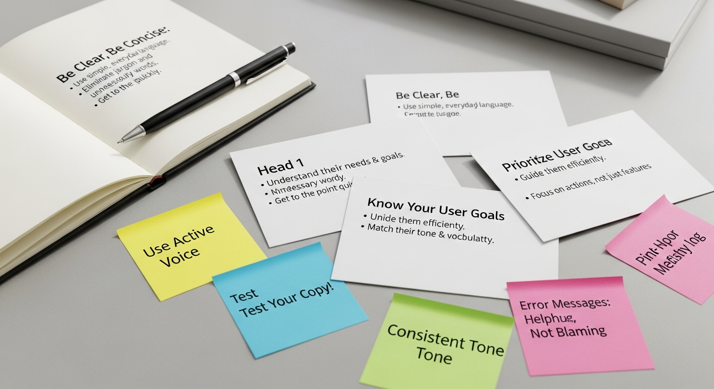
While the specific words may change from one project to another, the foundational principles of effective UX writing remain constant. These principles serve as a compass, guiding writers and designers toward creating text that truly serves the user.
-
Clarity: The paramount principle. UX copy must be instantly understandable, leaving no room for ambiguity or misinterpretation. Users should never have to guess what a button does or what an error message means. Use straightforward language and avoid jargon.
Example: Instead of “Initiate configuration parameters,” use “Set up your preferences.”
-
Conciseness: In digital interfaces, every word counts. Users are often scanning, not reading meticulously. Get straight to the point, remove unnecessary words, and convey information efficiently. Longer text can overwhelm and deter users.
Example: Instead of “Please click on the button below to proceed with the submission of your information,” use “Submit.”
- Consistency: Maintain a uniform voice, tone, and terminology across your entire product. Consistency builds familiarity and trust, making the interface feel cohesive and predictable. If you call something a “profile” in one place, don’t suddenly switch to “account settings” elsewhere. This extends to button styles, error message formats, and even capitalization.
-
User-Centricity: Always write from the user’s perspective. What do they need to know? What are they trying to accomplish? What questions might they have? Empathy is key here. Address the user directly (“You,” “Your”) to create a personal connection.
Example: Instead of “We have received your order,” use “Your order has been received.”
- Helpfulness: Good UX copy anticipates user needs and proactively offers guidance. This includes clear instructions, helpful tooltips, constructive error messages, and reassuring confirmation messages. The goal is to make the user feel supported, not abandoned.
- Accessibility: Ensure your writing is inclusive and accessible to all users, including those with disabilities. Use plain language, avoid complex sentence structures, and consider how screen readers will interpret your text. Provide alternative text for images and use proper semantic HTML.
-
Actionability: Guide users towards desired actions. Call-to-action (CTA) buttons should clearly state what will happen when clicked. Instructions should lead users step-by-step. The language should empower users to move forward confidently.
Example: Instead of “Click here,” use “Download Report” or “Explore Features.”
By adhering to these principles, UX writers can transform potentially frustrating interactions into smooth, intuitive, and even delightful experiences. These foundations ensure that every word contributes positively to the overall usability and emotional resonance of a digital product.
Practical UX Writing Tips for Crafting Engaging Experiences
- Know Your Audience Inside Out: Before writing a single word, invest time in understanding who your users are. What are their goals, pain points, technical proficiency, and emotional state when interacting with your product? Conduct user research, create personas, and analyze user feedback. This deep understanding informs not only the content but also the tone and complexity of your language. A banking app’s tone will differ significantly from a creative design tool’s tone.
-
Define Your Brand Voice and Tone: Your brand’s personality should shine through your UX copy. Is your brand playful, professional, empowering, or empathetic? Develop a style guide that outlines your brand’s voice (its consistent personality) and tone (how that personality adapts to different situations). This ensures consistency across all touchpoints, reinforcing your brand identity.
Example: A friendly brand might say, “Oops! Something went wrong. Let’s try that again,” while a formal brand might say, “Error: An unexpected issue occurred. Please refresh and retry.”
- Use Plain Language and Avoid Jargon: Resist the urge to use technical terms or industry-specific jargon unless your audience is exclusively composed of experts in that field. Opt for simple, common words and short sentences. If you must use a technical term, explain it clearly or provide a tooltip. The goal is to minimize cognitive load.
-
Be Direct and Use Active Voice: Active voice is generally clearer, more concise, and more direct than passive voice. It tells the user who is performing the action (usually the user themselves or the system).
Example: Instead of “Your account has been successfully created by us,” use “Your account is created.” Or better, “Account created successfully!”
- Anticipate User Needs and Proactive Guidance: Think several steps ahead. What questions might a user have at a particular point? What information do they need to make a decision? Provide context and guidance before they even ask for it. This includes helpful tooltips, clear instructions for complex tasks, and “just-in-time” learning.
-
Craft Helpful and Empathetic Error Messages: Error messages are critical moments for UX writing. A bad error message can be frustrating and even insulting. Good error messages should:
- Explain what went wrong: Clearly state the problem.
- Avoid blame: Don’t make the user feel at fault.
- Suggest a solution: Tell the user how to fix it or what to do next.
- Maintain brand tone: Even in error, stay true to your voice.
Example: Instead of “Invalid input,” try “That email address isn’t recognized. Please check for typos or register a new account.”
-
Master Microcopy: Small pieces of text often have the biggest impact. Pay meticulous attention to:
- Button labels: Make them action-oriented and outcome-focused (e.g., “Save Changes,” “Add to Cart,” “Get Started”).
- Form labels and placeholders: Clear, concise, and guiding. Placeholders can offer examples but shouldn’t replace labels.
- Tooltips and hints: Provide contextual help without cluttering the interface.
- Empty states: When a section has no content (e.g., an empty inbox), use this space to explain why it’s empty and how the user can populate it, often with a clear CTA.
- Test and Iterate Relentlessly: UX writing is not a one-and-done task. The only way to truly know if your words are effective is to test them with real users. Conduct usability testing, A/B tests on specific microcopy, and gather feedback. Be prepared to revise and refine your copy based on user behavior and insights. This iterative process is fundamental to good UX design.
- Collaborate Closely with Designers: UX writing is an integral part of the design process, not an afterthought. Work hand-in-hand with UI designers, product managers, and developers from the very beginning. Words and visuals are inseparable; they must complement each other to create a cohesive experience. Sometimes, a change in copy can eliminate the need for a complex visual, and vice versa.
By embedding these practical tips into your workflow, you can move beyond simply writing words to crafting experiences that resonate with users and drive engagement.
Best Practices Across Different Digital Touchpoints
Effective UX writing adapts to the specific context and purpose of each digital touchpoint. While the core principles remain, their application varies significantly.
-
Onboarding Flows:
This is your first impression. The goal is to welcome users, explain the product’s value, and guide them through initial setup with minimal friction. Focus on:
- Clarity of value proposition: What problem does your product solve for them?
- Step-by-step guidance: Break down complex tasks into manageable chunks.
- Reassurance and encouragement: Make users feel capable and supported.
- Progress indicators: Let them know where they are in the process.
Example: “Welcome to [App Name]! Let’s get you set up in 3 easy steps.”
-
Forms:
Forms are often pain points for users. Excellent UX writing can make them significantly less daunting:
- Clear labels: Always visible, never just placeholders.
- Helpful placeholders: Offer examples of input (e.g., “[email protected]”).
- Inline validation: Provide real-time feedback on input errors before submission.
- Descriptive error messages: As discussed, tell them what went wrong and how to fix it.
- Success messages: Confirm submission and suggest next steps.
- Group related fields: Use clear headings for sections to improve scannability.
-
Navigation Elements:
Navigation is the backbone of any digital product, and clear naming is crucial. This is where UX writing intersects powerfully with Information Architecture Explained. A well-structured information architecture relies on consistent and intuitive labels for menus, categories, and links. Your goal is to help users find what they need quickly and understand their current location within the product.
- Concise menu items: Single words or short phrases that are universally understood.
- Descriptive links: Tell users what they’ll find on the other side.
- Breadcrumbs: Show the user’s path, enhancing findability and context (e.g., Home > Products > Electronics > Laptops).
- Search functionality: Clear search prompts and helpful results filtering options.
-
Notifications and Alerts:
These messages demand immediate attention and must be:
- Timely: Delivered when relevant.
- Actionable: If a response is needed, make it clear.
- Respectful: Avoid overwhelming users with too many notifications.
- Contextual: Explain why the notification is appearing.
Example: “New message from Sarah: ‘Project update!’” with an option to “View Now.”
-
Call-to-Action (CTA) Buttons:
CTAs are pivotal for conversion and user progression. They should be:
- Clear and specific: Tell users exactly what will happen.
- Benefit-oriented: Hint at the value users will receive.
- Action-oriented: Use strong verbs.
Example: Instead of “Click Here,” use “Start Free Trial,” “Download Ebook,” or “Book a Demo.”
-
Empty States:
When a screen or section has no content (e.g., an empty shopping cart or an inbox with no messages), it’s an opportunity, not a void. Use empty states to:
- Explain why it’s empty: Provide context.
- Guide users on what to do next: Offer a clear path forward.
- Maintain brand voice: Inject personality and encouragement.
Example: “Your cart is empty! Time to fill it with amazing finds.” with a “Shop Now” button.
By tailoring your UX writing to these distinct touchpoints, you ensure that the user experience remains consistently smooth, intuitive, and engaging, regardless of where they are in their digital journey.
Integrating UX Writing with Broader Design Concepts for Holistic Experiences
UX writing doesn’t exist in a vacuum; it’s an interwoven thread within the larger tapestry of design. Its true power emerges when it’s seamlessly integrated with other design disciplines, contributing to a holistic and cohesive user experience. Just as an interior designer considers how furniture, lighting, and color palette combine to create a mood and function, UX writing collaborates with visual design, information architecture, and content strategy to achieve optimal digital environments.
Synergy with UI Design and Visual Elements
Words and visuals are two sides of the same coin in UI design. Excellent UX writing complements and enhances the visual layout, and vice versa. A clear button label is useless if the button is hard to find, and a beautiful icon can be ambiguous without accompanying text. UX writers work closely with UI designers to ensure:
- Layout Harmony: Text fits naturally within allocated spaces, avoiding truncation or awkward wrapping.
- Visual Hierarchy: Important text stands out, guiding the user’s eye alongside visual cues.
- Emotional Resonance: The tone of the copy aligns with the visual aesthetic, creating a consistent emotional experience.
- Reduced Cognitive Load: When visuals clearly convey a concept, text can be more concise. When visuals are abstract, text provides necessary clarification.
Contribution to Information Architecture (IA)
As mentioned previously, UX writing is fundamental to good Information Architecture Explained. IA is about organizing, structuring, and labeling content effectively so users can find information and complete tasks. UX writing provides the labels and descriptions that make an IA navigable and understandable. Consider:
- Navigation Labels: Clear, unambiguous names for menu items, categories, and subcategories.
- Taxonomies and Ontologies: Consistent terminology for classifying content.
- Search Functionality: Guiding users to effective search queries and presenting clear results.
Without thoughtful UX writing, even the most logical IA can become a confusing maze. The words are the signposts that help users traverse your digital landscape.
Impact on Brand Identity and Consistency Across Channels
Your brand’s voice, articulated through UX writing, is a critical component of its identity. It’s how your product communicates its personality and values. This consistent voice needs to extend beyond the product interface to all brand touchpoints. For instance, just as a meticulously crafted interior space reflects a brand’s ethos, your digital presence must do the same. This includes your website, email campaigns, and crucially, your social media presence.
When designing Social Media Graphics Design Guide, creatives must consider not only the visual appeal but also how accompanying text or embedded copy aligns with the brand’s established voice. A brand that uses an encouraging, friendly tone in its app’s onboarding should maintain that same tone in its social media posts, even if the graphics are dynamic and attention-grabbing. This holistic approach ensures that users experience a unified brand, whether they are interacting with an app feature, reading an email, or browsing a social media feed. The clarity, conciseness, and tone established through your UX writing guidelines should permeate every piece of communication, reinforcing trust and recognition.
Role in Content Strategy
UX writing is a specialized subset of a broader content strategy. A robust content strategy considers all content assets – marketing copy, blog posts, help documentation, and in-product text – and ensures they work together to achieve business and user goals. UX writers contribute by:
- Defining content models: How different types of content are structured and delivered.
- Establishing terminology: Creating a glossary of terms for consistency across all content.
- Mapping user journeys: Understanding where and when different content types are needed.
By thoughtfully integrating UX writing with these broader design concepts, teams can create truly holistic, effective, and memorable digital experiences that resonate with users and strengthen brand loyalty.
Measuring Success and Future-Proofing Your UX Writing Strategy in 2026
Effective UX writing isn’t just about crafting elegant prose; it’s about achieving measurable results. To justify the investment and continually improve, it’s crucial to define metrics and establish a robust strategy for measurement and iteration. Furthermore, as the digital landscape evolves rapidly, future-proofing your UX writing approach for 2026 and beyond is paramount.
Key Metrics for UX Writing Success
While direct attribution can sometimes be challenging, UX writing’s impact can be inferred and measured through various qualitative and quantitative methods:
- Task Completion Rates: If users are successfully completing key tasks (e.g., signing up, purchasing, submitting a form), it suggests your instructions and calls-to-action are clear.
- Time on Task: Shorter times to complete a task can indicate that users are finding information and understanding instructions quickly, without hesitation or confusion.
- Error Rates: A reduction in the number of errors users make (e.g., failed form submissions, incorrect selections) is a strong indicator of improved clarity in error messages and proactive guidance.
- Conversion Rates: For commercial products, clear and compelling microcopy on CTAs, product descriptions, and checkout flows can directly impact conversion from browsing to purchasing.
- User Satisfaction Scores (e.g., NPS, CSAT, SUS): Surveys and feedback mechanisms can gauge overall user sentiment. Users who find an interface intuitive and easy to understand are generally more satisfied.
- Support Tickets/FAQ Consultations: A decrease in the number of support requests related to “how-to” questions or error explanations suggests that in-product copy is doing its job effectively.
- A/B Testing: Directly compare different versions of microcopy (e.g., two different button labels, two versions of an error message) to see which performs better on specific metrics.
Iterative Improvement and User Research
Measurement should feed into an iterative design process. UX writing is never truly “finished.”
- Usability Testing: Observe users interacting with your product. Pay close attention to moments of hesitation, confusion, or misinterpretation of text. Ask them to “think aloud.”
- User Interviews and Surveys: Directly ask users about their understanding of specific pieces of text, their preferred terminology, or their emotional response to messages.
- Content Audits: Regularly review all existing copy within your product to ensure consistency, accuracy, and continued relevance. Identify areas for improvement or outdated language.
- Analytics Tools: Utilize heatmaps and session recordings to see where users are clicking, scrolling, or hesitating, which can sometimes indicate issues with accompanying text.
Future-Proofing Your UX Writing Strategy for 2026
The digital landscape is constantly shifting, and UX writing must adapt to new technologies and user behaviors. Here’s how to stay ahead:
- Embrace AI-Powered Tools (Thoughtfully): By 2026, AI writing assistants will be even more sophisticated. While they can help with grammar, conciseness, and even generating initial drafts, they lack human empathy, contextual understanding, and brand voice nuance. Use them as powerful aids, not replacements, for human UX writers.
- Prioritize Personalization: Users in 2026 will expect highly personalized experiences. UX writing must adapt to dynamic content, tailoring messages based on user data, preferences, and past behavior. This requires sophisticated content management systems and a deep understanding of user segments.
- Master Voice User Interfaces (VUI) and Conversational UI: With the rise of smart speakers, virtual assistants, and chatbots, writing for voice and conversational interfaces will be a critical skill. This involves understanding natural language processing, designing conversational flows, and writing for auditory cues and spoken responses, which is a significant shift from screen-based text.
- Design for Multi-Modal Experiences: Products in 2026 will increasingly integrate text, voice, gesture, and haptics. UX writers need to think about how their words complement and interact with these other modalities, ensuring a cohesive experience across different input and output methods.
- Focus on Ethical AI and Inclusive Language: As AI becomes more prevalent, the ethical implications of language—bias, fairness, and transparency—will be paramount. UX writers will play a crucial role in ensuring AI-driven copy is unbiased, transparent, and promotes inclusivity.
- Continuous Learning and Adaptability: The most important strategy for 2026 is a commitment to lifelong learning. Stay updated on emerging technologies, design trends, and evolving user expectations. Attend workshops, read industry publications, and experiment with new tools.
By diligently measuring the impact of your words and proactively adapting to the technological shifts of 2026, your UX writing strategy will not only remain relevant but will continue to drive superior user experiences and business success.
Frequently Asked Questions
Recommended Resources
You might also enjoy What Is Venture Capital And How Does It Work from Eamped.
Related reading: Best Productivity Apps 2026 (Bookmark Sharer).