The Complete Web Design & Visual Design Guide 2026
Welcome to the definitive guide for mastering web design and visual design in 2026 and beyond. In an ever-evolving digital landscape, creating impactful, user-centric, and visually stunning websites is more crucial than ever. This comprehensive pillar page from LayoutScene.com is meticulously crafted for aspiring designers, seasoned professionals looking to refresh their knowledge, and anyone passionate about crafting exceptional digital experiences. We’ll journey through the core principles that underpin great web design, explore the intricacies of visual aesthetics, delve into modern layout techniques with CSS, equip you with the best design tools, and emphasize the paramount importance of accessibility. Prepare to elevate your understanding and practical skills, ensuring your designs are not only beautiful but also functional, inclusive, and future-proof. Let’s build the web of tomorrow, today.
TL;DR: This guide covers essential web design fundamentals, from color theory and typography to advanced CSS layouts, indispensable design tools, and the critical aspects of building accessible websites. Master these elements to create visually appealing, user-friendly, and inclusive digital experiences that stand out in 2026.
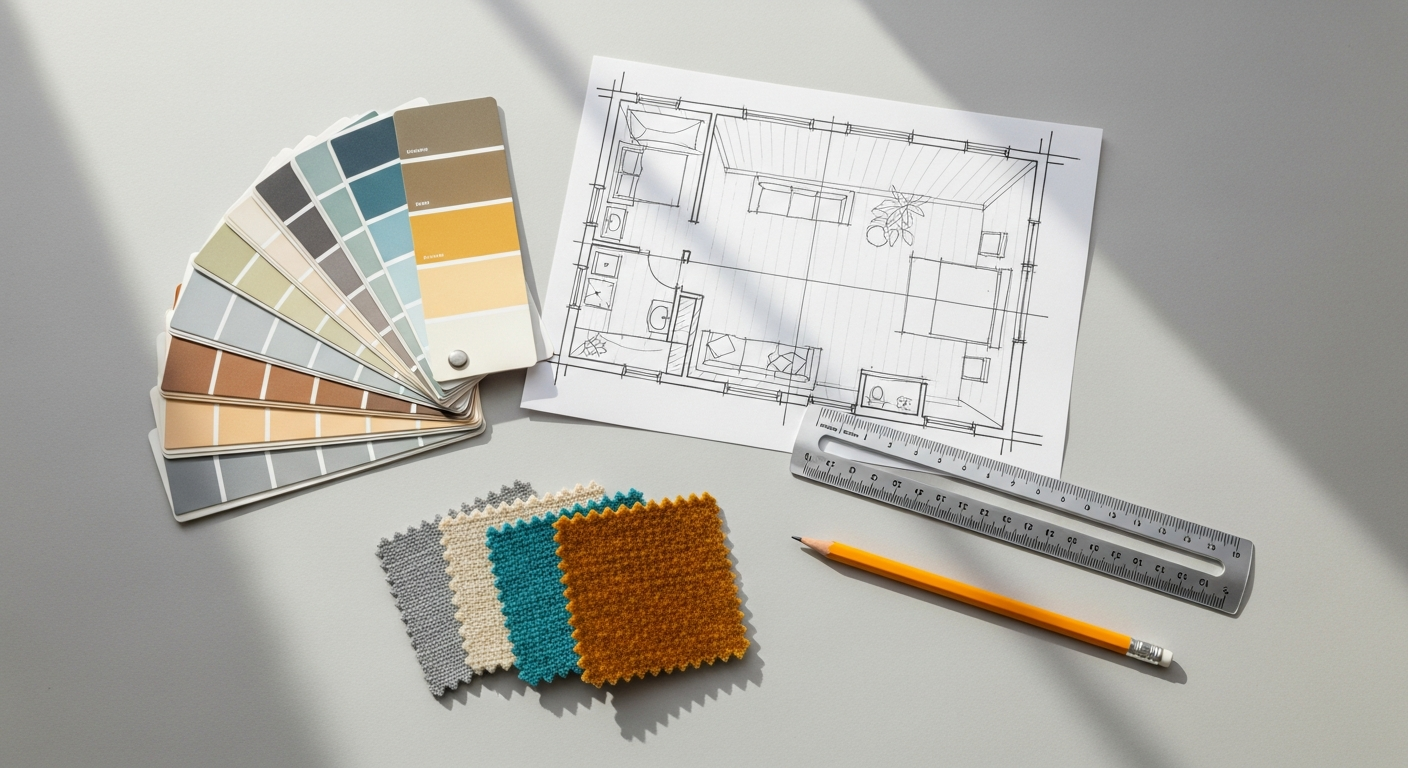
The Foundations of Good Web Design
Good web design is much more than just making something look pretty; it’s about solving problems, facilitating user journeys, and creating intuitive, engaging experiences. At its core, web design is a blend of art and science, requiring a deep understanding of human psychology, technological capabilities, and business objectives. The foundation of any successful website lies in a user-centric approach, prioritizing the needs and behaviors of the people who will interact with it. This means conducting thorough research, creating user personas, and mapping out user flows to ensure every design decision serves a purpose.
Key principles such as hierarchy, balance, contrast, and repetition are fundamental visual design concepts that translate directly into effective web design. Hierarchy guides the user’s eye through content, emphasizing important information. Balance creates a sense of stability and order, whether symmetrical or asymmetrical. Contrast helps differentiate elements and improve readability, while repetition fosters consistency and strengthens brand identity. Adhering to these principles ensures that a website is not only aesthetically pleasing but also easy to navigate and understand. The Nielsen Norman Group (NN/g), a leading authority in user experience, consistently highlights the importance of usability heuristics such as visibility of system status, match between system and the real world, user control and freedom, consistency and standards, and error prevention. Incorporating these heuristics from the outset can dramatically improve a website’s overall quality and user satisfaction.
Furthermore, responsive design is no longer an optional feature but a mandatory requirement. With users accessing websites on an ever-growing array of devices – from smartphones and tablets to desktops and smart TVs – a website must seamlessly adapt to different screen sizes and orientations. This involves flexible grids, fluid images, and media queries in CSS, ensuring a consistent and optimal experience across all platforms. A robust web design strategy also considers performance; slow loading times can significantly deter users and negatively impact search engine rankings. Optimizing images, minimizing code, and leveraging content delivery networks (CDNs) are crucial steps in delivering a fast and efficient website.
Finally, the foundation of good web design also includes understanding the technical limitations and possibilities. While designers don’t need to be expert coders, a basic grasp of HTML, CSS, and JavaScript can bridge the gap between design and development, fostering better communication and more feasible designs. This holistic approach, integrating user research, visual principles, technical considerations, and usability heuristics, forms the bedrock upon which truly exceptional web experiences are built. By focusing on these foundational elements, designers can ensure their creations are not just visually appealing, but also highly functional, accessible, and enjoyable for every user.
Color Theory for Web Designers
Color is one of the most powerful tools in a web designer’s arsenal, capable of evoking emotions, directing attention, and establishing brand identity. A solid understanding of color theory is indispensable for creating engaging and effective user interfaces. At its most basic, color theory revolves around the color wheel, which illustrates the relationships between primary, secondary, and tertiary colors. Understanding hues (the pure color), saturation (the intensity of the color), and value (how light or dark a color is) allows designers to manipulate color to achieve specific visual effects and communicate desired messages.
Beyond the technical aspects, color psychology plays a significant role in how users perceive a website. Different colors are associated with different emotions and concepts; for example, blue often conveys trust and professionalism, green suggests nature and growth, while red can signify urgency or passion. Strategic use of color can guide user behavior, highlight calls to action, and create a specific mood. For instance, a finance website might lean heavily on blues and greens to instill confidence, whereas a creative portfolio might use bolder, more vibrant palettes to express individuality. Developing effective color schemes involves understanding principles like monochromatic (variations of a single hue), analogous (colors next to each other on the color wheel), complementary (colors opposite each other), and triadic (three colors evenly spaced on the color wheel). Each scheme offers a unique visual harmony and can be chosen based on the project’s goals and brand identity.
However, the beauty of color must always be balanced with the necessity of accessibility. For web designers, this means rigorously adhering to contrast ratios as specified by the Web Content Accessibility Guidelines (WCAG). WCAG 2.1 and 2.2 recommend specific contrast ratios for text and graphical elements to ensure readability for users with visual impairments. For example, normal text generally requires a contrast ratio of at least 4.5:1, while large text needs 3:1. Ignoring these guidelines can render a website unusable for a significant portion of the population, undermining its effectiveness and inclusivity. Tools exist to check contrast ratios, and integrating them into the design workflow is crucial. For practical application and inspiration, exploring resources like Material Design’s color system can provide a structured approach to creating accessible and harmonious palettes. When you’re ready to select and refine your colors, you’ll find immense value in our dedicated resource, which explores the Best Color Palette Tools for Designers, offering practical solutions for generating and testing your schemes. By thoughtfully applying color theory and prioritizing accessibility, web designers can craft visually compelling and universally usable experiences.
Typography: Choosing the Right Fonts
Typography is the art and technique of arranging type to make written language legible, readable, and appealing when displayed. In web design, typography goes beyond merely selecting fonts; it encompasses every aspect of text presentation, from font size and line height to letter spacing and color. Excellent typography is fundamental to user experience, as the vast majority of web content is text-based. Poor typography can lead to frustration, reduced engagement, and a diminished perception of professionalism, while well-executed typography enhances readability, establishes brand personality, and guides the user through information effortlessly.
The first significant decision in typography is choosing between serif, sans-serif, and display fonts. Serif fonts, characterized by small decorative strokes (serifs) at the end of letterforms, are often associated with tradition, authority, and readability in long-form print text. Sans-serif fonts, lacking these strokes, are generally perceived as modern, clean, and highly readable on digital screens, making them a popular choice for body text and UI elements. Display fonts are highly decorative and best reserved for headlines, logos, or short bursts of text where impact is more important than sustained readability. The judicious pairing of fonts, typically combining a serif with a sans-serif or two complementary sans-serifs, creates visual interest and hierarchy without clashing. For instance, a strong sans-serif for headlines might be paired with a more subtle sans-serif for body text, or a classic serif for body text could be juxtaposed with a modern sans-serif for navigational elements. Our guide on the Best Fonts for Web Design provides an in-depth look at popular and effective font choices, helping you make informed decisions for your projects.
Beyond font selection, several micro-typographic considerations are crucial. Line height (leading) significantly impacts readability; too tight, and lines merge; too loose, and text appears disjointed. A general rule of thumb for body text is 1.5 times the font size for optimal readability. Letter spacing (kerning and tracking) adjusts the space between individual characters and words, ensuring text doesn’t appear too cramped or too airy. Font size must be carefully chosen, not just for legibility on desktop, but also for responsiveness on smaller screens. Using relative units like `em`, `rem`, or `vw` allows type to scale appropriately across devices, aligning with responsive design principles. Apple’s Human Interface Guidelines, for example, place a strong emphasis on legible and accessible typography, providing clear recommendations for minimum font sizes and line heights across their platforms.
Accessibility in typography is paramount. High contrast between text and background colors is a WCAG requirement, ensuring readability for users with visual impairments. Avoid using color alone to convey meaning, as color-blind users may miss critical information. Ensure sufficient font size, especially for body text, and allow users to scale text without breaking the layout. The goal is to make text not just visible, but truly readable and understandable for everyone. By paying meticulous attention to these typographic details, designers can transform raw text into a powerful component of the overall user experience.
CSS Layout: Grid vs Flexbox Explained
The evolution of CSS layout has dramatically transformed how web designers and developers structure web pages, moving from rudimentary methods like floats and positioning to sophisticated, powerful modules like Flexbox and CSS Grid. Understanding when and how to use each of these modern layout techniques is crucial for building responsive, maintainable, and robust user interfaces in 2026. Both Flexbox and CSS Grid are essential tools, but they solve different problems and excel in different scenarios.
Flexbox (Flexible Box Layout Module) is designed for one-dimensional layouts. This means it excels at arranging items in a single row or a single column. Think of it as a tool for distributing space among items along a primary axis (either horizontal or vertical) and aligning them along a secondary, perpendicular axis. Flexbox is perfect for components like navigation bars, form elements, card lists, or any scenario where you need to align items dynamically within a container. Key Flexbox properties like `justify-content` allow you to distribute space between items along the main axis (e.g., `space-between`, `center`), while `align-items` controls their alignment along the cross-axis (e.g., `flex-start`, `center`). Its power lies in its ability to make items “flex” or shrink to fill available space, making it incredibly useful for responsive design without complex calculations. For instance, creating a horizontal navigation menu where items space themselves out evenly or centering a single element vertically and horizontally within its parent are classic Flexbox use cases.
CSS Grid Layout, on the other hand, is built for two-dimensional layouts. This makes it the ideal solution for laying out entire pages or complex sections that require both rows and columns to be managed simultaneously. Imagine a traditional print layout with distinct headers, sidebars, main content areas, and footers – CSS Grid handles this with elegance and precision. With Grid, you define explicit rows and columns using properties like `grid-template-columns` and `grid-template-rows`, creating a “grid” onto which you can place content. You can then position items within specific grid cells or across multiple cells using `grid-column` and `grid-row` properties. Grid also introduces powerful concepts like `grid-gap` (for consistent spacing between grid items) and `fr` units (fractional units that distribute available space proportionally), making complex responsive layouts surprisingly straightforward. For a deep dive into the nuances and practical applications of these powerful layout modules, our comprehensive CSS Grid vs Flexbox Guide provides detailed examples and best practices.
While often presented as alternatives, Flexbox and CSS Grid are not mutually exclusive; they are complementary. A common and highly effective strategy is to use CSS Grid for the overall page structure (the macro layout) and then use Flexbox within individual grid cells for arranging content (the micro layout). For example, a page might use Grid to define its header, sidebar, and main content areas. Within the main content area, if you have a series of cards, you might use Flexbox to arrange the elements inside each card (e.g., image, title, description, button) in a single column or row. This combined approach leverages the strengths of both, leading to highly flexible, responsive, and maintainable web designs. Mastering both Flexbox and Grid empowers designers and developers to tackle virtually any layout challenge with confidence and efficiency.
Design Tools: Figma, Adobe XD, and Beyond
The landscape of UI/UX design tools has undergone a significant transformation in recent years, moving towards more collaborative, cloud-based, and feature-rich platforms. While many tools exist, Figma and Adobe XD have emerged as dominant players, each offering unique strengths for designers in 2026. Understanding their capabilities, and those of other notable tools, is crucial for optimizing workflows and producing high-quality designs efficiently.
Figma has rapidly become a favorite among design teams due to its unparalleled real-time collaboration features. Being entirely browser-based, it eliminates the need for software installations and allows multiple designers to work on the same file simultaneously, seeing each other’s changes live. This fosters an incredibly efficient and transparent design process, making it ideal for distributed teams and agile methodologies. Figma excels in UI design, offering robust vector editing capabilities, sophisticated prototyping tools with interactive flows, and a powerful component system (variants, auto layout) that facilitates the creation and maintenance of design systems. Its vibrant community and extensive plugin ecosystem further enhance its versatility, allowing designers to extend its functionality for specific needs, from accessibility checks to content generation. The ability to share live prototypes with stakeholders for feedback, directly within the browser, streamlines the iteration process significantly.
Adobe XD, part of the Adobe Creative Cloud suite, offers a strong alternative, particularly for designers already integrated into the Adobe ecosystem. XD provides a comprehensive set of tools for wireframing, UI design, prototyping, and collaboration. Its strengths lie in its intuitive interface, seamless integration with other Adobe products like Photoshop and Illustrator (allowing designers to easily import assets), and powerful prototyping features including voice prototyping and auto-animate. While its collaboration features are robust, they traditionally operated differently from Figma’s real-time co-editing, though Adobe has continuously improved its cloud capabilities. XD is often praised for its performance and its ability to handle complex projects with many artboards. For a detailed breakdown of their features, strengths, and weaknesses, our in-depth Figma vs Adobe XD Comparison offers a valuable resource for making an informed choice.
Beyond these two giants, other tools continue to play important roles. Sketch, a Mac-only application, was a pioneer in modern UI design and remains popular, especially for individual designers or smaller teams who prefer a desktop-first approach. It boasts a strong plugin community and a robust symbol system. InVision Studio aims to be an all-in-one design and prototyping solution, while Axure RP remains the go-to choice for highly complex interactive prototypes and detailed documentation, often favored by UX specialists for enterprise-level projects. The choice of tool often comes down to team size, existing ecosystem, budget, and specific project requirements. However, the underlying principles of good UI/UX design transcend any single tool. Proficiency in one or two leading platforms, coupled with a solid understanding of design fundamentals, will equip any designer for success in the dynamic world of web and visual design.
Building a Scalable Design System
In the complex world of web design, consistency and efficiency are paramount, especially as projects grow in size and involve multiple teams. This is where a design system becomes an indispensable asset. A design system is more than just a style guide or a component library; it’s a comprehensive collection of reusable components, guided by clear standards and principles, that can be assembled together to build any number of applications. It acts as a single source of truth for design and development, ensuring uniformity, speeding up workflows, and fostering collaboration across an organization. Think of it as the DNA of your digital products, dictating how everything looks, feels, and behaves.
The benefits of implementing a design system are manifold. Firstly, it drastically improves consistency across all touchpoints. By using predefined components and adhering to established guidelines, users encounter a cohesive experience regardless of which part of your product they are interacting with. This builds trust and reduces cognitive load. Secondly, it drives immense efficiency. Designers no longer need to design common elements from scratch, and developers can reuse existing code components, significantly accelerating the design and development cycles. This frees up valuable time for teams to focus on solving unique user problems rather than reinventing the wheel. Thirdly, design systems promote scalability. As products grow and new features are added, the system provides a robust framework to expand upon, ensuring that new additions align with the existing ecosystem. Finally, they enhance collaboration by providing a shared language and set of tools for designers, developers, product managers, and even content strategists, bridging the gap between disciplines.
Key components of a robust design system typically include: Design Principles (the philosophical underpinnings of your design choices), Brand Guidelines (logo usage, voice and tone), Visual Style Guide (color palettes, typography scales, iconography, spacing rules), UI Component Library (reusable elements like buttons, forms, cards, navigation), and Documentation (explaining how and when to use each component and style). Creating a design system is an iterative process that often starts with an audit of existing UI elements, identifying common patterns, and then standardizing them. Tools like Figma and Adobe XD are excellent for building and managing component libraries within a design system, allowing for the creation of master components and instances that update globally. For practical guidance on establishing such a framework, our guide How to Build a Design System offers actionable steps and best practices.
Well-known examples like Google’s Material Design and Apple’s Human Interface Guidelines serve as benchmarks for comprehensive design systems, demonstrating how a systematic approach can lead to world-class user experiences. These systems provide not just visual assets but also interaction patterns, motion guidelines, and accessibility considerations, proving that a design system is a living, evolving product in itself. Investing in a design system is an investment in the long-term health, efficiency, and coherence of your digital products, ensuring a consistent and delightful experience for all users.
Web Accessibility: Designing for Everyone
Web accessibility is not merely a technical checkbox; it’s a fundamental ethical imperative and a cornerstone of truly inclusive web design. Designing for accessibility means ensuring that websites and web tools can be used by everyone, regardless of their abilities or disabilities. This includes people with visual impairments (blindness, low vision, color blindness), hearing impairments, motor impairments, cognitive disabilities, and situational disabilities (e.g., using a device in bright sunlight, with one hand, or on a slow internet connection). Ignoring accessibility excludes a significant portion of the global population and can also lead to legal repercussions, as many countries have laws mandating accessible digital content.
The primary standard for web accessibility is the Web Content Accessibility Guidelines (WCAG), developed by the World Wide Web Consortium (W3C). WCAG 2.1 and the more recent WCAG 2.2 provide a detailed set of recommendations organized around four core principles, often remembered by the acronym POUR: Perceivable (information and UI components must be presentable to users in ways they can perceive), Operable (UI components and navigation must be operable), Understandable (information and the operation of the user interface must be understandable), and Robust (content must be robust enough that it can be interpreted reliably by a wide variety of user agents, including assistive technologies). Adhering to these principles guides designers and developers in creating experiences that are usable by a diverse audience.
Practically, implementing accessibility involves several key considerations. For visual content, providing meaningful alternative text (`alt` attributes) for images is crucial for screen reader users. Ensuring sufficient color contrast for text and interactive elements (as discussed in the color theory section) makes content readable for those with low vision or color blindness. For operability, all interactive elements must be keyboard-navigable, meaning users who cannot use a mouse can still access and operate every feature using only a keyboard or other assistive devices. Focus indicators must be clear and visible. Semantic HTML is vital; using appropriate HTML tags (e.g., `<h1>` for headings, `<nav>` for navigation, `<button>` for buttons) provides structure and meaning that assistive technologies can interpret. Additionally, providing clear and consistent navigation, predictable interactions, and plain language helps users with cognitive disabilities understand and use the website effectively.
Testing for accessibility should be an integral part of the design and development process. This includes automated accessibility checkers, manual keyboard testing, and, ideally, user testing with individuals with disabilities. For a deeper dive into the specific techniques and best practices for creating truly inclusive digital products, our guide Accessibility in UI Design provides comprehensive insights. By prioritizing accessibility from the initial design phase, designers can create web experiences that are not only beautiful and functional but also universally welcoming and usable for everyone, embodying the true spirit of the open web.
Key Takeaways
- User-Centricity is Paramount: Always design with the end-user in mind, focusing on their needs, behaviors, and accessibility requirements.
- Visual Design Fundamentals are Crucial: Master color theory, typography, and layout principles to create aesthetically pleasing and highly functional interfaces.
- Modern CSS Layouts are Essential: Leverage Flexbox for 1D component layouts and CSS Grid for 2D page structures to build responsive and robust designs.
- Choose the Right Tools for Your Workflow: Familiarize yourself with leading design tools like Figma and Adobe XD, understanding their strengths for collaboration and prototyping.
- Accessibility is Not Optional: Adhere to WCAG guidelines (2.1/2.2) and design inclusively to ensure your websites are usable by everyone, regardless of ability.
Comparison of Key Design Concepts & Tools
| Concept/Tool | Purpose | Key Features/Use Cases | Primary Benefit |
|---|---|---|---|
| Flexbox | 1D Layout (single row/column) | Aligning items in navbars, distributing space in cards, centering elements. | Efficient alignment and distribution of items within a single dimension. |
| CSS Grid | 2D Layout (rows and columns) | Full page layouts, complex content sections, magazine-style designs. | Powerful control over entire page structures with explicit rows and columns. |
| Figma | UI Design & Prototyping | Real-time collaboration, robust prototyping, auto layout, component variants. | Seamless team collaboration and efficient design system management. |
| Adobe XD | UI/UX Design & Prototyping | Intuitive interface, Adobe CC integration, advanced animation, voice prototyping. | Strong integration with Adobe ecosystem and powerful prototyping capabilities. |
| WCAG 2.1/2.2 | Web Accessibility Guidelines | Contrast ratios, keyboard navigation, semantic HTML, alternative text. | Ensures websites are usable by people with disabilities, promoting inclusivity. |
| Design Systems | Standardization & Scalability | Reusable components, style guides, documentation, design principles. | Consistency, efficiency, and scalability across digital products. |
Frequently Asked Questions (FAQ)
What is the most important skill for a web designer in 2026?
While technical skills are crucial, the most important skill for a web designer in 2026 is a strong understanding of user experience (UX) principles coupled with a commitment to accessibility. The ability to empathize with users, conduct research, solve problems, and design inclusive interfaces that cater to diverse needs far outweighs mastery of any single tool or coding language. Tools and technologies evolve rapidly, but foundational UX and accessibility principles remain constant and are what truly differentiate a good designer.
How can I stay updated with the latest web design trends and technologies?
Staying current in web design requires continuous learning. Regularly read industry blogs (like LayoutScene.com!), subscribe to newsletters from leading design organizations (e.g., Nielsen Norman Group, Smashing Magazine), follow influential designers on social media, participate in online communities (e.g., Reddit’s r/web_design, Discord servers), and attend virtual workshops or conferences. Experimenting with new tools and techniques on personal projects is also an excellent way to gain practical experience and deepen your understanding.
Is coding knowledge necessary for UI/UX designers?
While you don’t necessarily need to be a full-stack developer, a foundational understanding of HTML, CSS, and basic JavaScript is highly beneficial for UI/UX designers. Knowing how your designs translate into code helps you create more feasible and efficient designs, fosters better communication with developers, and gives you a deeper appreciation for technical constraints and possibilities. It enables you to “speak the same language” as your development counterparts, leading to smoother handoffs and more robust final products.
What’s the difference between UI design and UX design?
UI (User Interface) design focuses on the visual and interactive elements of a product – what the user sees and interacts with. This includes layouts, color palettes, typography, buttons, and animations. UX (User Experience) design, on the other hand, encompasses the entire journey a user takes when interacting with a product. It’s about how a user feels about the product and includes aspects like usability, accessibility, information architecture, and user research. Think of UI as the “looks” and “feel,” while UX is the “how it works” and “how enjoyable it is.” They are distinct but highly interdependent disciplines.
How important is mobile-first design in 2026?
Mobile-first design is critically important in 2026 and will continue to be so. With mobile devices often being the primary means of accessing the internet for a vast number of users, designing for the smallest screen first ensures that the core content and functionality are prioritized. This approach forces designers to make smart decisions about content hierarchy, performance, and interaction patterns. Once the mobile experience is solid, you can progressively enhance the design for larger screens, adding more complex layouts and richer content. It’s a foundational strategy for creating truly responsive and user-friendly websites.
Conclusion and Next Steps
Navigating the dynamic world of web design and visual design in 2026 demands a blend of foundational knowledge, continuous learning, and a user-centric mindset. This guide has traversed the critical pillars, from the psychological impact of color and the communicative power of typography to the structural elegance of CSS Grid and Flexbox, the collaborative efficiency of modern design tools, the systematic approach of design systems, and the non-negotiable imperative of web accessibility. By embracing these principles and practices, you are not just designing websites; you are crafting inclusive, engaging, and impactful digital experiences that stand the test of time.
The journey of a designer is one of perpetual growth. The digital landscape will continue to evolve, bringing new technologies, methodologies, and user expectations. To remain at the forefront, we encourage you to:
- Practice Regularly: Apply the concepts learned here to personal projects, participate in design challenges, and constantly seek opportunities