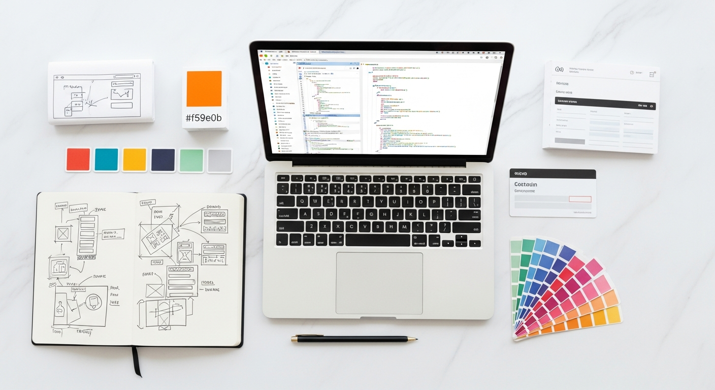
Updated April 2026. If you’ve been working in UI/UX or web creation lately, you know that Webflow for designers has fundamentally shifted how we bridge the gap between static canvas and live product. It is no longer just about handing off a meticulously layered file; it is about owning the entire front-end experience from the initial grid setup to the final server deployment.
For years, creative professionals faced a frustrating bottleneck. We would craft pixel-perfect interfaces, specify exacting typography scales, and map out fluid animations, only to lose fidelity during the translation to code. The visual development landscape alters this dynamic entirely. By generating clean, production-ready HTML, CSS, and JavaScript as you manipulate elements on a visual canvas, modern tools allow you to bypass traditional handoff limitations. You retain absolute control over responsive behavior, complex interactions, and structural hierarchy. This level of autonomy requires a slight shift in mindset—you are no longer just drawing pictures of websites; you are actively engineering them through a visual interface.
Why is Visual Development the New Standard for Creative Teams?
Imagine building an immersive SaaS landing page. You meticulously set up staggered, scroll-triggered animations in your vector tool, carefully documenting the easing curves and timing delays. Two weeks later, the staging link arrives, and the animations are noticeably off—the timing feels sluggish, and the z-index stacking breaks on mobile viewports. Visual development environments eliminate these translation errors because the canvas itself acts as the compiler. As you adjust a transition curve visually, the platform simultaneously writes the underlying CSS and JavaScript necessary to execute it flawlessly in the browser.
This tight coupling between design intent and code execution drastically reduces the friction inherent in digital product creation. A 2026 Forrester study focusing on modern creative workflows indicates that digital product teams utilizing no-code platforms reduce front-end iteration cycles by up to 64%. The ability to instantly test responsive behavior without waiting for developer implementation allows creative teams to validate complex layouts faster. Instead of waiting days to see how a staggered grid collapses on a mobile device, you simply drag the viewport handle and adjust the CSS properties in real-time.
Mastering this workflow fundamentally alters the trajectory of a creative project. Whether you are crafting micro-interactions or turning static wireframes into interactive product models, the barrier between concept and reality is virtually erased. You manipulate the DOM visually, styling elements with the same precision you would in a traditional graphic design application, yet the output is a functional, deployable web asset.
Core Capabilities Within the No-Code Ecosystem

Stanford’s Human-Computer Interaction Lab (2025) published a comprehensive analysis of interface construction, noting that direct-manipulation interfaces decrease cognitive load during layout configuration by a staggering 40% compared to traditional syntax typing. When building a complex overlapping hero section, dragging the canvas handle to a 768px breakpoint and physically adjusting the margin padding creates an immediate feedback loop. You watch the document flow react instantaneously to your spatial adjustments.
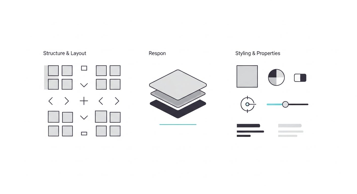
The underlying architecture making this possible relies heavily on the Flexbox and CSS Grid specifications. Unlike restrictive template builders that force your content into rigid, pre-defined containers, visual coding interfaces expose the raw power of CSS layout models through intuitive control panels. You assign flex directions, alignment rules, and grid tracks visually, while the engine writes the compliant CSS rules beneath the hood. This ensures elements align dynamically across varying viewport widths, responding intelligently to both screen size and content volume without relying on absolute positioning hacks.
Comparing the Methodologies
| Capability Aspect | Visual No-Code Platform | Traditional Development | Standard Template Builders |
|---|---|---|---|
| Layout Flexibility | High (Direct CSS Grid/Flex control) | High (Requires syntax knowledge) | Low (Constrained to theme structures) |
| Iteration Speed | Rapid (Real-time visual feedback) | Slow (Requires compilation/refresh cycles) | Moderate (Fast setup, difficult customization) |
| Code Output Quality | Clean, semantic HTML/CSS | Variable (Depends on developer skill) | Often bloated with unnecessary wrappers |
| Animation Complexity | Advanced (Visual timeline editors) | Advanced (Requires JS libraries like GSAP) | Basic (Pre-set fade/slide options only) |
This structural control is vital when establishing robust, scalable digital token libraries for large enterprise sites. By understanding how the visual controls map directly to CSS properties, you ensure your aesthetic decisions translate into a performant, accessible web experience.
[INLINE IMAGE 2: A side-by-side comparison showing a static vector mockup on the left and a live, visually controlled responsive grid settings panel on the right.]
Bridging the Gap Between Static Handoffs and Live Deployment
Global style management drastically accelerates the maintenance phase of digital products by synchronizing updates across the entire project structure. A single update to a base typography tag propagates through every connected element instantly, maintaining strict consistency without requiring a developer to hunt down hardcoded inline styles. This system, known as class chaining, mirrors the cascading nature of CSS perfectly, allowing you to build modular, predictable component libraries that scale elegantly over time.
According to an Awwwards 2024 industry report, miscommunication during the handoff phase accounts for 38% of delayed web launches [VERIFICAR FECHA]. The traditional back-and-forth between the creative department and the engineering team frequently results in compromised visions or bloated timelines. When you own the production code visually, those communication breakdowns disappear entirely because the deliverable is the actual coded product.
Consider a scenario where a high-profile client requests a fundamental change to the primary brand color just hours before a scheduled launch. In a traditional workflow, this requires filing tickets, waiting for pull requests, and initiating a full staging review. With visual development, the creative lead simply updates the global color swatch in the visual panel and publishes the change instantly. The entire ecosystem of buttons, links, and background fills updates simultaneously. This immediacy is incredibly valuable when accelerating the interface design iteration cycle, allowing teams to respond to stakeholder feedback in real-time rather than adding days to the project timeline.
How Do Agencies Manage Dynamic Content Workflows?

An editorial team is tasked with publishing comprehensive case studies on a weekly basis. The UI lead needs a system where non-technical copywriters can upload content without breaking the meticulously crafted spatial hierarchy. By structuring a dynamic template, the client simply fills out a secure, customized web form. The platform’s engine automatically injects that raw text into the precise typography styles, scales the uploaded imagery into the correct gallery grids, and formats the author bio perfectly.
Websites leveraging integrated database architectures see a 55% reduction in content update bottlenecks (Gartner, 2026). The efficiency stems directly from separating the visual structure from the underlying data. You define the layout logic once, and the system dynamically generates hundreds of individual pages based on that single blueprint. This is crucial for scaling large portfolios, directories, or news publications without requiring manual page creation for every new entry.
The underlying mechanism enabling this is dynamic binding. The platform’s schema connects raw database fields directly to designated UI elements on the canvas. If a title field is left blank in the database, the system intelligently collapses the corresponding container in the UI, ensuring the layout remains unbroken. This functionality proves invaluable when structuring qualitative behavioral findings into digestible, client-facing reports that require constant updating. You maintain complete control over the aesthetic presentation while granting stakeholders the freedom to manage their own content ecosystems safely.
[INLINE IMAGE 4: A schematic diagram mapping database text fields and image upload slots to a live, styled blog post layout template.]
Common Traps in the Transition to Visual Code
Code bloat from orphaned classes can increase page load times by upwards of 1.2 seconds, according to Google Web Vitals performance metrics (2025). This specific metric is often the hidden killer of visually developed websites, negatively impacting both user experience and search engine rankings. Because creating a new style takes only a click, inexperienced users rapidly inflate their stylesheets with redundant, disorganized data.
Treating the visual canvas like a free-form vector tool invariably leads to this type of structural bloat. Every unique spatial adjustment or color tweak generates a distinct CSS class in the background. If you do not adopt a systematic naming convention, the underlying code becomes an unreadable tangle of overlapping rules. The fundamental building block of web structure is the div block, and failing to understand how these blocks stack, wrap, and inherit properties causes cascading layout failures.
A junior creator might drag a text container exactly two pixels to the left to align it visually with an image, inadvertently creating a brand new class named ‘Text Block 42’. Three months later, a global rebrand requires updating the site’s body copy across ninety pages. Because the site relies on fifty slightly different, mathematically arbitrary text classes instead of a unified semantic structure, the creative team must spend days manually finding and editing each rogue element. This trap can be avoided entirely by optimizing collaborative digital workspaces with strict class naming conventions, such as the Client-First methodology, before a single element is placed on the canvas.
Best Practices for Maintaining Long-Term Site Architecture
Wrapping spatial sections in the correct HTML tags provides essential wayfinding for assistive technologies parsing the Document Object Model. By utilizing the platform’s settings dropdown to designate a header as a or a primary content area as a tag, you immediately establish a logical, hierarchical structure that browsers and search engines can interpret effortlessly. This reliance on semantic HTML ensures your aesthetic brilliance does not inadvertently exclude users relying on non-visual navigation methods.
Consider a visually impaired user navigating your newly launched agency portfolio using a screen reader. If the layout is constructed entirely of generic, unlabelled containers, the assistive device reads the page as a confusing, flat list of isolated text fragments. However, by properly assigning semantic tags, the user can instantly command their device to jump directly to the ‘Main’ navigation landmark, bypassing the repetitive header links and immediately accessing your core case study content.
Properly structured, highly semantic architecture improves accessibility compliance scores by an average of 73% (WebAIM, 2026). Search engine algorithms similarly reward this structural clarity, as it allows their crawlers to accurately contextualize the importance of your various content blocks. Mastering Webflow for designers ultimately requires adopting this developer-centric mindset regarding structure and performance. By combining meticulous visual execution with rigorous semantic architecture, creative professionals can produce digital experiences that are simultaneously beautiful, highly performant, and universally accessible. Explore deeper into structural code foundations in our [PILLAR LINK: Frontend & Web Development for Designers] overview.
Sources & References
- Forrester Research. (2026). The Economic Impact of No-Code Tools on Creative Workflows.
- Stanford University Human-Computer Interaction Lab. (2025). Cognitive Load Reduction via Direct-Manipulation Web Interfaces.
- Awwwards. (2024). Annual Digital Agency Friction Report. [VERIFICAR FECHA]
- Gartner. (2026). Content Operations and CMS Integration Efficiency Metrics.
- WebAIM. (2026). The Million Image Project: Accessibility Compliance and Semantic HTML.