Mastering the Design Handoff: Building Workflows Engineers Truly Embrace
The truth is, an inefficient design handoff doesn’t just impact designers; it significantly burdens engineers, forcing them to guess, make assumptions, and spend valuable time seeking clarification. This article will guide you through creating a robust design handoff workflow that engineers don’t just tolerate, but genuinely appreciate and use. We’ll explore strategies, tools, and best practices to bridge the gap between design and development, fostering collaboration and ensuring your designs are implemented with precision and care. By the end, you’ll be equipped to transform your handoff process from a potential bottleneck into a powerful accelerator for your product development cycle.
The Handoff Challenge: Why It’s Often Broken (and Why It Matters)
The design handoff is more than just exporting a few screens; it’s a complex act of translation and communication. It’s about distilling your intricate design decisions, user flows, and interaction nuances into a format that engineers can easily interpret and build upon. When this process breaks down, the consequences ripple across the entire project.
Think about the common pain points:
- Miscommunication and Ambiguity: Without clear specifications, engineers often have to make educated guesses about spacing, typography, colors, and behavior. This leads to inconsistencies and deviations from the intended design.
- Outdated or Incomplete Specs: Designs evolve rapidly. If documentation isn’t kept up-to-date or lacks crucial details like error states, empty states, or loading animations, engineers are left working with an incomplete picture.
- Lack of Context: Engineers might receive a set of screens without understanding the underlying user problem, the user journey, or the rationale behind specific design choices. This lack of empathy can lead to implementations that are technically correct but miss the mark on user experience.
- “Pixel-Perfect” Obsession vs. Practicality: While designers strive for pixel perfection, engineers need practical, scalable solutions. A handoff that doesn’t acknowledge technical constraints or component reusability can create friction.
- Tool Discrepancies: Different tools used by design and engineering teams can create barriers. Exporting assets incorrectly or using incompatible formats can waste significant time.
The impact of a broken handoff extends beyond mere frustration. It directly affects:
- Project Timelines: Constant back-and-forth for clarifications, design changes post-development, and rework due to misunderstandings significantly delay project completion.
- Developer Morale and Productivity: Engineers want to build, not decipher. A confusing handoff saps their energy, reduces their sense of accomplishment, and can lead to burnout.
- Product Quality and User Experience: Inconsistent UIs, buggy interactions, and features that don’t quite work as intended directly impact the end-user experience, eroding trust and satisfaction.
- Resource Allocation: Wasted time on rework means resources aren’t being used efficiently, potentially increasing project costs.
Understanding these challenges is the first step towards building a handoff process that prevents them. The goal isn’t just to transfer files; it’s to transfer knowledge, context, and a shared vision for the product.
Laying the Foundation: Pre-Handoff Best Practices
The most effective design handoffs don’t start at the end of the design phase; they begin much earlier in the product development lifecycle. Proactive collaboration and strategic planning are key to minimizing friction down the line.
Involve Engineers Early and Often
One of the most powerful strategies is to treat engineers as partners, not just recipients of your work. Involve them from the discovery and ideation phases.
- Kick-off Meetings: Include engineering leads in initial project kick-offs to ensure they understand the project goals, user problems, and technical constraints from the outset.
- Design Sprints & Workshops: Invite engineers to participate in design sprints, brainstorming sessions, and user story mapping exercises. Their technical insights can help validate feasibility, identify potential challenges early, and even inspire innovative solutions.
- Regular Check-ins: Schedule informal syncs or dedicated “design reviews for engineering” sessions as designs progress. This allows engineers to provide feedback on technical implications, suggest existing components that can be reused, and flag potential issues before designs are finalized. This proactive approach aligns with Nielsen Norman Group’s recommendations for fostering cross-functional collaboration.
Establish a Shared Language: Design Systems and Component Libraries
A robust design system is perhaps the single most impactful tool for a smooth design handoff. It serves as a single source of truth for both designers and engineers.
- Component Library: Ensure your design system includes a well-documented component library with clear guidelines for usage, states (hover, active, disabled, error), and responsiveness. Each component should ideally have a corresponding coded component.
- Naming Conventions: Standardize naming conventions for layers, components, styles (colors, typography, spacing), and assets. This consistency helps engineers quickly find and implement the correct elements.
- Tokenization: Use design tokens (e.g., `$color-primary-500`, `$spacing-md`) for design properties like color, typography, and spacing. These tokens can be directly mapped to variables in code, ensuring absolute consistency and making global changes effortless.
Strategic Documentation: What and How
Not every pixel needs exhaustive documentation, but critical aspects do. Focus on clarity and conciseness.
- User Flows: Clearly illustrate the user journey through the interface, including entry points, decision nodes, and exit points. Tools like Lucidchart or Miro can help visualize these.
- Interaction Details: Document animations (duration, easing), transitions, micro-interactions, and complex behaviors. Video recordings or detailed descriptions are often more effective than static images.
- Edge Cases & Error States: This is frequently overlooked but critically important. Show what happens when data is missing, an API call fails, or a user enters invalid input.
- Empty States & Loading States: Design and document how the UI appears before content loads or when there’s no data to display.
- Responsive Behavior: Clearly define how layouts and components adapt across different screen sizes and orientations. Use clear breakpoints and examples.
- Accessibility Considerations: Highlight specific WCAG (Web Content Accessibility Guidelines) requirements, such as focus order, alt text for images, ARIA attributes, and color contrast ratios. This proactive approach minimizes rework for accessibility compliance later.
Accessibility and Performance from the Start
Integrating accessibility (WCAG) and performance considerations into your design process from the very beginning can save significant time and effort during development.
- Color Contrast: Use tools like Stark or the Figma Contrast Checker plugin to ensure your color palettes meet WCAG AAA or AA standards.
- Typography: Specify accessible font sizes and line heights.
- Interactive Elements: Ensure sufficient target sizes for touch elements (NN/g recommends at least 44×44 CSS pixels).
- Animation Performance: Discuss with engineers the impact of complex animations on performance and explore efficient implementation methods.
The Core of the Handoff: What to Deliver and How
Once the foundational work is in place, the actual delivery of design assets and specifications becomes a streamlined process. The goal is to provide engineers with everything they need to build the product accurately, without unnecessary clutter.
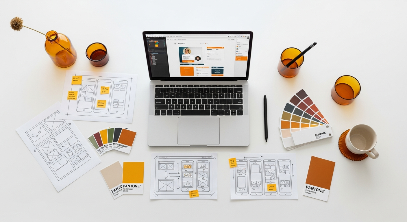
Visual Designs: High-Fidelity Mockups and Prototypes
Your high-fidelity mockups are the visual blueprints, but they need context.
- Organized Files: Keep your design files meticulously organized. Use pages, frames, or artboards to group related screens (e.g., “User Onboarding Flow,” “Product Details Page”).
- Clear Naming Conventions: Name your layers, frames, and components consistently and descriptively (e.g., “Button/Primary/Enabled,” “Input Field/Text/Default”). This helps engineers quickly locate elements in the design tool.
- Interactive Prototypes: Don’t just show static screens. Provide interactive prototypes (e.g., in Figma, Adobe XD, or InVision) to demonstrate user flows, transitions, and micro-interactions. A prototype speaks volumes where static screens can only hint.
Comprehensive Specifications
This is where the granular details come into play. Modern design tools have greatly automated this, but knowing what to look for and how to augment it is crucial.
- Dimensions and Spacing: Clearly indicate margins, paddings, and element sizes. Use a consistent spacing system (e.g., increments of 4px or 8px) that can be easily translated into CSS units.
- Typography: Provide a complete typography scale, including font families, weights, sizes, line heights, and letter spacing for all text styles (headings, body text, captions, etc.).
- Colors: Document your entire color palette, including hex codes, RGB values, and ideally, their corresponding design tokens (e.g., `$color-primary-500`). Specify usage for backgrounds, text, borders, and states.
- Assets: Export all necessary images, icons, and illustrations in appropriate formats (e.g., SVG for icons and illustrations, PNG/JPG for raster images, at 1x, 2x, and 3x resolutions for different pixel densities). Ensure assets are optimized for web performance.
- Interaction Details: Go beyond visual states. Describe how elements behave on hover, focus, active, disabled, and error states. Detail animations—their duration, easing curves (e.g., ease-in-out), and triggers.
- Content Strategy Integration: If dynamic content is involved, provide examples of varying content lengths, internationalization considerations (longer text strings in other languages), and how the UI adapts. Consider integrating with tools like Contentful or Storyblok for real content management.
Edge Cases and Error States
These are often the most overlooked but critical parts of a handoff. A well-designed product anticipates what goes wrong.
- Empty States: What does the screen look like when there’s no data? How do you encourage the user to add content?
- Loading States: How does the UI indicate that content is being fetched? (e.g., skeleton screens, spinners).
- Error Messages: Design clear, helpful error messages for form validation, network issues, or server errors.
- Permissions & Access: How does the UI change for users with different permission levels?
Leveraging Tools for Seamless Handoffs
Modern design tools have revolutionized the handoff process, moving beyond static PDFs to interactive, inspectable environments. Choosing the right tools and integrating them effectively is paramount.
Comparison of Popular Handoff Tools and Methods
| Tool/Method | Key Features | Best For | Considerations |
|---|---|---|---|
| Figma Dev Mode (and Inspect) |
|
Teams fully immersed in Figma, desire for a unified design-dev environment. | Requires engineers to learn Figma interface; can be overwhelming if not well-organized. |
| Zeplin |
|
Teams using various design tools, need for a highly structured, developer-centric handoff. | Additional subscription cost; another tool in the stack. |
| InVision Inspect |
|
Teams already using InVision for prototyping and collaboration. | Less robust than dedicated tools like Zeplin for complex specs; primarily for static screens. |
| Storybook |
|
Teams with established design systems, need for a shared component library and playground. | Requires upfront engineering effort to set up and maintain; not a design tool. |
| Traditional (PDF/Image Specs) |
|
Small projects, very early-stage concepts, or specific, complex interactions. | Prone to becoming outdated; time-consuming to create and update; not interactive. |
How These Tools Facilitate Communication and Asset Delivery
- Automated Specifications: Tools like Figma Dev Mode and Zeplin automatically generate CSS, iOS, or Android code snippets, eliminating manual measurement and reducing human error.
- Centralized Source of Truth: They provide a single place where designers and engineers can view the latest designs, specifications, and comments, reducing confusion from scattered files.
- Asset Export: These tools make it easy to export images, icons, and other assets in various formats and resolutions, optimized for different platforms.
- Collaboration Features: Built-in commenting, version history, and status tracking allow for direct communication and clear understanding of design changes and feedback.
- Design System Integration: Many tools integrate with design systems, linking components directly to their code counterparts or design tokens, fostering consistency.
Integration with Development Workflows
The best handoff tools don’t operate in a vacuum. Integrate them with your team’s existing development workflow:
- Project Management (Jira, Asana, Trello): Link design files or specific screens directly to user stories or tasks. This ensures engineers have immediate access to the relevant designs when working on a feature.
- Version Control (GitHub, GitLab): While design files aren’t typically in Git, links to design system documentation or Storybook components can be referenced in code repositories.
- Communication Platforms (Slack, Microsoft Teams): Use dedicated channels for design-dev questions, sharing updates, and quick feedback.
Beyond the Pixels: The Importance of Communication and Collaboration
Even with the most sophisticated tools and meticulously prepared files, human communication remains the bedrock of a successful design handoff. Technology facilitates, but people connect.
Dedicated Handoff Meetings
Don’t just drop files and expect engineers to figure it out. Schedule dedicated handoff meetings.
- Agenda: Prepare a clear agenda. Walk through the user flow, highlight key interactions, explain design decisions, and point out any complex or new components.
- Attendees: Ensure relevant engineers (frontend, backend if applicable), product managers, and QA specialists are present.
- Interactive Walkthrough: Use your interactive prototype to demonstrate the experience. Encourage questions and discussions.
- Follow-ups: Document any decisions made, action items, and outstanding questions. Share meeting notes promptly.
Asynchronous Communication Channels
While real-time meetings are vital, much of the day-to-day collaboration will happen asynchronously.
- Dedicated Channels: Set up a Slack or Teams channel for design-dev communication. This centralizes questions and answers, making them searchable for others.
- Contextual Comments: Use commenting features within your design tools (Figma, Zeplin) to provide specific feedback on elements, ask questions, or respond to engineer queries directly on the design.
- Video Explanations: For complex interactions, a short Loom or async video recording explaining the behavior can be incredibly effective, saving time compared to lengthy text descriptions.
Feedback Loops and Iteration
The handoff isn’t a one-way street. It’s an ongoing dialogue.
- Openness to Feedback: Be open to technical feedback from engineers. Sometimes, a design might be technically challenging or inefficient to implement. Be prepared to iterate on your designs in collaboration with engineering to find a solution that balances user experience with technical feasibility.
- Design QA: Actively participate in design QA, testing the implemented features against your designs and providing constructive feedback. This is a critical step to catch discrepancies early.
- “Shuttle Diplomacy”: As recommended by NN/g, designers should act as a bridge, understanding engineering constraints and translating them back into design, and vice versa.
Building Empathy Between Design and Engineering
At its core, a good handoff is about building stronger relationships and mutual understanding.
- Understand Their World: Take the time to understand engineering processes, constraints, and the tools they use. Attend engineering stand-ups occasionally.
- Explain Your “Why”: Always explain the user problem you’re solving and the rationale behind your design decisions. This context helps engineers make better implementation choices.
- Celebrate Successes Together: When a feature is successfully launched, acknowledge the joint effort.
The Role of a “Design System Champion”
For larger teams, having a dedicated individual or a small group championing the design system can significantly streamline handoffs. This role involves:
- Maintaining and updating the design system documentation.
- Ensuring design tokens are consistent across design and code.
- Training both designers and engineers on how to effectively use the design system.
- Facilitating communication between design and engineering on component development.
Maintaining Consistency: Design Systems as Your Handoff Backbone
We’ve touched upon design systems, but it’s worth emphasizing their transformative power in the handoff process. A well-implemented design system transforms handoff from a manual, repetitive task into a standardized, efficient exchange.
What is a Design System? Its Benefits for Handoff
A design system is a comprehensive set of standards, principles, and reusable components that guide the design and development of digital products. It’s more than just a style guide or a component library; it’s a living ecosystem that fosters consistency, scalability, and efficiency.
For handoff, a design system offers immense benefits:
- Single Source of Truth: Both designers and engineers refer to the same set of approved components, styles, and guidelines, eliminating ambiguity.
- Consistency: Ensures a consistent user experience across all product touchpoints, reducing user cognitive load and building brand recognition.
- Speed and Efficiency: Engineers can reuse pre-built, tested components, significantly accelerating development time. Designers can compose interfaces faster with established patterns.
- Reduced Technical Debt: Standardized components are easier to maintain and update, reducing the accumulation of inconsistent code.
- Improved Collaboration: Provides a common language and framework for designers, developers, and product managers to communicate effectively.
Industry standards like Google’s Material Design or Apple’s Human Interface Guidelines are excellent examples of comprehensive design systems that provide a robust framework for consistent product development. Your internal design system should serve a similar purpose, tailored to your brand and product needs.
Component Libraries: Shared Source of Truth
At the heart of a design system is the component library. This is where individual UI elements (buttons, inputs, cards, navigation bars) are defined, designed, and documented.
- Design Components: In tools like Figma, Sketch, or Adobe XD, these are master components with variants and properties that designers can easily drag and drop, ensuring consistency.
- Code Components: These are the corresponding, production-ready code implementations of the design components, often built in frameworks like React, Vue, or Angular.
- Synchronization: The ideal state is for design components and code components to be tightly synchronized. Tools like Storybook allow engineers to develop and showcase these components in isolation, serving as a living documentation for designers. Figma’s Dev Mode further bridges this gap by directly linking design components to their code counterparts.
Documentation Within the Design System
A component library is only as good as its documentation. For each component, include:
- Description: What is the component’s purpose?
- Usage Guidelines: When should this component be used? When should it not be used?
- Props/Attributes: List all available properties and their expected values (e.g., button type: primary, secondary, tertiary; icon name).
- States: Document all possible states (default, hover, active, focused, disabled, loading, error).
- Accessibility: Specific WCAG requirements, keyboard navigation, ARIA attributes.
- Examples: Provide code snippets and live examples of the component in action, preferably within Storybook.
Version Control for Design Assets and Documentation
Just as code evolves, so do design systems. Implement version control for your design files and documentation.
- Design Tool Version History: Leverage built-in versioning in tools like Figma.
- Design System Documentation Platform: Use platforms like Zeroheight, Supernova, or even Confluence/Notion to document changes, release notes, and deprecations for your design system.
- Clear Communication: When significant changes are made to core components, communicate these updates clearly to both design and engineering teams.
Post-Handoff: Ensuring Implementation Quality
The handoff isn’t truly complete until the product is live and performing as intended. The post-handoff phase is about vigilance, feedback, and continuous improvement.
Design QA: Reviewing Implemented Features Against Designs
This is a non-negotiable step. As a designer, you are the ultimate guardian of the user experience and visual integrity.
- Dedicated QA Cycles: Integrate design QA into your sprint cycles. Don’t wait until the very end.
- Side-by-Side Comparison: Compare the implemented feature directly against your high-fidelity mockups and interactive prototypes.
- Check All States: Test all documented states (hover, active, disabled, error, empty, loading) and edge cases.
- Responsiveness: Verify that the design adapts correctly across various screen sizes and devices.
- Interactions and Animations: Ensure that micro-interactions, transitions, and animations match the intended behavior and feel.
- Accessibility Check: Perform a quick check for key accessibility concerns like keyboard navigation, focus states, and color contrast.
Providing Constructive Feedback
When discrepancies are found, provide feedback that is clear, actionable, and constructive.
- Be Specific: Instead of “This looks off,” say “The padding on this button should be 16px, not 12px, according to the design system.”
- Use Visuals: Take screenshots, annotate them, or record short videos to illustrate the issue.
- Reference the Source: Always point back to the original design file, design system documentation, or prototype to provide context.
- Prioritize: Not every pixel perfect discrepancy is a critical bug. Work with product and engineering to prioritize design issues based on their impact on UX and business goals.
- Maintain a Positive Tone: Remember, you’re a team. Frame feedback as a collaborative effort to improve the product.
Iterative Improvements Based on User Testing and Analytics
The product’s journey doesn’t end at launch.
- User Testing: Continuously gather feedback from real users. This will reveal areas where the design or implementation might still be falling short.
- Analytics: Monitor key performance indicators (KPIs) and user behavior data to identify pain points or opportunities for improvement.
- Feature Enhancements: Use insights from user testing and analytics to drive iterative design and development cycles, ensuring the product continuously evolves to meet user needs.
Monitoring Performance and Accessibility in Production
Beyond visual fidelity, it’s crucial to ensure the product performs well and remains accessible in a live environment.
- Performance Monitoring: Work with engineers to monitor loading times, responsiveness, and overall performance. Slow interfaces degrade the user experience.
- Accessibility Audits: Periodically conduct accessibility audits (manual and automated) to ensure ongoing compliance with WCAG standards. This ensures your product is usable by the widest possible audience.
Evolving Your Handoff Workflow: Continuous Improvement
No workflow is perfect from day one, nor should it remain static. The most effective design handoff processes are those that continuously adapt and improve based on team feedback and evolving project needs.
Gathering Feedback from Engineers
The engineers are your primary “customers” for the design handoff. Their feedback is invaluable.
- Retrospectives: Include specific questions about the design handoff in your team’s sprint retrospectives. Ask what went well, what could be improved, and what caused friction.
- Informal Check-ins: Regularly ask engineers for their thoughts on the clarity of your designs, the usefulness of your documentation, and the efficiency of the tools you’re using.