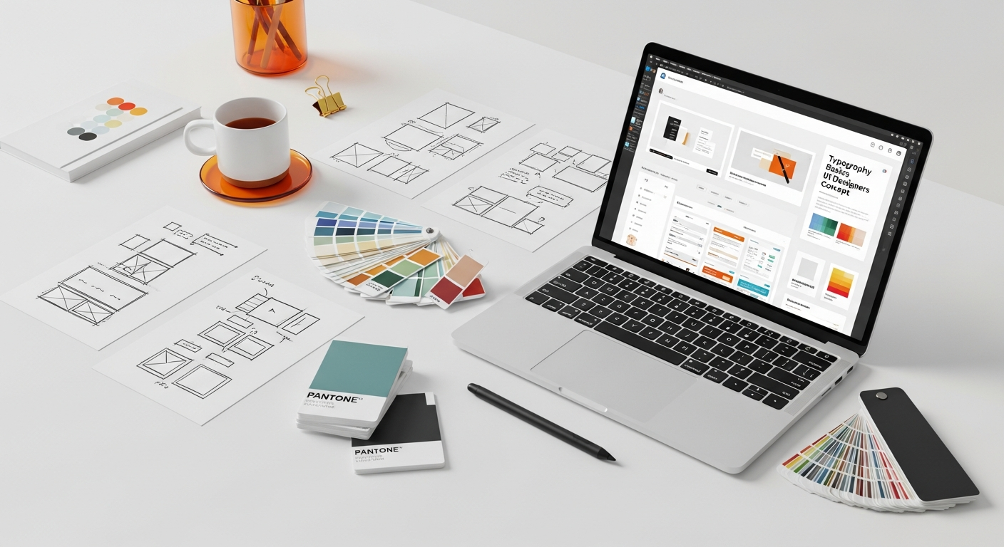
The Indispensable Role of Typography in UI Design
Typography, far from being a mere aesthetic flourish, forms the bedrock of effective user interface (UI) design. It is the primary means by which information is conveyed, instructions are given, and interactions are facilitated. Imagine navigating a website or an application where the text is illegible, inconsistent, or poorly organized; the frustration would be immediate and profound, leading to a swift departure. This highlights typography’s critical impact on the overall user experience.
At its core, typography in UI design serves several vital functions:
- Clarity and Readability: The most fundamental purpose of type is to be read effortlessly. Good typography ensures that users can quickly scan, comprehend, and retain information without straining their eyes or minds. This involves careful consideration of font size, line height, letter spacing, and contrast.
- Information Hierarchy: Typography creates a visual hierarchy, guiding the user’s eye through the content. By varying font sizes, weights, and styles, designers can emphasize key elements, group related information, and establish a clear flow, making complex interfaces digestible. This is crucial for effective Information Architecture Explained, as it helps structure content in a logical and intuitive manner.
- Brand Identity and Tone: Typefaces carry inherent personalities. A serif font might evoke tradition and authority, while a sans-serif could suggest modernity and simplicity. Script fonts often convey elegance or creativity. The choice of typeface, along with its application, profoundly influences the perceived brand identity and the emotional tone of the interface. It communicates whether the brand is playful, serious, innovative, or trustworthy.
- Usability and Accessibility: Beyond aesthetics, typography directly impacts a product’s usability. Accessible typography ensures that all users, including those with visual impairments or cognitive differences, can effectively interact with the interface. This involves adhering to standards for contrast, minimum font sizes, and scalable text. This directly ties into What Is Ux Design And Why It Matters, as typography is a cornerstone of creating a positive and inclusive user experience.
- Engagement and Retention: When text is beautifully and thoughtfully presented, it enhances user engagement. Users are more likely to spend time on an interface that is visually appealing and easy to read, fostering a sense of professionalism and care. Conversely, poor typography can lead to cognitive overload and disengagement, driving users away.
In the competitive digital landscape of 2026, where user expectations are higher than ever, neglecting typography is akin to building a house with a weak foundation. It’s not just about making things look good; it’s about making them work effectively, efficiently, and enjoyably for every single user. A strong understanding of typography empowers UI designers to craft interfaces that are not only beautiful but also highly functional and user-centric.
Decoding the Language of Type: Typefaces, Fonts, and Families
Before diving into the practical application of typography, it’s essential to understand the fundamental terminology that often gets conflated. While “typeface” and “font” are frequently used interchangeably, they represent distinct concepts in the world of type.
Typeface vs. Font vs. Font Family
- Typeface: A typeface (often referred to as a “font family”) is the overall design of a set of characters. It’s the artistic creation – the specific design style, visual characteristics, and aesthetic properties that define how the letters, numbers, and symbols look. Examples include Helvetica, Times New Roman, Arial, or Georgia. Think of a typeface as the blueprint or the specific design concept.
- Font: A font is a specific instantiation of a typeface at a particular size, weight, and style. For instance, “Helvetica Bold 12pt” is a font. “Times New Roman Italic 16pt” is another font. In the digital realm, a font is the actual file (e.g., .ttf, .otf, .woff) that contains the typeface’s design data, enabling it to be displayed on screens or printed. Historically, a font referred to a physical set of metal type characters of a specific size and style.
- Font Family: This term is often used interchangeably with typeface but specifically refers to a collection of related fonts that share a common design but vary in weight (light, regular, bold), style (italic, condensed, expanded), and sometimes width. For example, the “Roboto” font family includes Roboto Light, Roboto Regular, Roboto Medium, Roboto Bold, Roboto Black, and their italic counterparts.
Major Typeface Classifications
Understanding the different categories of typefaces is crucial for making informed design decisions. Each category carries inherent characteristics and connotations:
- Serif Typefaces:
- Characteristics: These typefaces have small decorative strokes or “feet” (serifs) attached to the end of the main strokes of letters.
- Sub-categories: Old Style (Garamond), Transitional (Times New Roman), Modern (Bodoni), Slab Serif (Rockwell).
- Connotations: Often associated with tradition, authority, classicism, trustworthiness, and readability in long-form print text.
- UI Use: Can be used for headings or specific branding elements to evoke a classic feel, but generally less common for body text on screens due to potential readability issues at smaller sizes, especially on lower-resolution displays.
- Sans-Serif Typefaces:
- Characteristics: “Sans” means “without,” so these typefaces lack the decorative serifs. They have clean, simple lines.
- Sub-categories: Grotesque (Franklin Gothic), Neo-Grotesque (Helvetica, Arial, Roboto), Humanist (Open Sans, Lato, Montserrat), Geometric (Futura, Gotham).
- Connotations: Modern, minimalist, clean, straightforward, versatile, objective.
- UI Use: Dominant choice for UI body text and interfaces due to their excellent readability on screens at various sizes and resolutions. Their clean lines render crisply, making them ideal for digital environments.
- Script Typefaces:
- Characteristics: Mimic handwritten calligraphy or cursive writing. They often have flowing strokes and connections between letters.
- Connotations: Elegance, formality, personal touch, creativity, romance.
- UI Use: Best used sparingly for decorative purposes, headings, or branding elements where a unique, personal touch is desired. Rarely suitable for body text due to poor legibility.
- Display/Decorative Typefaces:
- Characteristics: Designed for impact at large sizes, often highly stylized, unique, and attention-grabbing.
- Connotations: Wide range, depending on specific design – can be playful, futuristic, retro, grunge, etc.
- UI Use: Exclusively for large headlines, logos, or specific graphic elements. Never for body text or functional UI elements.
- Monospace Typefaces:
- Characteristics: Every character occupies the same horizontal space, like a typewriter.
- Connotations: Technical, coding, retro computing, precision.
- UI Use: Primarily for code blocks, data tables where column alignment is critical, or for specific retro/technical design aesthetics.
By understanding these classifications, UI designers can select typefaces that not only look good but also align with the product’s purpose, brand identity, and user expectations.
Core Typographic Elements for UI Mastery
1. Font Size (Point Size)
Font size dictates the physical size of the text. For UI, readability is paramount, and size is the first step.
- Considerations:
- Base Size: A good starting point for body text on desktop screens is typically 16px (or 1em/1rem). For mobile, this might be slightly larger, 16-18px, to account for viewing distance.
- Hierarchy: Use varying sizes to establish a clear visual hierarchy. Headings should be larger than subheadings, which in turn should be larger than body text.
- Context: Text within buttons, labels, or form fields might be slightly smaller than body text but must remain legible.
- Accessibility: Always ensure text is large enough to be read comfortably by users with varying visual abilities.
2. Font Weight
Font weight refers to the thickness of the strokes that make up a character (e.g., light, regular, medium, bold, black).
- Considerations:
- Emphasis: Bold weights are excellent for drawing attention to critical information, call-to-actions, or differentiating headings from body text.
- Hierarchy: Along with size, weight is a powerful tool for creating visual hierarchy without changing the typeface.
- Readability: Overuse of bold can make text feel heavy and difficult to read. Lighter weights can be elegant but might lack sufficient contrast on certain backgrounds.
- Availability: Ensure your chosen font family offers a range of weights to provide flexibility in your design system.
3. Line Height (Leading)
Line height (or leading, from traditional printing) is the vertical space between lines of text. Adequate line height is crucial for readability, especially in paragraphs.
- Considerations:
- Optimal Range: A general rule of thumb for body text is 1.4 to 1.8 times the font size (e.g., for 16px text, a line height of 22-28px).
- Longer Lines: As line length increases, so too should line height to help the eye track from the end of one line to the beginning of the next.
- Headings: Headings often benefit from slightly tighter line spacing than body text to keep them visually cohesive.
- Visual Comfort: Too little line height makes text feel cramped and hard to read; too much can make it feel disconnected.
4. Letter Spacing (Tracking & Kerning)
Letter spacing refers to the horizontal space between characters.
- Tracking: Adjusts the spacing uniformly across a range of characters.
- Use: Generally, body text benefits from slightly looser tracking for improved readability, while large headlines might benefit from tighter tracking to create a more solid visual block.
- Kerning: Adjusts the space between specific pairs of characters to improve visual balance (e.g., the space between ‘A’ and ‘V’ is often reduced).
- Use: Primarily for display text, logos, or large headings where precise visual balance is critical. Most modern fonts have good built-in kerning, so manual adjustment is less common for body text.
5. Word Spacing
Word spacing is the horizontal space between words. While often default, it’s particularly relevant for justified text.
- Considerations:
- Readability: Too much or too little word spacing can disrupt reading flow.
- Justified Text: Be cautious with justified text in UI, especially on the web, as it can lead to uneven word spacing (“rivers” of white space) that hinders readability. Left-aligned text is generally preferred for body copy.
6. Alignment
How text lines up horizontally.
- Left-aligned (Ragged Right): Most common and readable for body text, as it provides a consistent starting point for the eye.
- Right-aligned (Ragged Left): Suitable for specific contexts like captions, sidebars, or when aligning with right-sided elements. Avoid for long blocks of text.
- Centered: Best for short headlines, quotes, or small blocks of text to create a formal or decorative effect. Avoid for paragraphs as it makes eye tracking difficult.
- Justified: Text aligned to both left and right margins. While common in print, it’s generally discouraged for web UI body text due to potential uneven word spacing.
7. Color and Contrast
The color of your text and its background significantly impact readability and accessibility.
- Contrast Ratio: Adhere to Web Content Accessibility Guidelines (WCAG) for minimum contrast ratios (e.g., 4.5:1 for normal text, 3:1 for large text). Tools are available to check this.
- Legibility: Ensure sufficient contrast between text and its background to prevent eye strain and make text easily discernible for all users.
- Meaning: Color can also convey meaning (e.g., red for errors, green for success), but always combine with other cues for accessibility.
Mastering these elements allows UI designers to move beyond simply displaying text to actively crafting a visual language that enhances the user experience, establishes clear hierarchy, and reinforces brand identity.
Crafting Visual Harmony: Font Pairing and Hierarchy
Once you understand the individual elements of typography, the next challenge is to combine them harmoniously to create a cohesive and effective visual system. This involves mastering font pairing and establishing a clear typographic hierarchy.
The Art and Science of Font Pairing
Choosing multiple fonts for an interface can be daunting, but successful font pairing adds depth, personality, and structure to your design. The goal is to create contrast without chaos and harmony without monotony.
- Principle 1: Contrast is Key (but not too much):
- Opposites Attract: Often, pairing a serif with a sans-serif creates a pleasing contrast. For example, a strong serif for headlines and a clean sans-serif for body text.
- Weight & Style Contrast: If using fonts from the same family (e.g., a bold sans-serif with a light sans-serif), ensure sufficient contrast in weight or style (e.g., regular vs. italic).
- Avoid “Clashy” Similarities: Don’t pair two typefaces that are too similar but not identical. They’ll look like a mistake rather than an intentional choice.
- Principle 2: Maintain Harmony and Shared Characteristics:
- Shared X-Height: Fonts with similar x-heights (the height of lowercase letters like ‘x’) often pair well, as they maintain visual consistency, especially when used in proximity.
- Complementary Moods: Choose fonts whose personalities complement each other and the overall brand. A playful script shouldn’t be paired with an ultra-serious sans-serif unless it’s an intentional ironic statement.
- Limit Your Palette: Generally, stick to 1-3 font families. More than that can quickly lead to a cluttered and unprofessional look. A common approach is one font for headings and another for body text, or different weights/styles from the same family.
- Principle 3: Consider the Purpose:
- Headlines vs. Body: Display fonts or more distinctive typefaces work well for headlines, capturing attention. Body text demands high readability, so opt for clear, legible choices.
- Functional vs. Decorative: Reserve decorative or script fonts for specific, minimal uses where impact is more important than continuous reading.
- Tools and Resources:
- Explore Google Fonts pairings, Adobe Fonts recommendations, and websites like Font Pair for inspiration.
- Always test your pairings in context with actual content.
Establishing Visual Hierarchy with Typography
Typographic hierarchy is the arrangement of text elements on a page to indicate their relative importance. It guides the user’s eye, helping them quickly scan and understand the content structure. This is directly related to effective Information Architecture Explained, as typography visually reinforces the logical organization of content.
Here’s how to build a robust typographic hierarchy:
- Scale (Size):
- Primary Text: The largest text on the page, typically headlines (H1, H2), immediately draws attention.
- Secondary Text: Subheadings (H3, H4) and important call-to-actions are smaller than primary text but larger than body copy, providing structure.
- Tertiary Text: Body copy (paragraphs, lists) makes up the bulk of the content and should be highly readable.
- Quaternary Text: Smallest text, used for captions, footnotes, legal disclaimers, or metadata.
- Establishing a Ratio: Use a typographic scale (e.g., based on the golden ratio, Fibonacci sequence, or a simple arithmetic progression like 1.25, 1.333) to create harmonious size relationships between different text elements.
- Weight:
- Bold for Emphasis: Using bold or semi-bold weights for headings, subheadings, or key phrases within body text instantly increases their visual prominence.
- Contrast: Combine different weights (e.g., a light heading with a regular body text) to create clear differentiation.
- Color and Contrast:
- Highlighting: Brighter or more saturated colors can draw attention to specific text.
- Subduing: Lighter shades of gray can be used for less important information (e.g., timestamps, secondary labels) to push them into the background.
- Accessibility: Always ensure sufficient contrast, even for subtle color variations, to maintain readability for all users.
- Spacing (Line Height, Letter Spacing, Margins):
- Grouping: Tighter line height within paragraphs and generous spacing between paragraphs helps group related information and separate distinct blocks of text.
- Negative Space: Ample white space around headings and paragraphs makes the content feel less dense and more inviting.
- Visual Breaks: Using different line heights for different levels of text helps create visual breaks and guides the eye.
- Capitalization and Style:
- ALL CAPS: Use sparingly for short, impactful statements (e.g., button labels, very short headlines) as it can reduce readability for longer blocks of text.
- Italics: For emphasis, book titles, or specific semantic meaning, but avoid for large blocks of text.
By thoughtfully combining font pairing with a well-defined typographic hierarchy, UI designers can create interfaces that are not only aesthetically pleasing but also intuitively navigable, ensuring users can effortlessly find, understand, and interact with the information presented.
Ensuring Readability and Accessibility in UI Typography
While aesthetics and brand identity are crucial, the paramount concern for UI typography is ensuring that text is readable and accessible to the widest possible audience. Neglecting these aspects can alienate users, hinder usability, and even lead to legal complications. As we move into 2026, accessibility is no longer an afterthought but a fundamental requirement for ethical and effective design.
The Pillars of Readability
Readability refers to how easily a user can read and comprehend text. Several typographic factors contribute to it:
- Optimal Font Size: As discussed, a base font size of 16px (or 1em/1rem) for body text is generally recommended for desktop. For mobile, sometimes 16-18px is preferred. Headings should scale up appropriately. Users should also have the option to scale text larger in their browser settings.
- Appropriate Line Height (Leading): For body text, a line height of 1.4 to 1.8 times the font size typically offers good readability. This provides enough vertical space to prevent lines from blending together, aiding the eye in tracking from one line to the next.
- Manageable Line Length: Lines that are too long force the eye to travel too far, causing fatigue. Lines that are too short break up thoughts too frequently. An ideal line length for body text is generally considered to be 45-75 characters per line (including spaces), with 60-70 being optimal.
- Clear Letter and Word Spacing: Default spacing provided by well-designed fonts is often sufficient. Avoid overly tight or loose tracking/kerning for body text, as both can hinder legibility.
- Suitable Alignment: Left-aligned text (with a ragged right edge) is almost always the most readable choice for long blocks of text in UI. It provides a consistent starting point for the eye. Avoid justified text unless it’s handled exceptionally well with hyphenation, and avoid centered text for paragraphs.
- High-Quality Typefaces: Choose typefaces specifically designed for screen use. Sans-serif fonts are often preferred for body text on digital screens due to their clean lines rendering crisply at various resolutions.
Web Content Accessibility Guidelines (WCAG) and Typography
WCAG provides internationally recognized standards for web accessibility. Adhering to these guidelines is not just good practice; it’s often a legal requirement. For typography, key WCAG principles include:
- Contrast Ratio (WCAG 2.1 Success Criterion 1.4.3 Contrast (Minimum)):
- Normal Text: Requires a minimum contrast ratio of 4.5:1 between text and its background.
- Large Text: For text that is 18pt (24px) or larger, or 14pt (18.66px) and bold, the minimum contrast ratio is 3:1.
- Importance: This ensures that text is distinguishable for users with low vision or color blindness. Tools like WebAIM Contrast Checker can help you verify compliance.
- Text Resizing (WCAG 2.1 Success Criterion 1.4.4 Resize text):
- Users must be able to resize text up to 200% without loss of content or functionality. This means using relative units (
em,rem) rather than fixed pixel values for font sizes where possible, and ensuring layouts adapt gracefully.
- Users must be able to resize text up to 200% without loss of content or functionality. This means using relative units (
- Text Alternatives (WCAG 2.1 Success Criterion 1.1.1 Non-text Content): While not strictly typography, remember that any text embedded within images (e.g., a logo with text) must have a text alternative for screen readers.
- Avoid Text as Images: Whenever possible, use actual text rather than embedding text within images, as image-based text is not searchable, selectable, or scalable for accessibility tools.
Responsive Typography
In a multi-device world, typography must adapt seamlessly across different screen sizes and orientations. Responsive typography ensures a consistent and readable experience whether a user is on a large desktop monitor, a tablet, or a smartphone.
- Fluid Font Sizes: Instead of fixed pixel sizes, consider using fluid typography techniques (e.g., CSS
clamp()function, viewport units likevw) that scale font sizes based on screen width, within defined minimum and maximum limits. - Breakpoints: Define breakpoints in your CSS to adjust font sizes, line heights, and line lengths for different device categories (e.g., mobile, tablet, desktop). For instance, a headline that’s 48px on desktop might be 32px on mobile to prevent it from overwhelming the screen.
- Line Length Adjustment: As screen width changes, adjust column widths or text container widths to maintain optimal line lengths for readability.
- Testing Across Devices: Always test your typographic choices on actual devices or emulators to ensure they render correctly and remain legible across the range of screen sizes your users might employ.
By prioritizing readability and accessibility, UI designers can create interfaces that are not only beautiful but also inclusive, ensuring a positive experience for every user in 2026 and beyond.
Practical Tips for UI Typography in 2026 and Beyond
As the digital landscape continues to evolve, so too do the best practices and tools for UI typography. Staying ahead means embracing new technologies, maintaining consistency, and always prioritizing the user. Here are some practical tips to elevate your UI typography in 2026 and beyond.
1. Embrace Variable Fonts
Variable fonts represent a significant leap in typographic technology. Instead of needing separate font files for each weight, width, or style, a single variable font file contains all these variations, allowing for incredibly granular control.
- Benefits: Smaller file sizes (faster loading), infinite stylistic variations (from ultra-light to ultra-bold, condensed to expanded, and custom axes like optical size), and enhanced animation possibilities.
- Application: Use them to create subtle typographic animations, fine-tune responsiveness across breakpoints, or develop highly unique brand expressions without compromising performance.
2. Prioritize Performance
Large font files can significantly slow down page load times, impacting user experience and SEO.
- Font Subsetting: Only include the characters you need (e.g., specific language subsets, numbers, punctuation) to reduce file size.
- Font Formats: Use modern font formats like WOFF2, which offer better compression than older formats like TTF or OTF.
- Font Loading Strategies: Implement strategies like
font-display: swap;to ensure text is visible even if the custom font takes time to load, preventing the dreaded “flash of invisible text” (FOIT).
3. Develop a Robust Type Scale and Design System
Consistency is paramount in UI design. A well-defined type scale ensures harmonious and predictable typography across your entire product.
- Modular Scale: Base your font sizes on a mathematical ratio (e.g., 1.25, 1.333, 1.5) to create a harmonious and consistent hierarchy.
- Define Styles: Create specific styles for H1, H2, H3, body text, captions, buttons, etc., including font family, size, weight, line height, and color.
- Documentation: Document your typographic choices within a design system. This ensures all designers and developers work from a single source of truth, maintaining brand consistency across all touchpoints, including elements for a Social Media Graphics Design Guide.
4. Test, Iterate, and Get Feedback
Typography is subjective, but its impact on usability is measurable.
- A/B Testing: Test different font choices, sizes, or line heights with real users to see which performs better in terms of readability and task completion.
- User Feedback: Solicit feedback on text legibility and comfort. Are users straining? Do they find the text easy to scan?
- Accessibility Audits: Regularly conduct accessibility audits to ensure your typography meets WCAG standards.
5. Consider Internationalization and Localization
If your product serves a global audience, your typographic choices must accommodate different languages.
- Character Sets: Ensure your chosen fonts support the necessary character sets for all target languages (e.g., Cyrillic, Arabic, Asian scripts).
- Text Expansion/Contraction: Be aware that text in different languages can expand or contract significantly, impacting layout and line length. Design with flexibility in mind.
- Font Rendering: Different operating systems and browsers render fonts slightly differently. Test your UI on various platforms.
6. Stay Updated with Trends (But Don’t Follow Blindly)
The world of typography is always evolving.
- Emerging Fonts: Keep an eye on new font releases and trends, especially those designed with digital interfaces in mind.
- Micro-Typography: Pay attention to subtle details like hyphenation, soft hyphens, and preventing widows and orphans (single words/lines left alone at the beginning/end of paragraphs) for a polished look.
- User Preferences: While trends are interesting, always prioritize user preferences and accessibility over fleeting fads.
By integrating these practical tips into your UI design workflow, you’ll be well-equipped to create interfaces that boast exceptional typography, providing delightful and accessible experiences for users well into 2026 and beyond.
Frequently Asked Questions About UI Typography
What is the difference between a typeface and a font?
A typeface is the overall design or style of a set of characters (e.g., Helvetica, Times New Roman). It’s the artistic concept. A font is a specific instantiation of that typeface at a particular size, weight, and style (e.g., Helvetica Bold 12pt). In digital terms, the font is the file you install, while the typeface is the visual design contained within it.
Why is good typography so important for UI design?
Good typography is crucial because it directly impacts readability, usability, and the overall user experience. It establishes information hierarchy, guides the user’s eye,
Recommended Resources
You might also enjoy Best Laptops For Work 2026 from Bookmark Sharer.
Check out How To Set Up A Secure Vpn For Your Remote Team on Eamped for a deeper dive.