The Logo Redesign Playbook for 2026: When to Evolve Your Brand and How to Do It Right
Is It Time for a Brand Evolution? Recognizing the Triggers for a Logo Redesign
Before you even think about sketching, the most crucial step is understanding why a redesign is necessary. Not every logo needs an overhaul, but several clear signals indicate it might be time for a strategic brand evolution. As a senior designer, I’ve seen countless brands benefit from a well-timed refresh, and just as many suffer from a poorly conceived or unnecessary one. Let’s explore the key triggers:
Outdated Aesthetics and Design Trends
The design world moves fast. What was cutting-edge five or ten years ago might now feel clunky, complex, or simply out of sync with current sensibilities. Think back to the days of heavy skeuomorphism – glossy buttons, realistic textures, and drop shadows galore. While charming in their time, today’s aesthetic leans towards clean lines, thoughtful minimalism, subtle gradients, and functional simplicity. If your logo is still clinging to an aesthetic that feels like a relic from a bygone era, it’s losing its ability to connect with a modern audience. An outdated look can subtly communicate that your company itself is behind the times, even if your services are cutting-edge.
Shifting Business Strategy or Vision
Brands are living entities. They grow, pivot, and expand. If your company has undergone significant changes – perhaps entering new markets, launching a drastically different product line, merging with another entity, or targeting a completely new demographic – your existing logo might no longer accurately represent your core identity. A logo designed for a local startup might feel restrictive for an international corporation. A brand that initially focused on B2B software might need a softer, more approachable feel if it ventures into consumer apps. The logo needs to align with the strategic narrative you’re building for your future.
Negative Perception or Reputation Issues
Sometimes, a brand needs to distance itself from a past scandal, a negative association, or simply a period of poor performance. A redesign can act as a powerful symbolic gesture, signaling a fresh start and a renewed commitment to values. It’s not a magic bullet to fix underlying problems, but it can be a vital component of a broader strategy to rebuild trust and redefine public perception. Think of it as turning a new page; the logo is the new cover art.
Lack of Versatility and Scalability
In today’s multi-platform world, a logo needs to shine everywhere: from a massive billboard to a tiny favicon, from a website header to a social media profile picture, and even on merchandise or packaging. If your current logo struggles with legibility at small sizes, loses impact when simplified, or doesn’t adapt well to different color backgrounds or orientations, it’s failing a fundamental test of modern design. A truly effective logo is inherently versatile, maintaining its integrity and recognition across all mediums.
Competitive Landscape Changes
The market is never static. New competitors emerge, existing ones rebrand, and industry standards shift. If your logo now blends in too much with the competition, or worse, looks less professional or innovative than theirs, it’s time to re-evaluate. A redesign can help you carve out a stronger, more distinctive visual niche, ensuring your brand stands out and communicates its unique value proposition effectively.
International Expansion or Cultural Relevance
Venturing into global markets often means encountering diverse cultural sensibilities. A logo that works perfectly in one region might inadvertently carry negative connotations or simply fail to resonate in another. A strategic redesign can help create a more universally appealing and culturally sensitive mark, fostering broader connection and avoiding potential missteps.
Performance Issues: Low Recognition or Memorability
Ultimately, a logo needs to be memorable and instantly recognizable. If your target audience consistently struggles to recall your logo, or if it fails to evoke the desired emotional response, it’s not performing its primary job. This is harder to measure but can be gleaned from user feedback, brand recall studies, and general market sentiment.
Practical Advice: To assess these triggers, conduct a thorough brand audit. This includes competitive analysis, market research, and crucially, gathering feedback from your existing customers and internal teams. Tools like SurveyMonkey or UserTesting can provide invaluable insights into how your current logo is perceived. Don’t just assume; validate your assumptions with data.
The Strategic Foundation: Before You Touch a Single Pixel
Resist the urge to jump straight into design software. A successful logo redesign is 90% strategy and 10% execution. Without a robust strategic foundation, you’re merely redecorating without understanding the underlying architecture. This phase is about deep introspection and meticulous planning.
1. Define Your “Why” and Set Clear Goals
This is the absolute bedrock. Why are you doing this? What specific problem are you trying to solve? What do you hope to achieve? Goals might include:
- Attracting a younger demographic
- Increasing brand recognition by X%
- Communicating innovation and modernity
- Improving conversion rates on your website
- Distancing the brand from a past perception
- Better reflecting an expanded product/service offering
These goals must be specific, measurable, achievable, relevant, and time-bound (SMART).
2. Conduct a Comprehensive Brand Audit
This isn’t just about your logo; it’s about your entire brand ecosystem.
- Internal Audit: Revisit your company’s mission, vision, core values, unique selling proposition (USP), and brand personality. What makes you truly unique? What message do you want to send?
- External Audit:
- Competitor Analysis: Who are your direct and indirect competitors? What do their logos look like? What messages do they convey? Where are the opportunities for you to differentiate visually?
- Market Trends: What are the prevailing design aesthetics and cultural shifts impacting your industry? This isn’t about chasing fads, but understanding the visual language your audience is accustomed to.
- Target Audience Research: Who are you trying to reach? What are their demographics, psychographics, values, and visual preferences? Conduct surveys, focus groups, and interviews. Tools like Google Analytics and social media insights can provide valuable demographic data, while qualitative methods like user interviews (even informal ones) can uncover deeper insights.
This audit provides the raw material for your new brand story.
3. Develop a Clear Creative Brief
The creative brief is your blueprint, a document that distills all the strategic insights into actionable directives for the design team. It should include:
- Project goals and objectives
- Target audience description
- Key messages the logo should convey
- Desired emotional response
- Brand personality (e.g., modern, friendly, authoritative, playful)
- List of non-negotiables (e.g., must retain a certain color, must evoke a specific industry)
- Examples of logos you like and dislike (with explanations)
- Technical requirements (e.g., must work in monochrome, must be scalable)
- Timeline and budget
This brief ensures everyone is on the same page, minimizing misunderstandings and streamlining the design process.
4. Assemble Your Core Team and Stakeholders
A redesign impacts every facet of a business. Involve key stakeholders from the outset: marketing, sales, product development, leadership, and of course, the design team. Establishing clear roles, responsibilities, and decision-making processes early on is critical for smooth execution.
Tools & Techniques: SWOT analysis (Strengths, Weaknesses, Opportunities, Threats), brand positioning maps, empathy mapping for target audiences, and collaborative mood boards using platforms like Pinterest or Milanote can be incredibly effective in this phase.
The Design Process: From Concept to Polished Mark
With your strategic foundation firmly in place, it’s time to translate those insights into a compelling visual identity. This is where the magic of design happens, but it’s a structured, iterative process, not a spontaneous flash of brilliance.
Phase 1: Research & Inspiration
Even with a solid creative brief, it’s vital to immerse yourself further.
- Visual Landscape: Dive into current design trends (not to copy, but to understand), historical logo design, and successful rebrands. Look beyond your industry for inspiration.
- Mood Boards: Curate a diverse collection of images, typography, color palettes, textures, and existing logos that evoke the desired feeling and aesthetic. This helps align the visual direction with the strategic goals. Tools like Pinterest, Milanote, or even a simple Figma board are excellent for this.
- Logo Types Exploration: Consider which type of logo best suits your brand:
- Wordmark: Text-only (e.g., Google, Coca-Cola)
- Lettermark: Monogram (e.g., IBM, CNN)
- Pictorial Mark: Icon-only (e.g., Apple, Twitter bird)
- Abstract Mark: Abstract geometric form (e.g., Nike swoosh, Adidas trefoil)
- Mascot: Illustrated character (e.g., KFC Colonel, Michelin Man)
- Emblem: Logo within a symbol/badge (e.g., Starbucks, Harley-Davidson)
- Combination Mark: Text + Icon (e.g., Lacoste, Burger King)
Each has its strengths and weaknesses depending on brand recognition, name length, and desired impact.
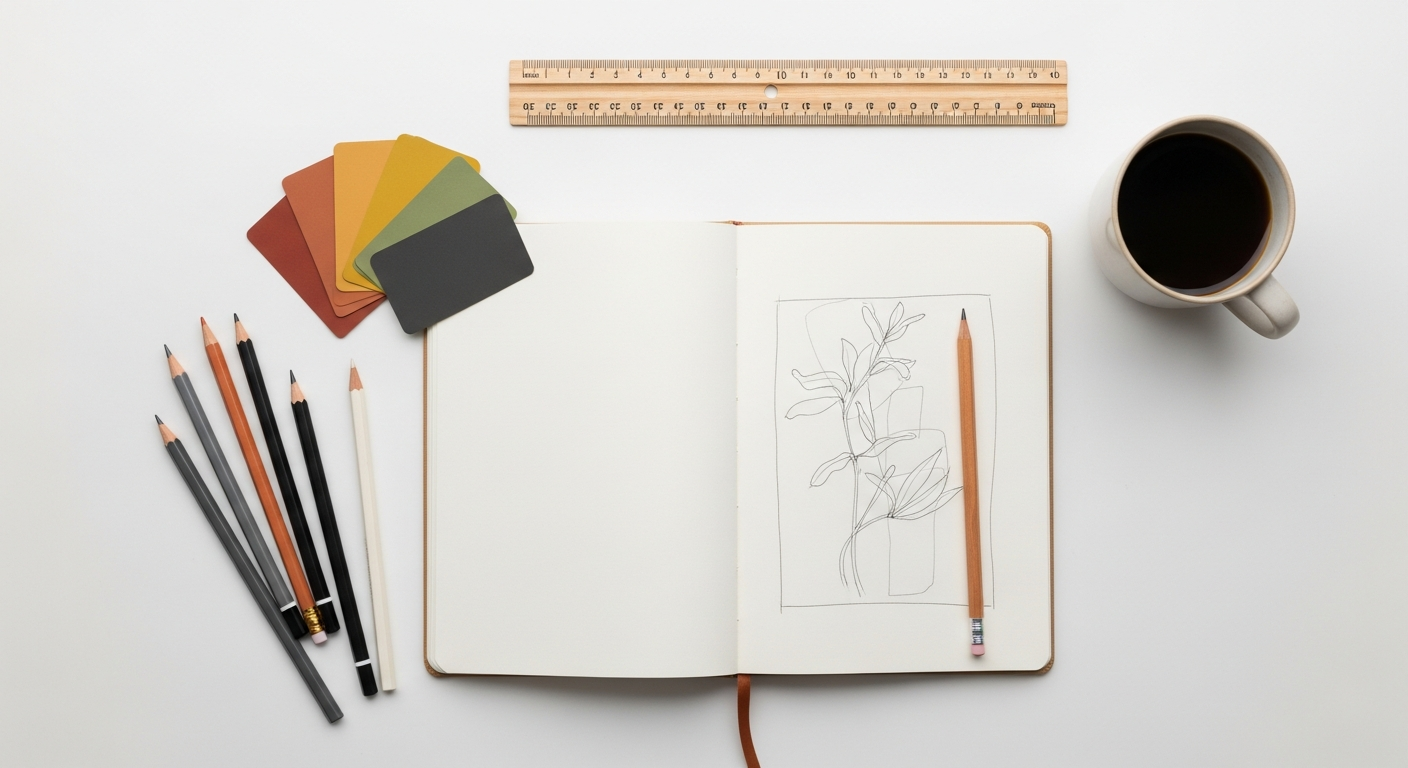
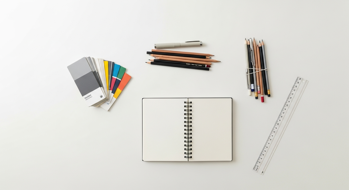
Phase 2: Sketching & Ideation – Quantity Over Quality
This is the most freeing part of the process. Grab a sketchbook, a pen, or an iPad Pro with Procreate. Don’t self-censor. Generate as many diverse concepts as possible. Focus on exploring different visual metaphors, typography treatments, and compositional ideas based on your brief. The goal here is breadth, not perfection. Think about the core principles of effective logo design:
- Simplicity: Easy to recognize and remember.
- Memorability: Distinctive enough to recall.
- Versatility: Works across all mediums and sizes.
- Timelessness: Endures for years without feeling dated.
- Appropriateness: Relevant to your industry and audience.
Phase 3: Digitalization & Refinement
Select the strongest 3-5 concepts from your sketches and bring them into vector software. This is where precision and craftsmanship come into play.
- Vector Software: Adobe Illustrator, Figma (with its robust vector tools), or Affinity Designer are your go-to tools. Working in vectors ensures infinite scalability without loss of quality.
- Grids and Geometry: Use grids, guides, and principles like the golden ratio (where appropriate) to ensure balance, harmony, and visual precision. Optical adjustments are often necessary; sometimes, perfect mathematical alignment doesn’t look right.
- Typography Selection: Choose fonts that align with your brand’s personality and are legible across all applications. Experiment with custom lettering or subtle modifications to existing typefaces to create something truly unique. Consider font pairings if your brand identity requires more than one typeface.
- Color Palette: Explore color psychology and its impact on emotion and perception. Test various palettes. Crucially, consider accessibility (WCAG guidelines) to ensure adequate contrast for all users, and ensure the logo works effectively in monochrome and inverse versions.
- Iteration: Refine, refine, refine. Every curve, every line, every spacing decision matters. Test the logo at different sizes, in black and white, and against various backgrounds.
Phase 4: Presentation & Structured Feedback
Present your refined concepts (typically 2-3 strong directions) to your stakeholders.
- Contextual Mockups: Don’t just show the logo on a plain white background. Present it in context: on a website header, a mobile app screen, a business card, signage, social media profiles, and any relevant packaging or merchandise. Tools like Mockupworld or Smartmockups can quickly generate realistic mockups.
- Explain the “Why”: Articulate the rationale behind each design direction, connecting it back to the creative brief and strategic goals.
- Structured Feedback: Guide the feedback process. Ask specific questions aligned with the brief rather than open-ended “do you like it?” questions. Focus on whether the logo meets the objectives, not just personal preference. Figma’s commenting features are excellent for collaborative feedback.
- Iteration Based on Feedback: Be prepared to iterate. Incorporate constructive feedback, but always filter it through your expert design lens. Sometimes, a stakeholder’s feedback points to a problem, but their suggested solution isn’t the best design approach. It’s your job to find the optimal solution.
Phase 5: Finalization & Brand Guidelines
Once a direction is approved and refined, the final assets need to be prepared.
- Master Files: Deliver all necessary file formats: vector (AI, EPS, SVG), raster (JPG, PNG) for web and print, in various sizes and color modes (RGB, CMYK).
- Logo Variations: Provide horizontal, vertical, icon-only, and wordmark-only versions, along with specific versions for dark and light backgrounds.
- Comprehensive Brand Guidelines: This is an essential document that ensures consistency across all touchpoints. It should cover:
- Logo usage (clear space, minimum size, incorrect usage examples)
- Color palette (primary, secondary, accent colors with Hex, RGB, CMYK, and Pantone values)
- Typography (primary and secondary fonts, usage for headings, body copy)
- Imagery style and tone
- Voice and tone of communication
Tools like Frontify or Brandfolder can help manage and distribute these assets, or you can create a custom guide using Adobe InDesign or even Figma.
The Rollout Strategy: Launching Your New Identity
A brilliant logo redesign can fall flat without a well-executed launch. This phase is about meticulous planning and widespread implementation.
1. Internal Launch First: Build Excitement and Advocacy
Before the public sees it, introduce the new logo and brand guidelines to your entire team. Explain the “why” behind the change, its significance, and how it aligns with the company’s future. Equip them with the new assets and guidelines, turning them into brand ambassadors. This fosters internal buy-in and ensures everyone is on message.
2. Phased vs. Big Bang Approach
Decide on your launch strategy:
- Big Bang: A complete, simultaneous overhaul across all touchpoints. This generates maximum buzz but requires immense coordination. Best for significant rebrands with a clear narrative.
- Phased Rollout: Gradually update elements over time. Less disruptive, but can lead to inconsistency during the transition period. Suitable for refreshes or smaller organizations.
3. Update All Touchpoints – Meticulously
This is often the most time-consuming part. Create a comprehensive checklist of every single place your old logo appears and ensure it’s replaced with the new one.
- Digital Assets:
- Website (header, footer, favicons, loading screens)
- Mobile apps (splash screens, app icons)
- Social media profiles (avatars, banners)
- Email signatures and templates
- Digital advertising campaigns
- Online directories and listings
- Internal software and platforms
- Physical Assets:
- Business cards and stationery (letterheads, envelopes)
- Signage (office, retail, vehicles)
- Packaging and product labels
- Uniforms and merchandise
- Marketing collateral (brochures, flyers, presentations)
Use project management tools like Asana or Trello to track progress across all departments.
4. Develop a Communication Plan
Tell your story. Announce the redesign to your audience, explaining the strategic reasons behind the change. This helps them understand and embrace the new identity rather than feeling alienated.
- Press Release: For significant rebrands, inform media outlets.
- Blog Post/Website Announcement: Detail the journey and the meaning behind the new logo.
- Social Media Campaign: Teasers, reveal posts, and engaging content explaining the evolution. Tools like Buffer or Hootsuite can help schedule this.
- Email Campaign: Directly inform your subscribers and customers.
5. Monitor, Measure, and Adapt
The launch isn’t the end; it’s the beginning.
- Track Reactions: Monitor social media sentiment, website traffic, and customer feedback.
- Measure Performance: Are you achieving your initial goals? Track brand recognition, recall, and any relevant business metrics.
- Be Responsive: Be prepared to address questions, clarify misunderstandings, and even make minor adjustments if there’s significant negative feedback (though a thorough pre-launch process minimizes this risk).
Common Pitfalls to Avoid in Your Rebranding Journey
Even the best intentions can lead to missteps. Being aware of common pitfalls can help you navigate your redesign with greater success.
- Redesigning Without a Clear Strategy: This is the cardinal sin. A purely aesthetic change without a strategic “why” is a wasted effort and often leads to an identity crisis. Don’t redesign just because you’re bored with the old one.
- Ignoring Your Audience: Failing to involve your customers in research or testing phases is a recipe for disaster. They are the ones who ultimately interact with your brand. Remember Tropicana’s failed 2009 redesign, which alienated customers and led to a swift reversion to the old packaging.
- Losing Brand Recognition: While a redesign can be transformative, it shouldn’t completely erase your brand’s heritage or make you unrecognizable to loyal customers. A gradual evolution is often safer than a drastic, alienating overhaul. The Gap’s brief, disastrous 2010 redesign is a cautionary tale of losing identity.
- Lack of Internal Buy-in: If your own employees aren’t on board, the rollout will be disjointed and ineffective. Involve them early and often.
- Underestimating the Scope and Cost: A logo redesign is just the tip of the iceberg. The real work (and cost) comes from updating every single touchpoint. Factor in time and budget for asset creation, printing, web development, and communication.
- Chasing Fleeting Trends: While being current is important, designing a logo solely based on the hottest trend of 2026 will likely make it look dated by 2028. Aim for timelessness with a contemporary feel.
- Poor Execution: Rushing the design process, cutting corners on research, or working with inexperienced designers can result in a mark that lacks polish, versatility, or strategic depth. Invest in professional design expertise.