Beyond the Logo: Crafting a Bulletproof Visual Identity Guide for Brands in 2026
The Foundation: Understanding Your Brand’s Core
Before you even think about pixels or pantones, you need to dig deep into the essence of the brand. A visual identity guide isn’t just a collection of pretty assets; it’s a strategic document that reflects the brand’s soul. Skipping this foundational step is like building a house without blueprints – you might get something up, but it won’t be stable or fit for purpose. This initial phase is where you translate abstract concepts into tangible directives for visual expression.
Brand Discovery & Strategy
This is where the real detective work begins. You need to understand the brand inside and out. Start by asking the fundamental questions:
- Mission, Vision, Values: What is the brand’s purpose? What future does it envision? What core principles guide its actions? These statements are the bedrock upon which all visual decisions are made. For instance, a brand focused on “innovation and disruption” will have a vastly different visual language than one emphasizing “trust and heritage.”
- Target Audience: Who are you trying to reach? Understanding your audience’s demographics, psychographics, needs, and aspirations is critical. Are they tech-savvy millennials, eco-conscious Gen Z, or established professionals? Their preferences will influence everything from color choices to photographic styles. Create detailed user personas to bring this audience to life.
- Brand Personality/Archetype: If your brand were a person, how would you describe it? Is it a playful jester, a wise sage, a heroic leader, or a sophisticated creator? Defining a clear personality (e.g., authoritative, friendly, luxurious, minimalist, energetic) helps designers make consistent choices across all elements. Tools like Miro or Milanote are excellent for collaborative brainstorming and mood board creation during this phase, allowing you to gather visual inspiration that embodies these abstract concepts.
- Competitive Analysis: What are your competitors doing well? Where are they falling short? How can your brand visually differentiate itself while still resonating within its industry? Analyzing the visual landscape helps you identify opportunities for unique positioning and avoid blending into the background.
These insights form the strategic brief that will guide every subsequent design decision. Without this clarity, your visual identity will lack direction and impact.
Defining the “Why”: The Brand Story
Beyond just facts, every compelling brand has a story. What narrative does your brand want to tell? How does it connect with its audience on an emotional level? This story isn’t just for marketing copy; it profoundly influences the visual aesthetic. A brand story about “empowering creatives” might lean into vibrant, expressive visuals, while a story about “sustainable living” might opt for earthy tones and organic textures. This “why” provides the emotional anchor for your visual identity, ensuring that every design choice resonates with the brand’s deeper purpose. It’s about creating a coherent and memorable experience, not just a collection of assets.
Building Blocks: Core Visual Elements
With the strategic foundation laid, it’s time to translate those insights into the tangible visual elements that will define your brand. These are the fundamental components that will appear on almost every piece of communication. Getting these right, with clear guidelines, is paramount for consistency.
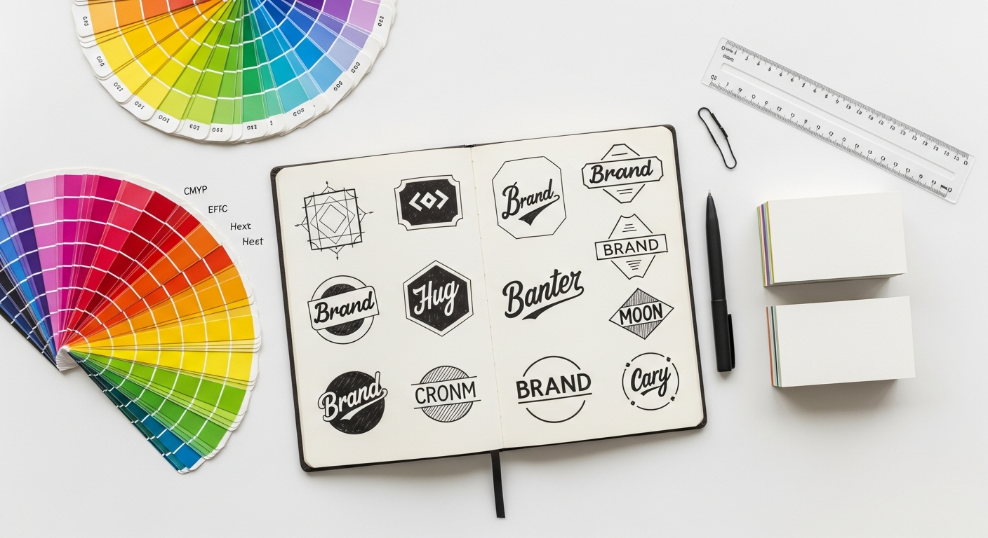
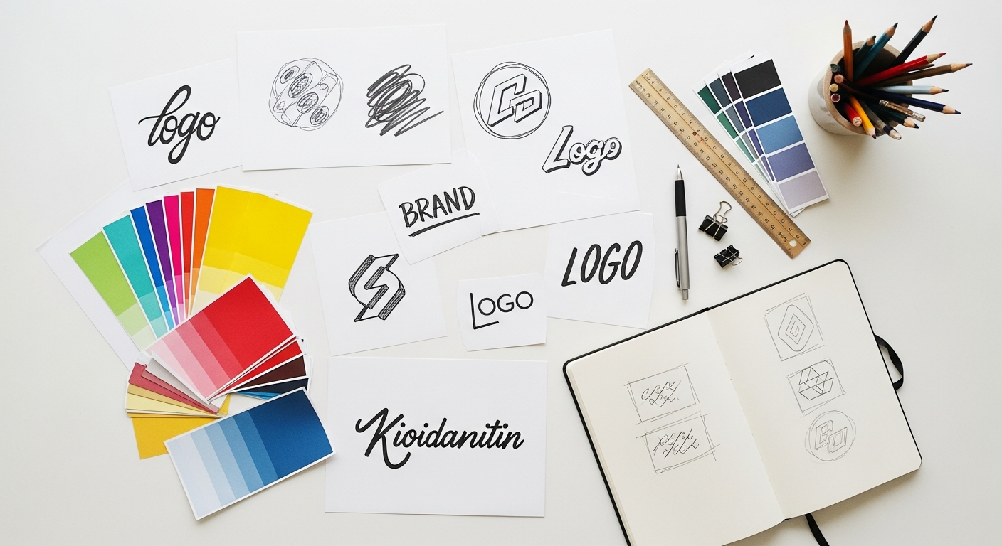
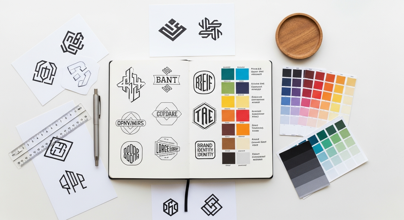
Logo & Its Variations
Your logo is often the first visual encounter someone has with your brand, and it needs to be robust enough for diverse applications. Your guide must meticulously document its usage.
- Primary Logo: The main version, typically horizontal or stacked. Show its clear space (the minimum area around it that must remain free of other elements), minimum size for legibility, and approved background colors.
- Secondary Logos & Submarks: Alternative versions for specific contexts, like social media avatars, app icons, or merchandise where the primary logo might not fit well. Think about simplified versions, icons, or wordmarks.
- Favicons: The tiny icon that appears in browser tabs.
- Color Variations: Full-color, single-color (e.g., black, white), and reverse versions for different backgrounds.
- Misuse Cases: Crucially, show examples of what not to do. This includes stretching, distorting, recoloring, adding effects, or placing the logo on busy backgrounds. This prevents common errors and preserves logo integrity.
- File Formats: Specify which file types should be used for different purposes. For print, vector formats like SVG, AI, and EPS are essential for scalability without pixelation. For digital, PNG (with transparency) and JPG are common.
Tools: Adobe Illustrator is the industry standard for logo creation due to its vector capabilities. For collaborative design, Figma and Sketch also offer powerful vector editing features and are excellent for documenting logo usage within a design system.
Color Palette
Colors evoke emotion and convey meaning. Your guide needs to define a precise, functional color system.
- Primary Colors: The main brand colors, used most frequently.
- Secondary Colors: Supporting colors that complement the primary palette.
- Accent Colors: Used sparingly to draw attention to key elements like calls to action or interactive states.
- Neutral Colors: Grays, off-whites, and blacks for backgrounds, text, and subtle accents.
- Color Values: Provide precise values for each color: Hex codes (for web), RGB (for digital screens), CMYK (for print), and Pantone (for consistent offset printing).
- Usage Guidelines: Specify how colors should be applied. For example, “primary blue for headings, secondary green for buttons, neutral gray for body text.” Include rules for background usage and color hierarchy.
- Accessibility: This is non-negotiable for 2026. Ensure all color combinations (especially text on backgrounds) meet WCAG (Web Content Accessibility Guidelines) contrast ratio standards. Tools like WebAIM’s Contrast Checker or plugins within Figma can help you verify compliance.
Tools: Adobe Color and Coolors.co are fantastic for exploring and generating palettes. Within Figma, you can create and manage color styles, making it easy to apply and update your palette across all designs.
Typography System
Typography defines the brand’s voice – whether it’s sophisticated, playful, serious, or approachable. A well-defined typography system ensures readability and consistency.
- Primary Fonts: Your main typeface(s) for headings and body text.
- Secondary & Accent Fonts: Typefaces used for specific purposes, like quotes, captions, or decorative elements. Limit your font choices to avoid visual clutter and ensure performance.
- Hierarchy: Define the usage for each font family, weight, and size. Specify styles for H1-H6 headings, body text, link text, button text, captions, and UI elements.
- Styling: Document line height (leading), letter spacing (kerning), and paragraph spacing. Provide examples of how each style looks.
- Accessibility: Emphasize readability. Ensure font sizes are adequate, line heights are comfortable, and color contrast is sufficient. Consider font licensing for web and print use.
- Web Fonts vs. Print Fonts: Specify which fonts are optimized for web use (e.g., from Google Fonts or Adobe Fonts) and which are for print.
Tools: Figma and Sketch allow you to create and manage text styles, which are invaluable for maintaining consistency. For font selection and pairing, explore Google Fonts and Adobe Fonts.
Expanding the Visual Language: Beyond the Basics
Once the core elements are established, it’s time to build out the broader visual language that adds depth, personality, and versatility to your brand. These elements are crucial for creating a rich and immersive brand experience.
Imagery & Photography Guidelines
The images you use tell a story and profoundly impact how your brand is perceived.
- Style & Tone: Define the mood and aesthetic. Are images authentic and candid, polished and professional, abstract and artistic, or vibrant and energetic? Provide examples of approved imagery.
- Subject Matter: What themes or subjects should be depicted? What should be avoided? For example, a tech brand might focus on diverse teams collaborating, while an outdoor brand might feature majestic landscapes.
- Lighting & Composition: Are images bright and airy, moody and dramatic, or natural and diffused? Specify preferred compositional techniques (e.g., rule of thirds, leading lines).
- Filters & Treatments: Should images be desaturated, have a specific color overlay, or be heavily filtered? Provide specific examples or presets.
- Dos and Don’ts: Show clear examples of appropriate and inappropriate imagery. This helps prevent generic stock photos that don’t align with the brand.
- Stock Photography: If using stock, specify preferred sources (Unsplash, Pexels, Adobe Stock) and how to select images that fit the brand’s style.
Tools: Adobe Photoshop for image editing and mood board creation.
Iconography & Illustration
Icons and illustrations add visual interest, simplify complex information, and reinforce brand personality.
- Style Guide: Define the aesthetic – are icons line-based, filled, duotone, flat, 3D, or skeuomorphic? Specify stroke weights, corner radius, and overall complexity.
- Consistency: Emphasize uniformity in style, perspective, and level of detail across all icons.
- Color Usage: How should brand colors be applied to icons and illustrations?
- Usage Examples: Show common icons and illustrations in various contexts (e.g., UI elements, marketing materials).
Tools: Adobe Illustrator for vector illustrations and icons. For pre-made icon sets, specify sources like Font Awesome or The Noun Project, with guidelines on how to customize them to match the brand’s style.
Data Visualization & Infographics (If Applicable)
For brands that frequently present data, guidelines for charts, graphs, and infographics are crucial for maintaining consistency and clarity.
- Chart Styles: Define preferred chart types (bar, line, pie, etc.) and their visual treatment.
- Color Mapping: How should brand colors be applied to data sets? Ensure accessibility in color choices.
- Typography for Labels: Specify font styles, sizes, and weights for axes, legends, and data labels.
- Layout & Structure: Guidelines for spacing, grid usage, and overall presentation of infographics.
Tools: While data visualization tools like Tableau or Datawrapper can generate charts, the visual styling should be dictated by your guide, often implemented by designers using Illustrator or Figma.
Motion & Animation Principles
In an increasingly interactive world, motion design is a powerful tool for enhancing user experience and conveying brand personality.
- Brand Personality in Motion: Is the motion subtle and sophisticated, quick and energetic, smooth and fluid, or playful and bouncy?
- Easing & Duration: Define preferred easing curves (e.g., ease-in-out, linear) and typical animation durations for different types of interactions.
- Common Animations: Guidelines for hovers, transitions, loading states, and micro-interactions.
- Sound Design (If Applicable): Brief notes on auditory cues if they are part of the brand experience.
Tools: Adobe After Effects for complex animations. For web and app interfaces, Lottie animations and CSS animations are common, and their behavior should be documented.
Structure & Implementation: Bringing the Guide to Life
A beautifully designed visual identity is useless if it’s not accessible, understandable, and actionable. The structure and format of your guide are just as important as its content. Think of it as a user manual for your brand.
Choosing Your Format
The format you choose depends on your team’s needs and how frequently the guide will be accessed and updated.
- Static PDF Document: Good for initial distribution, archiving, or print-focused brands. However, it can quickly become outdated and isn’t ideal for a “living” document.
- Web-based Guide / Microsite: This is my strong recommendation for today and 2026. It’s easily searchable, always up-to-date, can include interactive examples (e.g., hover states, animation demos), and is accessible from anywhere. It’s fantastic for large, distributed teams.
- Design System Platform: Tools like Zeroheight, Frontify, or integrating directly into Figma (with components and styles) go beyond just a style guide and become a single source of truth for both design and development. This is the gold standard for efficiency and consistency.
Essential Sections & Layout
Regardless of the format, a well-organized guide makes information easy to find and digest.
- Table of Contents: A clear, navigable list of all sections.
- Introduction: Briefly explain the guide’s purpose and the brand’s mission.
- Brand Story/Personality: Reiterate the strategic foundation.
- Core Elements: Detailed sections for Logo, Color, Typography.
- Expanded Elements: Sections for Imagery, Iconography, Motion, etc.
- Usage Examples: Crucially, show both “Do’s” and “Don’ts” with visual examples for each element. This helps prevent misinterpretation.
- Downloadable Assets: Provide easy access to logos, fonts, icon sets, and templates.
Use clear headings (H2, H3), ample white space, and visual hierarchy to make the guide itself a testament to good design.
Version Control & Accessibility
A visual identity guide is a living document.
- Version Control: Implement a system for tracking changes and updates. For web-based guides or design systems, this is often built-in. For static documents, clearly label versions (e.g., v1.0, v1.1).
- Accessibility of the Guide Itself: Ensure the guide is readable and navigable for everyone, including those with disabilities. Use proper HTML semantics, sufficient color contrast, and clear language.
Tools: Cloud storage services like Google Drive or Dropbox can help manage versions of static documents. For design system platforms, versioning is a core feature.
Educating Your Team & Partners
The best guide in the world is useless if no one knows how to use it.
- Onboarding: Integrate the guide into the onboarding process for new designers, marketers, and developers.
- Workshops: Conduct regular workshops to explain key principles and answer questions, especially after major updates.
- Accessibility: Make it effortless to find and access. Link it prominently on internal wikis or project management tools.
The Living Document: Maintaining & Evolving Your Guide
The digital world is constantly shifting. New platforms emerge, trends evolve, and brands grow. Your visual identity guide cannot be a static artifact; it must be a living, breathing document that adapts and evolves with your brand and the market.
Regular Audits & Updates
Schedule periodic reviews of your visual identity guide.
- Annual Review: At least once a year, conduct a thorough audit. Are all components still relevant? Do they accurately reflect the brand’s current strategy and personality?
- Ad-hoc Updates: Don’t wait for the annual review if a significant change occurs. Did you launch a new product line with unique visual requirements? Did a new brand campaign necessitate a slight shift in photographic style? Update the guide as needed.
- Market Trends: While your brand identity should be timeless, its application might need to adapt to current design trends (e.g., the rise of 3D illustrations, dark mode UI). Ensure your guide provides enough flexibility to embrace these without losing core consistency.
Feedback Loops
Your guide is a tool for your team. Gather their input to make it better.
- Internal Stakeholders: Collect feedback from designers, marketers, developers, and even sales teams. Are there areas of confusion? Are components missing? Are the guidelines clear enough?
- User-Friendly: Is the guide easy to navigate and understand? Identify pain points that hinder adoption or lead to misinterpretations. This feedback is invaluable for refining the guide and making it truly useful.
Future-Proofing for 2026 and Beyond
As we look towards 2026, consider how emerging technologies and platforms might impact your brand’s visual identity.
- Scalability for New Mediums: Think beyond traditional web and print. How will your brand appear in augmented reality (AR) or virtual reality (VR) environments? What about AI-generated content? Your guidelines should provide enough flexibility to translate your identity to these new frontiers without losing its essence.
- Dynamic Brand Elements: Consider how your brand might incorporate subtle animations, interactive elements, or even generative design that reacts to user input or data. Your guide can set principles for these dynamic elements.
- Embracing Flexibility: While consistency is key, rigidity can stifle innovation. Your guide should strike a balance, providing clear boundaries while allowing room for creative interpretation and adaptation to new contexts. The goal is consistent experience, not identical replication.
By treating your visual identity guide as a living, evolving asset, you ensure your brand remains relevant, cohesive, and impactful, ready for whatever the future of design brings.