Crafting Captivating Covers: Your Comprehensive Guide to Book Cover Design Principles and Process for 2026
The Foundation: Understanding the Brief and Audience
Before you even think about pixels or typography, the most critical step in any design project, especially book covers, is a deep dive into the brief. This isn’t just about what the author wants; it’s about what the book needs.
Deconstructing the Author’s Vision
- The Core Message: What is the absolute essence of the book? Is it a thrilling mystery, a heartwarming romance, a groundbreaking non-fiction exposé, or a whimsical fantasy? Your design must encapsulate this in a single glance.
- Key Themes & Motifs: Identify recurring symbols, settings, or emotional arcs. These can be powerful visual cues.
- Tone & Mood: Is it serious, humorous, suspenseful, hopeful, dark, or light? The cover’s aesthetic must mirror the book’s emotional landscape.
- Author’s Expectations: While you’re the design expert, understanding the author’s personal preferences and non-negotiables is vital for a smooth collaboration. Ask about covers they love and hate, and why.
Genre Analysis and Target Audience
Every genre has its visual language, a set of unspoken rules that readers rely on for navigation. Ignoring these can alienate your audience, while simply mimicking them can make your book disappear in a sea of similar titles. Your goal is to innovate within the genre’s established visual framework.
- Researching Competitors: Spend time on digital storefronts (Amazon, Kobo, Apple Books) and in physical bookstores. Analyze bestsellers and recent releases within the target genre. What common visual elements, color palettes, and typographic styles do they share? How do they communicate genre instantly?
- Identifying Reader Expectations: A thriller reader expects tension and mystery; a romance reader seeks connection and emotion; a business book reader looks for authority and clarity. Your cover must fulfill these subconscious expectations.
- Demographics & Psychographics: Who is the ideal reader? Their age, interests, lifestyle, and even their preferred aesthetic can influence your design choices. A young adult fantasy cover will look vastly different from a historical fiction aimed at mature readers.
As a seasoned designer, I’ve learned that a truly successful cover doesn’t just look good; it acts as a cultural signifier, speaking directly to its intended audience in a language they instinctively understand. It’s about creating a visual shorthand that says, “If you love [Genre X], you’ll love this book.”
Mastering the Visual Language: Core Design Principles

Once you understand the book’s soul, it’s time to translate it into a compelling visual narrative. This is where your mastery of fundamental design principles becomes paramount.
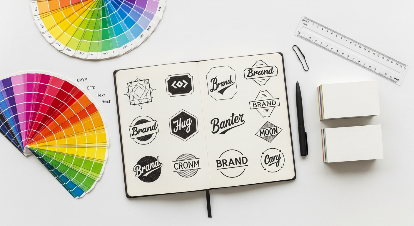
Typography: The Voice of Your Book
Typography on a book cover is more than just text; it’s an emotional cue. The choice of typeface, its size, weight, kerning, leading, and pairing all contribute to the cover’s overall message.
- Readability First: Above all, the title and author name must be instantly legible, especially at thumbnail size.
- Mood & Personality: A serif font might convey tradition or gravitas, a sans-serif modernity or clarity, a script font elegance or whimsy. Match the font’s personality to the book’s tone.
- Typographic Hierarchy: The title is usually dominant, followed by the author name, and then the subtitle or blurb. Use size, weight, and color to guide the reader’s eye.
- Font Pairing: Aim for contrast but also harmony. A strong serif title paired with a clean sans-serif for the author name can create visual interest without clutter. Limit yourself to 2-3 fonts to avoid visual chaos.
Color Theory: Evoking Emotion and Setting the Scene
Color is perhaps the most immediate emotional trigger in design. A well-chosen palette can instantly communicate genre, mood, and even character.
- Color Psychology: Understand the cultural and psychological associations of colors. Reds for passion/danger, blues for calm/trust, greens for nature/growth, blacks for mystery/sophistication.
- Genre Conventions: Certain genres lean on specific palettes (e.g., bright, bold colors for children’s books; muted, earthy tones for literary fiction; stark contrasts for thrillers).
- Contrast & Harmony: Use color to create focal points and ensure legibility. A strong contrast between text and background is essential. Explore complementary, analogous, and monochromatic schemes.
- Accessibility: Ensure sufficient color contrast for readers with visual impairments, particularly if your book has a significant digital presence. Tools like the Web Content Accessibility Guidelines (WCAG) contrast checker can be useful here.
Imagery & Illustration: The Heart of the Visual Story
Whether you use photography, custom illustration, or abstract graphics, the central image is often what captures initial attention.
- Relevance: The image must directly relate to the book’s content or themes, without giving away major spoilers.
- Quality & Impact: Use high-resolution images. For photography, ensure professional quality. For illustration, consider the style – does it align with the book’s tone (e.g., whimsical, gritty, realistic)?
- Symbolism: Can a single image convey a complex idea or emotion? A lone figure, a specific object, or a striking landscape can be incredibly powerful.
- Originality vs. Stock: While stock photography can be a cost-effective solution, it often lacks uniqueness. Custom illustration or photography, though more expensive, can give your cover a distinct, memorable edge. When using stock, ensure you modify it significantly to avoid a generic feel.
Composition & Hierarchy: Guiding the Eye
Composition is how you arrange all the elements on the page. Hierarchy ensures that the most important information is seen first.
- Focal Point: What’s the first thing you want the reader to see? This should be the most prominent element.
- Rule of Thirds/Golden Ratio: Use these classic compositional guidelines to create balanced and visually pleasing layouts.
- White Space: Don’t be afraid of empty space. It allows elements to breathe and prevents the cover from looking cluttered.
- Flow: Arrange elements so the eye naturally moves from one point to the next, guiding the reader through the information.
The Thumbnail Test: Digital-First Impact
This is where UI/UX thinking truly shines. In today’s market, most readers first encounter a book cover as a small thumbnail on an e-commerce site. Your cover must be impactful and legible even at 100×150 pixels.
- Simplicity: Overly complex designs get lost. Focus on one strong visual idea.
- Bold Typography: Ensure the title is clear and readable at small sizes.
- Strong Contrast: High contrast helps elements pop.
- Instant Genre Recognition: Can someone tell what genre it is from a tiny image?
Always test your designs by shrinking them down to thumbnail size. If it doesn’t work small, it won’t work big either.
The Modern Designer’s Toolkit: Software and Resources
The right tools empower you to execute your vision with precision and efficiency. Here’s a rundown of essential software and resources for book cover design in 2026.
Core Design Software
- Adobe Photoshop: The industry standard for raster image manipulation. Essential for photo-based covers, compositing multiple images, color grading, and adding textures. Its non-destructive editing capabilities are a lifesaver.
- Adobe Illustrator: Your go-to for vector graphics. Perfect for custom typography, logos, geometric patterns, and scalable illustrations. Ensures crisp lines and infinite scalability for print.
- Adobe InDesign: While Photoshop and Illustrator can handle many covers, InDesign excels at multi-page layouts, which is crucial for full wraparound covers including the spine and back cover. It’s built for print production, offering precise control over text flow, bleeds, and slugs.
- Figma / Adobe XD: Increasingly valuable for initial concepting, mood boarding, and client presentations. Their collaborative features allow for real-time feedback and quick iterations on digital mock-ups. You can rapidly explore different layouts, color schemes, and typographic pairings, especially when presenting digital-first cover concepts.
Alternative & Specialized Tools
- Affinity Suite (Photo, Designer, Publisher): A powerful, more affordable alternative to Adobe, offering similar capabilities for raster, vector, and layout design.
- Procreate (iPad): Excellent for hand-drawn illustrations and digital painting, offering a natural feel for artists who prefer a more tactile approach. Integrates well with Photoshop for final touches.
- Blender / Cinema 4D: For designers incorporating 3D elements, these tools offer advanced modeling, rendering, and texturing capabilities to create stunning, photorealistic (or stylized) visuals.
Essential Resources
- Stock Photo & Illustration Libraries: Unsplash, Pexels, Adobe Stock, Shutterstock, Getty Images. Remember to check licensing carefully and always aim to customize stock assets significantly.
- Font Libraries: Google Fonts, Adobe Fonts, MyFonts, Font Squirrel, Creative Market. Invest in high-quality fonts that support your brand and message.
- Mock-up Generators: Smartmockups, Placeit. These tools help you visualize your cover on various book formats, e-readers, and marketing materials, which is excellent for client presentations and social media assets.
- Mood Boarding Tools: Pinterest, Milanote, Figma/XD artboards. Essential for gathering inspiration and communicating visual direction.
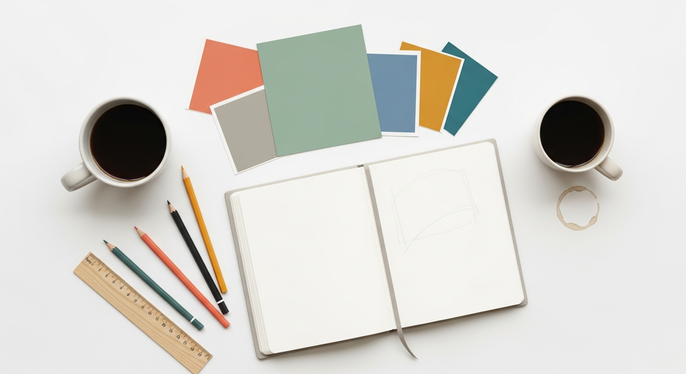
The Iterative Process: From Concept to Final Artwork
Great book covers aren’t born in a flash of genius; they’re the result of a structured, iterative process.
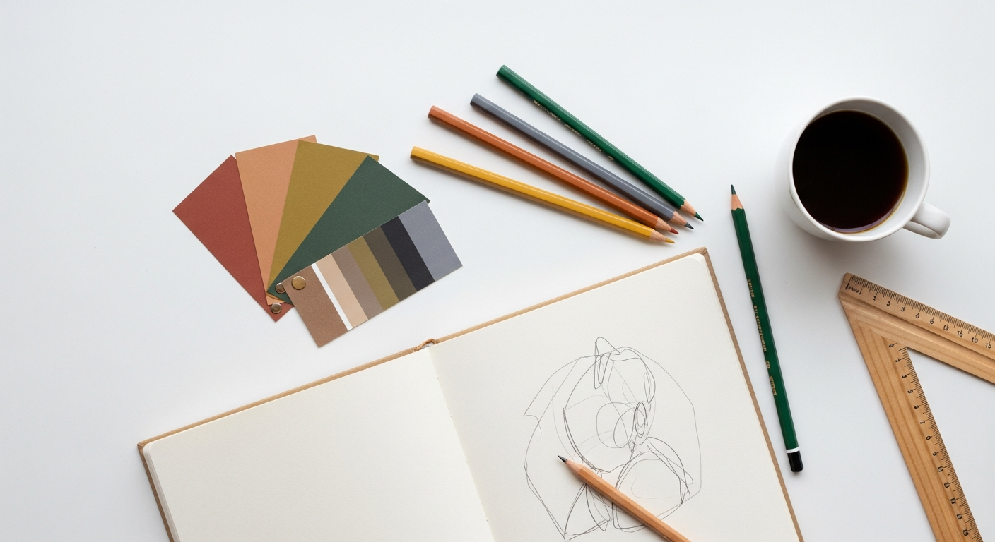
Phase 1: Research & Mood Boarding (1-2 Days)
- Deep Dive: Revisit the brief, genre analysis, and competitor research.
- Inspiration Gathering: Collect images, typography, color palettes, and existing covers that resonate with the book’s themes and target audience. Don’t just look at book covers; draw inspiration from film posters, album art, fashion, and fine art.
- Synthesize: Create a digital mood board (using Pinterest, Milanote, or even an artboard in Figma) that visually communicates the desired aesthetic, tone, and direction. Share this with the author for early alignment.
Phase 2: Thumbnail Sketches & Concepts (2-3 Days)
- Rapid Ideation: Start with rough, low-fidelity sketches. These can be on paper or quick digital blocks in Figma. Focus on composition, focal points, and overall layout. Don’t get bogged down in details.
- Explore Multiple Directions: Aim for 3-5 distinct concepts. One might be genre-standard, another more abstract, one focusing on typography, another on imagery. This variety helps the client articulate what they like and dislike.
- Present Initial Ideas: Share these rough concepts with the author, explaining the rationale behind each. This early feedback prevents wasted time on fully developed designs that miss the mark.
Phase 3: Digital Mock-ups & Refinement (3-5 Days)
- Bring Concepts to Life: Select 1-2 strongest concepts (or the client’s preferred direction) and develop them in your core design software (Photoshop, Illustrator, InDesign).
- Focus on Detail: Implement chosen typography, source or create imagery, finalize color palettes. Pay meticulous attention to visual hierarchy, balance, and readability.
- Create Mock-ups: Use mock-up generators to show the cover in realistic contexts (on an e-reader, a physical book, a bookshelf). This helps the client visualize the final product.
Phase 4: Feedback & Iteration (Ongoing)
- Structured Feedback: Present the refined mock-ups to the author. Encourage specific, constructive feedback. Use tools like Figma’s commenting feature or InVision for clear communication.
- Iterate Thoughtfully: Implement feedback, making changes that improve the design while staying true to the book’s essence. Be prepared to explain your design choices and push back gently if a suggestion compromises the design’s effectiveness.
- Multiple Rounds: Expect 2-3 rounds of significant revisions. This iterative loop is where good designs become great.
Phase 5: Pre-press & Deliverables (1-2 Days)
- Print Specifications: Work closely with the publisher or author to get precise print specifications: trim size, bleed, spine width (calculated based on page count and paper stock), and ISBN placement.
- Back Cover & Spine Design: Design the back cover (blurb, author bio, barcode) and spine (title, author, publisher logo) to seamlessly integrate with the front.
- File Preparation: Export high-resolution print-ready files (typically PDF/X-1a or PDF/X-4) with correct color profiles (CMYK), crop marks, and bleed.
- Digital Assets: Prepare web-optimized versions (JPEG, PNG) for e-book platforms and marketing materials (social media banners, website headers). Ensure these are appropriately sized and compressed.
Beyond the Cover: Digital & Print Considerations for 2026
Designing for 2026 means thinking holistically about how a cover functions across all mediums, from a physical bookstore shelf to a TikTok ad.
Digital-First Mentality
The vast majority of initial book discoveries happen online. This means your cover must perform exceptionally well as a small, compressed image.
- Thumbnail Optimization: As discussed, this is non-negotiable. Simplify, use bold elements, and ensure legibility.
- Responsive Design Principles: Think about how the cover might be cropped or displayed on different screen sizes and aspect ratios for marketing.
- Accessibility: Ensure text contrast, and consider providing descriptive alt text for digital images of covers, benefiting visually impaired readers.
Print Specifications and Production
While digital is king for discovery, a physical book remains a cherished object. Understanding print requirements is crucial.
- Bleed & Trim: Design with an adequate bleed margin to prevent unsightly white edges after trimming.
- Spine Width: This is determined by the book’s page count and paper thickness. Always get the exact measurement from the printer.
- Color Profiles: Work in CMYK for print. Understand how colors might shift from screen (RGB) to print. A soft proof can help manage expectations.
- Special Finishes: Consider spot UV, foil stamping, embossing, or debossing for premium covers. These tactile elements can significantly enhance a physical book’s appeal, but must be designed for from the outset.
Marketing Assets & Brand Consistency
A book cover is just one piece of a larger marketing puzzle. Think about how the design translates to other promotional materials.
- Social Media Graphics: Create variations for Instagram, Facebook, X (formerly Twitter), and Pinterest. Consider short animated snippets for platforms like TikTok or Reels, showcasing the cover’s key elements.
- Website Banners & Ads: Adapt the cover’s aesthetic for various digital ad formats.
- Author Branding: Ensure the cover aligns with the author’s overall brand identity, especially for authors with multiple books.
Elevating Your Craft: Advanced Tips & Future-Proofing
- Develop Your Signature Style: While adhering to genre conventions, strive to infuse your unique artistic voice. This will make your work recognizable and sought after.
- Understand Licensing: Be meticulous about image, font, and illustration licensing. Proper attribution and usage rights are critical.
- Storytelling Through Design: Always ask yourself: “Does this cover tell a compelling story, even without words?” The best covers hint at the narrative, build intrigue, and promise an experience.
- Continuous Learning: The design landscape is always evolving. Stay updated with new software features, design trends, and publishing industry shifts. Attend webinars, read design blogs (like Layout Scene!), and experiment.
In 2026, the demand for striking, effective book covers will only intensify. By mastering these principles and processes, you’re not just designing a pretty picture; you’re crafting a powerful marketing tool that connects readers with stories, making you an indispensable asset in the publishing world.