Mastering Blog Design Patterns for Enhanced Article Engagement
We’ll explore how thoughtful design choices, from typography and layout to interactive elements and accessibility considerations, can transform a static page into a dynamic hub of information. By applying established UI/UX principles and leveraging modern design thinking, you can create a blog that not only informs but also delights, fostering a deeper connection with your audience. Get ready to elevate your blog’s design from functional to truly captivating, ensuring every article you publish achieves its maximum potential for engagement.
Understanding Engagement: Beyond the Click
Before diving into specific design patterns, it’s crucial to define what “engagement” truly means in the context of a blog. It’s far more nuanced than a simple page view. True engagement encompasses several key metrics and user behaviors:
- Time on Page/Dwell Time: How long a user spends actively interacting with your content. Longer times often indicate deeper interest.
- Scroll Depth: How far down the page a user scrolls. Reaching the end suggests they’ve consumed the majority of your article.
- Bounce Rate: The percentage of visitors who leave your site after viewing only one page. A low bounce rate on blog articles is desirable.
- Interaction with Embedded Elements: Clicks on images, videos, infographics, or interactive charts.
- Internal Link Clicks: Navigating to other articles or relevant pages within your site.
- Social Shares: Sharing the article on social media platforms.
- Comments: Leaving feedback or engaging in discussions below the article.
- Calls to Action (CTA) Conversion: Signing up for a newsletter, downloading a resource, or making a purchase directly from the article.
As UI/UX designers, our goal is to craft an experience that nudges users towards these positive behaviors. This requires a holistic approach, considering not just the aesthetic appeal but also the usability, accessibility, and overall flow of information. Nielsen Norman Group research consistently shows that users scan rather than read every word, especially on the web. Therefore, design patterns must facilitate quick comprehension and effortless navigation, making it easy for readers to find value and stay engaged.
The design choices you make directly influence whether a reader feels overwhelmed, bored, or genuinely interested. A cluttered layout, inconsistent typography, or a lack of visual cues can quickly deter even the most motivated reader. Conversely, a well-structured, visually appealing, and interactive article can transform a casual visitor into an active participant. By understanding these dimensions of engagement, you can strategically apply design patterns to meet and exceed user expectations, fostering a more meaningful interaction with your blog content.
The Power of Visual Hierarchy and Readability
Visual hierarchy is the bedrock of effective UI/UX design, particularly for content-heavy pages like blog articles. It guides the reader’s eye, emphasizing key information and creating a logical flow through the content. Without a clear hierarchy, your article becomes a wall of text, intimidating and difficult to digest. Here’s how to leverage it:
- Typography as a Guide:
- Headings (H1-H6): Use a clear, consistent hierarchy. Your H1 should be prominent, H2s break up major sections, and H3s delineate sub-topics. Varying font sizes, weights, and even colors (sparingly) can differentiate these levels.
- Body Text: Choose a highly readable font (e.g., sans-serifs like Lato, Open Sans, or serif fonts like Merriweather for long-form content). Ensure a comfortable line height (1.5-1.8 times the font size) and ample letter spacing.
- Contrast: Adhere to WCAG guidelines for color contrast between text and background. Aim for at least a 4.5:1 ratio for normal text and 3:1 for large text to ensure readability for users with visual impairments.
- Strategic Use of White Space:
- Paragraph Spacing: Generous spacing between paragraphs prevents text from feeling dense and allows for natural breaks.
- Margin and Padding: Ample margins around the main content block and padding within elements (like callout boxes) prevent a cramped feel and improve focus.
- Line Length: The optimal line length for readability is generally considered to be 50-75 characters per line. Too short makes eyes jump frequently; too long makes it hard to track.
- Visual Cues and Formatting:
- Bold and Italics: Use sparingly to highlight keywords or important phrases. Overuse diminishes their impact.
- Bullet and Numbered Lists: Break down complex information into easily digestible points. This is a prime example of scannable content.
- Blockquotes: Use to emphasize important quotes or statements, setting them apart visually from the main text.
- Callout Boxes/Highlights: Design distinct sections for key takeaways, definitions, or warnings. Material Design principles often advocate for clear visual separation using cards or elevated surfaces.
By meticulously crafting your visual hierarchy, you not only make your content more aesthetically pleasing but also significantly improve its comprehensibility and scannability, directly contributing to higher engagement. Readers can quickly grasp the structure, identify key points, and decide where to focus their attention, reducing cognitive load and encouraging them to stay longer on the page.
Crafting Compelling Introductions and Scannable Content
The introduction of your blog post is your first, and often only, chance to hook a reader. It needs to be concise, engaging, and immediately convey the value proposition of the article. Think of it as a micro-story that sets the stage and promises a solution or insight. Beyond the intro, the entire article must be designed for scannability, acknowledging that most users don’t read every word.
Compelling Introductions:
- The Hook: Start with a question, a surprising statistic, a bold statement, or a relatable anecdote. Something that piques curiosity.
- Problem/Solution: Clearly articulate the problem the reader might be facing and hint at how your article will provide the solution.
- Value Proposition: Explicitly state what the reader will gain by reading the article – new knowledge, a practical skill, a fresh perspective.
- Conciseness: Keep intros to 2-3 short paragraphs, ideally under 150 words. Get to the point quickly to avoid losing attention.
Designing for Scannability:
Once you’ve hooked them, you need to ensure the rest of the article is easy to navigate and digest. This is where design patterns directly support content consumption:
- Frequent Subheadings (H2, H3): Break your content into logical, bite-sized chunks with descriptive subheadings. These act as mini-headlines, allowing readers to quickly grasp the topic of each section and jump to areas of interest.
- Short Paragraphs: Avoid dense blocks of text. Aim for paragraphs of 3-5 sentences maximum. Shorter paragraphs are less intimidating and easier to read on screens.
- Bullet Points and Numbered Lists: As discussed, these are invaluable for presenting information in an organized, easy-to-scan format. Use them for features, steps, advantages, disadvantages, or any collection of related items.
- Visual Separators: Use horizontal rules (
<hr>) or subtle graphic dividers to visually separate distinct sections or ideas when a subheading isn’t appropriate but a break is needed. - In-text Highlighting: Judicious use of bolding for keywords, names, or key phrases helps readers quickly identify the core message of a paragraph without reading every word.
- Summary Boxes: For longer, more complex articles, consider a “Key Takeaways” or “In This Section” box at the beginning or end of major sections to provide a quick summary.
By combining a strong opening with a highly scannable structure, you empower readers to extract value efficiently, catering to both those who want to deep-dive and those who prefer to skim. This user-centric approach to content presentation significantly boosts engagement by respecting the reader’s time and cognitive load.
Interactive Elements and Multimedia Integration
Static text, no matter how well-written, can only hold attention for so long. Integrating interactive elements and rich multimedia transforms a passive reading experience into an active, immersive one, dramatically increasing engagement. These elements break up text, illustrate complex concepts, and provide alternative ways to consume information.
Types of Interactive Elements and Multimedia:
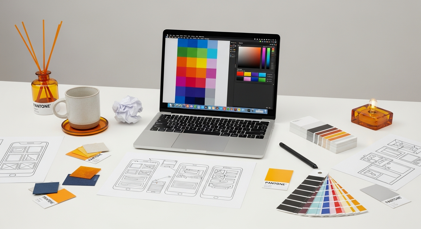
- High-Quality Images and Graphics:
- Purpose: Visual appeal, breaking up text, illustrating points, evoking emotion.
- Best Practices: Use relevant, high-resolution images. Optimize file sizes for fast loading. Include descriptive alt text for accessibility (WCAG). Consider custom illustrations or infographics to convey unique data.
- Placement: Strategically place images near relevant text sections. Use hero images at the top of an article to set the tone.
- Videos and Animated GIFs:
- Purpose: Demonstrations, tutorials, interviews, adding dynamic content.
- Best Practices: Embed videos from platforms like YouTube or Vimeo for optimal performance. Ensure videos are short and to the point. Provide transcripts or captions for accessibility. GIFs can convey quick concepts or add personality.
- Infographics and Data Visualizations:
- Purpose: Presenting complex data or processes in an easily digestible, visual format.
- Best Practices: Design clear, concise infographics. Ensure data is accurate and sources are cited. Make them shareable. Tools like Canva, Piktochart, or Adobe Illustrator can be used.
- Embedded Interactive Content:
- Quizzes and Polls: Engage readers by asking for their opinions or testing their knowledge.
- Calculators: Provide practical tools relevant to the article’s topic (e.g., a UX ROI calculator).
- Interactive Charts/Maps: Allow users to explore data points or locations.
- Code Snippets (for design/dev blogs): Highlighted and easily copyable code blocks are essential.
- Audio Snippets/Podcasts:
- Purpose: Offer an auditory alternative for consuming content, catering to different learning styles or contexts.
- Best Practices: Embed short audio clips for interviews or explanations. Ensure a player is easily accessible and controllable.
When integrating multimedia, always consider its relevance and value to the user. Don’t just add elements for the sake of it. Each piece of media should enhance understanding, illustrate a point, or offer a new dimension to the content. Furthermore, ensure all multimedia is optimized for fast loading and accessibility. Slow loading times due to unoptimized images or videos can severely detract from the user experience, leading to high bounce rates. Thoughtful integration of these elements can transform an ordinary blog post into a memorable and highly engaging experience.
Optimizing for Mobile and Accessibility
In today’s multi-device world, a blog article that isn’t optimized for mobile is effectively inaccessible to a significant portion of your audience. Similarly, neglecting accessibility alienates users with disabilities and can even lead to legal repercussions. These aren’t just good practices; they are foundational requirements for driving engagement and ensuring inclusivity.
Mobile Optimization (Responsive Design):
A responsive design approach ensures your blog content adapts seamlessly to various screen sizes, from large desktop monitors to tablets and smartphones. Here are key considerations:
- Fluid Layouts: Use relative units (percentages, ems, rems) instead of fixed pixels for widths and heights.
- Flexible Images and Media: Images should scale down or up without breaking the layout. Implement
max-width: 100%; height: auto;for images. - Breakpoints: Define specific breakpoints in your CSS to adjust layout, font sizes, and element arrangements for different device categories.
- Touch Targets: Ensure interactive elements (buttons, links) are large enough and have sufficient spacing for easy tapping on touchscreens (Nielsen Norman Group recommends at least 48×48 CSS pixels).
- Readability on Small Screens: Adjust font sizes and line heights for optimal reading on mobile. Long lines of text are particularly problematic on narrow screens.
- Navigation: Simplify navigation menus for mobile, often using a “hamburger” icon or similar pattern to save space.
- Performance: Mobile users are often on slower connections. Optimize images, minify CSS/JS, and leverage browser caching to ensure fast loading times. Google’s Core Web Vitals heavily emphasize mobile performance.
Accessibility (WCAG Compliance):
Designing for accessibility means making your content usable by everyone, regardless of their abilities or the assistive technologies they use. The Web Content Accessibility Guidelines (WCAG) provide a comprehensive framework.
- Semantic HTML: Use appropriate HTML tags (
<h1>,<p>,<ul>,<a>,<img>, etc.) to structure your content logically. This helps screen readers interpret the page structure. - Alt Text for Images: Provide descriptive
altattributes for all meaningful images. This allows screen readers to convey the image’s content to visually impaired users. - Keyboard Navigation: Ensure all interactive elements (links, buttons, forms) can be accessed and operated using only a keyboard. Focus indicators should be visible.
- Color Contrast: As mentioned, maintain sufficient contrast between text and background colors to aid users with low vision or color blindness.
- Clear Link Text: Link text should be descriptive and make sense out of context (e.g., “Read our accessibility guide” instead of “Click here”).
- Captions and Transcripts for Multimedia: Provide captions for videos and transcripts for audio content to benefit users who are deaf or hard of hearing, or those who prefer reading.
- Form Labels: All form inputs should have properly associated labels (using the
<label>tag) for screen reader users.
By prioritizing both mobile optimization and accessibility, you not only expand your potential audience but also demonstrate a commitment to inclusive design. This commitment enhances your brand’s reputation and ensures a positive, equitable experience for every visitor to your blog.
Strategic Calls to Action and Internal Linking
Once you’ve captivated your reader with engaging content and an excellent user experience, the next step is to guide them towards further interaction. Strategic Calls to Action (CTAs) and intelligent internal linking are crucial design patterns for converting passive readers into active participants, whether that means subscribing, sharing, or exploring more content.
Effective Calls to Action (CTAs):
A CTA is a prompt that encourages a user to take a specific action. For blog articles, CTAs should be relevant, clear, and visually distinct.
- Clarity and Conciseness: Use action-oriented language that clearly states what will happen (e.g., “Download the Ebook,” “Subscribe to Our Newsletter,” “Read More Case Studies”).
- Visual Prominence: CTAs should stand out from the surrounding content. This can be achieved through:
- Button Design: Use contrasting colors, ample padding, and clear typography. Material Design guidelines offer excellent principles for button states and hierarchy.
- Placement: Strategically place CTAs at logical points in the article, often at the end, or after a section that naturally leads to the desired action. Sometimes, a subtle in-text CTA can work mid-article.
- White Space: Surround CTAs with sufficient white space to draw attention to them.
- Value Proposition: Briefly remind the user of the benefit they’ll receive by clicking the CTA. For example, “Subscribe to get weekly UX insights” instead of just “Subscribe.”
- Variety: Don’t limit yourself to one type of CTA. You might have a primary CTA (e.g., newsletter signup) and secondary CTAs (e.g., share on social media, read related articles).
Intelligent Internal Linking:
Internal links connect different pages within your own website. They are vital for SEO, guiding users through your content, and increasing time on site.
| Method | Engagement Impact | Pros | Cons | Best Use Cases |
|---|---|---|---|---|
| Plain Text Article | Low to Moderate | Fast loading, easy to produce | Can be visually monotonous, lower retention | Quick updates, news, very short posts |
| Rich Media Article (Images, Videos) | Moderate to High | Visually appealing, breaks up text, better retention | Requires media creation, potential for slow load times if not optimized | Tutorials, product reviews, thought leadership, interviews |
| Interactive Article (Quizzes, Infographics) | High | Highly engaging, memorable, encourages participation | Complex to create, requires development/design resources | Data-heavy posts, educational content, lead generation |
| Scannable Article (Lists, Subheadings) | High (for information retrieval) | Quick comprehension, caters to scanners, reduces cognitive load | Can feel fragmented if overused, less narrative flow | How-to guides, best practices, comparative lists |
- Contextual Linking: Embed links naturally within the body text to related articles, definitions, or resources on your site. For example, “Learn more about UX research methods in our detailed guide.”
- “Related Posts” Sections: After the main content, offer a curated list of 3-5 related articles. Use algorithms or manual curation to ensure relevance.
- “Next Article” or “Previous Article” Links: For serial content or structured learning paths, these guide users through a sequence.
- Resource Hubs: Link to broader resource pages or categories where readers can explore more on a topic.
- Anchor Text Optimization: Use descriptive keywords in your anchor text, not generic phrases like “click here.” This benefits both SEO and user understanding.
By thoughtfully integrating CTAs and internal links, you create a guided journey for your readers. You don’t just present information; you curate an experience that encourages deeper exploration, ultimately increasing time on site, reducing bounce rates, and moving users further down your conversion funnel.
Leveraging User Feedback and Analytics for Iterative Design
The design process isn’t a one-and-done affair, especially in the dynamic world of web content. To truly drive and sustain engagement, you must embrace an iterative approach, continuously gathering user feedback and analyzing performance data. This allows you to identify what’s working, what’s not, and where opportunities for improvement lie.
Tools and Methods for Gathering Feedback and Data:
- Web Analytics Platforms (e.g., Google Analytics):
- Key Metrics: Track page views, unique visitors, average time on page, bounce rate, exit rate, scroll depth (via events), and conversion rates for CTAs.
- Behavior Flow: Understand how users navigate through your site from a blog post.
- Audience Demographics: Gain insights into who your readers are.
- Heatmaps and Session Recordings (e.g., Hotjar, Crazy Egg):
- Heatmaps: Visually show where users click, move their mouse, and how far they scroll on a page. This can reveal areas of interest or confusion.
- Session Recordings: Watch actual user sessions to understand their journey, identify pain points, and observe interactions with specific design elements.
- A/B Testing (e.g., Google Optimize, Optimizely):
- Method: Create two or more versions of a design element (e.g., CTA button color, headline, image placement) and show them to different segments of your audience.
- Purpose: Statistically determine which version performs better against a defined metric (e.g., click-through rate, time on page).
- User Surveys and Feedback Widgets:
- Method: Implement short, contextual surveys (e.g., “Was this article helpful?”) or feedback widgets (e.g., thumbs up/down, star ratings) directly on your blog posts.
- Purpose: Gather qualitative insights into user satisfaction, content clarity, and specific pain points.
- Comment Sections and Social Media Monitoring:
- Qualitative Feedback: Read comments on your blog and social media mentions. These often contain direct feedback about content clarity, design issues, or missing information.
- Community Engagement: Active comment sections themselves are a sign of engagement.
Applying Insights for Iterative Design:
Once you’ve collected data, the crucial step is to translate it into actionable design improvements:
- Identify Drop-off Points: If analytics show users consistently leave at a certain point, investigate the content or design of that section. Is it too dense? Is the image irrelevant?
- Optimize CTAs: A/B test different CTA texts, colors, or placements if conversion rates are low.
- Improve Scannability: If scroll depth is low, consider breaking up long paragraphs, adding more subheadings, or incorporating lists.
- Enhance Visuals: If heatmaps show users ignoring certain images, replace them with more relevant or engaging visuals.
- Address Accessibility Issues: User feedback or accessibility audits might highlight areas where WCAG guidelines are not met, impacting usability for some users.
By integrating this continuous feedback loop into your UI/UX design process, you ensure your blog remains dynamic, responsive to user needs, and consistently optimized for maximum engagement. This data-driven approach is a hallmark of mature design practice and essential for long-term success.
Beyond the Article: Related Content and Community Features
Engaging a reader doesn’t end when they finish reading a single article. The goal is to foster a relationship, encourage deeper exploration of your content ecosystem, and build a sense of community. Design patterns that facilitate this “beyond the article” experience are crucial for long-term engagement and brand loyalty.
Curating Related Content:
Once a reader has finished an article, their interest in that topic, or related ones, is likely at its peak. This is the prime opportunity to present them with more valuable content.
- “Related Posts” Widgets:
- Placement: Typically at the bottom of the article, above the comments section.
- Design: Use clear thumbnails, concise titles, and a brief description (optional). Make them visually appealing but not distracting.
- Relevance: Ensure the suggested articles are genuinely relevant, either by topic, category, tags, or author. Intelligent algorithms can help, but manual curation often yields the best results.
- Quantity: Offer 3-5 related articles to avoid overwhelming the user.
- Category/Tag Navigation:
- Purpose: Allow users to easily browse all articles within a specific category or under a particular tag.
- Placement: Often in a sidebar, at the top of an article, or as part of the meta-information (e.g., “Posted in: UX Design“).
- Design: Make these links clear and easily discoverable.
- Author Box:
- Purpose: Humanize your content by showcasing the author’s expertise and personality.
- Content: Include a photo, short bio, social media links, and a link to all articles by that author.
- Benefit: Builds trust and allows readers to follow specific voices they connect with.
- Content Series/Collections:
- Design Pattern: If an article is part of a series, clearly indicate its position (e.g., “Part 3 of 5”) and provide navigation to previous and next articles in the series.
- Benefit: Encourages sequential consumption and deeper understanding of a topic.
Fostering Community Features:
Turning your blog into a platform for discussion can significantly boost engagement and create a loyal audience.
- Comments Section:
- Design: Make it easy to comment. Use a clear input field, indicate required fields, and provide options for replies.
- Moderation: Implement a moderation strategy to ensure respectful and relevant discussions.
- Interaction: Encourage authors and community managers to respond to comments, fostering dialogue. Platforms like Disqus or native WordPress comments are common.
- Social Sharing Buttons:
- Placement: Prominently display share buttons (floating, at top/bottom of article).
- Design: Use recognizable icons for major platforms (Twitter, LinkedIn, Facebook, Pinterest).
- Benefit: Low-friction way for readers to become advocates for your content.
- Subscription Options:
- Purpose: Convert one-time visitors into recurring readers.
- Design: Offer clear sign-up forms for email newsletters, RSS feeds, or push notifications. Highlight the value proposition.
- User-Generated Content (e.g., Reviews, Testimonials):
- Context: While less common for pure blog posts, if your blog features product reviews or case studies, allowing user contributions can be highly engaging.
By thoughtfully designing for these “beyond the article” interactions, you extend the user’s journey, build a stronger community around your content, and ultimately drive deeper, more sustained engagement with your blog and your brand.
Key Takeaways
- Prioritize Visual Hierarchy and Scannability: Use clear headings, ample white space, and lists to guide the reader’s eye and make content easy to digest, following Nielsen Norman Group principles.
- Integrate Rich Media Strategically: Employ high-quality images, videos, and infographics to break up text, illustrate points, and create a more dynamic, engaging experience.
- Optimize for Mobile and Accessibility: Ensure responsive design for all devices and adhere to WCAG guidelines for inclusivity, making your content accessible to everyone.
- Implement Clear CTAs and Internal Linking: Guide users to further action or related content with well-designed calls to action and contextual internal links to increase time on site and conversions.
- Embrace Iterative Design with Analytics: Continuously gather user feedback and analyze data (e.g., Google Analytics, heatmaps) to refine your design patterns and improve engagement over time.
Frequently Asked Questions
Q: How important is mobile responsiveness for blog articles?
A: Mobile responsiveness is critically important. A significant portion of web traffic comes from mobile devices, and Google prioritizes mobile-first indexing. A non-responsive design leads to poor user experience, high bounce rates, and negatively impacts your search engine rankings. It’s a fundamental requirement for modern web design, as highlighted by WCAG for accessibility and Google for user experience.
Q: What’s the ideal length for a blog article to maximize engagement?
A: There’s no single “ideal” length; it depends on the topic and audience. For SEO purposes, longer, comprehensive articles (1500-2500 words) often perform well, as they can cover a topic in depth. However, engagement is also about quality and relevance. A 500-word article can be highly engaging if it’s concise and delivers immediate value. The key is to make every word count and ensure the article is well-structured and scannable, regardless of length, to maintain reader interest.
Q: How can I use visual hierarchy to improve readability?
A: Visual hierarchy guides the reader’s eye. Use distinct font sizes, weights, and colors for headings (H1, H2, H3) to signal importance and structure. Employ ample white space around paragraphs and elements to