Mastering Data Table Design Patterns for Complex Applications
This comprehensive guide is tailored for UI/UX designers and design students who are ready to tackle the complexities of data table design head-on. We’ll delve into the foundational principles, essential features, advanced interaction patterns, and critical accessibility considerations that elevate a mere grid of data into a powerful user tool. By the end, you’ll be equipped with the knowledge and strategies to design data tables that not only look good but also perform exceptionally, even in the most demanding application environments.
Understanding the Core Challenge: Why Data Tables Are Tricky
Data tables, at their core, are about displaying structured information in rows and columns. Simple enough, right? Not so fast. The inherent complexity arises when you introduce large datasets, multiple data types, diverse user tasks, and varying screen sizes. Users don’t just want to *see* data; they want to *do things* with it: compare, filter, sort, edit, export, and derive meaning. This often involves juggling multiple cognitive loads simultaneously.
One of the primary challenges is managing information overload. Presenting too much data without proper organization leads to cognitive strain. Users struggle to find what they need, leading to errors and inefficiency. Another hurdle is balancing density with readability. Enterprise applications often demand high information density, but cramming too much into a small space compromises legibility and accessibility. Designers must also contend with the dynamic nature of data; tables are rarely static, requiring robust solutions for real-time updates, user-driven customizations, and complex interactions.
Furthermore, the context in which a data table is used significantly impacts its design. A table for financial traders needing real-time updates and lightning-fast actions will differ vastly from one used by a HR manager reviewing employee records or a data scientist analyzing experimental results. Each scenario brings its own set of priorities, from performance and responsiveness to advanced filtering capabilities and bulk actions. Ignoring these contextual nuances is a common pitfall that results in generic, ineffective table designs. Your goal is to design a table that acts as a powerful extension of the user’s intent, not just a display grid.
Foundational Principles of Effective Data Table Design
Before diving into specific components, it’s crucial to establish a strong foundation built on core UX principles. These principles act as your compass, guiding design decisions towards optimal usability and user satisfaction.
- Clarity and Readability: The primary goal of any data table is to make information understandable at a glance. This means careful attention to typography (font size, line height, weight), sufficient contrast between text and background, and appropriate spacing. Avoid visual clutter. Nielsen Norman Group (NN/g) emphasizes that scannability is paramount; users often skim, looking for specific pieces of information.
- Information Hierarchy: Not all data is equally important. Establish a clear visual hierarchy to guide the user’s eye to the most critical information first. Use varying text weights, colors (sparingly and meaningfully), and column ordering to emphasize key data points. Group related information logically.
- Consistency: Maintain consistent design patterns, interaction behaviors, and terminology throughout your application. If one table uses a specific icon for editing, all other tables should use the same icon for the same action. This reduces cognitive load and improves learnability.
- User Control and Freedom: Empower users to manipulate the table to suit their needs. Provide options for sorting, filtering, searching, and even customizing column visibility. As per Jakob Nielsen’s 4th Usability Heuristic, users need control and freedom to undo actions and navigate efficiently.
- Feedback and Status: Users need to know what’s happening. When an action is performed (e.g., sorting, filtering, loading data), provide clear visual feedback. Use loading indicators, success messages, and error states to keep users informed and prevent frustration.
- Accessibility: This is non-negotiable. Data tables must be usable by everyone, including individuals with disabilities. Adhere to WCAG (Web Content Accessibility Guidelines) standards, ensuring keyboard navigation, proper semantic HTML, and sufficient color contrast. We’ll delve deeper into this later.
By keeping these principles at the forefront of your design process, you lay the groundwork for a robust and user-friendly data table experience, regardless of the complexity of the data it contains.
Essential Components & Features for Complex Data Tables
Complex data tables go far beyond just displaying rows and columns. They integrate a suite of interactive elements that empower users to manage and extract value from their data. Here are the essential components you’ll frequently incorporate:
1. Pagination and Infinite Scroll
- Pagination: Divides large datasets into smaller, manageable pages. Essential for performance and user comprehension. Provide clear page numbers, “previous” and “next” buttons, and potentially a “go to page” input. Material Design guidelines often recommend showing 10-25 items per page as a default.
- Infinite Scroll (Lazy Loading): Loads more data as the user scrolls down. Can feel more fluid but might make it harder for users to locate specific items or understand the total scope of data. Best for discovery-oriented interfaces where users continuously browse.
2. Sorting
Allow users to sort data by any column, typically in ascending or descending order. Indicate the currently sorted column and direction clearly (e.g., with an arrow icon). Multi-column sorting can be a powerful advanced feature for complex analytical tasks.
3. Filtering and Searching
- Global Search: A single input field that searches across all visible columns. Ideal for quick lookups.
- Column-Specific Filters: Dropdowns, date pickers, or range sliders within column headers allow for granular filtering. This is crucial for narrowing down large datasets. Consider various filter types:
- Text input (exact match, contains)
- Dropdowns (single or multi-select)
- Date pickers (range, specific date)
- Number range sliders
- Filter Chips/Tags: Display active filters visually, allowing users to easily see what’s applied and remove them with a single click.
4. Column Management
For highly customizable tables, allow users to:
- Reorder Columns: Drag-and-drop functionality to arrange columns according to their preference.
- Hide/Show Columns: A “Column Visibility” menu where users can select which columns to display or hide. This is invaluable for users who only need specific data points.
- Resize Columns: Enable users to adjust column widths to accommodate different content lengths or screen sizes.
5. Row Selection and Bulk Actions
When users need to perform actions on multiple rows simultaneously:
- Checkbox Selection: A checkbox in each row, and a “select all” checkbox in the table header.
- Bulk Action Bar: A contextual toolbar that appears when rows are selected, offering actions like “Delete,” “Archive,” “Export,” or “Change Status.”
6. Export and Import
Allow users to export data (e.g., to CSV, Excel, PDF) or import new data into the table. Provide options for exporting filtered data, selected rows, or the entire dataset.
Integrating these components thoughtfully ensures that your data table is not just a display, but a powerful, interactive tool that adapts to diverse user needs and data complexities.
Advanced Interaction Patterns for Enhanced User Control
Beyond the essential components, advanced interaction patterns can significantly elevate the user experience, especially in applications where data manipulation and detailed insights are paramount. These patterns provide deeper control and richer information display.
1. In-line Editing
Instead of forcing users to navigate to a separate edit page, in-line editing allows them to modify data directly within the table cell. This is particularly useful for quick corrections or updates to individual fields. When implementing in-line editing:
- Clearly indicate editable fields (e.g., on hover, with an icon).
- Provide clear feedback on save/cancel actions.
- Handle validation errors gracefully within the cell context.
- Consider single-click or double-click activation based on expected frequency of editing.
2. Expandable Rows (Master-Detail View)
When a row contains summary information but also has a wealth of related details, an expandable row pattern is invaluable. Clicking on a row (or an expand icon) reveals additional content directly below it, without leaving the table context. This is excellent for:
- Displaying nested data (e.g., order details under an order summary).
- Showing detailed logs or activity history related to an item.
- Providing additional actions that don’t fit in the main row.
Ensure a clear visual indicator for expandable rows and a smooth animation for expansion/collapse.
3. Contextual Menus and Row Actions
Right-click (desktop) or a dedicated “more options” (ellipsis) icon per row can reveal a contextual menu with actions specific to that row. This keeps the main table interface clean while providing powerful options like “View Details,” “Duplicate,” “Archive,” “Share,” or “Download.” Be mindful not to overload these menus; prioritize the most frequent and critical actions.
4. Drag-and-Drop Reordering
For tables where the order of items is meaningful and user-definable (e.g., task lists, playlist management), drag-and-drop reordering offers a highly intuitive interaction. Provide clear visual cues during the drag operation (e.g., a ghost image of the row, insertion indicators) and immediate feedback upon successful reordering. Ensure this feature is accessible via keyboard as well.
5. Data Visualization within Tables (Sparklines, Progress Bars)
For certain types of data, embedding small visualizations directly within table cells can provide immediate insights without needing to leave the table. Examples include:
- Sparklines: Tiny line charts showing trends over time (e.g., stock performance, website traffic).
- Progress Bars: Visualizing completion status (e.g., project progress, download status).
- Heatmap Cells: Using color intensity to represent numerical values (e.g., risk levels, performance scores).
These micro-visualizations enhance scannability and help users quickly identify patterns or outliers. However, use them judiciously to avoid visual clutter.
Implementing these advanced patterns requires careful planning and testing to ensure they enhance usability rather than complicate it. Always consider the specific user tasks and data types to determine which patterns are most appropriate.
Comparing Data Table Interaction Patterns
Choosing the right interaction patterns is crucial for complex applications. Here’s a comparison of common patterns to help you decide:
| Pattern | Best For | Advantages | Disadvantages | Accessibility Considerations |
|---|---|---|---|---|
| Pagination | Very large, static datasets; structured browsing. | Predictable, clear sense of scope; good for performance. | Requires clicks for navigation; can disrupt flow for continuous browsing. | Ensure clear tab order and focus management for page links. |
| Infinite Scroll | Discovery-oriented content; frequently updated feeds. | Seamless browsing experience; feels fast and fluid. | Can lose track of position; difficult to reach footer content; performance issues with very large datasets. | Provide “load more” button for keyboard users; announce new content loading. |
| In-line Editing | Frequent, small data updates; forms part of a larger workflow. | Reduces navigation; faster task completion. | Can introduce accidental edits; requires robust validation and undo options. | Ensure fields are focusable, accessible via keyboard; clear feedback on save/cancel. |
| Expandable Rows | Master-detail views; displaying nested or supplementary data. | Keeps main table clean; contextual detail without leaving table. | Can create complex visual hierarchy; may require multiple clicks to find deep info. | Use ARIA attributes like aria-expanded and aria-controls; ensure keyboard activation. |
| Column Visibility Toggle | Highly customizable user roles; varying data focus. | Personalization; reduces visual clutter for individual users. | Can lead to inconsistencies if not managed well; users might hide important data. | Clearly label controls; ensure changes are announced to screen readers. |
Designing for Responsiveness and Performance
Data tables in complex applications are rarely confined to a single screen size or a single data volume. Designing for responsiveness and ensuring optimal performance are critical for a truly robust solution.
Responsiveness: Adapting to Different Screen Sizes
Desktop applications often have ample screen real estate, but mobile and tablet users still need to interact with data. Simply shrinking a desktop table is not an option; it leads to unreadable text, tiny touch targets, and horizontal scrolling nightmares. Consider these strategies:
- Prioritize Columns: Determine the most critical columns that must always be visible. Hide less essential columns on smaller screens, offering a “show more” option or a column selector.
- Horizontal Scrolling (Controlled): While generally discouraged, for truly complex tables with many critical columns, horizontal scrolling might be necessary on smaller screens. Make sure it’s clearly indicated and smooth. The first column (e.g., ID or Name) should often be “sticky” or frozen to maintain context.
- Cards/List View: Transform the table into a list of cards on mobile. Each card represents a row, with key data points displayed prominently and additional details accessible via expansion or a dedicated detail page. This is often the most user-friendly approach for mobile.
- Condensed View: Reduce padding, font sizes, and collapse certain elements (e.g., turn icons into text labels on hover) to fit more content.
- Expandable Rows for Details: On mobile, the main table might only show 2-3 key columns, with a tap on the row expanding to reveal all other data in a vertical stack.
Performance: Handling Large Datasets
A table displaying thousands or even millions of rows can quickly become sluggish, impacting user experience. Performance considerations are paramount:
- Server-Side Processing: For very large datasets, offload sorting, filtering, and searching to the server. Only fetch and render the data that’s currently needed (e.g., the current page of data). This dramatically reduces the load on the client-side browser.
- Virtualization (Windowing): Only render the rows that are currently visible within the user’s viewport, plus a few buffer rows above and below. As the user scrolls, new rows are rendered, and old, out-of-view rows are removed from the DOM. Libraries like React Window or AG Grid implement this effectively.
- Debouncing and Throttling: For search and filter inputs, use debouncing to delay the execution of the search/filter function until the user has paused typing for a short period. Throttling can limit how often a function is called during continuous events like scrolling.
- Efficient Data Loading Indicators: Provide clear visual feedback (spinners, skeleton loaders) when data is being fetched or processed, managing user expectations during wait times.
By thoughtfully addressing both responsiveness and performance, you ensure your data tables remain usable and efficient across diverse devices and under heavy data loads, a hallmark of robust complex applications.
Accessibility Best Practices for Data Tables
Accessibility is not an afterthought; it’s a fundamental requirement for inclusive design. For data tables, which are inherently complex, adhering to WCAG (Web Content Accessibility Guidelines) is crucial. A well-designed accessible table ensures that users relying on screen readers, keyboard navigation, or other assistive technologies can understand and interact with the data effectively.
1. Semantic HTML Structure
- Use
<table>,<thead>,<tbody>,<tr>,<th>, and<td>: These tags provide the necessary semantic meaning for screen readers to interpret the table structure. Avoid using generic<div>elements styled to look like a table. - Table Headers (
<th>) withscopeattribute: Use<th scope="col">for column headers and<th scope="row">for row headers (if applicable). This helps screen readers associate data cells with their corresponding headers. - Caption (
<caption>): Provide a concise description for the table using the<caption>element. This acts as a title for screen reader users, giving context.
2. Keyboard Navigation
- Tab Order: Ensure a logical tab order that allows users to navigate sequentially through interactive elements (sort buttons, filter inputs, pagination controls, actionable cells).
- Arrow Keys: For more complex tables with in-cell interactions or editable fields, consider implementing arrow key navigation within the table cells themselves.
- Focus Indicators: Provide clear visual focus indicators (e.g., an outline) for all interactive elements when they receive keyboard focus.
3. ARIA Attributes
ARIA (Accessible Rich Internet Applications) attributes help convey roles, states, and properties of UI elements to assistive technologies, especially for custom components or advanced interactions:
aria-labelledby/aria-describedby: Link complex controls or sections to explanatory text.aria-sort: On column headers, indicate the current sort direction ("ascending","descending","none").aria-expanded: For expandable rows, indicate whether the row is currently expanded ("true") or collapsed ("false").role="grid"/role="gridcell": For highly interactive, spreadsheet-like tables, consider using ARIA grid roles, but be aware that these require robust keyboard interaction implementation.
4. Color Contrast and Text Scaling
- WCAG Contrast Ratios: Ensure text and interactive elements meet WCAG AA contrast ratios (4.5:1 for normal text, 3:1 for large text and UI components).
- Text Resizing: Design your table to gracefully handle text resizing up to 200% without loss of content or functionality. Avoid fixed heights for rows or cells that might truncate text.
5. Clear Labels and Instructions
All interactive elements (buttons, filters, search fields) should have clear, descriptive labels, either visually or via ARIA attributes, so screen reader users understand their purpose.
By diligently applying these accessibility best practices, you ensure that your powerful data tables are not just functional, but universally usable, reflecting a commitment to inclusive design principles.
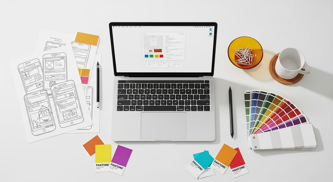
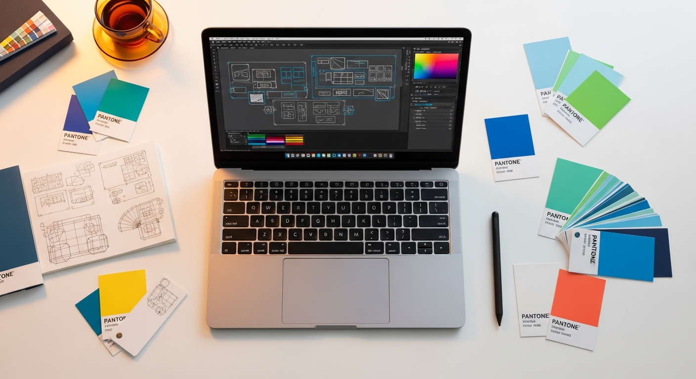
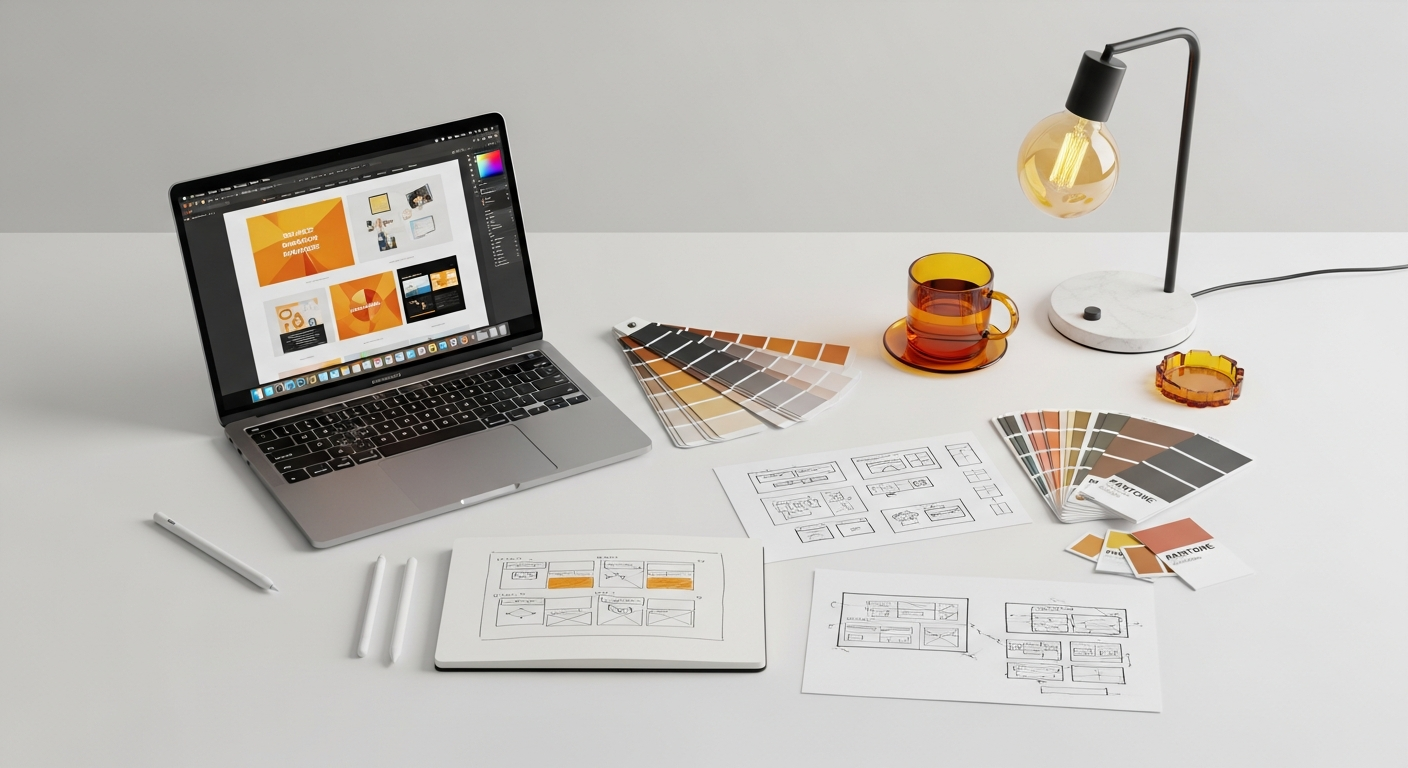
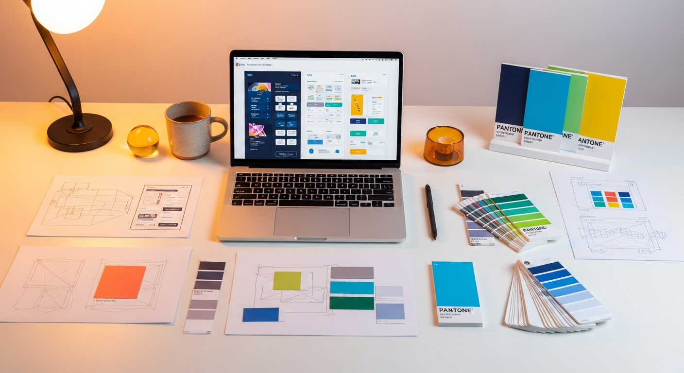
Tools and Prototyping for Data Table Design
Designing complex data tables is an iterative process that benefits immensely from the right tools and prototyping methods. From initial wireframes to high-fidelity interactive prototypes, leveraging these resources can streamline your workflow and improve your final product.
1. Design and Prototyping Tools
- Figma, Sketch, Adobe XD: These are industry-standard tools for UI design. They offer robust features for creating reusable components (like table cells, rows, and headers), setting up auto-layout for responsive tables, and building interactive prototypes.
- Figma’s Variants and Auto Layout: Excellent for creating different states of table components (e.g., hover, selected, sorted) and ensuring columns adapt to content.
- Plugins: Look for plugins that help generate dummy data, create complex tables, or even simulate data visualization within cells.
- Axure RP: Known for its powerful interactive prototyping capabilities, Axure is particularly strong for demonstrating complex interactions like in-line editing, drag-and-drop, and dynamic filtering within tables without writing code.
- Pen and Paper / Whiteboard: Don’t underestimate the power of low-fidelity sketching for initial ideation, especially for mapping out column priorities and basic interaction flows.
2. Design Systems and Component Libraries
Leveraging existing design systems can significantly accelerate your data table design process and ensure consistency. Many popular design systems offer well-documented and accessible table components:
- Material Design (Google): Provides comprehensive guidelines and components for data tables, including specifications for density, sorting, selection, and pagination.
- Ant Design: A popular React UI library that offers highly customizable and feature-rich table components, often serving as inspiration for complex enterprise applications.
- Bootstrap: While more foundational, Bootstrap’s table styling can be a starting point for basic table structures.
- Your Own Internal Design System: If your organization has one, ensure your data table component is robust, flexible, and adheres to your brand’s guidelines.
3. Prototyping Techniques for Data Tables
- Static Mockups: Useful for initial layout and visual design, but quickly become insufficient for complex interactions.
- Clickable Prototypes: Link pages and states to simulate basic navigation and actions (e.g., clicking a sort arrow changes the table state).
- High-Fidelity Interactive Prototypes: Use advanced features in tools like Figma or Axure to simulate dynamic behaviors:
- Simulate filtering by showing/hiding rows based on input.
- Demonstrate pagination by swapping out table content.
- Show in-line editing states with input fields appearing on click.
- Code-Based Prototypes: For the most complex interactions, sometimes building a lightweight, functional prototype using front-end frameworks (React, Vue, Angular) with table libraries (e.g., React Table, AG Grid) is necessary. This allows for realistic testing of performance and complex data manipulation.
By thoughtfully combining design tools, leveraging established design systems, and employing appropriate prototyping techniques, you can efficiently iterate, test, and refine your data table designs to meet the demanding requirements of complex applications.
Measuring Success: Metrics and User Testing for Data Tables
Designing an excellent data table isn’t just about implementing features; it’s about ensuring those features translate into a superior user experience. Measuring the success of your data table design and conducting thorough user testing are crucial steps to validate your solutions and identify areas for improvement.
Key Metrics to Track
- Task Completion Rate: Can users successfully complete common tasks involving the table (e.g., find a specific record, apply a filter, perform a bulk action)? Track the percentage of successful completions.
- Time on Task: How long does it take users to complete specific tasks? A well-designed table should reduce the time required for data manipulation and analysis.
- Error Rate: How often do users make mistakes (e.g., applying the wrong filter, incorrectly editing a cell)? A high error rate indicates usability issues.
- Feature Adoption: Are users utilizing the advanced features you’ve implemented (e.g., column customization, multi-sort)? Low adoption might suggest discoverability issues or lack of perceived value.
- Satisfaction Scores (SUS, NPS): System Usability Scale (SUS) or Net Promoter Score (NPS) surveys can provide qualitative and quantitative feedback on overall user satisfaction with the table interface.
- Page Load Time / Interaction Latency: For performance-critical tables, monitor how quickly the table loads and how responsive it is to user interactions (sorting, filtering, pagination).
User Testing Methodologies
User testing is indispensable for understanding real-world interaction with your data tables. Recruit users who represent your target audience and have them perform realistic tasks.
- Usability Testing (Moderated/Unmoderated):
- Moderated: Conduct one-on-one sessions where you observe users, ask questions, and probe their thought process. This is excellent for uncovering “why” certain issues occur.
- Unmoderated: Users complete tasks remotely, often recorded for later analysis. Useful for gathering data from a larger group and identifying common pain points.
Tasks for Data Tables:
- “Find all active orders placed in the last month by customer X.”
- “Update the status of these five selected tasks to ‘Completed’.”
- “Sort this table to show the highest-value opportunities first, then by creation date.”
- “Customize the columns to only show ‘Product Name’, ‘Quantity’, and ‘Price’.”
- A/B Testing: If you have multiple design approaches for a specific table feature (e.g., filter panel vs. inline column filters), A/B testing can help determine which performs better with real users.
- First Click Testing: Measures where users click first to accomplish a task. For tables, this can reveal if key actions or information are easily discoverable.
- Card Sorting / Tree Testing: While not directly for tables, these methods can help validate the information architecture that feeds into your table (e.g., how columns are grouped, what data is most important).
Always iterate on your designs based on the insights gained from testing and metrics. Data table design is an ongoing process of refinement, ensuring that your solution remains effective as user needs and data complexities evolve. Remember that even small improvements in efficiency across frequently used tables can lead to significant gains in overall application usability and user satisfaction.
Key Takeaways
- Data tables are foundational for complex apps; prioritize clarity, control, and efficiency to prevent user frustration.
- Build on principles like information hierarchy, consistency, and user control, guided by NN/g heuristics.
- Integrate essential features like pagination, sorting, filtering, and bulk actions for robust data management.
- Enhance user experience with advanced patterns such as in-line editing, expandable rows, and contextual menus.
- Design for responsiveness (e.g., cards on mobile) and performance (server-side processing, virtualization) for diverse contexts and large datasets.
- Ensure full accessibility by using semantic HTML, robust keyboard navigation, and appropriate ARIA attributes, adhering to WCAG standards.
Frequently Asked Questions
Q: What’s the biggest mistake designers make with complex data tables?
A: The biggest mistake is treating a data table as merely a visual display rather than an interactive tool. Designers often overlook the need for robust filtering, sorting, and bulk action capabilities, or fail to consider how users will actually *use* the data to accomplish tasks, leading to frustrating experiences and reduced productivity.
Q: How do I handle a massive number of columns in a data table?
A: When faced with many columns, prioritize. Identify the most critical columns that must always be visible. For less critical columns, offer solutions like column visibility toggles (allowing users to hide/show columns), horizontal scrolling (with a sticky first column for context), or using expandable rows to reveal secondary details. Responsive design strategies like transforming to a card view on smaller screens are also crucial.
Q: Should I use pagination or infinite scroll for large datasets?
A: It depends on the user’s goal. Pagination is better for structured browsing, where users might want to jump to specific pages or understand the total scope of data (e.g., financial reports). Infinite scroll is ideal for discovery-oriented content where continuous browsing is expected and the total count isn’t critical (e.g., social media feeds, content streams). For complex apps, pagination often provides more control and context.
Q: What are the key accessibility considerations for data tables?
A: Key considerations include using proper semantic HTML (<table>, <th> with scope, <caption>), ensuring full keyboard navigability for all interactive elements, employing ARIA attributes (like aria-sort, aria-expanded) to convey states to screen readers, and maintaining sufficient color contrast ratios as per WCAG guidelines. Providing clear labels and instructions is also vital.
Q: How can I ensure my data table designs are truly user-friendly?
A: Beyond implementing features, continuous user testing is paramount. Conduct moderated and unmoderated usability tests with target users, giving them realistic tasks. Track key metrics like task completion time, error rates, and feature adoption. Gather feedback through surveys. Iterate on your designs based on these insights, always striving to simplify interactions and enhance clarity.
Designing data tables for complex applications is a testament to a UI/UX designer’s skill in balancing information density, interaction complexity, and user needs. By adopting a user-centered approach, leveraging foundational principles, and meticulously implementing essential and advanced patterns, you can transform what might otherwise be a daunting grid into a powerful, intuitive tool that empowers users