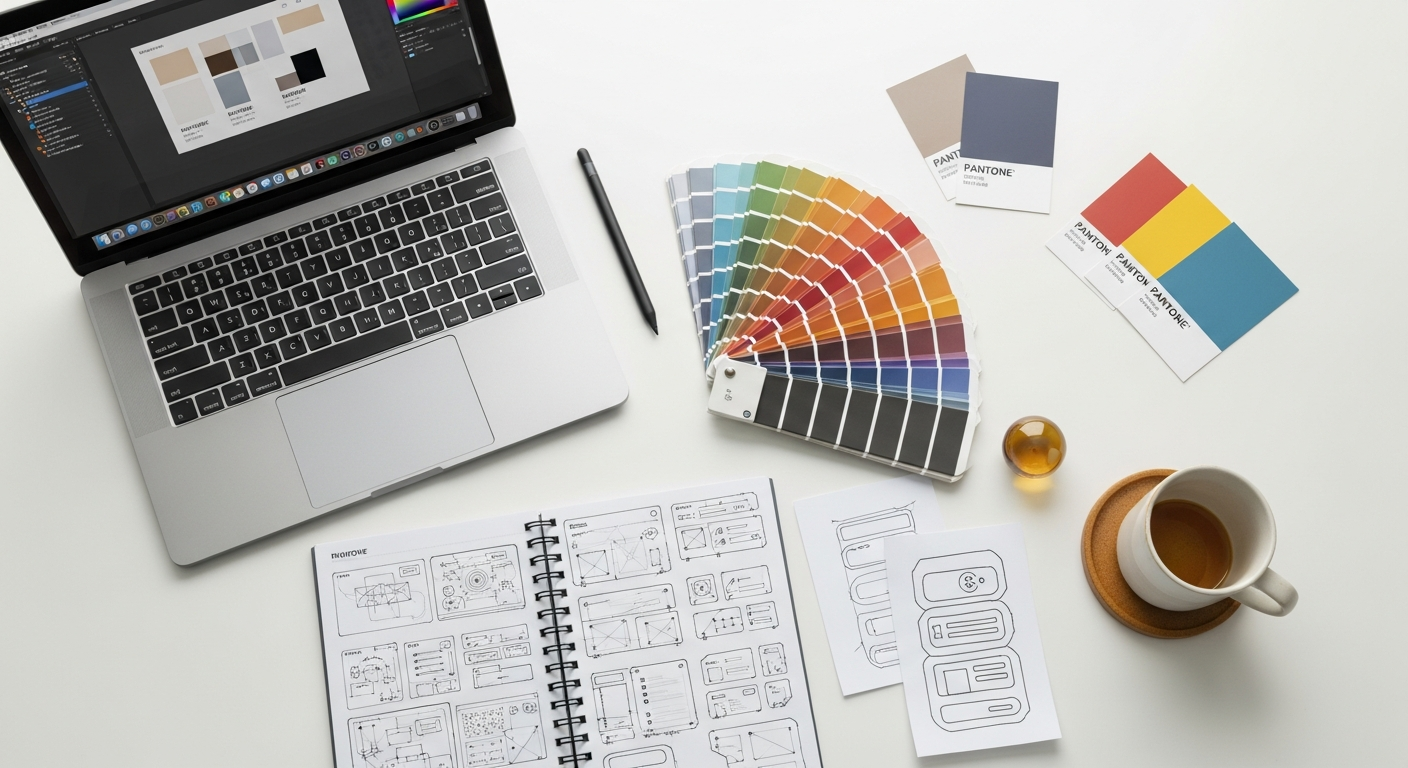
Unlocking Dynamic Prototypes: Leveraging Figma Variables for Realistic User Experiences
Figma, a leading design and prototyping tool, has significantly raised the bar with the introduction of Variables. This groundbreaking feature empowers designers to move beyond superficial interactions, allowing you to imbue your prototypes with genuine intelligence and responsiveness. By enabling the creation of designs that react to user input, manage different states, and even simulate data changes, Figma Variables transform your prototypes from static mockups into living, breathing representations of your final product. This article will guide you through the intricacies of Figma Variables, demonstrating how you can harness their potential to build incredibly realistic prototypes, elevate your user testing, and ultimately deliver superior user experiences.
The Evolution of Prototyping: Why Variables Matter Now
For years, prototyping tools focused primarily on connecting screens and simulating basic navigation. A user clicks a button, and they navigate to a new screen. While this was a significant leap from static wireframes, it offered a limited view of user interaction. Real-world applications are far more complex, characterized by dynamic data, conditional logic, and changing states. Think about a shopping cart where the total updates as you add items, a login form that displays an error if credentials are wrong, or a dashboard that filters data based on user selections.
These dynamic behaviors were traditionally difficult, if not impossible, to replicate realistically within design tools. Designers often resorted to creating numerous artboards for every possible state, leading to unwieldy files, maintenance nightmares, and prototypes that felt stiff and artificial. This limitation profoundly impacted the quality of user testing. As noted by the Nielsen Norman Group, the fidelity of a prototype directly influences the quality and depth of user feedback. Low-fidelity prototypes might uncover major usability issues, but high-fidelity, interactive prototypes are crucial for identifying subtle interaction flaws, validating complex workflows, and understanding user mental models in a context closer to the final product.
The advent of Figma Variables marks a pivotal moment in this evolution. It allows designers to inject a layer of programmatic logic directly into their designs without writing a single line of code. This means you can now define elements that change based on conditions, simulate data input and output, and manage multiple design states from a single source. This capability bridges a critical gap between design and development, enabling you to prototype behaviors that were once exclusive to coded applications. By embracing variables, you’re not just creating mockups; you’re building interactive simulations that provide a more accurate and comprehensive testing ground for your designs, ultimately leading to more robust and user-centric products.
Understanding Figma Variables: The Building Blocks of Dynamic Design

At its core, a Figma Variable is a named container that holds a specific value. Think of it like a placeholder that can dynamically change its content or state based on user interactions or predefined conditions. This concept is fundamental to programming, and its integration into a design tool like Figma is revolutionary. Variables empower you to define and manage attributes of your design elements in a centralized, dynamic way, offering unparalleled flexibility compared to static properties or even traditional components.
Figma currently supports four primary types of variables:
- Number: Stores numerical values. Ideal for counters, quantities, scores, progress percentages, or even financial amounts.
- String: Stores text values. Perfect for dynamic content like user names, error messages, search queries, or form input fields.
- Boolean: Stores a true or false value. Essential for managing binary states such as toggles (on/off), checkboxes (checked/unchecked), visibility (show/hide), or selection states (selected/unselected).
- Color: Stores specific color values. While primarily used for theming and design systems, color variables can also be dynamically changed to reflect states (e.g., active vs. inactive button colors).
Unlike components, which are reusable UI elements, or styles, which define static properties like colors and typography, variables introduce a layer of dynamic data management. A component might have a text layer, but a variable can define what text that layer displays. A component might have an active and inactive state, but a boolean variable can control which state is currently visible. This distinction is crucial: components define the structure and appearance, while variables define the dynamic content and state logic.
To get started, you’ll find Variables within the “Local Variables” section of the Design panel. Here, you can create new variable collections to organize your variables (e.g., “User Data,” “System States,” “Theme Settings”). Within each collection, you can define individual variables, assign their type, and set an initial value. For example, you might create a “User Data” collection with a String variable named “userName” initialized to “Guest User,” and a “System States” collection with a Boolean variable named “isLoggedIn” initialized to “false.”
Once defined, you can link these variables to properties of your design elements. For instance, you can link the “userName” variable to the text content of a text layer, or the “isLoggedIn” variable to the visibility of a “Login” button. As you build interactions, you can then modify these variable values, causing your design elements to update dynamically. This foundational understanding is key to unlocking the sophisticated prototyping capabilities that variables offer.
Crafting Interactive States with Boolean and String Variables
Boolean and String variables are perhaps the most straightforward yet powerful tools for creating interactive states and dynamic content in your prototypes. They allow you to simulate user input and system responses with remarkable fidelity, moving beyond simple screen transitions to actual state changes within a single screen or component.
Boolean Variables for State Management:
Boolean variables (true/false) are perfect for controlling binary states. Consider common UI elements:
- Toggles and Checkboxes: You can create a toggle switch component. Link its ‘on’ state to a boolean variable like
isDarkMode. When the user interacts with the toggle, you setisDarkModeto true or false, dynamically changing the background color or theme of your prototype via a mode switch (more on modes later). - Visibility: Use a boolean to control the visibility of layers or groups. For instance, an
isErrorVisibleboolean can show or hide an error message below a form field. When a user submits an invalid input, you setisErrorVisibleto true, making the error message appear. - Selection States: For navigation items, tabs, or radio buttons, a boolean like
isSelectedcan control their active visual style (e.g., a highlighted background or bold text). When a user clicks a tab, you set its correspondingisSelectedvariable to true and other tabs’ variables to false. - Loading Indicators: A boolean
isLoadingcan be used to show a spinner or skeleton loader while content is presumably being fetched, and then hide it onceisLoadingis set to false.
String Variables for Dynamic Text Content:
String variables are invaluable for any situation where text content needs to change dynamically. This is a massive leap from static text layers:
- User Input Simulation: Create an input field. When a user “types” into it (simulated by clicking a button or an interaction), you can set a string variable (e.g.,
userNameInput) to a specific value. Then, link this variable to a text layer elsewhere on the screen (e.g., “Hello,userNameInput!”). - Error Messages: Instead of hiding/showing different error messages, you can have a single text layer linked to an
errorMessagestring variable. When an error occurs, you update theerrorMessagevariable with the specific error text (e.g., “Invalid email format” or “Password too short”). - Search Results: Simulate a search bar where typing in a query (a string variable) dynamically filters or updates a list of results displayed as text.
- Notifications and Status Updates: A string variable can hold the content of a notification banner or a status message, which updates based on user actions.
Combining these two variable types unlocks sophisticated interactions. Imagine a login form where a string variable captures the email input, and a boolean variable controls the visibility of an error message based on the validity of that email. This level of detail in prototyping not only makes your designs more robust but also significantly enhances the realism of your user testing scenarios.
Simulating Data & Logic with Number Variables
Number variables introduce the ability to simulate quantitative data and perform basic arithmetic operations directly within your Figma prototypes. This functionality is transformative for designs that involve counters, calculations, progress tracking, or any scenario where numerical values change dynamically based on user interaction or system logic. Previously, simulating such behaviors often required complex workarounds or simply couldn’t be achieved with a high degree of fidelity in design tools.
Consider the following practical applications for number variables:
- E-commerce Cart Functionality:
- Item Quantity: Create a number variable, say
itemQuantity, initialized to 1. Design “+” and “-” buttons. When the user clicks “+”, you can setitemQuantity = itemQuantity + 1. For “-“, setitemQuantity = itemQuantity - 1, adding a condition to prevent it from going below 0 or 1. - Total Price Calculation: Link a text layer displaying the total price to a number variable
totalPrice. If each item costs $10, you can settotalPrice = itemQuantity * 10. This allows the total to update dynamically as the quantity changes.
- Item Quantity: Create a number variable, say
- Progress Indicators:
- Progress Bars: Use a number variable,
progressValue, ranging from 0 to 100. As a user completes steps in a multi-stage process, incrementprogressValue. Link this variable to the width of a progress bar rectangle within a component, simulating real-time progress. - Step Counters: For a multi-step form, a
currentStepnumber variable can track which step the user is on, updating a “Step X of Y” display.
- Progress Bars: Use a number variable,
- Scoring and Gamification:
- Quiz Scores: In a quiz prototype, a
userScorevariable can be incremented when the user selects a correct answer. - Like/Dislike Counts: Similar to item quantities, a
likeCountvariable can be incremented or decremented when a user interacts with a like button.
- Quiz Scores: In a quiz prototype, a
The ability to perform mathematical operations (addition, subtraction, multiplication, division) on number variables directly within Figma’s prototyping panel is a game-changer. It means you can build logic that truly reflects application behavior, rather than just simulating visual changes. This provides a significantly more realistic context for user testing, allowing you to observe how users interact with quantitative feedback and dynamic calculations. For instance, observing users struggle with understanding how a total price updates in a cart can reveal crucial usability issues that a static prototype would completely miss.
When designing with number variables, ensure that the displayed numbers are formatted appropriately (e.g., currency symbols, decimal places) if your prototype aims for very high fidelity. While Figma variables themselves don’t handle complex formatting directly, you can combine them with string variables or multiple text layers to achieve the desired presentation. The key is to leverage number variables to manage the underlying numerical logic, making your prototypes intelligent and responsive to user input.
Advanced Variable Applications: The Power of Collections and Modes
While individual variables are powerful, their true potential is unlocked when organized within Collections and utilized with Modes. These features elevate Figma Variables from simple placeholders to a robust system for managing complex design states, themes, and even content localization, making your design system more consistent and adaptable.
Variable Collections: Organizing Your Dynamic Design System
Variable collections act as containers for logically grouping related variables. This is crucial for maintaining order and scalability, especially in large projects or design systems. Instead of a flat list of variables, you can categorize them:
- Theme Variables: A collection for all color variables related to light mode, dark mode, or different brand themes.
- Component State Variables: Variables that control the states of specific components (e.g., a collection for “Button States” containing
isDisabled,isHoveredbooleans). - Content Variables: For string variables used across different sections, like “userGreeting” or “productName.”
- Global Settings: Variables that affect the entire application, like
currentLanguageorfontSizeBase.
This organizational structure makes it easier for you and your team to find, understand, and manage variables, promoting consistency and reducing errors across your design files.
Modes: Switching Contexts and Themes with Ease
Modes are perhaps the most exciting feature, allowing you to define different sets of values for the same variables within a collection. This enables instant switching between various contexts or themes, making your prototypes incredibly versatile. Here are some prime examples:
- Dark Mode/Light Mode:
- Create a “Theme” collection.
- Define color variables like
backgroundColor,textColorPrimary,buttonColor. - Create two modes within this collection: “Light” and “Dark.”
- Assign appropriate color values to each variable for both modes.
- Now, with a single interaction (e.g., clicking a toggle), you can switch the entire prototype between light and dark themes by simply changing the active mode of the “Theme” collection. This mirrors the theming concepts found in Material Design and Apple’s Human Interface Guidelines, making your prototypes truly adaptive.
- Language Localization:
- Create a “Localization” collection.
- Define string variables for all key text elements (e.g.,
welcomeMessage,callToAction,cartTotalLabel). - Create modes for “English,” “Spanish,” “French,” etc.
- Assign the corresponding translated strings to each variable within each mode.
- Your prototype can now dynamically switch between languages, invaluable for testing global products.
- Device or Screen Size Simulation:
- While not a direct substitute for responsive design, modes can help simulate different content densities or element arrangements. You could have modes like “Desktop,” “Tablet,” “Mobile” within a “Layout” collection.
- Variables in this collection might control the number of columns, spacing values, or even the visibility of certain elements, offering a quick way to preview adaptations.
The power of modes lies in their ability to manage multiple versions of your design system’s variables from a single source. This not only dramatically reduces the number of frames you need to create for different states or themes but also ensures that changes to a variable value are propagated consistently across all relevant modes. It’s an indispensable feature for designers working on robust design systems, allowing for efficient iteration and comprehensive testing of diverse user scenarios.
Integrating Variables with Conditional Logic and Expressions
The true intelligence of Figma Variables comes alive when combined with conditional logic and expressions within the prototyping panel. This is where your prototypes transcend simple state changes and begin to simulate complex decision-making processes, validation rules, and intricate user flows that are hallmarks of real-world applications. Figma’s prototyping now allows you to define “if/else” statements, enabling elements and variables to react differently based on specific conditions.
Let’s explore how this integration can be applied:
- Form Validation and Feedback:
- Scenario: A login form requires a valid email and a password of at least 8 characters.
- Variables:
emailInput(String)passwordInput(String)isEmailValid(Boolean, initially false)isPasswordValid(Boolean, initially false)showEmailError(Boolean, initially false)showPasswordError(Boolean, initially false)
- Logic:
- On ‘Submit’ button click:
IF emailInput contains "@" AND emailInput contains "." THEN set isEmailValid = true ELSE set isEmailValid = falseIF passwordInput.length >= 8 THEN set isPasswordValid = true ELSE set isPasswordValid = falseIF isEmailValid = false THEN set showEmailError = true ELSE set showEmailError = falseIF isPasswordValid = false THEN set showPasswordError = true ELSE set showPasswordError = falseIF isEmailValid AND isPasswordValid THEN Navigate to Dashboard ELSE Stay on Login Screen
- On ‘Submit’ button click:
- This setup allows you to dynamically show specific error messages (linked to
showEmailError/showPasswordErrorvisibility) and only proceed if all conditions are met, providing a highly realistic validation experience.
- User Authentication Flows:
- Scenario: A user attempts to log in. If credentials are correct, they proceed; otherwise, an error is shown.
- Variables:
userLoggedIn(Boolean, initially false),loginErrorMessage(String, initially empty). - Logic:
- On ‘Login’ button click:
IF emailInput == "[email protected]" AND passwordInput == "password123" THEN set userLoggedIn = true AND Navigate to Home ELSE set loginErrorMessage = "Invalid credentials" AND set userLoggedIn = false
- On ‘Login’ button click:
- This simulates a basic login check, which is crucial for testing secure flows and understanding user recovery paths.
- Conditional Content Display:
- Scenario: Display different content or features based on user role or subscription status.
- Variables:
userRole(String, e.g., “admin”, “standard”),isPremiumUser(Boolean). - Logic:
IF userRole == "admin" THEN Show Admin Panel ELSE Hide Admin PanelIF isPremiumUser == true THEN Show Premium Features ELSE Show Upgrade Prompt
Figma’s expression builder supports comparisons (`==`, `!=`, `<`, `>`), logical operators (`AND`, `OR`), and basic arithmetic. While it’s not a full-fledged programming language, it provides enough power to simulate most common application logic. This capability significantly enhances the fidelity of your prototypes, allowing for more comprehensive user testing that uncovers not just usability issues but also logical flaws in your proposed interactions. By integrating variables with conditional logic, you can build prototypes that truly react to user decisions, leading to a more robust and validated design.
Best Practices for Variable-Driven Prototyping
Harnessing the full power of Figma Variables requires more than just understanding their mechanics; it demands a strategic approach to organization, naming, and application. Adhering to best practices ensures your variable-driven prototypes remain scalable, maintainable, and effective throughout the design process.
- Establish Clear Naming Conventions:
- Consistency is Key: Adopt a consistent naming convention from the outset. For example, use camelCase (
isLoggedIn,userName,itemCount). - Descriptive Names: Variable names should clearly indicate their purpose and type. Avoid vague names like “Var1” or “Status.” Instead, use “
isModalOpen” or “currentTabSelection.” - Prefixes/Suffixes (Optional but helpful): Some teams use prefixes like
bool_,str_,num_to denote variable types, though Figma’s UI often makes this redundant.
- Consistency is Key: Adopt a consistent naming convention from the outset. For example, use camelCase (
- Organize with Collections and Modes Strategically:
- Logical Grouping: Group related variables into collections (e.g., “Global Styles,” “User Data,” “Component States”).
- Leverage Modes: Use modes for distinct themes (light/dark), languages, or user roles. Avoid creating modes for every single component state; often, individual boolean variables are sufficient for that.
- Start Simple: Don’t over-engineer your variable structure initially. Add complexity as your prototype grows.
- Document Your Variables:
- While Figma doesn’t have a dedicated documentation panel for variables, you can create a dedicated “Variables Documentation” page within your Figma file.
- Explain the purpose of each variable, its expected values, and how it’s intended to be used. This is invaluable for team collaboration and future maintenance.
- Test and Iterate Continuously:
- Small Steps: Implement variables incrementally. Test each new piece of logic to ensure it behaves as expected before adding more complexity.
- Edge Cases: Actively test edge cases (e.g., minimum/maximum values for numbers, empty strings for text inputs, toggling states rapidly).
- User Feedback: Use realistic prototypes with variables during user testing to gather richer, more actionable feedback on dynamic interactions.
- Balance Fidelity and Effort:
- Not Everything Needs a Variable: While variables are powerful, not every single interaction needs to be variable-driven. Sometimes a simple screen transition or component variant is sufficient.
- Prioritize Complexity: Focus on using variables for interactions that are crucial for user understanding, involve data manipulation, or have multiple states that would be cumbersome to manage otherwise.
- Performance: Be mindful of the number of variables and complex interactions, especially in very large files, as they can sometimes impact prototype performance. Optimize where necessary.
- Consider Accessibility from the Outset:
- Variables can help you test accessibility features. For instance, use number variables to simulate different font sizes (WCAG 1.4.4 Resize text) or color variables to test contrast ratios across themes (WCAG 1.4.3 Contrast (Minimum)).
- Ensure that dynamic state changes are visually clear and provide sufficient feedback to users, aligning with principles from WCAG 2.1.
By integrating these best practices into your workflow, you’ll not only create more powerful and realistic prototypes but also establish a more efficient and collaborative design process, ensuring that your variable-driven designs are robust and easy to manage.
The Impact on User Testing and Design Handoff
The shift to variable-driven prototyping with Figma has profound implications for two critical stages of the design process: user testing and design handoff. By enabling a level of realism previously unattainable in design tools, variables fundamentally enhance the quality of feedback and the clarity of communication between design and development teams.
Enhanced User Testing
Traditional prototypes often present users with a predefined, linear path. If a user tries something unexpected or enters invalid data, the prototype typically breaks or fails to respond appropriately. This limits the depth of insights you can gather. Figma Variables overcome these limitations:
- More Authentic Scenarios: You can create prototypes that truly react to user input, simulate data changes, and handle conditional logic. This means users can interact with your design in a way that closely mimics a live application, providing feedback on actual behaviors rather than just static visuals or predefined clicks.
- Uncovering Deeper Usability Issues: When users encounter realistic error states, dynamic content updates, or conditional flows, they are more likely to reveal nuanced usability problems that pertain to information architecture, feedback mechanisms, and mental models. For example, does the user understand why an error message appeared? Is the dynamic content update clear and timely?
- Validating Complex Flows: Multi-step forms, filtering systems, and personalized dashboards can now be tested in their full interactive glory. This allows you to validate the logic of these complex flows, ensuring they are intuitive and robust before any code is written.
- Reduced Guesswork: With dynamic prototypes, designers no longer need to guess how a user might react to a specific data change or state. The prototype itself provides the answers, leading to more confident design decisions backed by empirical user data. This aligns perfectly with Nielsen Norman Group’s emphasis on empirical data from user research to inform design.
Streamlined Design Handoff
One of the perennial challenges in UI/UX design is effectively communicating complex interactions and dynamic behaviors to developers. Static mockups and even basic click-through prototypes often leave much to interpretation, leading to assumptions, rework, and delays. Figma Variables significantly bridge this gap:
- Single Source of Truth: The variable-driven prototype becomes the definitive blueprint for interaction logic. Developers can interact with the prototype and observe exactly how elements change, what conditions trigger those changes, and how data is manipulated. This greatly reduces the need for lengthy documentation of every single interaction state.
- Clearer Communication of Logic: Instead of writing “When user types invalid email, show error message ‘Invalid email format’,” the prototype itself demonstrates this behavior. Developers can inspect the variables and the conditional logic in Figma’s inspect panel, gaining a deeper understanding of the intended functionality.
- Reduced Misinterpretations and Rework: By providing a highly accurate interactive model, variables minimize the chances of misinterpretation during development. This leads to fewer rounds of revisions, faster development cycles, and a product that more closely matches the design vision.
- Foundation for Design Systems: For teams building robust design systems, variables, especially when combined with modes, provide a powerful way to communicate global tokens, theming, and component states. This consistency ensures that the developed product adheres closely to the design system’s principles, as championed by methodologies like Material Design.
In essence, Figma Variables empower designers to speak the language of logic and data, creating prototypes that are not just visual representations but functional specifications. This elevates the design role, making designers more integral