Mastering Interaction Design Principles: Your Foundation for Intuitive UX
Crafting exceptional digital experiences transcends mere aesthetics; it hinges on a profound understanding of how users interact with technology. This understanding is codified into what designers refer to as interaction design principles – the fundamental guidelines that dictate the creation of intuitive, efficient, and profoundly satisfying digital interfaces. For professionals across the Digital Design & Creative Professions, mastering these principles is not just beneficial, but essential for developing products that genuinely resonate with their audience. This comprehensive guide will explore core tenets such as Affordance, Feedback, and Consistency, illustrating their critical role in shaping user behavior and fostering engagement. It serves as a pillar resource, empowering designers to build more effective and user-centric digital products, from web applications to mobile experiences.
Foundational Elements of Effective Digital Interfaces
For any professional in the Digital Design & Creative Professions, a deep understanding of core user experience design tenets is non-negotiable. These guidelines offer a structured approach to solving complex interaction problems, ensuring that digital products are not only functional but also a joy to use. They act as a compass, guiding designers through the intricate process of shaping user behavior and expectations. By integrating these principles from conception to launch, teams can systematically reduce friction, enhance learnability, and build lasting trust with their user base. This foundational knowledge ultimately underpins the success of any digital product in a competitive market.
To provide a quick reference, here’s an overview of some key human-computer interaction principles:
| Principle | Core Definition | Key Benefit | Example Application |
|---|---|---|---|
| Affordance | The perceived properties of an object that indicate how it can be used. | Reduces cognitive load, promotes intuitive interaction. | A button that visibly looks clickable (e.g., raised, shadowed); an icon’s shape suggesting its function. |
| Feedback | Informing users about the results of their actions or the system’s state. | Confirms actions, reduces uncertainty, builds trust. | A loading spinner; a notification sound; a visual highlight upon selection; a success message. |
| Consistency | Maintaining similar behaviors, appearances, and sequences for similar elements. | Increases learnability, predictability, and reduces errors. | Standardized navigation menus; uniform button styles across an application; consistent icon meanings. |
| Learnability | How easy it is for new users to accomplish basic tasks and become proficient. | Lowers entry barriers, broadens user base, reduces support needs. | Clear onboarding flows; familiar UI patterns; intuitive categorization. |
| Efficiency | Enabling users to perform tasks with minimal effort and time once they are familiar with the system. | Increases productivity, user satisfaction, and repeat usage. | Keyboard shortcuts; saved preferences; intelligent auto-completion; streamlined multi-step forms. |
| Forgiveness | Designing systems that allow users to make mistakes without severe consequences and easily recover. | Reduces anxiety, encourages exploration, prevents data loss. | “Undo” functionality; confirmation dialogs before destructive actions; autosave features; clear error messages. |
| Visibility | Making all necessary options and information for a task clearly present and obvious. | Guides users, reduces search time, clarifies system status. | Clearly labeled menu items; visible status bars; breadcrumb navigation; clear notification badges. |
| Mapping | The relationship between controls and their effects, ideally following natural analogies. | Reduces mental effort, makes controls intuitive and predictable. | Volume control moving up/down corresponding to louder/quieter; directional arrows mapping to physical movement. |
[INLINE IMAGE 1: diagram illustrating the interconnected relationship between interaction design principles (e.g., affordance, feedback, consistency) and positive user experience outcomes such as satisfaction, efficiency, and learnability]
Deconstructing Core Principles for Intuitive Design
To truly excel in digital product design, a comprehensive understanding of each core interaction design principle is paramount. These aren’t isolated concepts; rather, they form a cohesive framework that, when applied thoughtfully, transforms a functional interface into an intuitive and delightful one. Each principle addresses a specific aspect of human psychology and behavior, enabling designers to anticipate user needs and prevent common frustrations. This section unpacks these foundational tenets, offering clarity on their definition, purpose, and practical application, providing a solid grounding for creating effective UI/UX strategies.
What is Affordance in Digital Interfaces?
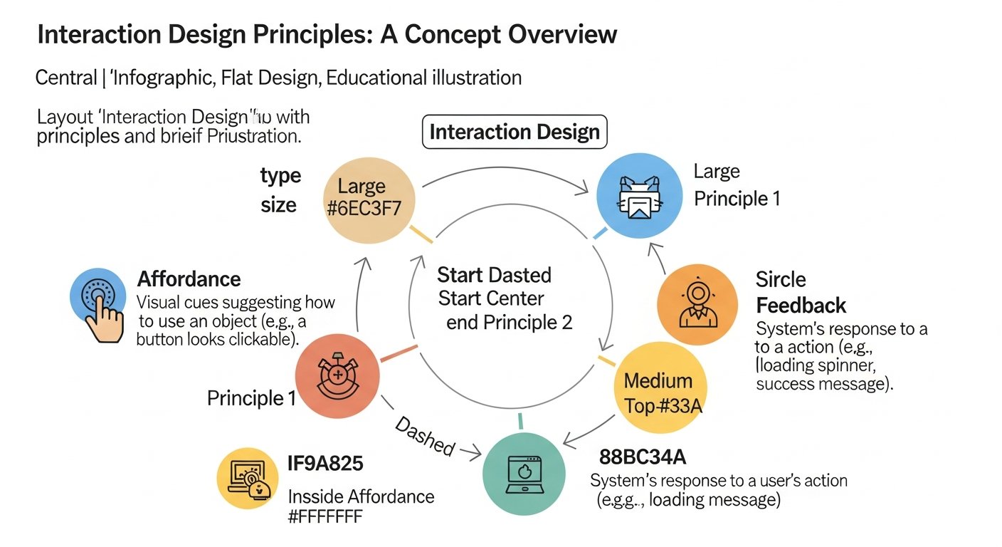
Affordance, in the realm of digital product design, is the visual or auditory cue that suggests how an object can be used. It’s about making actions self-evident. A button that appears raised or shadowed inherently “affords” clicking, while underlined text suggests it’s a link to be clicked. Its purpose is to reduce cognitive load, allowing users to intuitively understand and interact with an interface without needing explicit instructions. Designers apply this by utilizing familiar UI elements, maintaining visual hierarchies, and employing established design patterns that users already recognize. Effective affordance directly impacts user experience by making digital products feel natural and effortless to navigate. learn more about affordance
The Principle of Feedback: Guiding User Actions
Feedback is the immediate and relevant information provided to a user after they perform an action or when the system’s state changes. Its purpose is to confirm that an action has been received, to show progress, or to indicate an error, thereby reducing user uncertainty and building trust. For example, a loading spinner after submitting a form, a subtle vibration on a mobile tap, or an audible ‘ding’ when an email sends. Designers implement this through visual cues (color changes, animations), auditory signals, or haptic responses, ensuring that the feedback is timely, clear, and non-intrusive. Prompt and meaningful feedback significantly impacts user experience by validating their interactions and maintaining a sense of control.
How Does Consistency Build User Trust?
Consistency refers to maintaining uniform behaviors, appearances, and operational sequences for similar elements within a digital product and across a suite of related products. This principle is vital because it builds user trust and familiarity, reducing the effort required to learn new parts of an application. When navigation, terminology, and visual styles remain consistent, users can transfer their knowledge from one part of the interface to another. This impacts user experience by increasing learnability and predictability, minimizing errors, and fostering a sense of reliability. Designers achieve this through comprehensive design systems, style guides, and rigorous adherence to established UI patterns across all digital touchpoints. explore consistency in UX
Applying Learnability for First-Time Users
Learnability describes how easily new users can accomplish basic tasks and quickly become proficient with a digital product. Its primary purpose is to lower the barrier to entry, making interfaces accessible to a broader audience and reducing the need for extensive training or support. This principle impacts user experience by making first interactions smooth and positive, encouraging continued engagement. Designers apply learnability by utilizing familiar conventions, providing clear onboarding flows, offering progressive disclosure of complexity, and ensuring that common tasks follow intuitive user flows. For instance, using universally recognized icons and simple, direct language significantly aids learnability. understand learnability principles
Ensuring Efficiency in User Workflows
Efficiency in human-computer interaction focuses on enabling users to perform tasks with minimal effort and time once they are familiar with the system. The purpose of this principle is to maximize user productivity and satisfaction, particularly for frequent users. High efficiency directly impacts user experience by reducing frustration, saving time, and fostering a sense of mastery. Designers implement efficiency by offering shortcuts, allowing customization, optimizing common workflows (e.g., pre-filling forms, intelligent auto-completion), and designing for quick navigation between frequently used sections. A financial application, for example, might allow users to quickly repeat past transactions with minimal clicks. designing for efficiency
Forgiveness and Error Prevention: Empowering Users
Forgiveness, also known as error tolerance, means designing systems that allow users to make mistakes without severe consequences and to easily recover from errors. The purpose is to reduce user anxiety, encourage exploration, and prevent data loss. This impacts user experience by creating a safe environment where users feel empowered to try new things without fear of irreversible damage. Designers apply forgiveness through features like “undo” buttons, autosave functionalities, clear and actionable error messages, and confirmation dialogs before destructive actions. For example, a text editor might automatically save changes every few minutes, allowing a user to recover their work after an accidental closure. error tolerance in design
Visibility and Discoverability: Making Actions Clear
Visibility refers to making all necessary options, information, and system states for a given task clearly present and obvious to the user. Its purpose is to guide users through an interface, reduce the time spent searching for options, and clarify the system’s current status. This directly impacts user experience by enhancing predictability and reducing cognitive effort. Designers ensure visibility through clear labeling, using visual cues (like progress bars or breadcrumb navigation), and making essential functionalities easily discoverable without deep menu diving. A common application is a shopping cart icon that clearly displays the number of items added, providing immediate status. visibility and discoverability
Mapping: Bridging Real-World Expectations to Digital Interactions
Mapping describes the relationship between controls and their effects, ideally drawing on natural analogies and real-world metaphors. The purpose of good mapping is to make controls intuitive and predictable, requiring minimal mental effort from the user. For instance, a volume slider that moves upwards to increase volume intuitively maps to the real-world concept of “more.” This impacts user experience by making interactions feel natural and reducing learning curves. Designers apply mapping by aligning digital controls with physical world expectations, leveraging familiar spatial relationships, and using clear visual representations that mirror intended actions. mapping controls effectively
Integrating Design Principles into the UX/UI Development Cycle
The effective application of these digital product design methodologies is not a one-time event; it’s an ongoing process deeply embedded within the entire UX/UI development cycle. From the initial stages of user research to the final phases of testing and iteration, considering how these principles shape the user journey is crucial. This proactive integration ensures that intuitive interfaces are not merely an afterthought but a fundamental outcome of the design process. Designers must continuously ask: “How does this decision align with principles of learnability or efficiency?” to build truly user-centric digital products that stand the test of time and evolving user expectations.
From Research to Ideation: Identifying User Needs
The journey of applying effective UI/UX strategies begins long before a single pixel is placed. During the research phase, understanding user behaviors, mental models, and pain points provides the bedrock for informed design decisions. Principles like Learnability and Efficiency directly inform how user flows are mapped out, anticipating where users might struggle or seek faster ways to accomplish tasks. In ideation, designers use this knowledge to brainstorm solutions that inherently afford the correct actions and provide timely feedback, ensuring that early concepts are grounded in human-centered approaches. This early consideration prevents costly redesigns later in the development cycle, setting a strong foundation for intuitive interfaces.
Prototyping and Iteration: Bringing Concepts to Life
As concepts move into prototyping, the practical application of user experience design tenets becomes tangible. Low-fidelity prototypes focus on the core interactions, allowing designers to test basic affordances and navigational consistency. High-fidelity prototypes refine these interactions, incorporating detailed visual feedback and ensuring that the product’s aesthetic reinforces its usability. Iterative design, a core practice, relies heavily on these principles; each iteration is an opportunity to enhance efficiency, improve forgiveness by addressing potential error states, and refine the overall clarity through better visibility. This cyclical process of build-test-refine is where principles truly come alive, shaping the user’s path.
User Testing and Validation: Refining the Experience
User testing is where the theories of human-computer interaction principles are put to the ultimate test against real-world users. Observing participants interact with prototypes reveals whether the intended affordances are clear, if feedback is understood, and if the overall consistency aids rather than hinders. Metrics gathered during testing, such as task completion rates and error counts, provide quantifiable data on the effectiveness of applied principles like Efficiency and Forgiveness. This validation stage is critical for identifying areas where principles might be misapplied or overlooked, allowing designers to make data-driven adjustments that refine the user experience, ensuring the digital product truly meets user needs and expectations.
[INLINE IMAGE 2: infographic showing a user-centered design process incorporating iterative feedback loops, with phases like ‘Discover,’ ‘Define,’ ‘Develop,’ and ‘Deliver,’ each highlighting how interaction principles are applied iteratively]
Measuring the Success of Intuitive Digital Product Design
Implementing principles for intuitive interfaces is only half the battle; quantifying their impact is equally crucial for continuous improvement and demonstrating value to stakeholders. Measuring the effectiveness of applied design tenets allows teams to move beyond subjective opinions and make data-driven decisions. By tracking specific metrics and gathering user insights, organizations can ascertain whether their efforts are truly leading to enhanced user satisfaction, improved efficiency, and reduced support costs. This approach underscores the strategic importance of UX design, proving that thoughtful application of digital product design methodologies directly contributes to business success.
Key Performance Indicators (KPIs) for User Experience
To gauge the success of effective UI/UX strategies, specific KPIs are indispensable. These can include task completion rate (e.g., percentage of users successfully completing a purchase), time on task (average time taken to perform a specific action), error rates (frequency of user mistakes), and user satisfaction scores (often measured via Net Promoter Score or Customer Satisfaction Score). For instance, a 15% reduction in task completion time for a critical workflow over six months, paired with a 10% increase in user satisfaction scores, clearly indicates successful application of efficiency and learnability principles. Monitoring these metrics over time provides a tangible measure of how well user experience design tenets are translating into improved usability and business outcomes.
User Testing Metrics and Observational Insights
Beyond quantitative KPIs, user testing provides invaluable qualitative and quantitative data about how users interact with a digital product. Observational insights reveal nuances in behavior that metrics alone might miss. During usability sessions, designers can track success rates for specific tasks, identify common points of confusion related to poor visibility or inconsistent navigation, and measure the perceived learnability of new features. For example, if during testing, 7 out of 10 new users struggled to locate the “save” function despite clear affordances, it indicates a potential issue with discoverability or mapping. This firsthand experience is critical for pinpointing exact areas where the application of design principles needs refinement, leading to more robust and intuitive interfaces.
Case Studies in Principle Application
Examining successful applications of user experience design tenets provides tangible proof of their efficacy. Consider a scenario where an e-commerce platform implemented immediate visual feedback for adding items to a cart and a clear “undo” option for accidental removals. Post-implementation, they observed a 10% reduction in cart abandonment rates and a 5% increase in conversion rates, alongside qualitative feedback indicating reduced user anxiety during the shopping process. Such outcomes directly link the application of Feedback and Forgiveness principles to measurable business improvements. These real-world examples serve as powerful illustrations of how thoughtful digital product design methodologies can lead to significant positive impact.
Common Pitfalls in Applying Digital Interface Principles
Even seasoned professionals can fall into common traps when implementing digital product design methodologies. Misapplication or outright neglect of core user experience design tenets can lead to interfaces that are frustrating, confusing, or simply ineffective. Identifying and avoiding these pitfalls is just as crucial as understanding the principles themselves. A proactive approach to recognizing these common errors ensures that design efforts result in truly intuitive interfaces, rather than adding to the digital landscape of poorly conceived interactions.
- Inconsistent Application: Applying a principle in one area but ignoring it in another. For example, having consistent button styles on one page but entirely different ones on another, severely impacting learnability and user trust.
- Over-reliance on Conventions: Blindly following established patterns without understanding their context or whether they truly serve the specific user base. This can lead to uninspired or even unsuitable designs.
- Neglecting Feedback: Failing to provide immediate and clear feedback for user actions, leaving users uncertain about whether their input was received or what the system is doing.
- Poor Affordance Cues: Designing elements that don’t look like what they do (e.g., a clickable link that isn’t underlined, or a button that looks like static text), leading to discoverability issues.
- Overloading the User: Presenting too much information or too many options at once, which violates visibility and increases cognitive load, making the interface feel overwhelming.
- Lack of Forgiveness: Designing systems with no “undo” options or clear error recovery paths, making users fearful of making mistakes and hindering exploration.
- Ignoring User Research: Basing design decisions solely on assumptions or personal preferences instead of actual user needs and behaviors, leading to principles being applied in ways that don’t align with the target audience.
The Evolving Landscape of Human-Computer Interaction
The field of human-computer interaction is in constant flux, driven by technological advancements and shifting user expectations. While the fundamental principles for intuitive interfaces remain timeless, their application continues to evolve with new paradigms. Understanding these emerging trends is vital for Digital Design & Creative Professions to stay at the forefront of digital product design methodologies. Anticipating how AI, AR/VR, and ethical considerations will reshape user experience design tenets ensures that future digital products are not only intuitive but also innovative and responsible.
AI and Adaptive Interfaces
Artificial intelligence is profoundly influencing the development of adaptive interfaces that can personalize user experiences. AI-driven systems learn from user behavior to tailor content, predict needs, and even adjust the UI dynamically, enhancing principles like Efficiency and Learnability. For example, an AI might recommend relevant features or proactively offer assistance based on a user’s past interactions, making the digital product feel more intelligent and responsive. Designers must now consider how to design for algorithms that augment traditional interaction patterns, ensuring transparency and control while harnessing the power of personalization.
Augmented and Virtual Reality Experiences
Augmented Reality (AR) and Virtual Reality (VR) introduce entirely new dimensions to human-computer interaction, pushing the boundaries of traditional digital product design methodologies. In these immersive environments, concepts like Affordance and Mapping take on new spatial meanings, requiring designers to think in three dimensions. Feedback becomes multisensory, involving haptics and spatial audio. Designing intuitive interfaces for AR/VR demands a deep understanding of human perception and movement in physical space, challenging designers to translate established UX design guidelines into groundbreaking spatial computing experiences.
Ethical Considerations in Design
As digital products become more integrated into daily life, the ethical implications of design choices are gaining critical importance. User experience design tenets now extend to considerations of privacy, data security, accessibility, and the potential for manipulative or addictive design patterns. Designers are increasingly challenged to apply principles not just for usability but also for user well-being and societal impact. This involves designing for transparency, ensuring equitable access, and prioritizing user autonomy, reflecting a maturation of the Digital Design & Creative Professions towards more responsible and conscientious digital product development.
Conclusion: The Enduring Value of User-Centered Design
The journey through mastering interaction design principles reveals that creating impactful digital products is a blend of art and science. These fundamental guidelines — from Affordance and Feedback to Consistency and Forgiveness — are not merely rules but tools that empower designers to craft experiences that truly resonate with users. For those in the Digital Design & Creative Professions, a deep and nuanced understanding of these principles is the bedrock upon which intuitive, efficient, and ultimately satisfying digital products are built. By prioritizing user needs, continually learning, and adapting to new technological landscapes, designers ensure that the digital world remains accessible, enjoyable, and genuinely useful for everyone. The enduring value of user-centered design, guided by these timeless principles, will continue to shape the future of human-computer interaction.
Sources & References
- Norman, Don A. (2013). The Design of Everyday Things: Revised and Expanded Edition. Basic Books.
- Krug, Steve. (2014). Don’t Make Me Think, Revisited: A Common Sense Approach to Web Usability. New Riders.
- Nielsen, Jakob. (1994). Ten Usability Heuristics for User Interface Design. Nielsen Norman Group. (Available at: https://www.nngroup.com/articles/ten-usability-heuristics/)
- Garrett, Jesse James. (2010). The Elements of User Experience: User-Centered Design for the Web and Beyond. New Riders.
- Shneiderman, Ben, & Plaisant, Catherine. (2016). Designing the User Interface: Strategies for Effective Human-Computer Interaction (6th ed.). Pearson.
About the Author
Jian Li, Creative Lead & UI/UX Strategist — I thrive on exploring the intersection of technology, art, and human behavior to create impactful digital products. Certified Usability Analyst (CUA), M.A. Interaction Design.
Reviewed by Maya Singh, Senior Content Editor & UX Strategist — Last reviewed: March 28, 2026
Reviewed by Maya Singh, Senior Content Editor & UX Strategist — Last reviewed: March 28, 2026