From Screen to Print: A Designer’s Guide to Print Production Basics
At Layout Scene, we believe that mastering the fundamentals of print isn’t just about avoiding costly mistakes; it’s about unlocking a new level of creative control and ensuring your designs translate flawlessly across all mediums. This comprehensive guide to Print Production Basics is designed to equip graphic designers, UI/UX professionals, and creatives of all stripes with the essential knowledge needed to navigate the complexities of prepress, printing, and finishing. By understanding these core principles, you’ll not only enhance the quality of your printed work but also communicate more effectively with printers, saving time, money, and most importantly, preserving your design integrity.
What are the foundational elements for print production?
Before any design leaves your computer, its foundational settings dictate how it will perform in the physical world. The right starting point is crucial for a successful print job. This foundational understanding is the cornerstone of any effective print production guide.
What are Vector and Raster graphics, and how do they build my design?
- Vector Graphics: These are mathematical paths, points, and curves. They are infinitely scalable without losing quality, making them ideal for logos, illustrations, text, and any element requiring sharp edges at any size. Common vector file formats include AI, EPS, and SVG (though SVG is more web-focused, it’s vector). Always use vector for your primary branding elements.
- Raster Graphics: Also known as bitmap images, these are made up of a grid of pixels. Photographs are the most common example. When scaled up excessively, raster images become pixelated. Common raster formats include JPEG, PNG, TIFF, and PSD.
Practical Tip: Always design logos and crucial graphic elements in a vector program like Adobe Illustrator. If you’re incorporating raster images into a vector layout (e.g., a photo in an InDesign brochure), ensure the raster image itself has sufficient resolution for print.
What is the difference between DPI and PPI in print resolution?
- DPI (Dots Per Inch): This refers to the resolution of a physical printer. It indicates how many ink dots a printer can place within one linear inch. Higher DPI generally means sharper print quality.
- PPI (Pixels Per Inch): This refers to the resolution of a digital image. It indicates how many pixels are contained within one linear inch of an image.
While often used interchangeably, for designers, PPI is what you control in your software. The industry standard for high-quality print production is 300 PPI for raster images at their intended output size. Anything significantly below this (e.g., 72 PPI, common for web images) will likely appear blurry or pixelated when printed.
Practical Tip: When sourcing images, always aim for the highest resolution possible. If you have an image that’s 300 PPI at 4×6 inches, but you need to print it at 8×12 inches, its effective resolution will drop to 150 PPI, which is too low for quality print. Always check the effective resolution within your layout software (e.g., InDesign’s Links panel).
What is the difference between CMYK and RGB color models for print?
- RGB (Red, Green, Blue): This is an additive color model used for digital displays (screens, TVs, monitors). It creates colors by mixing varying intensities of red, green, and blue light. When all three are at full intensity, white is produced. This model boasts a wide gamut of vibrant colors.
- CMYK (Cyan, Magenta, Yellow, Black): This is a subtractive color model used for print. Colors are created by mixing varying percentages of transparent inks that absorb (subtract) certain wavelengths of light. When all four inks are mixed, theoretically, black is produced (though K, or Key/Black, is added for richer blacks and efficiency). The CMYK gamut is smaller than RGB, meaning some vibrant RGB colors cannot be accurately reproduced in CMYK.
Real-World Example: A bright neon green logo designed in RGB for a website will likely appear duller and flatter when printed in CMYK. This is known as an ‘out-of-gamut’ color.
Practical Tip: Always start your print-bound design projects in CMYK color mode. While design software can convert RGB to CMYK, doing so at the end of the process can lead to unexpected color shifts. Working in CMYK from the outset allows you to see a more accurate representation of how colors will appear in print and adjust them proactively.
How can I ensure color consistency from screen to paper?
Color is perhaps the most emotionally impactful element of design, yet it’s also one of the most challenging to manage across different mediums. Effective color management is critical for a high-quality print production guide.
What is the role of Color Profiles (ICC Profiles) in print?
ICC (International Color Consortium) profiles are digital files that describe the color characteristics of a device (monitor, scanner, printer) or a color space (sRGB, Adobe RGB, CMYK Fogra39). They help translate colors consistently from one device to another, ensuring that what you see on your screen is as close as possible to what you get in print.
- Monitor Calibration: Regularly calibrating your monitor with a hardware calibrator (e.g., X-Rite i1Display Pro, Datacolor Spyder) is paramount. This creates an accurate ICC profile for your screen, ensuring you’re viewing colors as faithfully as possible. Uncalibrated monitors are a leading cause of color discrepancies.
- Working Color Spaces: For print, your primary working space should be CMYK. Specific CMYK profiles like FOGRA39 (for European offset printing) or SWOP Coated v2 (for North American offset) are common. Your printer will often specify their preferred profile.
Practical Tip: Invest in a good monitor calibrator. It’s a fundamental tool for any designer serious about color accuracy. Always communicate with your printer about their preferred CMYK profile before you start your project, or definitely before sending final files.
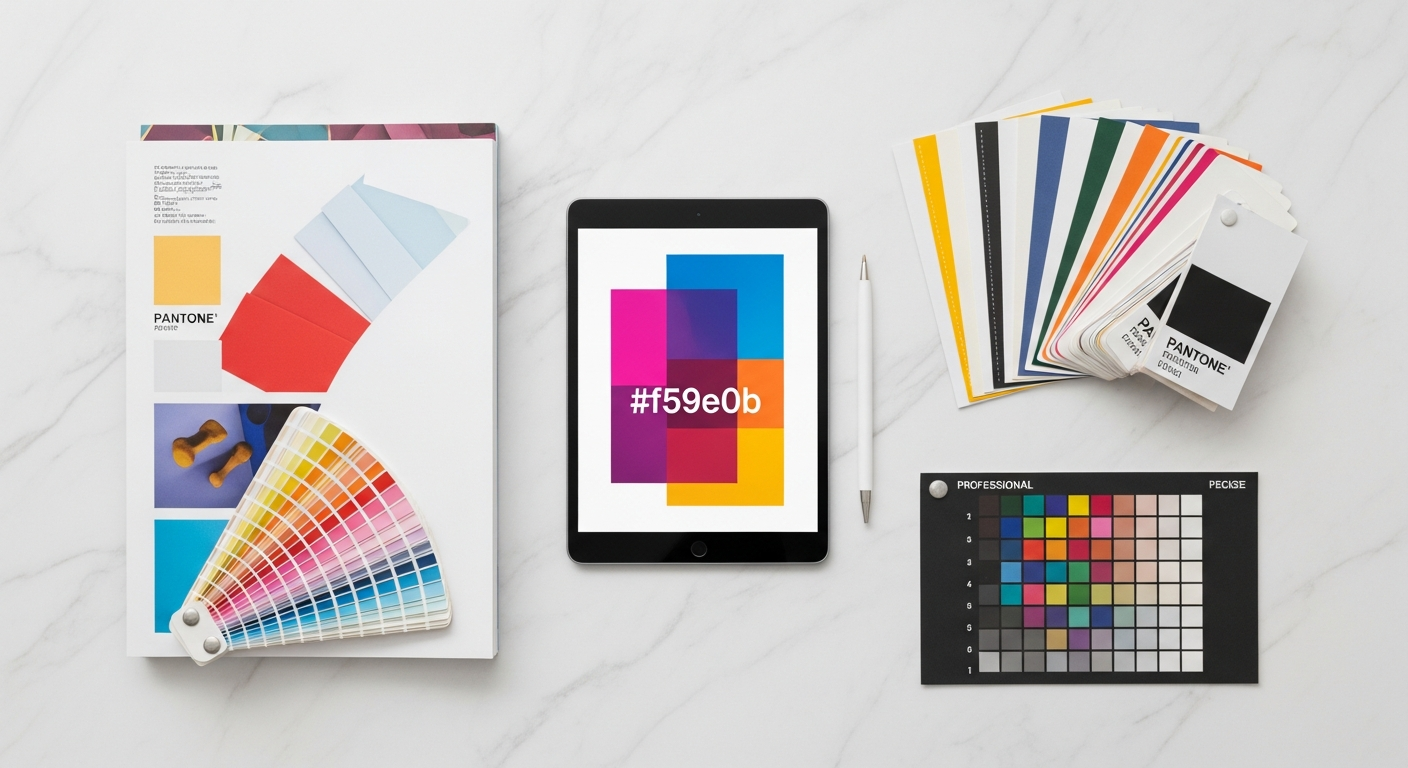
When should I use Spot Colors for precision in print?
While CMYK uses four process inks, spot colors (like those in the Pantone Matching System – PMS) are pre-mixed, custom inks used to achieve specific, consistent colors that might be difficult or impossible to reproduce accurately with CMYK alone. They are often used for branding to ensure absolute color fidelity across all printed materials.
Real-World Example: Coca-Cola Red or Tiffany Blue are specific spot colors. Using a Pantone Solid Coated swatch ensures that iconic red looks the same on a bottle label, a billboard, and a business card, regardless of the printer or location.
Practical Tip: When using spot colors, always refer to a physical Pantone swatch book (Solid Coated and Solid Uncoated) to verify the color. Screens cannot accurately display spot colors. Ensure your design software has the correct Pantone libraries loaded and that you’ve selected the appropriate version (e.g., Pantone Solid Coated for glossy paper, Solid Uncoated for matte). Clearly specify spot colors in your print instructions.
What are Soft Proofing and Hard Proofing in print production?
- Soft Proofing: This is a digital simulation of how your design will look when printed, viewed on your calibrated monitor. It uses your chosen ICC profile to adjust the display to mimic the printer’s output. While helpful, it’s not foolproof due to monitor limitations.
- Hard Proofing: This is a physical print of your design, created either by your printer or on a calibrated proofing device. It’s the closest representation of the final printed piece before the full run. Types include digital proofs (often inkjet prints) or, for critical jobs, a press proof (an actual print from the press, usually costly).
Practical Tip: Always request a hard proof for critical projects, especially those with tight color requirements or high quantities. For smaller, less critical jobs, a PDF proof from the printer is a minimum requirement, allowing you to check content, layout, and basic color representation.
How do Typography and Layout impact print readability and visual flow?
Typography and layout are the backbone of effective visual communication. In print, these elements take on specific considerations to ensure maximum readability and impact. A strong print production guide emphasizes the nuances of text on paper.
How do I manage and embed fonts for print?
Fonts used in your design must be available to the printer for accurate reproduction. Missing fonts are a common prepress error, leading to text reflowing or substituting with generic fonts (e.g., Arial), ruining your carefully crafted layout.
- Embedding Fonts: When exporting PDFs, ensure all fonts are embedded. This bundles the font files within the PDF, making them accessible to the printer.
- Outlining Fonts: For logos, headlines, or small pieces of text, converting text to outlines (or curves) is a common practice. This converts text characters into vector shapes, eliminating any font dependency. However, outlined text is no longer editable.
Practical Tip: For final print files, convert all text to outlines, particularly for logos and non-editable design elements. For documents with extensive editable text (e.g., a brochure or book), embed fonts in a high-quality PDF. Always keep a working file with editable text as your master!
What is Microtypography, including Kerning, Tracking, and Leading?
These fine-tuning adjustments are crucial for legibility and aesthetic appeal in print.
- Kerning: Adjusting the space between specific pairs of characters (e.g., “VA” often needs negative kerning). Incorrect kerning can lead to awkward gaps or collisions.
- Tracking: Adjusting the overall space between characters across a selection of text. Looser tracking can make headlines feel airy; tighter tracking can fit more text but reduce readability if overdone.
- Leading (Line Spacing): The vertical space between lines of text. Too tight, and lines merge; too loose, and readability suffers. Generally, leading should be 120-145% of the font size for body text.
Practical Tip: Pay close attention to these details, especially for headlines, subheadings, and body text in important documents. Zoom in to identify awkward kerning pairs. Good microtypography makes a significant difference to professional output.
What are the key Layout Principles for print, such as Grids, Margins, Gutters, and Columns?
- Grids: Underlying structures that help align elements and create visual consistency. Essential for multi-page documents.
- Margins: The blank space around the edges of your page. Crucial for visual breathing room and protecting content from being cut off. Don’t place critical information too close to the edge.
- Gutters: The space between columns of text or between two facing pages (e.g., in a book or magazine). Adequate gutter space is vital for readability, especially for content near the binding.
- Columns: Breaking text into columns improves readability, especially for longer lines of text.
Real-World Example: A magazine layout typically uses strong grids, generous margins, and carefully considered gutters to ensure articles are easy to read and visually appealing, even across the page fold.
Practical Tip: Establish your document grid, margins, and columns at the very beginning of your design process. Use “safe zones” to indicate where important content must remain to avoid being trimmed or obscured by binding.
How do I prepare my files for print, including bleeds, marks, and preflight?
Once your design is visually complete, the technical preparation of the file for the printer is critical. This stage, often called prepress, ensures that your design translates accurately to the printing press. This section is vital for any comprehensive Print Production Guide.
What is bleed and why is it important for print?
Bleed refers to the portion of your design that extends beyond the trim edge of the page. When printing, slight variations can occur during the cutting process. If your design goes right to the edge without bleed, a tiny shift could result in a thin, unsightly white line along the edge of your finished piece.
- Standard Bleed: The most common bleed amount is 3mm (0.125 inches) on all sides. For large format printing, this might increase.
- How it Works: You extend your background colors, images, or graphic elements past the trim line into the bleed area. After printing, the paper is cut along the trim line, removing the bleed and ensuring your design appears to run right to the edge without white gaps.
Practical Tip: Always set up your document with bleed from the very beginning of your project. Most design software (InDesign, Illustrator, Photoshop) allows you to specify bleed during document creation. Never attempt to add bleed by simply scaling up your design or manually extending elements haphazardly.
What are Printer Marks and how do they guide the press?
Printer’s marks are symbols added outside the trim area of your document that provide information to the printer. They are essential for accurate printing and finishing.
- Crop Marks (Trim Marks): These indicate where the paper should be trimmed. They define the final size of your printed piece.
- Bleed Marks: Indicate the extent of the bleed area.
- Registration Marks: Small targets used to align separate plates (for CMYK or spot colors) on press, ensuring perfect color registration.
- Color Bars (Control Strips): Strips of color patches used to monitor ink density and color accuracy during the press run.
- Page Information: Often includes the page number, file name, and date, helpful for identifying different files or versions.
Practical Tip: When exporting your final PDF for print, most design software offers an option to include “All Printer’s Marks” or select specific marks. Always include crop and bleed marks. Consult your printer if they have specific requirements for other marks.
Why is Preflighting my print files important?
Preflighting is the process of checking your digital file for potential problems before sending it to print. This proactive step can save immense time and money by catching errors early.
- What to Check:
- Image resolution (300 PPI for print).
- Color mode (CMYK for print).
- Fonts (embedded or outlined).
- Bleed (present and correct).
- Overprint issues (e.g., white elements set to overprint, which would disappear).
- Missing or modified links (images).
- Tools: Adobe InDesign has a powerful built-in Preflight panel. Adobe Acrobat Pro also offers robust preflight tools, allowing you to check PDFs against industry standards or custom profiles.
Practical Tip: Make preflighting a non-negotiable step in your workflow. Before packaging or sending any file, run a thorough preflight check. If you’re unsure about an error, consult your printer or a prepress expert.
How do I package my files for a printer?
Packaging a file (especially in InDesign) gathers all necessary elements (fonts, linked images, and the document itself) into a single folder, ensuring nothing is missed when transferring to the printer.
Practical Tip: For complex projects, always use the “Package” function in InDesign. For simpler jobs, a well-prepared PDF (with fonts embedded and images properly linked/embedded) is often sufficient.
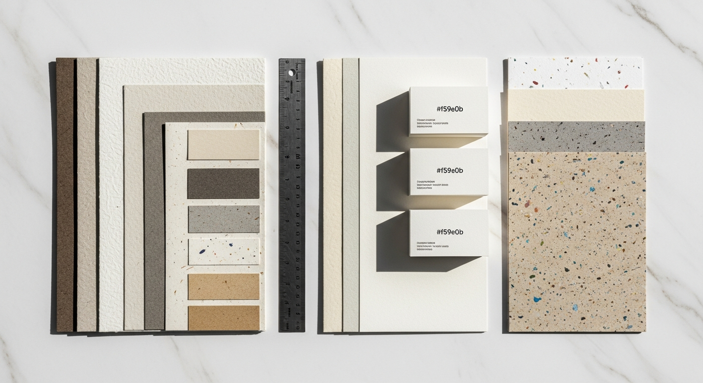
How does paper selection impact my design?
The choice of paper significantly influences how your design is perceived. It affects tactile experience, color rendition, durability, and even the environmental footprint. This element is often overlooked but crucial in a holistic print production guide.
What are the different Paper Types, including Coated vs. Uncoated and Finishes?
- Coated Paper: Features a layer of clay or other materials that fills the pores of the paper, creating a smooth, less absorbent surface.
- Gloss: High sheen, vibrant colors, good for photography, can have glare.
- Matte: Smooth, non-reflective finish, softer look, good for readability, less vivid colors than gloss.
- Silk/Satin: A middle ground between gloss and matte, subtle sheen, good color reproduction without high glare.
Coated papers generally produce sharper images and more vibrant colors because the ink sits on the surface rather than soaking into the fibers.
- Uncoated Paper: Porous, absorbent paper without a coating. Offers a natural, tactile feel.
- Smooth: Standard printer paper, good for text.
- Vellum: Slightly rougher texture.
- Linen: Embossed texture mimicking linen fabric.
Uncoated papers often result in softer, more muted colors as the ink tends to absorb and spread slightly into the fibers. Great for letterheads, invitations, or designs aiming for an organic feel.
Practical Tip: Always ask your printer for paper samples. Feeling the paper and seeing how ink looks on different finishes is invaluable. Consider the purpose of your design: a glossy brochure for high-impact photography vs. an uncoated business card for an artisanal brand.
What is Paper Weight (GSM/Pounds) and why does it matter?
Paper weight indicates its thickness and rigidity. Different regions use different measurement systems:
- GSM (Grams per Square Meter): Used globally. Higher GSM means thicker, heavier paper.
- 80-120 GSM: Standard copy paper, lightweight flyers.
- 130-170 GSM: Poster paper, brochure interiors.
- 200-250 GSM: Card stock, heavy covers, business cards (mid-range).
- 300-400 GSM+: Premium business cards, rigid covers.
- Pounds (lb): Used predominantly in North America, often accompanied by a basis weight (e.g., 80lb Text, 100lb Cover). This system can be confusing as “pound” refers to the weight of 500 sheets of a specific size of paper.
Practical Tip: Discuss paper weight with your printer. They can provide recommendations based on the project type and your budget. Remember that thicker paper often conveys a sense of quality and durability.
What are the environmental considerations for paper selection?
Sustainability is increasingly important. Many printers offer eco-friendly paper options:
- Recycled Content: Paper made from post-consumer waste.
- FSC Certified: Paper from forests managed responsibly.
- Chlorine-Free: Processed without harmful chlorine chemicals.
Practical Tip: If environmental impact is a concern for your brand or client, inquire about recycled or FSC-certified paper options. This can also be a strong marketing point for the final product.
What are the different printing processes and specialty finishes?
Understanding how your design will be brought to life mechanically is crucial. Different printing methods are suited for different jobs, influencing cost, quality, and turnaround time. This section provides a high-level overview, essential for any designer’s print production guide.
What is Digital Printing and when should I use it?
- How it Works: Uses toner (like a laser printer) or liquid ink (like an inkjet printer) directly from digital files. No printing plates are required.
- Pros:
- Cost-effective for short runs (typically under 500-1000 pieces).
- Fast turnaround times.
- Variable Data Printing (VDP): Each piece can be customized with unique text or images (e.g., personalized letters).
- Less setup cost.
- Cons:
- Higher cost per piece for very large quantities.
- Smaller color gamut than offset, sometimes less precise color matching for spot colors.
- Limited paper size and stock options.
- Best For: Business cards, flyers, short-run brochures, personalized direct mail, prototypes, and proofs.
What is Offset Printing and when should I use it?
- How it Works: An image is transferred (offset) from a plate to a rubber blanket, then to the printing surface. Each color (CMYK and spot colors) requires a separate plate.
- Pros:
- Superior color accuracy and consistency, especially for large runs.
- Cost-effective for medium to long runs (typically over 1000 pieces).
- Wider range of paper stocks and finishes.
- Produces very sharp, high-quality images.
- Cons:
- Higher setup costs due to plate creation.
- Longer turnaround times.
- Not suitable for variable data printing.
- Minimum quantity usually required.
- Best For: Magazines, books, high-volume brochures, packaging, anything requiring precise color matching and high quality over many units.
What are Specialty Finishes in print production?
Beyond standard printing, various finishing techniques can add a premium, tactile, or visually striking element to your design.
- Spot UV: A clear, glossy coating applied to specific areas (spots) of a printed piece, creating a contrast in texture and sheen. (e.g., a glossy logo on a matte business card).
- Foil Stamping: Applying metallic or colored foil to paper using heat and pressure, often for logos or text, creating a luxurious effect.
- Embossing/Debossing: Raising (embossing) or indenting (debossing) an image or text into the paper without ink, creating a subtle, tactile dimension.
- Die-Cutting: Using a custom-made steel rule die to cut paper into unique shapes (e.g., custom-shaped business cards, intricate packaging).
- Lamination: Applying a thin plastic film (matte, gloss, soft-touch) over the printed surface for protection, durability, and a changed tactile feel.
- Varnishing: A liquid coating applied over the entire printed sheet for protection or aesthetic effect (e.g., a flood dull varnish for a uniform matte look).
Practical Tip: When planning specialty finishes, integrate them into your design from the start. Discuss capabilities and limitations with your printer early on, as these finishes often require specific file setup (e.g., a separate spot color channel for Spot UV). Request samples to understand the real-world effect.
How can effective communication with printers ensure success?
The relationship between designer and printer is collaborative. Effective communication is the most powerful tool in your print production guide to ensure your vision becomes a reality.
How do I get accurate quotes from printers?
A detailed quote requires clear specifications. Provide your printer with all the necessary information upfront to avoid surprises.
- Quantity: Exact number of pieces.
- Finished Size: The final trimmed dimensions.
- Paper Stock: Type (coated/uncoated), finish (gloss/matte), and weight (GSM/lb).
- Number of Pages: For multi-page documents.
- Colors: CMYK, number of spot colors (Pantone codes), black only.
- Binding/Finishing: (e.g., saddle-stitched, perfect bound, coil bound, fold type).
- Specialty Finishes: (e.g., Spot UV, foil, die-cut).
- Turnaround Time: When do you need it? (This affects pricing).
- Proofing: What type of proof do you require (PDF, digital hard proof, press proof)?
Practical Tip: Get multiple quotes from different printers to compare pricing and capabilities. Don’t always go for the cheapest option; consider their reputation, communication, and quality of work. Ask if they specialize in your type of project.
How do I provide clear print-ready files to my printer?
Your goal is to provide files that are as “printer-ready” as possible, minimizing the need for the printer to make adjustments (which can lead to errors and extra costs).
- Preferred Format: High-resolution PDF/X-1a is the industry standard. This format flattens transparencies, embeds fonts, and uses CMYK, reducing common issues.
- Organized Files: If providing native files (e.g., InDesign package), ensure all linked images and fonts are included in a neatly organized folder.
- Instructions: Include a clear text document with any specific instructions, quantities, paper choices, and finishing notes.
Practical Tip: Always double-check your file against a pre-flight checklist before sending. If your printer offers an online upload portal with pre-flight checks, utilize it. When in doubt, call your printer and ask for their preferred file submission guidelines.
Why is reviewing proofs diligently crucial for print projects?
This is your last chance to catch errors before mass production. Do not rush this step.
- Content Check: Read every word for typos, grammatical errors, and factual inaccuracies.
- Layout Check: Ensure all elements are correctly positioned, margins are consistent, and nothing is unexpectedly cut off.
- Color Check: Compare the proof to your calibrated screen (for soft proofs) or, ideally, to a physical color swatch (for hard proofs, especially with spot colors). Understand that a hard proof is the closest representation, but slight variations can occur on the final press run.
- Binding/Finishing Check: For multi-page documents, ensure page order is correct and any binding allowances (e.g., creep in saddle-stitching) are accounted for.
Real-World Example: A large marketing campaign printed with the wrong phone number on 10,000 flyers because the proof wasn’t thoroughly reviewed is a nightmare scenario. A simple typo can be a devastating and expensive mistake.
Practical Tip: Have at least two sets of eyes review the proof: yours and a client’s or colleague’s. Sign off on the proof only when you are 100% satisfied. Keep a signed copy for your records.
How do Quality Control and building relationships with printers contribute to success?
Once the job is printed, do a final quality check. Look for color consistency, registration, clean cuts, and accurate finishing.
Practical Tip: Building a strong relationship with a good printer is invaluable. They are your partners in production. A trusted printer can offer expert advice, troubleshoot issues, and provide solutions that elevate your designs. Don’t hesitate to ask questions, learn from their expertise, and view them as an extension of your creative team.
Conclusion: Elevate Your Designs from Digital to Tangible Excellence
The journey from a blank digital canvas to a polished, physical product is complex, yet incredibly rewarding. As designers, our goal is to create compelling visual narratives, and understanding the nuances of print production ensures that narrative translates flawlessly into the real world. This Print Production Guide has armed you with the essential knowledge, from the foundational principles of color and resolution to the practicalities of file preparation, paper selection, and collaborating with printers.
Mastering these basics isn’t just about avoiding errors; it’s about expanding your creative toolkit. It empowers you to design with confidence, pushing the boundaries of what’s possible when your ideas move beyond the screen. By embracing these principles, you elevate your status from a designer who creates visuals to a design professional who controls the entire lifecycle of their work, delivering impactful, tangible results every time.
Now, take these insights and apply them. The next time you embark on a print project, approach it with newfound confidence, armed with the knowledge to speak the printer’s language and ensure your designs achieve their full, vibrant potential in print. Dive deeper into specific areas that pique your interest, experiment with different papers and finishes, and build those crucial relationships with your print partners. Your journey to print mastery has just begun!
About the Author
Alex Chen is a graphic designer and print production specialist with over 10 years of experience helping creatives bring their digital designs to life in print. He is passionate about color accuracy, prepress best practices, and fostering effective communication between designers and printers. Connect with Alex on LinkedIn. Learn more about Alex Chen.
Published: January 15, 2023 | Last Modified: July 30, 2024
Frequently Asked Questions
What’s the most common mistake designers make when preparing files for print?
Why do my colors look different on screen than they do in print?
What is the ideal resolution for images in print?
When should I use a spot color instead of CMYK?
How do I package my InDesign files for a printer?
Reviewed by Maya Singh, Senior Content Editor & UX Strategist — Last reviewed: March 28, 2026